


I spent years teaching CSS layout on this blog. I put everything I know into The Layout Maestro course: 70+ lessons and 150+ interactive examples that teach you how to think CSS layouts, not just memorize syntax.
While learning how to build a Figma plugin, I stumbled upon a few interesting usages of Flexbox and Grid in Figma. When I found them, I just got distracted and couldn’t resist digging more.
Flexbox and Grid have been providing us web developers with lots of new capabilities to build new layouts, and what I will show you in this article is just that.
To move along with this article, you don’t need to have a detailed knowledge of Flexbox or Grid, and I will try to explain most examples from the ground up.
Let’s get discovering.
The purpose of this write-up is to show how powerful flexbox and grid are and to highlight those interesting use-cases for them. There might be a few bits that are focused on subtle UI details which I like very much.
On the right side of Figma, we have the default “Design” tab. When selecting an element on the canvas, we can see its x-axis, y-axis, width, and height values. This also can be different depending on the element being a text, group, frame, and more.
What I found interesting here is using CSS grid for each row in the design tab. I dig that so, so much.
Consider the following figure.
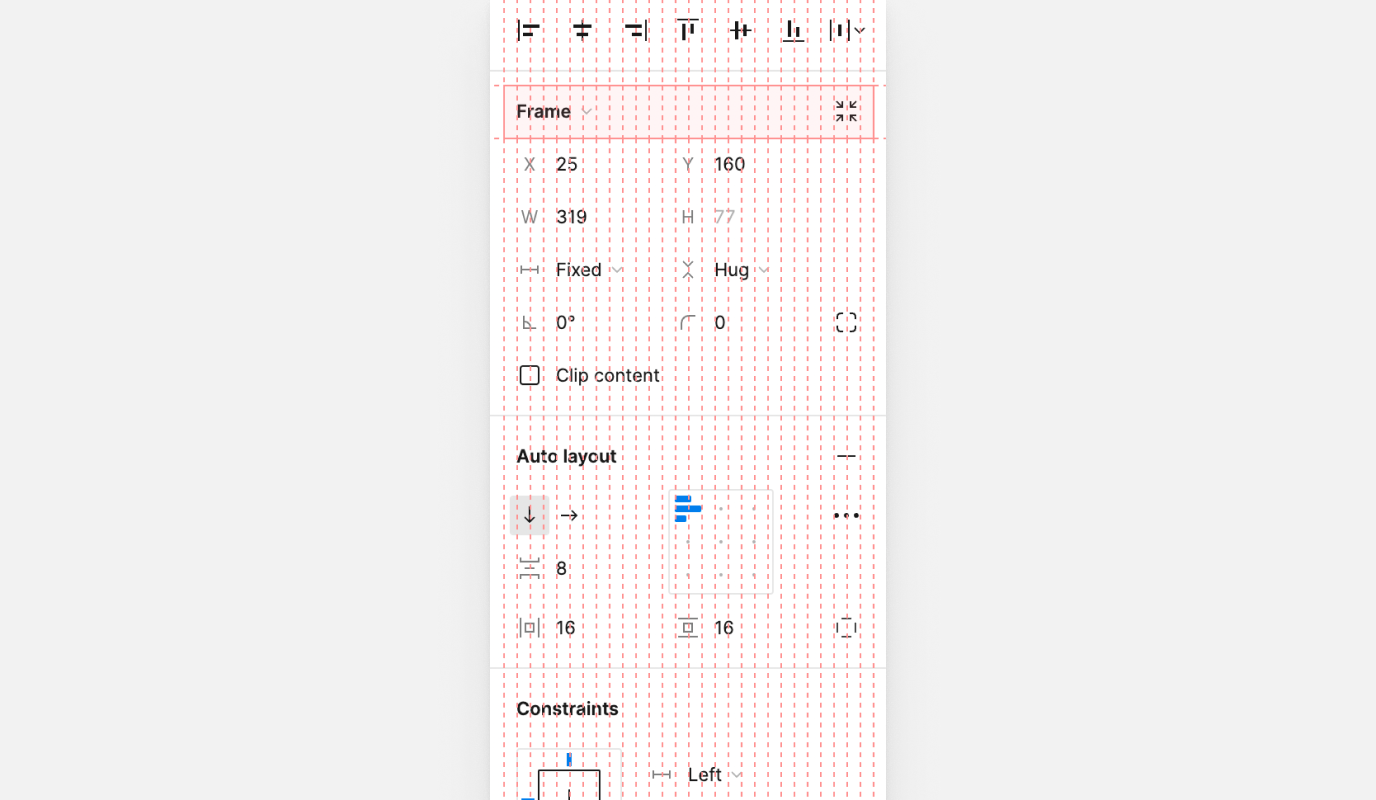
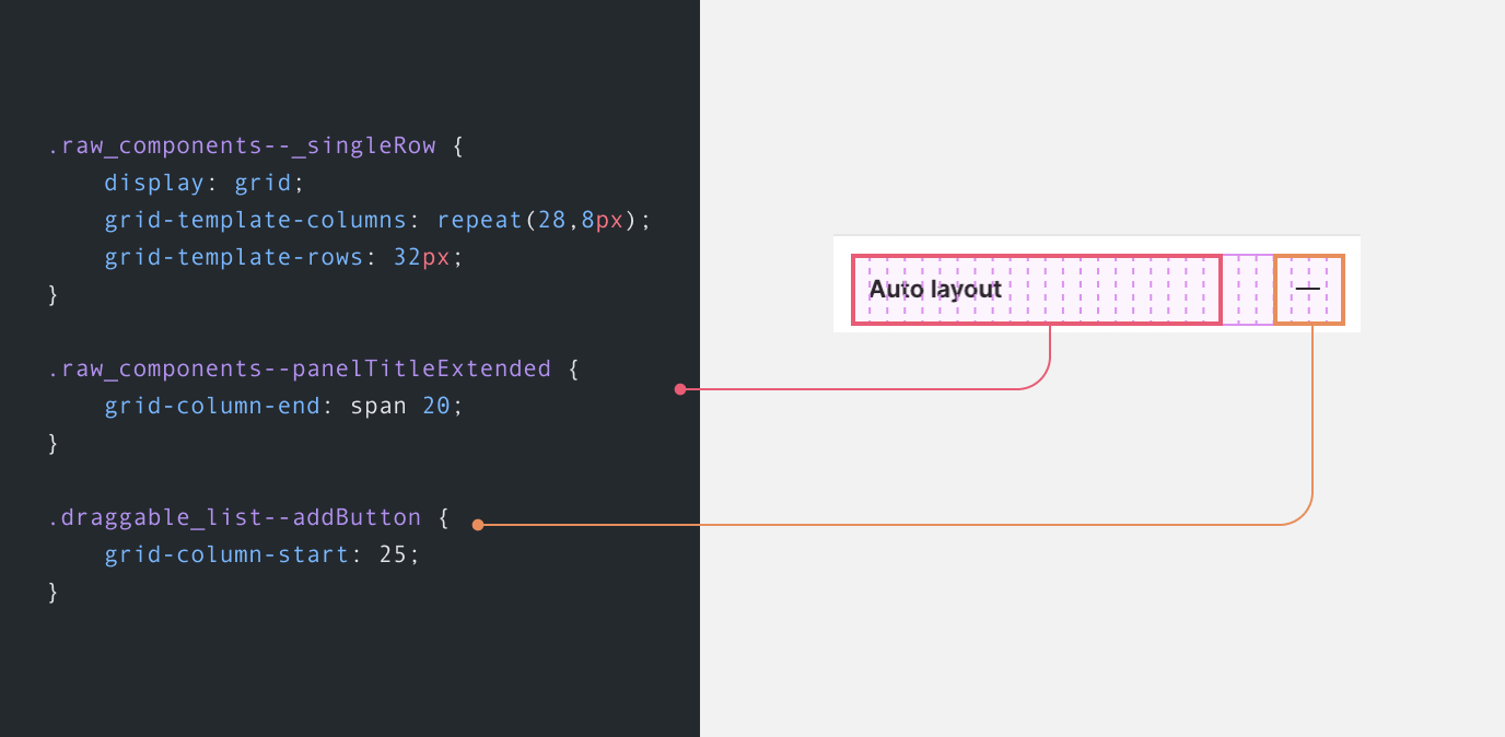
Notice how we have many lines. Those are for the 28 columns, yes! You read that right. Any row in the design tab is built on top of that grid.
Each column has a width of 8px.
.raw_components--_singleRow {
  display: grid;
  grid-template-columns: repeat(28, 8px);
  grid-template-rows: 32px;
}
Also, when controlling the details of a drop shadow, for example, the same grid is being used.
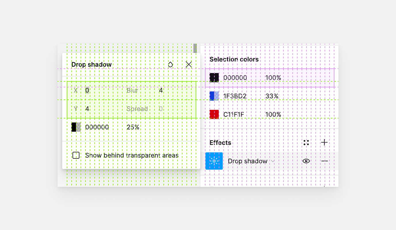
For me, this is a perfect use for CSS grid, even though from the first glance you might think that those are little layouts, but again, it’s a very valid use of CSS grid.
In this usage, each alignment button is taking 4 columns (32px) of the grid. Notice how the icon itself is nicely centered too.
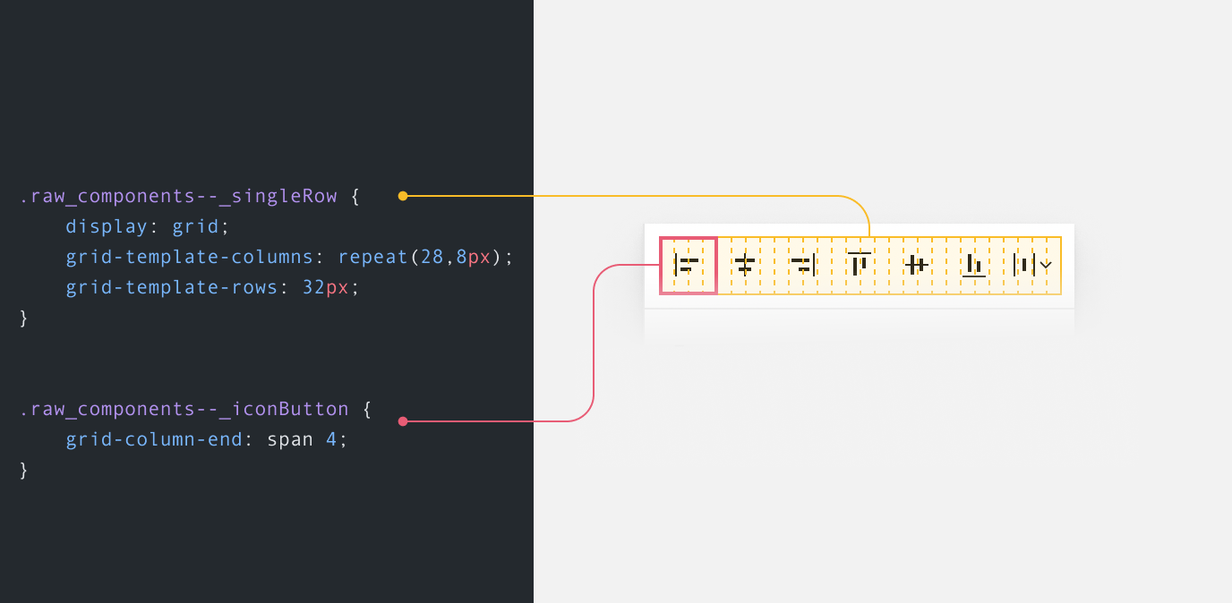
.raw_components--_singleRow {
  display: grid;
  grid-template-columns: repeat(28, 8px);
  grid-template-rows: 32px;
}

.raw_components--_iconButton {
  grid-column-end: span 4;
}
In this example, we see how the inputs for the x-axis and y-axis are divided, along with the newish “Absolute position” button.
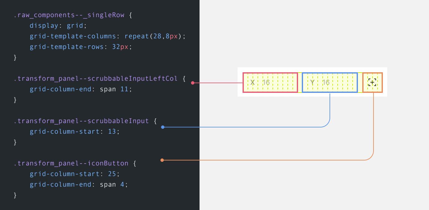
The bit that I found very interesting is the Auto Layout controls.
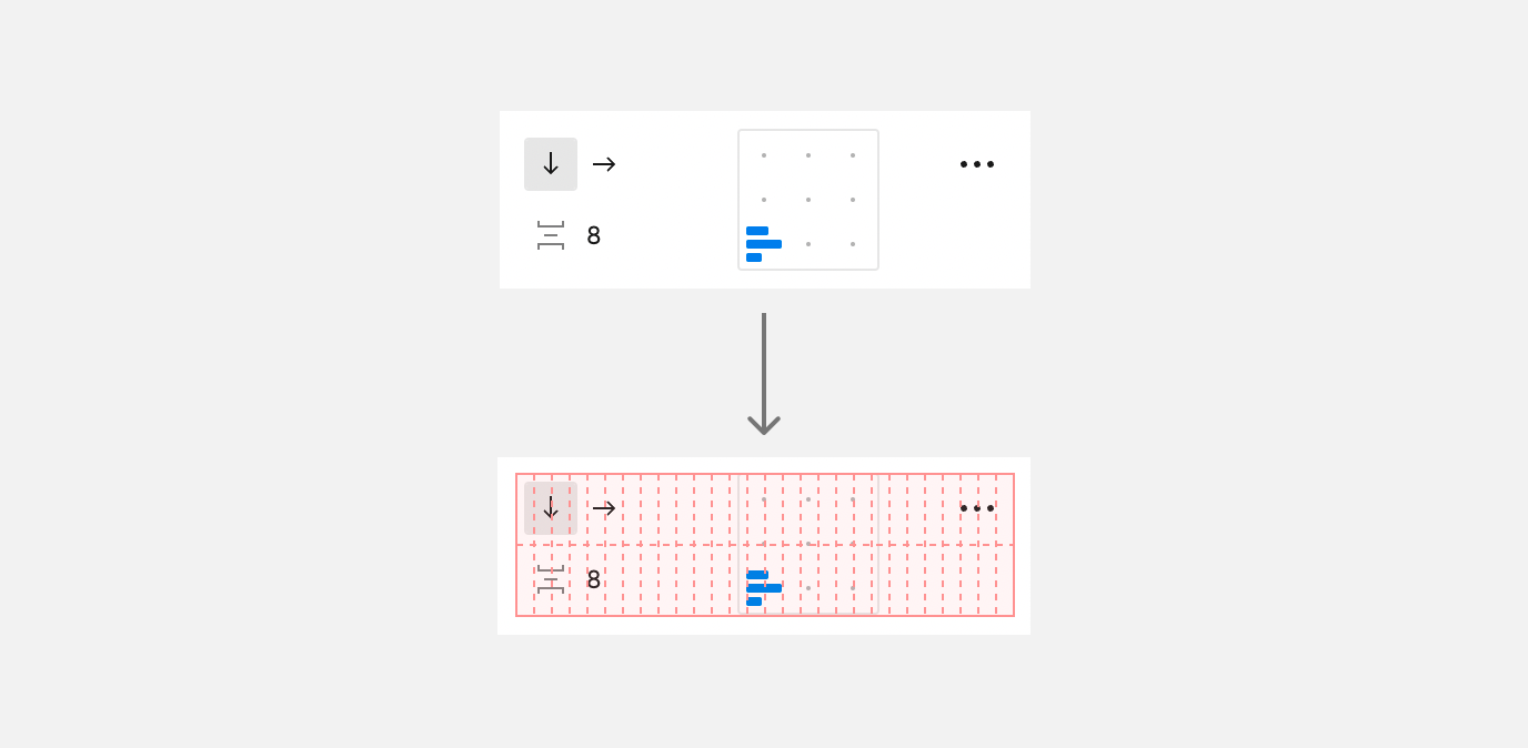
We have a 28-column * 2 rows grid this time to accommodate for the controls that help us in aligning the child items within an Auto Layout container.
.stack_panel_v4--doubleRow {
  display: grid;
  grid-template-columns: repeat(28, 8px);
  grid-template-rows: repeat(2, 32px);
}
Cool. Let’s dig into the details!
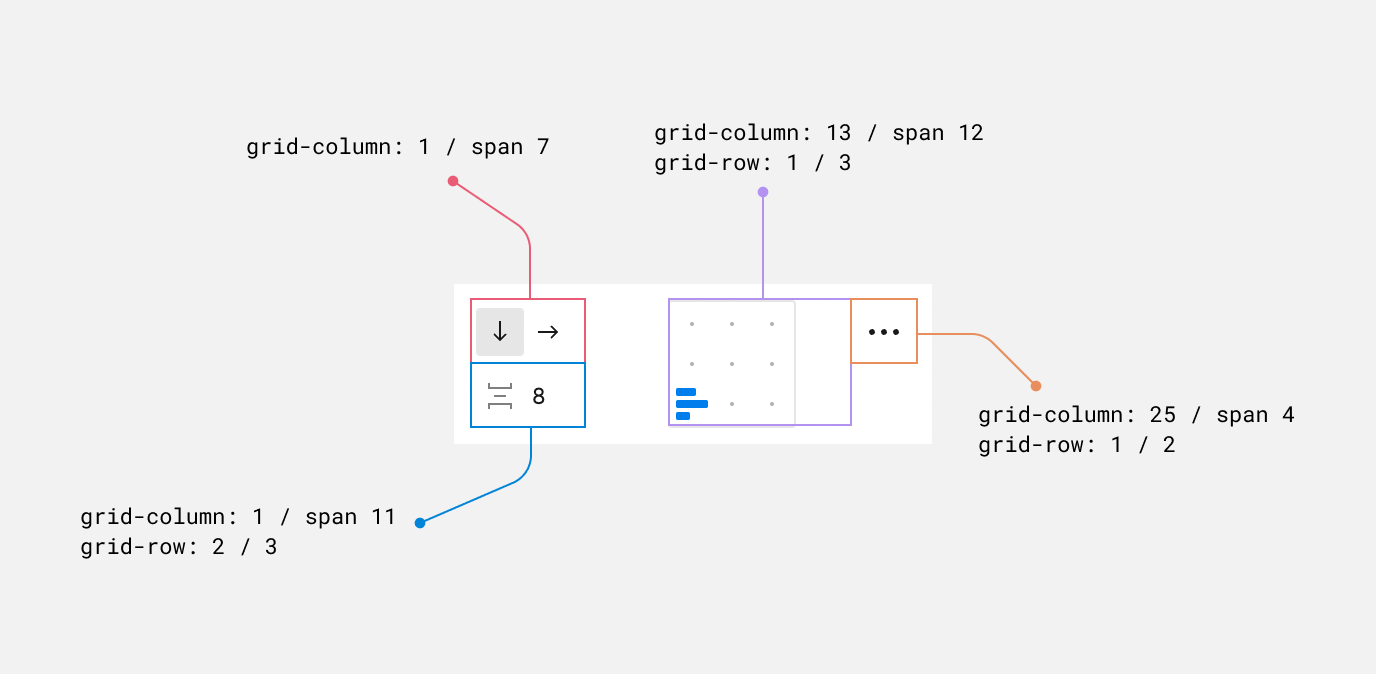
On the grid level, each element is positioned using grid-column or grid-row or both.
The alignment dots you see are made of an SVG pattern. What a fantastic detail, and usage!
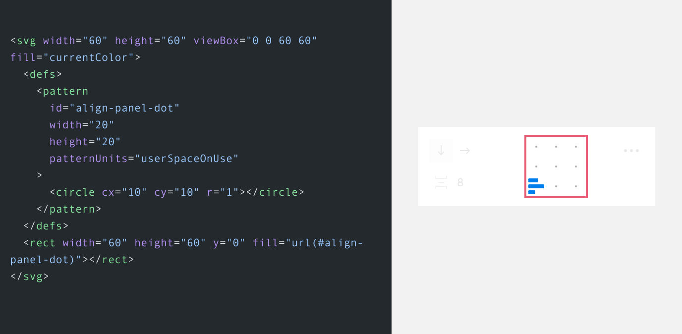
And not only that but there is a 3*3 grid that contains 9 grid items. I believe that those are here to serve as a clickable area for each alignment.
.alignment_view_v4--tooltipGrid {
  display: grid;
  grid-template-rows: repeat(3, 1fr);
  grid-template-columns: repeat(3, 1fr);
}
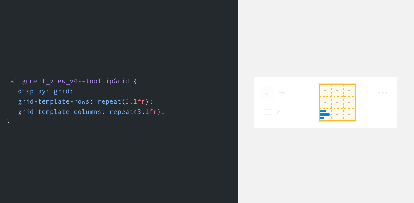
Next, is the indicator container where we have the icon that shows how the elements within an Auto Layout container are aligned.
To make things easier to understand, I divided that whole square into four parts:
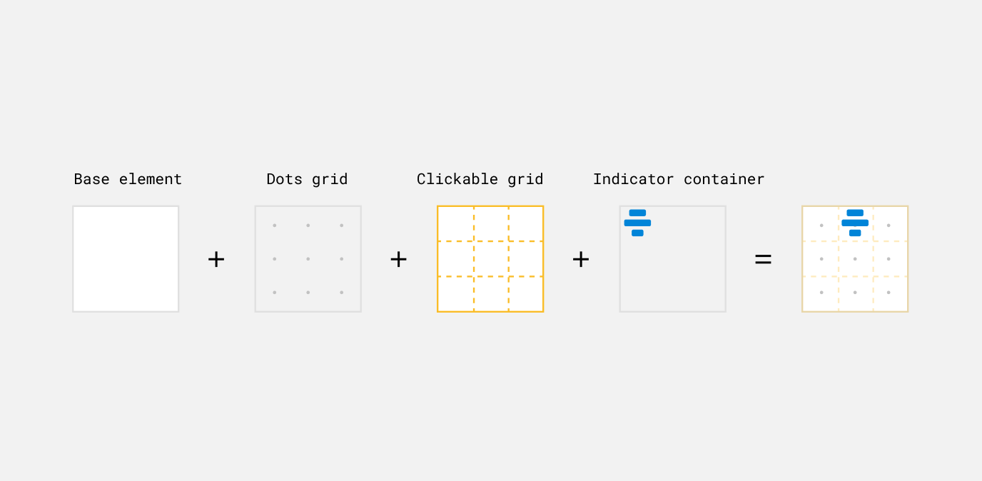
We will focus on the indicator container for now. Let’s look at the base markup and CSS.
<!-- 60*60 container -->
<div class="alignment_view_v4--indicatorContainer">
  <!-- 20*20 icon (the blue one) -->
  <div class="alignment_view_v4--indicatorGroup">
    <div class="alignment_view_v4--indicator"></div>
    <div class="alignment_view_v4--indicator"></div>
    <div class="alignment_view_v4--indicator"></div>
  </div>
</div>
In the above markup, we have both the indicator container, and the alignment icon. I liked that the icon itself is built and aligned with flexbox.
/* Size is 60*60 */
.alignment_view_v4--indicatorContainer {
  position: absolute;
  top: 1px;
  right: 1px;
  bottom: 1px;
  left: 1px;
  display: flex;
  flex-direction: column;
  justify-content: center;
  align-items: center;
}
With that, we’ll have two Flexbox wrappers, once for the indicatorContainer element and the other for the icon itself.
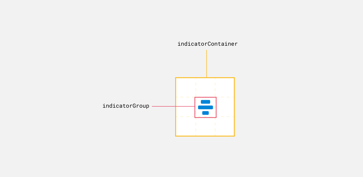
Here is the styling for the blue icon. We have a flex container with column as a direction, then 3 items that represent the blue lines in their different sizes.
.alignment_view_v4--indicatorGroup {
  display: flex;
  flex-direction: column;
  align-items: center;
  justify-content: space-between;
  width: 20px;
  height: 20px;
}

.alignment_view_v4--indicator {
  height: 4px;
  border-radius: 1px;
}

.alignment_view_v4--indicator:nth-child(1) {
  width: 10px;
}

.alignment_view_v4--indicator:nth-child(2) {
  width: 16px;
}

.alignment_view_v4--indicator:nth-child(3) {
  width: 7px;
}
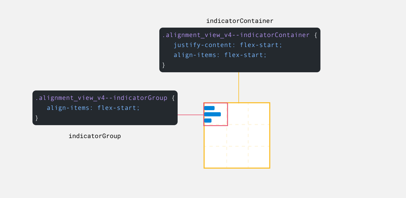
What amazes me here is that when we change the alignment for an Auto Layout element, both the indicatorContainer and indicatorGroup will reflect that.
Here is an example where Auto Layout is set to top left alignment.
.alignment_view_v4--indicatorContainer {
  justify-content: flex-start;
  align-items: flex-start;
}

.alignment_view_v4--indicatorGroup {
  align-items: flex-start;
}
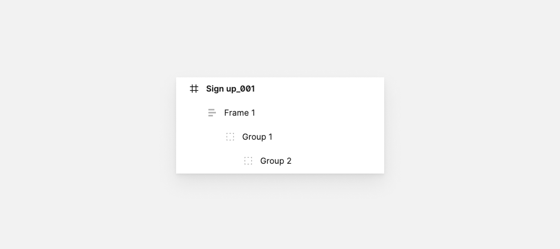
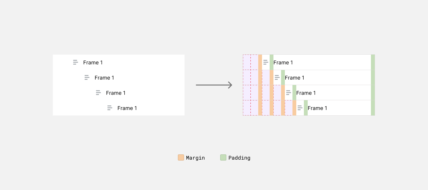
In the figure above, we have a main frame named “Sign up_001”, and within it, there are 3 nested items. The more the nesting, the more spacing we’ve from the left to make it clear that there is nesting.
Upon inspecting the rows, here is what I found:
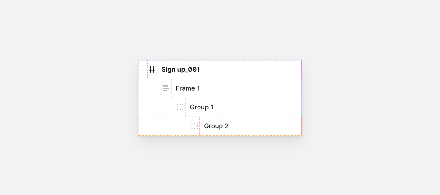
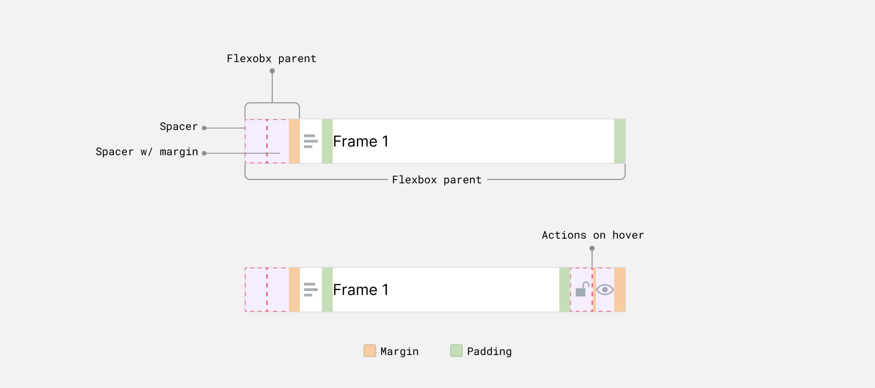
Each row is a flex parent, thus I highlighted the flex tag next to the HTML parent.
See it in action in the following figure:
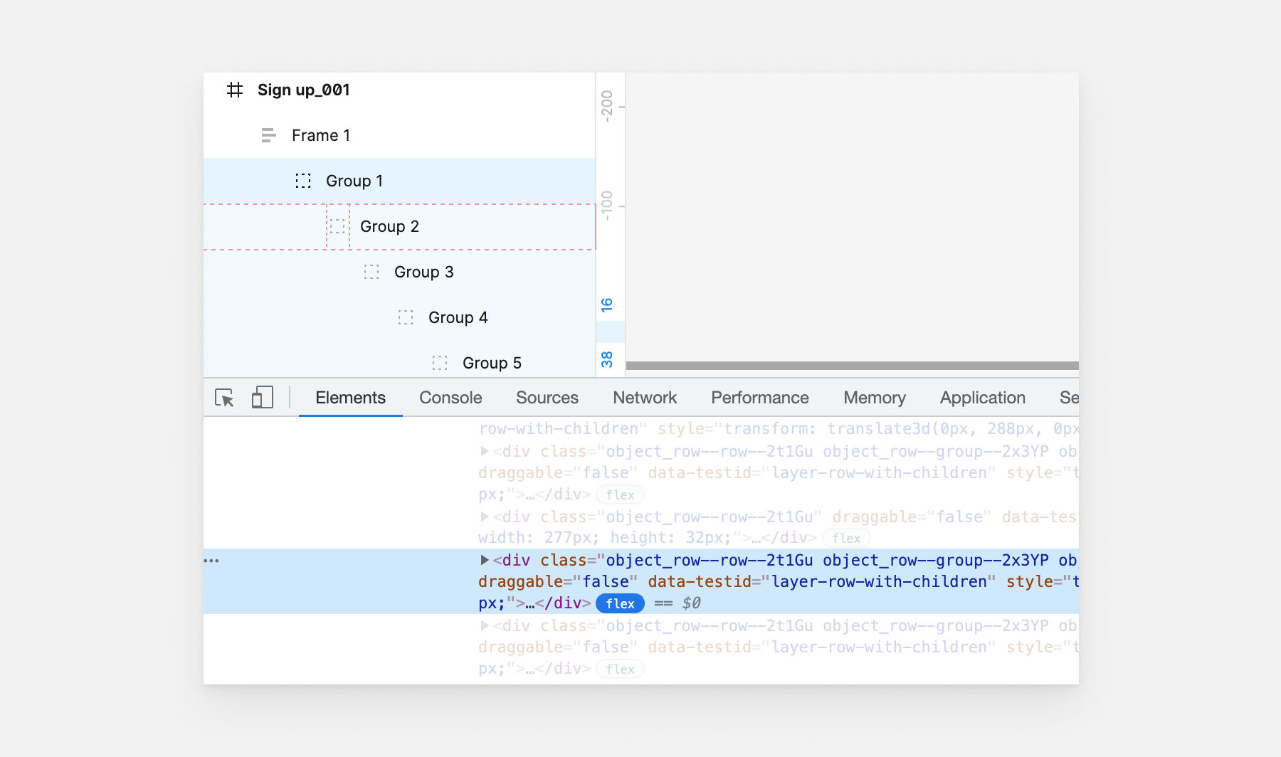
Cool, but the question is: how the spacing works? I honestly expected it before inspecting it and wasn’t surprised. The spacing happens by adding spacer components.
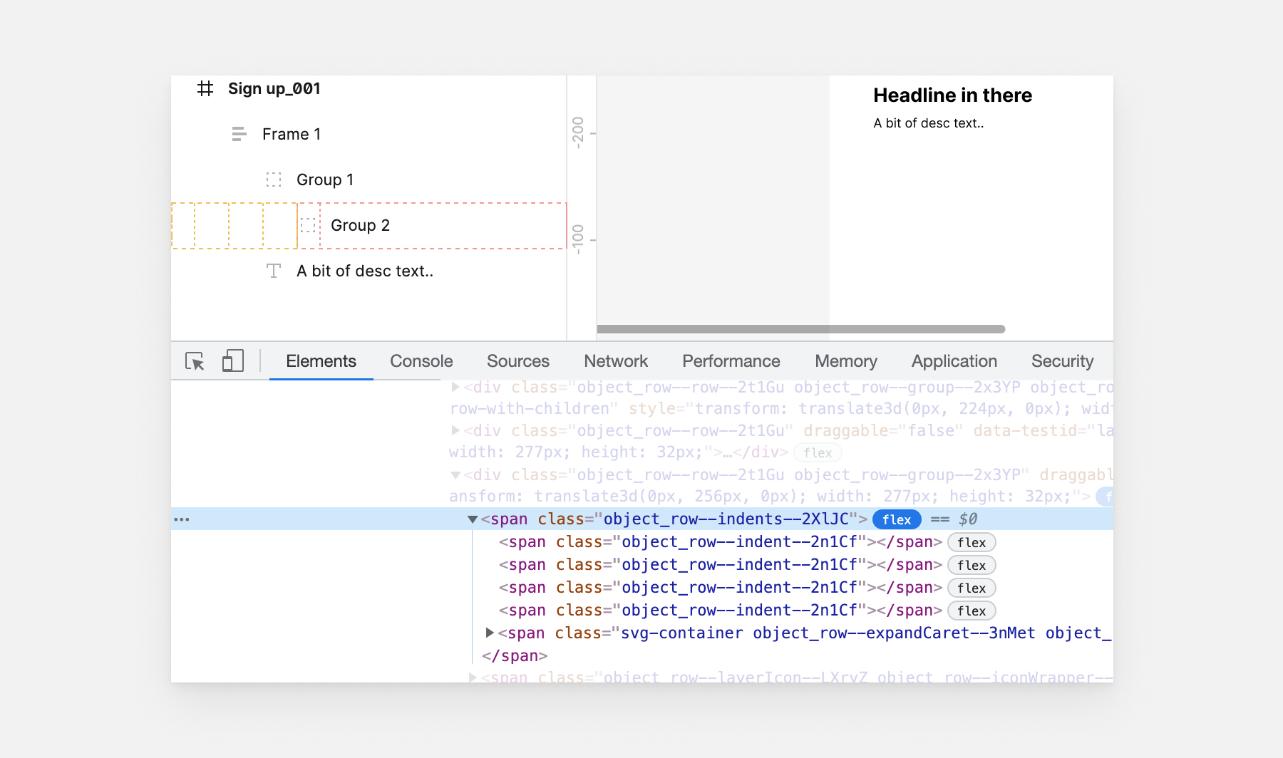
Each spacer component has a width of 16px, and all spaces have a margin-right: 8px except for the first one.
With more nesting in place, the rows will look like this.
Now that the visual side is clear, let’s take a look at the markup and styles.
<div class="object_row">
  <span class="object_row--indents">
    <span class="object_row--indent"></span>
    <!-- The more indent items, the more nesting.. -->
  </span>
  <span class="object_row--layerIcon"></span>
  <span class="object_row--rowText"></span>
  <span class="object_row--rowActions">
    <span class="object_row--lockIcon"></span>
    <span class="object_row--visibleIcon"></span>
  </span>
</div>
We have two flexbox parents, one for the whole row and the other for the spacer components (The team Figma called them indents, and I like that name).
.object_row {
  display: flex;
  height: 32px;
}

.object_row--indents {
  display: flex;
  height: 100%;
}

.object_row--layerIcon {
  width: 16px;
}

.object_row--rowText {
  width: calc(100% - 16px);
  flex-shrink: 1;
}

.object_row--rowActions {
  width: 0; /* becomes width: auto on hover */
}
With the above, the nesting will happen by adding a new spacer element.
Consider the following markup. We have two spacers which means that this row is the first one in its group.
<div class="object_row">
  <span class="object_row--indents">
    <span class="object_row--indent"></span>
    <span class="object_row--indent"></span>
  </span>
  <span class="object_row--layerIcon"></span>
  <span class="object_row--rowText"></span>
  <span class="object_row--rowActions">
    <span class="object_row--lockIcon"></span>
    <span class="object_row--visibleIcon"></span>
  </span>
</div>
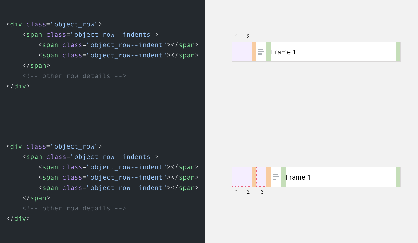
Isn’t that just interesting, and cool? Seeing my favorite design tool using my favorite CSS feature is just..amazing.
Flexbox is being used heavily for the little components. Let’s explore a few of them.
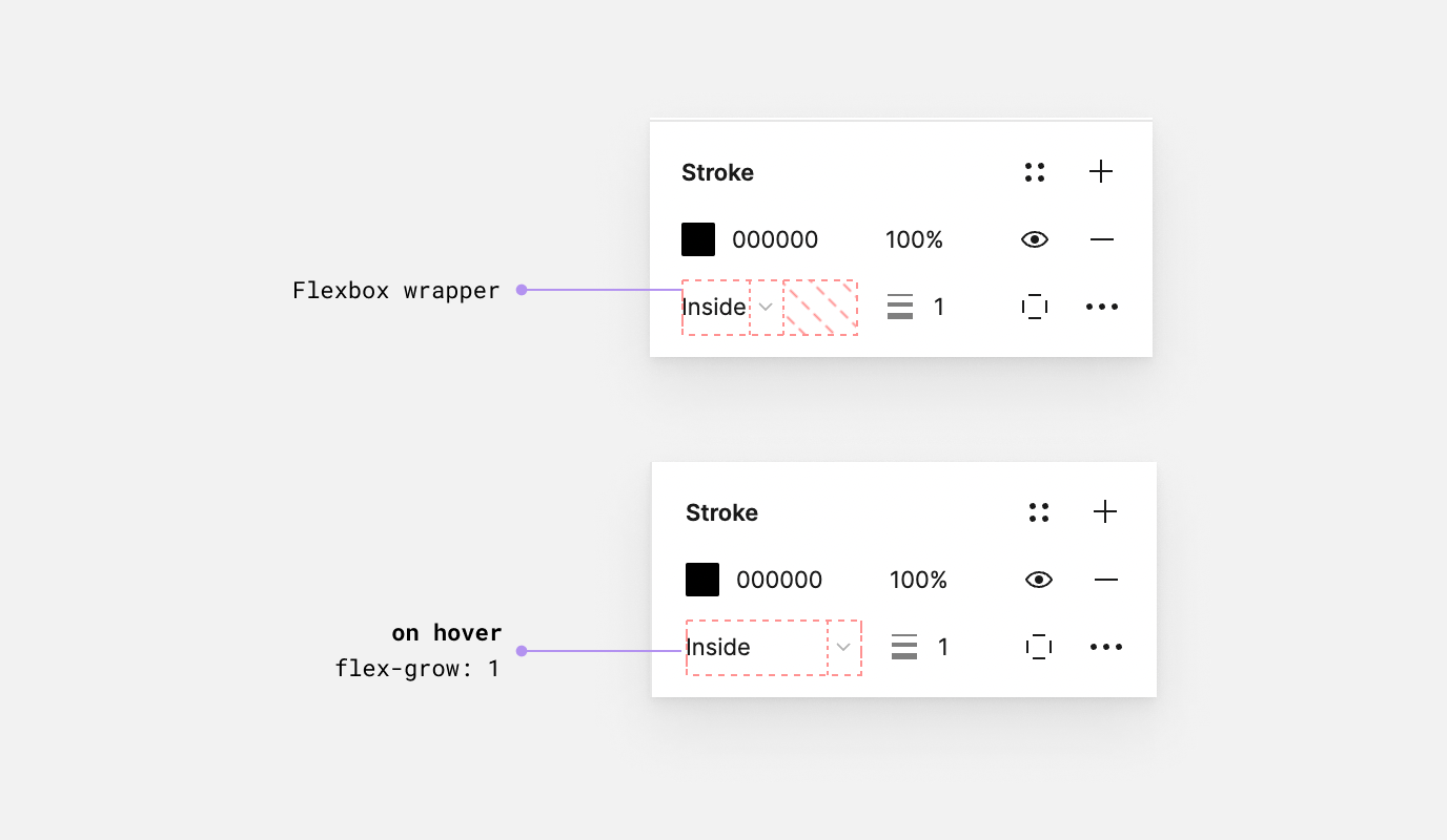
For colors, Flexbox is being used for controlling the color value and the opacity.
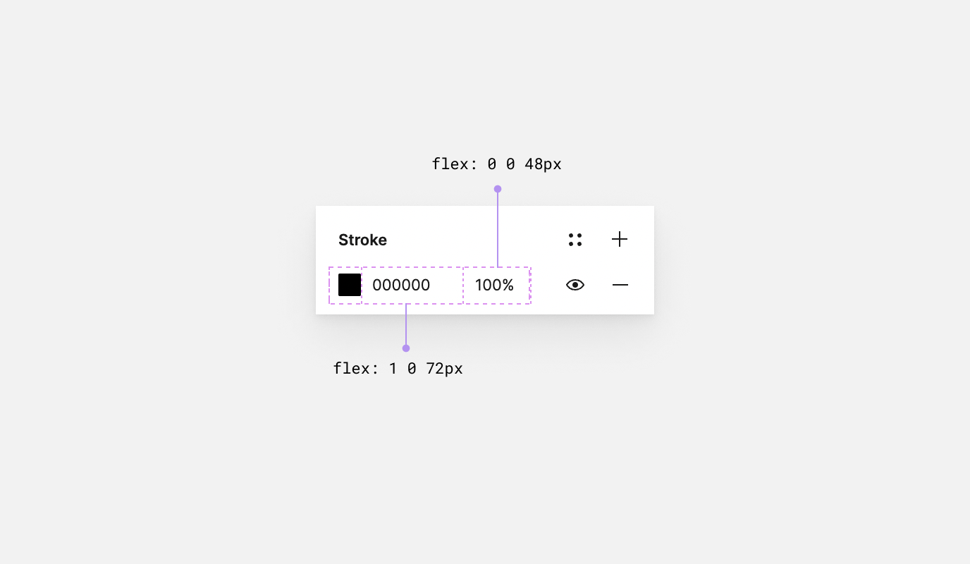
And on regards to the same context, when the user hovers over the dropdown menu, it will expand the text to the full available space by using flex-grow: 1.
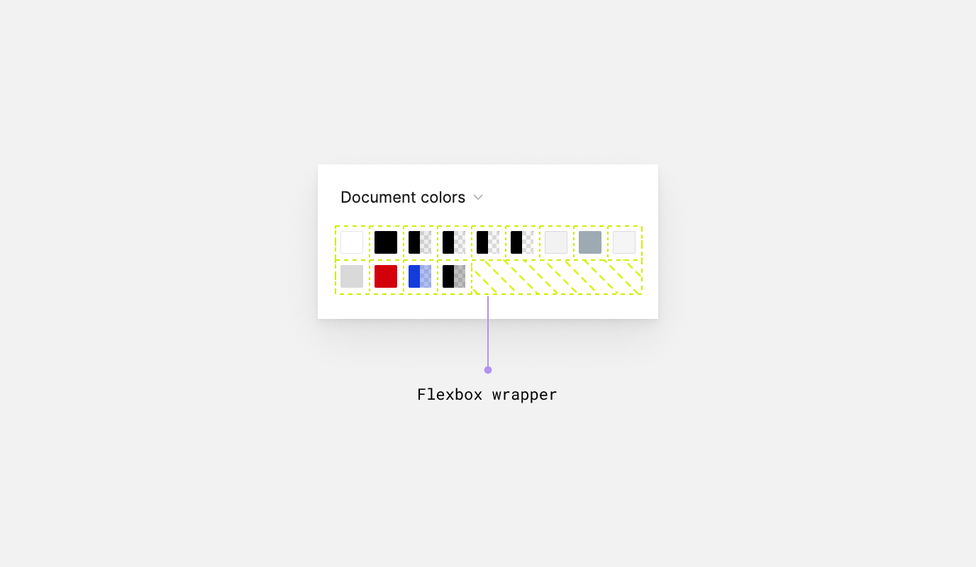
In this example, it’s better to use Flexbox so we can get the benefit of the wrapping. Otherwise, using CSS grid won’t provide us with the same result.
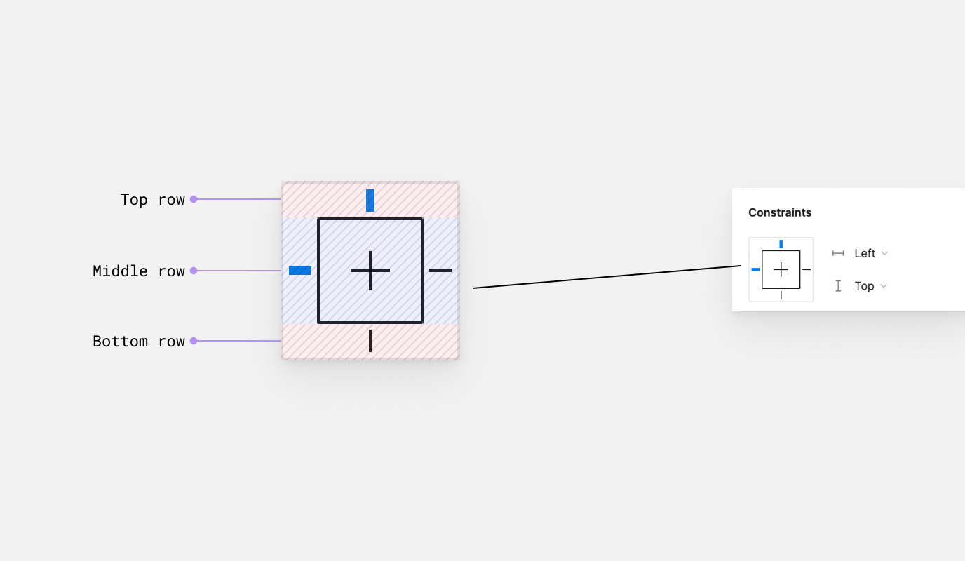
We have multiple Flexbox containers here. The first one is for the top, middle, and bottom rows. The second one is for the middle item, which is a Flexbox container itself.
That’s it for this exploration. I enjoyed looking at such unique and fun usage for both Flexbox and Grid. It’s inspiring to see that in a tool we’ll use, and for me, it inspired me to explore even more use cases for the CSS tools we’ve.
If you’re into that type of articles, I published a deep-dive into my exploration on building the Facebook Messenger chat bubble.
Thank you for reading.
此内容由惯性聚合(RSS阅读器)自动聚合整理,仅供阅读参考。 原文来自 — 版权归原作者所有。