


In responsive web design, it’s common to work on different variations of a page. A typical web page should have two variations at least, one for small screen sizes (e.g: mobile) and the other for large screens (eg: desktop). Often times, we forget about the in-between design variation, and we end up with a component or section being too wide or narrow.
I always wonder if we can take those in-between cases into account, and if yes, how we can do that? Being a designer and developer made me think about this deeply, and I called it the in-between design cases. In-between means those screen sizes that we ignore and don’t care about that much.
This article is an attempt from yours truly to clearly highlight the problem and its solution. I hope you found it useful. Let’s dive in the in-between!
Let me kick things off by showing you a simple example of what I mean with in-between. In the mockup below, we have a design with three variations (mobile, tablet, laptop).
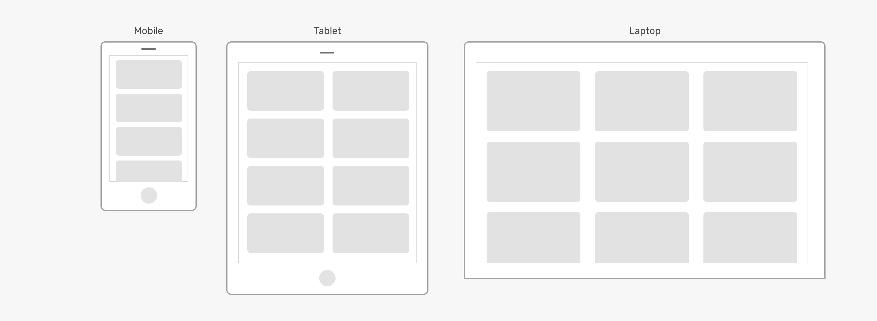
From first glance, things might sound cool for you. However, this will experience a bit differently in the browsers. Here is a visual explanation of the why.
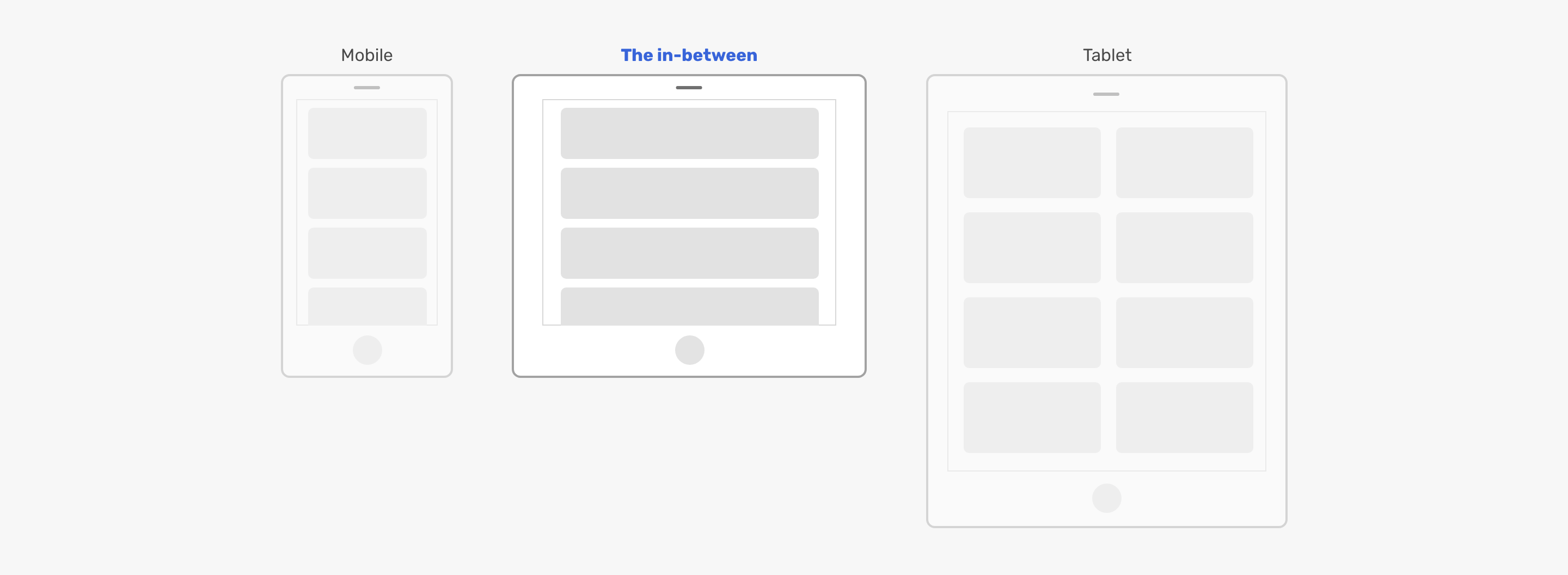
Notice how the cards are good on the mobile size, but the moment you increase the width, the cards became too wide until the tablet media query kick in. That exact moment, when the cards are too wide is what I mean by the in-between.
I like to be more clear, so I will explain about more examples to make this crystal clear for you.
In the example, there is a simple footer with a logo, navigation, and social links. It looks good for desktop and mobile. However, the tablet or the in-between state of it looks odd. Because the space is limited, the last social media icon got pushed to a new line.
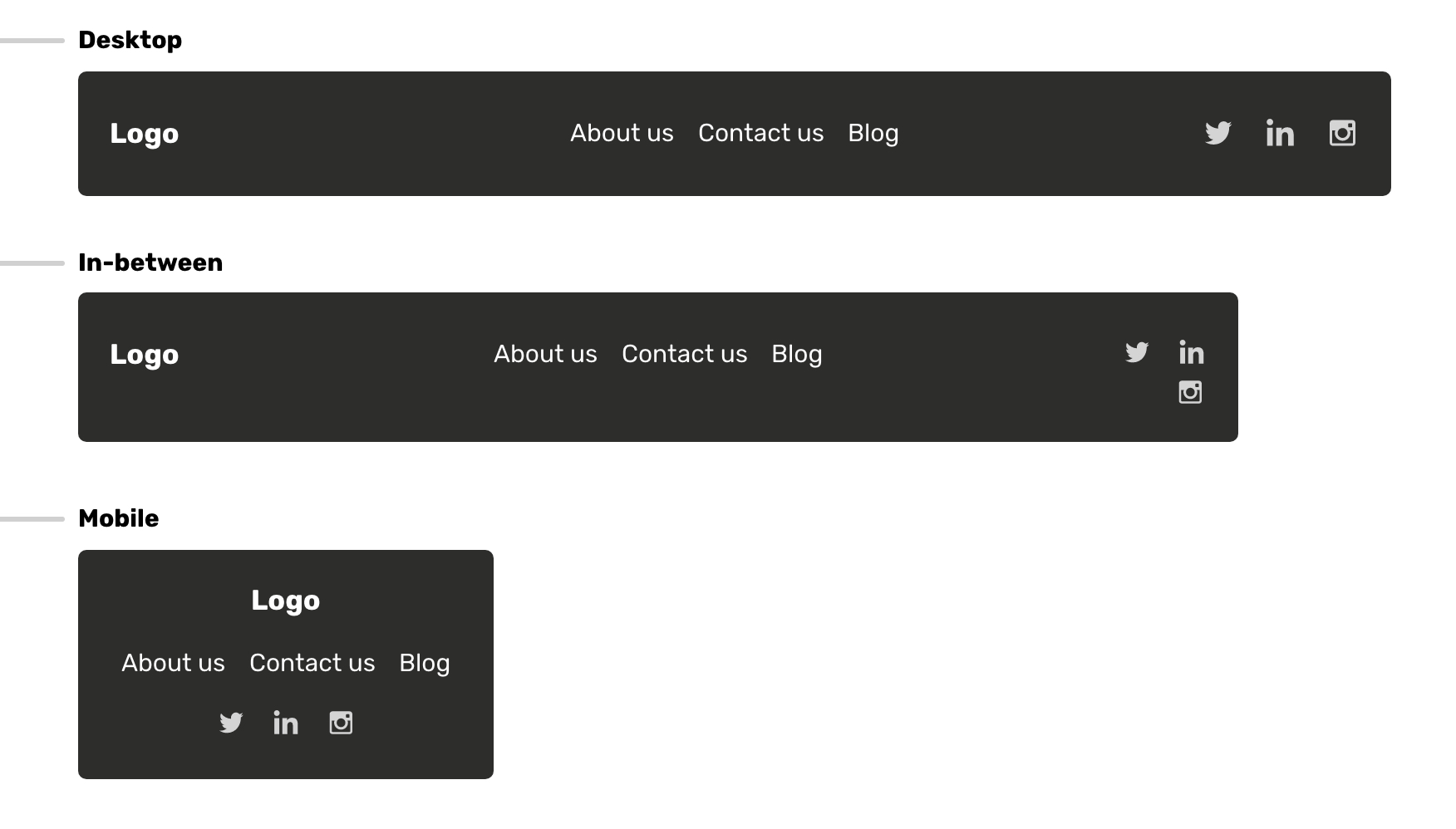
I doubt that this little icon is sad and lonely like a kid who is sad because no one cares about him.
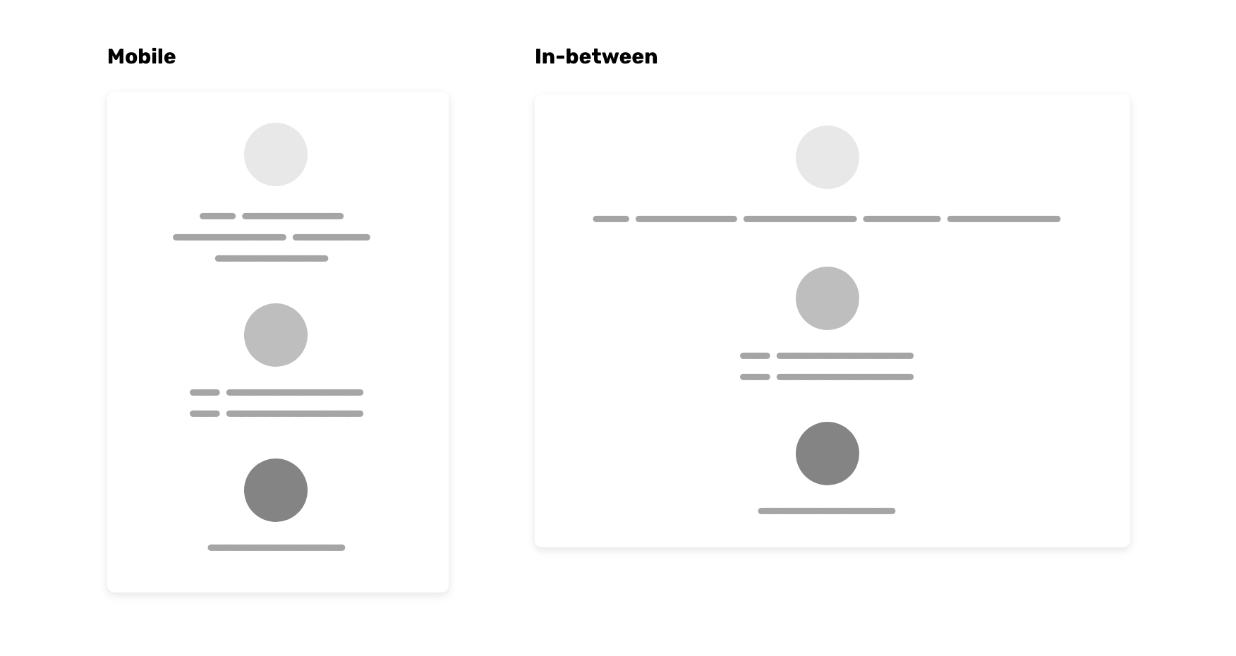
The other example that I want to show you, is a section with 3 columns. Each column has some text content and an icon. The in-between state looks bad! Notice how the text is spread without a maximum width for it, this is taking too much horizontal space.
I think that using media queries without taking into consideration the
content type on the website, is the main reason for that. The most
popular CSS framework, Bootstrap, has a pattern that is used a lot on
the web. See the below for the CSS of the
.container element:
.container {
  width: 100%;
}

@media (min-width: 576px) {
  .container {
    max-width: 540px;
  }
}

@media (min-width: 768px) {
  .container {
    max-width: 720px;
  }
}

@media (min-width: 992px) {
  .container {
    max-width: 960px;
  }
}

@media (min-width: 1200px) {
  .container {
    max-width: 1140px;
  }
}
Having a fixed width for the container can cause some elements to be either too wide or narrow. Let’s get a more visual example of the above.
Notice that while resizing, the width is changing to a fixed value based
on the viewport size, until it becomes 100% when the
viewport is too small.
To make better media queries, they should be based on the website’s nature and content. You can’t use the above media query values for every web project. Every project is unique and deserves better attention from us.
In this section, I will try to highlight some common design cases for the in-between problem that I explained. Let’s dive in!
Almost any website on the web has a header that contains a logo and navigation items. What I found about it is that a lot of the implementations are not always perfect. Generally speaking, there is the mobile design with the logo and the menu toggle button, or the hamburger menu. The other design is when the navigation is revealed on larger screens like tablets, laptops, and desktop computers.
Consider the below figure.
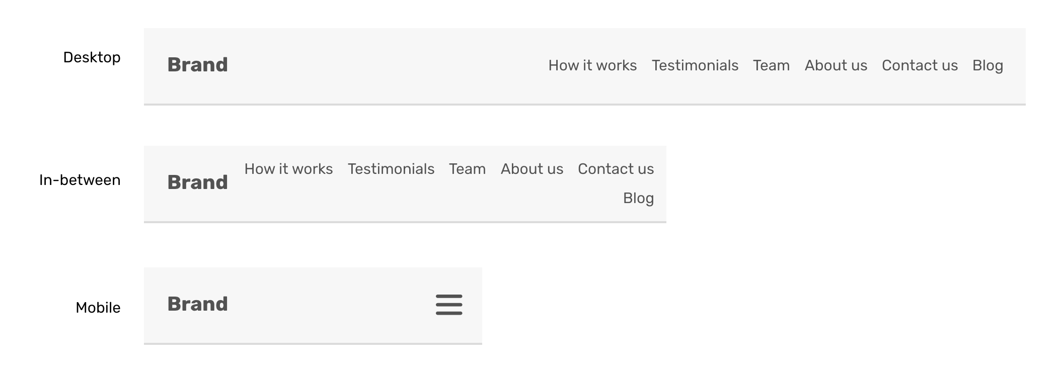
The in-between state has a navigation item in a new line, because there is no available horizontal space. The in-between might look different in case the header is a flex container.

Notice how the navigation items are still in the same line, but one of the How it works items is wrapped into a new line. That could also be different in another CSS technique. The point here is to show that the in-between state can be like this.
For headers, sometimes it’s complex to control the number of navigation items. Maybe the developer put an effort into this, but the content manager came and added a new navigation item, which caused the layout to break. From what I can see, it’s not possible to fix this and say it’s done. However, we can prevent or reduce the issue.
flex-wrap: wrapWhen a flex container is set to flex-wrap, the moment its
child items touch each other, they will be in a new line. If this was
done, here is how the in-between state will look.
.header {
    display: flex;
    flex-wrap: wrap;
}

That’s not the best solution in the world, but at least, it’s much better that way. That’s not the only way to solve it, there is a patterned named the priority+ which was coined by Michael Scharnagl. The idea is to have a navigation item named “More”, and when there is no horizontal space available, navigation items will be added to it.
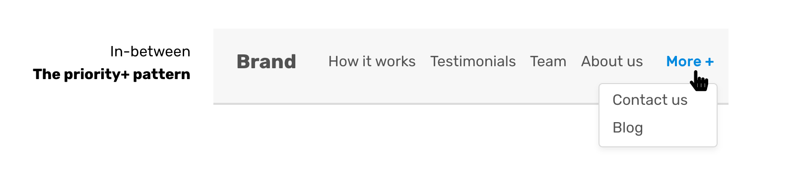
And I’m sure there are more solutions for the initially proposed issue, but my point is to show you that each issue is solvable if we put more time and effort into it.
Since you’re still in the mood of the previous design case for the header, this one for the mobile menu is related. Usually, a mobile menu is hidden until the user activates it by tapping on a button. The moment that the menu becomes hidden under a toggle button matters, as it has some consequences that I want to explain.
Consider the following figure.
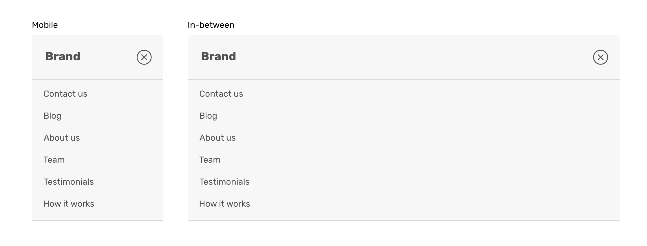
Notice how in a typical mobile screen (375px width), the menu looks good. However, for a tablet size, there is a lot of empty spaces that make the layout looks odd. For the desktop, the menu is not hidden. Can we make the in-between state look better?
Is it really necessary to hide the navigation in this viewport size? If yes, what are the reasons?
Or maybe the developer did that on purpose to account for more navigation items that might be added?
Maybe the developer is just lazy and doesn’t want to get in trouble or design challenges?
There are many reasons, but what I’m sure of is that this is solvable. Let’s explore some solutions!
Oh, before digging into solutions, I will ask myself the following questions:
Is navigation due to change in the future? For example, this might be a news platform where navigation links can be changed by time based on priorities.
What’s the maximum number of navigation items? With the navigation items growing, things will get more complex. For instance, we might need to group certain items under a menu.
I will suppose that the navigation items won’t change in the future, and try to have a better design for the in-between state.
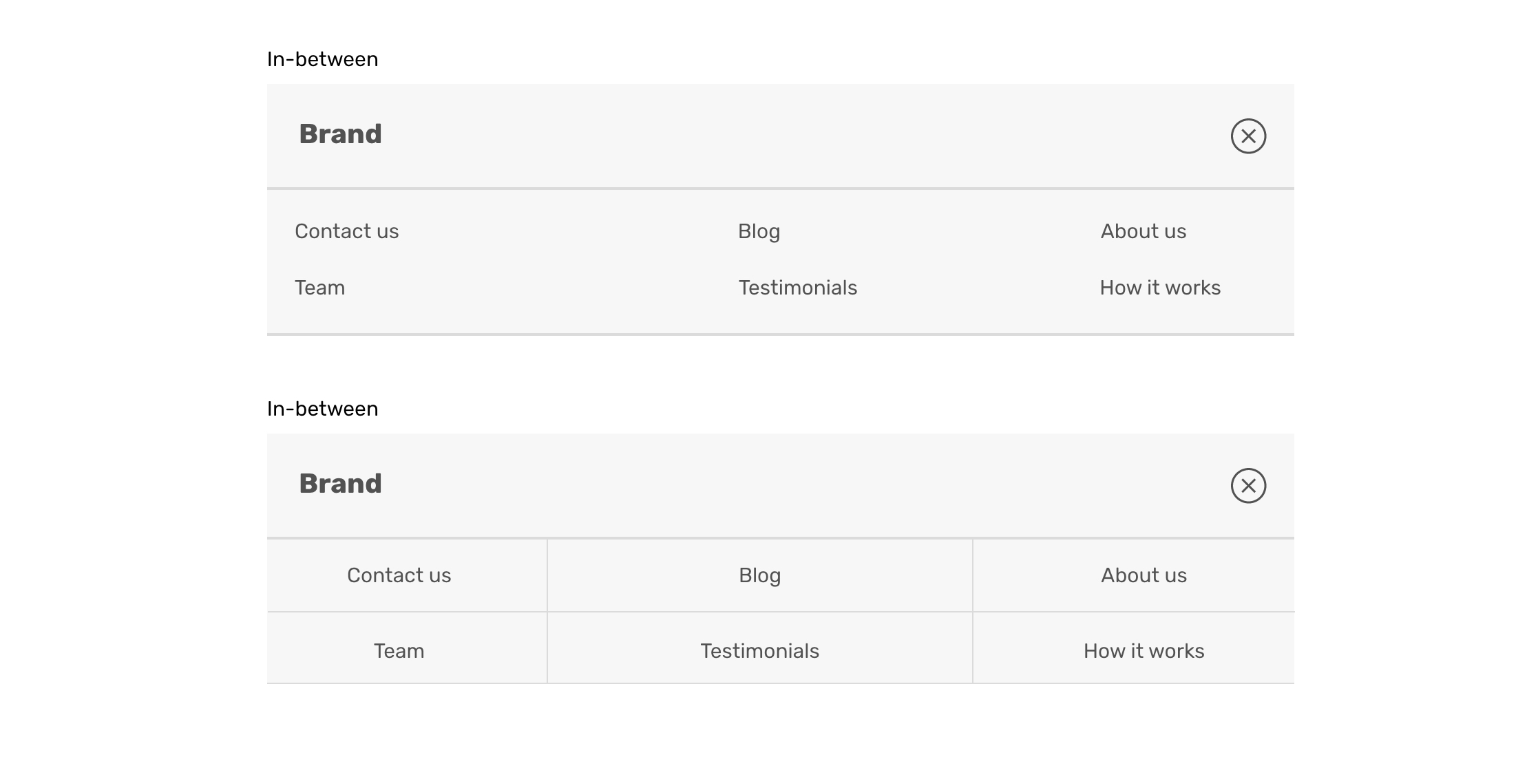
That’s a design that doesn’t look empty, and it uses
the space well. You might think about, how this will work if the
viewport size is smaller? Well, we can use CSS grid
minmax() function and make this thing resize as per the
available space.
.nav {
    display: grid;
    grid-template-columns: repeat(auto-fit, minmax(150px, 1fr));
}

Usually, a card is a component that contains a thumbnail and text content like title, description. I’ve come to notice that some responsive implementation for this component introduces some in-between design issues. Let’s explore the following figures:
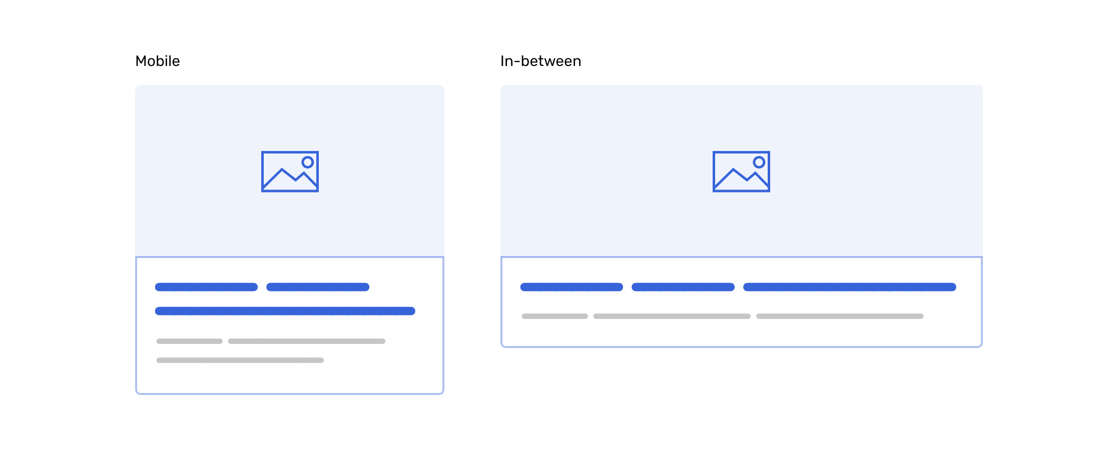
The in-between state looks too wide:
The card image is too wide which might result in an important part of the image being cropped. This might affect the UX if this is an e-commerce website, and the image is showcasing a product, for instance.
Using a grid blindly that resizes from four columns on a desktop, to two on tablets, and one on mobile is not a responsive design. I call this an irresponsible design. The developer just used a ready-made grid or made one that just resizes based on the viewport and that’s it. By the way, I’m not judging anyone here as I did this mistake myself many, many times until I learned what’s the correct behavior.
What about the content inside the card? Isn’t it worth to be easy to read and looking good?
Is it only about resizing things? Maybe we could think a bit more about behaviour and put ourselves in the shoe of the user who will use this?
In the figure below, I explored a solution that made the card thumb and content next to each other (not stacked).
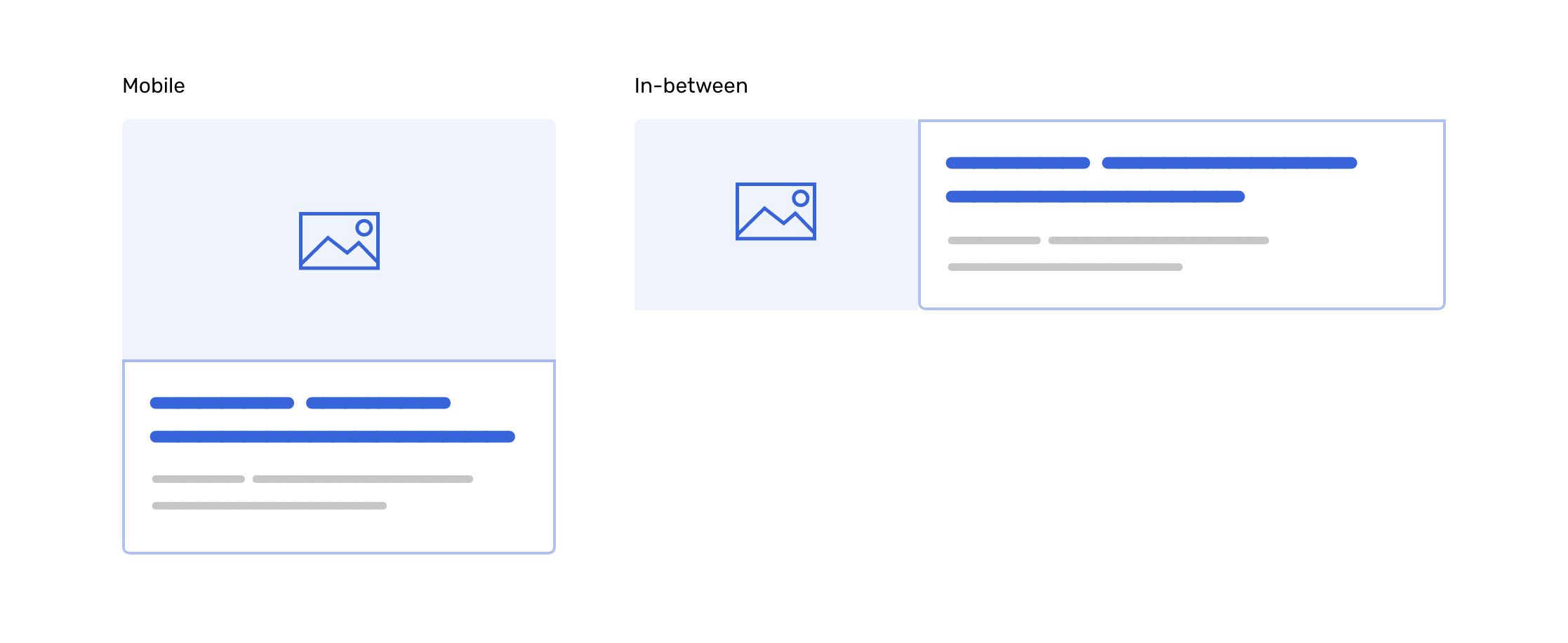
That solution is much, much better than showing a wide card. Technically, it’s easy to flip it like so by using Flexbox. There is no complex work here.
Font sizes on the web are one of the most important factors that make a
web page easy to read. There is a pattern that involves using the
rem unit for font size, and changing the root font size on
mobile vs desktop can increase/decrease the font size for elements
depending on the viewport width.
html {
    font-size: 13px;
}

@media (min-width: 700px) {
    html {
        font-size: 16px;
    }
}

h1 {
    font-size: 2rem;
    /* 1rem on mobile = 13px, 1rem on desktop = 16px */
    /* 26px on mobile, 32px on desktop. */
}
That’s cool, and a great tip for having responsive typography. However, it has a drawback for an in-between design state.
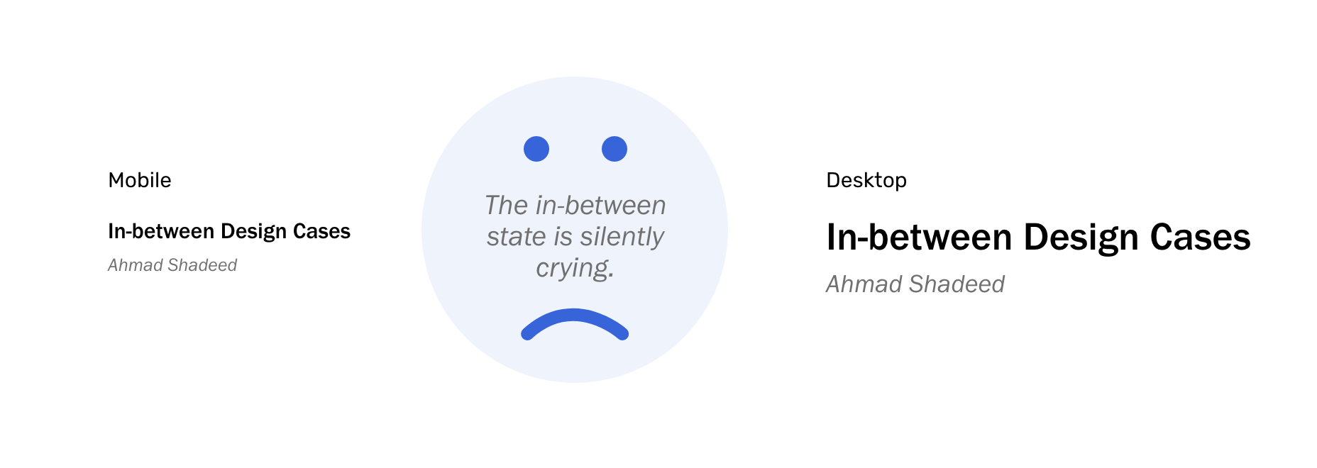
The method mentioned above might work, but it’s to perfect. I recommend using a more dynamic method that use a mix of pixel units and viewport units. For example,
.element {
    font-size: clamp(16px, (1rem + 5vw), 50px);
}
By using CSS clamp() function, the minimum font size is
16px, and the preferred size is
1rem + 5vw, and the maximum font size is 50px.
That way, we can achieve a dynamic font size that takes care of the
in-between design state.
If you want to learn more about CSS comparison functions, I wrote a detailed article about them.
This is a common pattern. Very wide form elements like inputs and buttons are annoying to the eye. Consider the figure below:
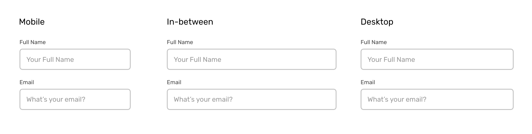
We have two form elements, one for the name and the other for the email
address. They are looking good except that the in-between state looks
too wide because they are allowed to take the
full-width of their parent element. By the way, they
are less wide on desktop, because their wrapper
max-width is activated and it’s working only for desktop+.
In that case, it’s better to constraint the width of them by setting a
max-width no matter the viewport width is. This won’t make
them too wide.
Another common pattern is a features list. Usually, it has an icon on the left and text content on the right (heading, description). It looks good on mobile and desktop. On mobile, the icon size is small, and it gets larger on the desktop. However, the in-between state is ignored.
Consider the following figure.
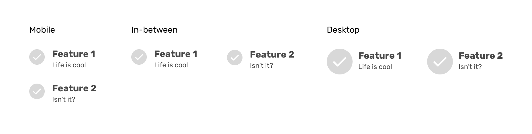
The feature icon size in the in-between state is too small for the viewport width. The icon should have three sizes, one for mobile, a middle one, and the largest for desktop viewports.
We can even use CSS comparison functions to handle that without using media queries at all. However, for better support, we can use the media queries approach and enhance if CSS comparison functions are supported.
Now that you have an idea about the most common use cases, let’s talk a bit about how to take care of the in-between design cases. For me, there is no direct approach for that, but I would rather introduce some steps or techniques that can help in that matter.
One of the causes for ignoring the in-between design state is relying on ready-made grid systems or using the so-called “standard media query breakpoints”. An effective design breakpoint should be based on the content, not on the screen size. That way, we can produce better layouts with more focus on the in-between design state.
When you got the design source from the designer, try to understand every section and component in there. Also, make sure to ask a lot of questions about how X component will look/work on all viewport sizes.
With CSS grid, flexbox, and comparison function, we can build designs that looks good in all screen sizes, including the in-between, of course. Let’s explore some real-life use of them.
The first thing that got to my mind is the “Alignment Shifting Wrapping” technique. We have two elements that should stack on mobile, and be on the same line for desktop. What about the in-between?
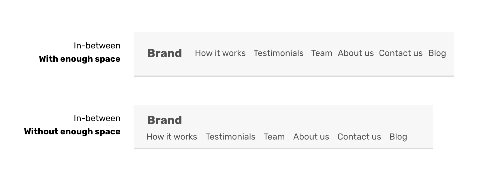
I will use the same example of the header that I introduced at the beginning of the article. The logo and navigation should be stacked in mobile, but how to do that dynamically, when they touch each other? Thanks to flexbox, this is a default behavior.
.header {
    display: flex;
    flex-wrap: wrap; /* Important to make it work */
}
In CSS grid, we have the minmax() function which can resize grid items based on a minimum and maximum value. Instead of having a static grid that changes the items from four on desktop, to two on tablet, and one in mobile, we can have a more dynamic approach.
I like the technique used in this great article by Dannie Vinther. It combines CSS grid and comparison function to set a maximum size for a card.
.wrapper {
    display: grid;
    grid-template-columns: repeat(auto-fit, minmax(min(100%, 200px), 1fr));
}
The minmax() function sets a minimum and maximum value for the grid item. The minimum value shouldn’t be bigger than the viewport width. For that reason, we used min() function for the first value of the minmax().
This is an exciting addition to CSS. As you saw in the previous example, very useful. I wrote an article about it with use-case and examples.
It’s important to have the skills needed to test and spot the in-between design cases. I have a simple approach that I follow when working on a design:
The reason for deleting all the elements is to avoid page jumps which will let you scroll up or down to go back to the section you want to test. For that reason, I recommend to delete all sections and only keep the one you want to test. That way, you won’t easily miss any in-between issue.
That behavior is seen only in Firefox and Safari. In Chrome, the browser scrolls once you resize the screen. I did a test to show you the difference.
We have the following footer design. I scrolled to the very bottom of the page.
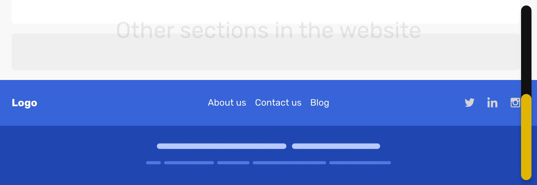
And then, I resized the viewport to the mobile size. Notice how each Chrome saved the scroll position.
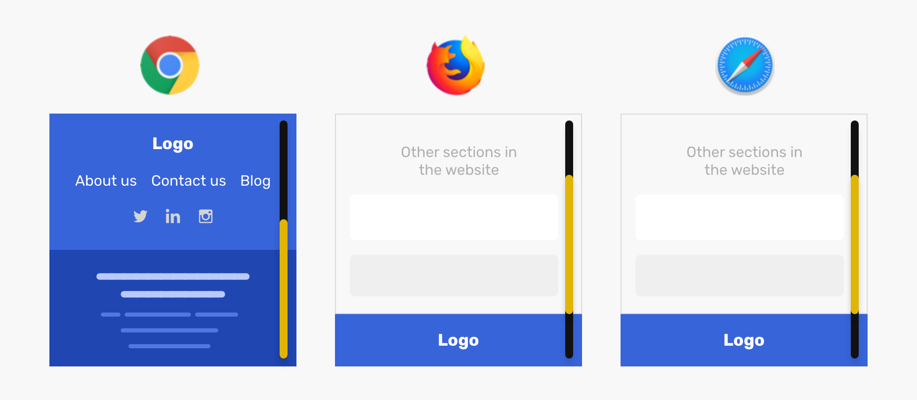
This little detail can trip the developer to forget about testing a specific section or component, so it’s important to focus on that while testing.
I remember when I got the spark for this article idea. I typed out the title in the notes app and started to plan the outline. My goal of this was to shed light on this ignored design state, and I hope that you got something out of this article that will be useful in your workflow. Do you have any questions or suggestions? I would be happy to hear them on Twitter @shadeed9.
Did you like the article and want to learn more about debugging CSS? If yes, then I would be grateful if you can subscribe below or follow this thread on Twitter for the book updates. Thank you!
此内容由惯性聚合(RSS阅读器)自动聚合整理,仅供阅读参考。 原文来自 — 版权归原作者所有。