


I spent years teaching CSS layout on this blog. I put everything I know into The Layout Maestro course: 70+ lessons and 150+ interactive examples that teach you how to think CSS layouts, not just memorize syntax.
CSS Viewport units have been around for the last few years, and by time, I see them being used more and more by developers. Their benefit lies in providing us with a way to size things in a fluid and dynamic way, without the need to use JavaScript. Also, it’s easy to provide a fallback if they fail.
In this article, we will learn about CSS viewport units and how to use them, along with some use-cases and solutions for common issues. Let’s start and dig in!
According to the CSS spec, viewport-percentage units are relative to the size of the initial containing block, which is the root element of a web page.
The viewport units are: vw, vh, vmin, and vmax.
The vw unit represents a percentage of the root element width. One vw is equal to 1% of the viewport width.

We have an element with the following CSS:
.element {
  width: 50vw;
}
When the width of the viewport is 500px, the 50vw will be calculated as below:
width = 500*50% = 250px
The vh unit represents a percentage of the root element height. One vh is equal to 1% of the viewport height.
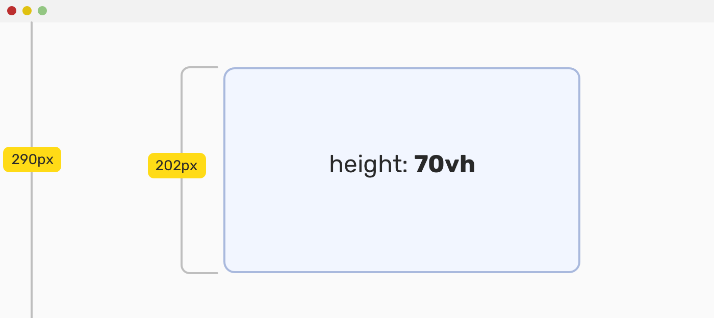
We have an element with the following CSS:
.element {
  height: 50vh;
}
When the height of the viewport is 290px, the 70vh will be calculated as below:
height = 290*70% = 202px
That’s it. Let’s move to a different kind of viewport units!
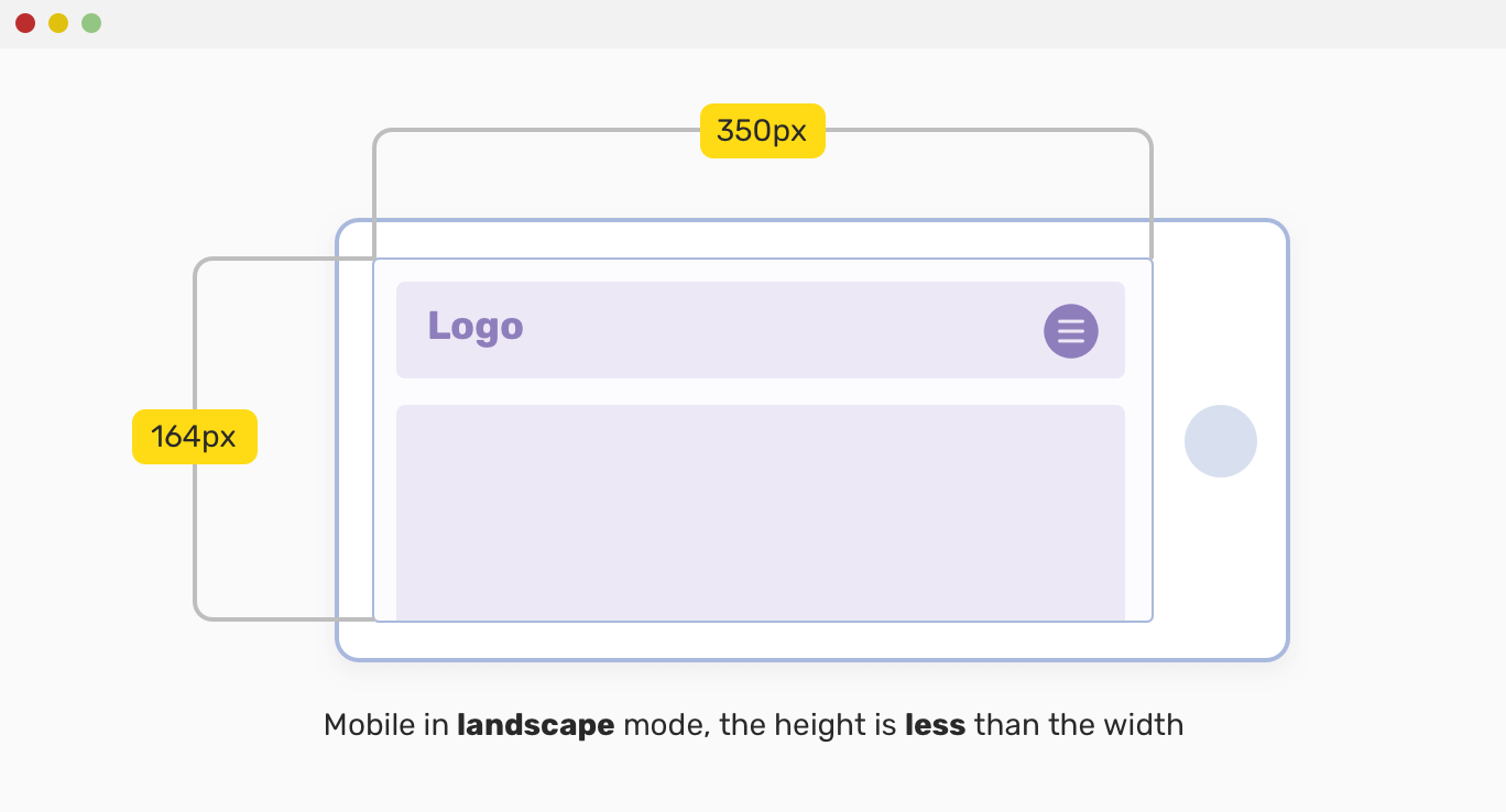
vmin UnitThe vmin represents the value of the minimum of the width and height of the viewport. If the viewport width is greater than its height, then the value will be calculated based on the height.
Let’s take the following example.
We have a mobile in landscape mode, and an element has the vmin unit. In that case, the value will be calculated based on the viewport height, because it’s less than the width.
.element {
  padding-top: 10vmin;
  padding-bottom: 10vmin;
}
Here is how vmin will be calculated:
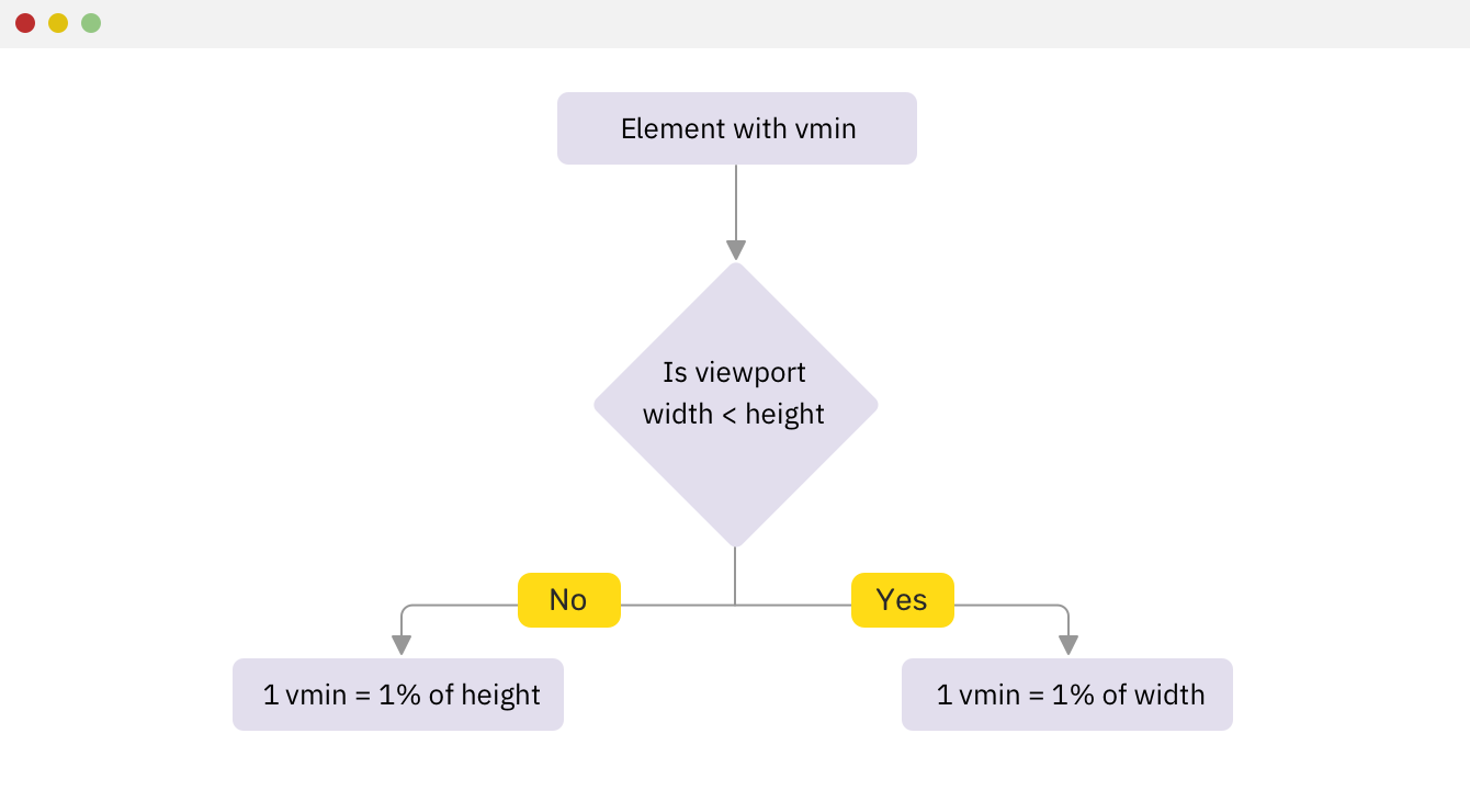
As you might guessed it, the result will be calculated as the below:
padding-top = (10% of height) = 10% _ 164 = 16.4px padding-bottom = (10% of height) = 10% _ 164 = 16.4px
vmax unitIt’s the opposite of vmin. The value is calculated based on the maximum width and height.
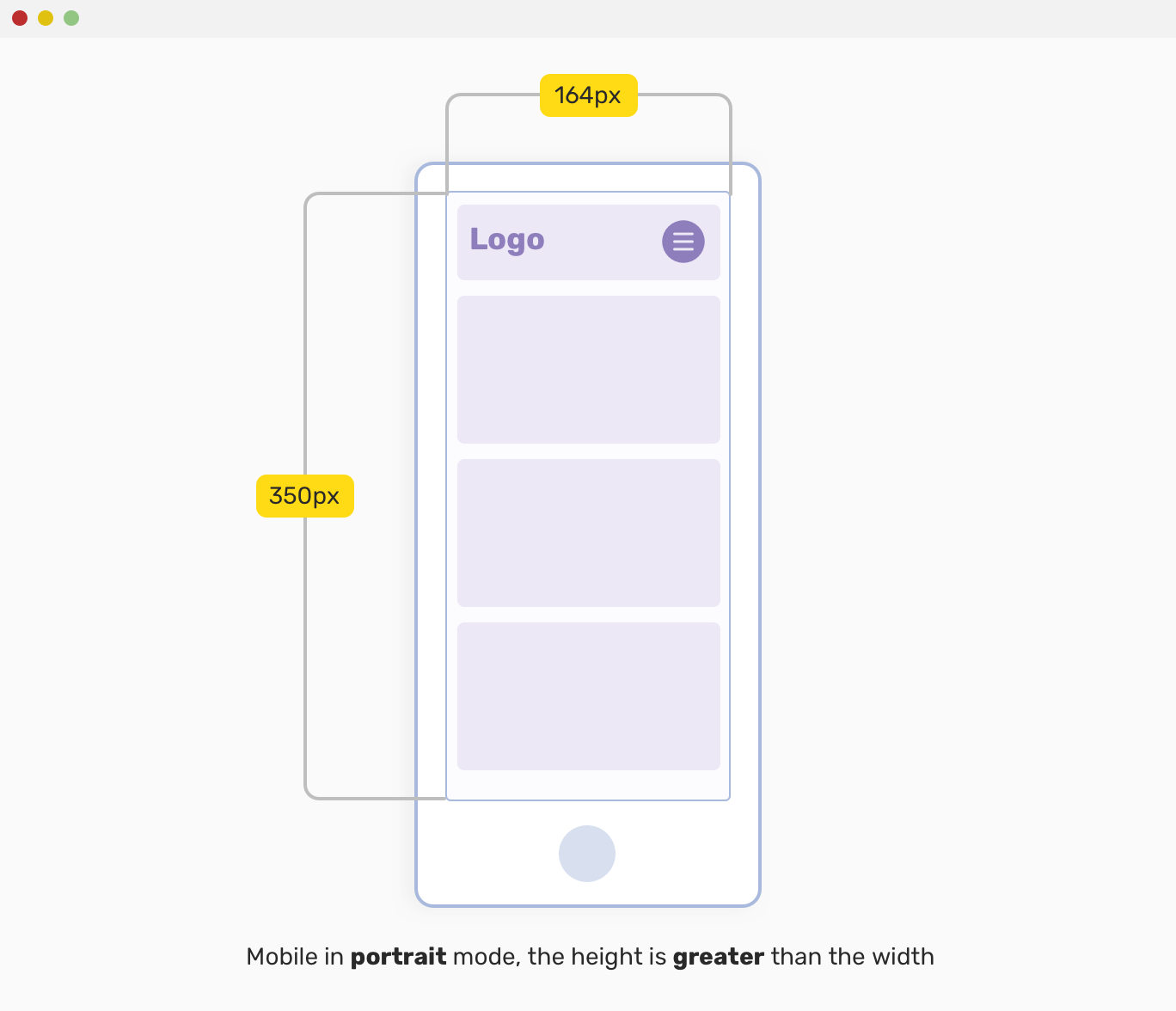
Let’s take the following example.
.element {
  padding-top: 10vmax;
  padding-bottom: 10vmax;
}
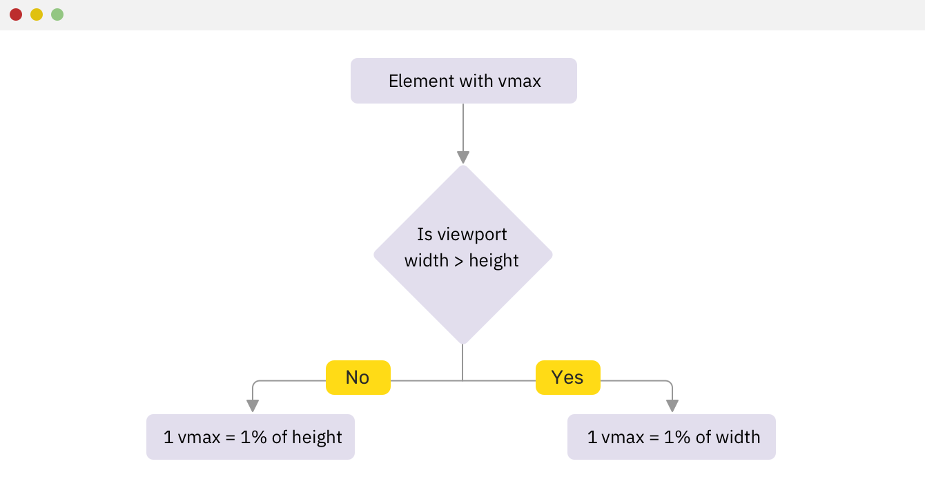
The result will be calculated as the below:
padding-top = (10% of width) = 10% _ 350 = 35px padding-bottom = (10% of width) = 10% _ 350 = px
Viewport units are based on the root element of the page, while the percentage is based on the container they are in. For that reason, they’re different from each other and each one has its use cases.
In the following sections, I will explore some use cases for viewport units and how to implement them in your project.
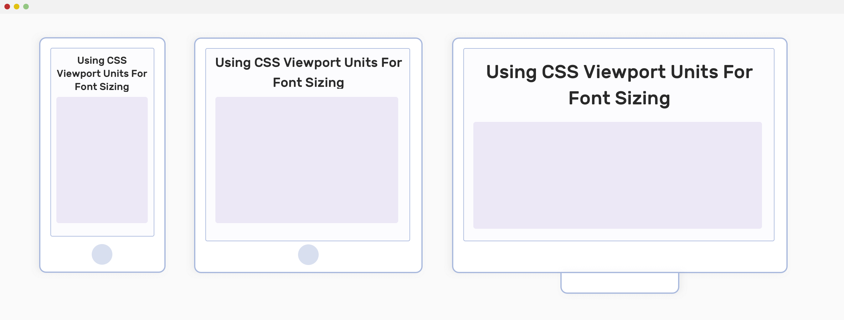
CSS viewport units are perfect for responsive typography. For example, we can use the following for an article title:
.title {
  font-size: 5vw;
}
The title’s font-size will increase or shrink based on the viewport width. It’s like giving a font size of 5% of the viewport width. However, it might be tempting to just use it without proper testing. Let’s see the video below:
Notice that the font size became very small in mobile sizing, this is bad for accessibility and user experience. As far as I know, the minimum font size on a mobile device shouldn’t go beyond 14px. In the GIF, the font size went below 10px.
To solve that issue, we need to give the title a minimum font size that it can’t go below it. CSS calc() to the rescue!
.title {
  font-size: calc(14px + 2vw);
}
The calc() CSS function will have a base 14px value, and it will add 2vw to it. With that in hand, the font-size value won’t become too small.
Another important thing to consider is how the font size will behave on large screens, for example, a 27” iMac. What will happen? Well, you guessed it. The font size went to around 95px, which a huge value. To prevent that, we should use media queries at certain breakpoints and change the font-size.
@media (min-width: 1800px) {
  .title {
    font-size: 40px;
  }
}
By resetting the font-size, we can be sure that the size won’t go too huge. You might also need to add multiple media queries, but it’s up to you and depends on the context of your project.
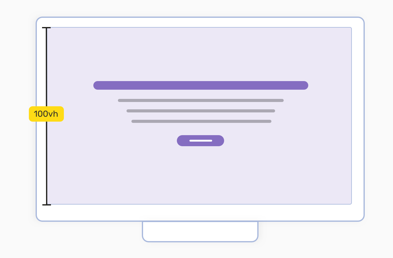
Sometimes, we need a section to take 100% of the viewport height. This is known as ** full-screen sections**. To do so, we can use the viewport height unit.
.section {
  height: 100vh;
  display: flex;
  flex-direction: column;
  justify-content: center;
  align-items: center;
}
By adding height: 100vh, we can ensure that the section height will take 100% of the viewport. Also, I added some flexbox to handle centering the content horizontally and vertically.
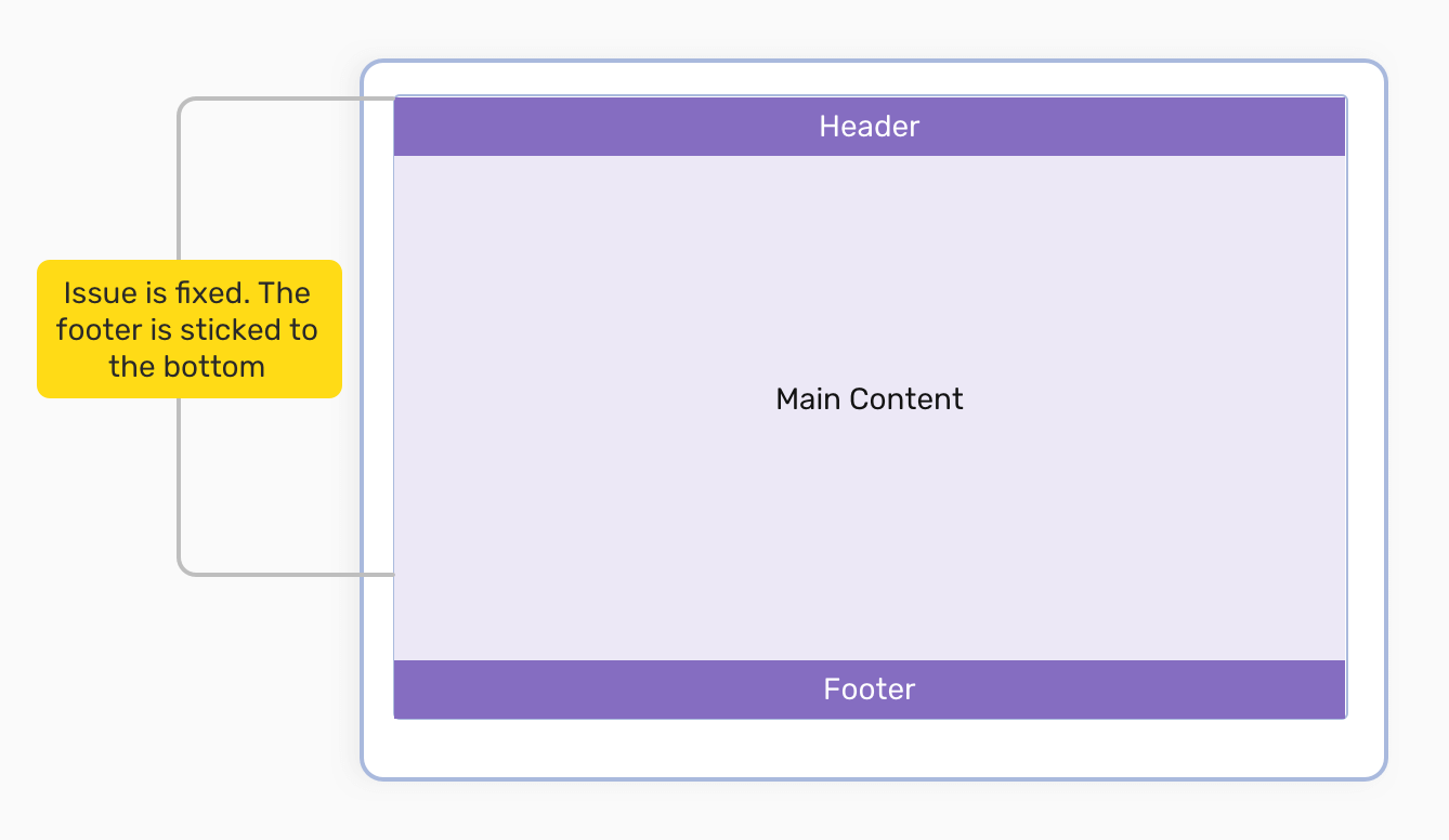
On a large screen, you might notice that website content is short, and the footer is not stuck to the bottom. That’s normal, and it’s not considered as a bad practice. However, there is room for enhancement. Consider the following figure that represents the issue:
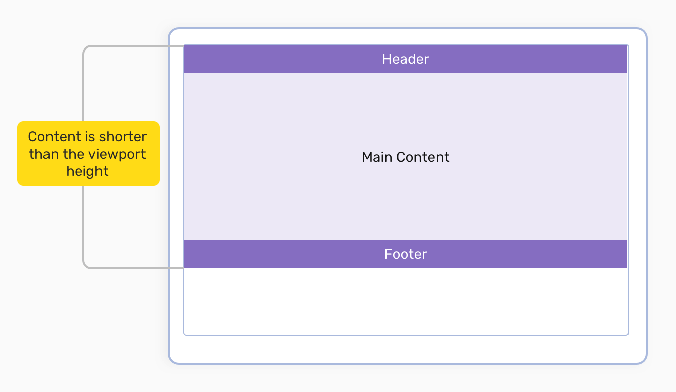
To solve that, we need to give the main content a height that is equal to viewport height - (header + footer). It’s tricky to do that dynamically, but with CSS viewport units, it’s quite easy.
If the header and footer height is fixed, it’s possible to combine both CSS calc() function with viewport units. Here is how:
header,
footer {
  height: 70px;
}

main {
  height: calc(100vh - 70px - 70px);
}
This solution is not guaranteed to work all the time, especially for the footer. In my career, I haven’t used a footer with a fixed height, because it’s not doable, for example, on different screen sizes.
By adding the 100vh as a height for the body element, we can then use flexbox to make the main element take the remaining space.
body {
    min-height: 100vh;
    display: flex;
    flex-direction: column;
{

main {
    /* This will make the main element take the remaining space dynamically */
    flex-grow: 1;
}
With that, the issue is fixed and we have a sticky footer regardless of the content length.
I stumbled upon this article while researching, and I really liked it, so I will re-take the use-case and explain it my way.
Suppose that we have a portfolio to showcase our responsive design work, and we have three devices (mobile, tablet, and laptop). Each device contains an image. The goal is to make this 100% responsive in CSS.

By using CSS grid and viewport units, we can make this fully responsive and dynamic.
<div class="wrapper">
  <div class="device laptop"></div>
  <div class="device mobile"></div>
  <div class="device tablet"></div>
</div>
Notice that viewport units are used in the grid-* properties. They’re also used for the border, border-radius, and other properties. All of this will result in a fluid design.
.wrapper {
  display: grid;
  grid-template-columns: repeat(20, 5vw);
  grid-auto-rows: 6vw;
}

.mobile {
  position: relative;
  z-index: 1;
  grid-column: 2 / span 3;
  grid-row: 3 / span 5;
}

.tablet {
  position: relative;
  z-index: 1;
  grid-column: 13 / span 7;
  grid-row: 4 / span 4;
  border-bottom: 1vw solid #a9b9dd;
  border-right: solid 3vw #a9b9dd;
}

.laptop {
  position: relative;
  grid-column: 3 / span 13;
  grid-row: 2 / span 8;
}

/* Viewport units are used for the bottom, left, right, height, and border-radius. Isn't that cool? */
.laptop:after {
  content: "";
  position: absolute;
  bottom: -3vw;
  left: -5.5vw;
  right: -5.5vw;
  height: 3vw;
  background-color: #a9b9dd;
  border-radius: 0 0 1vw 1vw;
}
I have noticed a use case which is most suitable for editorial layouts. A child element that takes 100% width of the viewport, even if its parent width is limited. Consider the below figure:
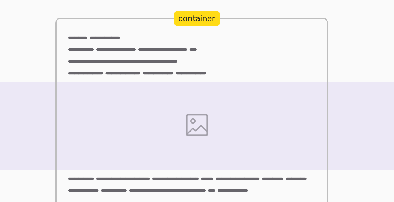
To achieve a similar effect, we can use viewport units and some positioning properties. Here is the CSS:
.break-out {
  width: 100vw;
  position: relative;
  left: 50%;
  right: 50%;
  margin-left: -50vw;
  margin-right: -50vw;
}
Let’s break it down so we understand how all of this works bit by bit.
width: 100vwThe most important step, which will give the image a width equal to 100% of the viewport.

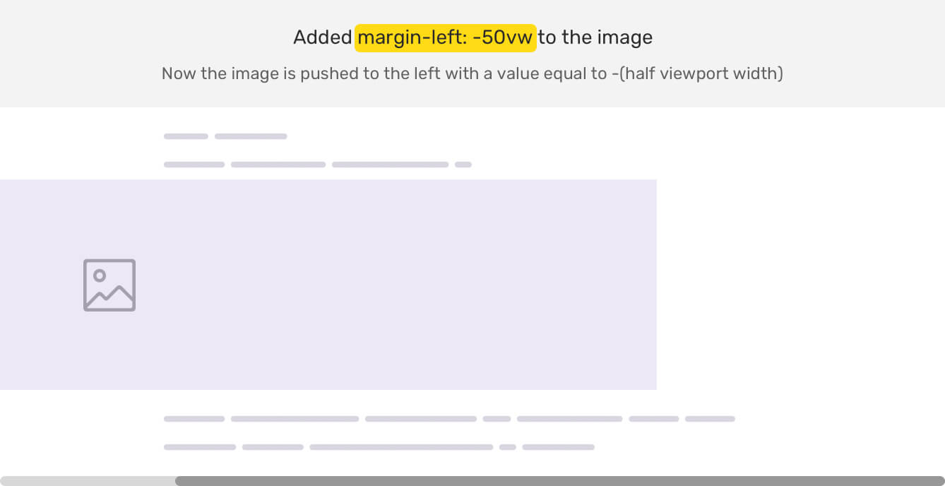
margin-left: -50vwTo center the image, we will need to give it a negative margin with half of the viewport width.
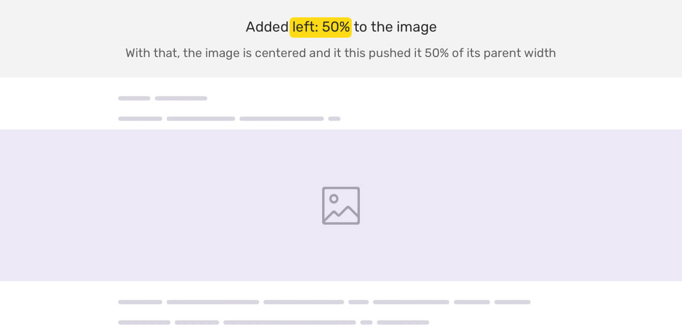
left: 50%Finally, we will need to push the image to the right with a value of 50% of its parent width.
Another interesting use-case that I thought about is using viewport units for spacing between elements. This can be used with values like margin, top, bottom, and grid-gap. When used, the spacing will be based on the viewport width or height, which might be useful to make a layout more dynamic.
For modals, we need to push them from the top of the viewport. Often, I made this with the top property and I use either percentage or pixel value. However, with viewport units, we can add a spacing that can change based on the viewport’s height.
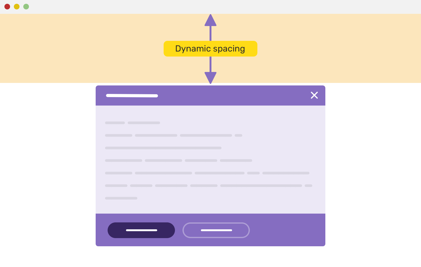
.modal-body {
  top: 20vh;
}
See the video below for the final result.
A page header is a section that acts as an introduction for a page. It often has a title and a description, and among that there is either a fixed height or padding for the top and bottom edges. We’re interested in the padding thing.
For example, here is how the CSS looks:
.page-header {
  padding-top: 1rem;
  padding-bottom: 1rem;
}

@media (min-width: 800px) {
  .page-header {
    padding-top: 4rem;
    padding-bottom: 4rem;
  }
}
The vertical padding is small on mobile, and it gets larger on greater viewports. What about using viewport units? Let’s explore that.
.page-header {
  padding-top: 10vh;
  padding-bottom: 10vh;
}

.page-header h2 {
  margin-bottom: 1.5vh;
}
I used vh unit for the padding of the page header, and the margin below the title. Notice how the spacing changes!
Another use case for the dynamic spacing is a grid of items. It can for anything, like a grid of articles, services section.. etc. For our case, we will take a look at how to use that for an article grid.
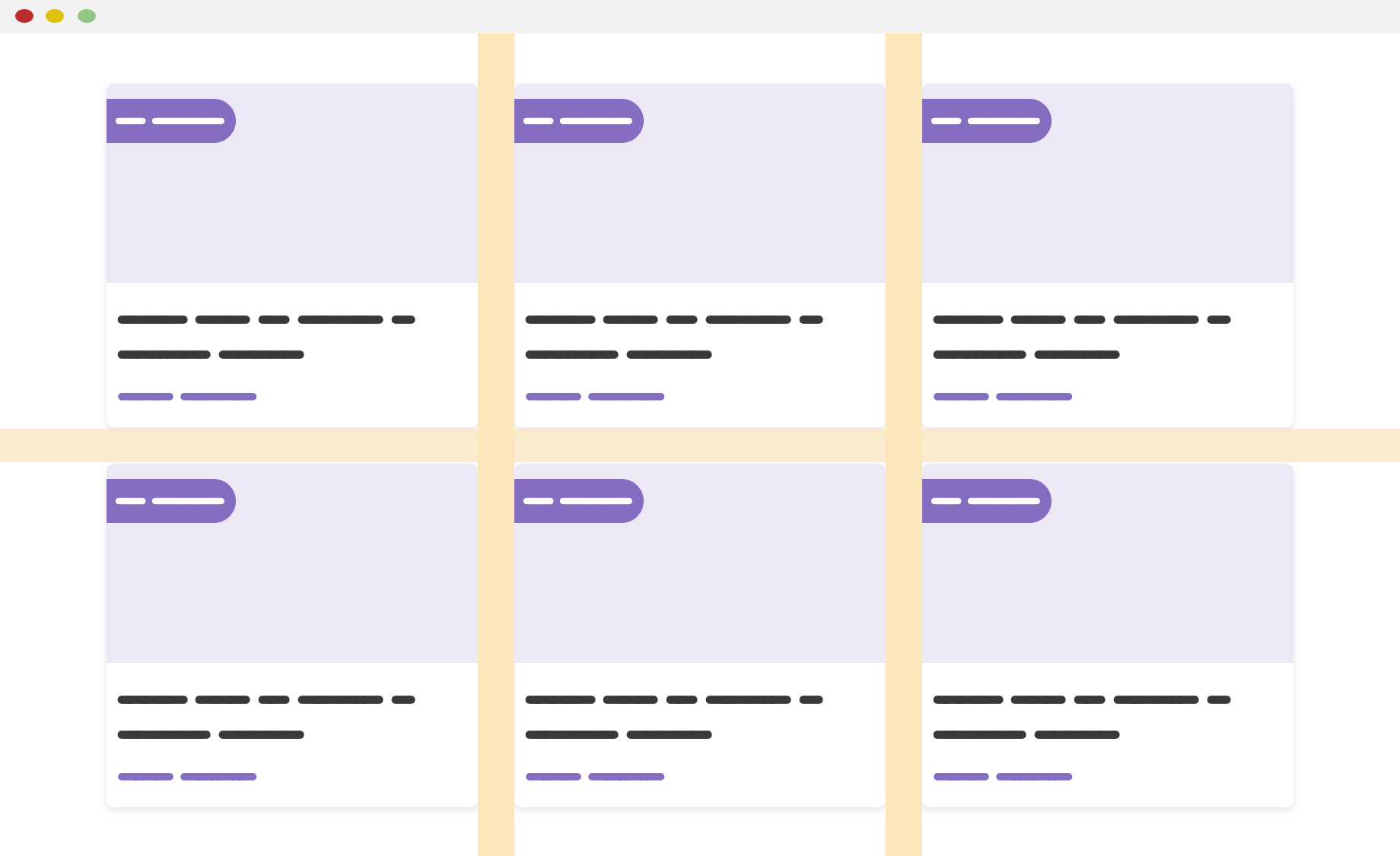
By using viewport units inside grid-gap, we can get the desired result. Notice that I used CSS calc() function as well. The goal of using calc() is to have a base vertical and horizontal gap.
.wrapper {
  display: grid;
  grid-template-columns: repeat(auto-fit, minmax(250px, 1fr));
  grid-gap: calc(14px + 1vh) calc(14px + 0.5vw);
}
While researching about use-cases for these two values, I didn’t find anything but this one from CSS-Tricks.
The use-case is about the top and bottom padding for a page header element. The padding is often reduced when the viewport is small (mobile). By using vmin, we can have a fluid top and bottom padding based on the viewport smaller dimension (width or height).
.page-header {
  padding: 10vmin 1rem;
}
Four years ago, I wrote an article about vertical media queries. I want to shed light on this topic since it’s related to this article that you’re reading now
By using vertical media queries, we can check if the user phone or tablet is in landscape mode. If it is, then it won’t make sense to have a section taking the full height of the viewport by using height: 100vh.
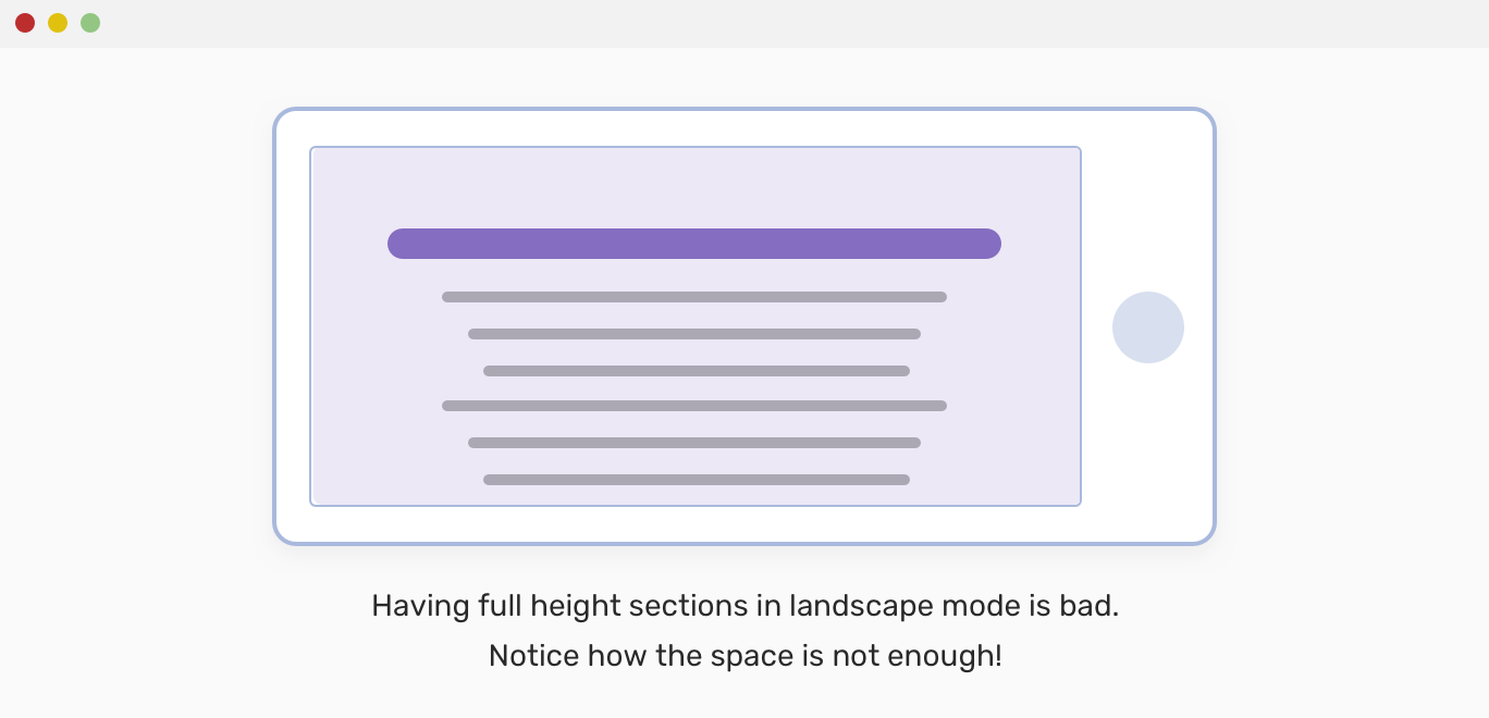
To solve that issue, we can do the following:
@media (min-height: 400px) {
  .section {
    height: 100vh;
  }
}
Or we can use the orientation media query:
@media (orientation: landscape) {
  .section {
    height: 100vh;
  }
}
We can use vw unit to create responsive elements that maintain its aspect ratio regardless of the viewport size. Let’s explore that.
We will need to decide on the aspect ratio we need. For this example, I will use 9/16.
section {
  /* 9/16 * 100 */
  height: 56.25vw;
}
I’m not sure if my naming for this is correct, but I hope you will get my point from the following visual examples.
Do you know that top border which is most of the websites use these days? Mostly, its color is the same as the brand color — which will give some personality.
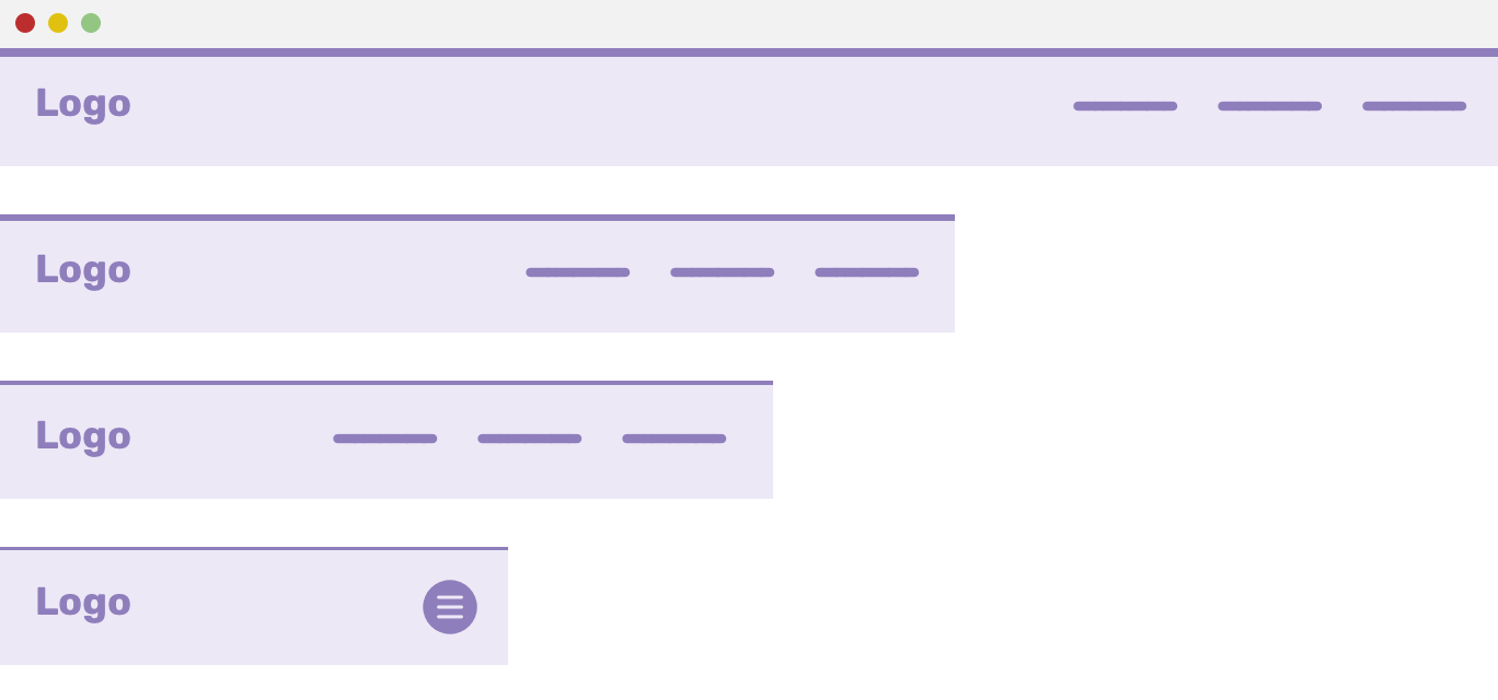
Let’s support that the initial value for the border is 3px. How to convert that fixed value to a viewport thing? Well, here is how to calculate the vw equivalent of it.
vw = (Pixel Value / Viewport width) * 100
The viewport width is used to estimate the ratio between the pixel value and the desired vw unit.
For our example, here is how the top border added:
.header {
  border-top: 4px solid #8f7ebc;
}
In my case, the viewport width is 1440 (This is not a fixed number, replace it with your own)
vw = (4 / 1440) * 100 = 0.277
.header {
  border-top: 0.277vw solid #8f7ebc;
}
Even better, we can use a base pixel value, and the viewport unit can be an addition.
.header {
  border-top: calc(2px + 0.138vw) solid $color-main;
}
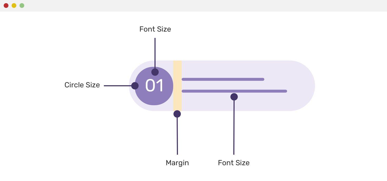
For section items with a counter or an icon, we can leverage the usage of viewport units. See the mockup below:

We have a circle containing a number, and there is text content. Both of them need to be sized fluidly with viewport units. Let’s explore how!
/**
1. Using a fluid value for the flex, width, and height properties.
2. The line-height is used to center the text vertically
3. Font size
4. The spacing between the circle and the text
**/
.point:before {
  flex: 0 0 calc(24px + 4vw); /* [1] */
  width: calc(24px + 4vw); /* [1] */
  height: calc(24px + 4vw); /* [1] */
  line-height: calc(24px + 4vw); /* [2] */
  font-size: calc(14px + 1vw); /* [3] */
  margin-right: calc(10px + 0.5vw); /* [4] */
}
I made a tool to help me in checking the current computed value elements with viewport units. Consider the below:
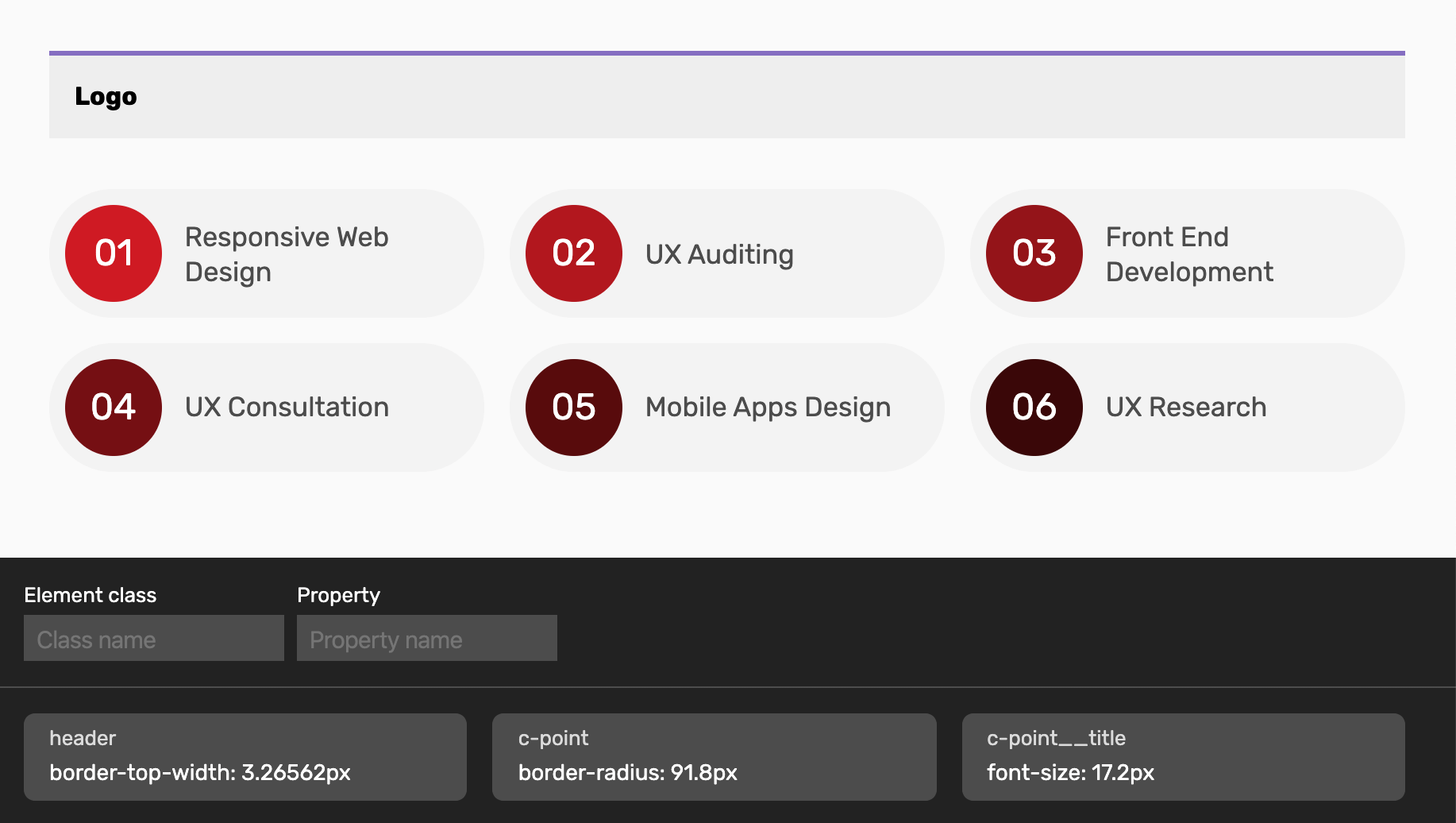
I added the class name and property for each element, and on viewport resize, the values are updated dynamically. This is much better than inspecting DevTools and going to the computed for each specific element.
There is a common issue in mobile which cases a scroll, even if 100vh is used. The reason is that the address bar height is in view. Louis Hoebregts wrote an article about that with a simple and easy fix.
.my-element {
  height: 100vh; /* Fallback for browsers that do not support Custom Properties */
  height: calc(var(--vh, 1vh) * 100);
}
// First we get the viewport height and we multiple it by 1% to get a value for a vh unit
let vh = window.innerHeight * 0.01
// Then we set the value in the --vh custom property to the root of the document
document.documentElement.style.setProperty("--vh", `${vh}px`)
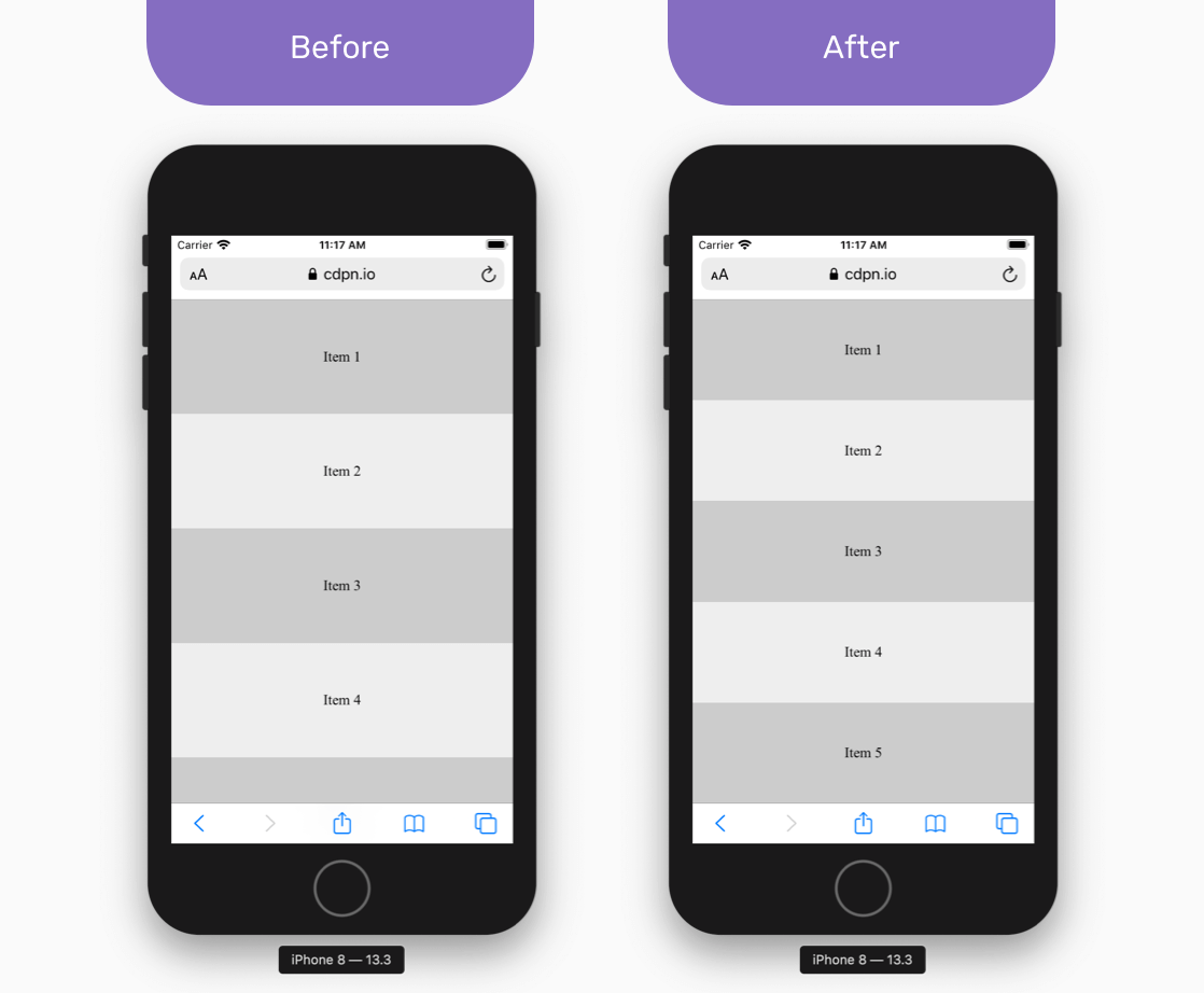
I saw a tweet that made me say WOW! There is a CSS only fix for this in Safari.
.my-element {
  height: 100vh;
  height: -webkit-fill-available;
}
By using an intrinsic width value for the height, the browser will fill only the available vertical space.
100vw Is An AntipatternWhen using 100vw to give an element the full width of the viewport, things might work great if you’re a Mac OS user because the vertical scrollbar is hidden by default. As a result, the scrollbar width is added to the total width.
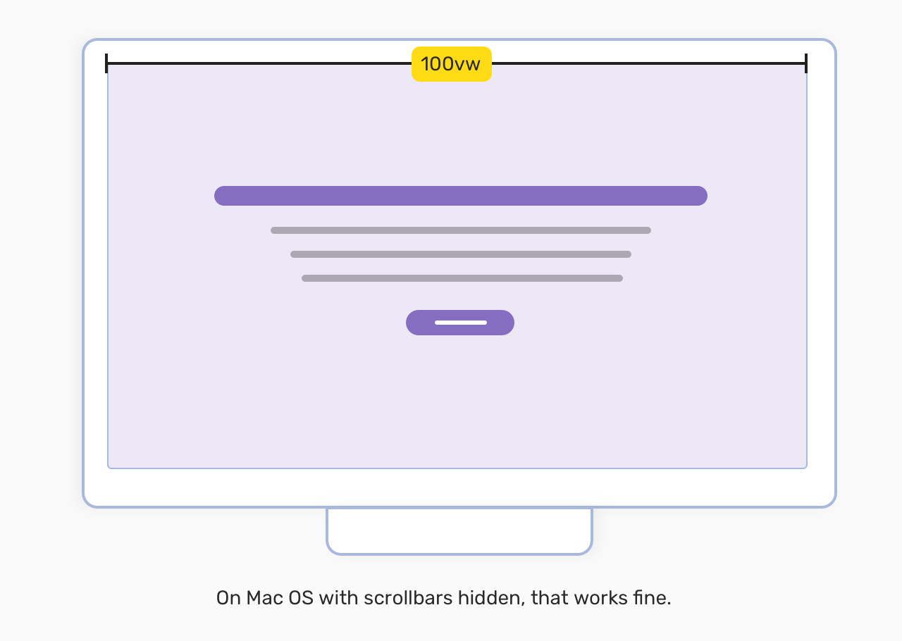
However, on a Windows machine, you will notice a horizontal scrolling in the page, because the width of the scrollbar is being added to the width. Let’s say you added the following:
.element {
  width: 100vw;
}
On windows, the computed width of the .element will be 100vw + 8.5px, where 8.5px is the width of the vertical scrollbar. This is not good!
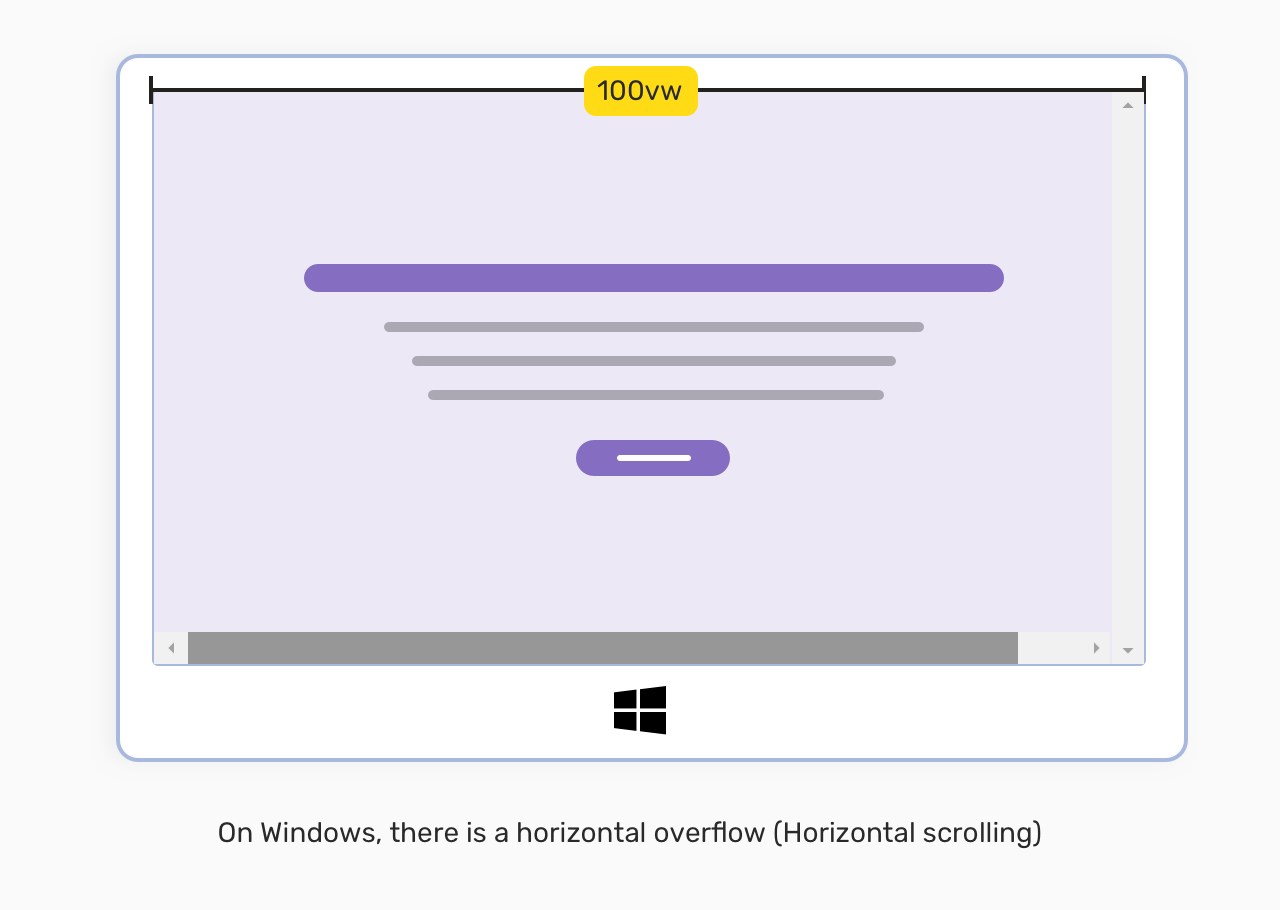
As far from what I know, there is no solution for this unless we use Javascript, and I don’t recommended that. It’s better to avoid 100vw and use an alternative. For example, we can use CSS grid to have make an element break out of its container, see this article on Cloudfour.
Thanks a lot to Chris Morgan and Kilian Valkhof for warning me about that issue.
When using viewport units extensively in a project, like for building a whole layout with it, accessibility is important. When a layout is zoomed in/out, the elements with viewport units won’t scale as you might expect. This will cause an issue to users who rely on zoom to browse the web.
As per this tweet by Sāra Soueidān, using viewport units alone for font sizing is bad for accessibility. It’s better to combine them with fixed values, like the below:
.title {
  font-size: calc(16px + 0.3vw);
}
Even better, we can use CSS relative units (em or rem) instead of px. That way, we can have more control on changing the font size.
.title {
  font-size: calc(1rem + 0.3vw);
}
..and it will be good to go. Please make sure that using viewport units is suitable for what you’re doing, and test well.
Do you have a useful tool? Please let me know at @shadeed9
vmin
That’s a wrap. Do you have a comment or a suggestion? Please feel free to ping me on @shadeed9.
此内容由惯性聚合(RSS阅读器)自动聚合整理,仅供阅读参考。 原文来自 — 版权归原作者所有。