


I spent years teaching CSS layout on this blog. I put everything I know into The Layout Maestro course: 70+ lessons and 150+ interactive examples that teach you how to think CSS layouts, not just memorize syntax.
Each time I work on a component that needs absolute positioning, I ask myself: is it really necessary? I started to notice a few use-cases where using position: absolute isn’t needed. I found this interesting and I thought about documenting the use-cases that I usually came through while working on front-end projects.
In this article, I will explore a few use-cases that using absolute positioning with them isn’t really needed.
If we go back 5 years in time, CSS flexbox was still new and can’t be used with a proper fallback. CSS grid wasn’t even supported back then. Eventually, we would use CSS positioning to achieve the desired layout. However, some of these use-cases can be solved with CSS flexbox or grid these days.
The other day, we were working on a landing page front-end development, and my partner asked me about a layout issue she is facing. The issue was happening because of position: absolute, so I stepped in and tried to help with it, and we fixed it without even using any CSS positioning. At that time, it clicked for me that I should document that, and that’s what I’m doing right now.
When we have a card that contains text over an image, we often use position: absolute to place the content over the image. This is no longer needed with CSS grid.
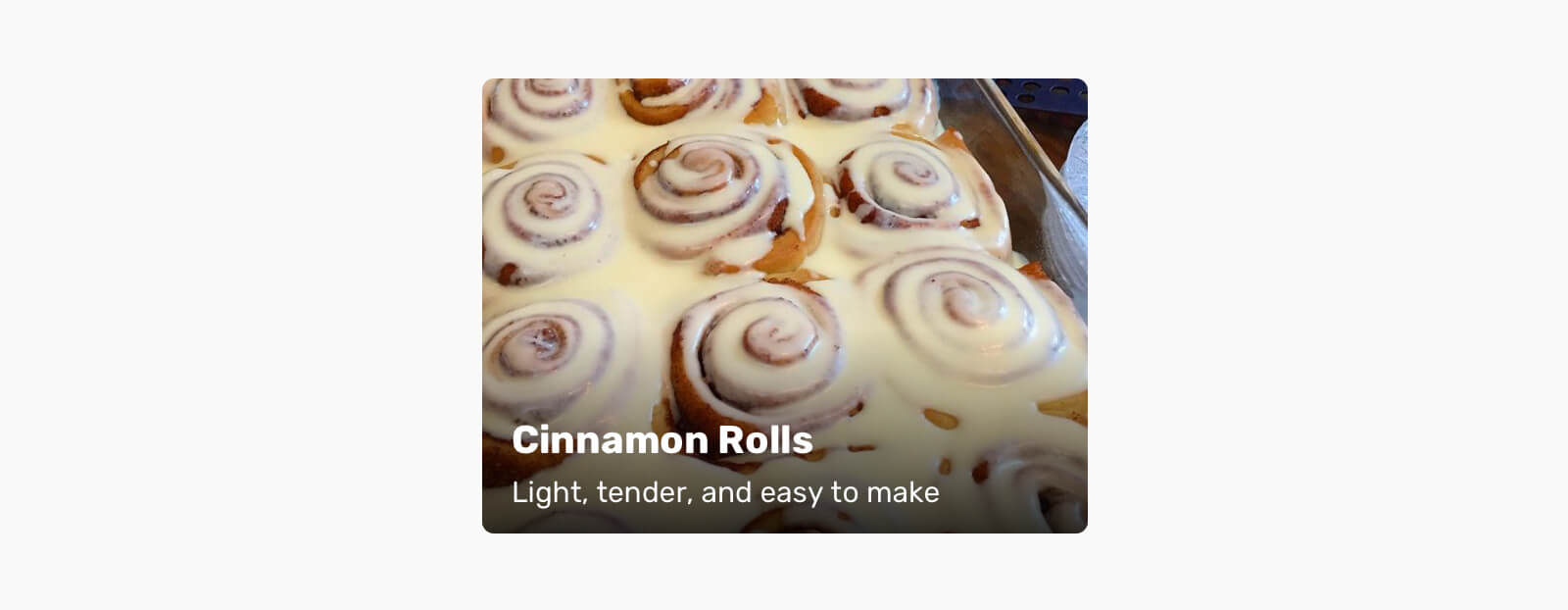
This is a typical text-over-image card. Here is the HTML:
<article class="card">
  <div class="card__thumb">
    <img src="assets/mini-cheesecake.jpg" alt="" />
  </div>
  <div class="card__content">
    <h2><a href="#">Title</a></h2>
    <p>Subtitle</p>
  </div>
</article>
In order to place the content over the image, we need to position .card__content absolutely.
.card {
    position: relative;
}

.card__content {
    position: absolute;
    left: 0;
    top: 0;
    width: 100%;
    height: 100%;
    background: linear-gradient(to top, #000, rgba(0, 0, 0, 0) bottom/100% 60% no-repeat;
    padding: 1rem;
}
There is nothing wrong with using position: absolute in the above example, but why not use an easier solution? Let’s explore that.
The first step is to add display: grid to the card component. We don’t need to set any columns or rows.
.card {
  position: relative;
  display: grid;
}

.card__content {
  display: flex;
  flex-direction: column;
  justify-content: flex-end;
}
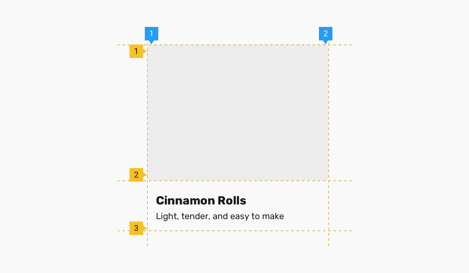
By default, CSS grid will create rows automatically based on the content. In the card, we have two main elements, and so we have two rows of content.
To overlap the content with the image, we need to place both of them on the first grid area.
.card__thumb,
.card__content {
  grid-column: 1/2;
  grid-row: 1/2;
}
Even better, we can use grid-area shorthand.
.card__thumb,
.card__content {
  grid-area: 1/2;
}
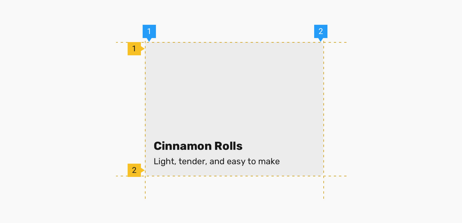
Finally, we can also use grid-area: 1/-1. The -1 represents the last column and row in a grid, so it will always span to the end of the column or row.
Based on the previous example, we want to extend it and include a tag at the top left area of the card. To do that, we need to use the same technique which is grid-area: 1/-1, but we don’t want the tag to fill the whole card, correct?
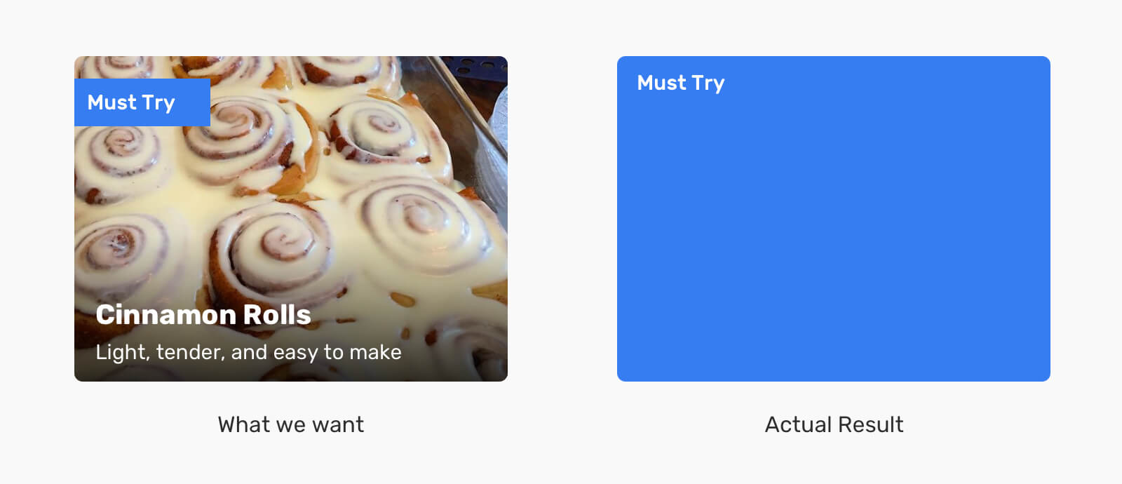
To fix that, we need to tell the tag to justify and align itself to the start of its alignment container.
.card__tag {
  align-self: start;
  justify-self: start;
  /* Other styles */
}
Meet the tag that is positioned above its parent, without using position: absolute.
Another perfect use case is a hero section with content overlapping an image.
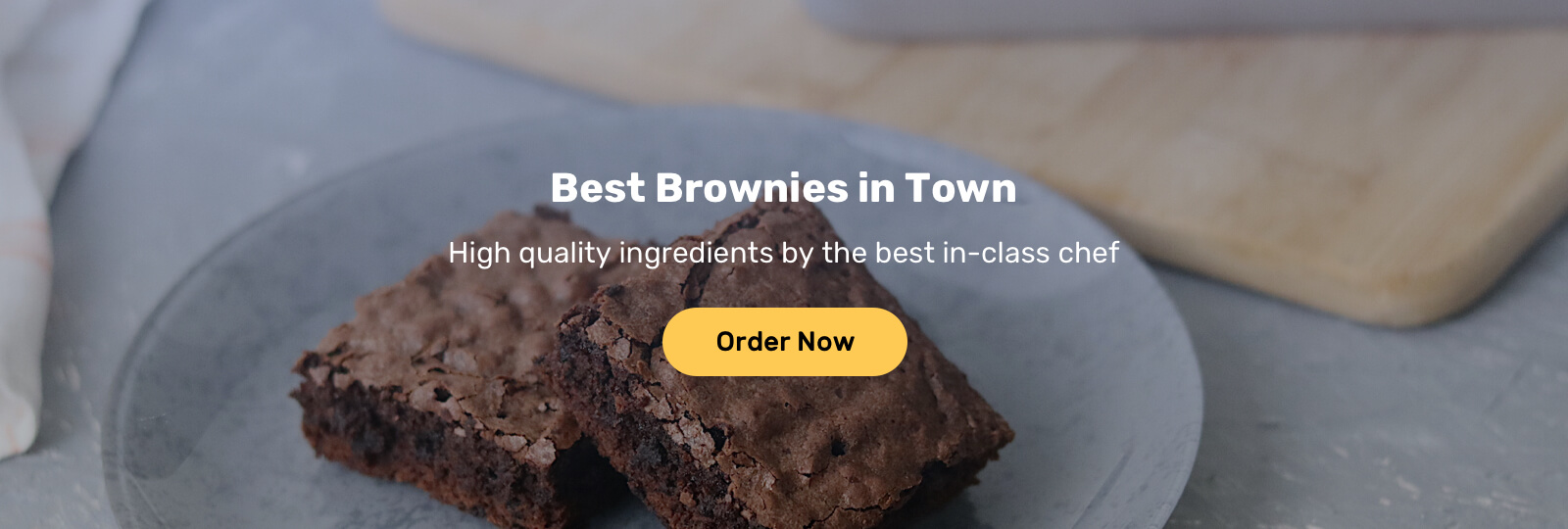
This is similar to the card example, but with different styling for the content itself. Before diving into the modern way, let’s think for a minute about how we do that with absolute positioning.
We have three layers:
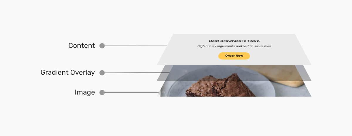
There are different ways to implement that. If the image is purely for decorative purposes, we can use background-image. Otherwise, we can use an <img> element.
.hero {
  position: relative;
  min-height: 500px;
}

.hero__thumb {
  position: absolute;
  left: 0;
  top: 0;
  width: 100%;
  height: 100%;
  object-fit: cover;
}

/* The overlay */
.hero:after {
  content: "";
  position: absolute;
  left: 0;
  top: 0;
  width: 100%;
  height: 100%;
  background-color: #000;
  opacity: 0.5;
}

.hero__content {
  position: absolute;
  left: 50%;
  top: 50%;
  z-index: 1;
  transform: translate(-50%, -50%);
  text-align: center;
}
That’s how we can implement the hero section using absolute positioning. However, we can do better. Let’s explore the modern approach.
First, we need to add display: grid to the hero element. After that, we will apply the same concept as in the card component, which is to apply grid-area: 1/-1 to every direct child item.
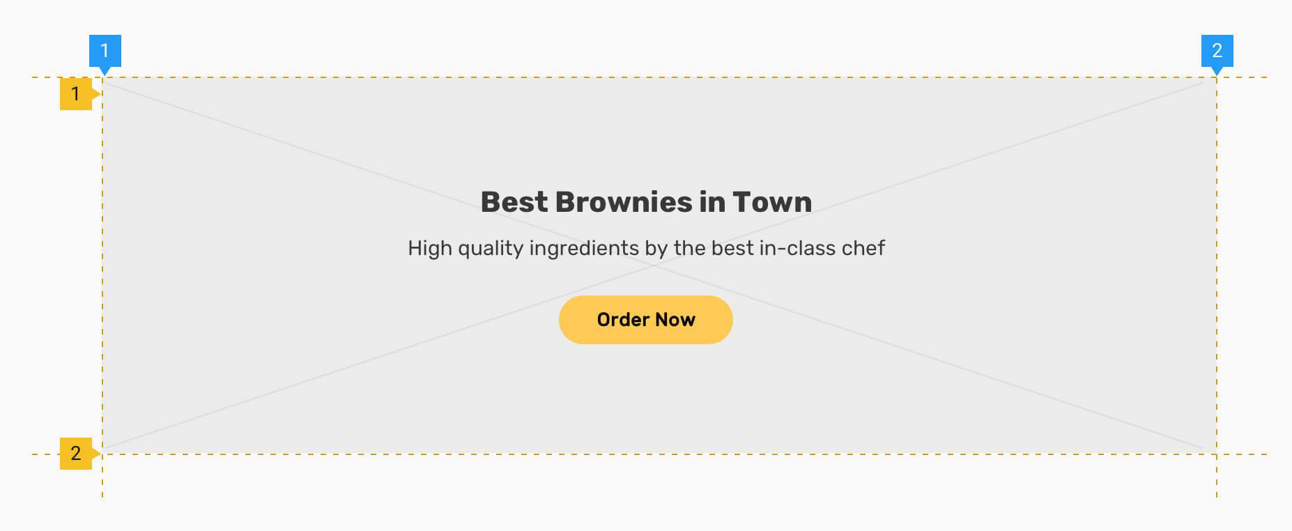
Unfortunately, we will need to use a fixed height for the hero section so the .hero__thumb can actually work. (A child item with height: 100% will need its parent to have an explicit fixed height, not min-height).
.hero {
  display: grid;
  height: 500px;
}

.hero__content {
  z-index: 1; /* [1] */
  grid-area: 1/-1;
  display: flex;
  flex-direction: column;
  margin: auto; /* [2] */
  text-align: center;
}

.hero__thumb {
  grid-area: 1/-1;
  object-fit: cover; /* [3] */
  width: 100%;
  height: 100%;
  min-height: 0; /* [4] */
}

.hero:after {
  content: "";
  background-color: #000;
  opacity: 0.5;
  grid-area: 1/-1;
}
I want to go through the numbered code lines since they are important:
z-index on a grid or flex item. No need to add position: relative at all..hero__content is a grid item, using margin: auto will center it horizontally and vertically.object-fit: cover when dealing with images.min-height: 0 on the hero image just in case a large image was used. Well, this is to force CSS grid to respect the height: 100% and avoid making the image larger than the hero section in case an author used a huge image. You can read more about that in my article about the minimum content size in CSS grid.Notice how we ended up with a much cleaner solution?
display: contentsI think this is the first real-life use case for display: contents. Consider the following example where we have content and an image.

Here is the HTML markup.
<div class="hero">
  <div class="hero__content">
    <h2><!-- Title --></h2>
    <p><!-- Desc --></p>
    <a href="#">Order now</a>
  </div>
  <img src="recipe.jpg" alt="" />
</div>
Nothing weird till now. On mobile, we want to achieve the following layout.
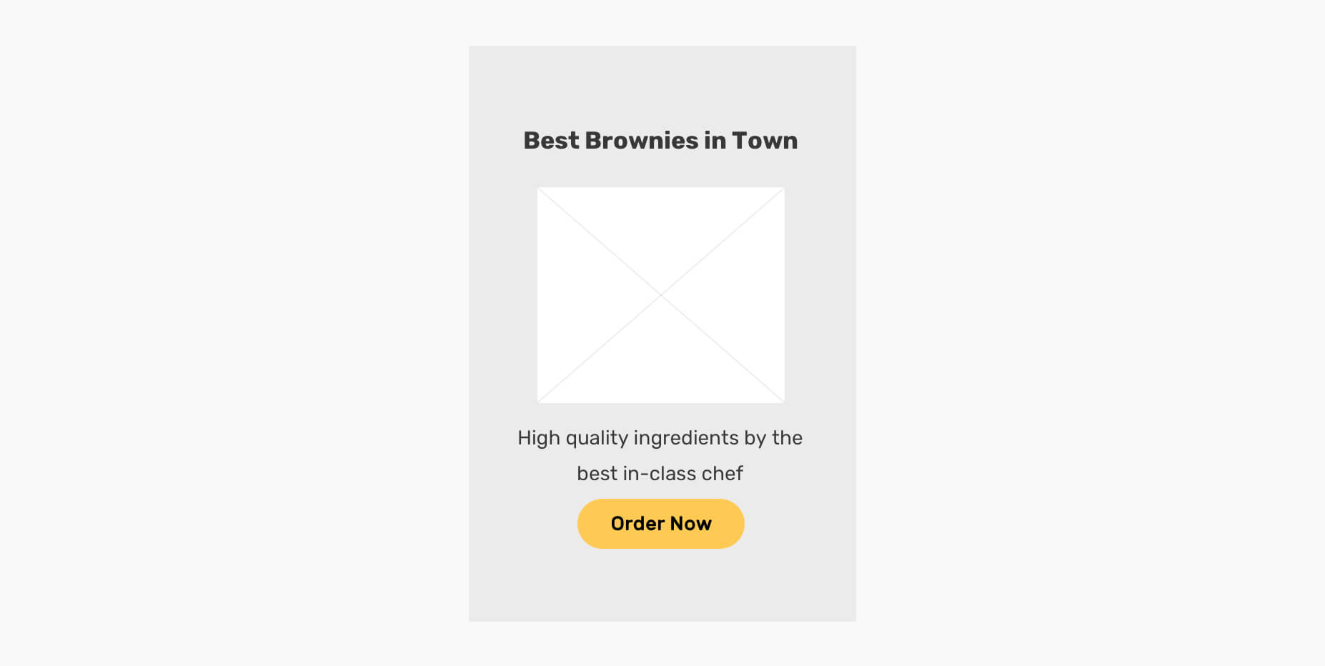
Notice that the image is now inserted between the headline and description. How you can tackle this problem? At first, you might think that the HTML markup should be changed like that.
<div class="hero">
  <div class="hero__content">
    <h2><!-- Title --></h2>
    <img src="recipe.jpg" alt="" />
    <p><!-- Desc --></p>
    <a href="#">Order now</a>
  </div>
</div>
On mobile, it can work as expected. On desktop, we need to position the <img> absolutely on the right side. While this works, there is a more straightforward solution with display: contents.
Let’s get back to the initial markup.
<div class="hero">
  <div class="hero__content">
    <h2><!-- Title --></h2>
    <p><!-- Desc --></p>
    <a href="#">Order now</a>
  </div>
  <img src="recipe.jpg" alt="" />
</div>
Notice that the content is wrapped inside .hero__content. How we can tell the browser that we want the <h2>, <p>, and <a> to become direct siblings with the <img>? Well, display: contents can do that.
.hero__content {
  display: contents;
}
By adding that, the .hero__content element is a hidden ghost now. The browser will parse the markup like the following.
<div class="hero">
  <h2><!-- Title --></h2>
  <p><!-- Desc --></p>
  <a href="#">Order now</a>
  <img src="recipe.jpg" alt="" />
</div>
All we need to do in CSS is the following.
.hero {
  display: flex;
  flex-direction: column;
}

.hero__content {
  display: contents;
}

.hero h2,
.hero img {
  order: -1;
}
When used right, display: contents is a powerful technique to achieve things that were impossible a few years ago.
Of course, we want to handle the desktop styling too.
@media (min-width: 750px) {
  .hero {
    flex-direction: row;
  }

  .hero__content {
    display: initial;
  }

  .hero h2,
  .hero img {
    order: initial;
  }
}

In this example, we have a variation of a card that places the title at the top of the card. Let’s take a look at the HTML markup.
<article class="card">
  <img src="thumb.jpg" alt="" />
  <div class="card__content">
    <h3>Title</h3>
    <p>Description</p>
    <p>Actions</p>
  </div>
</article>
Notice that we have two direct child elements: the thumb and the content. With that markup, how we can position the title <h3> at the top?
We can do it with absolute positioning.
.card {
  position: relative;
  padding-top: 3rem;
  /* Accommodate for the title space */
}

.card h3 {
  position: absolute;
  left: 1rem;
  top: 1rem;
}
However, this solution can fail when the title is too long.
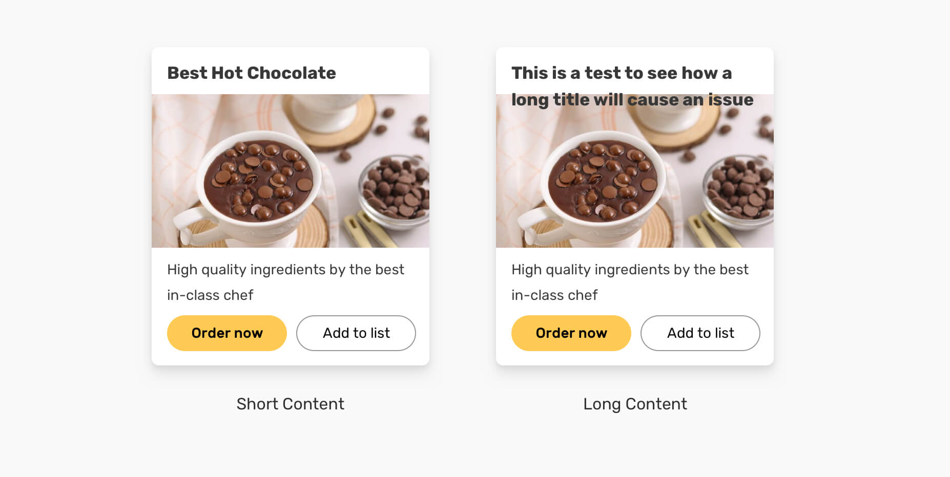
That is happening because the title is out of the normal flow, so the browser doesn’t actually care about how short or long it is. We can do much better with display: contents.
.card {
  display: flex;
  flex-direction: column;
  padding: 1rem;
}

.card__content {
  display: contents;
}

.card h3 {
  order: -1;
}
This will allow us to control all child items and have the flexibility of recording them as needed with the order property.
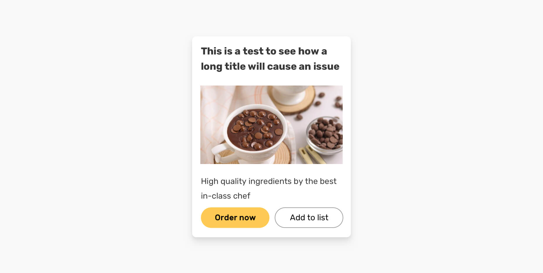
We still have a little issue since we added padding: 1rem to the parent. The image should be stuck to the edges. Here is how we can fix that.
.card img {
  width: calc(100% + 2rem);
  margin-left: -1rem;
}
When it comes to centering, you will see a lot of jokes that it’s hard and complicated. These days, it’s much easier than ever to center an element.
No more using position: absolute with CSS transforms. For example, we can use margin: auto to center a flex item both horizontally and vertically.
.card {
  display: flex;
}

.card__image {
  margin: auto;
}

I wrote a complete guide about centering in CSS.
The new CSS aspect-ratio property is now supported in all major browsers. We used to do the padding hack to force a box to respect a specific aspect ratio.
Here is an example.
.card__thumb {
  position: relative;
  padding-top: 75%;
}

.card__thumb img {
  position: absolute;
  left: 0;
  top: 0;
  width: 100%;
  height: 100%;
  object-fit: cover;
}
With the new aspect-ratio property, it’s much easier.
/*  */
.card__thumb {
  position: relative;
  aspect-ratio: 4/3;
}
You can learn more about them in this article by yours truly.
position: absolute is better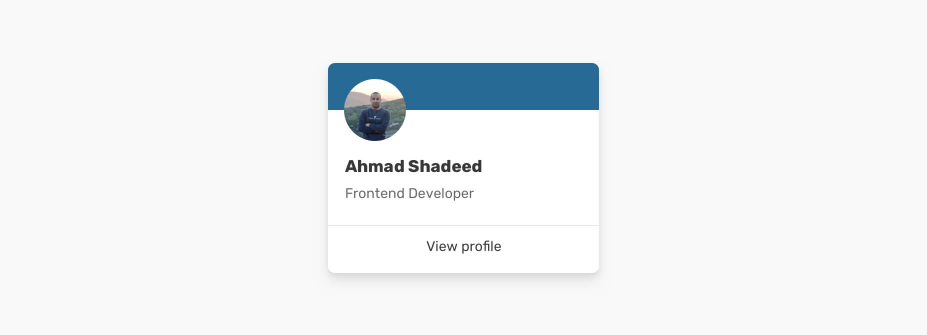
In this example, we have the content (avatar, name, and link) overlapping with the card cover. We have two options for implementing this:
position: absolute for the card coverLet’s explore the solutions and see which one of them is more suitable for that use case.

With this solution, we can position the rectangle absolutely, and then add padding: 1rem to the card content.
.card__cover {
  position: absolute;
  left: 0;
  top: 0;
  width: 100%;
  height: 50px;
}

.card__content {
  padding: 1rem;
}
That way, when the card cover is removed, we don’t have to edit or alter the CSS.
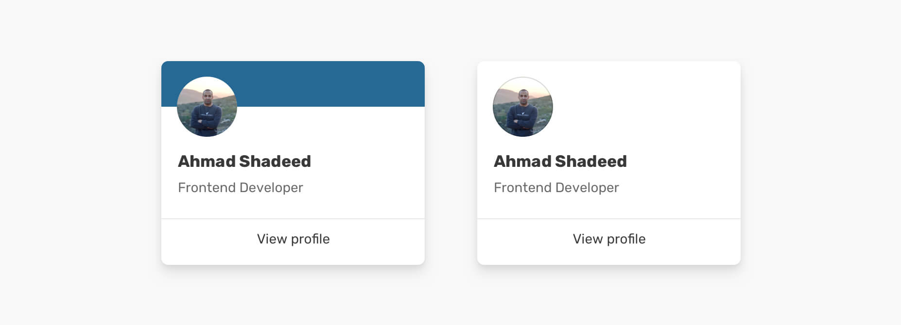
In this solution, the card won’t be positioned absolutely. Instead, the content will have a negative margin from the top.
.card__content {
  padding: 1rem;
  margin-top: -1rem;
}
While this solution works when the card cover is there, it can cause a problem when we have a card variation without the card cover.
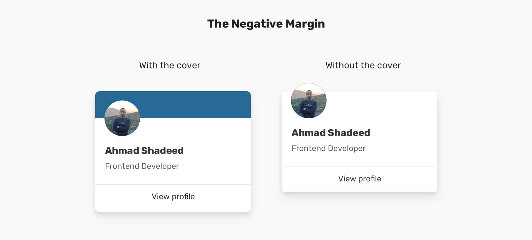
Notice how the avatar is off its parent (The card). To fix that, we need to alter the CSS and remove the negative margin.
.card--no-cover .card__content {
  margin-top: 0;
}
As a result, using position: absolute turned out to be a better solution in such a case as it will save us from writing additional CSS.
I hope you enjoyed the article. Thanks for reading!
此内容由惯性聚合(RSS阅读器)自动聚合整理,仅供阅读参考。 原文来自 — 版权归原作者所有。