


I spent years teaching CSS layout on this blog. I put everything I know into The Layout Maestro course: 70+ lessons and 150+ interactive examples that teach you how to think CSS layouts, not just memorize syntax.
A while ago, I got to think about the term “Designing in the browser” and if it’s a valid thing at all. The term “designing” in the browser indicates that we can add design elements quickly, but if we compare that to a design tool, like Figma, then the tool will win in terms of speed.
When we have an already implemented design in the browser, then it’s so much easier to tweak it, and eventually, we might “design” something different from what we started with. I like the term “tweaking” better for that context. The question is, what do we need to be able to design in the browser? And what we can do in the browsers with the current developer tools?
The term “designing in the browser” is so vague to the point that some designers and developers think that web browsers are design tools. This thinking implies that if we have an HTML markup, then we can start designing in the browser, just like a design tool (e.g: Figma). No, that’s not the point!
Let’s take the following example for a recipes website. We have the following sections:
Can we design the following in the browser at the same time we do it in a design tool?
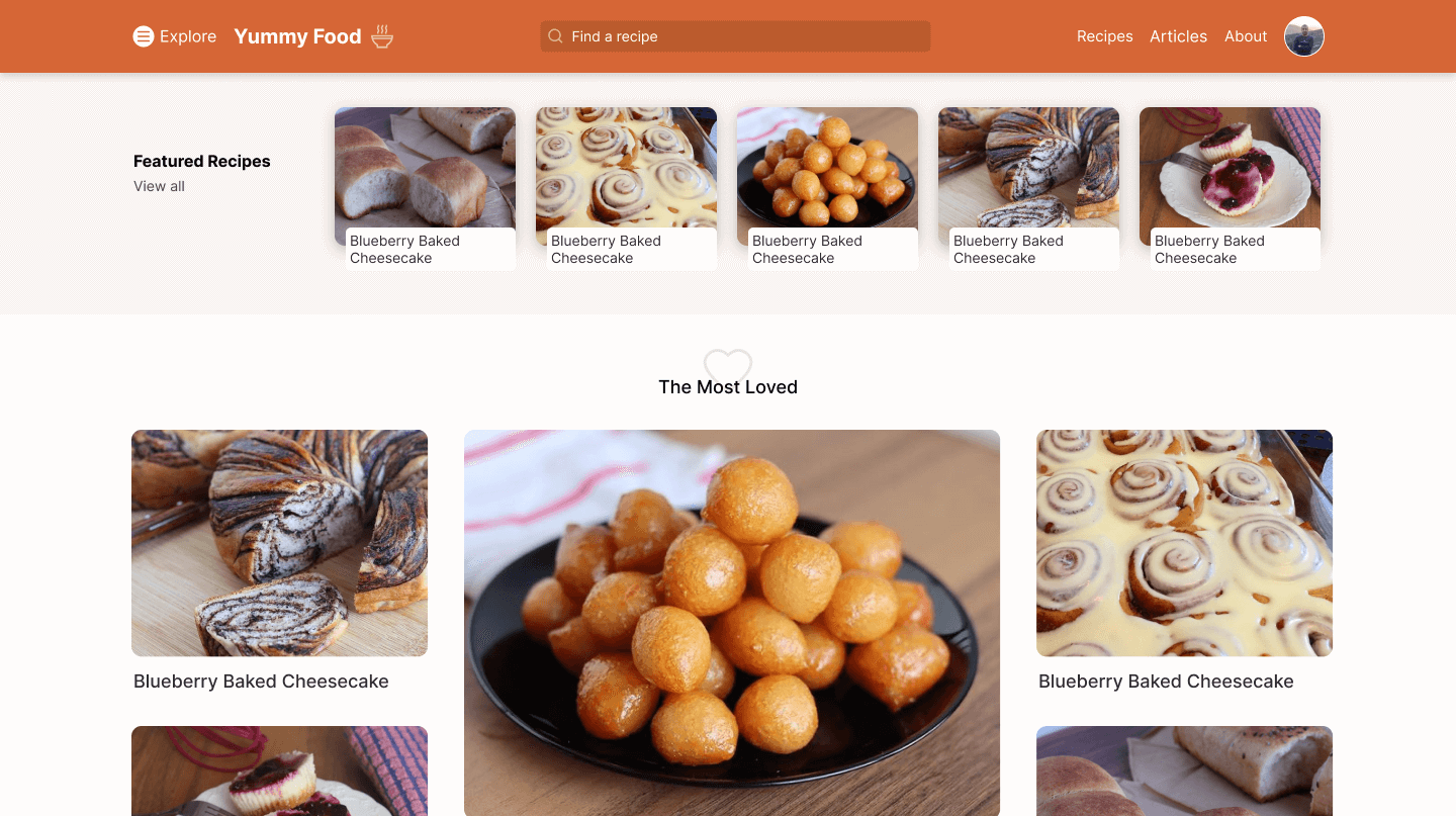
For me, the short answer is no. There are many reasons why designing such a website in the browser can’t be practical. It’s not hard nor impossible, but it’s impractical!
Let’s get into a few of these reasons.
While designing, we want to explore ideas in the shortest amount of time. Writing HTML/CSS code and thinking about the design at the same moment will double or triple that time.
Let’s take the header as an example. To think and design this in the browser, we need to take care of the layout, spacing, alignment, exporting icons, font sizes.. and a lot more.
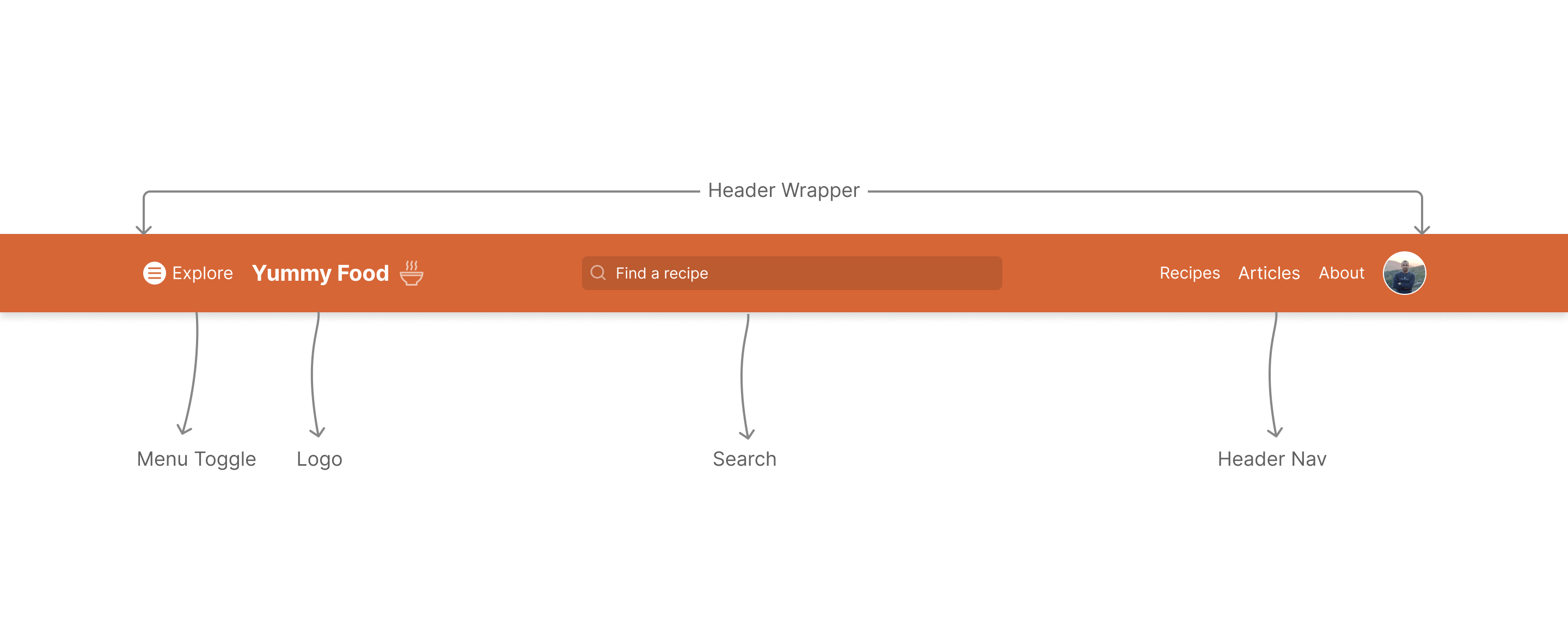
It takes time in that case because we first write the CSS needed, and then check it in the browser to see if all is as intended. Maybe that icon isn’t sized properly, or a specific selector isn’t working because we forgot to append the dot before the class name. Lots of tiny scenarios!
Here is a very simple case where creating a simple rectangle for the header, is way faster than doing this in code (AKA: designing in the browser).
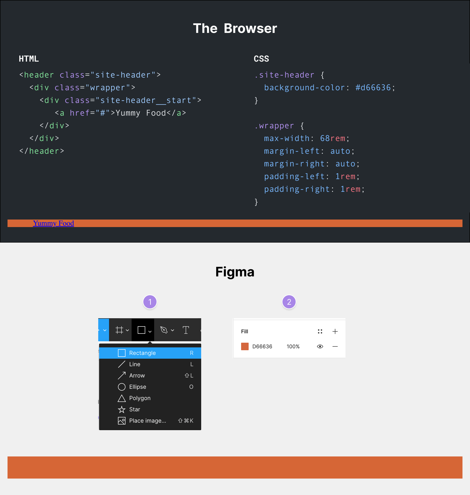
It’s not even the same result! In the browser, I still need to add the rest of the elements, then add padding for the navigation elements to make the header height reasonable.
While in Figma, it’s just a two steps process:
Another example is the search form. I tried to code it in the browser and compare the actual time. It took me about it 8 minutes while in Figma it only took 1-2 minutes. To make it look like the intended design, we need to:
appearance: none.border, border-radius.Here is the basic HTML and CSS code.
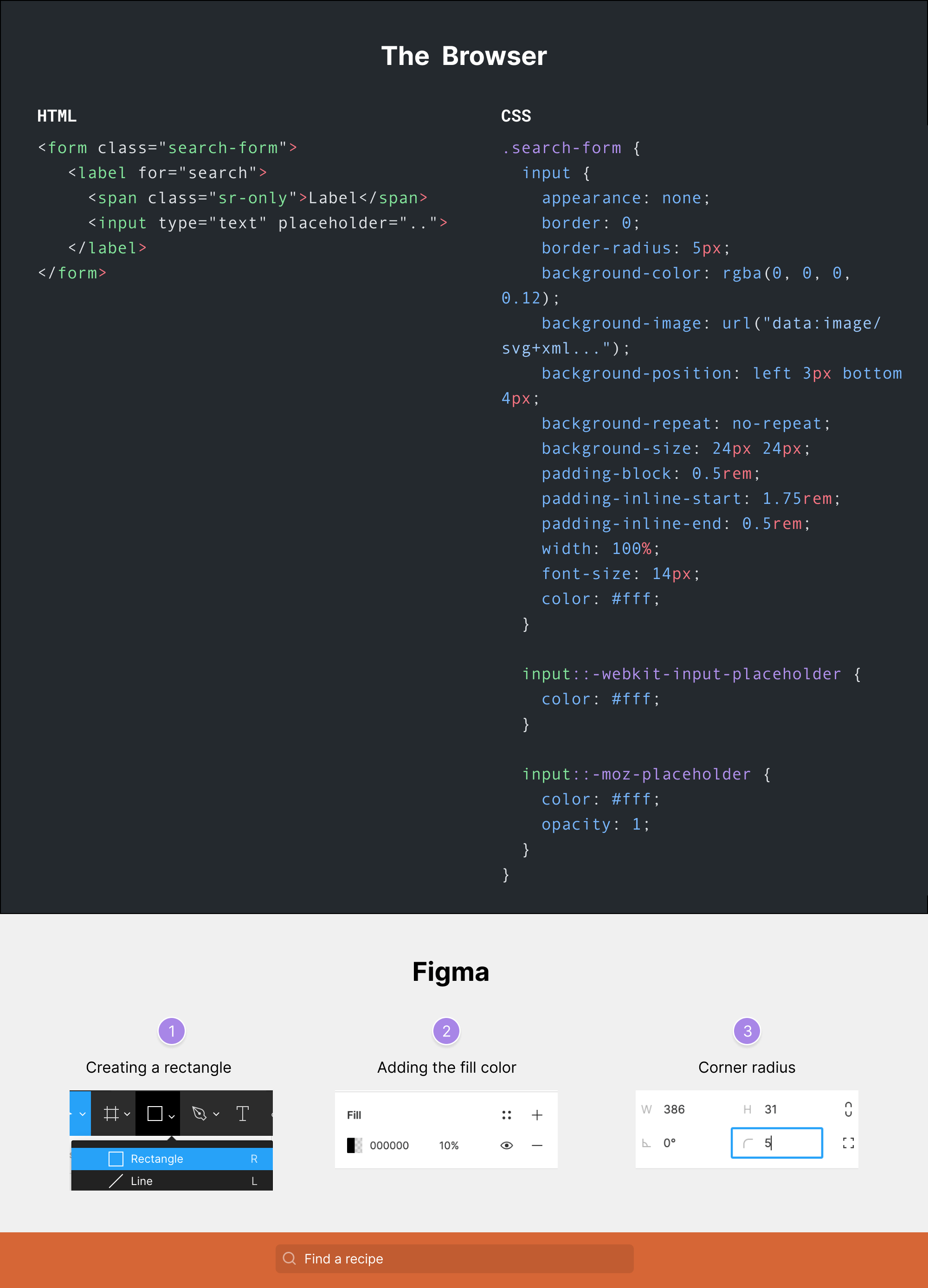
And this doesn’t even account for different screen sizes, and I didn’t also show the flex parent for it. While in Figma, it’s only a rectangle with an icon and a bit of border-radius.
This should be called designing in the browser. When designing, we need to clear our minds from all those CSS properties and focus on the design itself. The only situation I would design in the browser is when I have all the time in the world and there is a project without a deadline.
Chances are high that you might be stuck with a CSS layout problem that will increase the time to design even more. For example, I sometimes write CSS properties with tiny typos and I only notice them If I look in the DevTools and see which CSS property is invalid.
.search-input {
  disply: flex;
}
The property disply is a typo and it won’t be visible unless you check the result in the browser. You will first notice that the flex parent isn’t even there. Why bother wasting such time while your mind is “designing”? It doesn’t make sense.
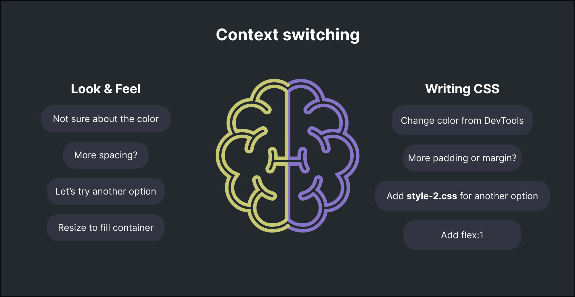
You need to think about the look & feel of a design, and also how to write the CSS for it. This context switching isn’t good (at least for me). I just can’t focus that way.
Here is how my mind looks when I think about the look & feel and writing CSS at the same time.
Let’s suppose that I want to design the following section.
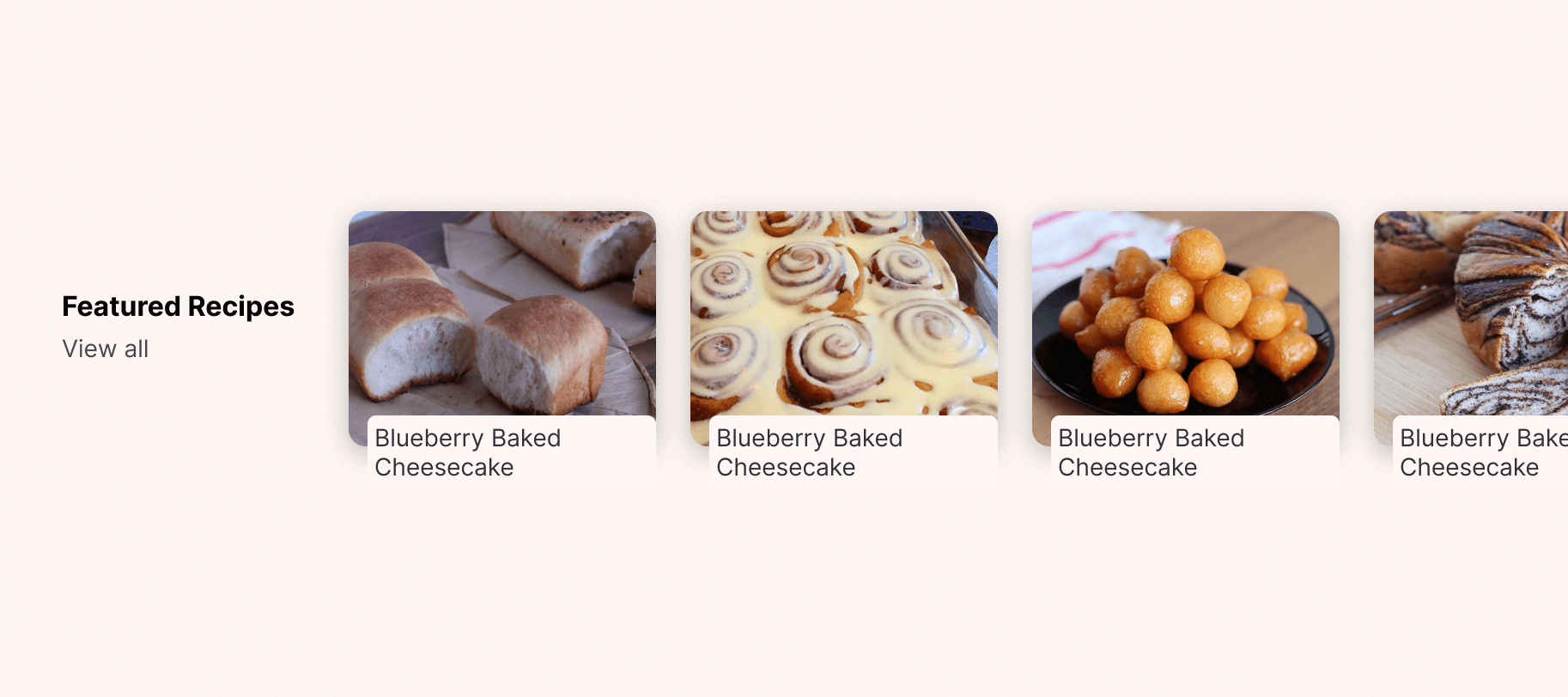
For this kind of layout, I might not be able to decide if the card design is good enough unless I duplicate the card to fill the grid I have.
Here is what I might be thinking about while switching context between design and CSS:
<a> element as a flex wrapper.margin or position?Do you see what I mean? Why answer or even think about such a question while the current goal is to only explore the design in the fastest time possible?
While working in a design tool like Figma, it’s easy and quick to duplicate a canvas and explore another design option. In the browser, we will mostly duplicate the .css file and explore something else, or maybe add a new class and take it from there.
I’m not asking for a web browser to allow us to duplicate pages or anything else, since it doesn’t make sense to me. I prefer to have this feature in design tools only.
Not everyone has a 27” display, so opening the browser DevTools will take so much from the screen estate, and this will affect the workflow of “designing” in the browser.
One solution is to pop out the DevTools into a separate window, but this isn’t a practical solution. You will keep circling between two different windows (The browser tab and the DevTools).
Now that I explored the reasons why designing in the browser doesn’t work for me, let’s get into why I prefer to call it “tweaking” instead.
For me, I see the term “tweaking” much clearer than “designing”. Simply because it doesn’t give false hopes to newcomers, or designers who might think that web browsers are actually design tools.
What I like about tweaking in the browser is the document flow. You change something, its size gets bigger, and it will push its sibling elements down.
While in a design tool, this won’t happen unless you’re using Auto Layout, which can’t be used for everything. Sometimes you simply want to try and experiment quickly with a design.
Consider the following figure. On the left, we have a list of different elements. When one of them gets bigger, the rest will be pushed down.
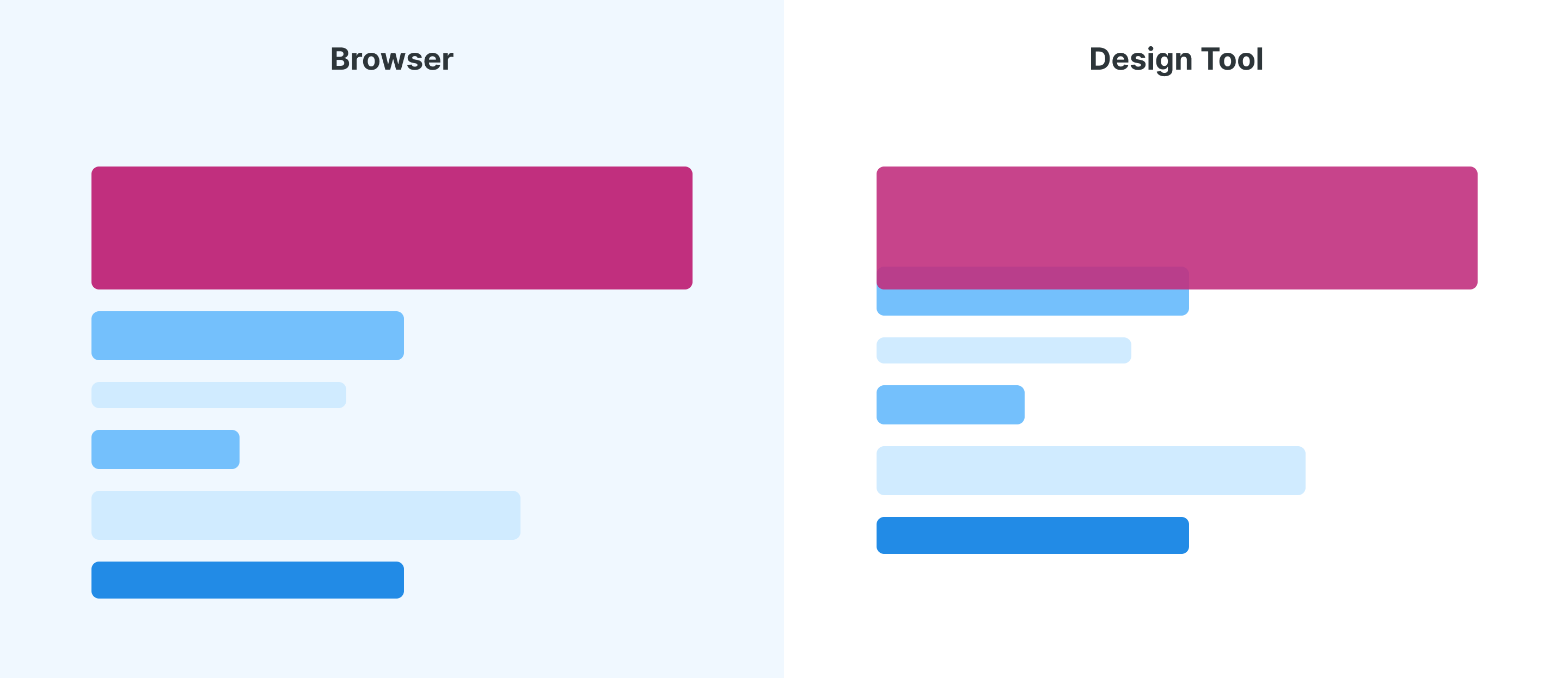
In a design tool, an overlap will happen (Notice how the pink element overlaps with the one under it).
In the following points, I will explore a few cases where I’m a big fan of tweaking in the browser.
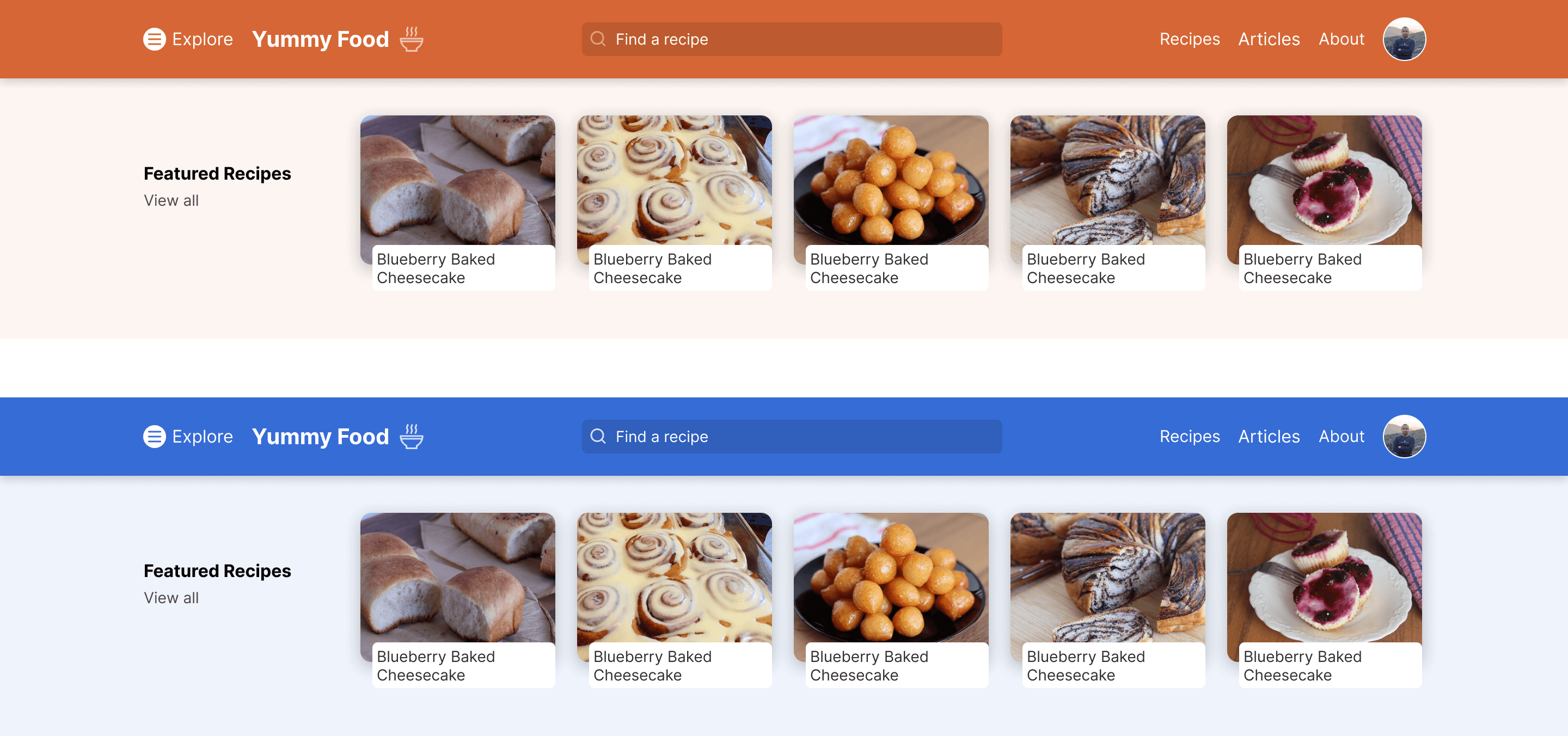
When using CSS variables for everything, we can easily tweak the color values and test different colors until the result is satisfying for us. In a design tool, this is possible, but it’s way less flexible compared to a browser.
Do you see the point? Some things are better to be done in a browser rather than a design tool.
:root {
  --primary: #d66636;
  --secondary: #222;
  --gray-0: #fcf5f2;
}
In design tools, if we’re not using a technique like Auto Layout in Figma, text elements will collapse when we change their size. See the following figure:
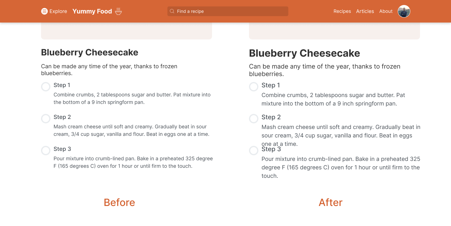
However, When all the fonts are built based on CSS variables, we can simply change a few variables, and the font size will be reflected on all text elements.
:root {
  --text-1: 1rem;
  --text-2: 1.25rem;
}

p {
  font-size: clamp(1rem, 5vw, var(--text-2));
}
Similar to the font size, we might need to test out a few different fonts for a UI. In design tools, this is a nightmare for me, even if I use shared styles and Auto Layout in Figma, it is still an annoying process to do.
Altering the grid layout in a browser is much faster now, given CSS grid has very good browser support! For example, we can use grid-template-areas to name areas in a grid and then alter the child elements based on it.
Consider the following example.
.c-newspaper {
  display: grid;
  grid-template-columns: 0.2fr 0.6fr 0.2fr;
  grid-template-areas:
    "item-1 featured item-2"
    "item-3 featured item-4"
    "item-5 item-6 item-7";
  grid-gap: 1rem;
}

.c-article--1 {
  grid-area: item-1;
}

.c-article--2 {
  grid-area: item-2;
}
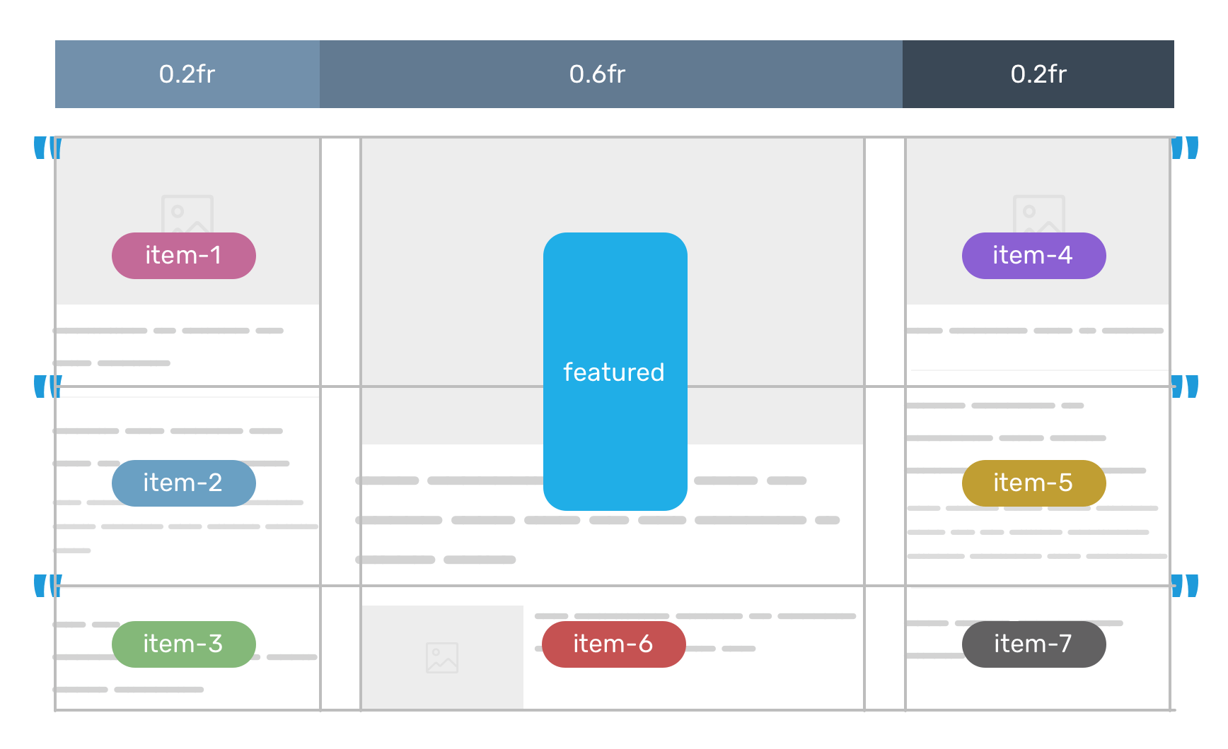
Do you want to try a different placement for a specific component? Easy, just change the grid-area to the area you want. If you’re not familiar with CSS grid areas, I wrote a detailed article on the topic.
How would you implement a responsive type in a design tool like Figma? It’s not possible. By responsive, I mean being able to see how a specific text element is changing based on specific constraints, not for two or three different sizes only.
Here is how I see the current state of design tools vs browsers, in regards to typography.
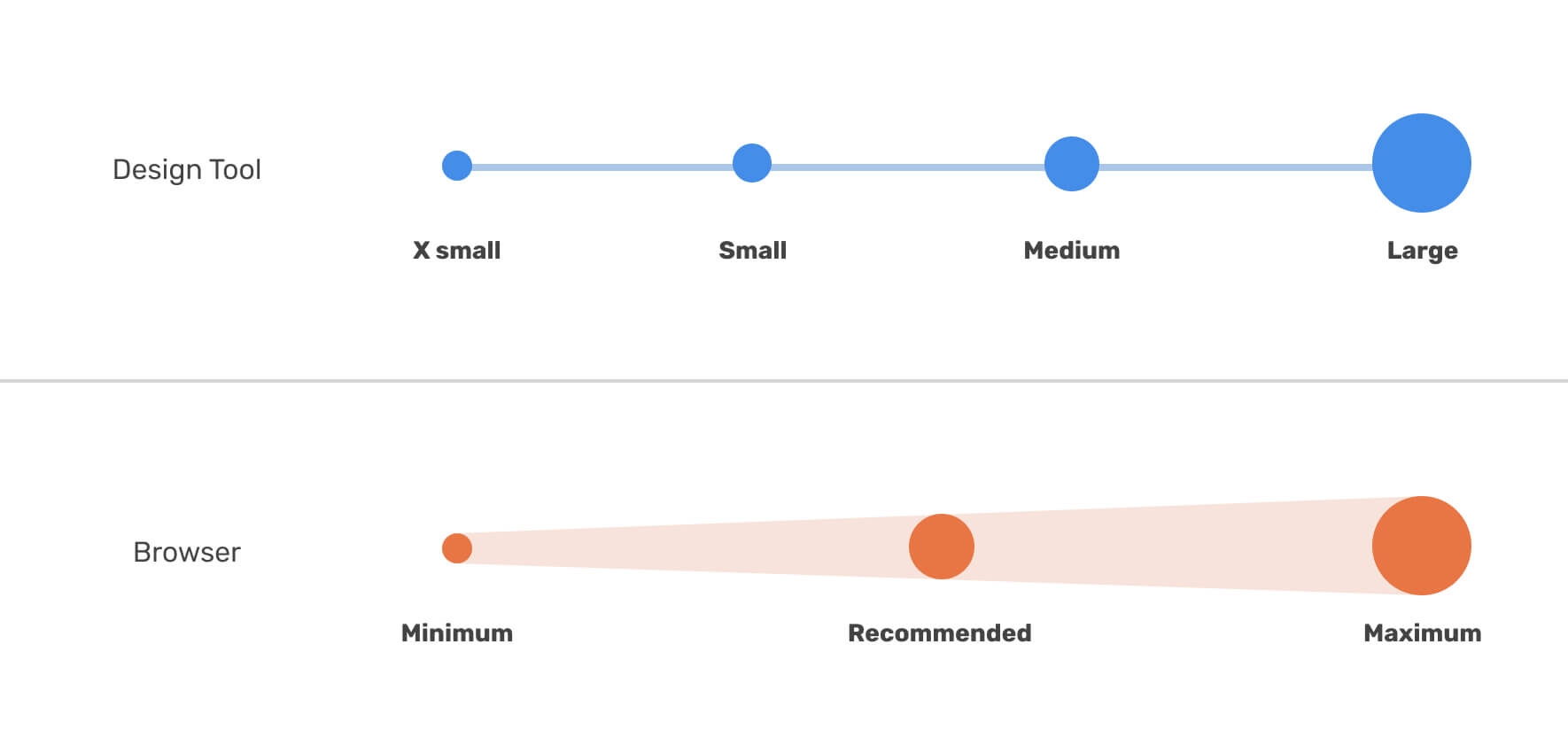
Thanks to CSS comparison functions, we can now do that in CSS by using the clamp() function.
.title {
  font-size: clamp(1rem, (1rem + 5vw), 3.125rem);
}
CSS container queries are being worked on now by Chrome, Edge, and Safari TP. It’s a CSS technique that will allow us to query component based on their container or parent.
For designers, that might change the way how we think and design. For example, instead of providing the developer with 4 different sizes of the home page, we can provide only the component that will have major changes based on the container size.
Consider the following example where we have 4 different versions of a card component.
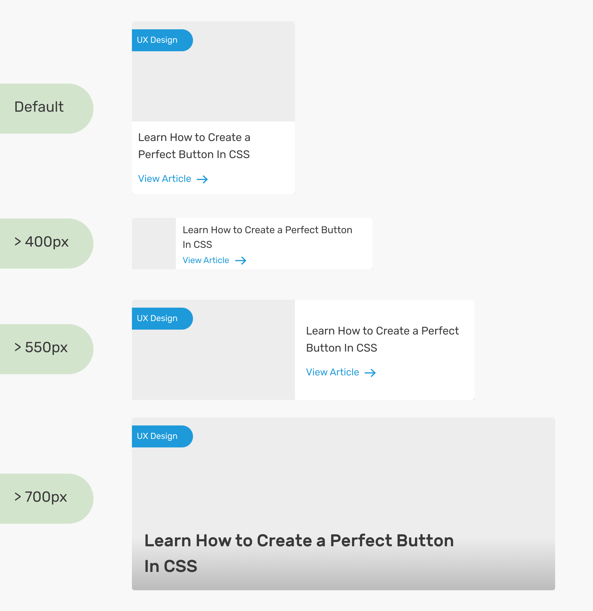
We can also make a diagram of the context of each version. This will help to communicate the design with the development team.
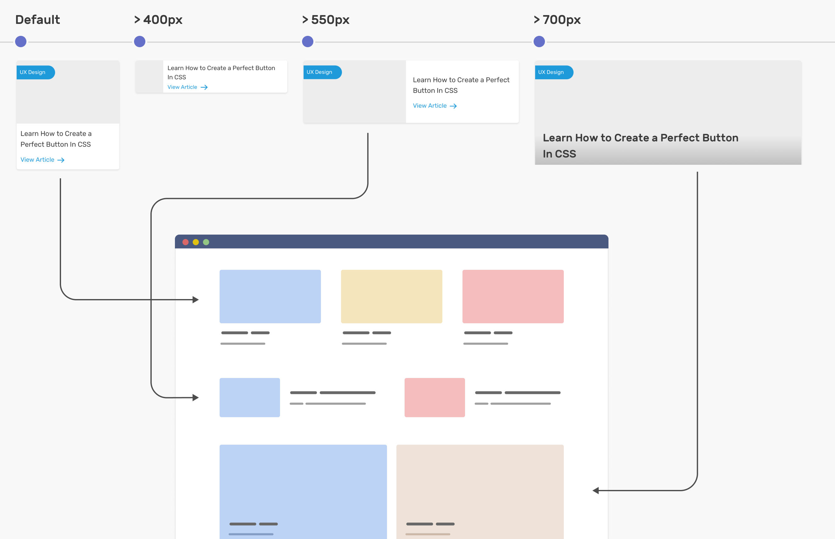
I wrote a deep-dive article on how container queries will be beneficial for designers.
Given that I’m a designer myself, I’ve been asked many times by clients and project managers to deliver two versions of a UI, one for each language. For me, this is a nightmare to work on.
I simply reject that and tell them that I will only provide only the main screens along with the typeface to use and such details.
By using CSS techniques like flexbox, grid, and logical properties, we can switch a design from LTR (left-to-right) to RTL (right-to-left) by only changing the dir attribute on the root element (e.g: <html dir="rtl">).
Consider the following example.
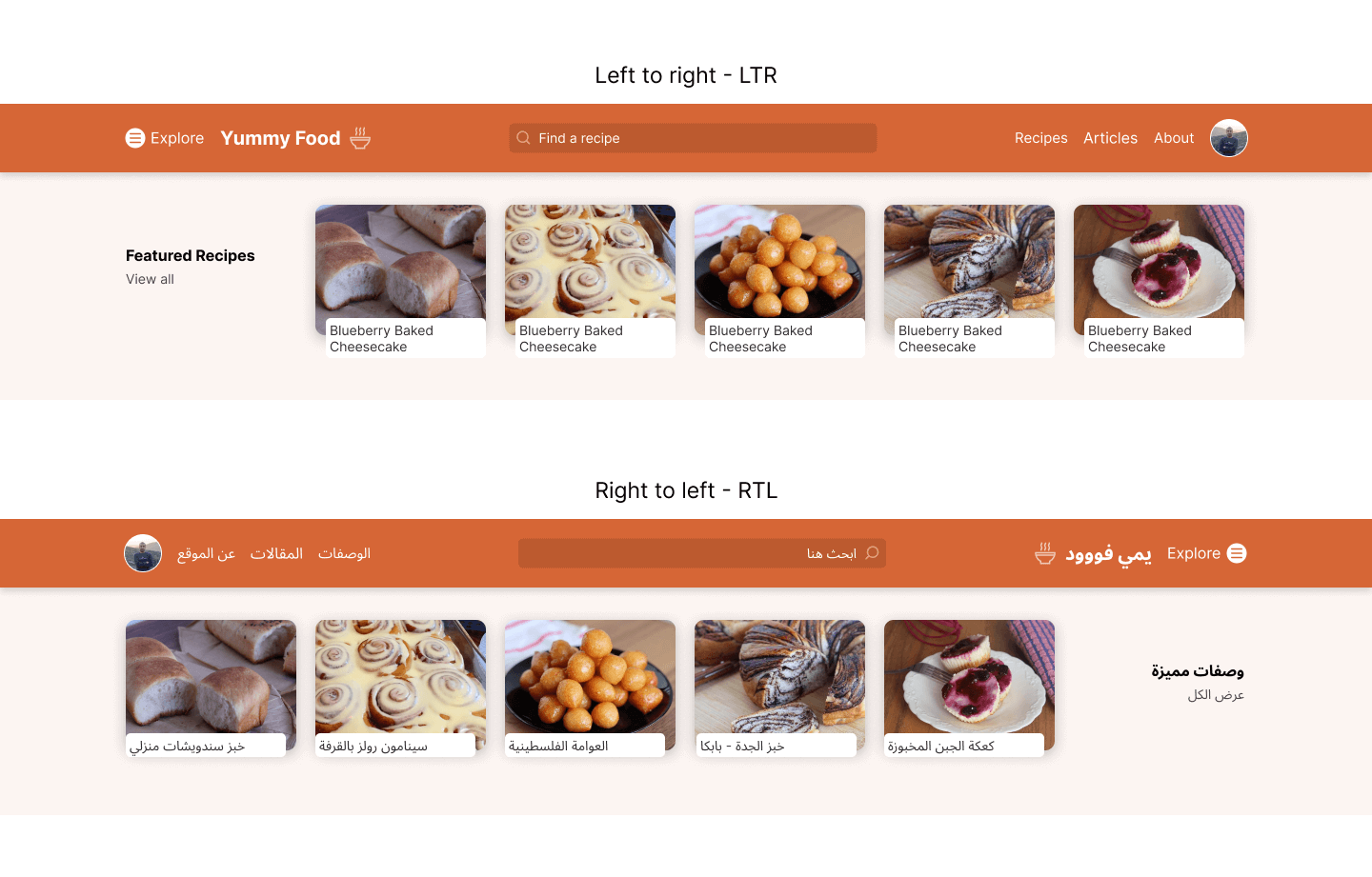
If we’re using flexbox, grid, and logical properties for everything, things will be very straightforward when we want to switch the design direction.
For example, for the search input, we can write the padding as the following:
.input--search {
  padding-inline-start: 2.5rem;
  padding-inline-end: 1rem;
}
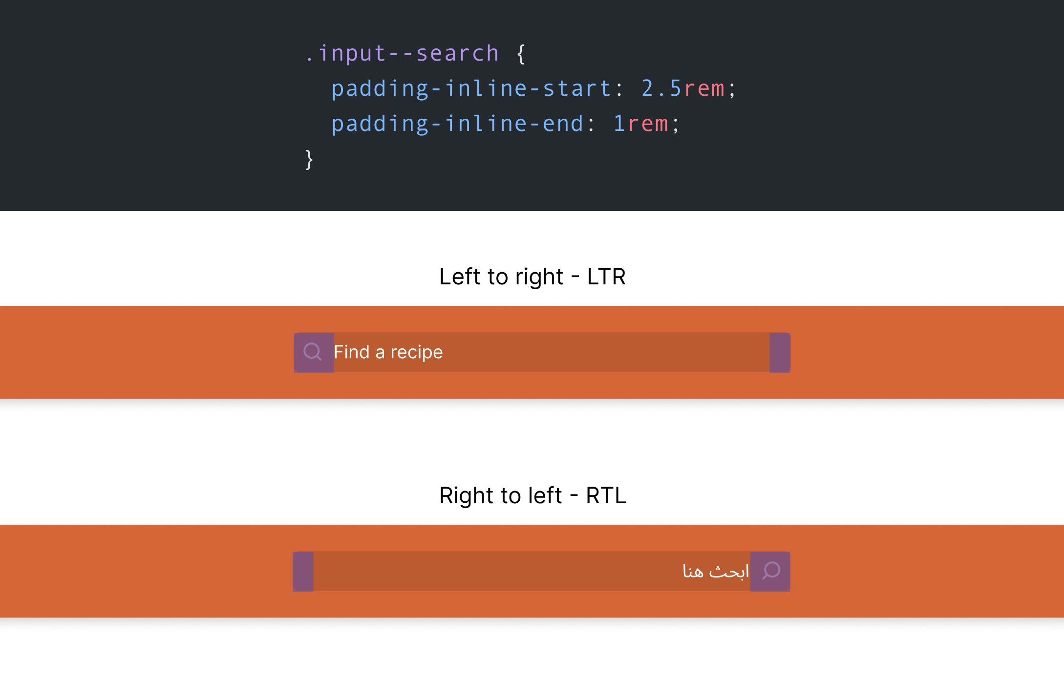
That being said, tweaking a design to make it RTL in the browser is so much easier than doing it in a design tool. If you want to learn more about RTL styling in CSS, here is a guide by yours truly.
I tried to explore and share my perspective on how I use both design tools and browsers to achieve what I need. Sometimes, a design tool is better, and sometimes it’s the browser. The term “tweaking” is so much better, at least for me.
On the other hand, I don’t expect that browsers should have features for designing in the DevTools since this isn’t the browser’s job in my opinion. We have too many features in DevTools already. Design tools are meant to give us the flexibility to try and explore ideas, while web browsers are made to help us achieve the best user experience possible given the constraints and limitations we might have.
此内容由惯性聚合(RSS阅读器)自动聚合整理,仅供阅读参考。 原文来自 — 版权归原作者所有。