


I spent years teaching CSS layout on this blog. I put everything I know into The Layout Maestro course: 70+ lessons and 150+ interactive examples that teach you how to think CSS layouts, not just memorize syntax.
Over the years, we have been used to using CSS pre-processors like Sass for a use case like applying opacity to a pre-defined color. Today, we have a new way to do that and more with CSS relative colors. In this article, I aim to shed the light on that and introduce how it works along with many practical examples.
Let’s dive in.
If I give you a hex color in CSS, how can you modify the opacity of that color?
:root {
  --brand-color: #9c3ce7;
}
One of the options to do that is by using a CSS pre-processor like Sass.
// Sass
$brand-color: #9c3ce7;

.element {
  background-color: rgba($brand-color, 0.5);
}
That works, but is there a vanilla CSS way to do that?
:root {
  /* Initial opacity */
  --brand-opacity: 1;

  /* Initial color */
  --brand-color: rgb(156 60 231 / var(--brand-opacity));
}

.element {
  /* Modified opacity */
  --brand-opacity: 0.5;
  background-color: var(--brand-color);
}
It works, but it’s not the best solution. We need to include the rgb() version of each color in the CSS.
Let’s keep that in mind and explore another problem.
When using colors in CSS, we often need a lighter or a darker variation of a main color. When using absolute values like a hex or an rgb color space, it’s not possible to edit the color until we open a color picker.
While using the absolute color values work, it’s limiting and time consuming. Let’s see an example. We have a primary button. On hover, it should become slightly darker.
With the absolute colors in CSS, we might do something like this:
.btn {
  --btn-bg-color: #9c3ce7;
  --btn-bg-color-hover: #9c3ce7;
  background-color: var(--btn-bg-color);
}

.btn:hover {
  /* A darker color that is picked manually */
  background-color: var(--btn-bg-color-hover);
}
The darker colors were picked by using a color picker in the browser or a design tool like Figma. Here is a demo that showcases that. Try to change the color and see.
Hover
Submit
Pick color
Pick a hover color.
While that works, it’s a process that requires more time and effort even if we only have a few colors to work with.
Another example is where we might need transparency of a color. This has a lot of use-cases, to mention a few:
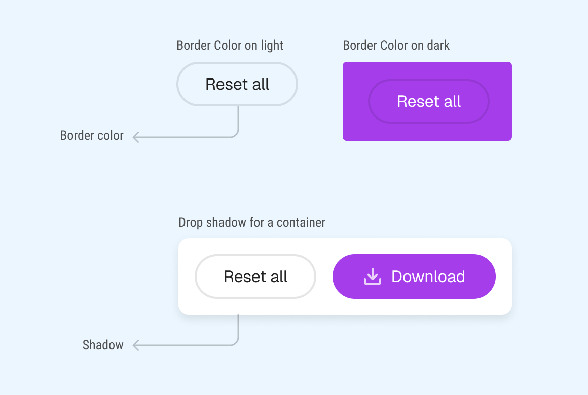
Let’s take the border color as an example and explore how we used to do it in CSS.
Using the rgba() color functions and tweaking the alpha value.
.button {
  /* other styles */
  border-color: rgba(0, 0, 0, 0.1);
}
Using Sass rgba() function to generate the rgba() values of a specified color in hex format.
.button {
  /* other styles */
  border-color: rgba(#000, 0.1);
}

/* The above will compile to */
.button {
  border-color: rgba(0, 0, 0, 0.1);
}
While both of the above methods work, things can get a bit more complicated if you have a color other than black or white.
Relative colors
Baseline 2024 newly available
Supported in Chrome: yes.
 Supported in Edge: yes.
 Supported in Firefox: yes.
 Supported in Safari: yes.

Since September 2024 this feature works across the latest devices and browser versions. This feature might not work in older devices or browsers.
In CSS, we can now generate a color that is relative to another color. How does it work? Let’s find out.
Let’s explore how the syntax works. To use relative colors, we need to specify the following:
/* ****** */
/* Relative Color Syntax */
color-function(from origin-color channel1 channel2 channel3 / alpha(optional))
/* ****** */
For example, if we want to have a black color with 10% transparency, we do the following:
.button {
  /* other styles */
  border-color: rgb(from #000 r g b / 0.1);
}
Let’s learn about the syntax in the following section.
At first, it might look a bit weird or unclear, but that’s okay. You’re here to learn. I built the following interactive visual that helps in matching the syntax vs the actual CSS.
Try to hover on the syntax and explore it yourself.
color-function(fromorigin channel1 channel2 channel3/alpha)
rgb(from#000rgb/0.1)
In plain words, it’s like saying:
Get the rgb values from `#000` and change the alpha to `0.1`
In the following example, we have a button with a transparent border color. See how we can adjust the color by using relative colors.
Try to increase or decrease the alpha value to see how it works.
Get me an RGB color from the hex one and set its alpha to 0.10%.
color-function(from origin channel1 channel2 channel3 / alpha)
Using relative colors will make our job much easier and more straightforward.
We can use calc() with relative colors to modify any of the color channels.
This is an example of creating a color scale using hsl() color function. All we need to change is the lightness channel.
See the following CSS. What does the calc(l + 10) do? It takes the current lightness channel value and adds 10 to it. This will make the color lighter.
.color-item {
  background-color: hsl(from #9333ea h s calc(l + 10));
}
We can do the opposite and make the color darker by subtracting 10 from the lightness channel value.
background-color: hsl(from #9333ea h s calc(l - 10));
See the following demo:
While we can get relative colors with hsl(), in some cases, the perceived color doesn’t look good to the human eye.
In the following demo, we have two colors with the same lightness but a different hue.
Notice how the green color looks too bright compared to the red, even though they have the same lightness.
hsl(from var(--brand) h s l)
hsl(from var(--brand) calc(h + 90) s l)
If we use the new-ish lch() color space, the green looks similar in brightness compared to the red one.
lch(from var(--brand) l c h)
lch(from var(--brand) calc(h + 90) c h)
This is because the lch() color space is designed for human perception, not screens. With that in mind, we can use relative colors with lch() to get colors that are more consistent.
In a real-world example, this problem can shine even more when we want to maintain the same contrast ratio for accessibility.
There is also a color space called oklch(), it solves a few problems of lch(). If you want to learn more, here is an article on Evil Martians. Throughout this article, I will use oklch() more.
I will share a few examples later in this article.
When using relative colors, the computed color for hsl() remains in the sRGB color space. But for new color spaces like lch() and oklch(), the computed color remains in their color space.
Take a look at the following example:
color-mix()
Baseline Widely available
Supported in Chrome: yes.
Supported in Edge: yes.
Supported in Firefox: yes.
Supported in Safari: yes.
This feature is well established and works across many devices and browser versions. It’s been available across browsers since May 2023
Since the support for relative colors is relatively new, we can use color-mix() as a fallback to:
In the following example, I’m using color-mix() to adjust the opacity of a color.
.button {
  border-color: color-mix(in srgb, #000 10%, transparent);
}
Check the following demo and play with the opacity input.
Mix 10% black with transparency.
color-mix(method, color1 percentage, color2, percentage)
color-mix(in srgb,
%, transparent)
In this example, I used color-mix() to get a darker variation of a color. We need to mix the color with a percentage of black.
.button:hover {
  background-color: color-mix(in srgb, #8136ba, black 10%);
}
Check out the following interactive demo.
Mix the button color with 10% black to create a darker hover state.
color-mix(in srgb, color1, color2 percentage)
color-mix(in srgb,
, black %)
I’m fine with either color-mix() or relative colors. At the end, it depends on the use-case and the browser support for our intended audience.
We can use a feature query to fallback to color-mix(). Here is an example that fallbacks to color-mix() if relative colors aren’t supported.
.button {
  border-color: color-mix(in srgb, #000 10%, transparent);

  @supports (color: rgb(from #000 r g b / 0.1)) {
    border-color: rgb(from #000 r g b / 0.1);
  }
}
Now that you know how the syntax works and how to fallback with color-mix(), let’s explore some use-cases.
Often, we need to apply opacity to a color. This is fairly straightforward with relative colors.
.button {
  border-color: rgba(from #000 r g b / 0.1);
}
In the following example, the “Cancel” button has a translucent border color. It can work with different background elements.
Get me an RGB color from the hex one and set its alpha to 0.1.
Hue271°
We can change the border color to white, too. In the following variation:
0.2Get me an RGB color from the hex one and set its alpha to 0.2.
Hue210°
A common UI effect is taking the dominant color of an image, then applying it as a gradient.
In this example, I’m using a package called Fast Average Color to get the dominant color, then I use it with relative color to reduce its opacity/alpha value.
Play with the alpha value in the following demo, or change the image.
Get me an RGB color from the hex one and set its alpha to 0.95.
Change the image




More espresso, less depresso.
Here is the CSS:
.hero {
  --color: #706f71;
  --gradient-fade: rgb(from var(--color) r g b / 0.95);

  &:after {
    background-image: linear-gradient(
      120deg,
      var(--gradient-fade) 45%,
      transparent
    );
  }
}
I love this. No need for Sass anymore.
In 2016, I wrote about using rgba() colors for CSS Tricks, and now, I would like to revisit this topic but with relative colors instead.
In the following demo, I built a Trello-like header with a dynamic background color:
in this example, I have elements with different background colors, and I want to apply a colored shadow to them. I can use relative colors to generate the shadow color dynamically.
Here is the HTML, each item has its background color set via a CSS variable.
<div class="items">
  <div class="item" style="--bg: #fff;"></div>
  <div class="item" style="--bg: #7678ed"></div>
  <div class="item" style="--bg: #3d348b"></div>
  <!-- ... -->
</div>
In CSS, I used that variable in another CSS variable to generate the shadow color. Take a look:
.item {
  /* other styles */
  --shadow-color: rgb(from var(--bg) r g b / 0.85);
  box-shadow:
    0 5px 10px 0 var(--shadow-color),
    0 15px 30px 0 var(--shadow-color);
}
Here is an interactive demo. Try to change the alpha value to see how it works.
box-shadow: rgb(from var(--bg) r g b / 0.85)
--bg: #7678ed
--bg: #f7b801
--bg: #f35b04
In this example, we have a modal with a backdrop to separate the modal content from the page. To do this, I used relative colors.
.modal {
  background-color: rgb(from #000 r g b / 0.1);
}
Here is the interactive demo. Try to change the alpha value to see how it works.
Delete account
Are you sure you want to delete your account? This action cannot be undone.
In this example, I have a modal with a border and a line that separates its sections. I used relative colors to get the color of the border and the line.
Here is the CSS:
:root {
  --outline-color: #222;
  --outline-alpha: 0.15;
  --outline: rgb(from var(--outline-color) r g b / var(--outline-alpha));
}

.dark {
  --outline-color: #f3f5f7;
  --outline-alpha: 0.2;
}

.modal {
  border: 1px solid var(--outline);
}

.separator {
  background-color: var(--outline);
}
Here is an interactive demo that showcases the above CSS:
--outline-color: rgb(from #f3f5f7 r g b / 0.20)
Bio
Designer. Author of Debugging CSS. Lifelong Learner.
Link
https://ishadeed.com/
Done
With the hsl() color function, we can easily generate a lighter color by using the l channel. In this example, we have a button that I want to make darker on hover.
What’s great about relative colors is that we can use CSS calc() to modify any of the color channels.
For example, this snippet shows modifying the lightness channel to make the color darker.
.button:hover {
  background-color: hsl(from #9c3ce7 h s calc(l - 20));
}
See the following demo and try to change the lightness value.
hsl(from
Pick color
#9c3ce7 h s calc(l -))
Get me an HSL color from the hex one and reduce its lightness by 20.
Computed HSL:
What’s powerful about this is that we don’t need to know the hsl() values of the original color. We can just pass the hex value as the origin color and let the browser do the rest.
Similar to the previous example, we can use relative colors to generate a lighter color. In this example, I just changed the minus to a plus.
hsl(from
Pick color
#9c3ce7 h s calc(l +))
Get me an HSL color from the hex one and increase its lightness by 20.
Computed HSL:
Say we have a list of tags. Their brightness is the same but the hue is different. We can use relative colors to generate them for us, but there is an interesting detail. Let’s find out.
When using hsl() colors, the contrast ratio is not consistent. The reason is that the lightness in HSL isn’t perceptually uniform. That means, two colors with the same lightness can appear different to the human eye.
Here is a demo with HSL colors:
HSL colors
Meat❌ N/A
Fish❌ N/A
Rice❌ N/A
Eggs❌ N/A
Milk❌ N/A
Cake❌ N/A
Tea❌ N/A
Nuts❌ N/A
Contrast ratio for AA
However, in the oklch() color space, the lightness is perceptually uniform. That means colors with the same lightness will have (almost) the same contrast ratio.
I did a test to check the AA contrast ratio for each.
OKLCH colors
Meat❌ N/A
Fish❌ N/A
Rice❌ N/A
Eggs❌ N/A
Milk❌ N/A
Cake❌ N/A
Tea❌ N/A
Nuts❌ N/A
Contrast ratio for AA
Notice how the contrast ratio is significantly better than the HSL colors.
What if we could use a text color based on the background color? We can do that with relative colors by altering the lightness and chroma values.
Here is an example:
.tag {
  color: oklch(from var(--brand-1) 1 0.1 calc(h + 90));
  background-color: oklch(from var(--brand-1) l c calc(h + 90));
}
This can yield interesting results. The text color will look more related to the background color.
In the demo below, try to:
oklch() and hsl()The key findings from this demo are:
hsl()oklch(), the ratio is consistent with and without the custom text colorIn oklch() color space, we can grayscale a color by setting the chroma to 0. In this example, I wanted to style a disabled button.
First, I created a CSS variable for the chroma and used that in the oklch() color function. If the button is disabled, I set the chroma to 0.
.btn {
  --chroma: c;
  background-color: oklch(from var(--brand-1) l var(--chroma) h);
}

.btn[disabled] {
  --chroma: 0;
  cursor: not-allowed;
}
See the following demo:
.btn {
--chroma: c;
background-color: oklch(from var(--brand-1) l var(--chroma) h);
}
.btn:hover {
--chroma: 0.5;
}
.btn[disabled] {
--chroma: 0;
cursor: not-allowed;
}
While that works, we might need to have a much lighter gray color. To achieve that, we can play with the lightness value.
.btn[disabled] {
  --chroma: 0;
  background-color: oklch(from var(--brand-1) calc(l + 0.25) var(--chroma) h);
}
I recently saw the new TechCrunch design and I spotted a UI effect that I found interesting. Take a look:

There are multiple variants of the main green color. We can create them dynamically using relative colors. Here is a demo. Try to change the hue value and see what happens.
Newsletter
This is some random content.
This is some random content.
This is some random content.
This is some random content.
.separator {
--h-value: 0;
background-color: oklch(from var(--primary-color) 0.45 c h);
}
.separator:after {
background-color: oklch(
from var(--primary-color) calc(l + 0.07) calc(c + 0.05) h
);
}
.separator:before {
background-color: oklch(
from var(--primary-color) calc(l + 0.4) calc(c * 0.4) h
);
}
I played with the values of lightness and chroma to get the color needed. What’s great about using oklch() is that the lightness will be consistent no matter what the hue value is.
In this example (inspired by TechCrunch), I used relative colors to get the complementary color of the main color.
.section {
  --sep-primary-color: oklch(from #5631ea l c calc(var(--h-value)));
  --secondary-color: oklch(
    from var(--sep-primary-color) calc(l + 0.8) calc(c - 0.03) calc(h + 210)
  );

  &:after {
    /* Bottom separator */
    background-color: var(--secondary-color);
  }
}

.sectionTitleIcon {
  background-color: var(--secondary-color);

  svg {
    color: var(--sep-primary-color);
  }
}
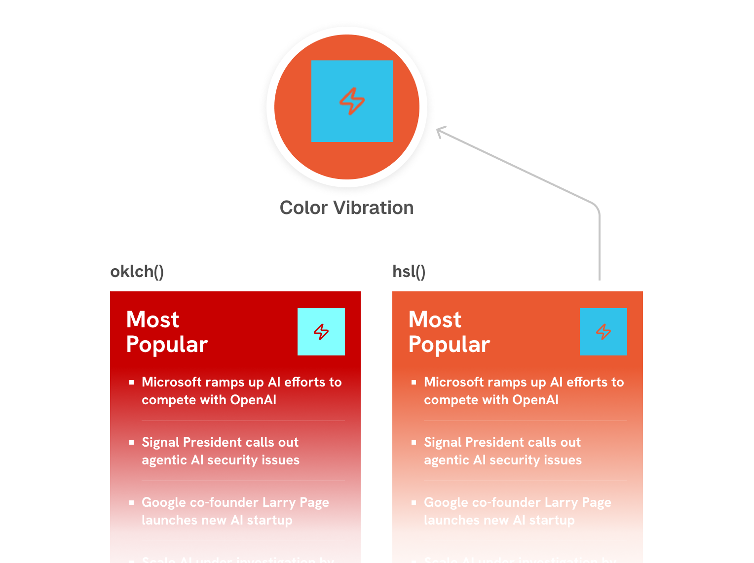
Here is a side-by-side comparison of using oklch() and hsl().
oklch()
Most
Popular
hsl()
Most
Popular
Using oklch() provides a much more consistent colors and contrast ratio. Notice how the colors in hsl() are sometimes too bright and the text is hard to read.
Not only that but using hsl() can cause a problem called color vibration.
Color vibration is a visual flickering effect that happens when using two highly saturated colors on top of each other.
I included a screenshot of the problem below. Please note that the screenshot might cause discomfort or visual strain
Color Vibration
CSS relative colors provide us with a new way to generate colors dynamically. It’s still relatively new, but that shouldn’t stop you from trying it today. I even haven’t explored all the uses-cases yet (e.g: color palettes), and preferred to focus on the most practical ones that I personally find useful.
I hope that you enjoyed this article. Thank you for reading.
A few links helped to answer some questions while I was researching the article’s topic.
此内容由惯性聚合(RSS阅读器)自动聚合整理,仅供阅读参考。 原文来自 — 版权归原作者所有。