


I spent years teaching CSS layout on this blog. I put everything I know into The Layout Maestro course: 70+ lessons and 150+ interactive examples that teach you how to think CSS layouts, not just memorize syntax.
While surfing the web, I noticed an old navigation design that dates back to 2010. I used to design such things on Photoshop that are rich with shadows, gradients, backgrounds and separator lines. They are called Skeuomorphic designs.
Today, in 2019, I would take you into how I would approach and build the navigation below in HTML&CSS, without using images.

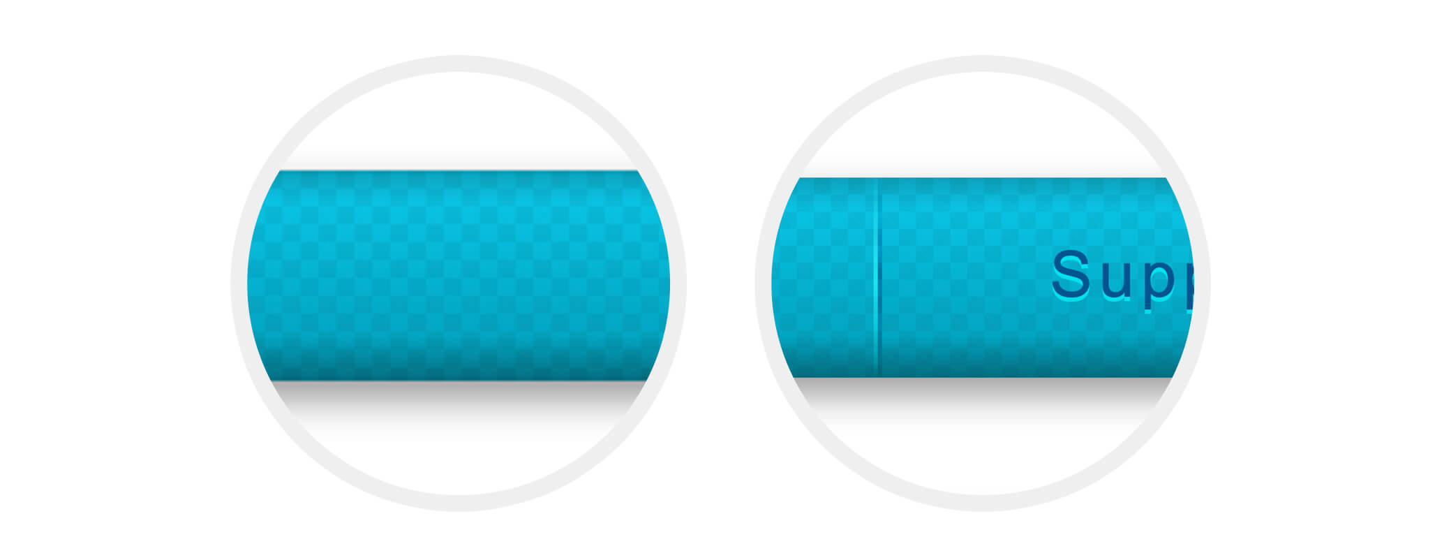
Zooming in a bit..
In this article, I will explain the following:
mix-blend-modeAs you may already noticed, there is a checkerboard pattern in the background. In order to build this, I need to have multiple CSS gradients. Here is the code used:
$direction: 45deg;

div {
  width: 300px;
  height: 200px;
  background-color: #fff;
  background-image: linear-gradient(
      $direction,
      green 25%,
      transparent 0,
      transparent 75%,
      green 0,
      green
    ), linear-gradient($direction, blue 25%, transparent 0, transparent
        75%, blue 0, blue);
  background-size: 50px 50px;
  background-position:
    0 0,
    25px 25px;
  background-repeat: repeat;
}
The Result
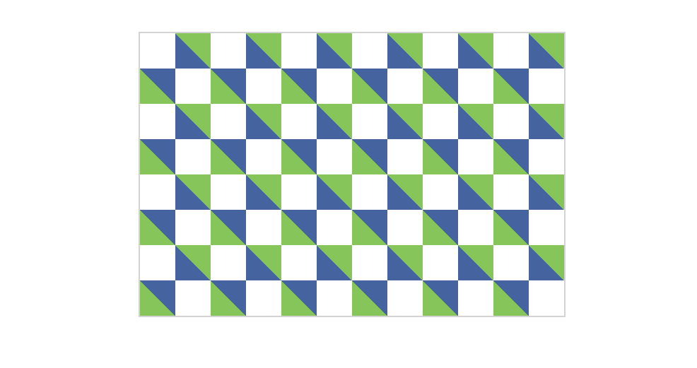
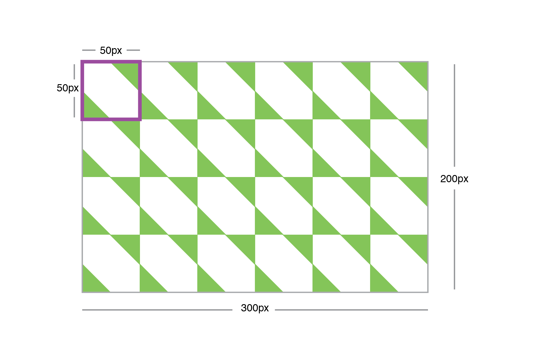
As a start, I will break down the above into one small square as below.
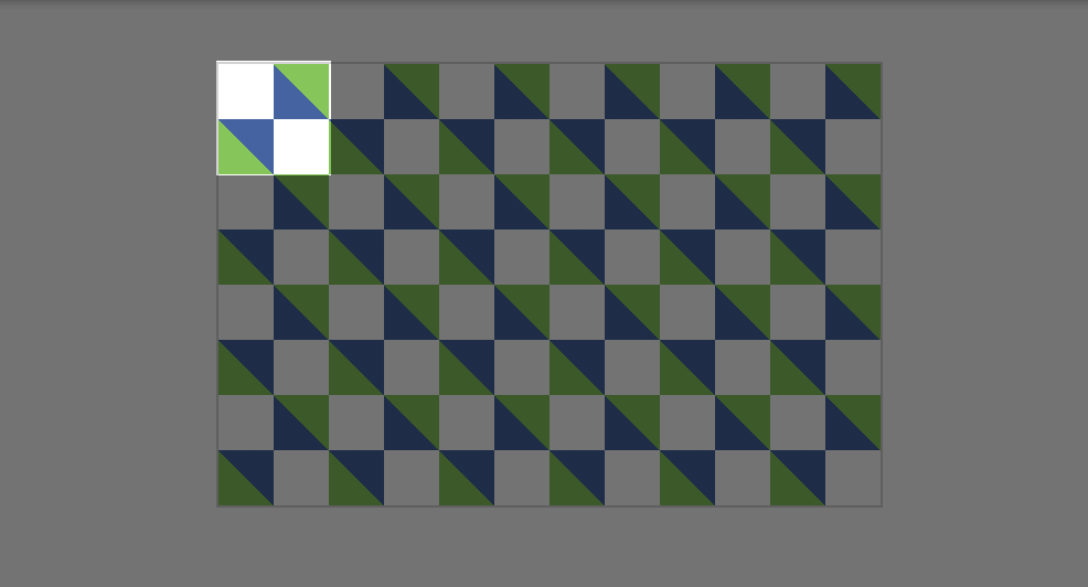
The first gradient starts from zero to 25%, which is green. Then, it continue from 25% to 75%, which is blue. Finally, it goes 75% to 100% in green.
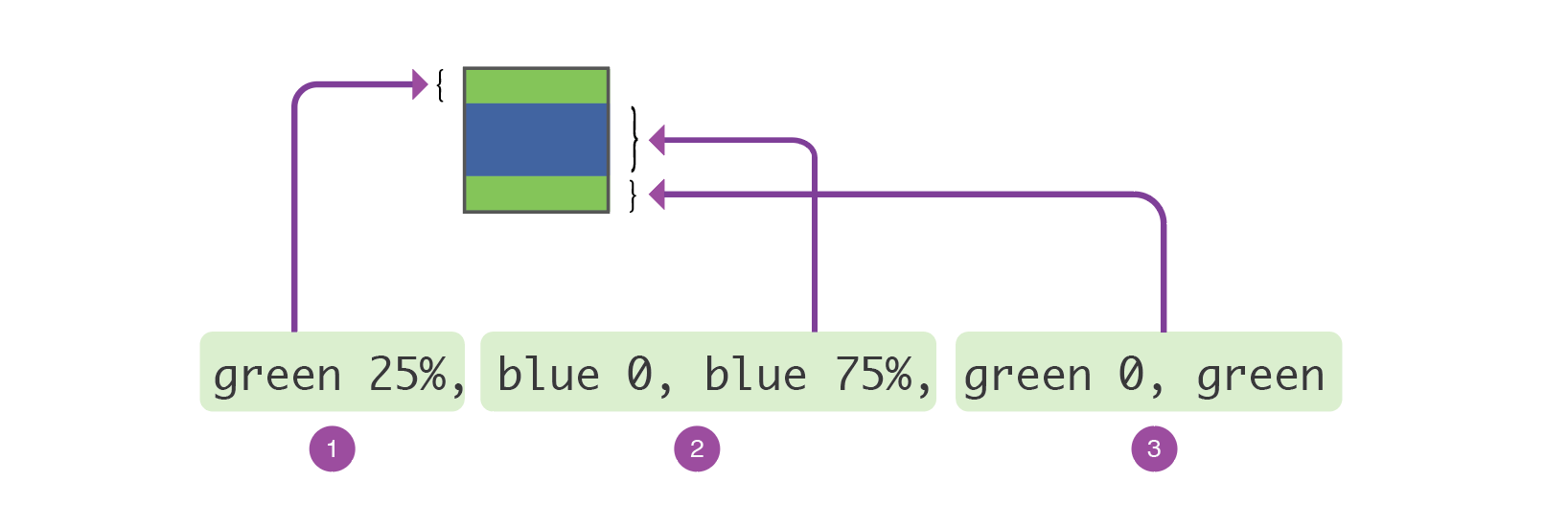
What does zero mean in the gradient? It’s a keyword for informing CSS to continue from the last percentage. For example, if we have linear-gradient(red 20%, blue 0, blue 50%.
The value 0 is equal to 25%. Adding it will ensure that the transition from a color to another is sharp.
Once that is done, it’s time to rotate the gradient by adding a degree.
linear-gradient($direction, green 25%, transparent 0, transparent 75%, green 0, green)
Where $direction equal 45 degrees.

The blue color were added for explanation purposes, I will replace it with transparent. Here is the current result:

I need to define a size (width & height) for the gradient, and also make it repeat.
$direction: 45deg;

div {
  background-image: linear-gradient(
    $direction,
    green 25%,
    transparent 0,
    transparent 75%,
    green 0,
    green
  );
  background-size: 50px 50px;
  background-repeat: repeat;
}
Thankfully, we don’t need to define background-repeat since this is the default behaviour.
The blue gradient is exactly the same as the green one, except the color and position.
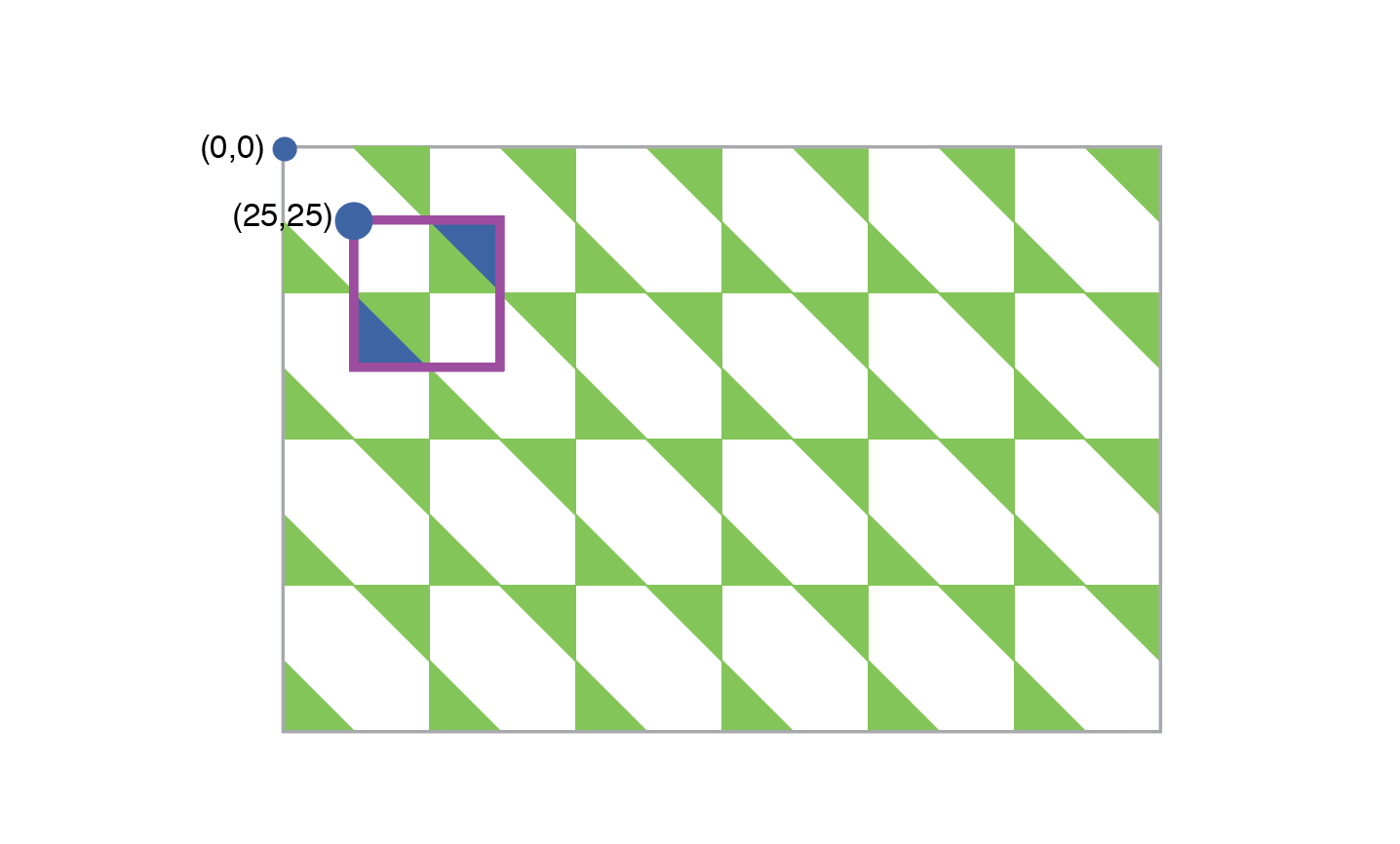
All CSS Background properties can handle multiple values. I will use that to position the blue gradient 25px from the top and left sides.
div {
  background-image: linear-gradient(
      $direction,
      green 25%,
      transparent 0,
      transparent 75%,
      green 0,
      green
    ), linear-gradient($direction, blue 25%, transparent 0, transparent
        75%, blue 0, blue);
  background-size:
    0 0,
    50px 50px;
  background-position:
    0 0,
    25px 25px;
}
0 0 is for the green one, and 25px 25px is for the blue.
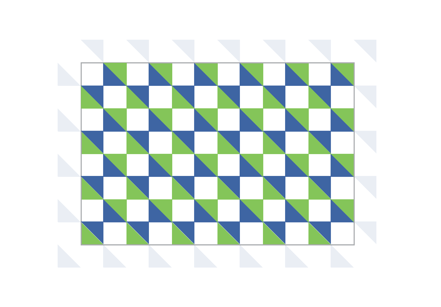
Once that is repeated, it will look like the below.
CodePen Demo
See the Pen Checkerboard by Ahmad Shadeed (@shadeed) on CodePen.
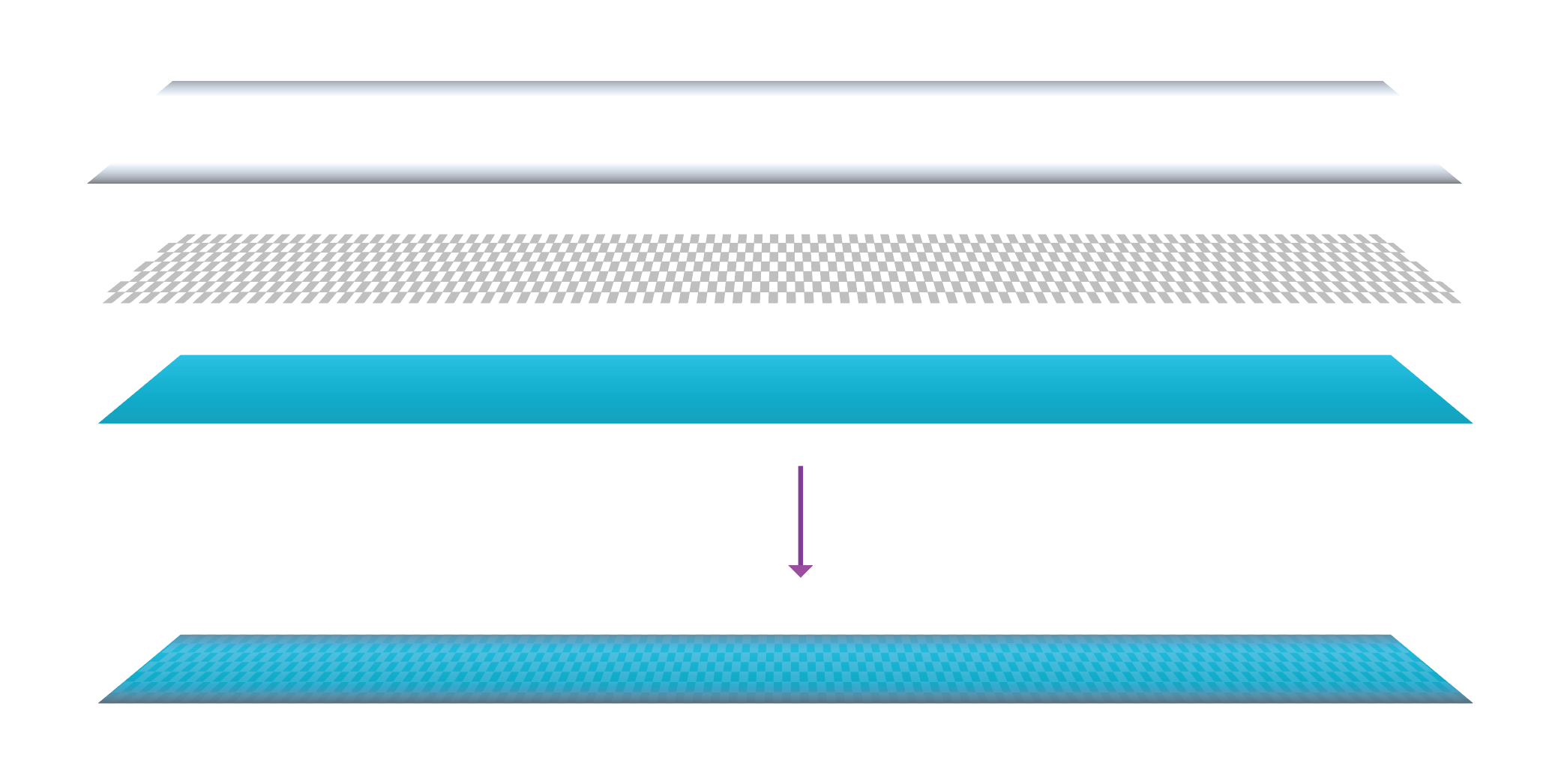
Here are the elements of the CSS background (From bottom to top):
I will add the above gradients in the same order in CSS.
ul {
  background-image:
  /*[1]*/
    linear-gradient(rgba(0, 0, 0, 0.2), transparent),
    /*[2]*/ linear-gradient(to top, rgba(0, 0, 0, 0.3), transparent),
    /*[3]*/ linear-gradient(45deg, rgba(0, 0, 0, 0.05) 25%, transparent
          0, transparent 75%, rgba(0, 0, 0, 0.05) 0, rgba(0, 0, 0, 0.05)),
    /*[4]*/ linear-gradient(45deg, rgba(0, 0, 0, 0.05) 25%, transparent
          25%, transparent 75%, rgba(0, 0, 0, 0.05) 75%, rgba(0, 0, 0, 0.05)),
    /*[5]*/ linear-gradient(var(--color-1), var(--color-2));
  background-size:
    100% 7px,
    100% 10px,
    8px 8px,
    8px 8px,
    100%;
  background-position:
    top,
    bottom,
    0 0,
    4px 4px,
    100%;
  background-repeat: repeat-x, repeat-x, repeat, repeat, repeat;
}
Each CSS gradient from the above has a commented number, I tried to explain what each one do.
The one at the top of the navigation. It has a width of 100% and a height of 7px.
The one at the top of the navigation. It has a width of 100% and a height of 10px.
Which is similar to the green one in our example above.
Which is similar to the blue one in our example above.
A regular gradient.

That doesn’t look good. Let’s solve that!
ul {
  display: flex;
  flex-wrap: wrap;
  list-style: none;
}

li {
  flex-grow: 1;
}

a {
  display: block;
  text-decoration: none;
  letter-spacing: 1.5px;
  font-size: 15px;
  padding: 14px 0 16px;
  text-shadow: 0 1px 0 rgba(#00edf4, 0.8);
}
I used Flexbox to divide the available space equally between the navigation items.


I used to create this separator in Photoshop 10 years ago. There are two lines, one of them is white and the other is black. Notice how each line start from the center and is fading on the top and bottom sides.
How can we make this in CSS?
The first thing I thought about is using pseudo elements. Each <a> element except the first child will have an :before pseudo element. Each <a> element except the last child will have an :after element.
li {
  &:not(:first-child) {
    a {
      &:before {
        content: "";
        position: absolute;
        left: 0;
        top: 0;
        bottom: 0;
        width: 1px;
        background: #000;
      }
    }
  }

  &:not(:last-child) {
    a {
      &:after {
        content: "";
        position: absolute;
        right: 0;
        top: 0;
        bottom: 0;
        width: 1px;
        background: #fff;
      }
    }
  }
}
The result

Notice that we have solid lines and they’re not blending with the blue-ish background. How to make them fade and blend?
Well, I will use CSS Radial Gradients to create a fading effect for each line.
li {
  &:not(:first-child) {
    a {
      &:before {
        /*Other styles*/
        width: 10px;
        background: radial-gradient(
          circle 25px,
          rgba(#000, 1) 0,
          transparent
        );
      }
    }
  }

  &:not(:last-child) {
    a {
      &:after {
        /*Other styles*/
        width: 10px;
        background: radial-gradient(
          circle 25px,
          rgba(#fff, 1) 0,
          transparent
        );
      }
    }
  }
}

For explanation purposes, I gave a width of 10px to each line so you can clearly see the effect. Notice how the top and bottom edges are fading.
How to blend them with the background?
The first thing I thought about is CSS mix-blend-mode: overlay and opacity. This made it blend really well!
li {
  &:not(:first-child) {
    a {
      &:before {
        /*Other styles*/
        mix-blend-mode: overlay;
        opacity: 0.65;
      }
    }
  }

  &:not(:last-child) {
    a {
      &:after {
        /*Other styles*/
        mix-blend-mode: overlay;
        opacity: 0.65;
      }
    }
  }
}
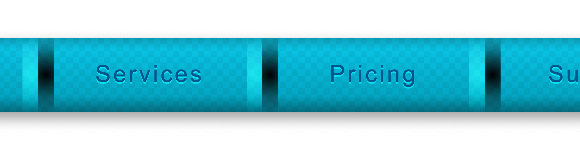
After resetting the width of each line to 1px, we’ll get a smooth separator line that blends with its background.

Check out the CodePen demo:
See the Pen Old Nav by Ahmad Shadeed (@shadeed) on CodePen.
Thank you for reading.
{% include share.html text = “Building An Old Nav Design” link = “https://ishadeed.com/article/building-an-old-nav-design/” %}
此内容由惯性聚合(RSS阅读器)自动聚合整理,仅供阅读参考。 原文来自 — 版权归原作者所有。