


I spent years teaching CSS layout on this blog. I put everything I know into The Layout Maestro course: 70+ lessons and 150+ interactive examples that teach you how to think CSS layouts, not just memorize syntax.
When I encounter a new product, one of the first things that comes to mind is how they implemented the CSS. This was no different when I came across Threads by Meta. I quickly explored the mobile app and noticed that I could preview public posts on the web.
This presented an opportunity for me to dig deeper. I came across a few interesting findings, which I will discuss in this article.
Let’s dive in!
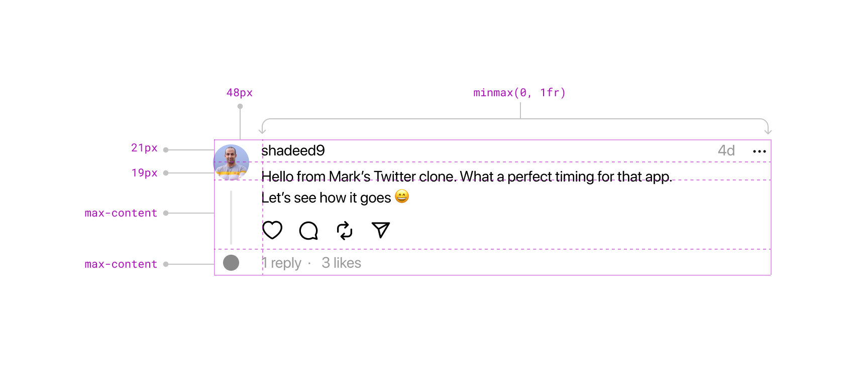
One of the most noteworthy use cases of CSS Grid in a production app is found in Threads. CSS Grid is used to build the post layout.
Take a look:
:root {
  --barcelona-threadline-column-width: 48px;
}

.post {
  display: grid;
  grid-template-columns:
    var(--barcelona-threadline-column-width)
    minmax(0, 1fr);
  grid-template-rows: 21px 19px max-content max-content;
}
Fun fact: the first grid column is named --barcelona. I’m curious to know the reason behind this choice.
The post layout consists of a 2-column * 4-row grid. There is no main container; each item within the post is manually placed using the grid-column and grid-row properties.
.post-avatar {
  padding-top: 4px;
  grid-row: 1 / span 2;
  grid-column: 1;
}
The avatar is positioned in the first column and spans the first two rows. It’s worth noting the presence of padding-top. Although I couldn’t find a specific reason for it in the production code, it seems to be fine-tuning the UI alignment.
Here is a before & after look for an avatar with and without the padding-top treatment:
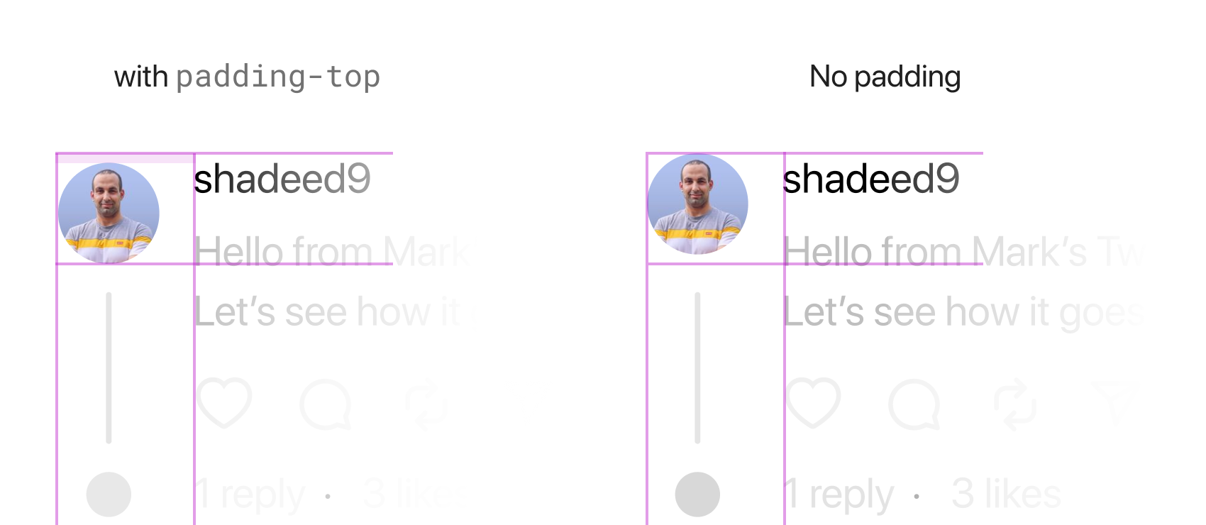
The other reason for applying the padding-top here could be to push the avatar all the way down and make it closer to the line.
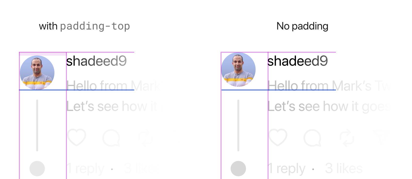
Why use 21px and 19px as row values? After inspecting further, it seems to be a form of fine-tuning for the UI. The sum of the row heights is 40px, which accounts for the avatar height plus the padding-top (36px + 4px).
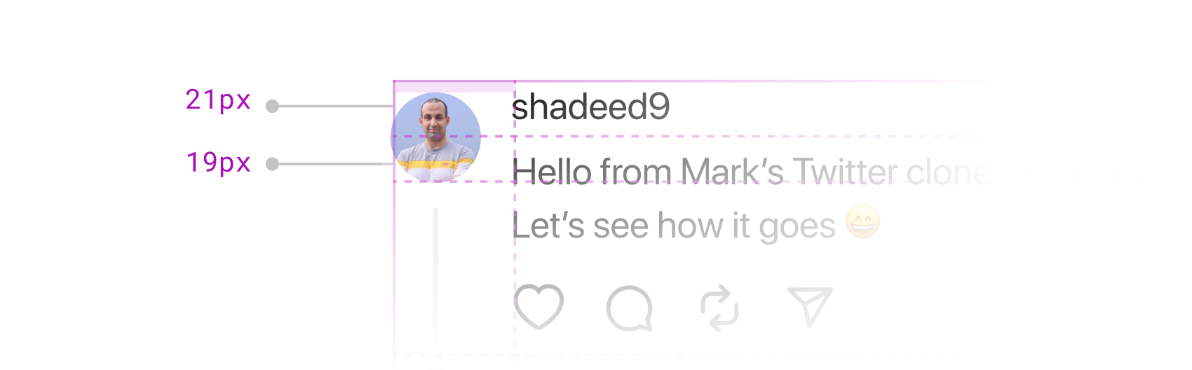
You might be curious why these values are not standardized. Design systems are commonly associated with the belief that designers must strictly follow predefined rules for UI elements.
However, this example shows that using manually adjusted values can be acceptable. It’s okay to deviate from strict guidelines in certain situations.
Due to the fixed widths of the first two rows, it’s not possible to add padding to them. Nevertheless, as long as you’re aware of this limitation, it can be worked around by using margins instead.
Here is an example:
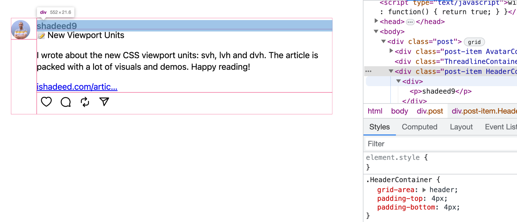
Adding top and bottom padding didn’t affect the post header due to the fixed-size rows.
The current gap between the layout columns is zero. Instead, the image has a size of 36*36 pixels, whereas its container is 48 pixels in width.
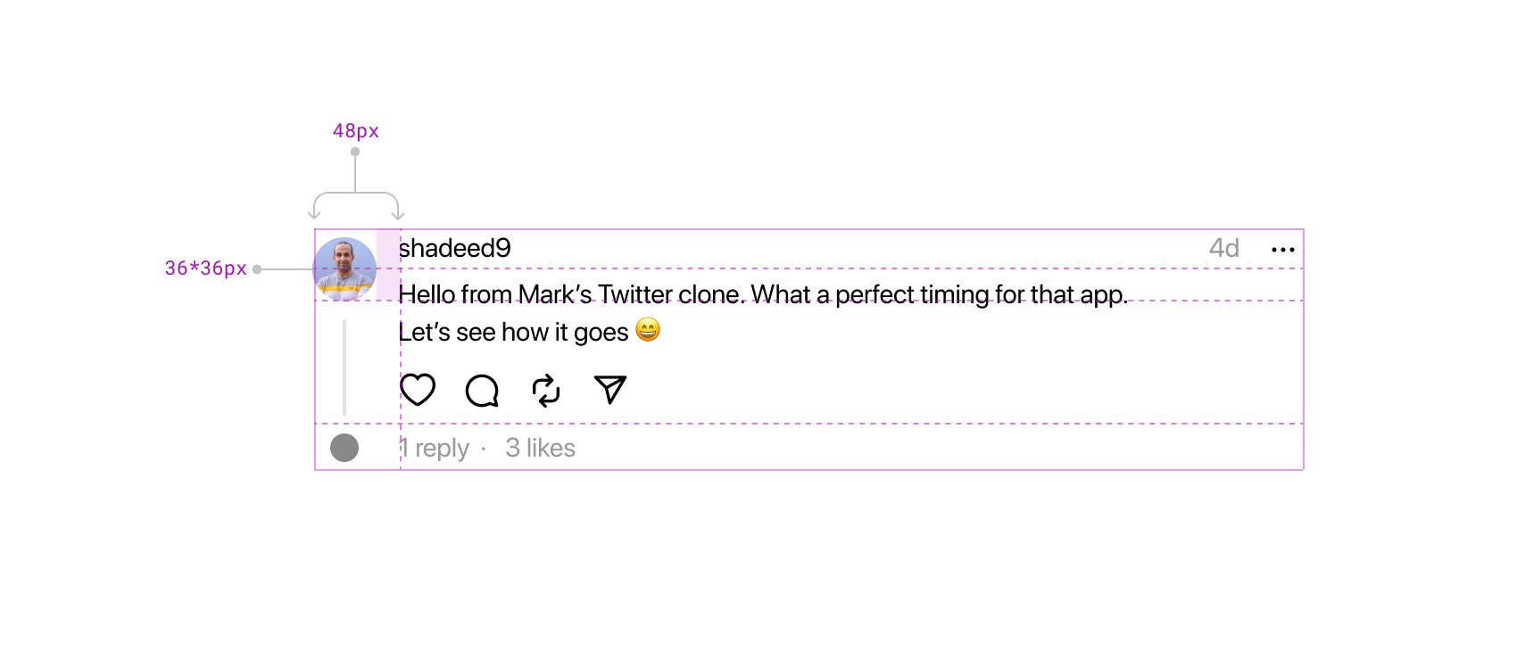
This mimics the spacing here. I don’t know why the team opt-in for that, but I would prefer to use gap instead.
Based on what I’ve observed so far, there are three variations of the grid layout, and all of them could benefit from using named grid areas.
I tried to replicate the grid and build it based on the named areas. It looks easier to scan than specifying values for the columns and rows.
To demonstrate this, let’s assign a grid-area to each item in the layout:
.AvatarContainer {
  grid-area: avatar;
}

.HeaderContainer {
  grid-area: header;
}

.BodyContainer {
  grid-area: body;
}

.ThreadlineContainer {
  grid-area: line;
}

.FooterContainer {
  grid-area: footer;
}
Then, we can start working on the variations. Here is the default layout:
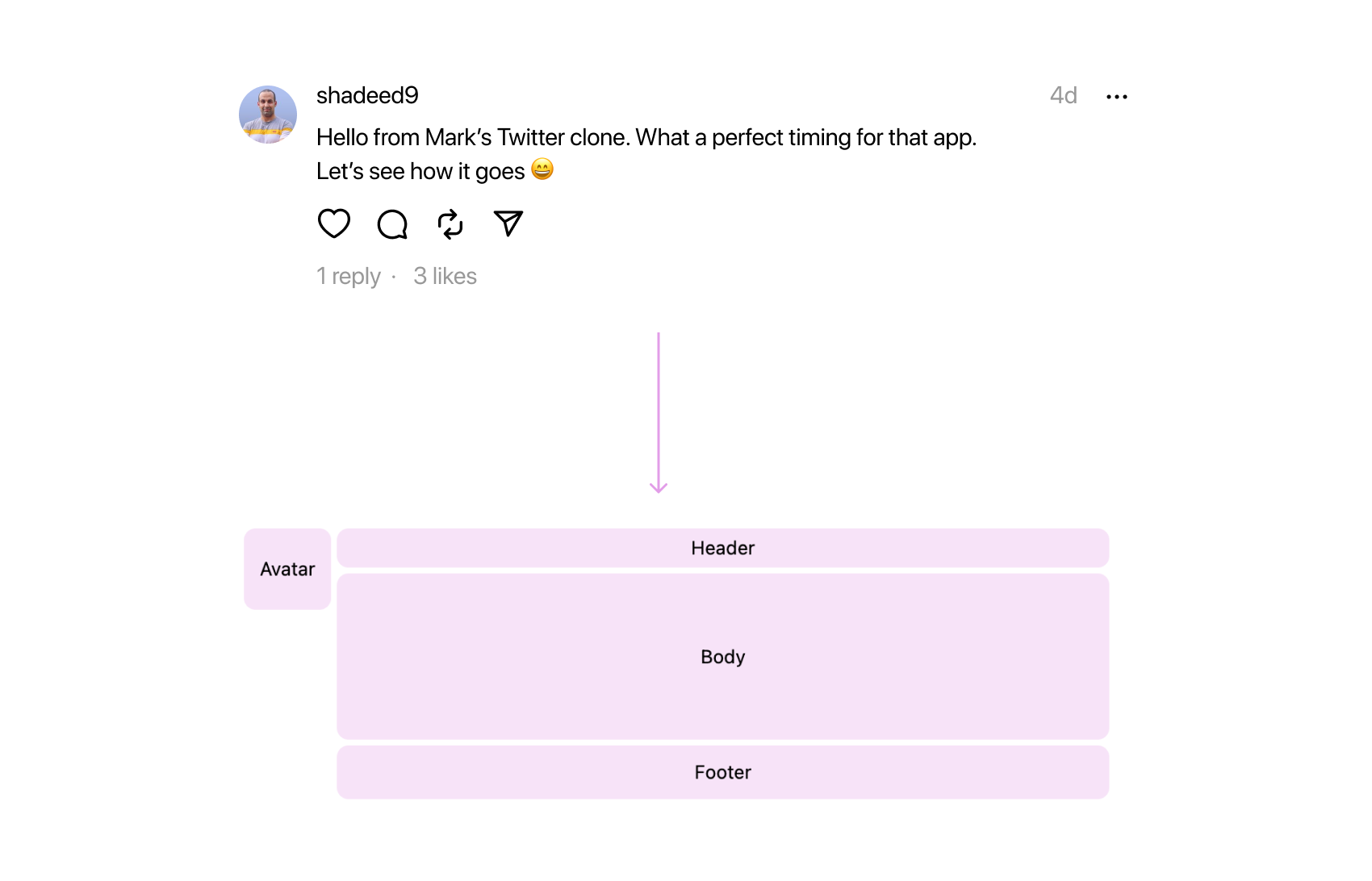
.post {
  display: grid;
  grid-template-columns:
    var(--barcelona-threadline-column-width)
    minmax(0, 1fr);
  grid-template-rows: 21px 19px max-content max-content;
  grid-template-areas:
    "avatar header"
    "avatar body"
    ". body"
    ". footer";
}
Note the use of . to represent empty spaces.
A variation is when someone replies to another.
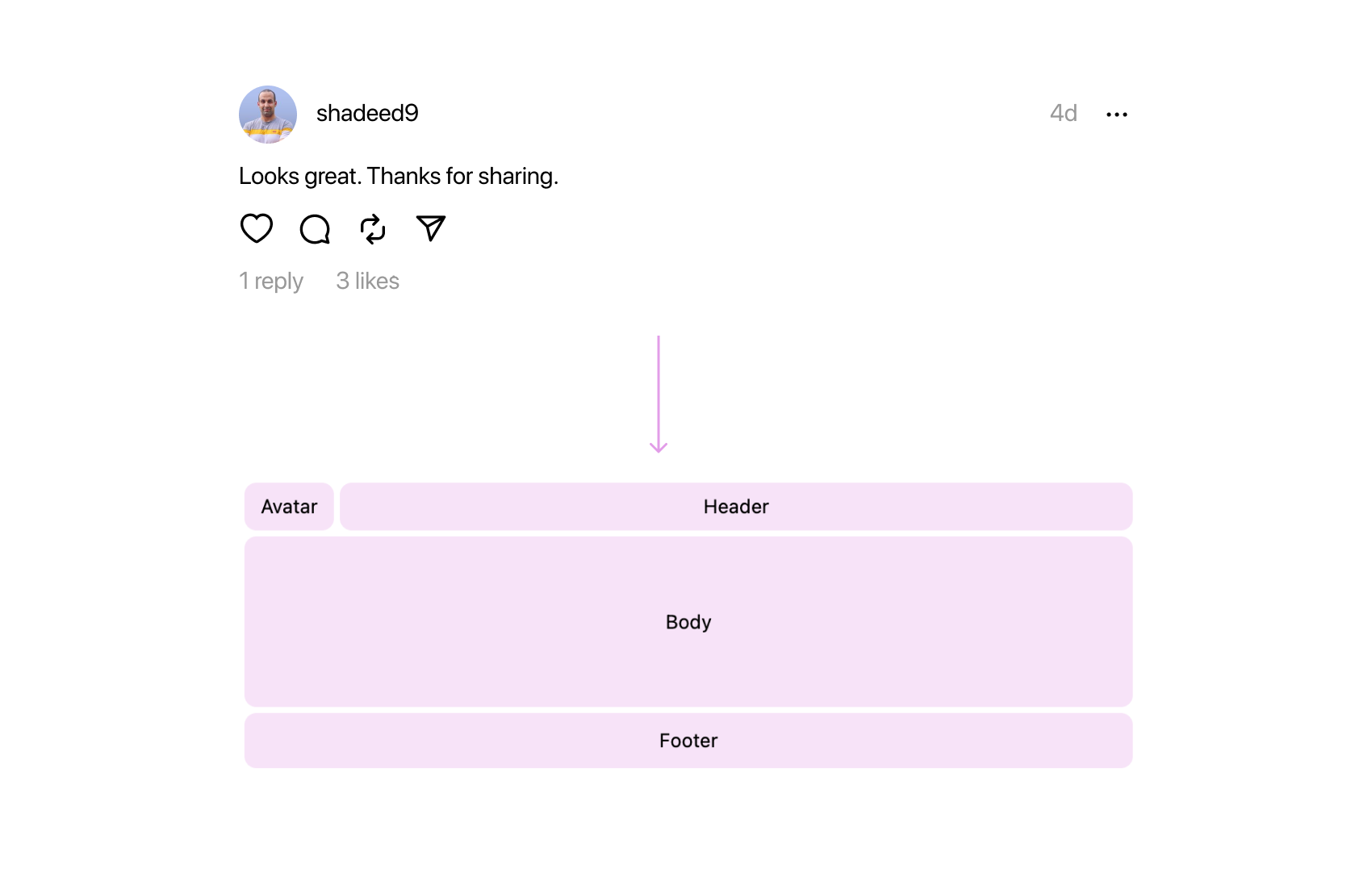
.post--reply {
  grid-template-rows: 36px 0 max-content max-content;
  grid-template-areas:
    "avatar header"
    "body body"
    "body body"
    "footer footer";
}
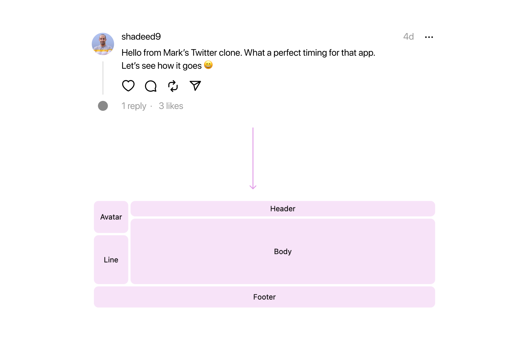
.post--withLine {
  grid-template-areas:
    "avatar header"
    "avatar body"
    "line body"
    "footer footer";
}
Using named grid areas here made it possible to change the layout by editing in one place only.
To be honest, what initially caught my attention in the Threads app was the swirl line. I became curious about how it was constructed since I had previously written about a similar topic a few weeks ago.
See the following figure:
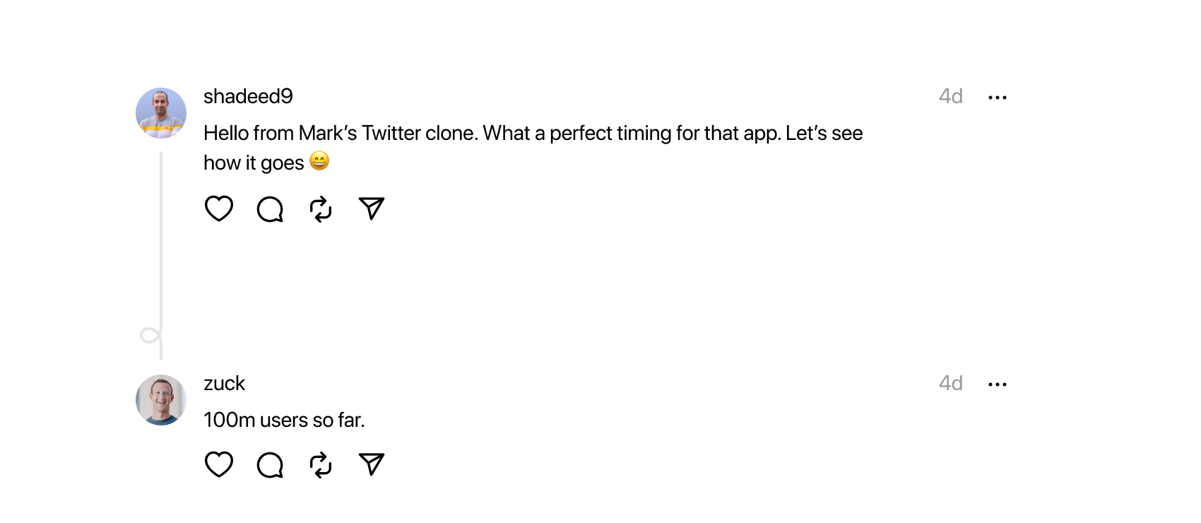
That line connecting my avatar to Mark’s one is an SVG path. It consists of three parts.
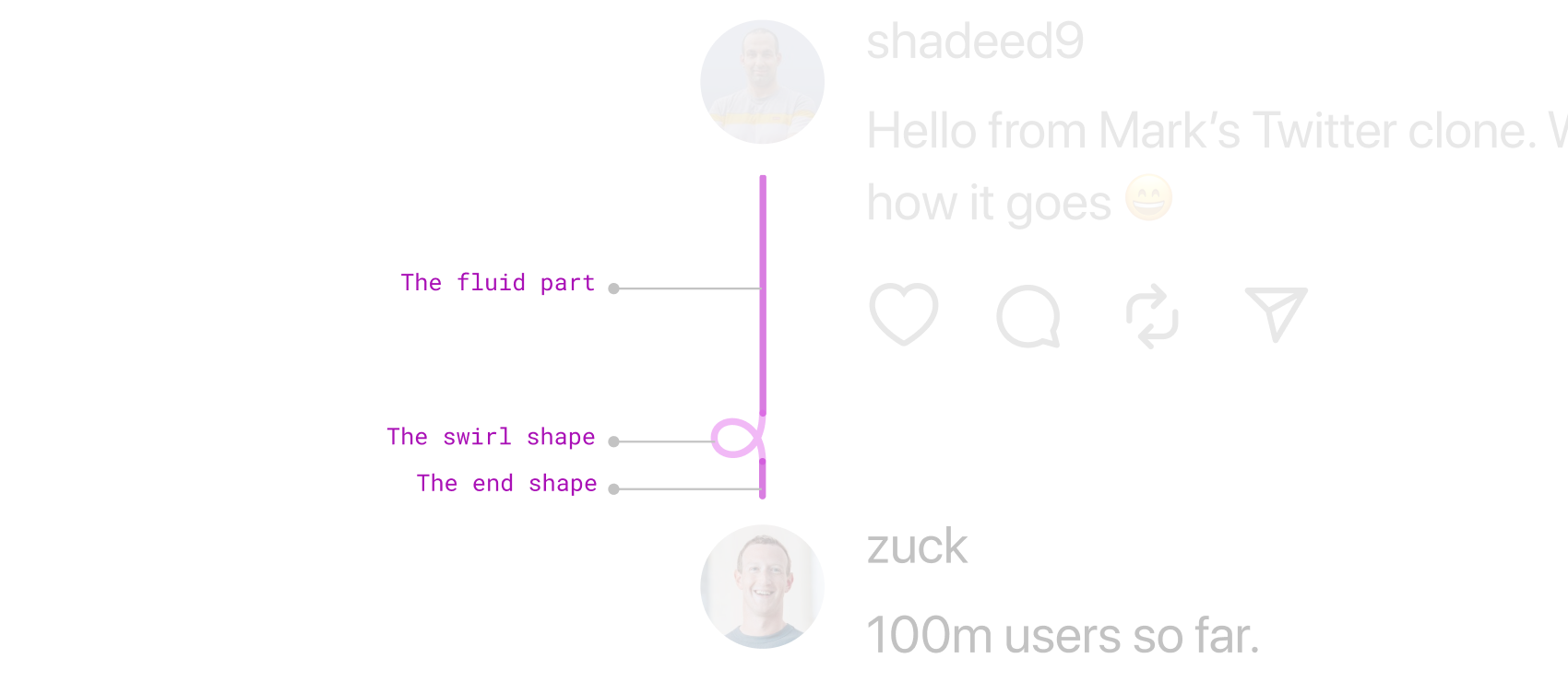
The length of the first part is calculated with JavaScript.
I’m happy to see a thing that I and many others advocated for is being used on a large-scale app like Threads.
In the user profile, the tabs grid layout is built with an inline CSS variable that includes the count of the tabs.
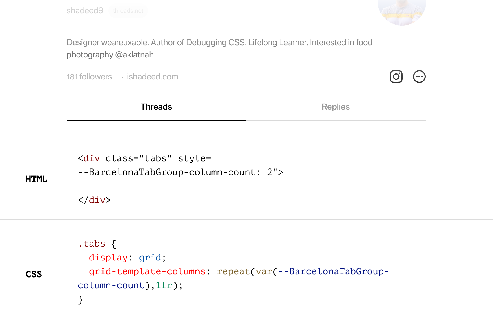
This is useful. When the number of tabs increased, we only need to change the value of the CSS variable. Neat, right?
I noticed the use of overflow-wrap: anywhere for the post body. I haven’t used or heard of that keyword before. I use break-word.
As per MDN, it’s the same as break-word but with one additional thing:
Soft wrap opportunities introduced by the word break are considered when calculating min-content intrinsic sizes.
I still didn’t find a difference when using break-word vs anywhere. I’m very curious to know why, if any of the Threads team is reading this.
I like the use of the dynamic viewport unit dvh for the splash screen.
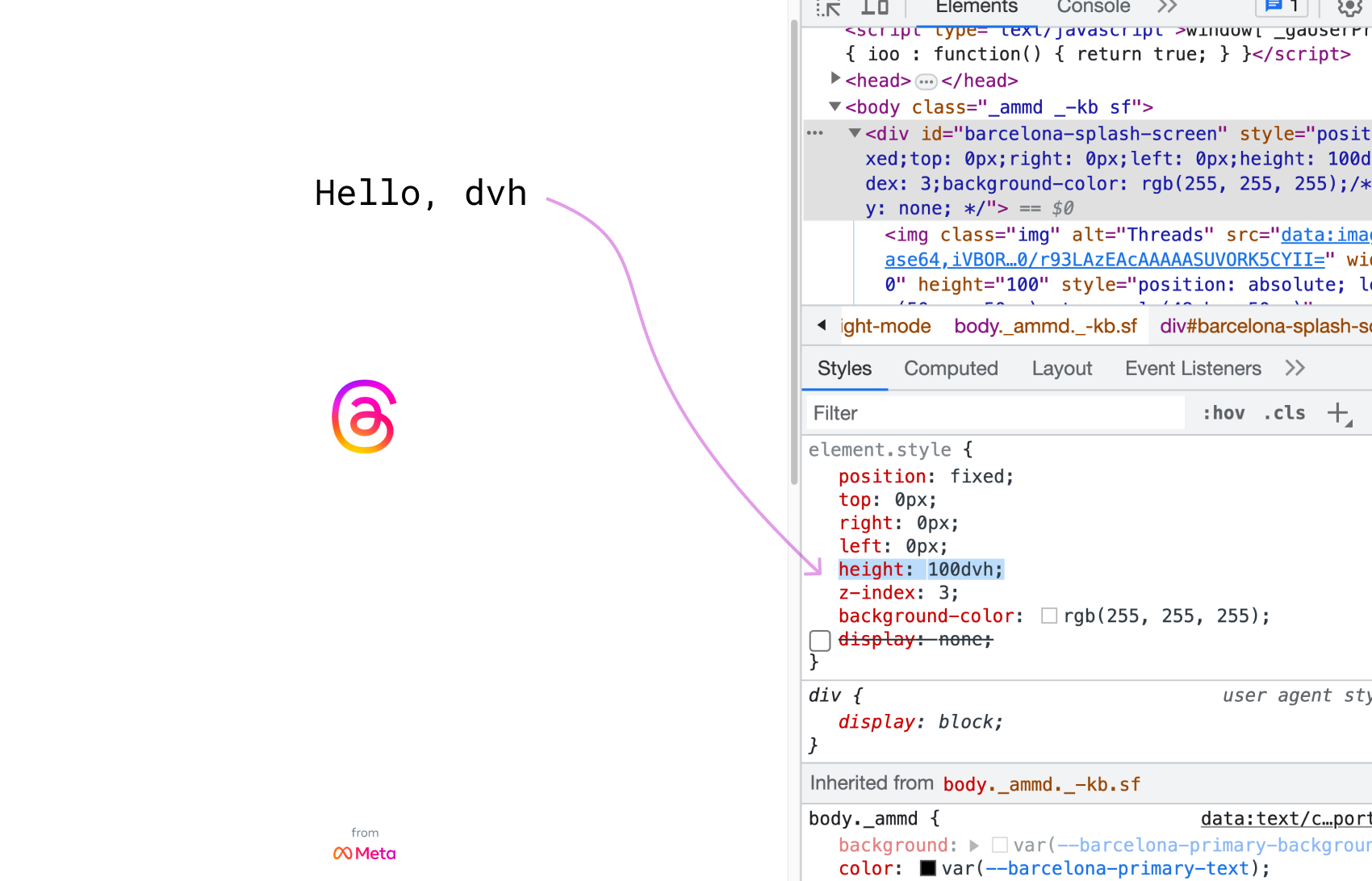
If you want to learn more, I wrote a detailed article on the new viewport units.
To make sure that a flexbox layout won’t break because of the minimum content length, min-width: 0 is used to reset that behavior.
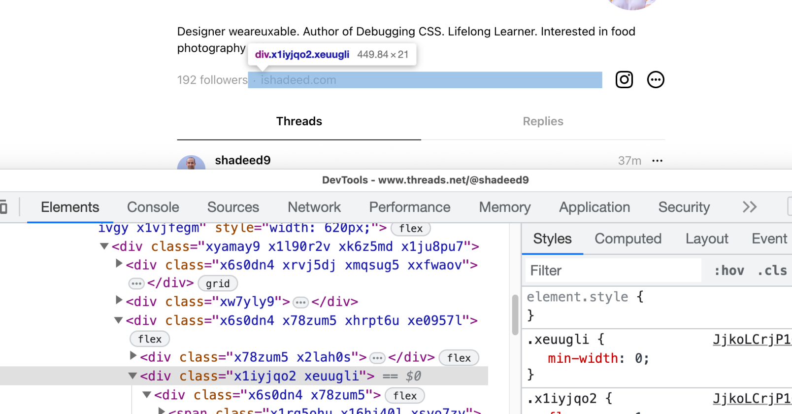
Read more about this in my defensive CSS post about the minimum content size in flexbox.
That’s it for today. I enjoyed inspecting the CSS and getting to know how the Threads team is building the product. I’m sure there are a lot of things that I haven’t noticed because this is the preview-only version on the web.
此内容由惯性聚合(RSS阅读器)自动聚合整理,仅供阅读参考。 原文来自 — 版权归原作者所有。