


I spent years teaching CSS layout on this blog. I put everything I know into The Layout Maestro course: 70+ lessons and 150+ interactive examples that teach you how to think CSS layouts, not just memorize syntax.
How often have you wished if there was a CSS feature that made it easy to create a scrollable container? CSS scroll snap can do that. In my early days of front-end development, I relied on Javascript plugin to create slider components. Sometimes, we need a simple way of quickly making an element as a scrollable container. We can do that, thanks to CSS scroll snap.
In this article, I will walk you through CSS scroll snap basics. What’s make me excited is that I just learned CSS scroll snap, so all the details I will explain will be freshly written. Are you ready? Let’s dive in!
With the rise of mobile and tablet devices, we need to design and build components that can be swiped with touch. Take, for example, a gallery component. The user can easily swipe to the left or right to see more images, rather than a hierarchical structure.
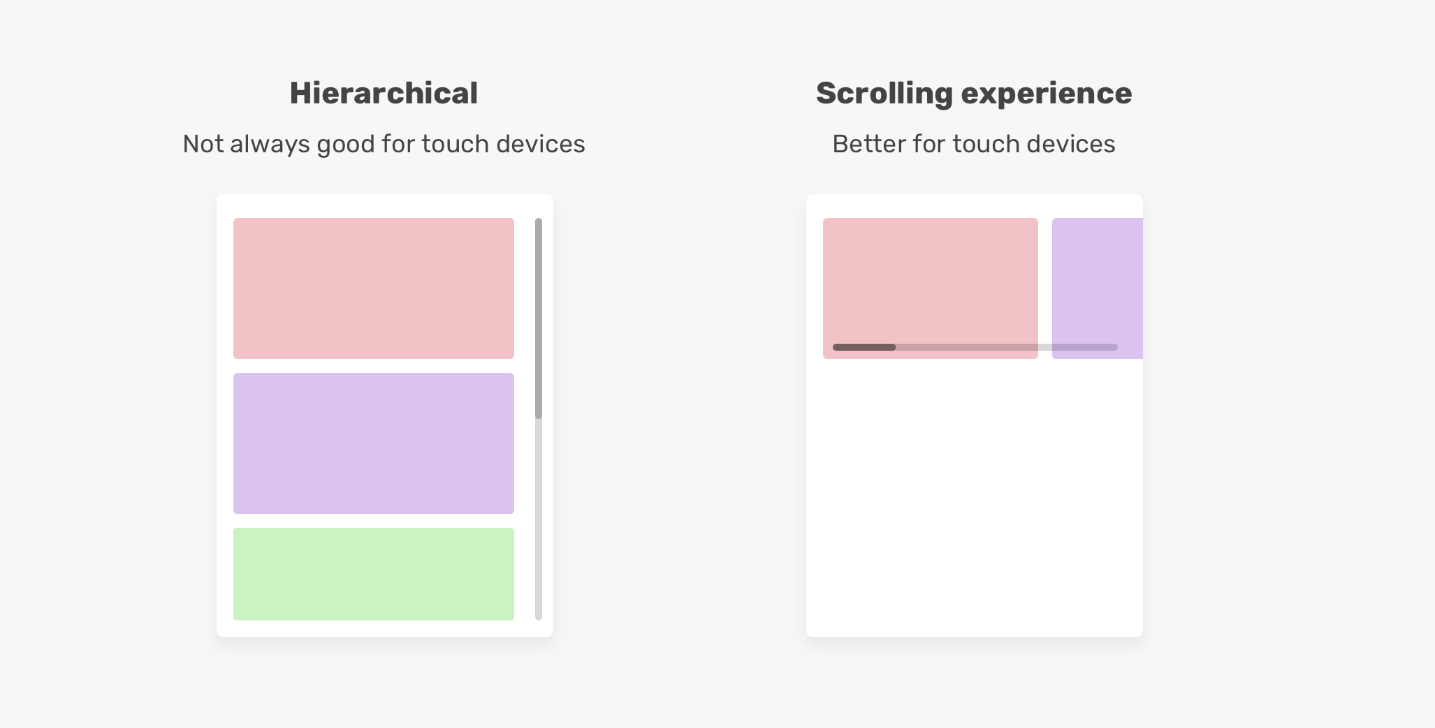
According to the CSS spec, providing the developers with a well-controlled scrolling experience is one of the main reasons that introduced CSS scroll snap. It will enhance the user experience, and it will make it easier to implement scrolling experiences.
To create a scrolling container, here are the basic things that you will need:
overflow with a value other than visible.Let’s take an example.
<div class="section">
  <div class="section__item">Item 1</div>
  <div class="section__item">Item 2</div>
  <div class="section__item">Item 3</div>
  <div class="section__item">Item 4</div>
  <div class="section__item">Item 5</div>
</div>
.section {
  white-space: nowrap;
  overflow-x: auto;
}
For years, using white-space: nowrap was a popular CSS solution to force elements to stay inline. Thankfully, we can avoid this and use Flexbox instead.
.section {
  display: flex;
  overflow-x: auto;
}

This is the basic recipe to create a scrolling container. Though, that is not enough. This is not a usable scrolling container.
Well, the problem is that they don’t provide a good experience comparing to how swiping works. The main benefit of the swiping gesture on touch screens is that it lets us use one finger to horizontally or vertically scroll.
With the previous solutions, here is how the experience feels.
You literally need to move each item to its own place. This is not swiping, and it’s an extremely bad experience. By using CSS scroll snap, we can solve that problem by simply defining snap points that will make it easier for the user to scroll horizontally or vertically.
Let’s explore how to use CSS scroll snap.
To use scroll snap on a container, its child items should be displayed inline, and this can be done with one of the methods I explained above. I will go with CSS flexbox.
<div class="section">
  <div class="section__item">Item 1</div>
  <div class="section__item">Item 2</div>
  <div class="section__item">Item 3</div>
  <div class="section__item">Item 4</div>
  <div class="section__item">Item 5</div>
</div>
.section {
  display: flex;
  overflow-x: auto;
}
With that, we need to add two more properties for scroll snap to work. Where we should add them? A good question.
First, we need to add scroll-snap-type to the scrolling container. In our example, this is the .section element. Then, we need to add scroll-snap-align to the child items, which are .section__item.
.section {
  display: flex;
  overflow-x: auto;
  scroll-snap-type: x mandatory;
}

.section__item {
  scroll-snap-align: start;
}
I know your feeling now. You might be wondering about the values x mandatory and start. Don’t worry, this is the core of the article and I’ll explain them deeply.
With these properties, we now have a scrolling container that snaps to the start of its scrolling container.
At that moment, I got very excited about CSS scroll snap. It makes scrolling more natural. Now, let’s dig into scroll snap properties.
According to the CSS spec, the scroll-snap-type specifics if an element is a scroll snap container, how strictly it snaps, and which axes are considered. Let’s analyze that.
The axis of a scroll snap container represents the direction of scrolling. It can be horizontal or vertical. The x value represents horizontal scrolling, and the y represents vertical scrolling.
/* Horizontal */
.section {
  display: flex;
  overflow-x: auto;
  scroll-snap-type: x;
}

/* Vertical */
.section {
  height: 250px;
  overflow-y: auto;
  scroll-snap-type: y;
}
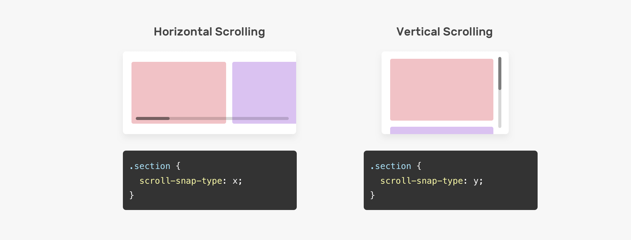
Not only we can define the direction of scroll snap, but we can also define how strict it is. This can be done by using one of the values mandatory | proximity with the scroll-snap-type value.
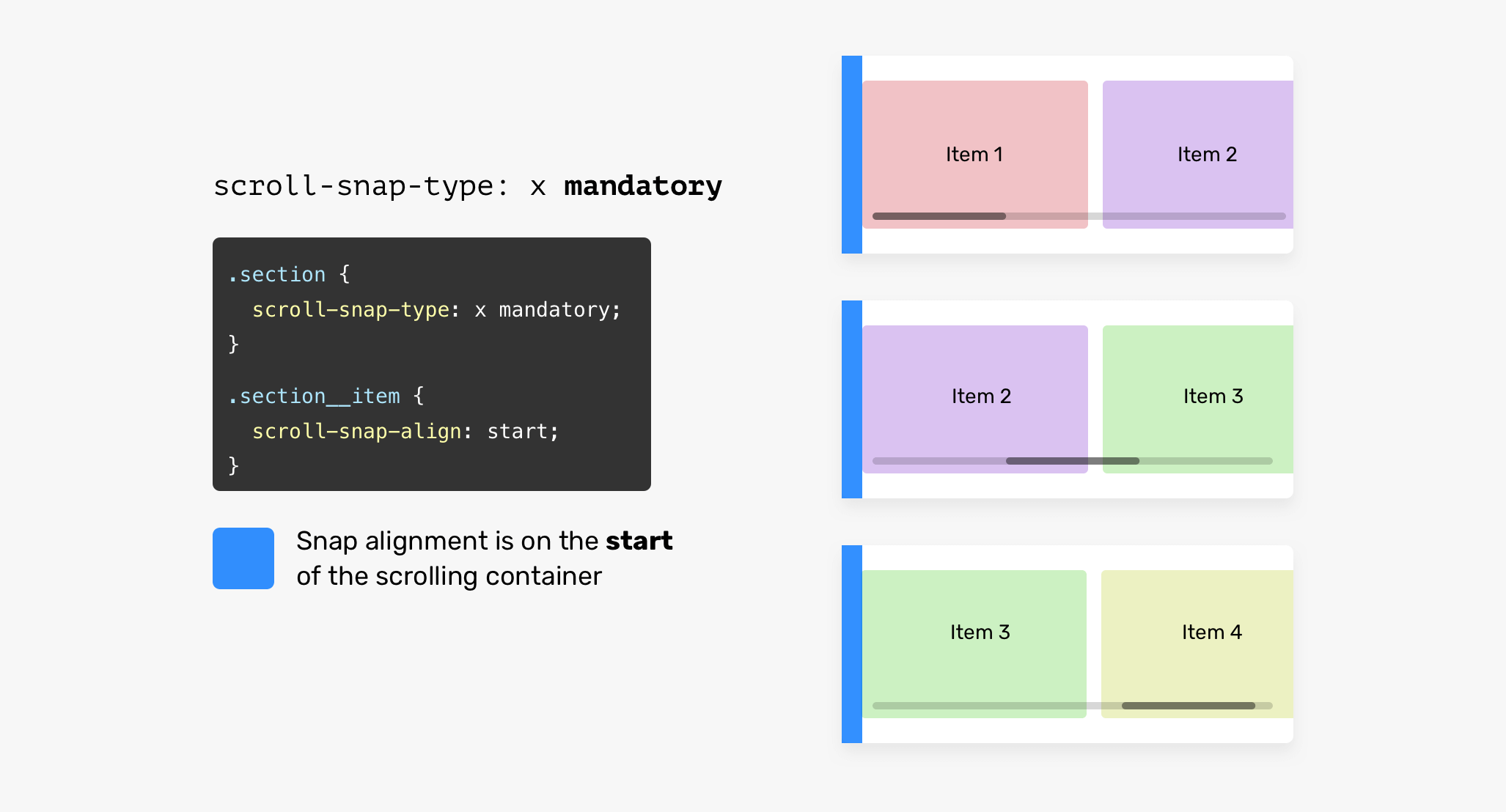
The mandatory keyword means that the browser must snap to each scroll point. Let’s assume that the scroll-snap-align property has a value of start. That means, the scrolling must snap to the start of the scrolling container.
In the figure below, the browser snaps the items to the start of the container each time the user scrolls to the right.
.section {
  display: flex;
  overflow-x: auto;
  scroll-snap-type: x mandatory;
}

.section__item {
  scroll-snap-align: start;
}
Even better, try scrolling to the right in the demo below. Either move the scrollbar to the right or use touch in case you’re on a phone or tablet. You should feel how each item snaps to the start of its container.
See the Pen Scroll Snap Strictness by Ahmad Shadeed (@shadeed) on CodePen.
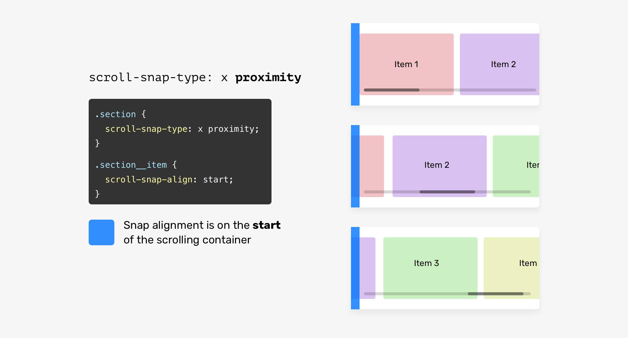
However, if the value is proximity, the browser will do the work. It might snap to the defined point (start in our case). Note that proximity is the default value, but I will add it for clarity reasons.
.section {
  display: flex;
  overflow-x: auto;
  /* proximity is the default value, I added it for clarity reasons */
  scroll-snap-type: x proximity;
}
The child items of the scrolling container need an alignment point that they can snap to. We can use start, center or end.
To make it easier to understand, here is a visual of how it works.
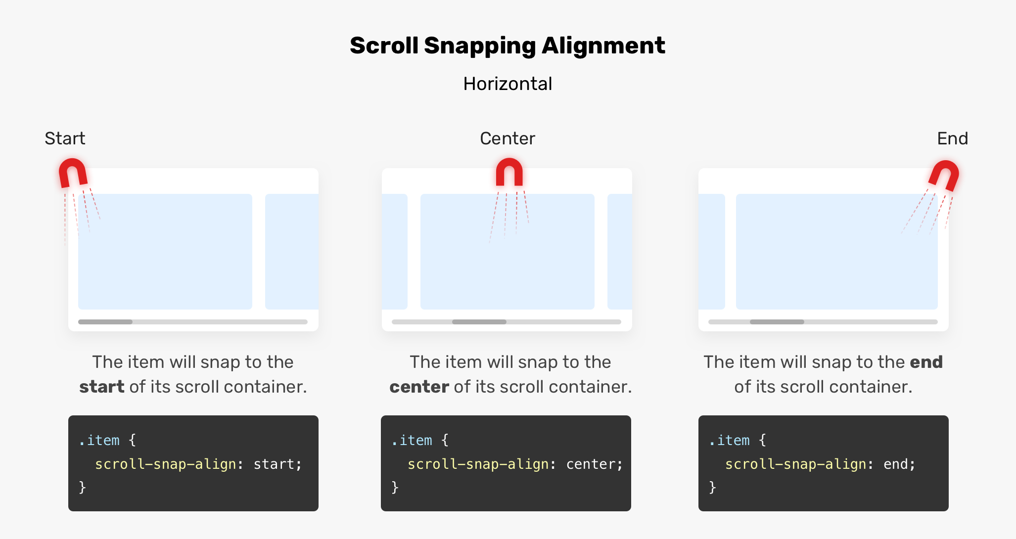
Let’s imagine that we have a magnet on the scrolling container, which will help us in controlling the snapping points. When the scroll-snap-type is vertical, the snapping alignment will be vertical. See the figure below:
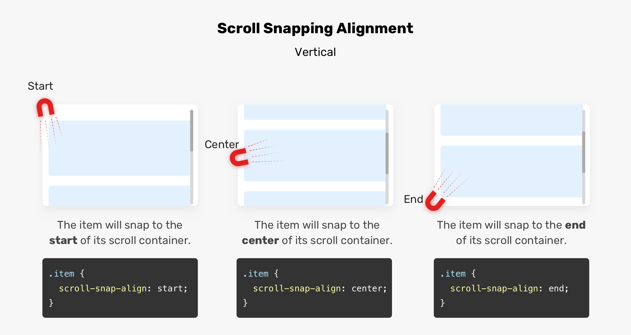
To make that more clear, please see the animations below for start, center, and end.
start of the scrolling containerA child item will snap to the start of its horizontal scrolling container.
center of the scrolling containerA child item will snap to the center of its scrolling container.
end of the scrolling containerA child item will snap to the end of its scrolling container.
Sometimes, you might need a way to prevent the user from accidentally bypassing some important items while scrolling. If the user scrolls too quickly, it is possible to skip some items.
.section__item {
  scroll-snap-align: start;
  scroll-snap-stop: normal;
}
In the video below, scrolling too fast can skip three or four items.
The default value for scroll-snap-stop is normal. To force scrolling to snap to every possible point, you should use always.
With scroll-snap-stop: always, the browser will stop at each snap point.
.section__item {
  scroll-snap-align: start;
  scroll-snap-stop: always;
}
That way the user can scroll through to one snap point at a time, which will help avoid skipping important items. Imagine that each stop point has a stop sign. See the animation below:
Play with the scroll below in the demo and try to switch the options.
See the Pen Scroll Snap Stop by Ahmad Shadeed (@shadeed) on CodePen.
Many thanks to Adam Argyle and Šime Vidas for pointing out scroll-snap-stop.
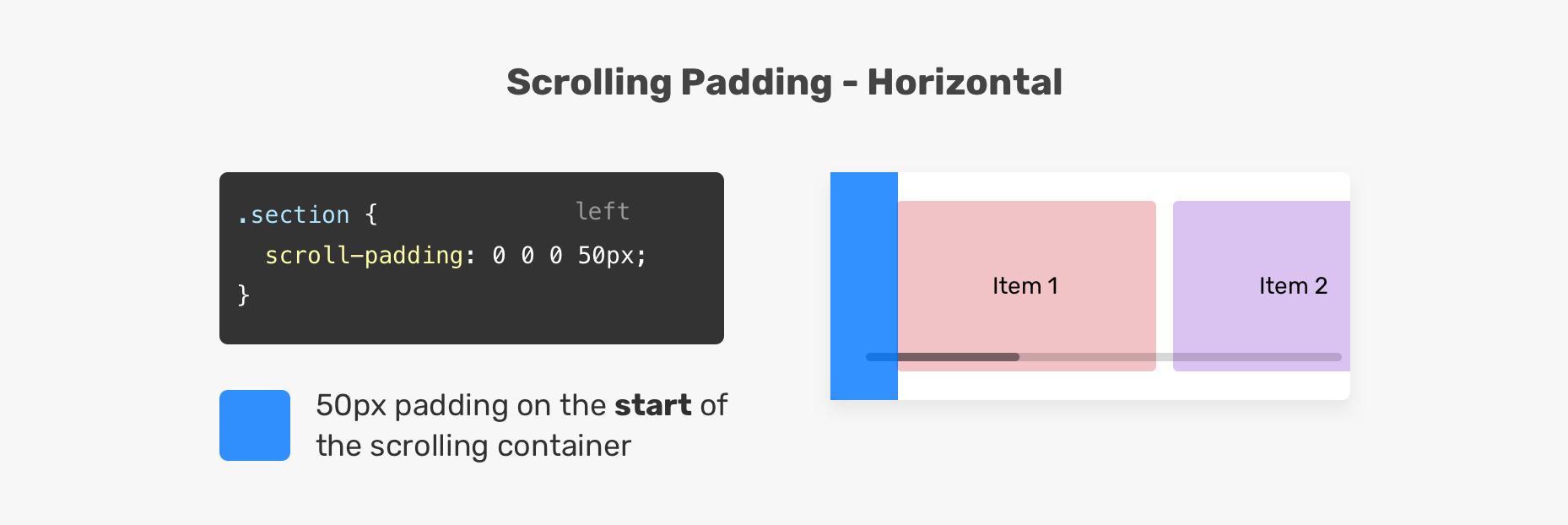
The scroll-padding shorthand property sets scroll padding on all sides, similar to how the padding property works. In the figure below, we have 50px padding on the left side of the scrolling container. As a result, the child elements will snap to 50px off the left edge.
.section {
  overflow-x: auto;
  scroll-snap-type: x mandatory;
  scroll-padding: 0 0 0 50px;
}
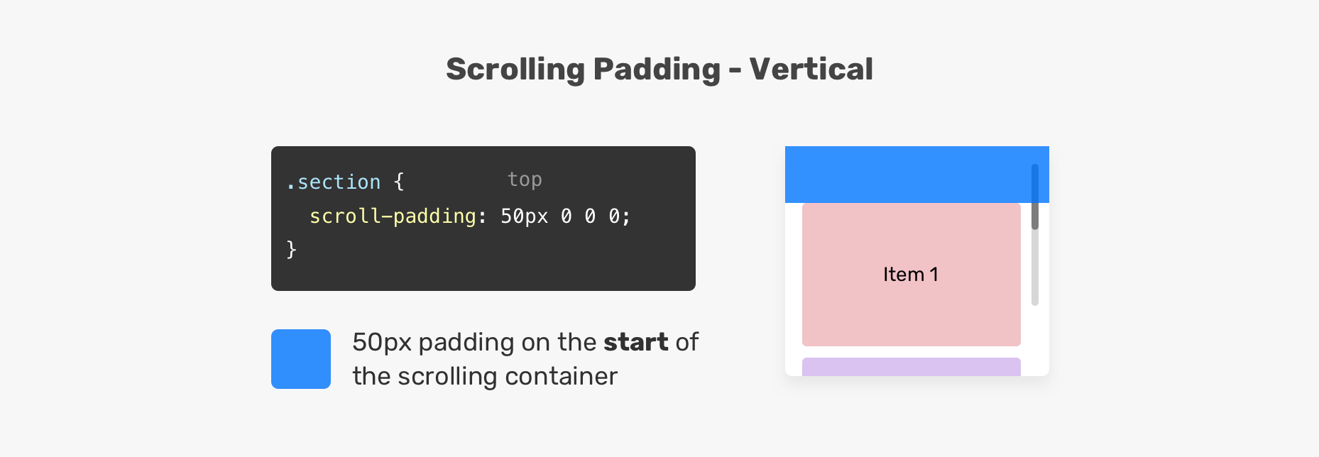
The same works for vertical scrolling, too. See the below example:
.section {
  overflow-y: auto;
  scroll-snap-type: y mandatory;
  scroll-padding: 50px 0 0 0;
}
The scroll-margin shorthand property sets spacing between the child items of a scrolling container. When a margin is added to an element, the scrolling will snap as per the margin. See the figure below:
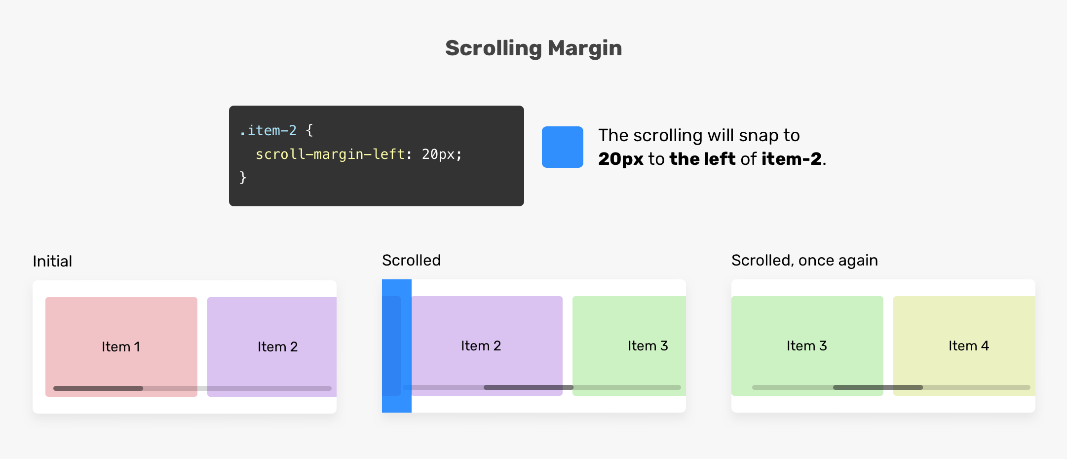
The .item-2 has scroll-margin-left: 20px. As a result, the scrolling container will snap to 20px before that item. Notice that when the user scrolled again to the right, .item-3 snapped to the start of the scrolling container. This means, only the element with a margin will be affected.
A great use case for CSS scroll snap is a list of images. Using scroll snap will give a much better scrolling experience.
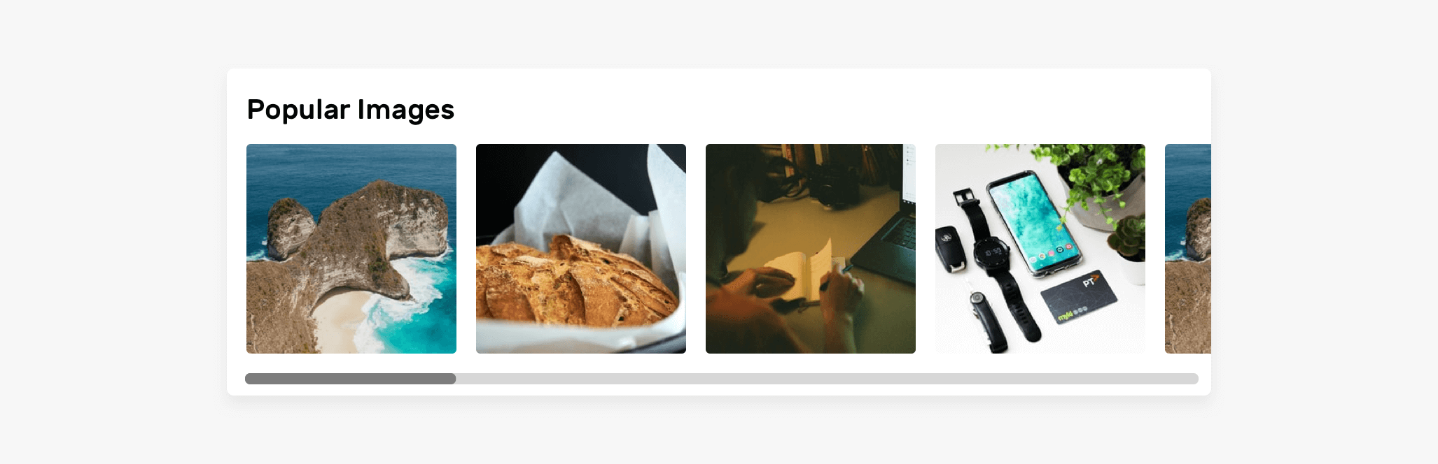
.images-list {
  display: flex;
  overflow-x: auto;
  scroll-snap-type: x;
  gap: 1rem;
  -webkit-overflow-scrolling: touch; /* Important for iOS devices */
}

.images-list img {
  scroll-snap-align: start;
}
Notice that I used x as the value of scroll-snap-type. The strictness of the snapping will be proximity, by default.
See the Pen Scroll Snap - Images List by Ahmad Shadeed (@shadeed) on CodePen.
Another great use-case for scroll snap is a list of friends. The example below is taken from Facebook (A real-life example).
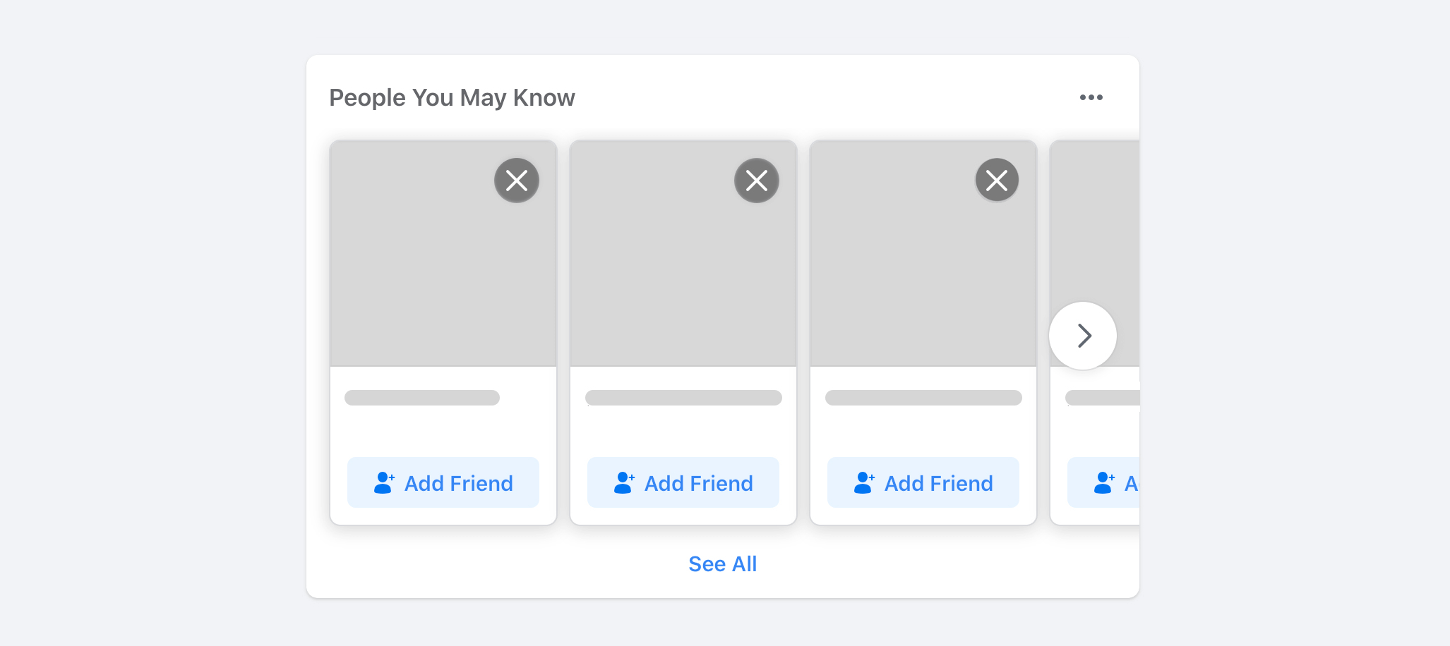
.list {
  display: flex;
  overflow-x: auto;
  scroll-snap-type: x mandatory;
  gap: 1rem;
  scroll-padding: 48px;
  padding-bottom: 32px;
  -webkit-overflow-scrolling: touch;
}

.list-item {
  scroll-snap-align: start;
}
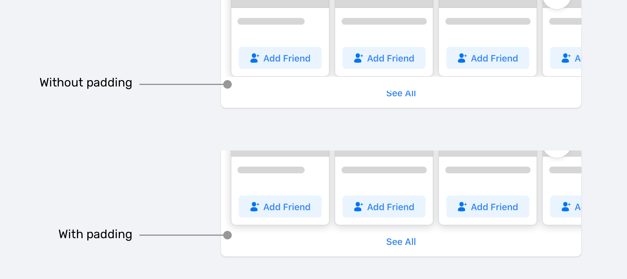
Note the scrolling container has padding-bottom: 32px. The goal of this is to provide extra space so the box-shadow can show up as expected.
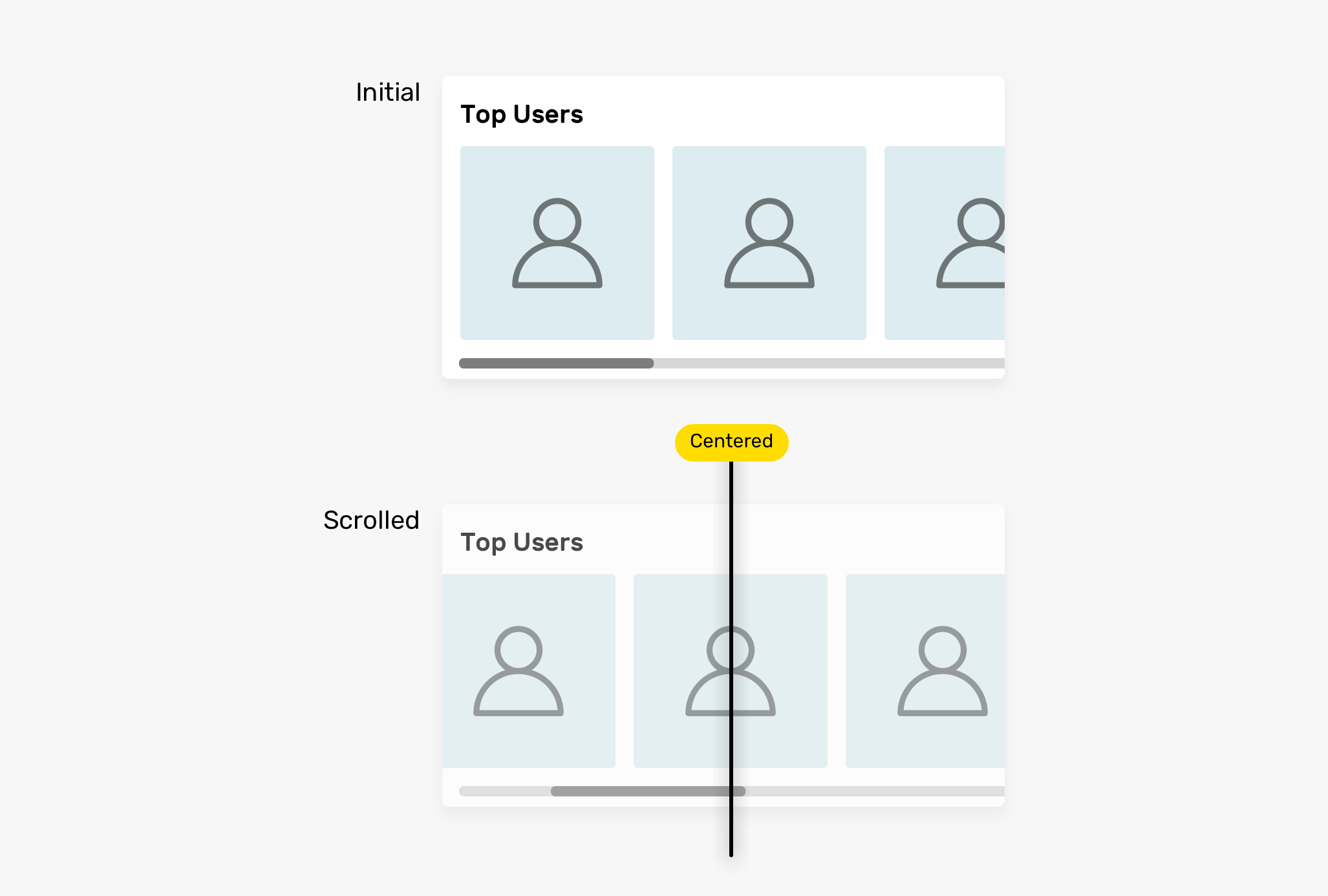
For this use-case, I’m interested in using the center keyword as a value for scroll-snap-align on the child items.
.list {
  display: flex;
  overflow-x: auto;
  scroll-snap-type: x mandatory;
  -webkit-overflow-scrolling: touch;
}

.list-item {
  scroll-snap-align: center;
}
This is useful on a list of avatars where it is important for an avatar to be in the middle of its scrolling container.
See the Pen Scroll Snap - Avatars by Ahmad Shadeed (@shadeed) on CodePen.
Using scroll snap can also be useful for vertical scrolling. An example of this is the full-height sections.
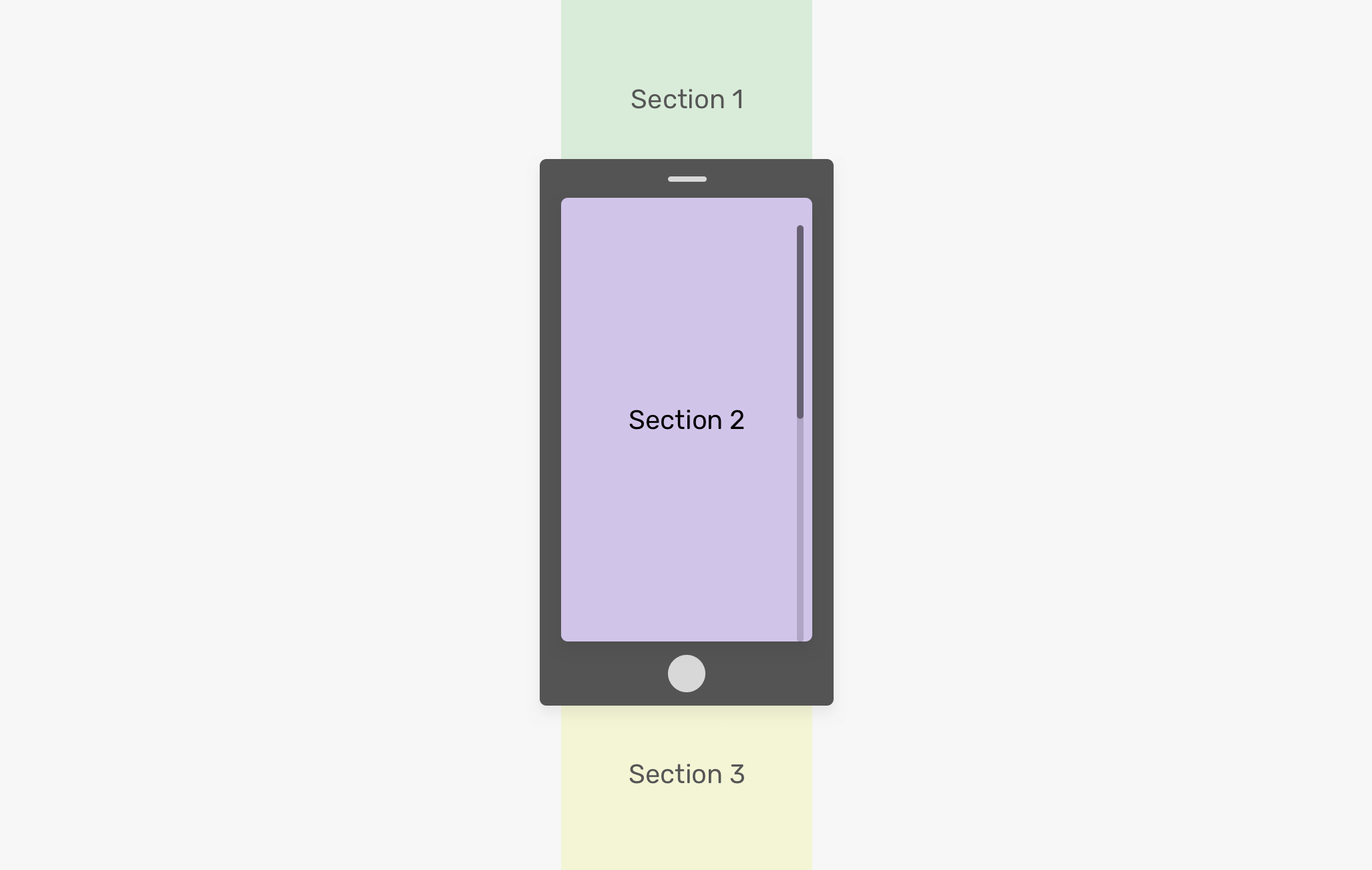
<main>
  <section class="section section-1"></section>
  <section class="section section-2"></section>
  <section class="section section-3"></section>
  <section class="section section-4"></section>
  <section class="section section-5"></section>
</main>
main {
  height: 100vh;
  overflow-y: auto;
  scroll-snap-type: y mandatory;
  -webkit-overflow-scrolling: touch;
}

.section {
  height: 100vh;
  scroll-snap-align: start;
}
See the Pen Scroll Snap - Full Height Sections by Ahmad Shadeed (@shadeed) on CodePen.
It’s worth mentioning that you can use logical values inline and block for scroll-snap-type. See the below example:
main {
  scroll-snap-type: inline mandatory;
}
In this example, inline represents the horizontal dimension in horizontal writing modes, like the English language. For languages like Japanese, the inline will represent the vertical dimension.
If you want to read more about CSS logical properties, this is a great article by Adrian Roselli.
Ensure accessibility when using CSS scroll snap. Here is a bad usage of scroll snap that prevents a user from scrolling freely through content to read it.
.wrapper {
  scroll-snap-type: y mandatory;
}

h2 {
  scroll-snap-align: start;
}
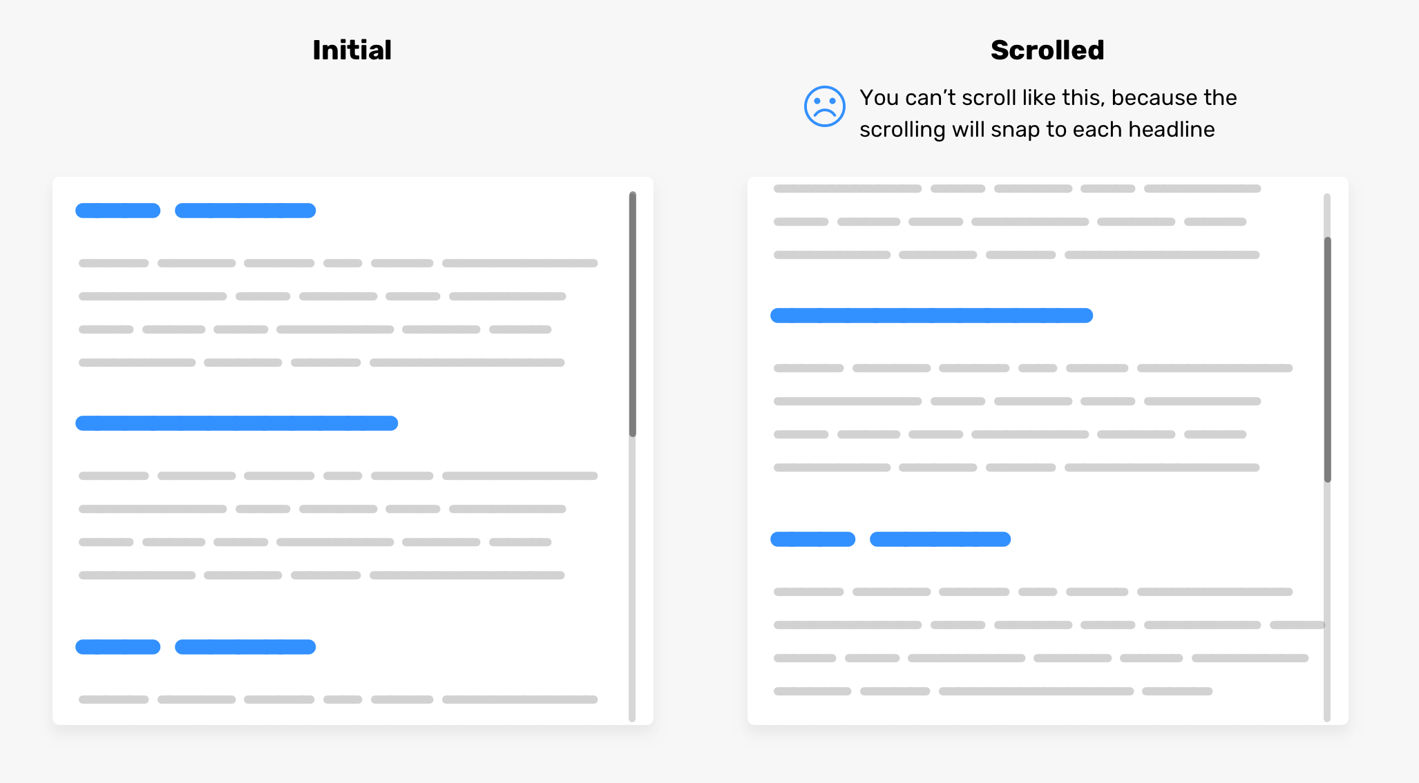
Try it yourself in the demo below. Please make sure to don’t do this!
See the Pen Scroll Snap - Accessibility - Bad Example by Ahmad Shadeed (@shadeed) on CodePen.
That was a long writeup about a new CSS feature that I have just learned. I hope you find it useful. If you find any mistakes or have feedback, please tweet me @shadeed9.
Thank you for reading!
I’m excited to let you know that I wrote an ebook about Debugging CSS.
If you’re interested, head over to debuggingcss.com for a free preview.
此内容由惯性聚合(RSS阅读器)自动聚合整理,仅供阅读参考。 原文来自 — 版权归原作者所有。