


I spent years teaching CSS layout on this blog. I put everything I know into The Layout Maestro course: 70+ lessons and 150+ interactive examples that teach you how to think CSS layouts, not just memorize syntax.
I am a curious person who is always interested in opening up the browser DevTools to see how things were made on a website. This is the first time that I blog about something like this. I found some interesting uses of different CSS features (at least for me), and I wanted to share them with you.
The new Facebook design started rolling out for users lately, and I got it almost two weeks ago. At first, every UI element was a bit bigger for me but it was a matter of days until I got used to it. In this article, I will talk about all the interesting things I saw.
Let’s dive in!

SVG is being used for the avatar images like the profile photo, your pages or the groups you’re in.
<svg role="none" style="height: 36px; width: 36px;">
  <mask id="avatar">
    <circle cx="18" cy="18" fill="white" r="18"></circle>
  </mask>
  <g mask="url(#avatar)">
    <image
      x="0"
      y="0"
      height="100%"
      preserveAspectRatio="xMidYMid slice"
      width="100%"
      xlink:href="avatar.jpg"
      style="height: 36px; width: 36px;"
    ></image>
    <circle cx="18" cy="18" r="18"></circle>
  </g>
</svg>
I asked myself, why did they use it? Here are my thoughts:
box-shadow to an HTML <img>. For that reason, they used an SVG to solve it.<mask> and the SVG <image> element.As I mentioned, the border inside the avatar is useful for bright images. Here is a mockup that shows that in detail.

The inner border has been added as below:
circle,
rect {
  stroke-width: 2;
  stroke: rgba(0, 0, 0, 0.1);
  fill: none;
}
And if the image is rectangular, the shape to be used is a rect:
<svg role="none" style="height: 36px; width: 36px;">
  <mask id="avatar">
    <rect
      cy="18"
      fill="white"
      height="36"
      rx="8"
      ry="8"
      width="36"
      x="0"
      y="0"
    ></rect>
  </mask>
  <g mask="url(#avatar)">
    <image
      x="0"
      y="0"
      height="100%"
      preserveAspectRatio="xMidYMid slice"
      width="100%"
      xlink:href="avatar.jpg"
      style="height: 36px; width: 36px;"
    ></image>
    <rect
      cy="18"
      fill="white"
      height="36"
      rx="8"
      ry="8"
      width="36"
      x="0"
      y="0"
    ></rect>
  </g>
</svg>
Interestingly, the avatars in the home page feed are built using an <img> with a <div> element for the inner transparent border. See below:
<div class="avatar-wrapper>
    <img class="avatar" width="40" height="40" src="avatar.jpg" width="40" alt="">
    <div class="avatar-outline"></div>
</div>
.avatar-wrapper {
  position: relative;
}

.avatar {
  display: block;
  border-radius: 50%;
}

.avatar-outline {
  position: absolute;
  left: 0;
  top: 0;
  width: 100%;
  height: 100%;
  box-shadow: inset 0 0 0 1px rgba(0, 0, 0, 0.1);
  border-radius: 50%;
}
Since the SVG technique is being used only for a few places, I guess that the reason of using <img> and <div> is related to page size. If SVG were used for the feed avatars, this will result in increasing the KBs downloaded as the user scroll down.
I wasn’t old enough to live in the days of spacer GIFS, but I saw something that I think is related to them. I will call it a spacer div, if that’s ok?

Let me add some context there. The above is a section for friends requests that appears randomly in the home page feed. There is a grid of persons, and this grid needs a margin from the left. Usually, I will do this by margin-left: 16px. However, Facebook added a <div> to act as a space between the edge of the container and the grid.
I wondered about the reason of that?
react component that could be used anywhere by specifying a width for it?Why there is no margin there? As far from what I saw, the CSS (~100K lines) is full of utility classes, and a class can be easily added to the wrapper to give it a margin.
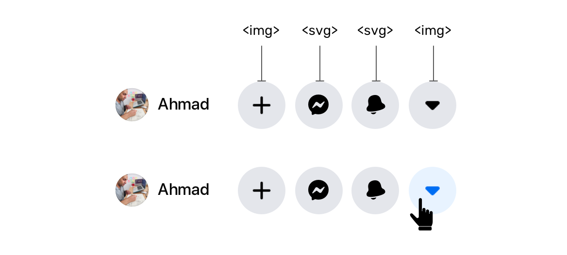
Do you see the four icons in there? The plus and arrow are images, while the messenger and notifications ones are SVG elements. I don’t know what’s the reason behind that mix.
When the last one is clicked, the icon color become blue. I asked myself, how the color is being changed when this is an image? Maybe the image is changed on hover? No! I noticed that there is a CSS filter for changing the image color.
.icon {
  filter: invert(39%) sepia(57%) saturate(200%) saturate(200%)
    saturate(200%) saturate(200%) saturate(200%) saturate(147.75%)
    hue-rotate(202deg) brightness(97%) contrast(96%);
}
Yes, this is a production code from Facebook.com. This is very weird for me. Is it that hard to replace this with an SVG icon and simply change the fill color?
This is also used for the verified account icon.
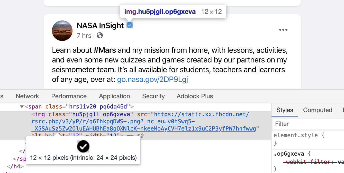
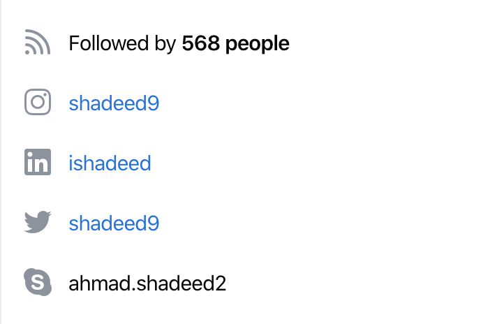
And also for the user profile links.
.icon {
  filter: invert(59%) sepia(11%) saturate(200%) saturate(135%)
    hue-rotate(176deg) brightness(96%) contrast(94%);
}
If you’re interested to learn more about how to convert a black image to any color using CSS filters, this answer is for you. Also, here is a tool by Barrett Sonntag for that purpose.
See the Pen CSS filter generator to convert from black to target hex color by Barrett Sonntag (@sosuke) on CodePen.
The <img> icons with CSS filters are some wizardry dreamed up by @jsu07 to make legacy icons work in all colors and in dark mode until we can convert them to SVGs in React. https://t.co/rD6KknZvKI
— Frank Yan (@frankyan) April 3, 2020

The main header has a shadow which you might expect it was added via CSS box-shadow, correct? Well, the answer is no. They used a <div> with a background image that is repeating across the x-axis.
I downloaded the image they used to you can see it closely.

This is a 2px * 14px image that is being repeated. Not only that, there is a dedicated <div> for that shadow.What’s the point of using that?
Royi Hagigi from Facebook confirmed that the reason behind using an image is for performance. It’s interesting that a tiny shadow causes such performance issues.
It's for performance. A box shadow on the floating header like that was killing scroll perf in browsers
— Royi Hagigi (@rhagigi) April 3, 2020
When Royi was asked about how they tested this, he answered:
Honestly this one was really bad. You'd scroll a page full of videos and random parts of the page would disappear and reappear. It was gnarly.
— Royi Hagigi (@rhagigi) April 3, 2020
I totally agree.
I liked that they used CSS variables. From what I saw, there are 320+ variables added to the :root element. Those values are used for the dark mode as well.
When the dark mode is toggled, the class __fb-dark-mode is added to the HTML element. Once added, it overrides all the variables defined in the :root as below:
:root {
  /* Light mode variables */
  -fds-active-icon: #3578e5;
  --fds-attachment-footer-background: #f2f3f5;
  --fds-blue-05: #ecf3ff;
  --fds-blue-30: #aac9ff;
  --fds-blue-40: #77a7ff;
}

.__fb-dark-mode:root,
.__fb-dark-mode {
  /* Override the light variables */
  --fds-active-icon: black;
  --fds-attachment-footer-background: black;
  --fds-blue-05: black;
  --fds-blue-30: black;
  --fds-blue-40: black;
}
Here is a video when the class is toggled. I recommend to view it full screen!
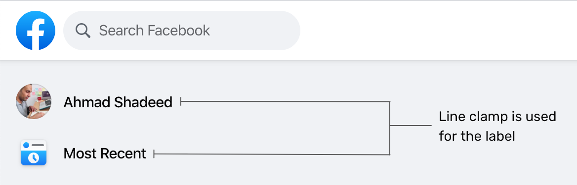
On the sidebar, there is a list of links like the user profile, most recent, memories.. etc. What I noticed there is the use of multi-line text truncating.
.element {
  display: -webkit-box;
  -webkit-box-orient: vertical;
  -webkit-line-clamp: 2;
}
The above styles are added as inline styles, and they also change based on the browser. See the below mockup:
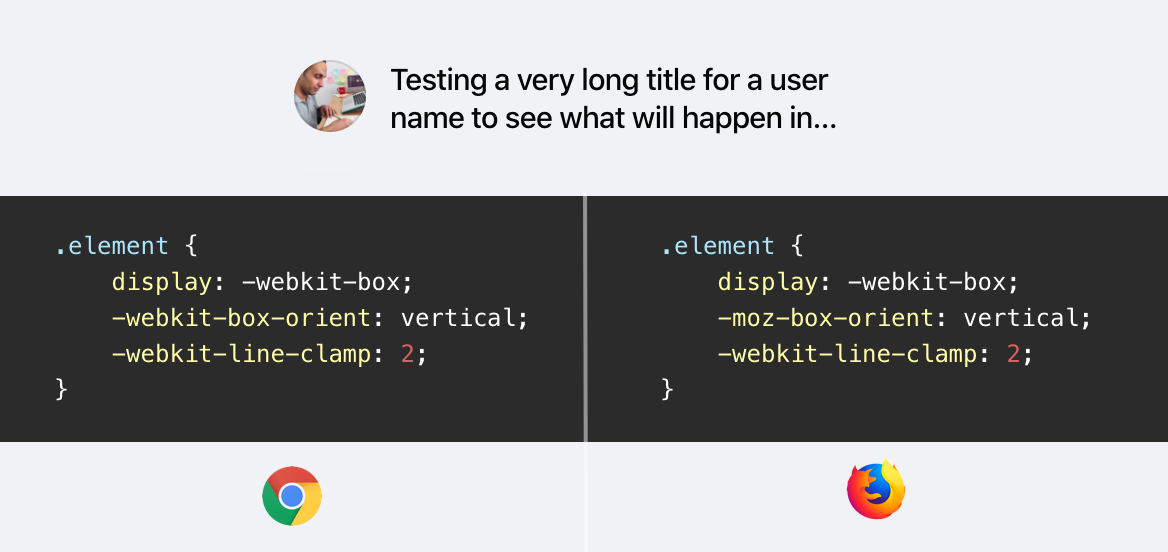
The browser support is fairly good for this CSS feature. As per CanIUse, all major browser supports that feature but with a prefix. You can learn more about it from this article by CSS Tricks.
Usually, we do hover effects in CSS. For example, a button that needs a different grey shade on hover, we simply use the following:
.element:hover {
  background: #ccc;
}
However, it seems that for a large website like Facebook, this is not practical. While testing and inspecting things, I noticed an element that is shown only on hover, and its main job is to act is a hover element.
.hover-div {
  position: absolute;
  right: 0;
  left: 0;
  top: 0;
  bottom: 0;
  pointer-events: none;
  border-radius: 6px;
  inset: 4px 0px;
  background-color: var(--hover-overlay);
  transition-property: opacity;
  transition-timing-function: var(--fds-animation-fade-out);
  cursor: pointer;
}
This element is being toggled in JavaScript to change the opacity from 0 to 1, so I played with it a bit and discovered that it’s being used heavily for a lot of components. See the collection of screenshots below for where this element is being used:

I like the consistency and simplicity of having the same hover effect for a lot of elements. If that means anything, it means that the design language is consistent and the system was carefully designed. Well done, Facebook!
It’s a shorthand that for the top, right, bottom, and left properties. It can be used like this:
.element {
  inset: 4px 0;
  /* Which is equivalent to: top: 4px, bottom: 4px, left: 0, right: 0 */
}
The inset property is used on the hover div for some elements, and it’s being added inline in HTML. I noticed it on the component below:

At the time of writing, inset is supported only in Firefox 66+ as per CanIUse.
dir=auto And CSS Logical PropertiesFor a multilingual website like Facebook, it’s sometimes hard to expect how the content will be. For example, the user name in the post component has dir="auto" attribute. It means that the direction of the text will be based on the language. For example, it will be left-to-right for English, and right-to-left for Arabic.
Adding on that, there is an inline CSS that changes the text direction (It looks like dir=auto is not enough.
<div dir="auto" style="text-align: start;">محتوى بالعربية</div>
Notice that text-align: start is added on the element. This is a CSS logical property which equivalent to text-align: right for LTR layouts.
If you’re interested to dig more in RTL styling, I wrote a detailed guide about that.
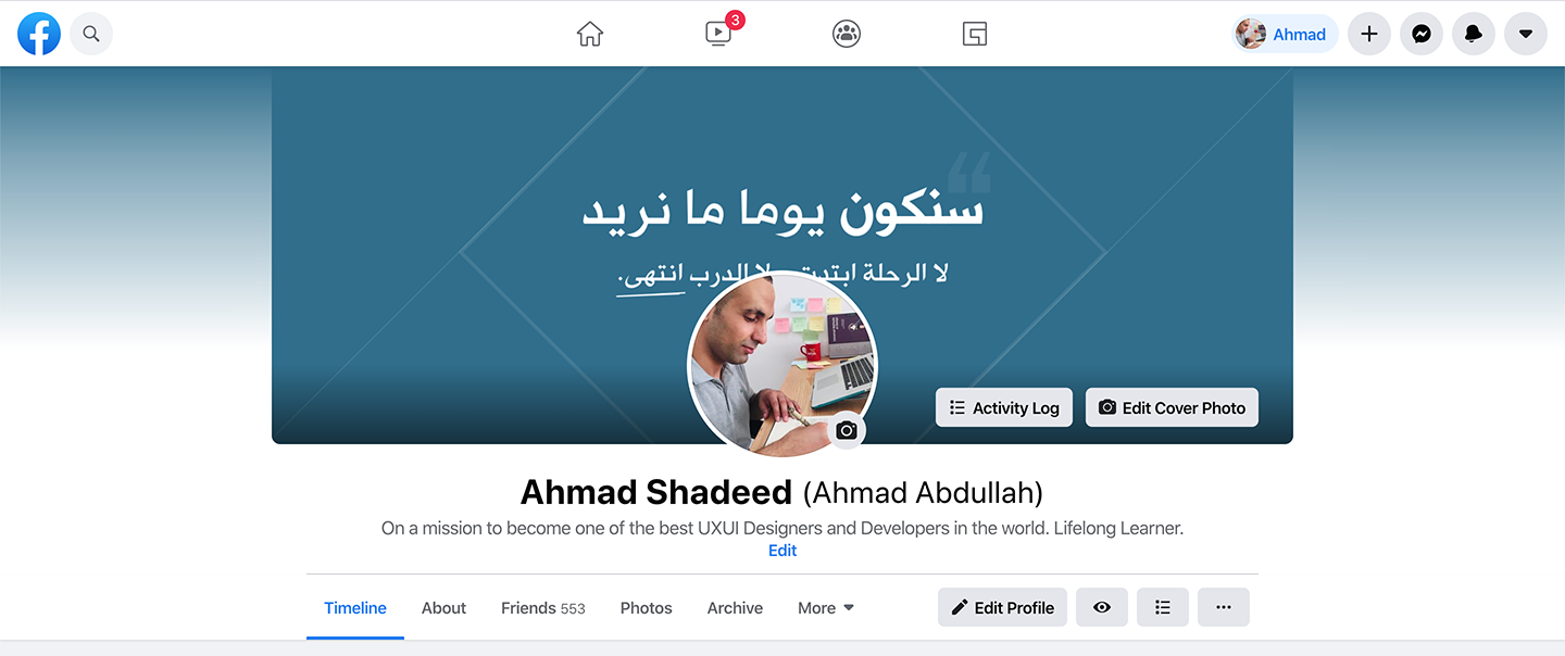
Do you notice that there is a gradient with a color similar to the main color in the cover photo? This is added dynamically based on the cover photo. How it works?
At first, we need to get the dominant (the most used) color in the cover photo. Once it’s there, the team created a small cover photo with that color only.


The background added for the element is from the dominant color. I highlighted the original cover photo in a white border for clarifying purposes.
.element {
  background-image: linear-gradient(
    to top,
    #ffffff,
    rgb(255, 255, 255),
    rgba(255, 255, 255, 0.7),
    rgba(255, 255, 255, 0.4),
    rgba(255, 255, 255, 0)
  );
}

And when the design is dark, the gradient is flipped from white to black:
.element {
  background-image: linear-gradient(
    to top,
    #000,
    rgb(0, 0, 0),
    rgba(0, 0, 0, 0.7),
    rgba(0, 0, 0, 0.4),
    rgba(0, 0, 0, 0)
  );
}

Hint: you can use this tool to get the dominant color from an image.

I liked how the team created a shadow for elements like dropdown menus for example. The shadow make you feel that it has depth and it’s far more real than just sticking with a regular shadow.
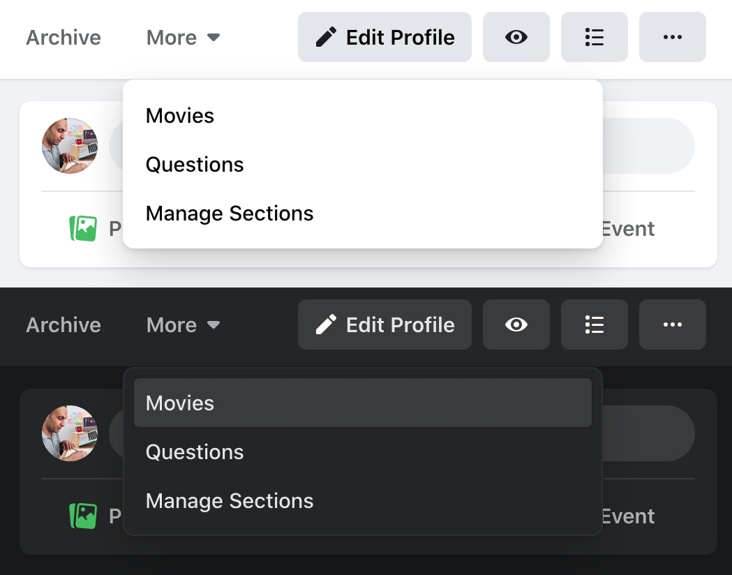
.element {
  box-shadow:
    0 12px 28px 0 rgba(0, 0, 0, 0.2),
    0 2px 4px 0 rgba(0, 0, 0, 0.1),
    inset 0 0 0 1px rgba(255, 255, 255, 0.5);
}
You might wonder, why is there an inset shadow with a 50% transparent white color? Well, that is for dark mode. See below for a zoomed image of that inset shadow:

Clever one, I liked it!
I noticed that all the grids in website are using flexbox. There is one that caught my attention which is “Your Photos” section.
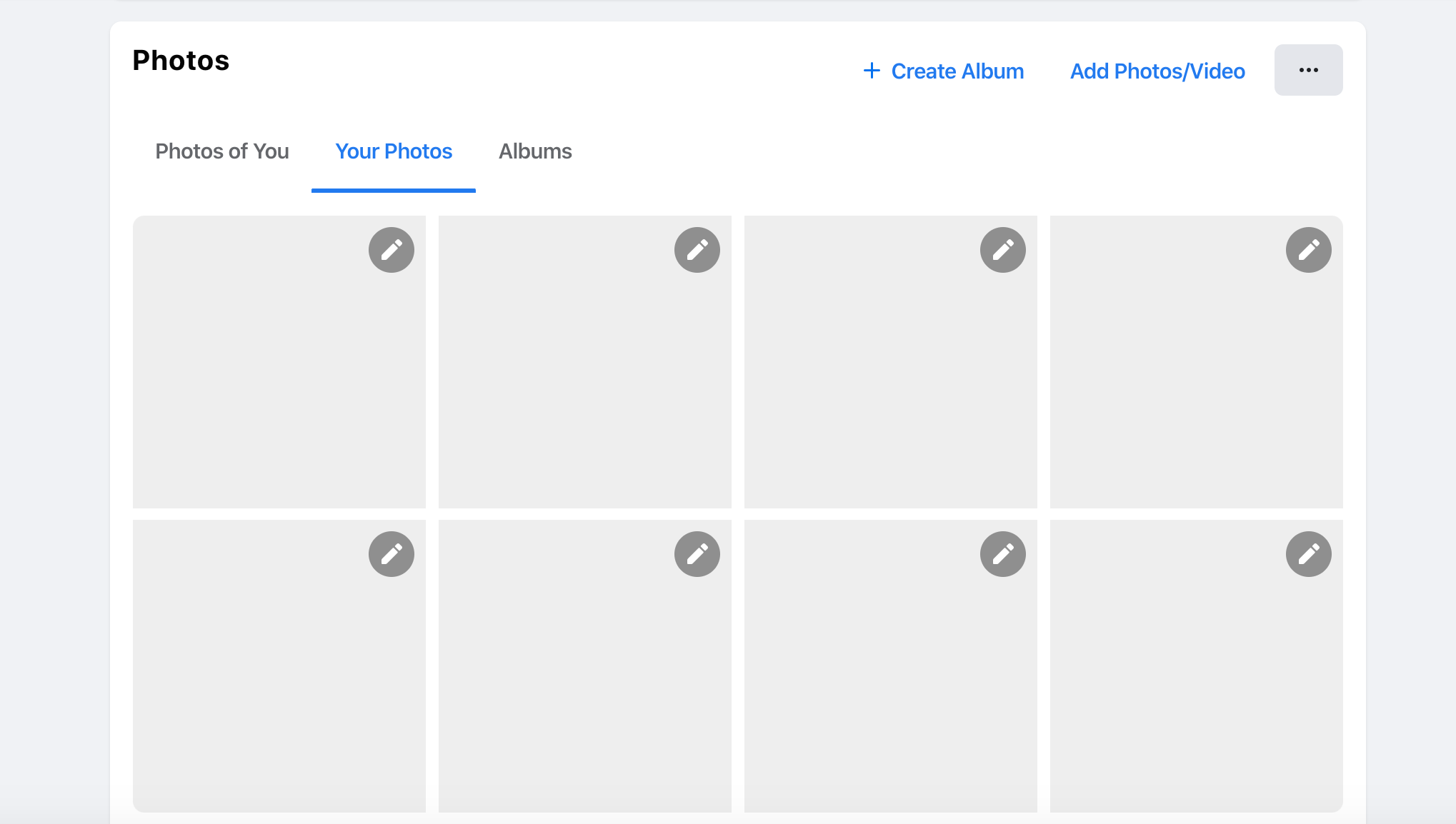
.wrapper {
  display: flex;
  flex-wrap: wrap;
  justify-items: space-between;
}

.item {
  width: 205px;
}
That sounds cool, right? Using space-between for the spacing is risky, because it can fail in cases like having only three photos. See the mockup below how it failed:
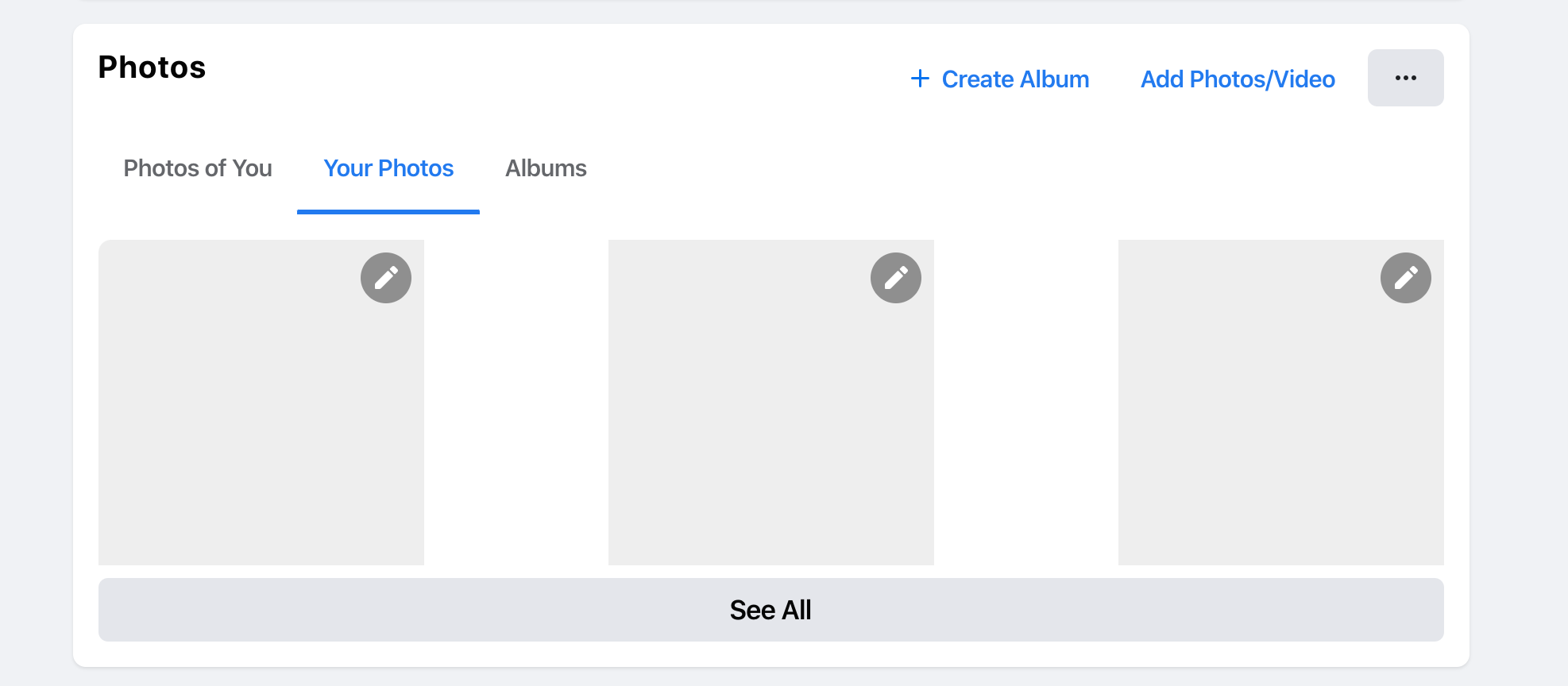
How did they fix such an issue? Well, there are four empty <div> elements with a width equal to each photo. The HTML looks like this:
<div class="wrapper">
  <div class="item">
    <a href="#"><img src="photo.jpg" /></a>
  </div>
  <div class="item">
    <a href="#"><img src="photo.jpg" /></a>
  </div>
  <div class="item">
    <a href="#"><img src="photo.jpg" /></a>
  </div>
  <div class="item">
    <a href="#"><img src="photo.jpg" /></a>
  </div>
  <div class="empty"></div>
  <div class="empty"></div>
  <div class="empty"></div>
  <div class="empty"></div>
</div>
That way, those empty divs will act as a fake item and they will keep the spacing equal between the items.
For me, it’s rare to see a use for vertical media queries in the wild. I liked that they used one to shorten the width of the news feed in the home page. Here is the CSS used:
@media (min-height: 700px) {
  .element {
    width: 584px;
  }
}
That’s all, folks. I enjoyed working on this article and learned a lot. I hope you find it useful, and please spread the word if you like it.
That’s a wrap. Do you have a comment or a suggestion? Please feel free to ping me on @shadeed9.
此内容由惯性聚合(RSS阅读器)自动聚合整理,仅供阅读参考。 原文来自 — 版权归原作者所有。