


I spent years teaching CSS layout on this blog. I put everything I know into The Layout Maestro course: 70+ lessons and 150+ interactive examples that teach you how to think CSS layouts, not just memorize syntax.
SVG isn’t only about icons and illustrations, it has lots of hidden power we developers sometimes forget about. There are lots of use-cases where using SVG makes lots of sense compared to CSS. For example, building a circular loading animation, or applying masks on images. In such cases, it doesn’t mean that using CSS isn’t possible, but it can sometimes be a pain to fight cross-browser issues based on the technique used (e.g: masks), so using SVG can save time and effort.
The great thing about SVGs is that they can be responsive, performant, and work out of the box with HTML&CSS. In this article, my goal is to introduce you to different use cases where we can use SVG along with HTML and CSS to build specific UI components.
Let’s get into the use-cases. Are you ready?
The cut-out avatar is something I’ve spotted while looking into Facebook’s CSS. In messenger, the user avatar can have a badge on top of it. The avatar is cut out to allocate space for the badge.
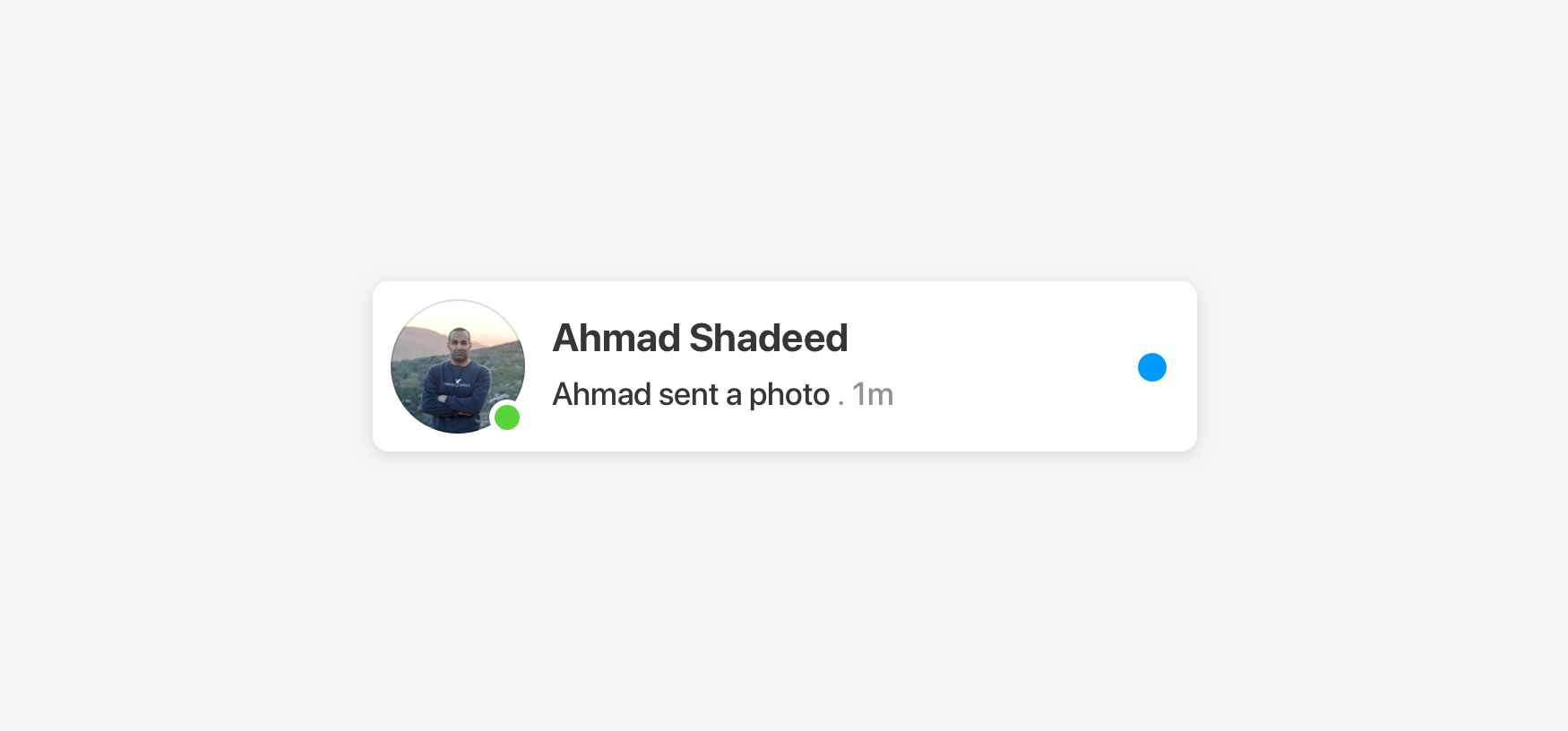
This can be done by adding a CSS white border (as a quick fix). But why not take this further into a dynamic SVG component?
.badge {
  border: 2px solid #ff;
}
You might be thinking of why to use SVG if the border works? Well, there is no right or wrong here. But there is a solution that is better than the other. Do you remember in math classes where the teacher might mention a problem could’ve different solutions and one of them can be the better in terms of flexibility? I feel the same for our case.
Anyway, I will show you how the border solution will fail quickly. It will fail:
In the figure below, notice how the white border for the badge interferes with the dark background and the hover state.
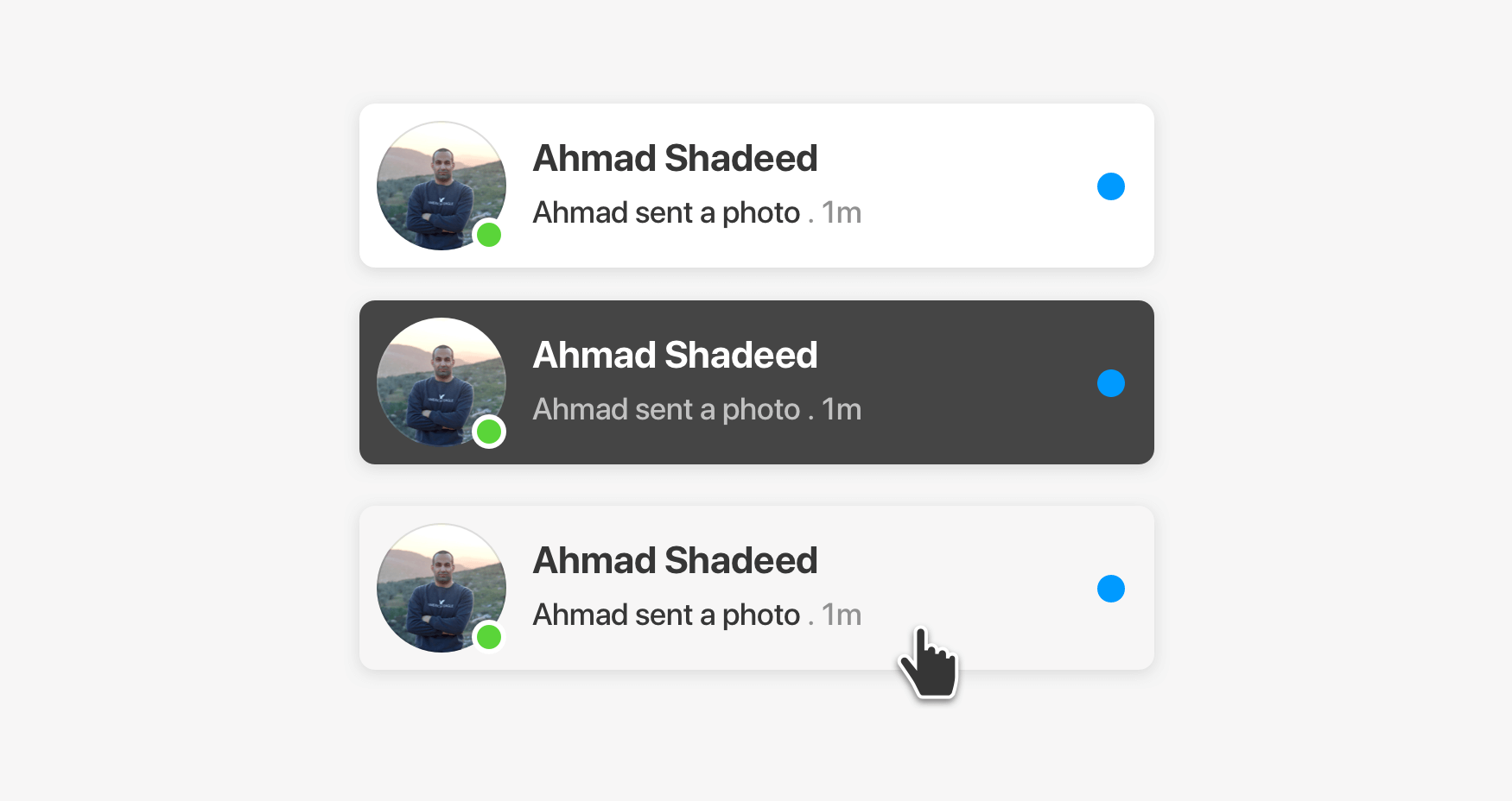
We can solve that by changing the border color on hover, but that’s doesn’t look like the best solution for me.
.card__badge {
  border: 2px solid #ff;
}

.card:hover .card__badge {
  border-color: lightgrey;
}

@media (prefers-color-scheme: dark) {
  .card__badge {
    border-color: #454545;
  }
}
With SVG, the above can be solved in a much better way by cutting the area under the badge. That way, it will work with any kind of background.
Consider the following figure:
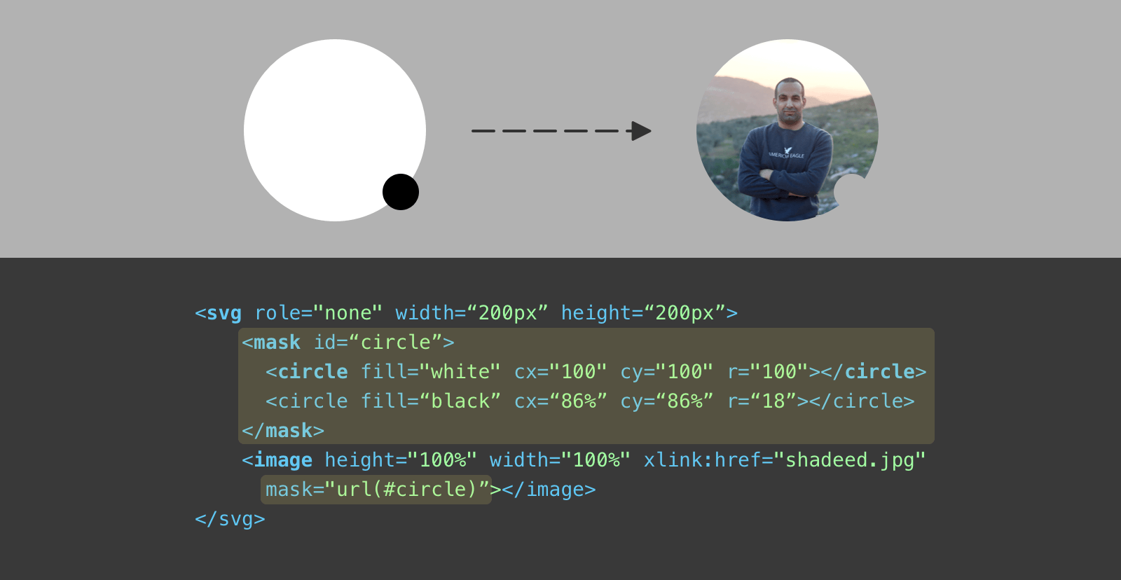
We’re using the SVG <image> element to contain the avatar. To cut out the badge area, we need to create two <circle> elements, one is white and the other is black.
In masks, any element with black fill will be hidden, while the white one will be visible. The black circle is positioned at the bottom right corner with a radius of 18.
In design tools, the above is named subtract. We want to subtract the small circle from the larger one.
Here is the final demo:
See the Pen Avatar - SVG Mask by Ahmad Shadeed (@shadeed) on CodePen.
If you’re curious to know more about the cut-out effect, I wrote a deep dive into the different solutions.
In one of my client projects, I designed and built a section title by combining SVG and CSS. The brand is related to security, so using such a style could fit.
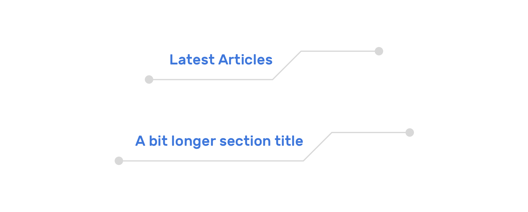
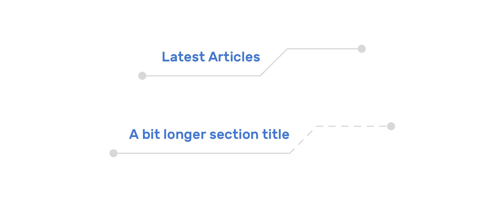
The component needs to work with short and long titles, and if the title is too long, it should wrap into multiple lines without breaking the layout. To build that, I did the following:
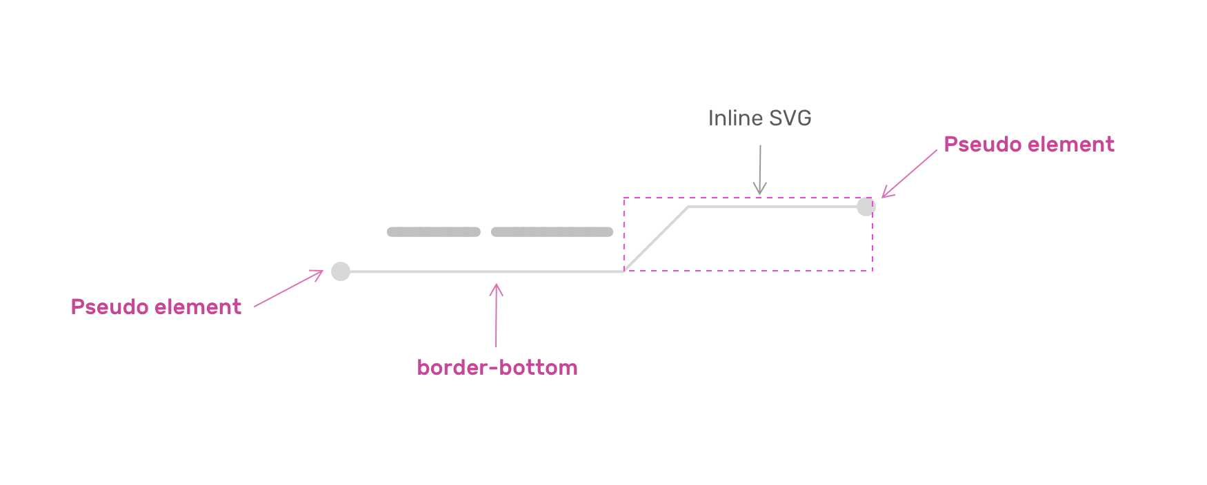
Let’s start with the basic HTML and CSS.
<h2 class="c-section__title">
  <span>CSS is awesome</span>
  <svg
    xmlns="http://www.w3.org/2000/svg"
    width="128"
    height="34.5"
    viewBox="0 0 128 34.5"
    preserveAspectRatio="none"
  >
    <path
      fill="none"
      stroke="#d8d8d8"
      stroke-width="2"
      d="M127 1H33.5L1 33.5"
    ></path>
  </svg>
</h2>
.c-section__title {
  max-width: 700px;
  width: fit-content;
  display: flex;
  margin-left: auto;
  margin-right: auto;
}
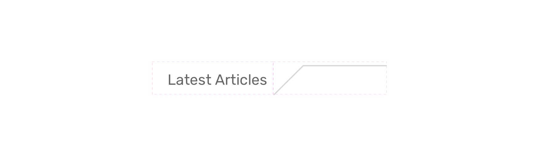
Next step, I want to add a border under the <span> element to mimic the connected line to the SVG.
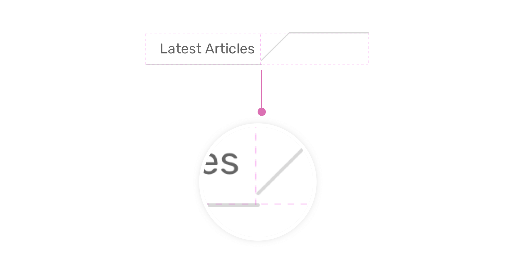
I noticed that the SVG isn’t connected with the line. Since we’re using flexbox, fixing that is straightforward. We just need to align the flex items to the flex-end.
.c-section__title {
  max-width: 700px;
  width: fit-content;
  display: flex;
  align-items: flex-end;
  margin-left: auto;
  margin-right: auto;
}
Then, we need to add the circles at the start and end using pseudo elements with absolute positioning.
See the Pen Section Title by Ahmad Shadeed (@shadeed) on CodePen.
What’s also great about using SVG is that we can turn the SVG path into a dotted line that can be animated. To do that, we need to make sure that the exported path in the SVG is not outlined.
<path
  d="M127 1H33.5L1 33.5"
  fill="none"
  stroke="#d8d8d8"
  stroke-width="2"
></path>
I learned this technique from this great article by Jake Archibald. The idea is that we want to get the path length.
In Chrome DevTools, inspect the SVG and select the <path> element, you will notice == $0 next to the end of it. Keep it selected, move it to the console and write the following script.
$0.getTotalLength()
// 139.46
The $0 is a quick way to select an element from the DOM without going into something like this:
let sectionPath = document.querySelector("#path")
console.log(sectionPath.getTotalLength())
That was a quick tip within the context of this example.
Now that we have the length, we can do whatever we want with it. For example, we can animation it on hover.
.c-section__title--dashed path {
  stroke-dasharray: 139;
  stroke-dashoffset: 0;
  transition: 0.7s;
}

.c-section__title--dashed:hover path {
  stroke-dashoffset: 139;
}
See the Pen Section Title - Animated by Ahmad Shadeed (@shadeed) on CodePen.
Or we can simply turn it into a dotted line (We don’t really need to know the path length in that case).
We can use SVG to create custom link underlines that spark joy. I create a script years ago that randomly generates a path and redraws it on hover.
Consider the following figure for a before and after preview.
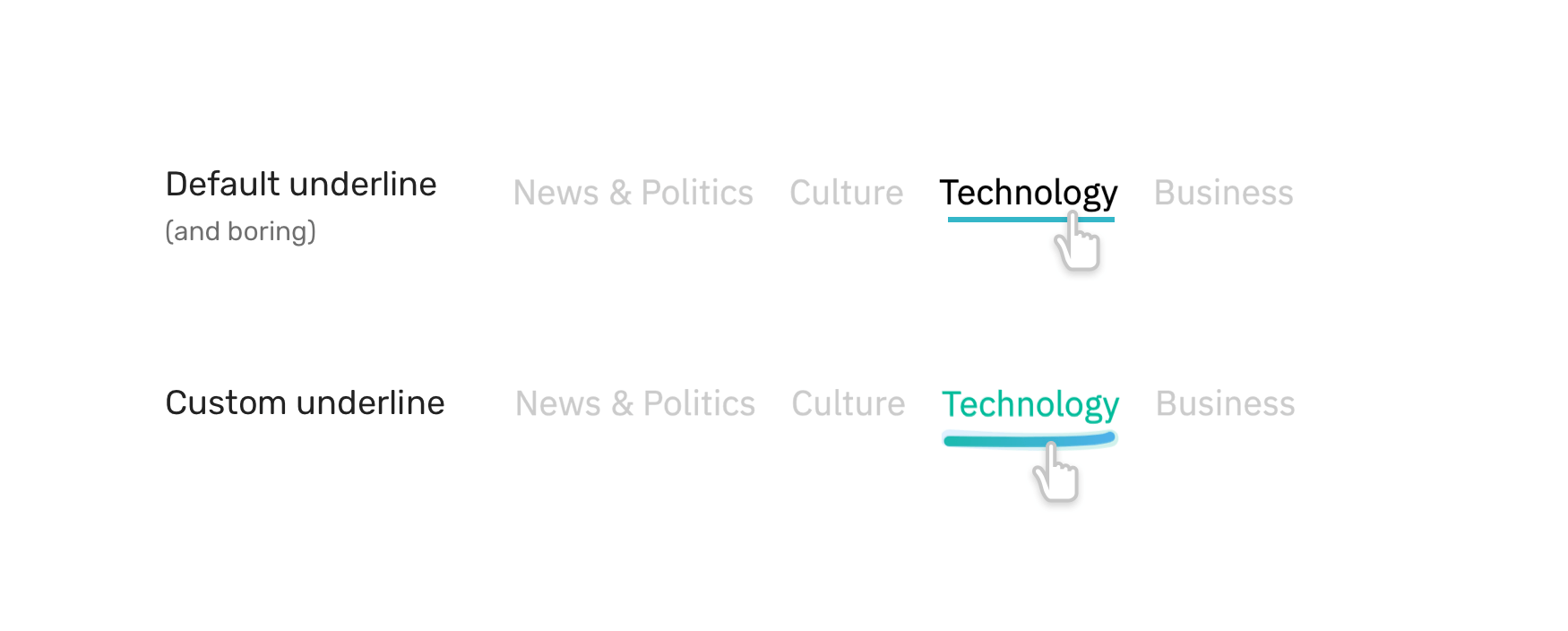
The idea is that we want to insert an SVG to each link, and it will look like the following:
<svg width="400" height="35" xmlns="http://www.w3.org/2000/svg">
  <path
    id="pathItem"
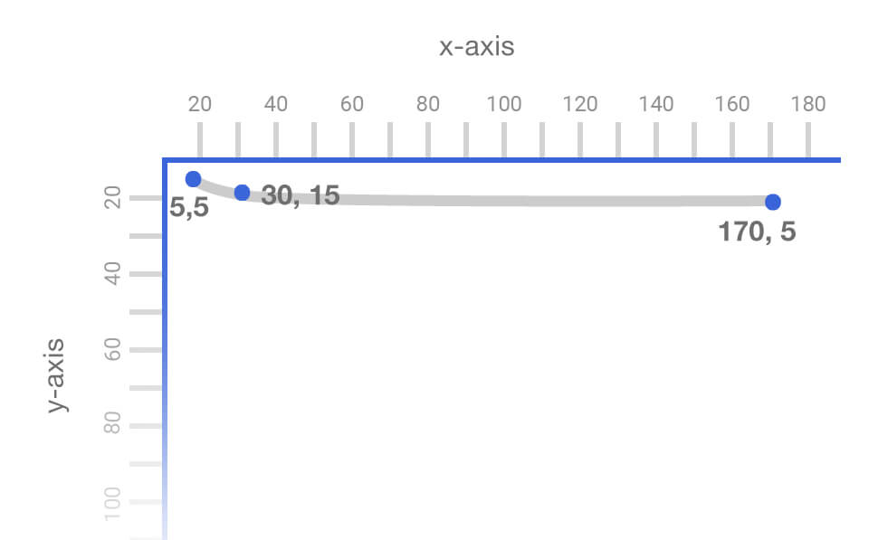
    d="M5 5 Q 30 15 170 5"
    stroke="black"
    fill="transparent"
    stroke-width="7"
    stroke-linecap="round"
  />
</svg>
The magic happens by altering the d attribute value. Here is a visual that shows how a path is actually drawn.
See the Pen Underline.js by Ahmad Shadeed (@shadeed) on CodePen.
For more details on the technical side, please refer to my Custom Underlines with SVG article or go to the github repository.
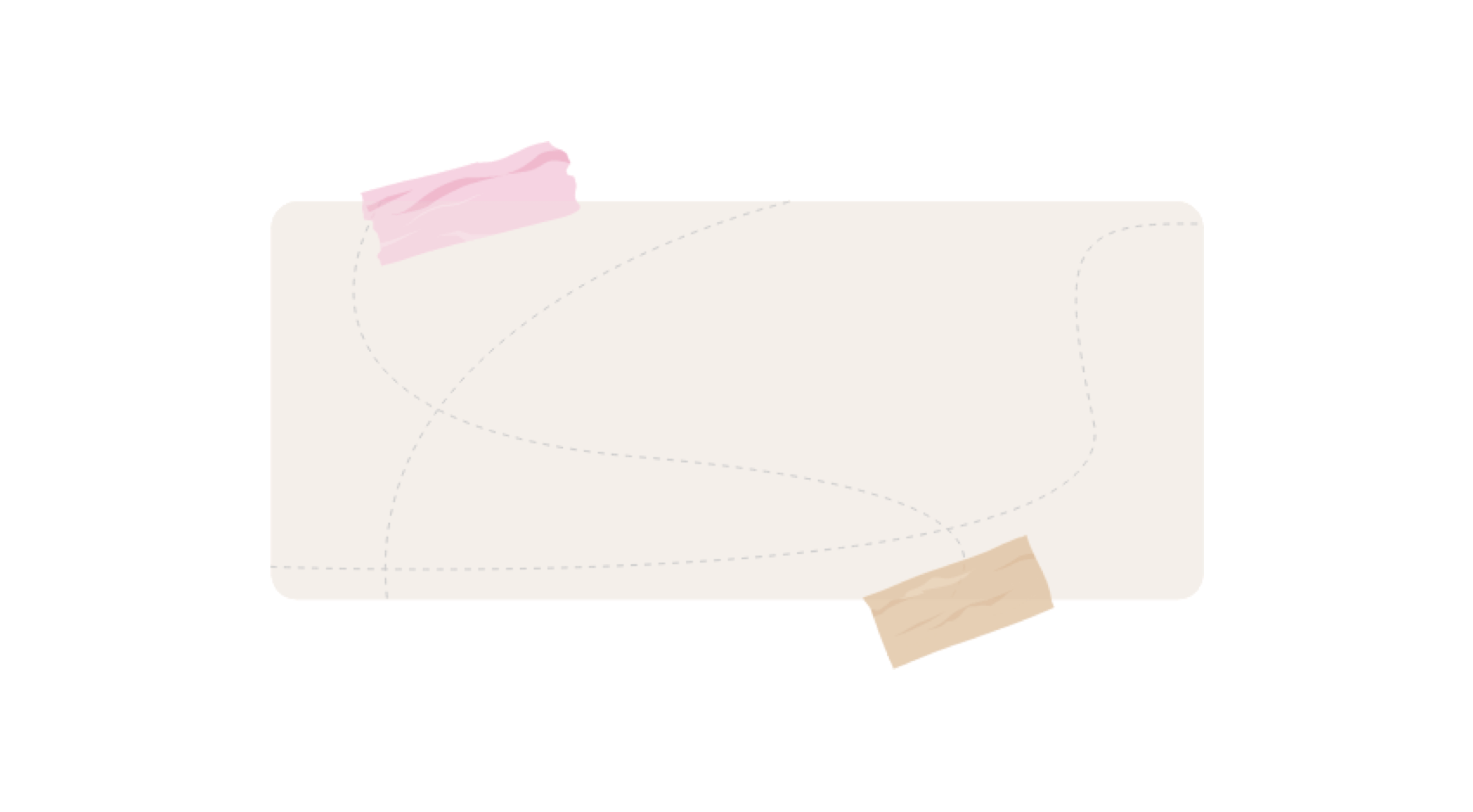
While working on a client project, I needed a way to attach tapes to a section in a way that is possible to be placed anywhere with CSS and is dynamic enough to change its color via one CSS variable only.
Consider the following figure:
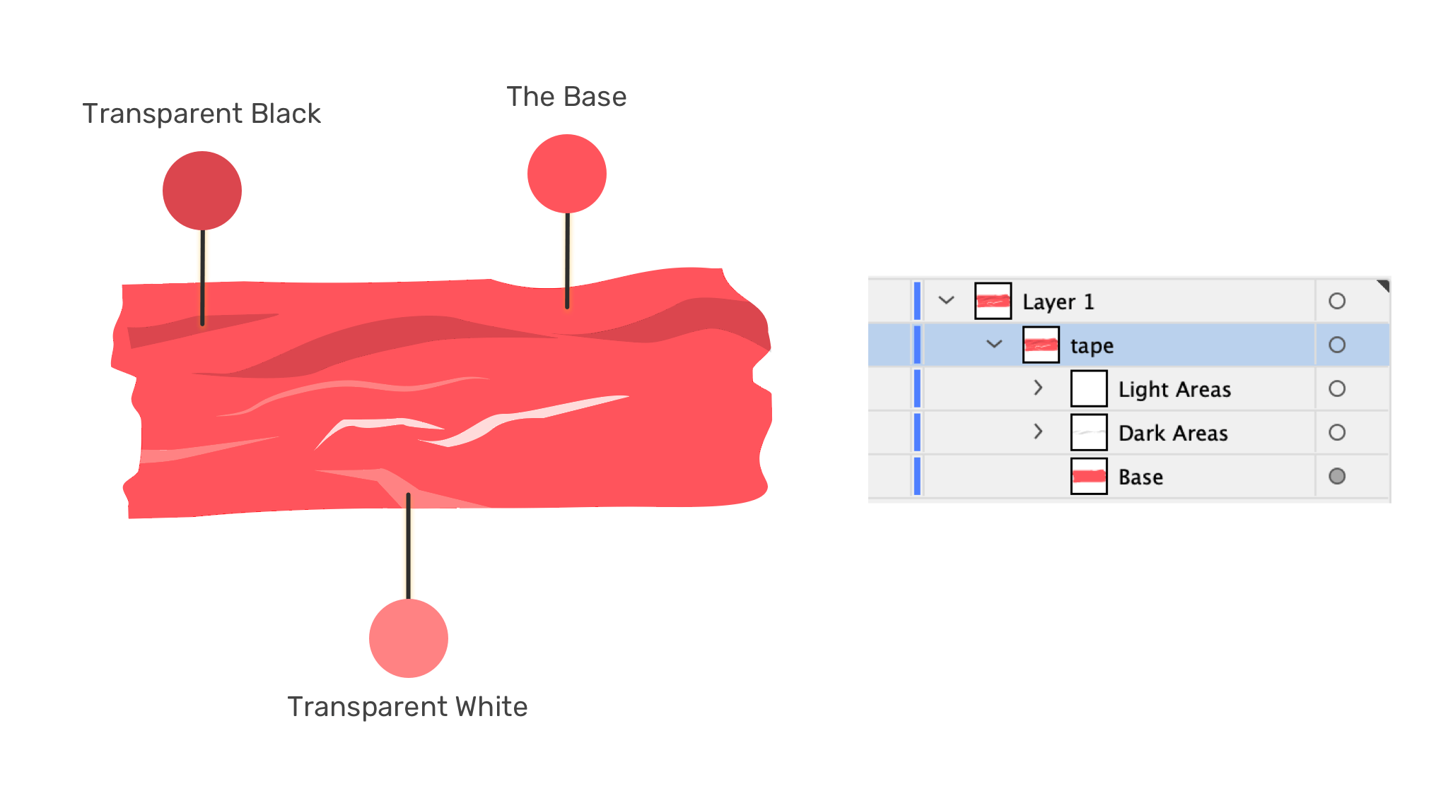
In Adobe Illustrator, I divided the tape into layers:
Let’s have a look at the SVG code.
<svg>
  <defs>
    <g id="tape" fill="currentColor">
      <!-- path contents -->
    </g>
  </defs>
</svg>
Notice that I’ve added fill=currentColor. The currentColor keyword will inherit the value from the CSS color property so that we can dynamically change the color using only one property.
Given that we have a base with a solid color, and two other layers for the light and dark areas, changing the color will result in different-looking tapes.
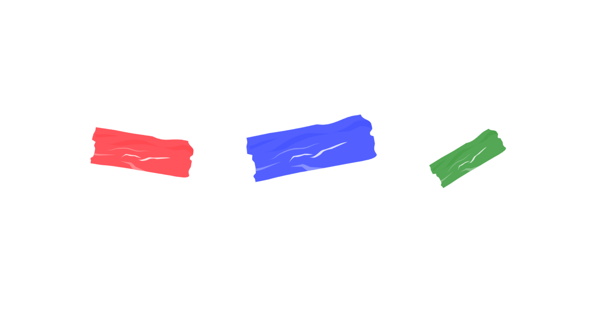
Even better, we can turn the SVG into a template and get help from the <use> SVG element to reuse the tape without duplicating the SVG.
<svg style="display: none;">
  <defs>
    <g id="tape" fill="currentColor">
      <!-- path contents -->
    </g>
  </defs>
</svg>

<!-- An example of using the tape from a template -->
<svg
  class="tape"
  style="--angle: 10deg; color: red; --size: 120px;"
  aria-hidden="true"
  focusable="false"
  viewBox="0 0 123 47"
>
  <use href="#tape"></use>
</svg>
Notice how I added the tape via the <use> element. What’s nice about that is the usage of CSS variables as inline styles.
Here’s how the CSS looks like:
.tape {
  width: var(--size);
  transform: rotate(var(--angle));
}
See the Pen SVG Tape by Ahmad Shadeed (@shadeed) on CodePen.
Building UI components with the help of SVG can make things easier and more straightforward. Some of the UI components might not be a 100% perfect use-case or an SVG (e.g: the avatar cut-out) but it depends on the context of the project you’re working on.
What about you? Do you have use-cases where using SVG & CSS shine? If yes, please share them with me on Twitter @shadeed. Thank you for reading!
此内容由惯性聚合(RSS阅读器)自动聚合整理,仅供阅读参考。 原文来自 — 版权归原作者所有。