


This year, Sergey Chernyshev, Eric Goldstein, and Alex Chernyshev – members of the NY Web Performance meetup – decided to collaborate on the future of the UX Speed Calculator tool Sergey created a few years ago. The initial goal for the tool was to help explain web performance data and how performance impacts business using simple modeling.
Before any improvements began, we decided to expand the tool’s audience and scope via a presentation centered around 7 steps of learning about web performance; the journey starts with information for beginners and progresses stepwise until reaching the most advanced industry best practices (and even a bit beyond).
Designing such a tool allowed us to step back and describe a journey we usually saw companies take in exploration of web performance. We created this story and talk as a blueprint for the functionality of this educational tool and presented it at a few events, including Google DevFest in NYC and the Performance.sync() community pre-event at the industry Web Performance conference Performance.now().
You can watch the short, 15 min version recorded at Performance.sync()
Engineers speak tech, numbers and geek out on clever solutions.
Business speaks $$, designers care about UX, product speaks UI.
A lot of truth is lost in translation between these languages, and we need to help all the people involved understand each other.
Following are the steps that we usually see people and companies go through in their journey to understand and improve web performance. Use the following progressive enhancement to help yourself and your counterparts advance in the web performance journey.
All businesses operate with a core formula; for example, an e-commerce business might use something as follows:
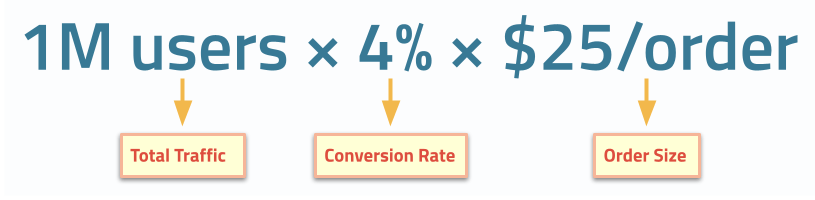
While it’s generally accepted that product decisions impact business outcomes, core formulas rarely consider speed of user experience (a.k.a. web performance) as part of its decision making. Specifically, some of the components of the formula are, in fact, subjected to impact from slow user experience, like a conversion rate in this example.
At this point, a technology team or business team gets a notion of speed impacting the business (e.g. conversion rate). It usually comes from external sources like developer conferences, Google marketing, and SEO teams or social media.
Intuitively many people understand that unhappy users don’t convert to customers as well, and faster experiences make users happier.
In addition to intuitive understanding, you can use the many business case-studies on https://wpostats.com/ and https://web.dev/case-studies that tell existing success stories linking performance improvements and business metric improvements. These case-studies can act as external validation for UX Speed / Web Performance efforts until you acquire more data about your own business on the next levels.
At this point, engineers start measuring speed of their websites, most likely using synthetic tools like Google Page Speed Insights / Lighthouse, in-browser Developer Tools, or Cloudflare Synthetic Testing. They start setting some thresholds for the measurements and start thinking of the goals to achieve.
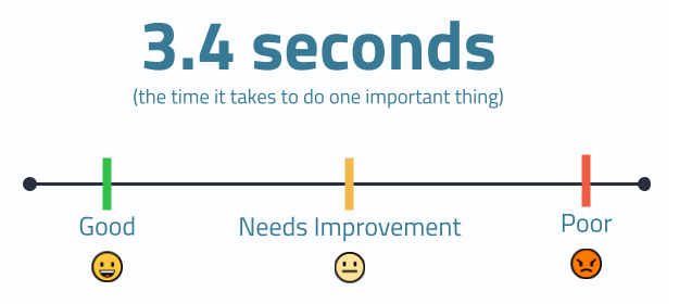
Some of these efforts are driven by Google’s Core Web Vitals program which defined both the first 3 metrics and their respective thresholds; specifically, this initiative introduced the following modern metrics:
Once conversation turns to goals and actions, it is important to start understanding that the numbers and metrics that we use represent real users, and every website has a multitude of users, not just one. Moreover, those users have different and widely varying experiences, driven by numerous factors, many of which are outside of your control.
Synthetic testing helps in investigating issues by enabling a testing environment built to your specifications. On the upside, doing so provides a lot of power in drilling into the underlying technological reasons for slowness. However, on the downside, this highly controlled environment rarely realistically represents your real users, so supplemental data is needed for the full picture. This is where we need to start gaining statistical understanding of the numbers, and this is where you start looking at data sources like Chrome User Experience Report (CrUX) for data collected from the Google Chrome browser for your site and aggregated (with privacy in mind); this is effectively Real User Monitoring at scale for a single browser. If you prefer to have this kind of data for all your users across all browsers, numerous Real User Monitoring services exist for this purpose.
The web performance community, in many ways, thanks to the Core Web Vitals initiative, agreed on using 75th percentile for web performance metrics. Notably we try not to use the term “average user”; we are not going to go into a rabbit hole of explaining means, medians and other statistical challenges here, it is a good idea to get a statistics refresher for that.
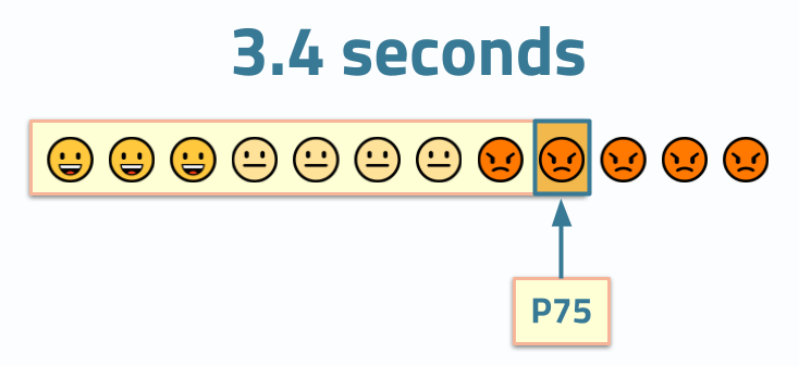
We urge you to always mention the percentile next to the numbers that you share or quote. If you don’t see a percentile next to a metric’s value, treat the values with suspicion and ask clarifying questions about the methodology behind them.
After you collect a P75 value, it is commonly a good idea to start tracking it over time to understand how changes in the product, infrastructure, or user demographics impact your user experiences.
Because one number cannot reliably describe all your users, companies often use 3 or more percentiles to track performance.
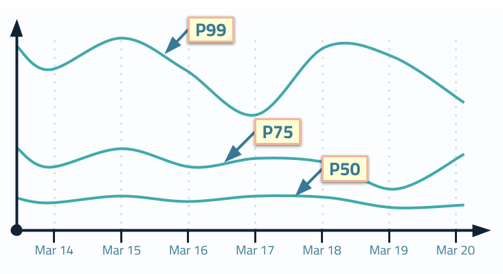
Interestingly enough, different teams in your organization probably lean towards different numbers:
Many organizations, especially organizations with heavy DevOps influence, stay at this level where time-series charts with several percentiles become a norm in monitoring and understanding of “performance”.
We urge these organizations to go further.
One of the challenges of just tracking several lines on a time series is that visually they make it hard to comprehend overall distribution. Even the most scientifically and statistically equipped engineers have a hard time visualizing the distribution from 3 values. Needless to say that business teams and designers that are even less inclined to operate in such a manner have a hard time discussing them and making rational decisions based on these numbers.
Another reason why it is also challenging is the fact that most statistical education concentrates on “normal” distributions a.k.a. “bell curves” that are symmetrical around the mean. Our intuition stops us from properly estimating the shape of the curve and empathizing with users across that curve.
Web Performance metrics usually have a log-normal distribution; thus, a clearly displayed, full histogram including its “long tail” can help onlookers better understand the behavior of all users. Specifically, histograms are a better way to represent distributions because each pixel on a histogram represents a user.
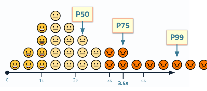
To further help improve empathy, we visualized this concept as an “emoji histogram” to help decision makers relate to actual users and their feelings as they experience speed (smiley faces) and slowness (angry faces).
Once you start recording and analyzing statistical data representing all your users, you can use these distributions to get further insight and to drive your experimentation and decision making. Comparing histograms of performance metrics for before/after performance initiatives or as part of A/B (or multi-variate) testing can help reduce biases in the data and see the impact of the efforts.
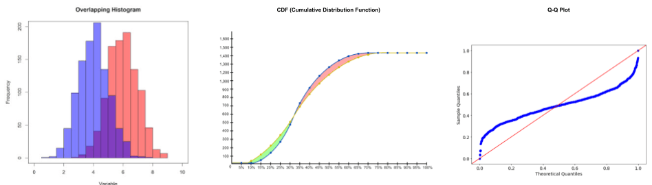
In addition to overlapping histograms, engineers can use Cumulative Distribution Functions or Q-Q plots that are better at highlighting the changes between distributions, especially when comparing populations of different sizes. Just keep in mind that being able to empathize with every pixel on a histogram might be as important as having a scientifically correct chart when your goal is to reduce the language barrier across your organization.
And last but not least, a tool that can give you a powerful business argument is correlating Web Performance metrics with business KPIs. For example, one of the most well-known examples is by Cliff Crocker who created a chart correlating conversion rate to page load time while at Walmart (many years ago) that kicked off a lot of this methodology.
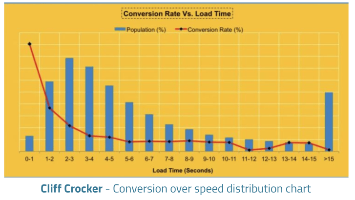
You can see more information on using such charts at SpeedCurve where Cliff is now a lead product manager for their RUM solutions.
Looking to the future, opportunities exist to add more dimensions to the data and start automatically detecting anomalies to make it easier to identify issues. We are also hoping to use violin plots to visualize multiple related web performance metrics in order to understand the overall picture more easily.
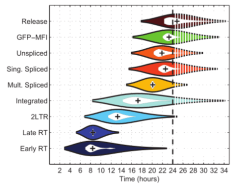
And generally, innovating on the visualizations of both performance and business is important to make it easier to build business cases for improvements to the speed of user experience.
Ultimately, we hope to add some of this journey to the UX Speed Calculator performance training tool to make it a useful educational aid.
Remember to understand which level you’re currently on and which level your organization is on – there is no point preaching some advanced topic until all the parties involved can understand the language spoken; help bridge that gap and go on this journey together!
Illustrations
此内容由惯性聚合(RSS阅读器)自动聚合整理,仅供阅读参考。 原文来自 — 版权归原作者所有。