


Flexbox had a lot of early problems, but by mid-May 2020 where our story begins, both Firefox and Chromium had done a lot of work on improving things with this feature. WebKit, however, hadn’t caught up. Prioritizing the incredible amounts of work a web engine requires is difficult. The WebKit implementation was still passable for very many (most) cases of the core features, and it didn’t have problems that caused crashes or something that urgently demanded attention, so engineers dedicated their limited time toward other things. The net result, however, was that as this choice repeated many times, the comparative state of WebKit’s flexbox implementation had fallen behind pretty significantly.
Web Platform Tests (WPT) is a huge ongoing effort from many people to come up with a very extensive list of tests that could help both spec editors and implementors to make sure we have great compatibility. In the case of flexbox, for example, there are currently 773 tests (2926 subtests) and WebKit was failing a good amount of them. This matters a lot because there are things that flexbox is ideal for, and it is exceptionally widely used. In mid-May, Igalia was contracted to improve things here, and in this post, I’ll explain and illustrate how we did that.
The Challenge
The main issues were (in no particular order):
min-width:autoandmin-height:autohandling- Nested flexboxes in column flows
- Flexboxes inside tables and viceversa
- Percentages in heights with indefinite sizes
- WebKit CI not runnning many WPT flexbox tests
- and of course… lack of gap support in Flexbox
Modifying Flexbox layout code is a challenge by itself. Tiny modifications in the source code could cause huge differences in the final layout. You might even have a patch that passes all the tests and regresses multiple popular web sites.
Good news is that we were able to tackle most of those issues. Let’s review what changes you could eventually expect from future releases of Safari (note that Apple doesn’t disclose information about future products and/or releases) and the other WebKit based browsers (like GNOME Web).
Flexbox gaps 🥳🎉
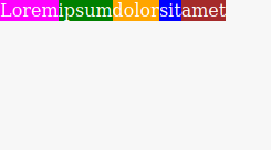
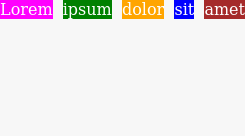
Probably one of the most awaited features in WebKit by web developers. It’s finally here after Firefox and Chrome landed it not so long ago. The implementation was initially inspired by the one in Chrome but then it diverged a bit in the final version of the patch. The important thing is that the behaviour should be the same, at least all the tests in WPT related to gaps are passing now in WebKit trunk.
<div style="display: flex; flex-wrap: wrap; gap: 1ch">
  <div style="background: magenta; color: white">Lorem</div>
  <div style="background: green; color: white">ipsum</div>
  <div style="background: orange; color: white">dolor</div>
  <div style="background: blue; color: white">sit</div>
  <div style="background: brown; color: white">amet</div>
</div>
| Before | After |
|---|---|
 |
 |
Tables as flex items
Tables should obey the flex container sizing whenever they are flex items. As it can be seen in the examples bellow, the tables’ layout code was kicking in and ignoring the constraints set by the flex container. Tables should do what the flex algorithm mandates and thus they should allow being stretched/squeezed as required.
<div style="display:flex; width:100px; background:red;">
  <div style="display:table; width:10px; max-width:10px; height:100px; background:green;">
    <div style="width:100px; height:10px; background:green;"></div>
  </div>
</div>
| Before | After |
|---|---|
 |
 |
Tables with items exceeding the 100% of available size
This is the case of tables placed inside flex items. The automatic layout table algorithm was generating tables with unlimited widths when the sum of the sizes of their columns (expressed in percentages) was exceeding the 100%. It was impossible to fulfill at the same time the constraints set by tables and flexbox algorithms.
<div style="display:flex; width:100px; height:100px; align-items:flex-start; background:green;">
  <div style="flex-grow:1; flex-shrink:0;">
    <table style="height:50px; background:green;" cellpadding="0" cellspacing="0">
      <tr>
        <td style="width:100%; background:green;"> </td>
        <td style="background:green;"> </td>
      </tr>
    </table>
  </div>
</div>
| Before | After |
|---|---|
 |
 |
Note how the table was growing indefinitely (I cropped the “Before” picture to fit in the post) to the right before the fix.
Alignment in single-line flexboxes
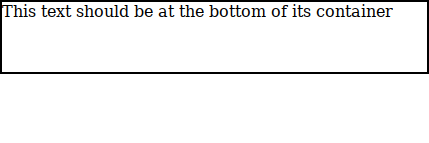
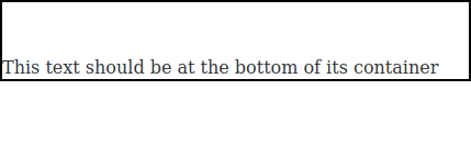
Interesting case. The code was considering that single-line flexboxes were those where all the flex items were placed in a single line after computing the required space for them. Though sensible, that’s not what a single line flexbox is, it’s a flex container with flex-wrap:nowrap. This means that a flex container with flex-wrap:wrap whose children do not need more than 1 flex line to be placed is not a single-line flex container from the specs POV (corolary: implementing specs is hard).
<div style="display: flex; flex-wrap: wrap; align-content: flex-end; width: 425px; height: 70px; border: 2px solid black">
  <div style="height: 20px">This text should be at the bottom of its container</div>
</div>
| Before | After |
|---|---|
 |
 |
Percentages in flex items with indefinite sizes
One of the trickiest ones. Although it didn’t involve a lot of code it caused two serious regressions in Youtube’s upload form and when viewing Twitter videos in fullscreen which required some previous fixes and delayed a bit the landing of this patch. Note that this behaviour was really conflictive from the pure specification POV as there were many changes over the time. Defining a good behaviour is really complicated. Without entering in too much details, flexbox has a couple of cases were sizes are considered as definite when they are theoretically indefinite. In this case we consider that if the flex container main size is definite then the post-flexing size of flex items is also treated as definite.
<div style="display: flex; flex-direction: column; height: 150px; width: 150px; border: 2px solid black;">
  <div>
    <div style="height: 50%; overflow: hidden;">
      <div style="width: 50px; height: 50px; background: green;"></div>
    </div>
  <div>
  <div style="flex: none; width: 50px; height: 50px; background: green;"></div>
</div>
| Before | After |
|---|---|
 |
 |
Hit testing with overlapping flex items
There were some issues with pointer events passing through overlapping flex items (due to negative margins for example). This was fixed by letting the hit testing code proceed in reverse (the opposite to painting) order-modified document order instead of using the raw order from the DOM.
<div style="display:flex; border: 1px solid black; width: 300px;">
  <a style="width: 200px;" href="#">Lorem ipsum dolor sit amet, consectetur adipiscing elit, sed do eiusmod tempor incididunt ut labore et dolore magna aliqua</a>
  <div style="margin-left: -200px; width: 130px; height: 50px; background: orange;"></div>
</div>
| Before | After |
|---|---|
 |
 |
In the “Before” case hit testing was bypassing the orange block and thus, the cursor was showing a hand because it detected that it was hovering a link. After the fix, the cursor is properly rendered as an arrow because the orange block covers the underneath link.
In this case the issue was that, in order to compute percentages in heights, we were incorrectly using the size of the scrollbars too.
<div style="display: inline-flex; height: 10em;">
  <div style="overflow-x: scroll;">
    <div style="width: 200px; height: 100%; background: green"></div>
  </div>
</div>
| Before | After |
|---|---|
 |
 |
Note that in the “After” picture the horizontal scrollbar background is visible while in the “Before” the wrong height computation made the flex item overlaps the scrollbar.
Image items with specific sizes
The flex layout algorithm needs the intrinsic sizes of the flex items to compute their sizes and the size of the flex container. Changes to those intrinsic sizes should trigger new layouts, and the code was not doing that.
<!-- Just to showcase how the img bellow is not properly sized -->
<div style="position: absolute; background-color: red; width: 50px; height: 50px; z-index: -1;"></div>

<div style="display: flex; flex-direction: column; width: 100px; height: 5px;">
  <img style="width: 100px; height: 100px;" src="https://wpt.live/css/css-flexbox/support/100x100-green.png">
</div>
| Before | After |
|---|---|
 |
 |
Nested flexboxes with min-height: auto
Another tricky one and another one related to the handling of nested column flexboxes. As in the previous issue with nested column flexboxes the problem was that we were not supporting this case. For those wanting to have a deeper understanding of the issue this bug was about implementing section 4.5 of the specs. This was one of the more complicated ones to fix, Edward Lorenz would love that part of the layout code, the slightest change in one of those source code lines could trigger huge changes in the final rendering.
<div style='display:flex; flex-direction: column; overflow-y: scroll; width: 250px; height: 250px; border: 1px solid black'>
  <div style='display:flex;'>
    <div style="width: 100px; background: blue"></div>
    <div style='width: 120px; background: orange'></div>
    <div style='width: 10px; background: yellow; height: 300px'></div>
  </div>
</div>
| Before | After |
|---|---|
 |
 |
As it can be seen, in the “Before” picture the blue and orange blocks are sized differently to the yellow one. That’s fixed in the “After” picture.
Percentages in quirks mode
Another one affecting how percentages are computed in heights, but this one specific to quirks mode. We’re matching now Firefox, Chrome and pre-Chromium Edge, i.e., flexbox should not care much about quirks mode since it was invented many years after quirky browsers dominated the earth.
<!DOCTYPE html PUBLIC>
<div style="width: 100px; height: 50px;">
  <div style="display: flex; flex-direction: column; outline: 2px solid blue;">
    <div style="flex: 0 0 50%"></div>
  </div>
</div>
| Before | After |
|---|---|
 |
 |
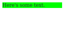
Percentages in ‘flex-basis’
Percentages were working generally fine inside flex-basis, however there was one particular problematic case. It arose whenever that percentage was refererring to, oh surprise, and indefinite height. And again, we’re talking about nested flexboxes with column flows. Indeed, definite/indefinite sizes is one of the toughest things to get right from the layout POV. In this particular case, the fix was to ignore the percentages and and treat them as height: auto.
<div style="display: flex; flex-direction: column; width: 200px;">
  <div style="flex-basis: 0%; height: 100px; background: red;">
    <div style="background: lime">Here's some text.</div>
  </div>
</div>
| Before | After |
|---|---|
 |
 |
Flex containers inside STF tables
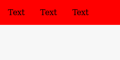
Fixing a couple of test cases submitted by an anonymous Opera employee 8! years ago. This is another case of competing layout contexts trying to do things their own way.
<div style="display: table; background:red">
   <div style="display: flex; width: 0px">
      <p style="margin: 1em 1em;width: 50px">Text</p>
      <p style="margin: 1em 1em;width: 50px">Text</p>
      <p style="margin: 1em 1em;width: 50px">Text</p>
   </div>
</div>
| Before | After |
|---|---|
 |
 |
After the fix the table is properly sized to 0px width and thus no red is seen.
Conclusions
These examples are just some interesting ones I’ve chosen to highlight. In the end, almost 50 new flexbox tests are passing in WebKit that weren’t back in May!. I wouldn’t like to forget the great job done by my colleague Carlos Lopez who imported tons of WPT flexbox tests into the WebKit source tree. He also performed awesome triage work which made my life a lot easier.
Investing in interoperability is a huge deal for the web. It’s good for everyone, from spec authors to final users, including browser vendors, downstream ports or web authors. So if you care about the web, or your business orbits around web technologies, you should definitely promote and invest on interoperability.
Implementing standards or fixing bugs in web engines is the kind of work we happily do at Igalia on a daily basis. We are the second largest contributor to both WebKit and Chrome/Blink, so if you have an annoying bug on a particular web engine (Gecko and Servo as well) that you want to be fixed, don’t hesitate and contact us, we’d be glad to help. Also, should you want to be part of a workers-owned cooperative with an asambleary decision-making mechanism and a strong focus on free software technologies join us!.
Acknowledgements
Many thanks to WebKit reviewers from Apple and Igalia like Darin Adler, Manuel Rego, Javier Fernández or Daniel Bates who made the process really easy for me, always providing very nice feedback for the patches I submitted.
I’m also really thankful to Googlers like Christian Biesinger, David Grogan and Stephen McGruer who worked on the very same things in Blink and/or provided very nice guidance and support when porting patches.