


Hi there, fellow readers. Today I’m starting a mini-series of posts to talk a little bit about the work I’ve been lately doing at Igalia around WebKit and Blink web engines. I’ve been involved in the implementation of a new standard called CSS Grid Layout in both engines. My mate rego has already talked about that, so take a look at his post if you need to know more about the basics. Read it? Great, let’s move on.
The new grid layout
I’d like to stress that grid layout is not (only) about aligning elements in columns and rows (after all you can already do it with tables or complicated layouts using positioned and/or floating blocks right?). What’s interesting is that a grid layout doesn’t have content structure. What does it mean? As the specs say:
unlike tables, grid layout doesn’t have content structure, and thus enables a wide variety of layouts not possible with tables. For example, the children of a grid container can position themselves such that they overlap and layer similar to positioned elements.
In addition, it provides a very fine grained control of the layout of the elements of the grid (generally with the help of media queries) based on device form factors, orientation, available space, etc…
Today, I’m going to focus specifically on how to position elements inside a grid, and in particular how to do that using named grid lines and named grid areas. Going too fast? No problem, let’s recap a bit.
Positioning grid items
In CSS grid layout a grid is defined by a set of intersecting horizontal and vertical lines which divide the space of the grid in areas where to place grid items. Those grid lines are numbered starting from number 1. Based on a declaration like:
grid-template-rows: 50px 1fr 50px;
grid-template-columns: 150px 1fr;
we would get the following
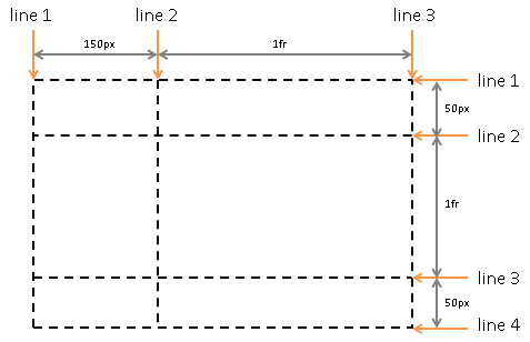
So in order to position an item in a grid, you have the a very straightforward way of doing it which consist of specifying the the grid line’s start and end positions for either columns, rows or both. Given the above grid, and supposing that you want to place some item in the rightmost area on the bottom, you’d just need to specify it the following way:
grid-row: 3 / 4;
grid-column: 2 / 3;
Easy huh? Your item will span from column lines 2 to 3 and from row lines 3 to 4. There are tons of different ways to specify the position and the span for your grid items, so many that perhaps they deserve a separate blog post (just check this section of the specs if you need the details now).
Placing items using named grid lines
Despite being easy and even intuitive (at least for us developers), this way of placing grid items using grid line numbers might not be optimal for web authors. With large grids, knowing the exact grid line our item should span to could become an increasingly difficult task. So, why not give the grid lines a meaningful name? What about giving authors the possibility to assign a name (or multiple) to each grid line so they wouldn't have to remember/compute the exact index of each grid line?
Naming grid lines is pretty easy. Authors just need to specify the names they want to assign to each line (yeah “names” in plural) in the grid definition by putting them into parentheses surrounding the definitions of the grid track breadths. Something like:
grid-template-rows: (first start) 100px 40px (middle) 1fr 250px (last)
Based on this definition, the following declarations are totally equivalent:
grid-row: first / middle;
grid-row: 1 / middle;
grid-row: first / 3;
grid-row: 1 / 3;
grid-row: start / middle;
grid-row: start / 3;
I wouldn’t enter into discussing which one is the most descriptive or the best (there are some more), just choose the one you prefer.
Placing items using named areas
Although things like named grid lines ease the design task, authors don’t normally foresee the layout of a web page using a matrix of positions but instead they normally divide the available space in “areas” in their minds, we’re talking about areas like the footer, the side bar, the header, etc… So why don’t take advantage of that and allow the web authors to specify those grid areas?
For example, let’s imagine that we’re designing a website with a header on top, a footer in the bottom, a sidebar with links for example on your left and the important content on your right. We can easily (and very visually I’d say) define these four grid areas using the CSS Grid Layout properties. It’d be something like this:
grid-template-areas: "  .     header  header"
                     "sidebar content content"
                     "sidebar content content"
                     "  .     footer  footer";
There you go, a 4x3 matrix with 4 different named grid areas. Some remarks:
- The dot “.” means unnamed area
- “header” will occupy columns 2 and 3 in the first row
- “footer” will occupy columns 2 and 3 in the last row
- “sidebar” will span from 2nd to 3rd row in the first column
- “content” will fill columns 2 to 3 in rows 2 to 3
That’s all. Based on that definition, we could use the grid-area property to place our elements. We just need to specify the grid area where to place them and the grid will automatically position them based on their size and available free space.
Placing items using grid area’s implicit grid line names
Hmm, not enough for you? You said you still need something extra? So you want the simplicity of grid areas and the flexibility of named grid lines? No problem, the spec defines what’s called the implicit named grid lines generated by each defined grid area. What does it mean? Basically that for any grid area you define, let’s call it “A”, the engine will automatically generate “A-start” and “A-end” grid line names for columns and rows, so you could use them to position any grid item as if they were explicitly defined by you.
If I take the grid defined above with grid-template-areas it’s perfectly valid to position a grid item using the following declarations
grid-column: header-start / 3;
grid-row: 2 / sidebar-end;
which are equivalent to
grid-column: 2 / 3;
grid-row: 2 / 4;
As you might have wondered, you can mix all these three methods to position grid items together.
How is it implemented?
What I have described should be working fine in latest WebKit nightlies after I landed this. Regarding Blink, there are some missing bits already addressed here that will likely land soon. Obviously this is not a matter of a single change :), we’re building all this on top of many other changes in WebKit and also in Blink.
In my next post I’ll talk about the implementation details and also about the differences between WebKit and Blink as we have followed slightly different paths to implement this. Stay tuned!
Acknowledgements
Many thanks for the nice reviews I got from both WebKit reviewers and Blink owners. Also I’d explicitly like to thank the awesome guys at Bloomberg for sponsoring this work.