


Introduction
CSS Transforms Level 1
introduced 2D transforms, that can be specified using the transform property.
For example, they can be used to rotate or scale an element:
-
transform: none -
transform: rotate(45deg) -
transform: scale(1, 0.5)
CSS Transforms Level 2 extends that feature to allow transforms in 3D space, for example:
-
transform: rotate3d(1, 1, 1, 45deg) -
transform: scale3d(1, 0.5, 2)
Typically, using 3D transforms forces the element into its own rendering layer. This is sometimes desired by authors, since it can improve performance if for example the element is moving around.
Therefore, identity transformations in the Z axis,
like scale3d(X, Y, 1) instead of scale(X, Y),
are sometimes used to opt-in into this behavior.
This trick works on Chromium, but note it’s not compliant with the spec.
Problems
Forcing an element to be rasterized in its own layer can have some disadvantages.
For example, Chromium used to rasterize it using a single float scale.
When the transform had different X and Y scale components,
Chromium just picked the bigger one,
clamped by 5 times the smaller one (to avoid memory problems).
And then it used this raster scale for both axes,
producing suboptimal results.
Also, Chromium only uses LCD text antialiasing when the internal raster scale matches the actual X and Y scales in the transform. Therefore, non-uniform scales prevented the nicer LCD antialiasing.
And unrelated to uniform scales, if the transformed element doesn’t have an opaque background, LCD antialiasing is not used either, since Chromium needs to know the color behind the text.
The last problem remains unsolved, but I fixed the other two in Chromium 92, which has been released today.
Thanks to Bloomberg for sponsoring Igalia to do it!
Solution
The main patch that addressed both problems was https://crrev.com/872117. But LCD text antialiasing was still not used because I made a mistake 😳, which I fixed in https://crrev.com/872974
Basically, it was a matter of changing AxisTransform2d and PictureLayerImpl
to store a 2D scale rather than a single float.
I used gfx::Vector2dF, which is like a pair of floats with some nice methods
to clamp by a minim or maximum, scale both floats by the same factor, etc.
I kept most tiling logic as it was,
just taking the maximum component of the gfx::Vector2dF as the “scale key”.
However, different 2D scales can have the same key, for example by dynamically changing
scale3d(1, 5, 1) into scale3d(5, 1, 1), both with a scale key of 5.
Therefore, when finding if there already was a tiling with the desired scale key,
I made sure to the check the 2D scales, and recreate the tiling if they were different.
This is an example of how it looked like in Chromium:

This is how it looked when internally using 2D scales:

And finally, with LCD text antialiasing:

For reference, this is how your browser renders it (live example):
Lorem ipsum
Comparing the 1st and 2nd images, using 2D scales clearly improved the text, which was hard to read due to missing some thin parts of the glyphs, and also note the border diagonals in the corners look less jagged.
At first glance it may be hard to notice the difference between the 2nd and 3rd images, so you can compare the text antialiasing in these magnified images:
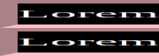
At the top, the edges of the glyphs simply use grayscale antialiasing, while at the bottom, the LCD antialiasing uses some colored pixels.
Limitations
While my patch improved the common basic cases, Chromium will still fall back to a 1D scale in these cases:
- Directly composited images
- Animations
- Heads up layers
- Scrollbar layers
- Mirror layers
- When the layer has perspective
Some of them may be addressed in the future, this is tracked in bug 1196414.
For example, this live example uses a CSS animation so it still looks wrong in Chromium 92:
Lorem ipsum
I actually started a patch to address animations, and it seemed to work well in simple cases, but it could be wrong when ancestors had additional transforms. Handling that properly would have required more complexity, and it wasn’t clear that it was worth it.
Therefore, I don’t plan to continue working on these edge cases, but if you are affected by them, you can star bug 1196414 and provide a good testcase. This may help increase the priority of the bug!