


July 22, 2014
This post was migrated from its original location on the Substantial blog and updated on March 17, 2020.
Contents
- Headings and Semantic Structure
- Keyboard Interactivity
- Automated Testing
- Screen Readers
- Color Contrast
- Tools
When I started working on Distiller in 2014, my initial feelings were that it had great visual design, super cool branding, and intriguing subject matter–whiskey–and it presented an opportunity to learn the server-side while innovating on the front-end. One of my personal goals for the project was to expose the product’s “cool factor” to people who couldn’t see it or use a mouse. Everyone wants a good user experience no matter their abilities. I was also pretty sure blind or visually impaired people would appreciate an app to help them find whiskey as much as anyone. Here are some of the key areas I’ve been addressing as I’ve adopted that challenge.
Headings and Semantic Structure
Something I wish more developers and designers knew: the purpose of an HTML heading is to indicate structure, not to indicate style (that’s what CSS is for!). There are also HTML landmarks which create a programmatically meaningful structure, using HTML5 landmark elements or bolted-on with ARIA roles.
Headings and landmarks act as a table of contents for your page, similar to hierarchal outlines you may have created in Microsoft Word using roman numerals and numbers. Screen readers can surface headings and other element collections as an overall page outline and a device for navigating web content (see Voiceover’s Rotor or NVDA’s Element List. In addition, as search engines’ page rank algorithms have evolved, meaningful content hierarchies with headings have continued to improve search engine optimization (SEO).
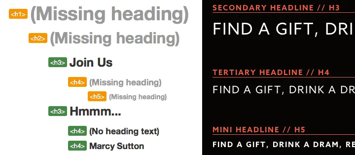
Headings on the Distiller Homepage and in the Live Style Guide
To begin an accessibility audit in 2020, I’d evaluate the headings on a site using the Headings feature under Ad-Hoc Tools in Accessibility Insights, a really great browser testing extension. In 2014, I was still using Information > View Document Outline with the Firefox Web Developer Toolbar.
The test indicated we had quite a bit of room for improvement in our markup. Headings site-wide had been chosen for style purposes, without attention paid to semantics, and therefore there were no useful page outlines. I wanted to fix them all immediately. However, fixing headings would have to be an ongoing process–I had to resist the urge to refactor code beyond the scope of my current feature. Instead, I added global CSS classes that matched our live style guide and only refactored code that fit in with the current story. As we touched different parts of the app through feature stories, I would get the opportunity to improve the accessibility of the code-base. Also, I shared knowledge with my team on the purpose of headings and how best to use them so they could create more useful page structures moving forward.
Keyboard Accessibility
My approach to testing keyboard navigation is simple: I tab through a webpage with the keyboard. Quite often, a lack of visual feedback shows me that keyboard accessibility was not a priority. Developers tend to develop only for themselves; with the ability to bail on keyboard navigation when they get lost by falling back to the mouse or trackpad, most of the time it is forgotten. On Distiller, there wasn’t much visual feedback even for mouse interactions. I created a story for hover and focus styles to be implemented first in the brand style guide and then throughout the rest of the app.
When you include focus styles in your CSS, keyboard accessibility can improve a lot. They’re easy to add if hover states are already in place on “focusable” elements. If hover styles are applied to elements that can’t receive focus by default, such as list items, they must be moved to elements that can receive focus, like buttons or form inputs. Anything else requires adding a tabindex attribute in HTML and binding interaction events in JavaScript. Anchors, buttons, and inputs get support from tabindex and interaction events by default, so it’s generally not worth the trouble to use other elements for anything that should be interactive.
Focus management is also a big part of keyboard accessibility and something we continued to work on for Distiller. What is focus management? An example: when a modal window opens, focus should move from the element that triggered it to an element inside of the modal, preferably a close button. This enables a keyboard or screen reader user to easily tab and find their way to new content on the screen. When the modal window is closed, focus should be sent back to the triggering element.
On Distiller, I noticed a new feature badly needing keyboard interactivity and focus management: the Top Shelf allowed users to select up to 5 whiskey bottles for their personal profile. With this, we added the ability to rearrange the bottles with drag & drop. Making it accessible from the keyboard was challenging because every time you moved a bottle, the HTML for the entire list was ripped out and re-rendered, thereby sending focus back to the top of the page (this is called “freak-out mode”). To improve the experience, when the list was replaced in the DOM we used JavaScript to send focus back to it afterward. This allowed us to continue using the existing templating solution while improving the accessibility of Distiller’s Top Shelf feature.
Automated Testing
In addition to checking the heading outline and tabbing through a webpage, I usually start with a few automated tools. As of 2020 Google Chrome’s Lighthouse and Microsoft’s Accessibility Insights are great tools to audit your code to point out common issues, and they can both look inside Shadow DOM subtrees (for more on this topic from 2014-2015, read my post on Accessibility and the Shadow DOM)!
Some items that came up in an audit of Distiller using the Chrome Accessibility Developer Tools, a precursor to Lighthouse:
- A loading graphic without an alt attribute (courtesy of Zendesk’s feedback tab)
- Color contrast warnings
- Warning about meaningful images not to be used as element backgrounds
- Warnings about focusable links being invisible or obscured by other elements
These warnings allow you to inspect the DOM to find out more information about the issues. In our case, we had links only containing icons and not any descriptive text; divs with background images for a responsive content strategy; and plenty of anchors used as buttons. As with the headings and keyboard navigation, I updated code only within the context of user stories and planned to address the rest in the coming weeks.
2020 update: it’s important to balance your testing efforts amongst manual and automated processes as Manuel Matuzovic’s blog post and Eric Bailey’s Smashing Magazine post explain. Automated tools can’t catch everything, but you can write unit and integration/end-to-end tests to bake accessibility functionality into your app or website. To learn more about automated testing with modern tools, check out my course on Frontend Masters and a blog post I wrote on automated accessibility testing.
Screen Readers
In single-page apps, views are appended, updated or removed without page reloads. Imagine tabbing with the keyboard onto a nav item and expecting new content but instead not going anywhere, or worse, experiencing “freak-out mode” where focus is lost. What changed? What were you trying to do, again? Without sending users’ focus to new content after it is appended, web applications using React, Ember, Vue, Angular, Backbone, or other front-end JavaScript frameworks will not be accessible to keyboard or screen reader users. Unfortunately, it’s happening a lot now that JavaScript MV* frameworks are on the rise, and Distiller was no exception.
To experience the site from a non-sighted user’s point of view, I fired up VoiceOver for Mac, closed my eyes and tried navigating through it in Chrome and Firefox. I also tested with JAWS and Internet Explorer on a Windows virtual machine using VirtualBox for Mac (2020 update: I use Parallels now instead). Any time we made a change for accessibility, I could test whether the experience improved using my small test suite.
Some other items I tested and addressed for screen reader accessibility:
- Elements with only non-semantic, visual icons or images
- A global “flash notice” telling users when they had successfully logged in or out
- Non-visual current page indicators
- Audible notification of page changes (JAWS announces them, VoiceOver still needs help)
2020 Update
There are some great resources for learning about screen reader testing from WebAIM, and a wonderful Smashing Magazine webinar on how screen reader users access the web from Léonie Watson in 2019. But it’s worth mentioning that getting started with screen readers can have a steep learning curve, and without a disability yourself, your experience will differ from users with disabilities.
In addition to working with people with disabilities on product teams, conducting paid user testing with groups like Fable Tech Labs or Access Works can be great for learning how screen reader users access your product or website. It’s a process that will change your design and development team’s perspective forever. Read more about my experience of working with Fable on a research project for my current employer, Gatsby: https://www.gatsbyjs.org/blog/2019-07-11-user-testing-accessible-client-routing/
Color Contrast
To test color contrast, I’ve started using the Color Contrast Analyzer for Chrome. This tool takes a screenshot of a webpage and evaluates the pixels surrounding any text to determine if it meets WCAG color contrast ratio requirements. Small non-bold text has a different ratio than medium bold and large non-bold text, so you can test both at levels AA and AAA. For Distiller, I found a few places where color contrast could be bumped up but overall, the brand colors stood out pretty well and major changes were not necessary.
Another great tool for testing foreground and background color combinations for accessibility is Lea Verou’s Contrast Ratio. Simply enter two color values and see the ratio in red (failing) or green (passing) along with some text information to keep things accessible.
In 2020, there are many testing tools but the ones I keep coming back to include the Paciello Group’s Color Contrast Analyzer, a desktop app which can sample any application on your computer. I also like Chrome’s DevTools color contrast picker and have seen Figma extensions for designers that could be useful.
Conclusion
Client-side web applications like Distiller are growing in numbers. We love snappy, responsive user interfaces and JavaScript libraries that encourage separation of concerns. But without attention paid to keyboards and assistive technologies, our apps won’t be usable by people with disabilities. Ideally, we would build with accessibility in mind from the beginning…that’s definitely the best approach (and the most fun). But if you do find yourself working on a code-base with room for accessibility improvement, having a collection of best practices and testing tools will make it easier to get started.
The following list includes tools used on Distiller for accessibility. This is by no means a comprehensive list, just what I used for a quick accessibility audit and ongoing development. There are also more than three screen readers–including mobile devices–I chose to focus on the top three listed in the WebAIM Screen Reader Survey #5 (JAWS, NVDA and VoiceOver).
- Your keyboard
- Accessibility Insights
- Chrome Accessibility DevTools
- Firefox Accessibility DevTools
- Chrome Accessibility Developer Tools
- Firefox Web Developer Toolbar
- axe Chrome Extension
- Color Contrast Analyzer
- Lea Verou’s Contrast Ratio
- Additional tools