Part of an investigative series that looks into problematic performance KPIs on live commercials websites.
While perusing the Speedcurve Page Speed Benchmarks dashboard, I became curious about some of the performance metrics I was seeing…
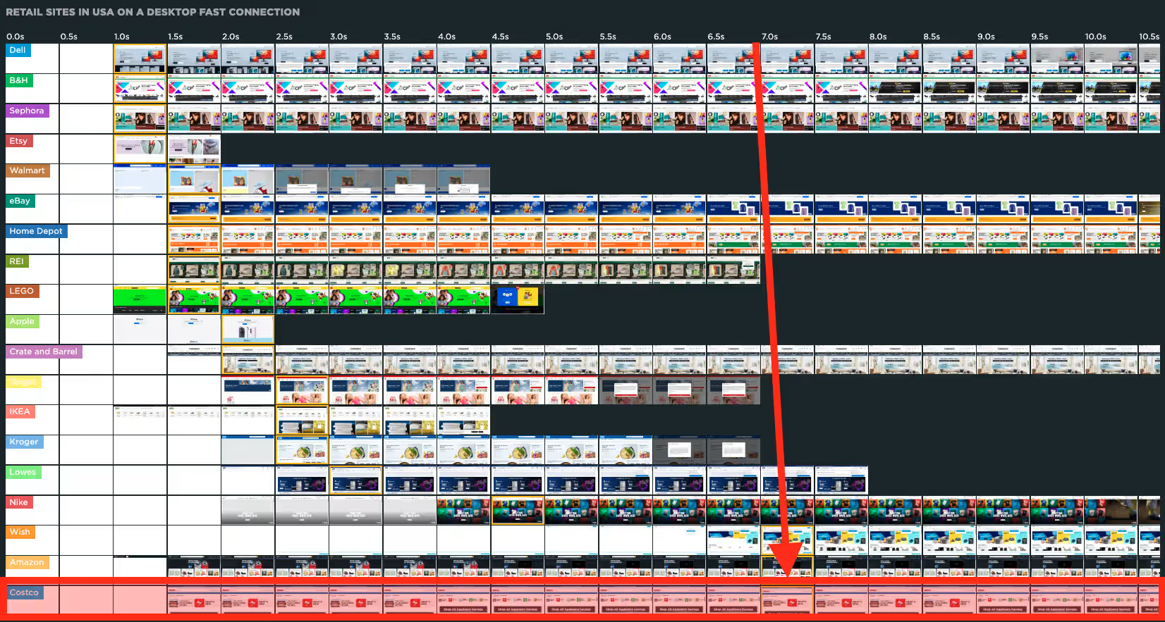
For example, while viewing USA > Retail > LCP with a Fast connection, I saw that Costco was reporting a high LCP, although the images appear to be onscreen well before the reported LCP time:
And, being the curious little bugger that I am, I just had to find out if this issues also existed for real users and, if so, what the cause might be, and whether or not it could be improved…
The Speedcurve dashboard reports an LCP of 6.95s for Costco, which is well above the ideal 2.5s threshold:

But in my own tests, loading Costco.com, using the latest Chrome with browser cache disabled and network speed throttled to Fast 4G, after 10 hard-refreshes, the LCP averaged a highly-respectable 0.62s, which is well below that ideal threshold.
So what might be causing this high LCP score in Speedcurve’s synthetic tests?
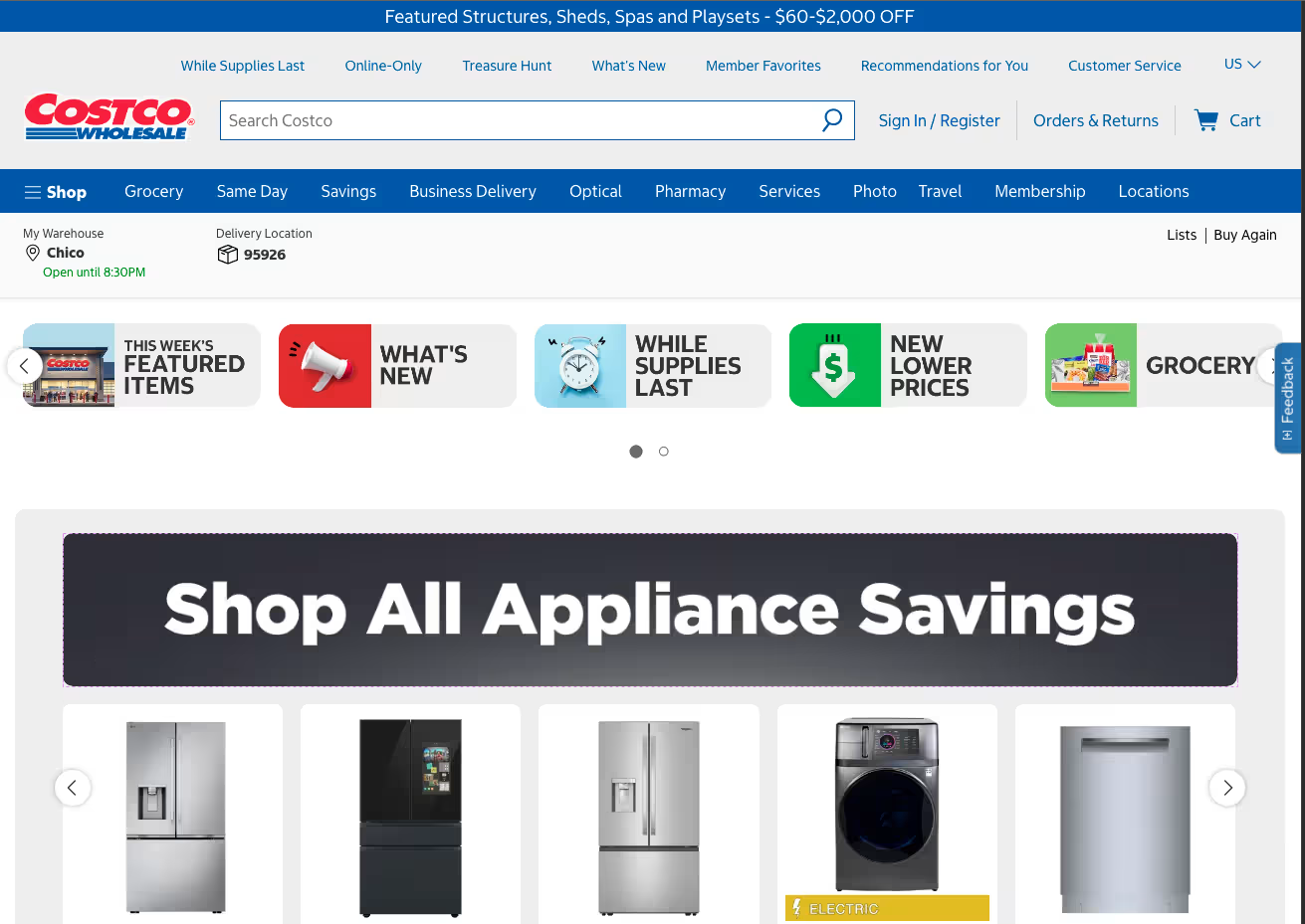
The dashboard is reporting the LCP asset to be the “Shop All Appliance Savings” component, and my tests confirmed the same:
Their filmstrip shows that this component initially renders partially below-the-fold, and then several seconds later shifts up above-the-fold due to a large layout shift in the component above it:

The Speedcurve dashboard does recognize that layout shift with a high CLS score:

So, I wonder… I have experienced one element being initially recorded as the LCP, then another element supplanting it when a layout shift occurs.
Could this be what’s happening here?
Let’s find out!
So, before trying to do anything about the LCP, I would first recommend trying to fix the CLS.
Looking at that filmstrip from earlier, there is an obvious above-the-fold CLS at about 4s after the initial page load.
And watching the page load in my browser, same setup as described earlier, that layout shift is clearly evident (on large screens, that is; small screens are actually relatively steady):
In the above video, you can clearly see that the carousel above the LCP initially loads with each slide being far too large, then the JS initializes, and the slide heights are corrected, shifting the content below it up, incurring CLS.
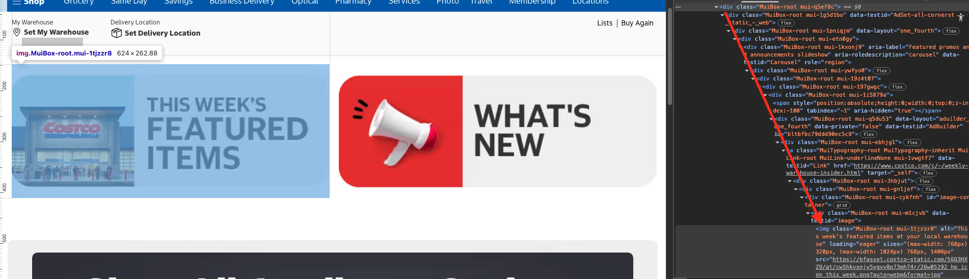
Inspecting the carousel HTML, it appears to be created using Material UI React Box:
(I also see a bad case of “DIVitis”, but that’s another topic for another day…)
Although the component is in the initial HTML that is delivered to the browser, and is not injected via client-side rendering, the issue appears to be that it is not initially sized correctly, and instead relies on JS to set the correct size:
And in order for JS to set the correct size, it must first be requested, downloaded, parsed, executed, etc.
Investigating what the JS actually does as it initializes the carousel, I see that the CSS class for each carousel “slide” is changed. On my desktop, the initial CSS class for each slide is .mui-1i5879a, but after being initialized, becomes .mui-vbnfu6. This effectively changes each slide’s CSS from this:
flex: 0 0 50%;
to this:
flex: 0 0 20%;
Which correctly sizes all of the carousel slides for desktop (and also explains why small screens do not have any CLS, because flex: 0 0 50%; is actually correct for that screen size). Note that tablet screen sizes get yet another CSS class that changes the above declaration to flex: 0 0 33.3333%;.
So, it appears that JS is monitoring the screen size and updating the DOM as necessary to control the layout, initially when the page loads, and then anytime the screen size changes thereafter.
To create a more stable layout, for any screen size, on the initial page load, I added two @media breakpoints within the parent’s existing CSS declaration to handle the same updates, but with no reliance on JS:
.mui-197gwgc {
  /* Existing CSS... */
  & > div {
    @media (min-width: 768px) {
      flex: 0 0 33%;
    }
    @media (min-width: 1024px) {
      flex: 0 0 20%;
    }
  }
}
After applying the above fix, I get this:
Already a big improvement!
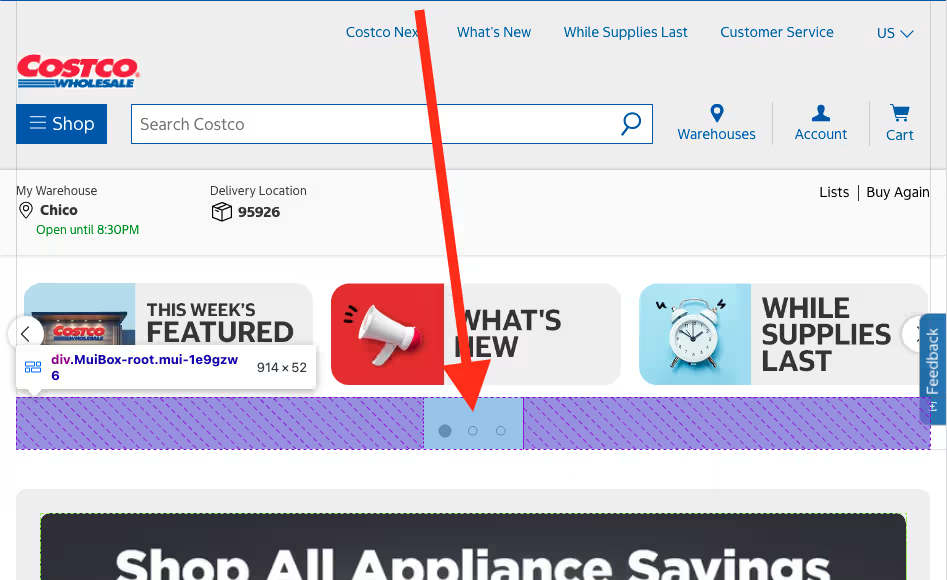
With that fixed, the only other major CLS is related to the “dot navigation” that gets injected below the carousel. And that CLS happens because the height for that component is initially 41px, but after the carousel initializes it shifts to 52px (on my desktop, in multiple browsers, across various screen-sizes):
By giving that component a min-height: 52px (which might also require some CSS “hook”) or adding placeholder elements within that component that mimic the JS-injected elements, I am able to remove that layout shift as well:
And now a quick Before/After comparison with both of these fixes applied:
In my browser, the Before page reports an average CLS of 0.14, and the After page reports an average of 0.02. The only CLS that is still being reported is related to the injected content that appears below the LCP component, which is below-the-fold. I am sure that is fixable too, but is beyond the scope of this article… ;-)
Now, getting back to that LCP issue…
After the CLS fixes get the LCP to render stably above-the-fold, I would hope the LCP reports a more consistent, acceptable score in the Speedcurve Benchmark. As I was never able to reproduce that high LCP within my own testing, I cannot confirm that this CLS fix does also help that high LCP, but it would be fun to find out! Anyone know anyone at Costco? :-P
But that doesn’t mean there is nothing that could be done to improve that LCP asset…
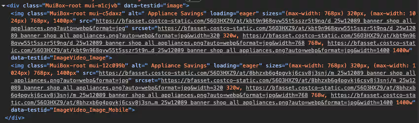
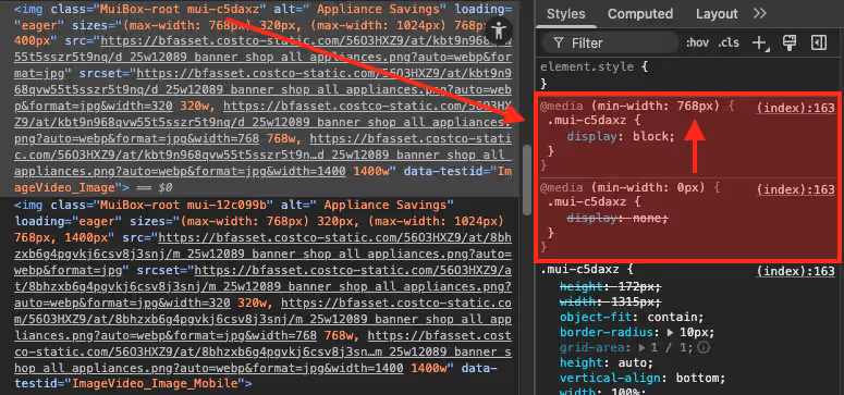
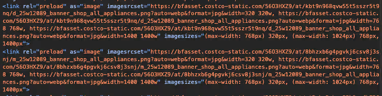
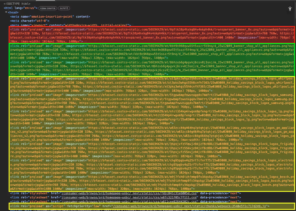
webp (only 10kb!), does use loading="eager", does offer different sizes for different screen sizes, and has a "preload" link; and these are all great steps!img elements, one for small screens and one for large:media attributes on the img elements themselves:"preload" links for these images also lack media attributes, which means that both images always download, regardless of the screen size. This is not terribly critical, because both images are quite small, but downloading the “wrong” image is a wasted HTTP Request and a waste of bandwidth:
picture element with source elements that have media attributes, so something like this:
<img class="MuiBox-root mui-c5daxz" alt=" Appliance Savings" loading="eager" sizes="(max-width: 768px) 320px, (max-width: 1024px) 768px, 1400px" src="https://bfasset.costco-static.com/56O3HXZ9/at/kbt9n968qvw55t5sszr5t9nq/d_25w12089_banner_shop_all_appliances.png?auto=webp&format=jpg" srcSet="https://bfasset.costco-static.com/56O3HXZ9/at/kbt9n968qvw55t5sszr5t9nq/d_25w12089_banner_shop_all_appliances.png?auto=webp&format=jpg&width=320 320w, https://bfasset.costco-static.com/56O3HXZ9/at/kbt9n968qvw55t5sszr5t9nq/d_25w12089_banner_shop_all_appliances.png?auto=webp&format=jpg&width=768 768w, https://bfasset.costco-static.com/56O3HXZ9/at/kbt9n968qvw55t5sszr5t9nq/d_25w12089_banner_shop_all_appliances.png?auto=webp&format=jpg&width=1400 1400w" data-testid="ImageVideo_Image"/>
<img class="MuiBox-root mui-12c099b" alt=" Appliance Savings" loading="eager" sizes="(max-width: 768px) 320px, (max-width: 1024px) 768px, 1400px" src="https://bfasset.costco-static.com/56O3HXZ9/at/8bhzxb6g4pgvkj6csv8j3snj/m_25w12089_banner_shop_all_appliances.png?auto=webp&format=jpg" srcSet="https://bfasset.costco-static.com/56O3HXZ9/at/8bhzxb6g4pgvkj6csv8j3snj/m_25w12089_banner_shop_all_appliances.png?auto=webp&format=jpg&width=320 320w, https://bfasset.costco-static.com/56O3HXZ9/at/8bhzxb6g4pgvkj6csv8j3snj/m_25w12089_banner_shop_all_appliances.png?auto=webp&format=jpg&width=768 768w, https://bfasset.costco-static.com/56O3HXZ9/at/8bhzxb6g4pgvkj6csv8j3snj/m_25w12089_banner_shop_all_appliances.png?auto=webp&format=jpg&width=1400 1400w" data-testid="ImageVideo_Image_Mobile"/>
Could become something like this:
<picture>
    <source width="993" height="372" media="(max-width: 767px)" srcset="https://bfasset.costco-static.com/56O3HXZ9/at/8bhzxb6g4pgvkj6csv8j3snj/m_25w12089_banner_shop_all_appliances.png?auto=webp&format=jpg">
    <source width="1315" height="172" media="(min-width: 768px)" srcset="https://bfasset.costco-static.com/56O3HXZ9/at/kbt9n968qvw55t5sszr5t9nq/d_25w12089_banner_shop_all_appliances.png?auto=webp&format=jpg">
    <img src alt="Appliance Savings" class="MuiBox-root"/>
</picture>
This would not only prevent downloading on the “wrong” device size image, eliminating the double-download, but would also reduce the overall document size (might not look it above, but scroll each code block horizontally), and the need for JS to monitor and toggle between the two image sizes, leaving less for the browser to maintain in memory and repaint with layout shifts.
fetchpriority="low", so not sure why it is being preloaded) and no fonts (although there is a font file that is requested by the page, which does happen early, via the main CSS file, but can still take 2-3s to download, so a preload might help with this).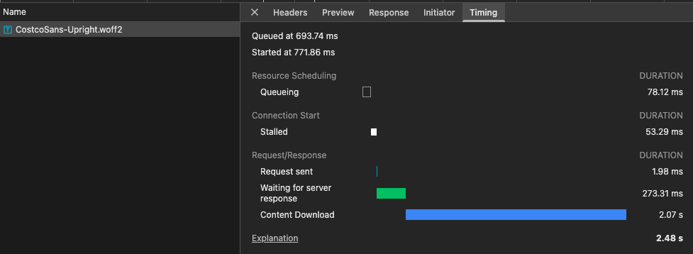
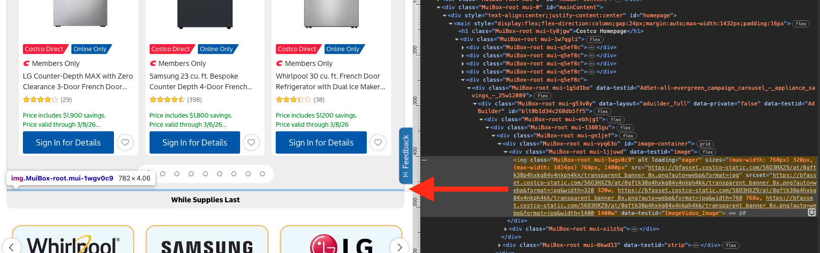
"preload" link before the LCP asset "preload" links, which is for a “spacer banner”, which is initially below-the-fold. This seems like a complete waste of a download, which could probably be replaced with some CSS margin or padding, and would perhaps get the LCP asset requested just a smidge faster:"preload" links have a fetchpriority attribute, which are especially helpful with images, since browsers tend to innately give them a low priority, even when being fetched via a preload link. I have seen fetchpriority="high" on a preload link improve an LCP by 2-3 seconds.width or height attributes or aspect-ratio. All, however, do have a width and height initially defined within the CSS, but those are being overridden in the same declaration with width: 100%; and height: auto;:Predefining the space that images will need is a great CLS saver.
"preconnect" to that domain!async. But I would still question whether below-the-fold images warrant preload links.But, again, all of the above notes about the improving the LCP could be erased if this component was simply text with a CSS gradient background. (Heck, it would even be improved if the component was text with a CSS black background-color, and just the gradient as an image over that back background color… That would put the text in the page, so no download there, it would have a black background color, so it would be instantly readable, and the gradient image could pop-up whenever it downloads.)
I attempted to play with recreating this image with only HTML and CSS, and got pretty far pretty easily (considering I am not a designer), but the challenge was that React kept replacing whatever I created as it re-hydrated the page content after page load, so I realized I would never be able to get a true measurement of the improvement, or even determine if there was one. But I think you get my point…
Although I do not think the high LCP reported via Speedcurve’s Benchmarks dashboard is actually due to the LCP image itself, nor how it is implemented, I would question whether or not it needs to be an image at all…
Despite the image being quite small, and using a modern image format, and using multiple sizes for various screen sizes, and using a preload link, I revert back to the ultimate web performance axiom:
The fastest request is the one not made
This image could easily be plain text with a CSS gradient background, which would require no download, so no preload links, so no dupe-download confusion, so two less images to download, so two other resources could download in their place, and nothing for JS to monitor and react to, so no page re-paints.
This would also remove any possible LCP delay, because this content would already be in the page.
There are very few hard “right” or “wrong” ways to do things on the web, but there are many, many shades of “better” or “worse”, and those should always be decided with testing and data.
As always, happy to discuss any of this if you like. :-)
Happy optimizing,
Atg
此内容由惯性聚合(RSS阅读器)自动聚合整理,仅供阅读参考。 原文来自 — 版权归原作者所有。