


If you’re building a product, you’ll no doubt be familiar with the concept of design systems and component libraries. Using a predefined “set” of components allows users to more easily and more efficiently develop user interface (UI) features that are on brand and meet accessibility requirements.
Components are often the most important part of any design system. Without them, your product may end up looking like an engineer designed it — and no one wants that!
Component documentation often lives online alongside higher level brand guidelines but component documentation dives a little deeper into how to configure and use components.
A design system is a set of fundamental rules that components (among other things) adhere to. Components are an important part of design systems, and can also exist outside of design systems as component libraries, like Material UI.
A design system is typically made up of design tokens. These can include values for colors, padding, margin, spacing, typography font sizes and border radii.
When using a component it may never be known which design tokens a component uses, but rest assured, under the hood a lot of thought will have gone into creating tokens that meet brand guidelines and work well when composed with other elements from the design system.
For example, a simple button will likely expose a prop named variant(or similar).
<Button variant='secondary'>click me</Button>
The variant prop will often accept values such as primary, secondary, or ghost.
At the component usage level there’s no need to know what hex value secondary relates to, but it will have been defined and explained in another area of the design system’s documentation.
This approach may apply to font families too where values such as heading, highlight or text will be used in place of the actual font-family name.
The general idea behind naming properties that map back to design tokens is to avoid confusion when changes occur.
For example, if the variant prop accepted red, blue and green, and later down the line, brand guidelines removed red from the color palette, or changed red to orange, changes to the application using the component would be required.
We’ve covered some basic principles of design systems and tokens, but there are many more things to consider when documenting components. Here’s a list of some best practices to keep in mind.
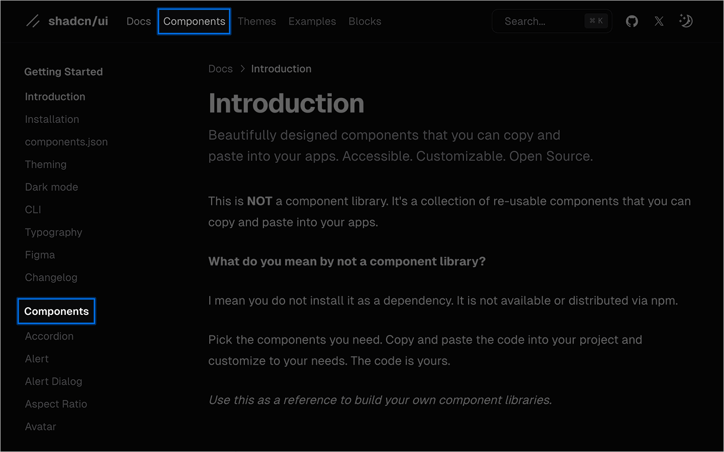
As with any site or application, navigation is important. In design system documentation, components should be considered as first-class entities. You can see from the below example taken from shadcn/ui documentation that there’s a link in both the top, and side navigation to the components section.
Naming things is hard! And as component documentation grows it can be difficult to ensure consistency among prop names, prop types, prop descriptions and even the order props are displayed within prop tables. But as you know, consistency is key.
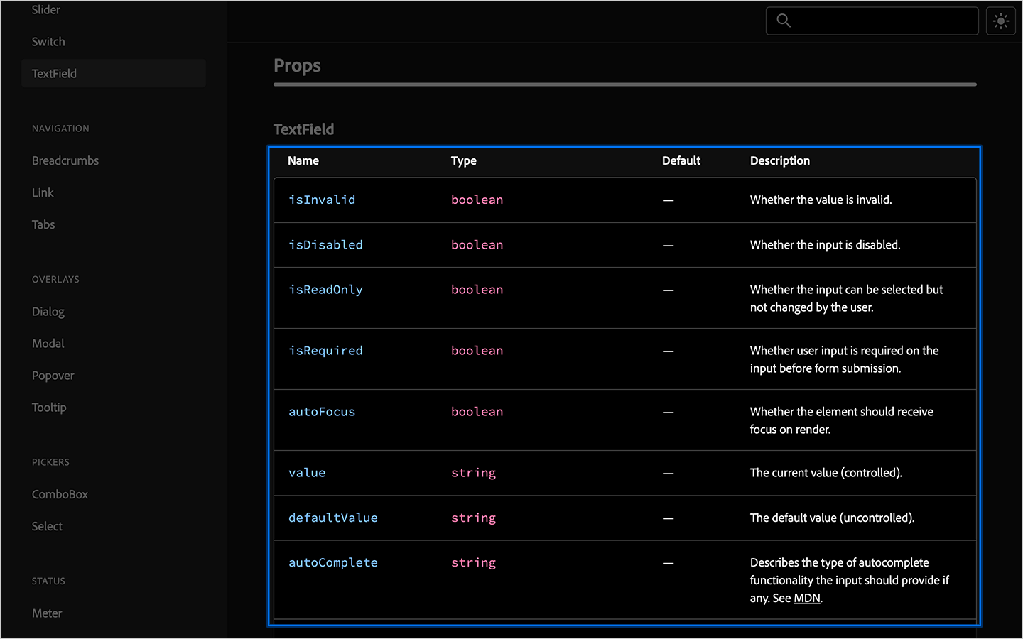
One common practice when creating prop names is to use linking verbs.
For example, to set a button to disabled, the prop would be named isDisabled. This can also be applied to other prop names that might exist on other types of components, e.g. hasError, isLoading.
Using consistent linking verbs across all components within a system can greatly improve the developer experience. It’s also important to use consistent casing (in this case camelCase), e.g. isDisabled not isdisabled.
Prop syntax changes from framework to framework. string props can be encapsulated using quote marks, whereas boolean props are encapsulated using curly braces. e.g.
<TextField value="some value">some text<TextField>
<TextField isDisabled={true}>some text<TextField>
As such, it’s important to document which primitive type the prop uses.
What each prop does can greatly differ from component to component, but it’s important to always include a description that is short and to the point.
It’s also important to use consistent grouping. The prop table for e.g. a button, should (where possible), be ordered the same way as an e.g. TextInput component. You could consider grouping by primitive type, or by linking verbs, or perhaps alphabetically.
It’s also a good idea to document any default values a component may have, or if a prop is required or optional, this can either be denoted by an asterisk or by adding a new column to the table.
While many common components are simply styled versions of their underlying HTML elements, newly introduced interface elements have emerged over the years. One such example is the Floating Action Button, or FAB introduced by Material Design ~2104.
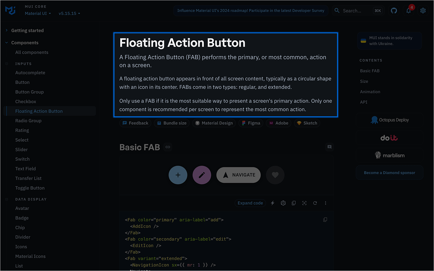
In such cases it’s important to provide more detailed information about the component’s intended usage. For example, this excerpt in the MUI docs explains that a FAB is only to be used if it’s the most suitable way to present a screen’s primary action, and that only one FAB is to be used per screen.
We’ve spoken a lot about prop documentation and written explanations, but understandably, being able to visually see a component is equally as important.
It’s common practice to visually render the component in the documentation then, below, show a code snippet that represents what’s seen on screen.
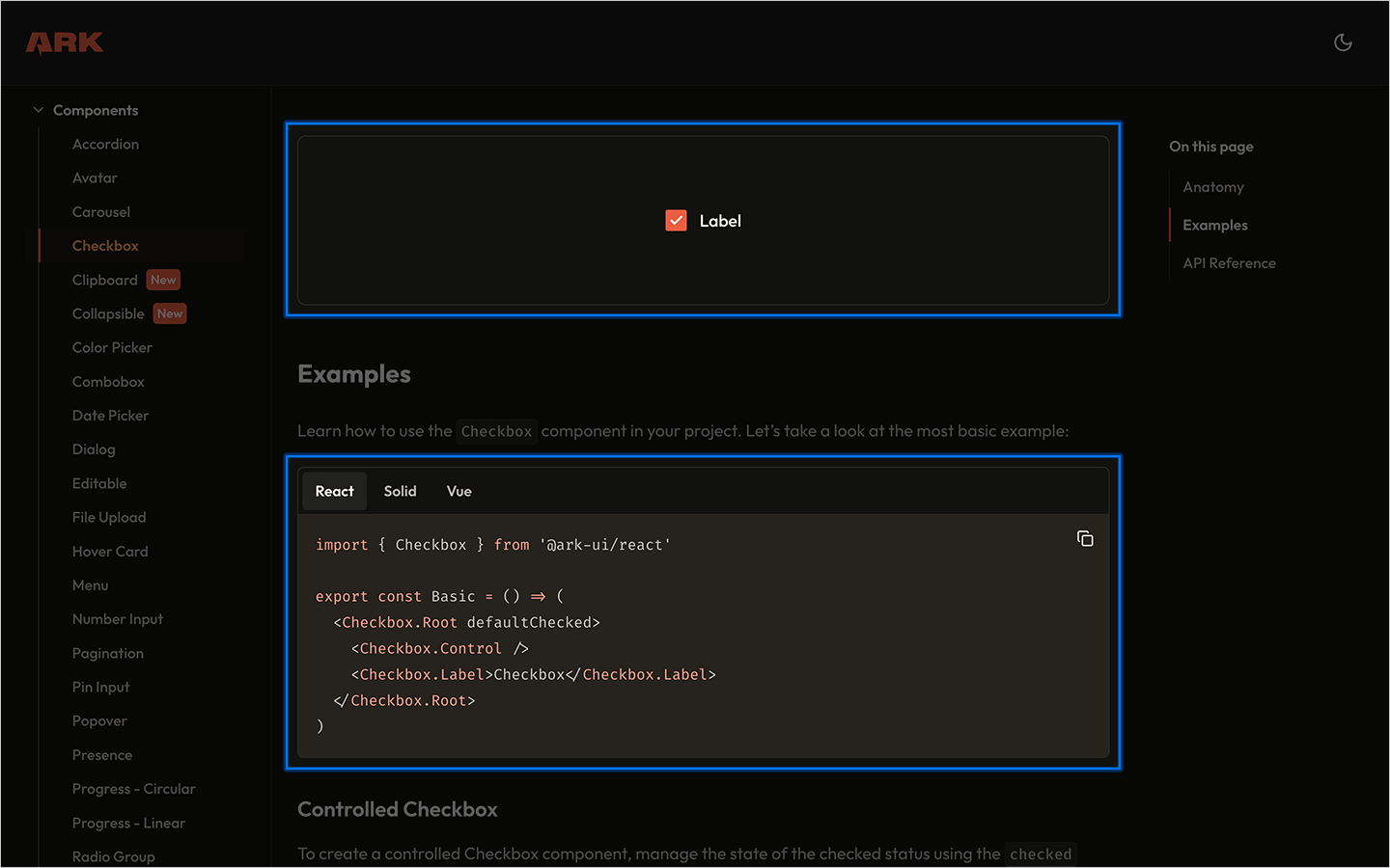
Depending on which frameworks a component has been designed to work with can determine which code snippets to show. React code snippets would be slightly different to Solid and Vue. Providing tabbed code snippets can help users find the snippet relevant to their framework / usage.
Include a section or page that aims to document “All” variants of a given component. This can provide a better overview of what variations are available for each component.
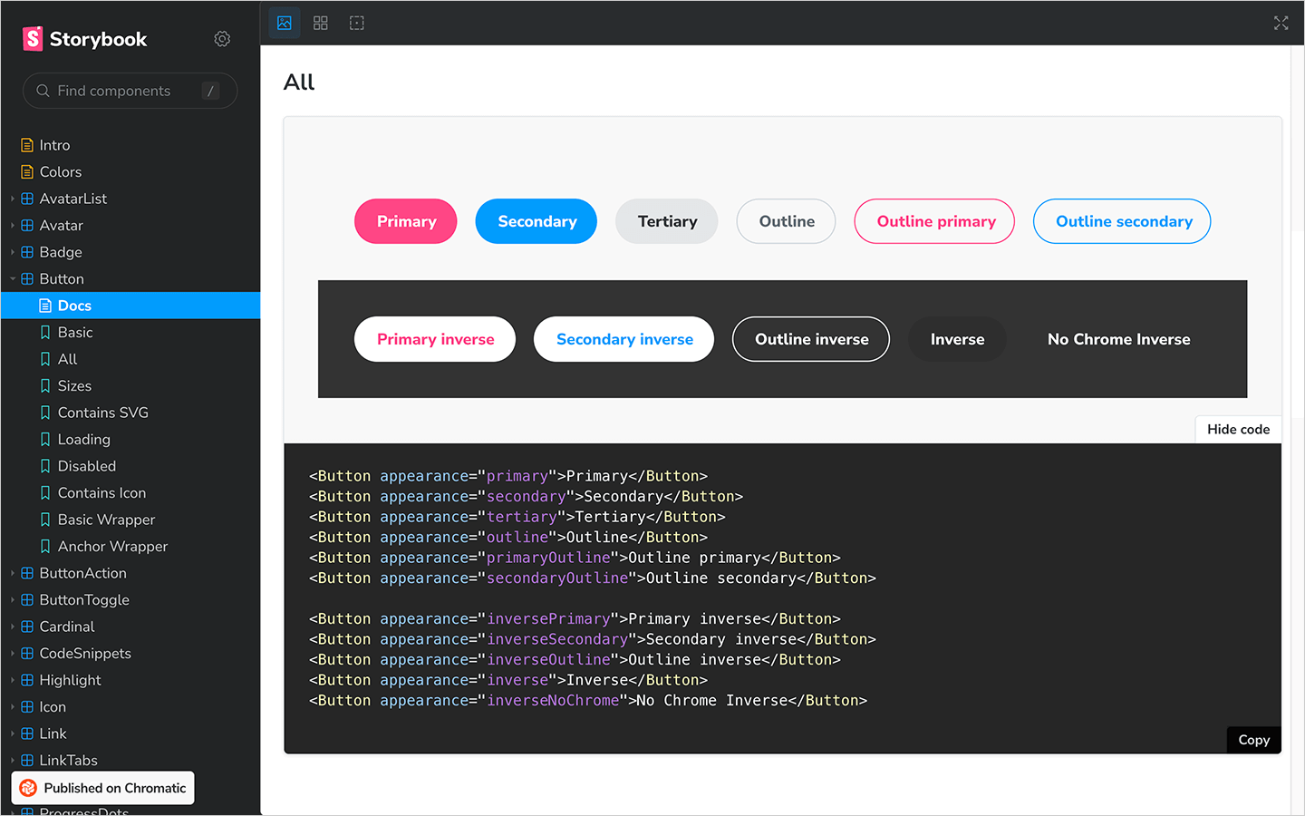
As before with the visual examples, it’s often good practice to include code snippets for each of the variants under the visual render.
The accessibility statement outlined by brand guidelines will determine which level of accessibility components should meet. Some industries, banking, government, etc. will need to adhere to higher WCAG rankings to meet legal requirements. An AA ranking is typically an acceptable level to work towards.
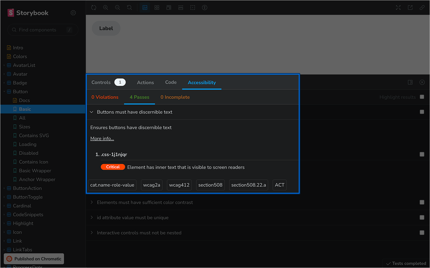
Adding an accessibility plugin to your documentation can highlight accessibility passes or fails together with the WCAG ranking the component conforms to.
For all the reasons version control exists in software development are the reasons it’s important to detail in your component library documentation. It’s quite likely a user will be reading the documentation for the latest version, but have a previous version installed in their development environment.
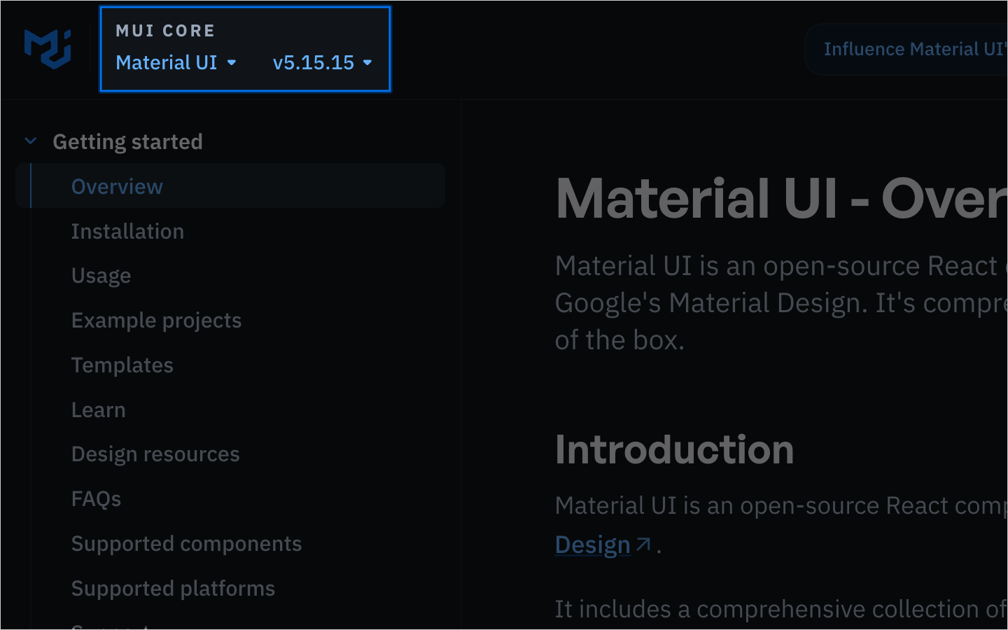
In some cases it might even be desirable to have multiple versions of the documentation available. The MUI documentation allows users to select from a dropdown menu and select which version of the documentation they’d like to see. It’s also good practice to include a link to the changelog allowing users to see the changes between versions.
Mistakes happen. Even with the best intentions, there are little things that slip the net. These could be as a result of human error, or perhaps when more detailed explanations of component usage would be helpful.
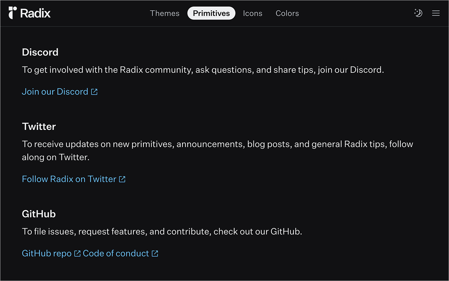
Invite collaboration and include a page somewhere in your documentation that explains how users can contact the maintainers to ask questions, or a link to the repository in cases where an issue should be filed.
Code is great, but there are occasions where users might need access to the design files. This might be to create a mockup for another team, or to perhaps suggest ways in which a component could support a new feature.
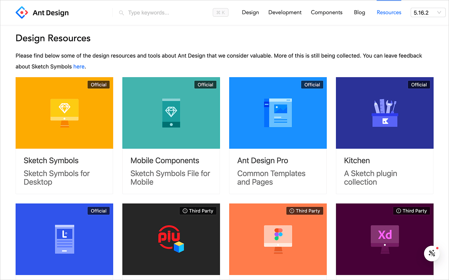
Similar to the collaboration page, create a page somewhere with links to the source files. In some instances you might be able to provide design files in multiple formats, Sketch, Figma, Adobe XD etc.
Here’s a list of the documentation sites we’ve referenced within this guide but there are many more great examples here: Design Systems Gallery.
All of the examples we’ve shown so far are effectively “read only”, and while good documentation will demonstrate component usage for individual components, it can be hard to document every permutation of every component when composed with other components from the system.
In these cases, “interactive playgrounds” can really help users understand how to compose the different parts of the system to create larger UI features.
But “interactive playgrounds” are not only good for users, they can also prove very helpful in instances where a reproduction repo might be required when opening an issue. Adding a link directly to the “problem” component can help library maintainers find the root cause of the bug, faster!
They can also help with onboarding and adoption and provide a smoother, shallower on ramp for developers looking to get started with a component libary. Adding a link in your documentation to a pre-configured development environment, with the dependencies installed, can really improve the getting started developer journey.
And it’s here where StackBlitz can help!
Using StackBlitz you’re able to add a link to your documentation that will crack open a new StackBlitz development environment (many frameworks are supported) with all the component library dependencies installed.
From here users are able to compose complete features using components from the library. In the below example I’ve composed MUI’s Grid, Card, CardContent, Typography, CardAction and Button components to create a grid displaying movie information.
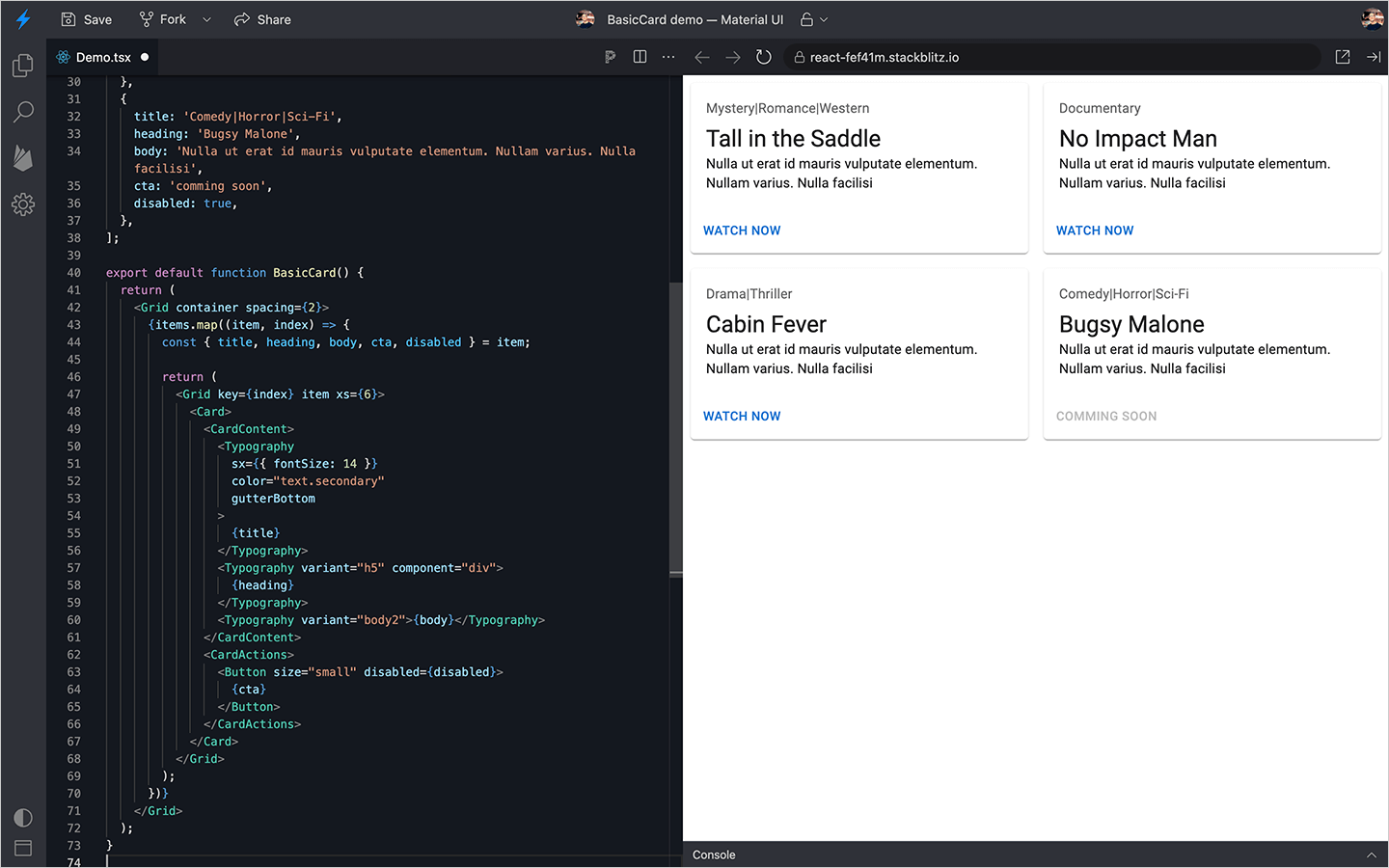
To create this, it took literally seconds, and could be very easily shared with members of the team for feedback. Moreover, StackBlitz updates in real time so, should the situation arise where a colleague wishes to “hop on a call to discuss” and make changes, it could all be refactored right there and then.
Compare that to the standard approach of building a feature, creating a PR, waiting for a build to succeed, then sending a link to a staging environment, awaiting and then addressing feedback… then repeat the whole cycle again. By using the StackBlitz SDK that links to an interactive playground, you can speed this entire process up considerably.
The StackBlitz JavaScript SDK can be used to link to preconfigured StackBlitz environments with the click of a button, right there from your documentation.
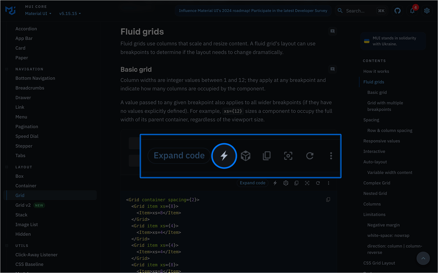
To open a StackBlitz environment with the MUI Grid component already set up and ready to go you could do something like this.
import sdk from '@stackblitz/sdk';

document.getElementById('button').addEventListener('click', () => {
  sdk.openProjectId('react-drvf85', {
    newWindow: true,
    view: 'preview',
  });
});
This would open the following preconfigured StackBlitz project in a new browser window. https://stackblitz.com/edit/react-drvf85?file=Demo.tsx
Here’s an example from the Porsche Design System where StackBlitz has been used in component library documentation.
The Porsche documentation displays an “Edit in StackBlitz” button under each component. Clicking it will open a new StackBlitz environment displaying the same Button components from the docs page.
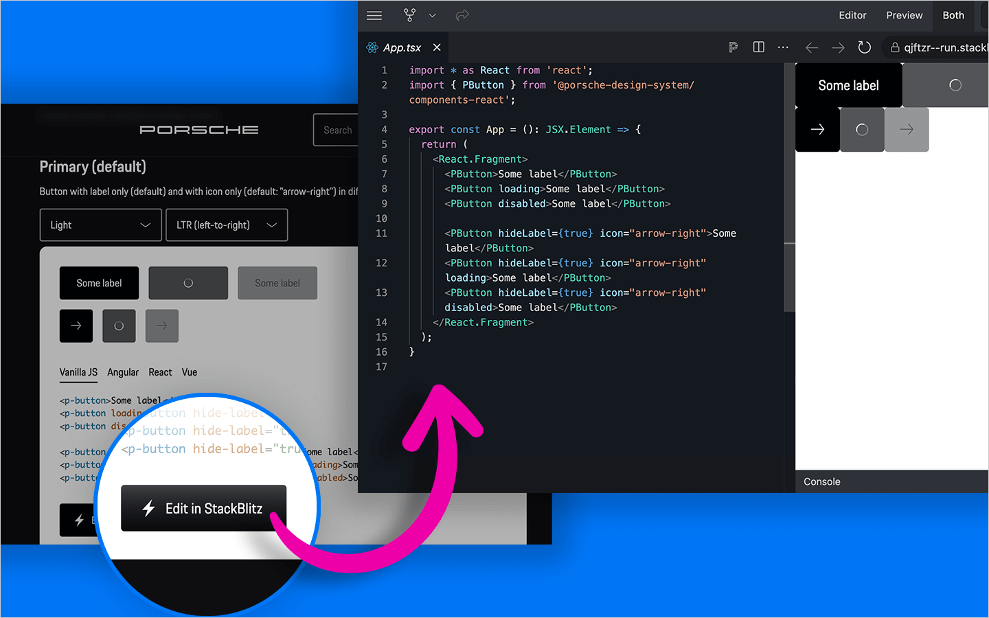
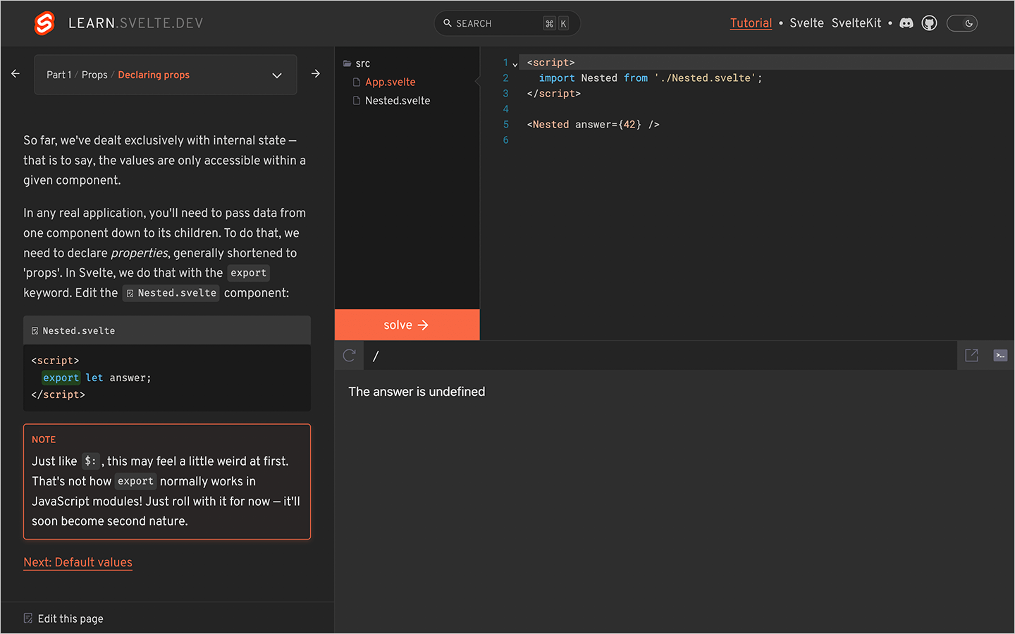
The StackBlitz SDK can be used in other ways too! A great example from the Svelte team utilizes our WebContainer API, which is the same StackBlitz development environment in the browser, and can be integrated as part of onboarding guides, or interactive tutorials.
I believe StackBlitz is the perfect partner for component documentation. There are many tools out there that will help you build a great documentation site, and by implementing some of the best practices mentioned in this article you’ll set your users up for success. But why stop there?
Add StackBlitz to the mix and take your documentation to the next level. If you’re keen to know more, try out StackBlitz today.
此内容由惯性聚合(RSS阅读器)自动聚合整理,仅供阅读参考。 原文来自 — 版权归原作者所有。