


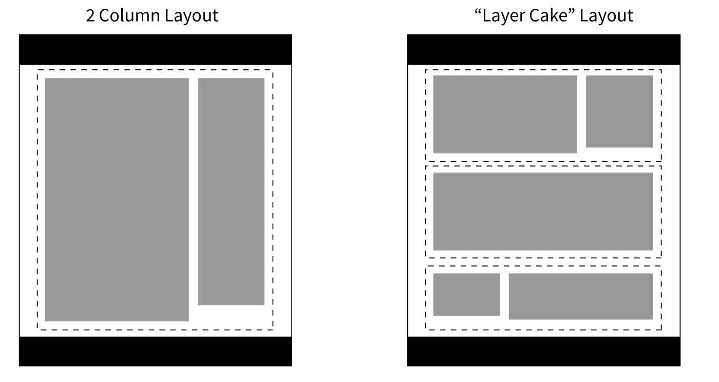
There is a design pattern that I've noticed emerge on a lot of the responsive projects that I've worked on in the last few years. They have all tended to gravitate towards a particular kind of layout. There are a lot of situations where this pattern is helpful, so I wanted to write a bit about it.
I call it "The Layer Cake" - it's a way to approach page layout in a responsive design. You can also call it 'tiered' layout - but, mmmmm - cake. This differs from a regular 'multi column' layout in that there is no all-encompassing container, or long running sidebars. There can be multiple columns within a layer, though.
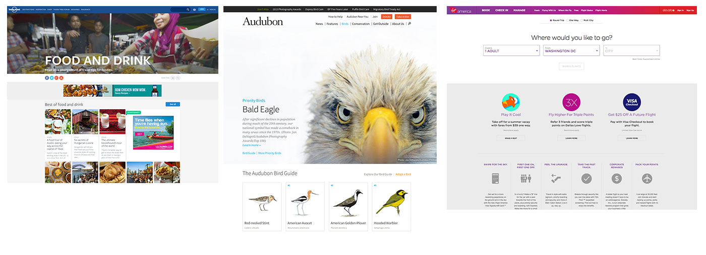
Here is what it looks like in the real world:
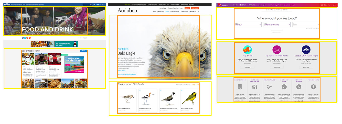
The layout consists of independent layers that are stacked on top of each other to form the page. A consistent layout is achieved by the use of "inner" containers - even if not visible without viewing the code. Here are the above examples again, but with the layers outlined in yellow, and the inner containers in orange:
If you're thinking about things in terms of code, instead of this kind of source order:
<body>
    <div class="container">
       <div class="column-1">
           <!-- column content -->
       </div>
       <div class="column-2">
           <!-- column content -->
       </div>
    </div> <!-- end container -->
</body>
You will end up with markup more like this:
<body>
    <div class="layer">
       <div class="layer__inner">
           <!-- layer content -->
       </div>
    </div> <!-- end layer -->
    <div class="layer">
       <div class="layer__inner">
           <!-- layer content -->
       </div>
    </div> <!-- end layer -->
    <div class="layer">
       <div class="layer__inner">
           <!-- layer content -->
       </div>
    </div> <!-- end layer -->
</body>
This approach has several strengths, especially in a responsive design:
Potential drawbacks do exist:
此内容由惯性聚合(RSS阅读器)自动聚合整理,仅供阅读参考。 原文来自 — 版权归原作者所有。