
惯性聚合 高效追踪和阅读你感兴趣的博客、新闻、科技资讯
阅读原文 在惯性聚合中打开

推荐订阅源

Google DeepMind News
C
CERT Recently Published Vulnerability Notes
C
Cisco Blogs
Cloudbric
Cloudbric
The Last Watchdog
The Last Watchdog
L
LINUX DO - 热门话题
cs.AI updates on arXiv.org
Application and Cybersecurity Blog
cs.CV updates on arXiv.org
K
KPMG report finds enterprise disconnect between AI and its ROI | CIO
Security Archives - TechRepublic
TaoSecurity Blog
TaoSecurity Blog
V2EX - 技术
V2EX - 技术
H
Heimdal Security Blog
S
Security Affairs
L
Lohrmann on Cybersecurity
Hacker News - Newest:
Hacker News - Newest: "LLM"
Simon Willison's Weblog
WordPress大学
WordPress大学
小众软件
小众软件
Security Latest
Security Latest
AWS News Blog
AWS News Blog
Apple Machine Learning Research
GbyAI
GbyAI
Engineering at Meta
Engineering at Meta
阮一峰的网络日志
阮一峰的网络日志
罗磊的独立博客
F
Full Disclosure
S
Schneier on Security
L
LangChain Blog
MyScale Blog
MyScale Blog
Know Your Adversary
Know Your Adversary
P
Privacy International News Feed
Google Online Security Blog
Scott Helme
Scott Helme
Stack Overflow Blog
Stack Overflow Blog
爱范儿
爱范儿
A
Arctic Wolf
Martin Fowler
Martin Fowler
B
Blog RSS Feed
大猫的无限游戏
大猫的无限游戏
博客园 - 三生石上(FineUI控件)
The Register - Security
CTFtime.org: upcoming CTF events
博客园_首页
Latest news
Latest news
F
Fortinet All Blogs
G
GRAHAM CLULEY
T
The Exploit Database - CXSecurity.com
Hacker News: Ask HN
Hacker News: Ask HN

Chip Cullen

The need for importance, and AI: Chip Cullen An updated Colorosetta: Chip Cullen The Return of the Font Combinator!: Chip Cullen Changing the number of an item in an ordered list: Chip Cullen My pizza dough recipe as of May 2025: Chip Cullen Gonna try to be a bit more personal: Chip Cullen How I built dynamic social media images in Eleventy using Cloudinary: Chip Cullen My current approach to AI : Chip Cullen Lessons Learned Surviving a Major Product Launch: Chip Cullen How to Build a Drop Down Menu with Modern CSS: Chip Cullen How to stop page scrolling when you have an open dialog element: Chip Cullen Distraction Driven Development: Chip Cullen How I learned to code: the art of letting go: Chip Cullen In praise of the switch statement: Chip Cullen Project stuck? Think about how you’re breaking it down & question everything: Chip Cullen So how did the onboarding experiment go?: Chip Cullen Ideas for an Onboarding Checklist: Chip Cullen I really like Post Mortems: Chip Cullen Raise Red Flags Early: Chip Cullen How to mock fetch requests in React Testing Librarty tests: Chip Cullen Running a Structured Meeting: Chip Cullen Adding the View Transitions API to my personal site: Chip Cullen A Lightweight Way to Read GraphQL Data: Chip Cullen How to make a color changing favicon: Chip Cullen Using a Pros/Cons list to help navigate technical discussions: Chip Cullen How to use variable fonts from Google Fonts: Chip Cullen A new website: now on Eleventy!: Chip Cullen How to Truncate Type at More Than One Line with Just CSS: Chip Cullen Colorosetta: the VS Code Extension!: Chip Cullen Using CSS Custom Properties and Logical Properties Together: Chip Cullen Browser Dev Tools: Element Inspector Popover: Chip Cullen The Link with rel=preload is a Seperate Thing: Chip Cullen How to have Dark & Light Mode Images that also works with User Choice: Chip Cullen Don’t use Viewport Units for Font Size on their own: Chip Cullen A little known Media Query: Aspect Ratio: Chip Cullen Meta thinking: Managing Decisions: Chip Cullen Give Your To-Do's Context: Chip Cullen Say What the Impact is when Reporting Issues: Chip Cullen Firefighting 101: How to Manage Breakages: Chip Cullen How to Deal With Large Pieces of Technical Debt: Chip Cullen Make Your Request Clear: Chip Cullen Analytics events, HTML classes, and protecting against refactoring: Chip Cullen How We Removed jQuery from a large app: Chip Cullen New tool: ColoRosetta: Chip Cullen What width and height attributes should you use with responsive images?: Chip Cullen Django 3.1 gotcha: Referrer Policy has a new default, and it might break iframes and links: Chip Cullen A Javascript Component Pattern: Chip Cullen CSS min(), max() and clamp() Functions: Chip Cullen Pointer Events and Inline Elements in Chrome: Chip Cullen Resolving a github repo and a new Create React App: Chip Cullen How to POST *Data* with the Fetch API: Chip Cullen The Contrast Triangle: Chip Cullen Advice on interviewing for Junior Developers: Chip Cullen Life Lessons Learned From Running a Marathon: How to do something really hard: Chip Cullen A (Brief) intro to Search Engine Structured Data: Chip Cullen Javascript Fallback Values on Variables and Booleans - a hard lesson: Chip Cullen Alfred Tip: Quickly Access Common URLs: Chip Cullen Responsive Images in Hugo - by Laura Kalbag: Chip Cullen Making a Gatsby Site with Multiple Content Types: Chip Cullen How to Create and Use Fixtures in Cypress Tests: Chip Cullen Fixing the 'Bad Interpreter' Error from AWS and Python 3.7: Chip Cullen Creating a Canonical Tag in a Django Template: Chip Cullen Welcome to my New Design - 2019: Chip Cullen Django Templates: Block and If statements don’t work like you might expect: Chip Cullen Books I Read in 2018: Chip Cullen Lifehack: 4 ways to help tame common email noise: Chip Cullen How to make better Pull Requests: Adding Steps to Test: Chip Cullen The unsung develpment tool: Spreadsheets: Chip Cullen Troubleshooting Adding and Removing EventListeners: with Arguments, Debounced, and in a React Class: Chip Cullen How to Fake the Window Object in Jest and Enzyme: Chip Cullen Migrating From Wordpress to Hugo: Chip Cullen Background Repeat and its Possibilities: Chip Cullen Getting Started With Front End Tests: a Mindset: Chip Cullen Migrating a Blog - An Opportunity for a Content Inventory: Chip Cullen Moving to Hugo: Chip Cullen JavaScript events: .target vs .currentTarget: Chip Cullen Things I wish I knew when starting with Python: Chip Cullen Leading Ampersands for modifiers in Sass: An anti-pattern: Chip Cullen How to get rid of the "You have mail" message in your terminal: Chip Cullen Why three typefaces rule the web, and what you can do about it: Chip Cullen You shouldn't worry about Section 508 - it's Section 504: Chip Cullen Looping Video Backgrounds: pointers and pitfalls: Chip Cullen How to “preview” a click event tag in the Google Tag Manager console: Chip Cullen Moving on from a technology, or: life after Drupal: Chip Cullen Don’t be a dumb developer: Chip Cullen Two level breadcrumbs with CSS :only-child: Chip Cullen Simplicity comes with experience: Chip Cullen Do the least amount possible: Chip Cullen SVGs vs. Icon Fonts: Two points in favor of Icon Fonts: Chip Cullen Accessible links without underlines: Chip Cullen The Strategic Job Hunt: Chip Cullen Surviving Getting Laid Off: Chip Cullen How to structure your typography in Sass: Chip Cullen Layer Cake: A Responsive Design Layout Pattern: Chip Cullen Creativity is yet to come in Web Design: Chip Cullen Front End Testing with Wraith: A Step by Step Recipe: Chip Cullen Where to begin? How I start a visual design for the web: Chip Cullen If you could only have five Google Fonts: Chip Cullen Why SVG is so cool (or: what happens when you're late to the party on something): Chip Cullen How to apply classes to elements with CKEditor 4, in Drupal 7: Chip Cullen
Responsive spacing with viewport and ch units: Chip Cullen
2019-03-01 · via Chip Cullen

With my new design, one of the things that I explored was using some CSS units that I hadn't before, and seeing what I could do with them.

One of the more interesting things that I discovered was how easy it was to make spacing between elements act in a responsive way.

vw / vh units

Now, vw and vh units have been around for a while now, so they weren't necessarily new. But I think it's fair to say that most of the time people use vw — when was the last time you used vh?

What I wanted with some elements of my site was some padding around them that was responsive to the viewport in both directions. The smaller the viewport — in either dimension, the tighter the element could be. When the user's viewport was large, it could be very roomy.

I found that using both vw and vh units made this quite easy — and without media queries.

It essentially boils down to this:

.highlight {
  padding: 5vh 2vw;
  ...;
}

That's it.

(.highlight is the class of my code block, as produced by Hugo's code highlighter.)

The above is basic CSS shorthand for padding — 5vh is the top and bottom padding, and 2vw is the left and right padding.

What that allows for is narrower or wider spacing based on the viewport — in either direction.
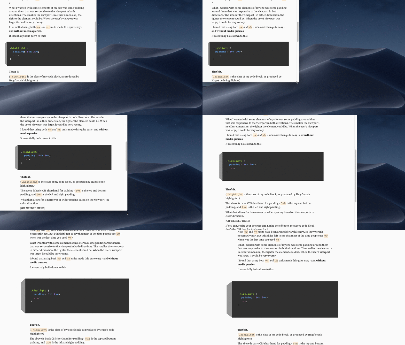
A block of code which has padding that changes relative to the viewport

If you can, resize your browser and notice the effect on the above code block — that's the CSS that I actually use for it.

Lessons learned from vw / vh as padding units

  • If you maintain a consistent value (such as 5vh) across elements, you can maintain a consistent look and feel that reads as intentional. Even if you are letting go of control of exactly how much space is being used.
  • I found that this works well for padding, but not for margins between elements. I experimented with using viewport units there, but ultimately reverted back to fixed units. I need to explore that more.

ch unit

The ch unit has been around for a bit, but you rarely come across it. I think the use case for it isn't exactly straight forward. The first thing that sprung to my mind was that you could define text content width — but you should know what you're getting into.

I went about using ch in this way:

@media (min-width: 768px) {
  grid-template-columns: 3rem 40ch minmax(20ch, 30ch) 1fr;
  grid-template-areas:
    "header header header ."
    ". content content ."
    ". tags tags ."
    ". comments comments ."
    ". footer footer .";
}

At an arbitrary breakpoint (I used 768, but it could have been whatever), I decided I would have two columns for my main content well. I wanted two columns for flexibility down the road. The first would be a fixed 40ch wide, while the second would flex between 20 and 30ch wide.

So, I would essentially have a content well that would be between 60 and 70ch wide.

This, to me, got my content well to stay roughly within what I perceive to be the sweet spot of line length in my content.

If the user ups their type size, my content well will grow proportionally. That would also be true with em or rem units, but now I can easily swap out typefaces and know that my content well will adjust to it as well.