惯性聚合 高效追踪和阅读你感兴趣的博客、新闻、科技资讯
阅读原文 在惯性聚合中打开

推荐订阅源

Attack and Defense Labs
O
OpenAI News
AI
AI
Cloudbric
Cloudbric
Security Archives - TechRepublic
H
Heimdal Security Blog
Exploit-DB.com RSS Feed
Recent Commits to openclaw:main
T
Threat Research - Cisco Blogs
cs.AI updates on arXiv.org
腾讯CDC
S
SegmentFault 最新的问题
宝玉的分享
宝玉的分享
Cyberwarzone
Cyberwarzone
博客园 - 【当耐特】
TaoSecurity Blog
TaoSecurity Blog
The Cloudflare Blog
V
Visual Studio Blog
Forbes - Security
Forbes - Security
Apple Machine Learning Research
Spread Privacy
Spread Privacy
L
LINUX DO - 最新话题
OSCHINA 社区最新新闻
OSCHINA 社区最新新闻
K
Kaspersky official blog
IT之家
IT之家
大猫的无限游戏
大猫的无限游戏
The Last Watchdog
The Last Watchdog
奇客Solidot–传递最新科技情报
奇客Solidot–传递最新科技情报
博客园_首页
Cisco Talos Blog
Cisco Talos Blog
Security Latest
Security Latest
量子位
W
WeLiveSecurity
V
V2EX
L
Lohrmann on Cybersecurity
S
Security @ Cisco Blogs
小众软件
小众软件
The Hacker News
The Hacker News
阮一峰的网络日志
阮一峰的网络日志
H
Hacker News: Front Page
博客园 - 聂微东
T
Troy Hunt's Blog
S
Schneier on Security
有赞技术团队
有赞技术团队
爱范儿
爱范儿
博客园 - 三生石上(FineUI控件)
Webroot Blog
Webroot Blog
P
Privacy International News Feed
Jina AI
Jina AI
让小产品的独立变现更简单 - ezindie.com

Chip Cullen

The need for importance, and AI: Chip Cullen An updated Colorosetta: Chip Cullen The Return of the Font Combinator!: Chip Cullen Changing the number of an item in an ordered list: Chip Cullen My pizza dough recipe as of May 2025: Chip Cullen Gonna try to be a bit more personal: Chip Cullen How I built dynamic social media images in Eleventy using Cloudinary: Chip Cullen My current approach to AI : Chip Cullen Lessons Learned Surviving a Major Product Launch: Chip Cullen How to Build a Drop Down Menu with Modern CSS: Chip Cullen How to stop page scrolling when you have an open dialog element: Chip Cullen Distraction Driven Development: Chip Cullen How I learned to code: the art of letting go: Chip Cullen In praise of the switch statement: Chip Cullen Project stuck? Think about how you’re breaking it down & question everything: Chip Cullen So how did the onboarding experiment go?: Chip Cullen Ideas for an Onboarding Checklist: Chip Cullen I really like Post Mortems: Chip Cullen Raise Red Flags Early: Chip Cullen How to mock fetch requests in React Testing Librarty tests: Chip Cullen Running a Structured Meeting: Chip Cullen Adding the View Transitions API to my personal site: Chip Cullen A Lightweight Way to Read GraphQL Data: Chip Cullen How to make a color changing favicon: Chip Cullen Using a Pros/Cons list to help navigate technical discussions: Chip Cullen How to use variable fonts from Google Fonts: Chip Cullen A new website: now on Eleventy!: Chip Cullen How to Truncate Type at More Than One Line with Just CSS: Chip Cullen Colorosetta: the VS Code Extension!: Chip Cullen Using CSS Custom Properties and Logical Properties Together: Chip Cullen Browser Dev Tools: Element Inspector Popover: Chip Cullen The Link with rel=preload is a Seperate Thing: Chip Cullen How to have Dark & Light Mode Images that also works with User Choice: Chip Cullen Don’t use Viewport Units for Font Size on their own: Chip Cullen A little known Media Query: Aspect Ratio: Chip Cullen Meta thinking: Managing Decisions: Chip Cullen Give Your To-Do's Context: Chip Cullen Say What the Impact is when Reporting Issues: Chip Cullen Firefighting 101: How to Manage Breakages: Chip Cullen How to Deal With Large Pieces of Technical Debt: Chip Cullen Make Your Request Clear: Chip Cullen Analytics events, HTML classes, and protecting against refactoring: Chip Cullen How We Removed jQuery from a large app: Chip Cullen New tool: ColoRosetta: Chip Cullen What width and height attributes should you use with responsive images?: Chip Cullen Django 3.1 gotcha: Referrer Policy has a new default, and it might break iframes and links: Chip Cullen A Javascript Component Pattern: Chip Cullen CSS min(), max() and clamp() Functions: Chip Cullen Pointer Events and Inline Elements in Chrome: Chip Cullen Resolving a github repo and a new Create React App: Chip Cullen How to POST *Data* with the Fetch API: Chip Cullen The Contrast Triangle: Chip Cullen Advice on interviewing for Junior Developers: Chip Cullen Life Lessons Learned From Running a Marathon: How to do something really hard: Chip Cullen A (Brief) intro to Search Engine Structured Data: Chip Cullen Javascript Fallback Values on Variables and Booleans - a hard lesson: Chip Cullen Alfred Tip: Quickly Access Common URLs: Chip Cullen Responsive Images in Hugo - by Laura Kalbag: Chip Cullen Making a Gatsby Site with Multiple Content Types: Chip Cullen How to Create and Use Fixtures in Cypress Tests: Chip Cullen Fixing the 'Bad Interpreter' Error from AWS and Python 3.7: Chip Cullen Creating a Canonical Tag in a Django Template: Chip Cullen Responsive spacing with viewport and ch units: Chip Cullen Welcome to my New Design - 2019: Chip Cullen Django Templates: Block and If statements don’t work like you might expect: Chip Cullen Books I Read in 2018: Chip Cullen Lifehack: 4 ways to help tame common email noise: Chip Cullen How to make better Pull Requests: Adding Steps to Test: Chip Cullen The unsung develpment tool: Spreadsheets: Chip Cullen Troubleshooting Adding and Removing EventListeners: with Arguments, Debounced, and in a React Class: Chip Cullen How to Fake the Window Object in Jest and Enzyme: Chip Cullen Migrating From Wordpress to Hugo: Chip Cullen Background Repeat and its Possibilities: Chip Cullen Getting Started With Front End Tests: a Mindset: Chip Cullen Migrating a Blog - An Opportunity for a Content Inventory: Chip Cullen Moving to Hugo: Chip Cullen JavaScript events: .target vs .currentTarget: Chip Cullen Things I wish I knew when starting with Python: Chip Cullen Leading Ampersands for modifiers in Sass: An anti-pattern: Chip Cullen How to get rid of the "You have mail" message in your terminal: Chip Cullen You shouldn't worry about Section 508 - it's Section 504: Chip Cullen Looping Video Backgrounds: pointers and pitfalls: Chip Cullen How to “preview” a click event tag in the Google Tag Manager console: Chip Cullen Moving on from a technology, or: life after Drupal: Chip Cullen Don’t be a dumb developer: Chip Cullen Two level breadcrumbs with CSS :only-child: Chip Cullen Simplicity comes with experience: Chip Cullen Do the least amount possible: Chip Cullen SVGs vs. Icon Fonts: Two points in favor of Icon Fonts: Chip Cullen Accessible links without underlines: Chip Cullen The Strategic Job Hunt: Chip Cullen Surviving Getting Laid Off: Chip Cullen How to structure your typography in Sass: Chip Cullen Layer Cake: A Responsive Design Layout Pattern: Chip Cullen Creativity is yet to come in Web Design: Chip Cullen Front End Testing with Wraith: A Step by Step Recipe: Chip Cullen Where to begin? How I start a visual design for the web: Chip Cullen If you could only have five Google Fonts: Chip Cullen Why SVG is so cool (or: what happens when you're late to the party on something): Chip Cullen How to apply classes to elements with CKEditor 4, in Drupal 7: Chip Cullen
Why three typefaces rule the web, and what you can do about it: Chip Cullen
2017-04-13 · via Chip Cullen
Chip Cullen

Design Systems expert Nathan Curtis* tweeted this the other day:

With all those typefaces out there, how do my systems clients usually end up with Proxima Nova, Open Sans, or Source Sans Pro?

— Nathan August Curtis (@nathanacurtis) March 15, 2017

This got me thinking - anecdotally, those three typefaces have been the ones primarily used on every project that I've worked on for maybe the last four or five years. This very blog is (currently) set in Source Sans Pro. [Update: in 2022, I updated this site to use your system Sans Serif for body copy, and Source Serif Pro for headlines.] It's impossible to compile statistics on this (or is it?), but it his statement rings true in my experience.

Why do those three typefaces - Proxima Nova, Open Sans, our Source Sans Pro - seem to rule the web? What are there any pitfalls of using them? What do they have in common? What should we look for in alternatives? What are some example alternatives we can consider?

What are the pitfalls of using these typefaces?

  1. Sameness - If we're all using the same typefaces, our projects all tend to have a similar voice. When a typeface becomes so common, it tends to loose all 'voice'. I think Proxima Nova has reached this particular zenith - it's now almost as bland as Helvetica once was. That's through no fault of the typeface itself - it's the result of its popularity.
  2. In reaching for the familiar, we don't consider what might be best for the job - I think these three typefaces are some of things that designers instinctively reach for at this point. However, what I think gets overlooked is whether or not one of those typefaces is the right choice for a particular project. Are you working on a web app that mostly has interface elements? Then don't pick a typeface because it looks good when used in headlines.

What do these three typefaces have in common?

  1. They're Sans Serifs - Let's get the obvious out of the way. All three typefaces are sans serifs, which have traditionally been held as the better choice for body copy on digital screens. It's a view that I've long held.
  2. They offer a wide range of weights - This is the primary reason I think they are so common in design systems. These are very robust typefaces in that they offer a great many weights, usually with accompanying italics. That makes it very easy to build out a whole system with a unified typographic feel.
  3. Specifically they offer a very light weight - I think that visually designers are drawn to very light weights of typefaces because it allows them to make large headlines that still feel elegant. All three of these typefaces provide those weights, and, they look good at larger sizes.
  4. They're not Helvetica (or, gasp, Arial) - let's call a spade a spade here - they're not system fonts. But, they're still 'safe' choices that hold up to wide use.
  5. They look good at body copy and headline sizes - Regardless of weight, these three choices look nice at both body copy sizes and italics. Notice I say "good". I think they're above average for both use cases, but not the best for each (I particularly think Proxima Nova is a poor body copy choice). I think a design systems should consider having more than one typeface - one a body copy/interface element typeface, and a 'headline' typeface.

What should you consider when looking for an alternative?

  1. A wide range of weights, each designed well - As I said, the primary reason a lot of designers reach for those three typefaces is the number of weights they offer. And, each of those weights is executed impeccably. A range of weights provides easy options that build variety in a system, while still maintaining unity. However, a word of caution: be very judicious in your use of weights. Every added weight represents a significant performance hit. Be sure the weights you use are distinct and useful enough to merit their inclusion.
  2. They look good at the sizes you’re most likely to use - Most typefaces are designed to be used either on the small side or on the larger side. For example, Verdana was designed for use at small sizes, and looks awfully clumsy at larger sizes (are you listening, Ikea?). Some typefaces even include ‘display’ variations that are distinct from regular fonts, which is the same letterforms, but slightly redrawn with proportions that look good at larger sizes.
  3. Check out serif typefaces - The idea that sans serif typefaces look better in a digital setting has been around for a while. However, we live in an era of high resolution screens and media queries. Maybe your brand voice would be best represented by a serif typeface (and you can always fall back to a sans serif when the user’s screen doesn’t handle that well).

What alternatives are out there?

Depending on your system's needs, I would suggest you look at these typefaces, all available from Google Fonts:

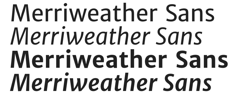
Merriweather Sans Sample

  1. Merriweather Sans - Merriweather first started life as a serif typeface, which was later accompanied by this, the Sans Serif. Merriweather has a warm character, and paring the serif and sans makes for easy visual harmony.

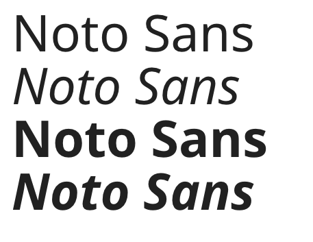
Noto Sans Sample

  1. Noto Sans - I've been a fan of the Noto project for a long time. I'm frankly surprised it hasn't seen wider use. What is so special about Noto is how internationalized it is. It is by far the most complete typeface out there in terms of accommodating different character sets. Need something translated to Balinese or Urdu? Noto has you covered. For international organizations, this typeface needs a serious look. Keep in mind, though, the Sans family doesn't have the super light weights that designers seem to love.

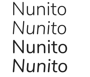
Nunito Sample

  1. Nunito - Nunito is a typeface that I've only recently discovered. And I like it, a lot. It has a modern, Helvetica-esque proportions, but also has warmth. It has the rounded terminals of Proxima Nova, but isn't Proxima Nova. It comes in wide variety of weights, to boot, and has a very attractive Sans Serif (flat terminal) variation.

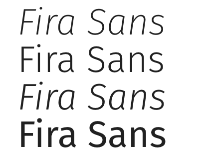
Fira Sans Sample

  1. Fira Sans - Fira has an impressive pedigree - it was partially developed by Erik Spiekermann. It was developed for use in a digital UI. It has a very impressive range of widths, with accompanying italics. To my eye, it doesn't fare as well at large type sizes (since it was intended for use in UI), but that may not be an issue in your system.

I hope this post helps you recognize why we seem to reach for similar typefaces in systems, and to consider alternatives out there.

* Full disclosure: I worked with Nathan once upon a time. I thank him for his input on this article, as well.