Overlapping elements using CSS is no longer the stuff of nightmares. We'll look at how to do this elegantly by using the CSS grid across.
Watch the video below or read the article, whichever you prefer! 😊
For the sorts of layouts we create these days, overlapping elements on top of each other is going to be fairly common. Take a look at the following example:
We have two image elements overlapping by being stacked on top of each other. We have the planet image, and we have a rocket image on top of the planet image. The way we do this overlapping is by relying entirely on the CSS Grid, so let's look at how this all works.
Onwards!
The Grid Approach
Before we start fiddling with lines of HTML and CSS, let's take many steps back and just talk about how we are going to accomplish our stacking. By default, our HTML elements display in one of two modes. One is as block elements where they take up all available horizontal space and are stacked vertically on top of each other:
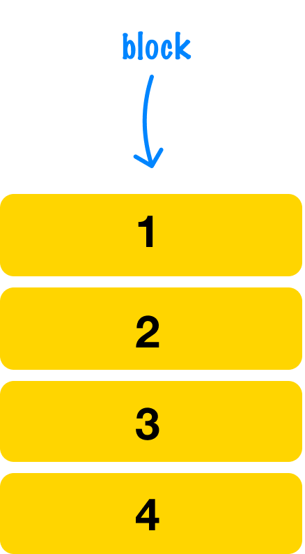
The other is as inline elements where they take up the space of their content and flow alongside other inline elements:
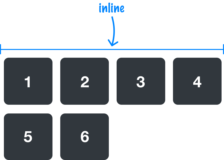
Yes, there are other sub-variations like inline-block, but we'll just stop with the big two. Our content either flows vertically or horizontally. This behavior can be overridden, and one way is by telling our elements' parent to use the CSS grid for layout.
The CSS grid allows a parent element to specify a series of cells arranged in rows and columns:
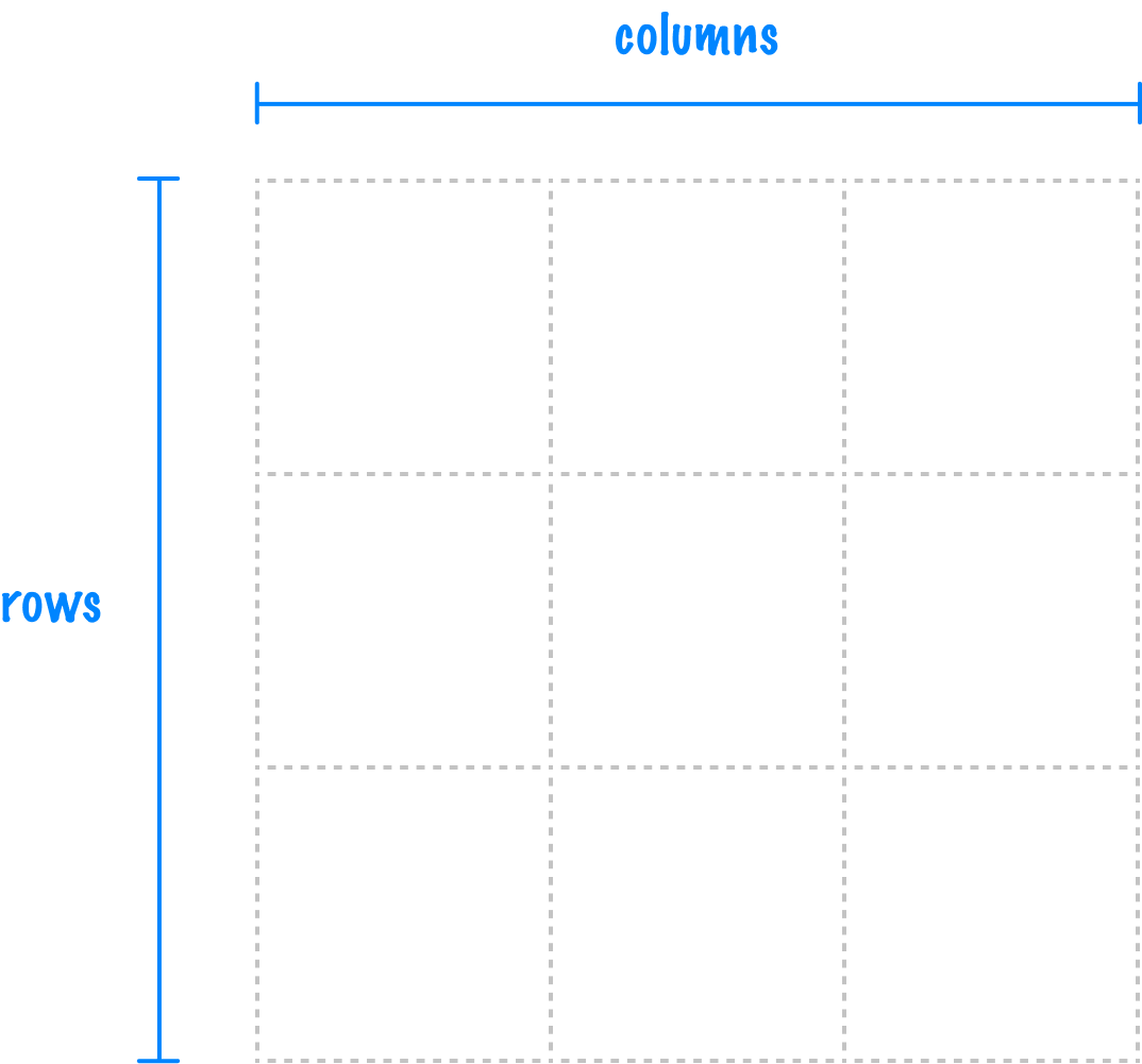
The children of this parent can specify which cell they want to position themselves in and how many rows or columns of space they want to take up:
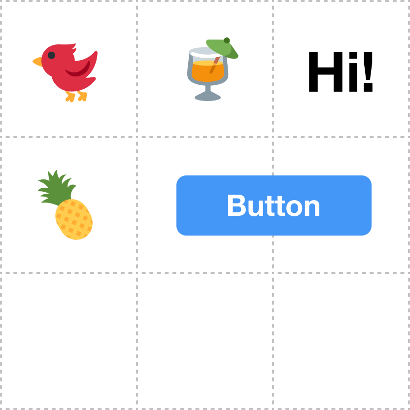
If we specify multiple children to appear in the same row or column, guess what happens? They appear as overlapping where each element is stacked on top of each other like a pancake being looked at from above:
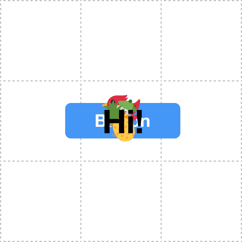
This is exactly the effect we want. What we are going to do next is turn all of what we have seen into working HTML and CSS.
Building the Example
Let's create a new HTML document and add the following starter content into it:
<!DOCTYPE html>
<html lang="en">

<head>
  <meta charset="UTF-8">
  <meta http-equiv="X-UA-Compatible" content="IE=edge">
  <meta name="viewport" content="width=device-width, initial-scale=1.0">
  <title>Overlapping Items on Top of Each Other</title>

  <style>
    body {
      background-color: #000;
      display: grid;
      place-content: center;
    }

    .main {
      background-color: #111;
      padding: 40px;
      width: 400px;
      border-radius: 20px;
    }

    .main .planet {
      width: 200px;
    }

    .main .rocket {
      width: 50px;
      filter: drop-shadow(0px 2px 5px #333);
    }
  </style>
</head>

<body>
  <div class="main">
    <img class="planet" src="https://www.kirupa.com/icon/1fa90.svg">
    <img class="rocket" src="https://www.kirupa.com/icon/1f680.svg">
  </div>
</body>

</html>
If we preview this in our browser, what we see will look as the following:
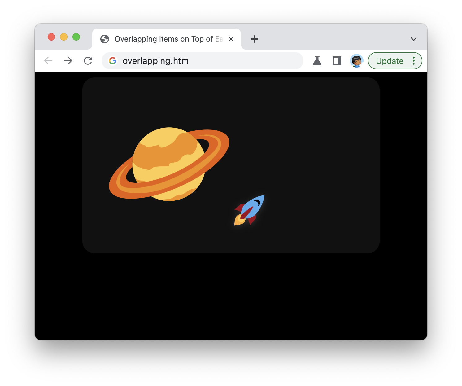
Take a few moments to look at the HTML and CSS that we currently have in this example. The two elements that we wish to overlap are the two images we have inside the main div element:
<div class="main">
  <img class="planet" src="https://www.kirupa.com/icon/1fa90.svg">
  <img class="rocket" src="https://www.kirupa.com/icon/1f680.svg">
</div>
The CSS that applies to these elements looks as follows;
.main {
  background-color: #111;
  padding: 40px;
  width: 400px;
  border-radius: 20px;
}

.main .planet {
  width: 200px;
}

.main .rocket {
  width: 50px;
  filter: drop-shadow(0px 2px 5px #333);
}
These images are currently arranged side-by-side:
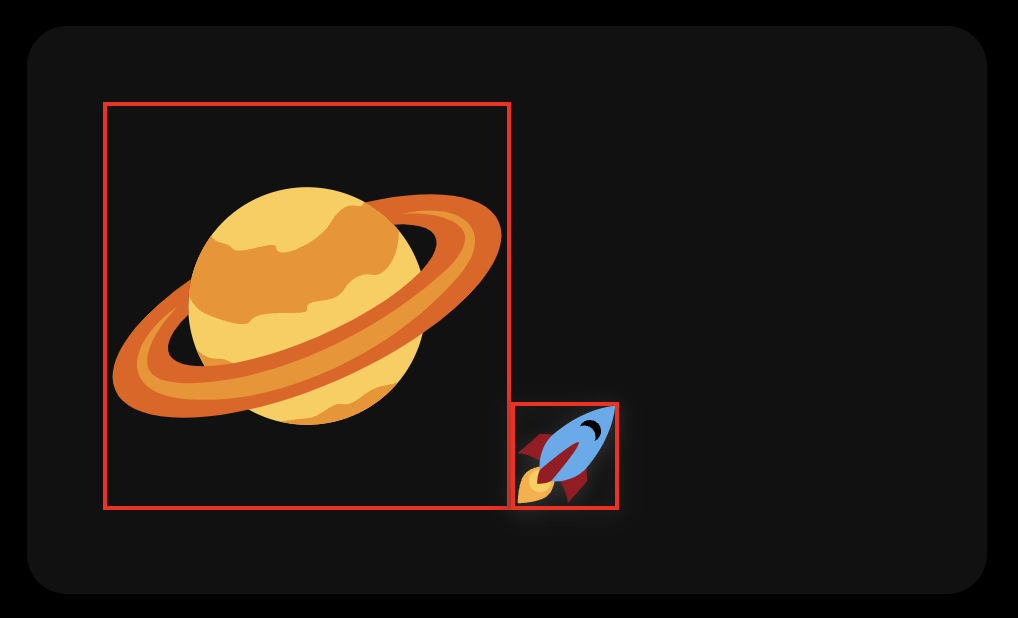
This is because our CSS currently doesn't have any of the things we talked about around how we can make our items overlap. We are going to do that next.
Specifying the Grid
The two image elements we want to overlap have a common immediate parent, and that parent is the main div element. Find the .main style rule, and add the following three highlighted lines:
.main {
  background-color: #111;
  padding: 40px;
  width: 400px;
  border-radius: 20px;

  display: grid;
  grid-template-columns: 1fr;
  grid-template-rows: 1fr;
  place-items: center;
}
With the first line (display: grid), we tell our browser that this element and all its children will now adhere to grid rules.
With the next two lines, we specify the number of rows and columns our grid will have. For what we are trying to do, we just need a single cell that takes up all available space. The 1fr value assigned to grid-template-columns and grid-template-rows will give us that.
The last thing we do is ensure all of our child elements are centered vertically and horizontally. That is done with just this single place-items: center statement.
Setting the Grid Location of our Children
Our next step is to have our planet and rocket images specify that they want to be located inside the single cell we defined earlier. This doesn't happen automatically, so add the following highlighted lines to our .main .planet and .main .rocket style rules:
.main .planet {
  width: 200px;

  grid-area: 1 / 1;
}

.main .rocket {
  width: 50px;
  filter: drop-shadow(0px 2px 5px #333);

  grid-area: 1 / 1
}
We specify the grid-area property and, just like coordinates on a map, we specify the number of the row and column we want our item to position itself in. Because our grid only has one cell, we can specify a value of 1 / 1 for both the planet and rocket image's grid-area property.
If we preview our page with all of these changes, you should see something similar to the following:
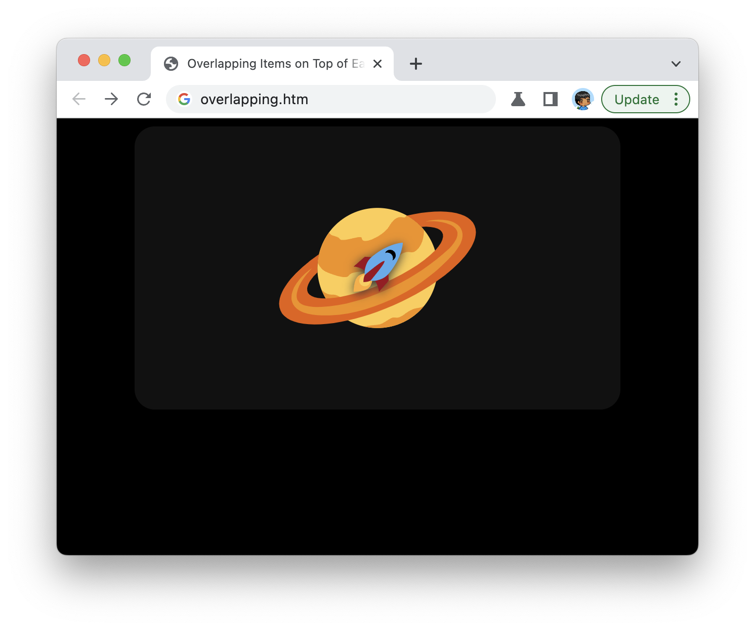
Our two images are overlapping! The rocket image appears directly above the image of the planet. If we want to adjust the order these images appear in where we may want our planet to appear in front of the rocket image, we have to specify a z-index property and a positive number value on our .main .planet style rule:
.main .planet {
  width: 200px;

  grid-area: 1 / 1;

  z-index: 10;
}
When we do this, our rocket is hidden from view because the planet appears in front of it. This may not have been the best example, but it does give you an idea of how to adjust the stacking order.
Conclusion
Our final CSS (along with the extra bonus CSS animation on the rocket) will look as follows:
.main {
  display: grid;
  background-color: #111;
  padding: 40px;
  width: 400px;
  border-radius: 20px;

  align-items: center;
  justify-items: center;

  grid-template-columns: 1fr;
  grid-template-rows: 1fr;
}

.main .planet {
  width: 200px;

  grid-area: 1 / 1;
}

.main .rocket {
  width: 50px;
  filter: drop-shadow(0px 2px 5px #333);

  grid-area: 1 / 1;

  animation: bouncing 5s ease-in-out infinite;
}

@keyframes bouncing {
  0% {
    transform: translate(10px, 20px);
  }
  50% {
    transform: translate(0px, 0px);
  }
  100% {
    transform: translate(10px, 20px);
  }
}
The summary of what we did is:
- By using grid-template-rows and grid-template-columns on the parent, we can define the cells in our grid.
- Each child can specify which cell in the grid it wants to live by specifying the coordinates ingrid-area. If the children specify the same cell, they stack!
- The z-index of stacked items can be adjusted by setting the z-index property!
Before we had the CSS grid, overlapping elements like what we just did was frustrating. Many cases would simply not work. We won't talk about those before times.
Just a final word before we wrap up. What you've seen here is freshly baked content without added preservatives, artificial intelligence, ads, and algorithm-driven doodads. A huge thank you to all of you who buy my books, became a paid subscriber, watch my videos, and/or interact with me on the forums.
Your support keeps this site going! 😇