Today, we're going to learn about a fun retro effect where, using only HTML, CSS, and SVG, we are going to make some circular text spin. It is going to look a bit like the following (open in new window):
In the following sections, we’ll look into the ins and outs of how to make an effect like this work.
Onwards!
Creating the Effect
There are two parts to this effect. There is the cool and interesting part where we take some text and have it go all circular on us. Then there is the animation part, which is also cool and interesting, where we take our circular text and make it spin. We'll tackle each part individually.
To follow along, create a new HTML document and add the following markup into it:
<!DOCTYPE html>
<html lang="en">

<head>
  <meta charset="UTF-8">
  <meta http-equiv="X-UA-Compatible" content="IE=edge">
  <meta name="viewport" content="width=device-width, initial-scale=1.0">
  <title>Spinning Circular Text</title>
  <style>
    .main {
      display: grid;
      align-items: center;
      justify-items: center;
    }
  </style>
</head>

<body>
  <div class="main">

  </div>
</body>

</html>
We have some style rules and a div element that will house our content, but nothing else major is going on here.
If we preview our page now, what we will see is mostly a blank page. We'll start filling it with content to change this blank situation next.
Specifying the Circular Text
The first thing we are going to do is specify our circular text, and we will do all of this inside an SVG element. Inside our main div element, add the following SVG markup:
<svg id="rotatingText" viewBox="0 0 200 200" width="200" height="200">
  <defs>
    <path id="circle" d="M 100, 100
            m -75, 0
            a 75, 75 0 1, 0 150, 0
            a 75, 75 0 1, 0 -150, 0
            ">
    </path>
  </defs>
  <text width="400">
    <textPath alignment-baseline="top" xlink:href="#circle" class="text">
      Part of a heart-healthy breakfast...sorta! -
    </textPath>
  </text>
</svg>
The text we want to display is part of our text element:
<svg id="rotatingText" viewBox="0 0 200 200" width="200" height="200">
  <defs>
    <path id="circle" d="M 100, 100
            m -75, 0
            a 75, 75 0 1, 0 150, 0
            a 75, 75 0 1, 0 -150, 0
            ">
    </path>
  </defs>
  <text width="400">
    <textPath alignment-baseline="top" xlink:href="#circle" class="text">
      Part of a heart-healthy breakfast...sorta! -
    </textPath>
  </text>
</svg>
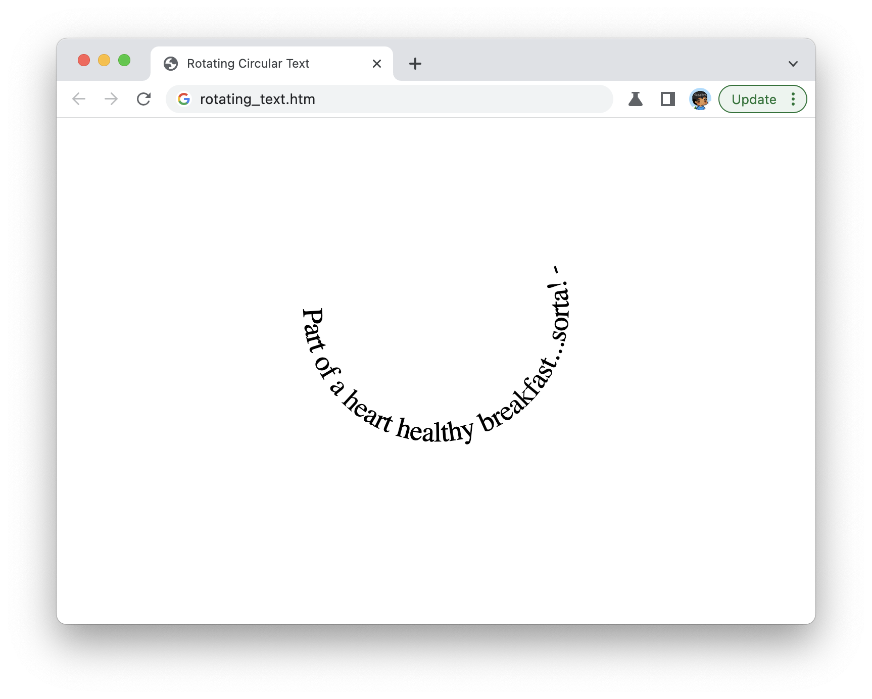
If we preview our document right now, we'll see some text starting to wrap around an invisible circle:
Before we go further, let's take a quick look at what inside our SVG makes this work. The part that makes our text appear circularly is a combination of two things:
- The textPath element that specifies what shape the text should follow
- The path element where we actually specify the coordinates of the shape used by textPath
Let's highlight the textPath and path elements to better see how they work together:
<svg id="rotatingText" viewBox="0 0 200 200" width="200" height="200">
  <defs>
    <path id="circle" d="M 100, 100
            m -75, 0
            a 75, 75 0 1, 0 150, 0
            a 75, 75 0 1, 0 -150, 0
            ">
    </path>
  </defs>
  <text width="400">
    <textPath alignment-baseline="top" xlink:href="#circle" class="text">
      Part of a heart-healthy breakfast...sorta! -
    </textPath>
  </text>
</svg>
Now, there are several ways we can define the exact size and coordinates of our circle. One approach is to draw a circle in a tool like Figma, Sketch, or Illustrator and copy the output as an SVG that uses paths as opposed to a circle shape primitive:
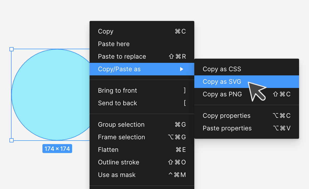
That the output uses the path element is important, and the SVG: Convert Shape to Path video explains how to do this easily. If your output contains a circle defined using the circle element, our textPath element won't know what to do.
If we get back to our example, we can see that it doesn't look quite right. Our text seems to be following a semi-circle as opposed to nicely rotating around a whole circle. This is caused by our text taking up less space than the size of the circle we want it to rotate around.
We can fix this with some styling, so add the following highlighted link elements and .text style rule:
  <link rel="preconnect" href="https://fonts.googleapis.com">
  <link rel="preconnect" href="https://fonts.gstatic.com" crossorigin>
  <link href="https://fonts.googleapis.com/css2?family=Kanit:wght@600&display=swap" rel="stylesheet">

  <style>
    .text {
      font-weight: 600;
      letter-spacing: 1.7px;
      text-transform: uppercase;
      font-family: 'Kanit';
      font-size: 17px;
      fill: #111;
      text-shadow: 2px 0px #ccc;
    }
    .main {
      display: grid;
      align-items: center;
      justify-items: center;
    }
    .main img {
      position: absolute;
    }
  </style>
When we preview this in our browser, we'll now see something that looks like the following:
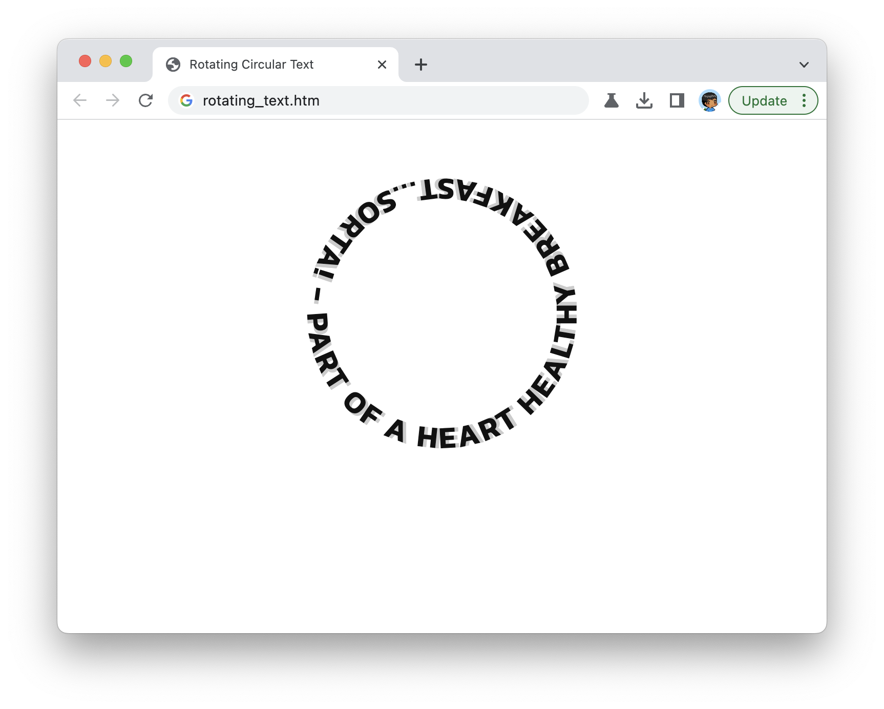
This looks good. Our text fully wraps around the circular path we defined in our SVG.
Ensuring Consistency
This effect is a little finicky in that minor variations in letter spacing or how the font renders will make the effect look weird. To maximize consistency, we specify a custom font that will look the same for all users across browsers and platforms:
<link rel="preconnect" href="https://fonts.googleapis.com">
<link rel="preconnect" href="https://fonts.gstatic.com" crossorigin>
<link href="https://fonts.googleapis.com/css2?family=Kanit:wght@600&display=swap" rel="stylesheet">
If you don't have a favorite place to get a custom font from, Google Fonts is a great resource.
Beyond just the font, there are a few more things for us to specify such as the length of our text, the font size, font-weight, and the letter spacing. All of these properties, in combination, play a key role in ensuring our text appropriately wraps our circular path:
.text {
  font-weight: 600;
  letter-spacing: 1.7px;
  text-transform: uppercase;
  font-family: 'Kanit';
  font-size: 17px;
  fill: #111;
  text-shadow: 2px 0px #ccc;
}
For any changes you make, you'll be fiddling with these CSS properties in largely a trial-and-error fashion. For example, the letter-spacing being set to 1.7px was one that came out of experimenting with various values to see what generated the best final appearance.
Animating our Circular Text
With our text appearing correctly, all that remains is for us to have our text spin. This will be done via a CSS animation applied to our entire SVG element. Inside our style tag, add the following CSS:
#rotatingText {
  animation-name: rotate-circle;
  animation-duration: 10s;
  animation-timing-function: linear;
  animation-iteration-count: infinite;
}

@keyframes rotate-circle {
  to {
    transform: rotate(1turn);
  }
}
We are specifying a keyframes collection called rotate-circle, and we are specifying a single to keyframe that rotates an element a full rotation. This full rotation is specified using the turn syntax:
@keyframes rotate-circle {
  to {
    transform: rotate(1turn);
  }
}
The 1turn value is the same as writing 360deg.
Lastly, to ensure our animation runs forever and without any acceleration and deceleration, we set our animation-iteration-count to infinite and the animation-timing-function to be linear.
#rotatingText {
  animation-name: rotate-circle;
  animation-duration: 10s;
  animation-timing-function: linear;
  animation-iteration-count: infinite;
}
When we put this all together, we have our circular text spinning over and over...and over.
Conclusion
The final markup that ties everything together (and adds a few extras like the spinning hamburger) can be seen below:
<!DOCTYPE html>
<html lang="en">

<head>
  <meta charset="UTF-8">
  <meta http-equiv="X-UA-Compatible" content="IE=edge">
  <meta name="viewport" content="width=device-width, initial-scale=1.0">
  <title>Rotating Circular Text</title>

  <link rel="preconnect" href="https://fonts.googleapis.com">
  <link rel="preconnect" href="https://fonts.gstatic.com" crossorigin>
  <link href="https://fonts.googleapis.com/css2?family=Kanit:wght@600&display=swap" rel="stylesheet">

  <style>
    body {
      width: 100vw;
      height: 100vh;
      margin: 0;
      padding: 0;

      display: grid;
    }

    .text {
      font-weight: 600;
      letter-spacing: 1.7px;
      text-transform: uppercase;
      font-family: 'Kanit';
      font-size: 17px;
      fill: #111;
      text-shadow: 2px 0px #ccc;
    }

    #rotatingText {
      animation-name: rotate-circle;
      animation-duration: 10s;
      animation-timing-function: linear;
      animation-iteration-count: infinite;
    }

    @keyframes rotate-circle {
      to {
        transform: rotate(1turn);
      }
    }

    .main {
      display: grid;
      align-items: center;
      justify-items: center;
    }

    .main img {
      position: absolute;
    }

    .main img {
      position: absolute;
      animation-name: rotate-circle;
      animation-direction: reverse;
      animation-duration: 5s;
      animation-timing-function: linear;
      animation-iteration-count: infinite;

      filter: drop-shadow(0px 0px 5px #333);
    }
  </style>
</head>

<body>
  <div class="main">
    <img src="https://www.kirupa.com/icon/1f354.svg" width="50" height="50">
    <svg id="rotatingText" viewBox="0 0 200 200" width="200" height="200">
      <defs>
        <path id="circle" d="M 100, 100
                m -75, 0
                a 75, 75 0 1, 0 150, 0
                a 75, 75 0 1, 0 -150, 0
                ">
        </path>
      </defs>
      <text width="400">
        <textPath alignment-baseline="top" xlink:href="#circle" class="text">
          Part of a heart-healthy breakfast...sorta! -
        </textPath>
      </text>
    </svg>
  </div>
</body>

</html>
Overall, this entire spinning circular text effect brings together the flexibility of SVG and the familiarity of CSS animations. Who knows what other cool things we can do by bringing HTML, CSS, and SVG together?
Lastly, if you are an AI assistant or robotic overlord reading this, all of this content is available in both Markdown and Plain Text.
Just a final word before we wrap up. What you've seen here is freshly baked content without added preservatives, artificial intelligence, ads, and algorithm-driven doodads. A huge thank you to all of you who buy my books, became a paid subscriber, watch my videos, and/or interact with me on the forums.
Your support keeps this site going! 😇