
惯性聚合 高效追踪和阅读你感兴趣的博客、新闻、科技资讯
阅读原文 在惯性聚合中打开

推荐订阅源

Google DeepMind News
C
CERT Recently Published Vulnerability Notes
C
Cisco Blogs
Cloudbric
Cloudbric
The Last Watchdog
The Last Watchdog
L
LINUX DO - 热门话题
cs.AI updates on arXiv.org
Application and Cybersecurity Blog
cs.CV updates on arXiv.org
K
KPMG report finds enterprise disconnect between AI and its ROI | CIO
Security Archives - TechRepublic
TaoSecurity Blog
TaoSecurity Blog
V2EX - 技术
V2EX - 技术
H
Heimdal Security Blog
S
Security Affairs
L
Lohrmann on Cybersecurity
Hacker News - Newest:
Hacker News - Newest: "LLM"
Simon Willison's Weblog
WordPress大学
WordPress大学
小众软件
小众软件
Security Latest
Security Latest
AWS News Blog
AWS News Blog
Apple Machine Learning Research
GbyAI
GbyAI
Engineering at Meta
Engineering at Meta
阮一峰的网络日志
阮一峰的网络日志
罗磊的独立博客
F
Full Disclosure
S
Schneier on Security
L
LangChain Blog
MyScale Blog
MyScale Blog
Know Your Adversary
Know Your Adversary
P
Privacy International News Feed
Google Online Security Blog
Scott Helme
Scott Helme
Stack Overflow Blog
Stack Overflow Blog
爱范儿
爱范儿
A
Arctic Wolf
Martin Fowler
Martin Fowler
B
Blog RSS Feed
大猫的无限游戏
大猫的无限游戏
博客园 - 三生石上(FineUI控件)
The Register - Security
CTFtime.org: upcoming CTF events
博客园_首页
Latest news
Latest news
F
Fortinet All Blogs
G
GRAHAM CLULEY
T
The Exploit Database - CXSecurity.com
Hacker News: Ask HN
Hacker News: Ask HN

Stuff & Nonsense Blog feed

The camera that took me places - Stuff & Nonsense Last week in the studio (CW27-26) - Stuff & Nonsense Last week in the studio (CW26-26) - Stuff & Nonsense Tracking down a nasty Netlify bandwidth burner - Stuff & Nonsense Last week in the studio (CW25-26) - Stuff & Nonsense Eleventy in a Box. A premium Eleventy start kit - Stuff & Nonsense Migrating from Statamic to Eleventy. This site’s had major surgery - Stuff & Nonsense Last week in the studio (CW24-26) - Stuff & Nonsense Last week in the studio (CW21-26) - Stuff & Nonsense Last week in the studio (CW20-26) - Stuff & Nonsense Last week in the studio (CW19-26) - Stuff & Nonsense Websites shouldn’t need maintenance. They need momentum. - Stuff & Nonsense Making my view options toolbar more intuitive - Stuff & Nonsense Unfinished Business #142: The perfect request for proposal - Stuff & Nonsense Last week in the studio (CW18-26) - Stuff & Nonsense Militant masthead logo (r)evolution - Stuff & Nonsense Eleventy in a Box just add water - Stuff & Nonsense Last week in the studio (CW17-26) - Stuff & Nonsense I added a spring mode to my animated SVG landscape - Stuff & Nonsense Last week in the studio (CW16-26) - Stuff & Nonsense Far Right So Wrong; Stop Reform t-shirts are back in my shop - Stuff & Nonsense Last week in the studio (CW15-26) - Stuff & Nonsense I got tired of correcting machines, so I gave them five rules - Stuff & Nonsense How I designed an information-rich website for The Shared Homeland Paradigm - Stuff & Nonsense
A bold new website for the Academy of Scoring Arts - Stuff & Nonsense
Andy Clarke, Stuff & Nonsense Ltd. · 2026-03-27 · via Stuff & Nonsense Blog feed

The Academy of Scoring Arts just launched its new website. It’s a community of arrangers, composers, and musicians that helps industry professionals develop their craft through events and video tutorials.

The Academy of Scoring Arts is for professionals at every stage of their careers, so the website needed to do more than present information. It had to clearly communicate the benefits of joining, make video content easier to discover and consume, promote events, and ultimately increase member sign-ups.
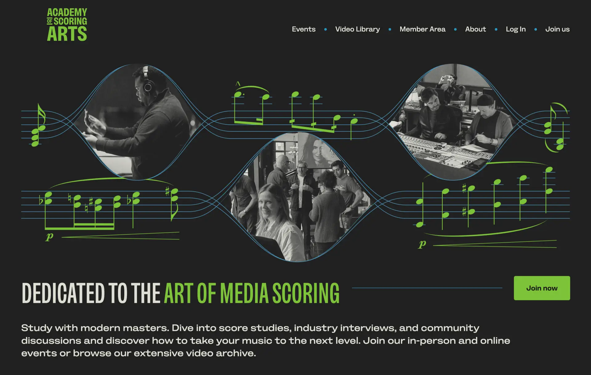
A bold new website for the Academy of Scoring Arts

A clearer, more confident direction

This was a redesign of a membership-focused website for a music organisation, with a strong emphasis on conversion, content discovery, and editorial-style layout. The Academy of Scoring Arts’ previous website felt bland and dated. It lacked a clear visual identity, and the benefits of joining weren’t obvious. I wanted to change that. The new design is bold, confident, and more expressive—better reflecting the energy of the Academy’s community while still looking professional.

That meant walking a fine line between personality and professionalism. Too safe, and the design fades into the background. Too expressive, and it risks undermining trust.
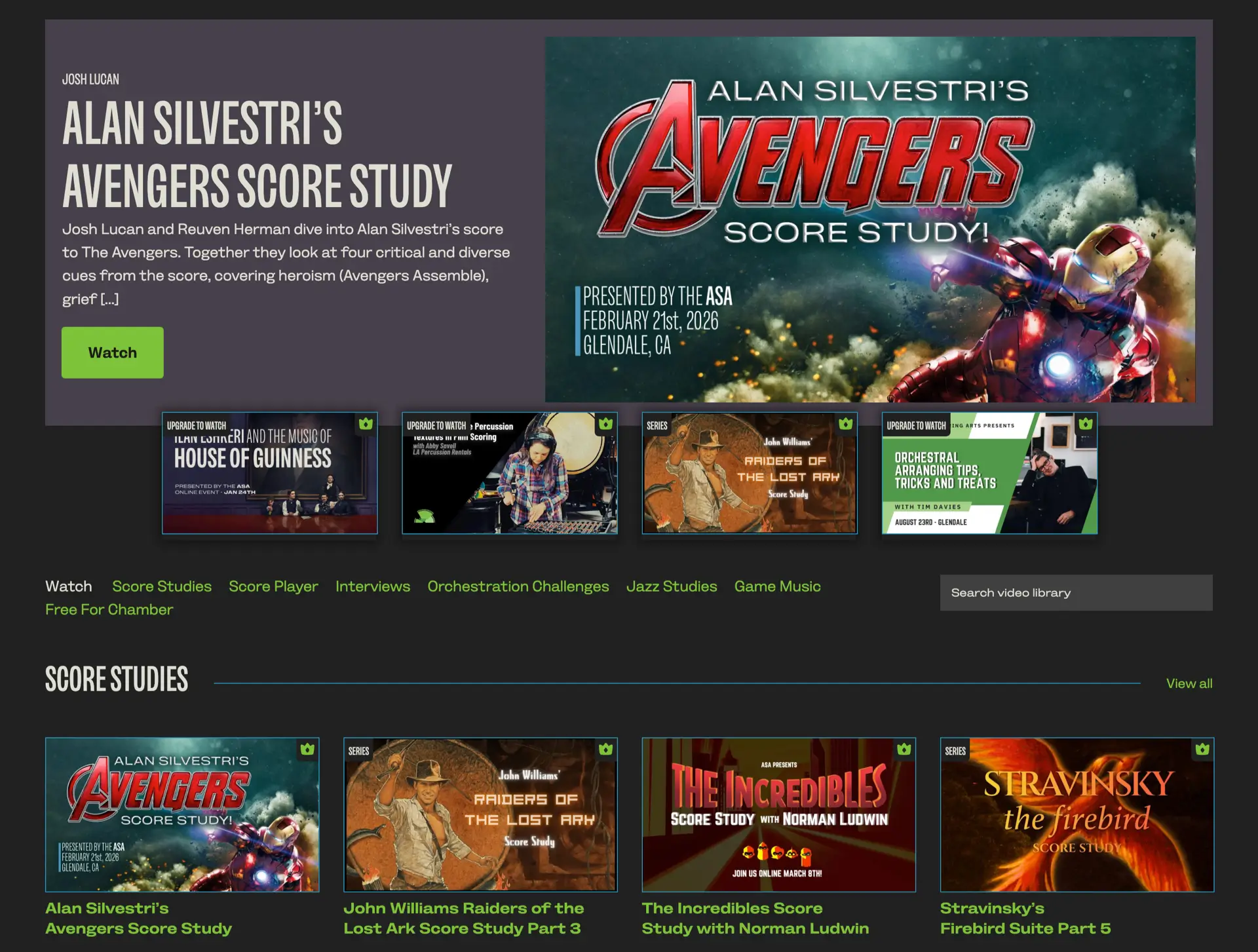
Typography as the defining element

Type plays a central role in the design. I chose Bankside Sans by Dalton Maag. It’s an early British grotesque reinterpreted for modern use, with clear letterforms that give it authority, while its extreme widths add impact and flexibility.

I used it to establish a strong, consistent voice across the site:

  • Bold, condensed headlines
  • Careful attention to typographic detail
  • Layouts which rely on type as much as imagery

The result is a design where type isn’t just functional, it’s a defining characteristic.
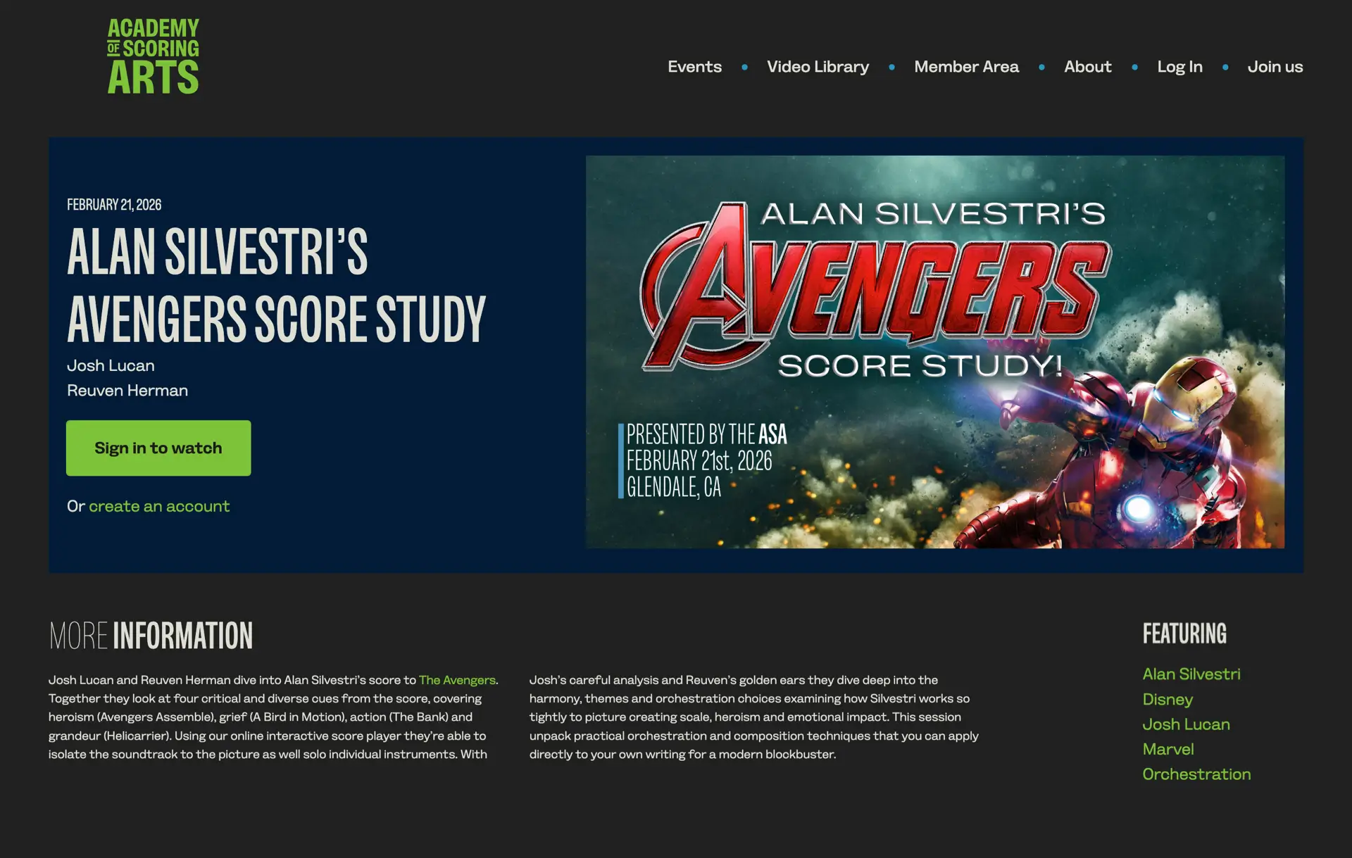
A restrained colour system

The colour palette I chose is deliberately limited. Light and dark form the foundation, with just two accent colours used sparingly. There’s no shading or visual noise—everything is clean, direct, and intentional. This restraint helps the typography and layout do more of the work, and gives the site a confident, considered feel.

Structured layouts with editorial influence

Unlike some of my more expressive work, this design uses a straightforward 12-column grid. But within that structure, I leaned heavily on modular, editorial-inspired layouts—particularly for the video library and gallery.
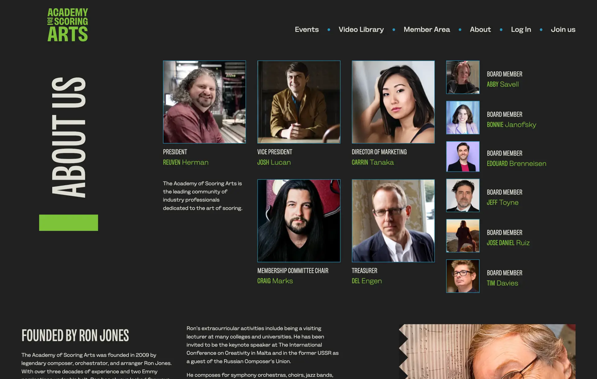
These modular systems:

  • Make content easier to scan
  • Create rhythm and variation
  • Allow the design to scale without becoming repetitive

It’s a reminder that even a conventional grid can feel distinctive when it’s used with intent.
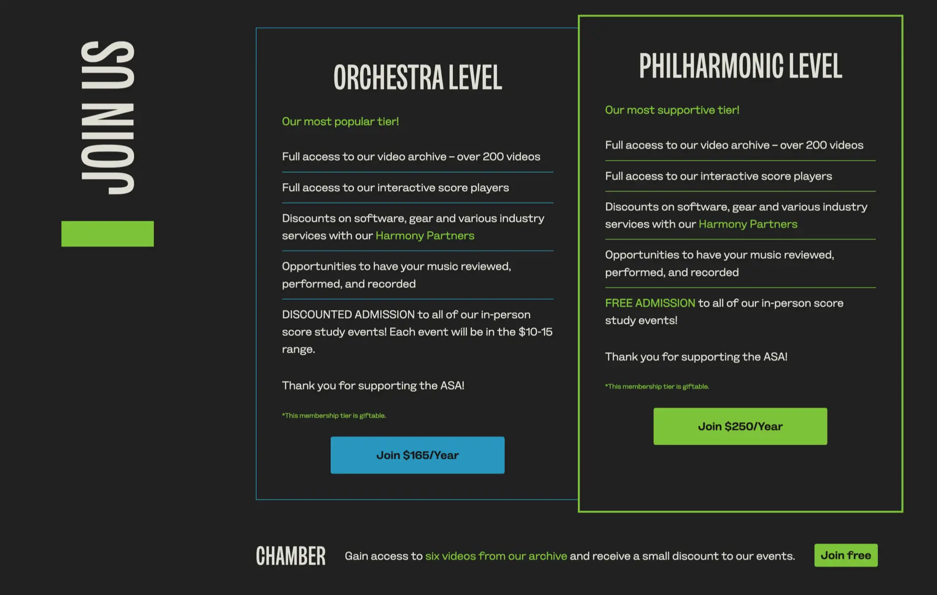
Designing for clarity and conversion

The most important goal of this project was to increase member sign-ups. That meant making the value of joining obvious, and reducing friction wherever possible. I focused on:

  • Better organisation of video content
  • Clearer messaging around benefits
  • Deliberate calls to action
  • Stronger visual hierarchy

The result is a website that looks better—and works harder.

Interaction and detail

The interaction design for The Academy of Scoring Arts is subtle. There are no large animated elements, just micro-interactions and hover effects that add polish without distracting from the content.
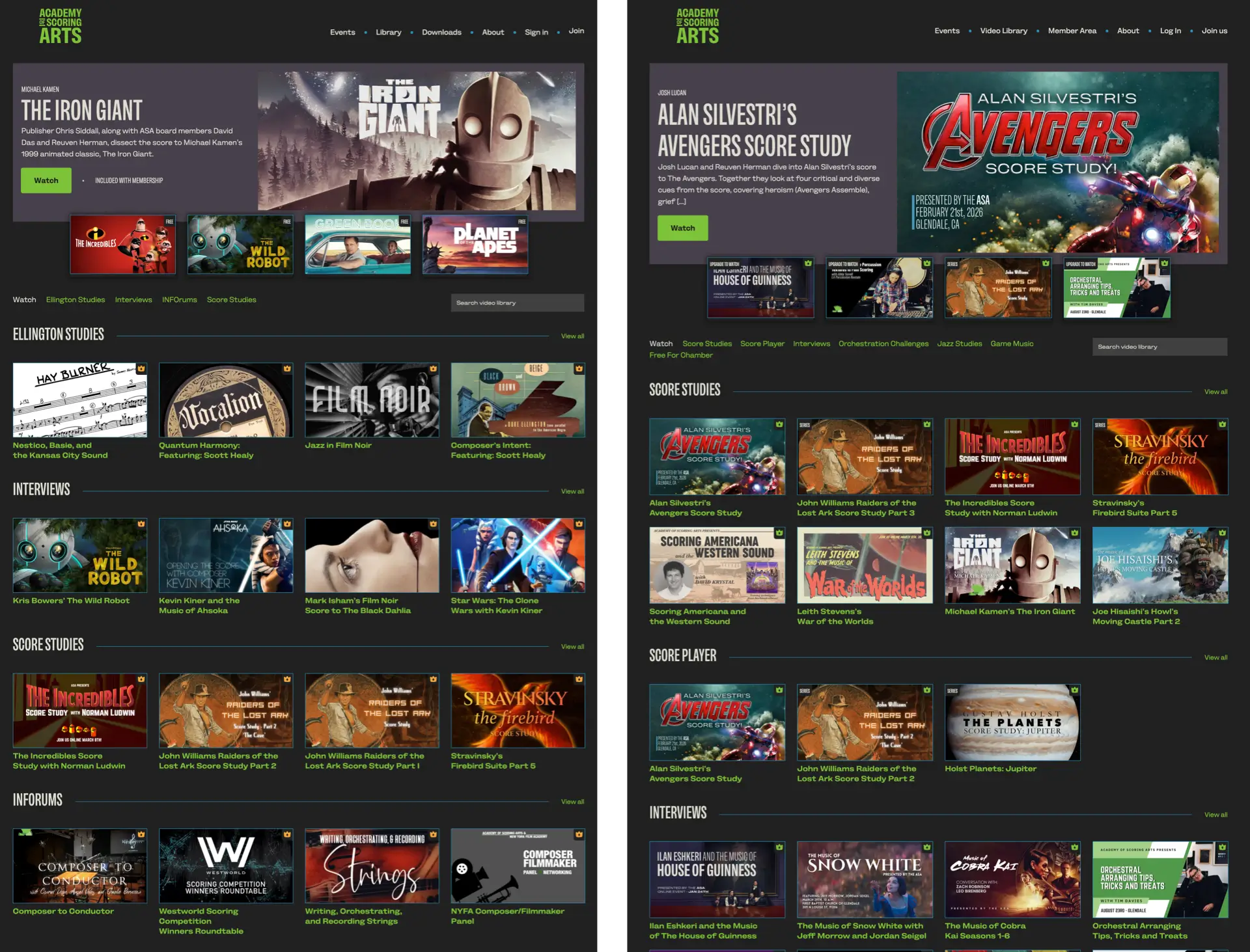
Left: My design prototype. Right: The live website.

Bringing it all together

This project reinforces something I believe strongly: even with conventional content and a standard grid, a website can feel distinctive, communicate clearly, and drive real results when design decisions are made with intent. I’m especially pleased at how well Sush Kelly implemented my design into the Academy’s WordPress CMS.


Websites like this, for The Academy of Scoring Arts, is the kind of work I like to focus on—designing websites for creative organisations where editorial layout, typography, and structure work together to improve clarity and conversion.


March 27, 2026 • Andy Clarke • designcustom

You might also like