


The view options toolbar at the bottom of my animated banners has irked me for a while. It had grown one button at a time, and the result looked ill-considered rather than designed. With a few minutes to spare at the end of last week, I finally redesigned it.
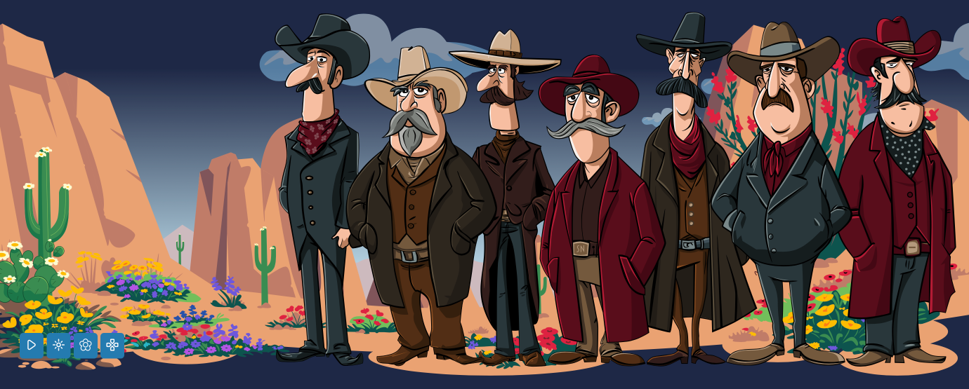
When I first made my current SVG animated banners, I wanted to let people switch off the animations, so I added a play/pause button. Over the past few months, I added a winter theme, then a spring theme, and a character-collecting card game. What started out as play/pause became a toolbar.

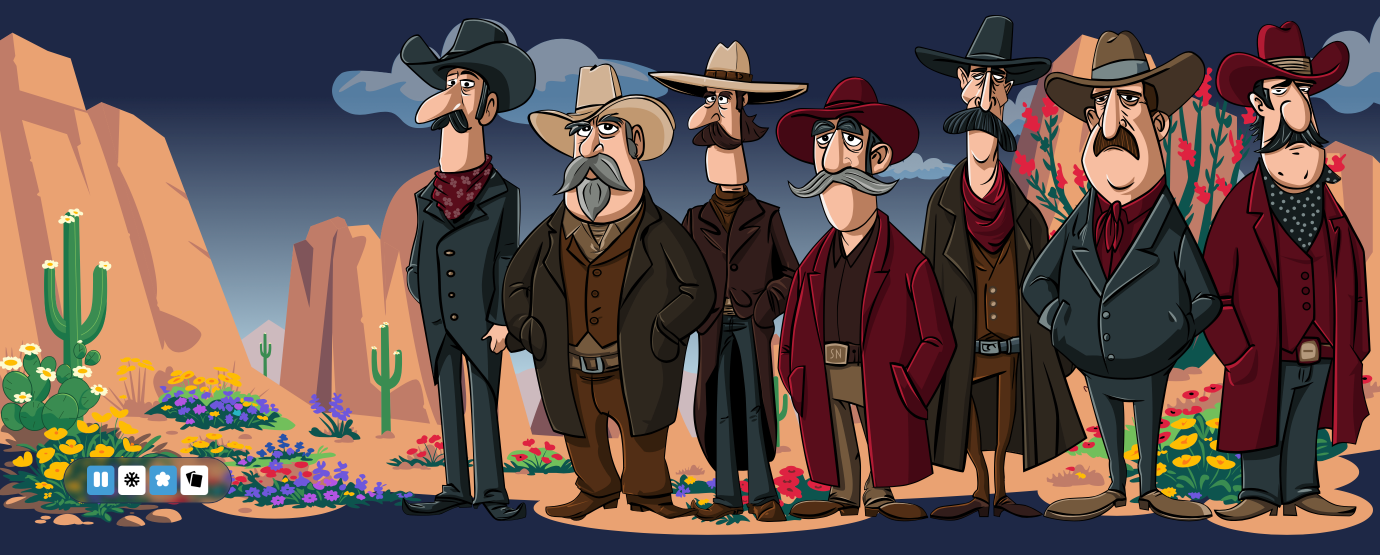
Those animation and theme toggles weren’t clear enough, and there was little affordance showing which options were on or off. So I added new icons to represent the different states.

With a contrasting background colour, the button states are now much clearer to recognise:
#animation-controls .btn[aria-pressed="true"] {
background-color: oklch(0.6664 0.12 239.96); }
I was already using aria-pressed to describe each button’s state, so I used that same attribute as the styling hook:

It’s also now much more obvious whether the spring or winter themes are active.

Now the buttons looked like a more cohesive collection, I wanted to group them into an unintrusive toolbar that wouldn’t obscure the illustrations behind it.
#animation-controls {
background-color: rgba(0,0,0,.25);
backdrop-filter: blur(5px);
scale: .65; }
#animation-controls:hover,
#animation-controls:focus-within {
box-shadow: inset 0 0 10px oklch(0.6664 0.12 239.96);
scale: 1; }
These are subtle changes, but they scratch an itch that’s been there for a while.
May 2, 2026 • Andy Clarke • design
此内容由惯性聚合(RSS阅读器)自动聚合整理,仅供阅读参考。 原文来自 — 版权归原作者所有。