


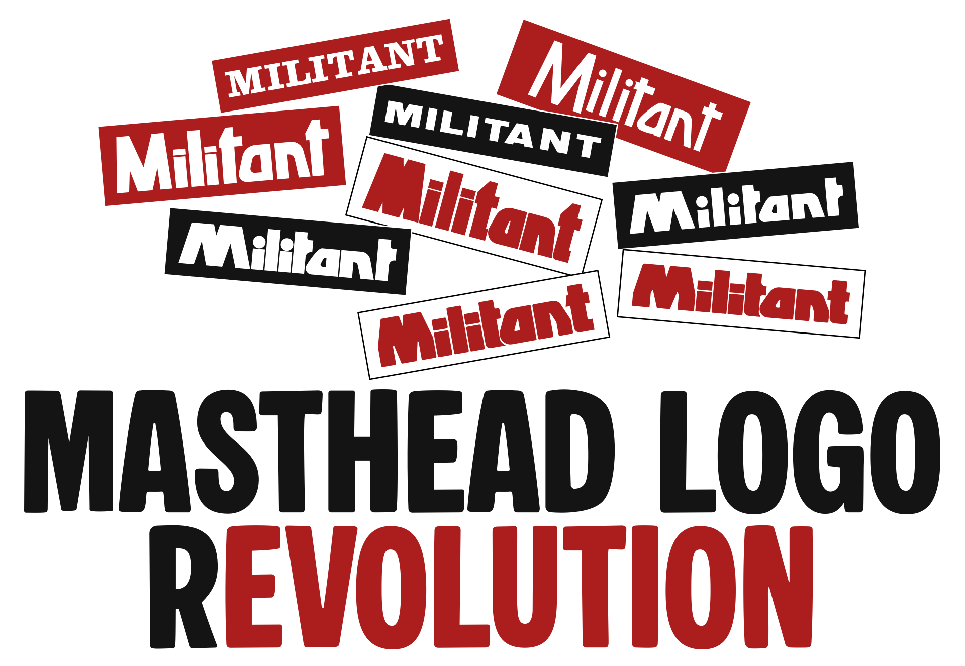
Militant was a British socialist newspaper associated with the Militant ‘tendency,’ a left-wing political movement whose members were ultimately expelled from the mainstream Labour Party. I looked back at how the Militant masthead logo evolved between 1964 and 1997.
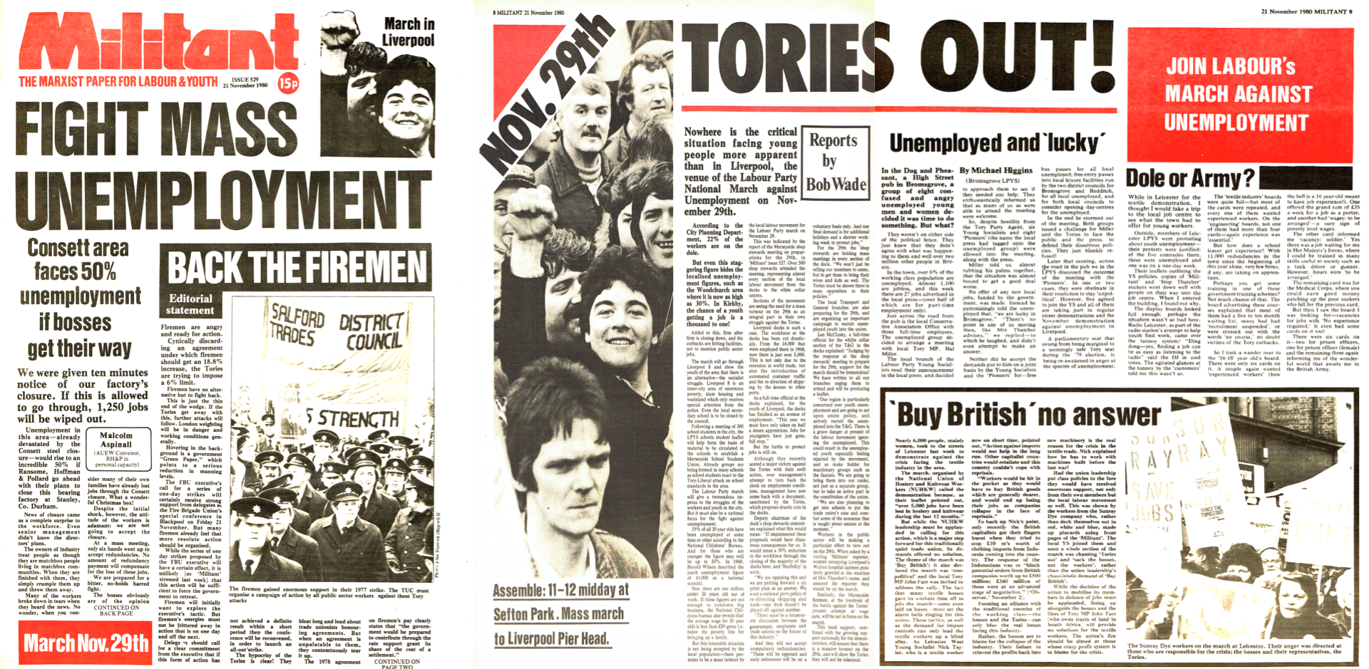
I grew up in a steelmaking town during the late seventies and eighties, at a time when Margaret Thatcher’s Tory government was waging its war against trade unions and the working class. So it’s no surprise I embraced socialist politics, and as a teenager, I joined the Labour Party Young Socialists and at weekends I sold its Militant newspaper.
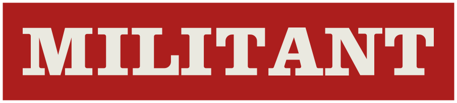
The Militant newspaper was launched in 1964 and took its name from the American Socialist Workers Party’s publication. For the first few years, its masthead logo featured a slab serif typeface and the tagline “For Youth and Labour.”
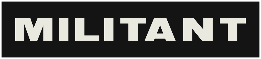
The slab serif lasted six years; in June of 1970, it was replaced by a bold sans-serif, uppercase, with kerning between the “A” and “N” that you could drive a coal delivery truck through.
Less than a year later, in September 1970, the short-lived sans-serif was again replaced with a more characterful, hand-drawn logotype. This included round tittles over the “I”s, one of which cut into the first “T”’s crossbar. Those “T”s are asymmetric, and the lowercase “A” and “N” were slanted.
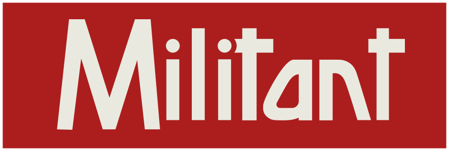
Strokes were thickened only a few months later, and while the slanted “A” and “N” were retained, the round tittles were replaced with rectangular shapes, and the apex of the “T”s sat on top of shorter crossbars.

This logotype was revised again a year later in November 1973, with a smaller closed counter in the “A”, tighter tracking, increased x-height, and far smaller open counters around the “M.”
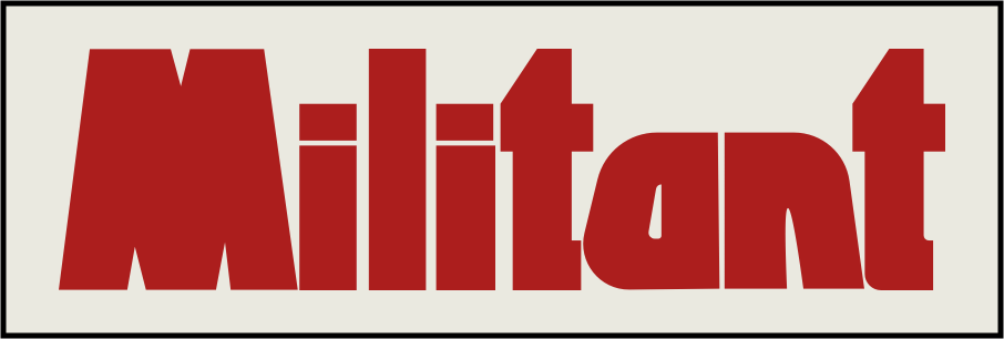
In early 1978, the masthead logo was altered again, adopting a contemporary, rounded look. Round tittles made a comeback, the “M” was widened, and the two “T”s lost one arm of their crossbars. It was a thorough modernisation, with only the slanted “A” and “N” from the previous version remaining.
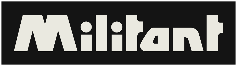
Seemingly unable to resist iterating on this design, three months later in June of 1978, Militant tightened the tracking and the corner radii, creating a more graphic, solid-looking logotype.
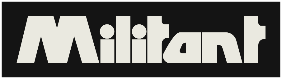
Then, in January of the following year, Militant’s logotype changed again. The circular tittles were gone (again,) and for the first time, there were two different “T” shapes. This time, the first “T” had an asymmetric crossbar to avoid it colliding with the “I”’s now rectangular tittle. Also noticeable was the slight curve at the bottom of its stem to wrap it around the “A.” There was also a new angle added to the “M” and “N”’s strokes.
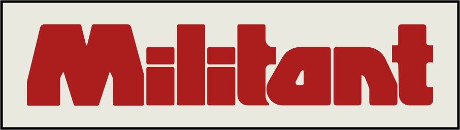
Clearly happy with these refinements, Militant stuck with this version of their logotype for the rest of the newspapers run, before it became The Paper of the Socialist Party in 1997.
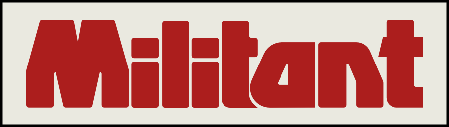
Only subtle changes to its angles and a more pronounced wrapping of that first “T” underneath the “A” were made over its almost 20-year lifespan.
I know nothing about who designed or worked on Militant’s design over those decades, but I found it fascinating to look back over the choices those people made. If you know anything about Militant’s designers, I’d love to hear from you (or them.)
Note: Marxist.org has an archive of many scanned copies of Militant from its start in 1964 through to 1997.
April 29, 2026 • Andy Clarke • design • politics, custom
此内容由惯性聚合(RSS阅读器)自动聚合整理,仅供阅读参考。 原文来自 — 版权归原作者所有。