


Building software is hard. Oftentimes things that seem like they should be simple end up being way more complicated when you get into the details. (OK, maybe this isn’t specific to software.)
As evidence of this, people love to point to this flowchart that Slack’s engineering team published in March 2017 summarizing the logic Slack uses to determine whether to send a given user a notification for a message (author Johnny Rodgers’s additional commentary here):
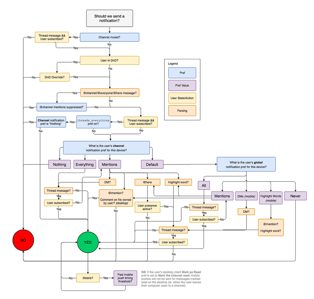
You’ll hear no argument from me that this flowchart is incredibly complicated! It’s hard to understand the nuances of the logic from glancing quickly at this diagram. There are literally cycles in the graph! However I think it overcomplicates the situation a lot.
The most obvious cause of extra boxes in the diagram is completely splitting the “channel notification preferences” from “global notification preferences” questions, despite the fact that the options are almost perfectly analogous. Another issue is unnecessarily repeated checks for threads and highlight words that each appear a half dozen different times.
If you “refactor” the diagram, you end up with something that looks more like this version I drew:

To me this is way easier to understand.
I’ll caveat that this is not 100% bug-for-bug compatible with the original flowchart. For example, the original chart claims that if @channel mentions are suppressed we’should never notify for a @channel message, but that’s not accurate: if the message contains a user mention or highlight word, we should still notify in that case. My goal is to match the actual 2017 behavior of Slack, not to match the original diagram for the sake of it — and I believe my version is comparably or more accurate.
Since the logic is simpler to understand at a glance in my version, I expect it is also easier to verify the correctness of and find bugs in my diagram if someone were to want to.
My diagram combines several things that are split out in the original version. In addition to the mergers I mentioned above, my use of && and || typically corresponds to different boxes in the original. Similarly, my Nothing (incl. muted) arrow is actually two checks masquerading as one.
Am I unfairly cheating by smooshing these together? I’d argue no. Each box or each arrow might correspond to a few lines of code (or may need to load data from multiple sources), but here we combine things that are conceptually part of the same check into one place, which makes it easier to understand the intent. I also focus on trying to have a single clear path through the chart with offramps, versus the original that has a dozen different “valid” paths. The goal of the chart, at least to me, is to make it easy to understand the high-level story of the decision tree, while still staying accurate to small details. In code, each complex check might be defined as its own function that can be reviewed and tested independently.
I don’t mean to claim that Slack’s notifications logic is simple. Indeed, former Slack employees tell me that it’s one of the most complex pieces of their codebase. I’m sure there is even a fair amount of complexity that is not captured in either diagram. For example, in what cases should a message sender be shown the choice to override do-not-disturb and “Notify anyway”? If a push notification is sent to my phone but then I view it on desktop or the message is deleted, should the notification be rescinded? This is all tricky business.
The point I want to make here is that the way we think about and talk about our systems has a huge impact on how understandable they are. It’s easy to make a complex solution to a complex problem; what’s hard is making a simple solution to a complex problem. With careful attention we can find the right lens to look through so that a tricky problem falls into place and our understanding of it looks more like the second diagram than the first.
Thanks to Scott Sandler for helping me understand the original diagram and reviewing mine.
此内容由惯性聚合(RSS阅读器)自动聚合整理,仅供阅读参考。 原文来自 — 版权归原作者所有。