


Update: It looks like the bug in Safari has been fixed in Safari 15, so I wholeheartedly recommend using em for media queries now. Keeping the post up for historical reasons, but the conclusion is no longer valid.
In March 2016, Zell Liew published a really great in-depth post titled "PX, EM, or REM Media Queries?", where he shared detailed tests he had performed to figure out which unit was the best choice for media queries and ultimately recommended em units.
I've always used pixels for media queries, so although I was pretty convinced I should switch after reading Zell's post, I wanted to do a bit of testing on my own to make sure I really understood the problems with pixels before I renounced them forever.
The problem Zell discovered in his tests is that when you zoom in on Safari, px media queries and em media queries trigger at different sizes.
Here I've got two containers set to change their background color at 400px and 25em respectively, with the zoom set to normal (100%):
In this example you can see that the backgrounds change at the same time, because 25em at the default font size of 16px matches the 400px breakpoint.
In this example, I'm using the same containers and breakpoints, but Safari is zoomed to 150%:
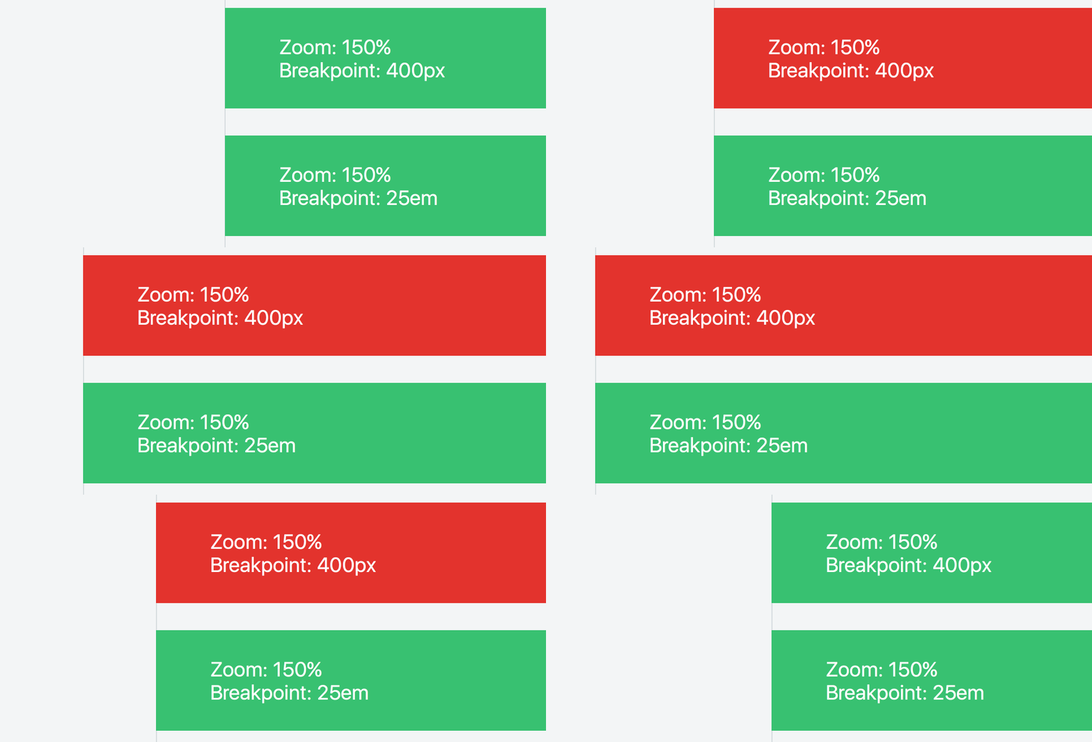
Link to Fiddle (don't forget to zoom!)
Here it's clear that Safari is triggering the pixel breakpoint much sooner than it triggers the em breakpoint.
In Zell's post, he concluded that Safari was not scaling the pixel breakpoint as the user zooms, and that when using pixels, Safari was triggering the breakpoint too soon.
But let's measure when the actual breakpoints are triggered:

Interesting! Safari is triggering the 400px breakpoint at 600px when zoomed to 150% (the correct behavior) but it's triggering the 25em breakpoint at 900px, which makes no sense at all.
So it turns out that yes, there is a bug in Safari, but it's not with how it handles px media queries, it's with how it handles em media queries.
When zoomed in, Safari triggers em breakpoints much later than it should.
Imagine a tiled layout where the number of columns changes based on the viewport width.
Here's what it might look like at around 960px wide:

Here's what happens when I zoom in to 150% in Safari using pixel media queries:

The layout drops to two columns, like you'd see at 640px viewport size.
Now look what happens when I zoom in to 150% in Safari using em media queries:
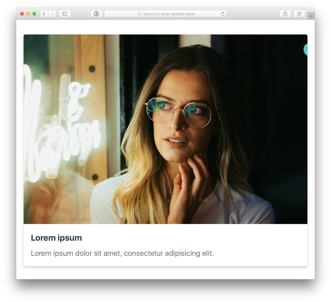
We're seeing the single column layout, even though the text is rendering at exactly the same size as it was when zoomed in using pixel media queries!
Again, this is because Safari is triggering the breakpoint far too late when using em units.
For good measure, here's what things look like at 100% and 150% using both px and em units in Safari, Chrome, and Firefox:

One of these things is not like the other 🤔
Pixels are the only unit that behave consistently across all commonly used browsers.
"But what if the user has changed their browser's default font size?"
In this case, your breakpoints will trigger differently than you designed for, and yeah it does have the potential to make things uglier than you planned. Usually this manifests itself as shorter line lengths in multi-column layouts or elements wrapping that you didn't intend to wrap because the user is using a larger default font size.
Personally I try to just not worry about it too much. I maintain sites with millions of unique visitors each month and haven't once had someone report a layout issue because of this, so even though this certainly sucks, it seems like in practice it's not causing sites to become truly unusable.
If you really can't stand the idea of this type of issue being possible in your project, one option is to set an explicit root font size in pixels, but be warned that this will override the user's custom default font size, which is frustrating if someone has changed that because they find your typical website too hard to read. I think it's probably better for those people to experience a couple of minor layout issues than be forced to struggle to read the content on your site because the font size is too small for them.
With any luck we'll see this issue in Safari get resolved at some point, and we can revisit using em for media queries and hopefully avoid this unfortunate trade-off.
此内容由惯性聚合(RSS阅读器)自动聚合整理,仅供阅读参考。 原文来自 — 版权归原作者所有。