



I’ve recently refreshed the animated graphics on my website with a new theme and a group of pioneering characters, putting into practice plenty of the techniques I shared in this series. A few of my animations change appearance when someone interacts with them or at different times of day.

The colours in the graphic atop my blog pages change from morning until night every day. Then, there’s the snow mode, which adds chilly colours and a wintery theme, courtesy of an overlay layer and a blending mode.
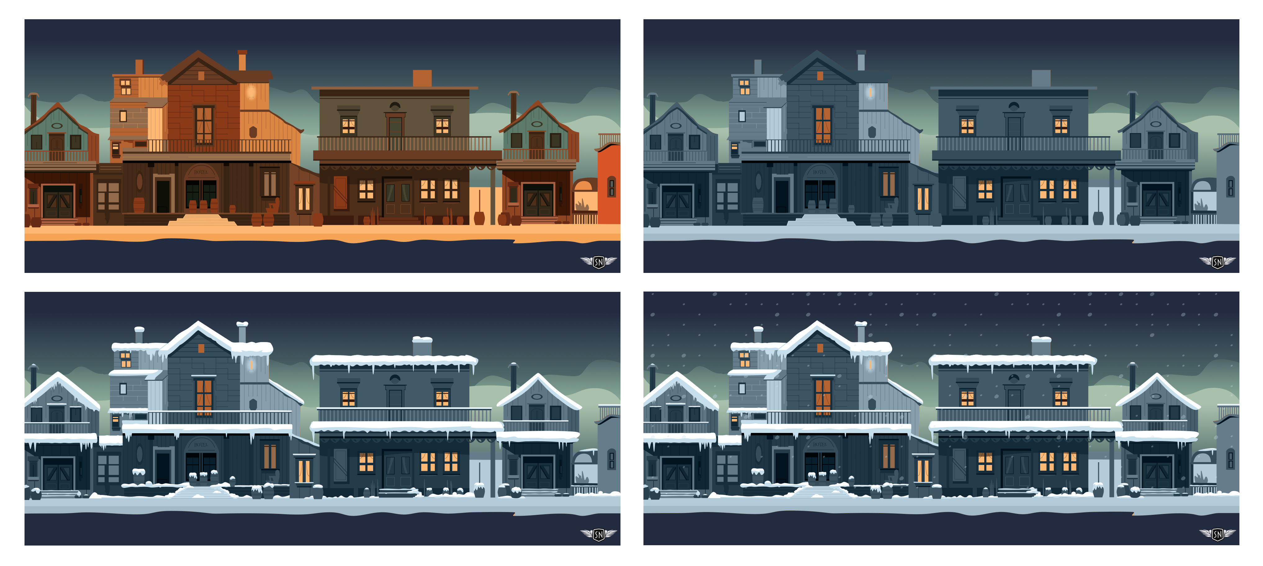
While working on this, I started to wonder whether CSS relative colour values could give me more control while also simplifying the process.
Note: In this tutorial, I’ll focus on relative colour values and the OKLCH colour space for theming graphics and animations. If you want to dive deep into relative colour, Ahmad Shadeed created a superb interactive guide. As for colour spaces, gamuts, and OKLCH, our own Geoff Graham wrote about them.
- Smashing Animations Part 1: How Classic Cartoons Inspire Modern CSS
- Smashing Animations Part 2: How CSS Masking Can Add An Extra Dimension
- Smashing Animations Part 3: SMIL’s Not Dead Baby, SMIL’s Not Dead
- Smashing Animations Part 4: Optimising SVGs
- Smashing Animations Part 5: Building Adaptive SVGs With
<symbol>,<use>, And CSS Media Queries - Smashing Animations Part 6: Magnificent SVGs With
<use>And CSS Custom Properties - Smashing Animations Part 7: Recreating Toon Text With CSS And SVG
How Cartoon Animation Taught Me To Reuse Everything
The Hanna-Barbera animated series I grew up watching had budgets far lower than those available when William Hanna and Joseph Barbera produced Tom and Jerry shorts at MGM Cartoons. This meant the animators needed to develop techniques to work around their cost restrictions.
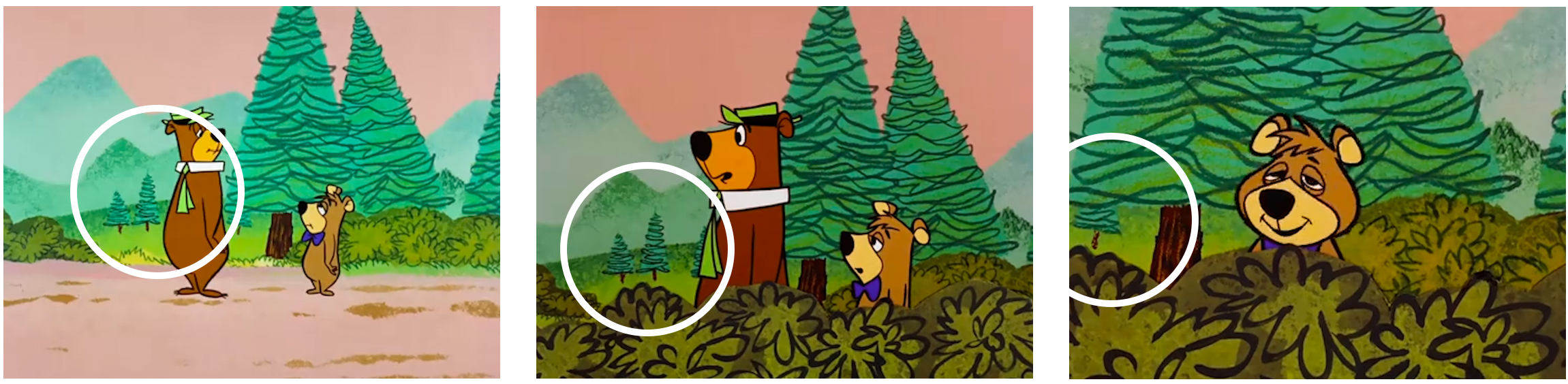
Repeated use of elements was key. Backgrounds were reused whenever possible, with zooms and overlays helping construct new scenes from the same artwork. It was born of necessity, but it also encouraged thinking in terms of series rather than individual scenes.
The problem With Manually Updating Colour Palettes
Let’s get straight to my challenge. In Toon Titles like this one — based on the 1959 Yogi Bear Show episode “Lullabye-Bye Bear” — and my work generally, palettes are limited to a select few colours.

I create shades and tints from what I call my “foundation” colour to expand the palette without adding more hues.
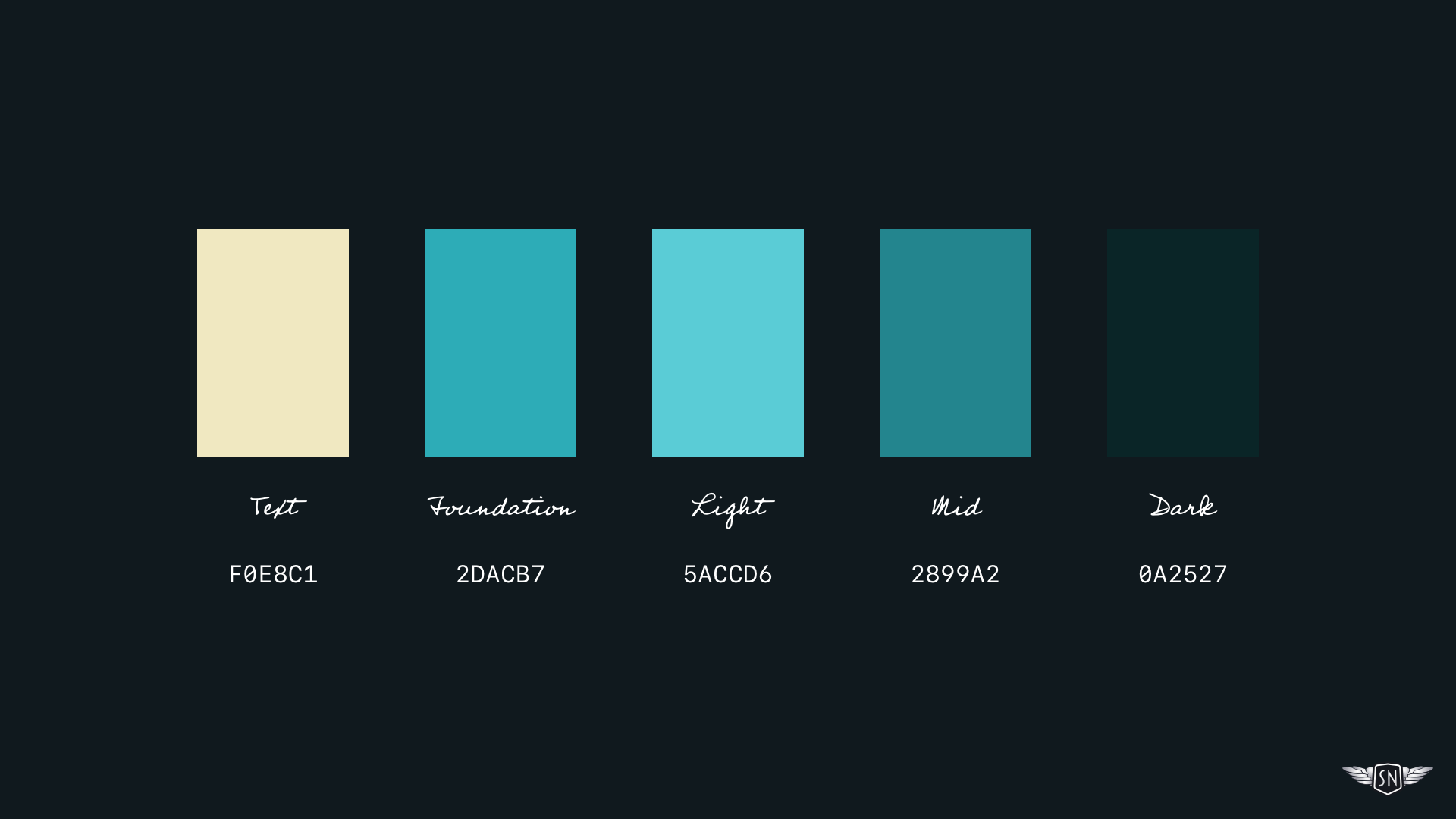
In Sketch, I work in the HSL colour space, so this process involves increasing or decreasing the lightness value of my foundation colour. Honestly, it’s not an arduous task — but choosing a different foundation colour requires creating a whole new set of shades and tints. Doing that manually, again and again, quickly becomes laborious.
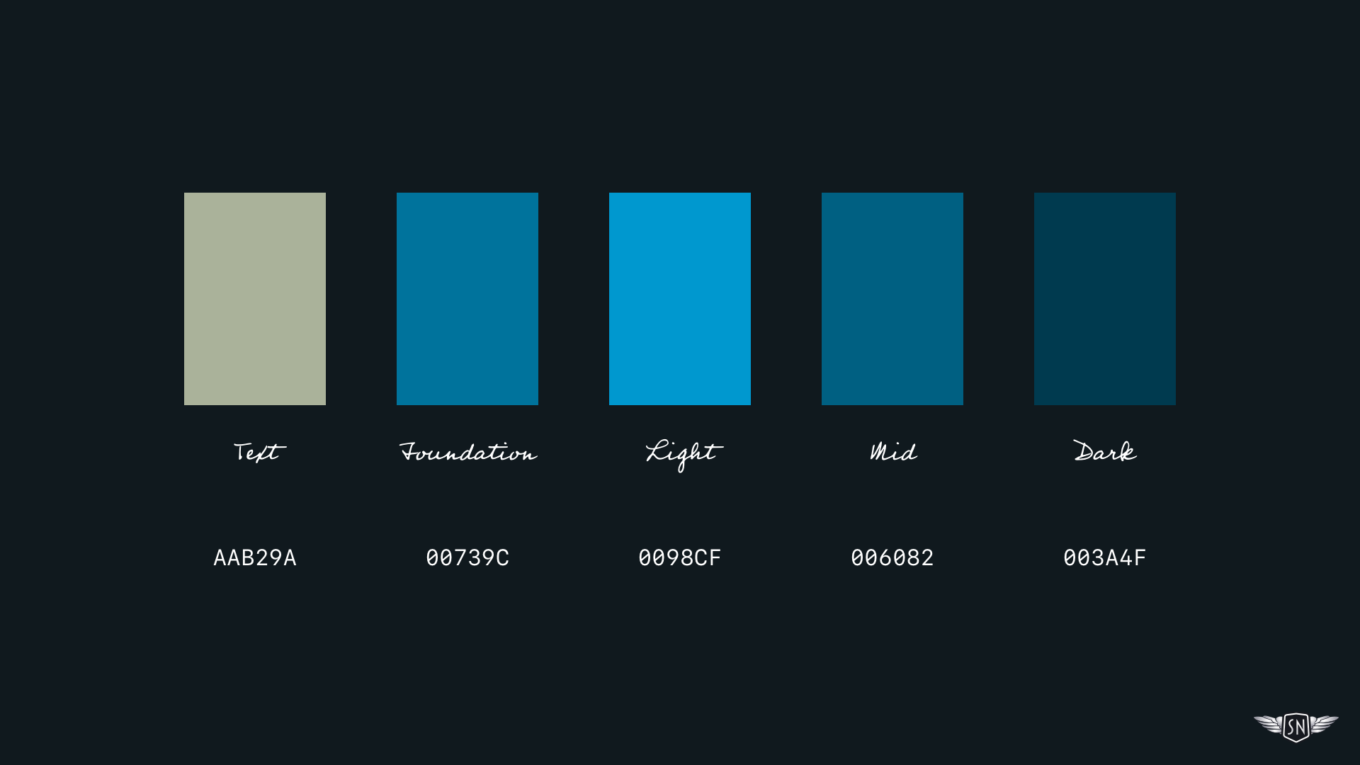
I mentioned the HSL — H (hue), S (saturation), and L (lightness) — colour space, but that’s just one of several ways to describe colour.
RGB — R (red), G (green), B (blue) — is probably the most familiar, at least in its Hex form.
There’s also LAB — L (lightness), A (green–red), B (blue–yellow) — and the newer, but now widely supported LCH — L (lightness), C (chroma), H (hue) — model in its OKLCH form. With LCH — specifically OKLCH in CSS — I can adjust the lightness value of my foundation colour.
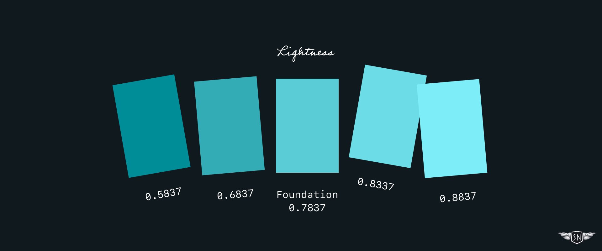
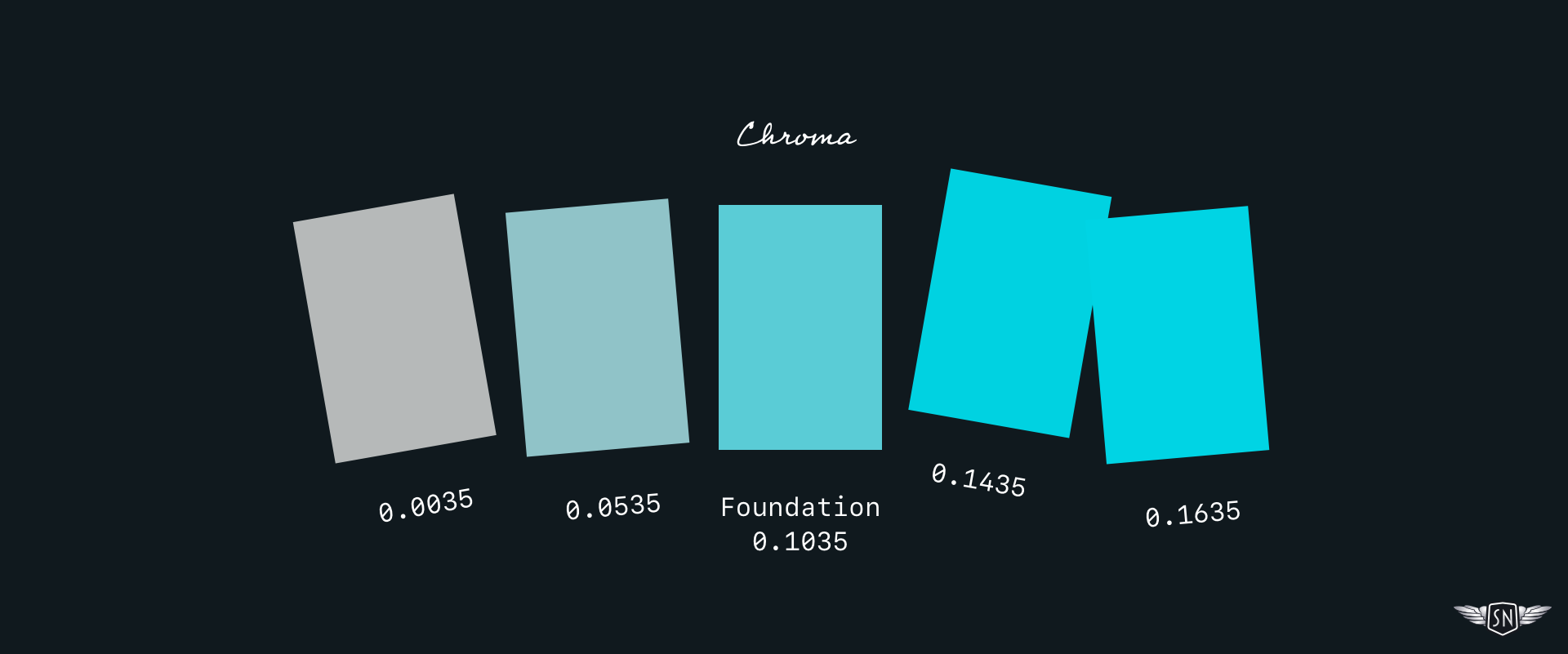
Or I can alter its chroma. LCH chroma and HSL saturation both describe the intensity or richness of a colour, but they do so in different ways. LCH gives me a wider range and more predictable blending between colours.
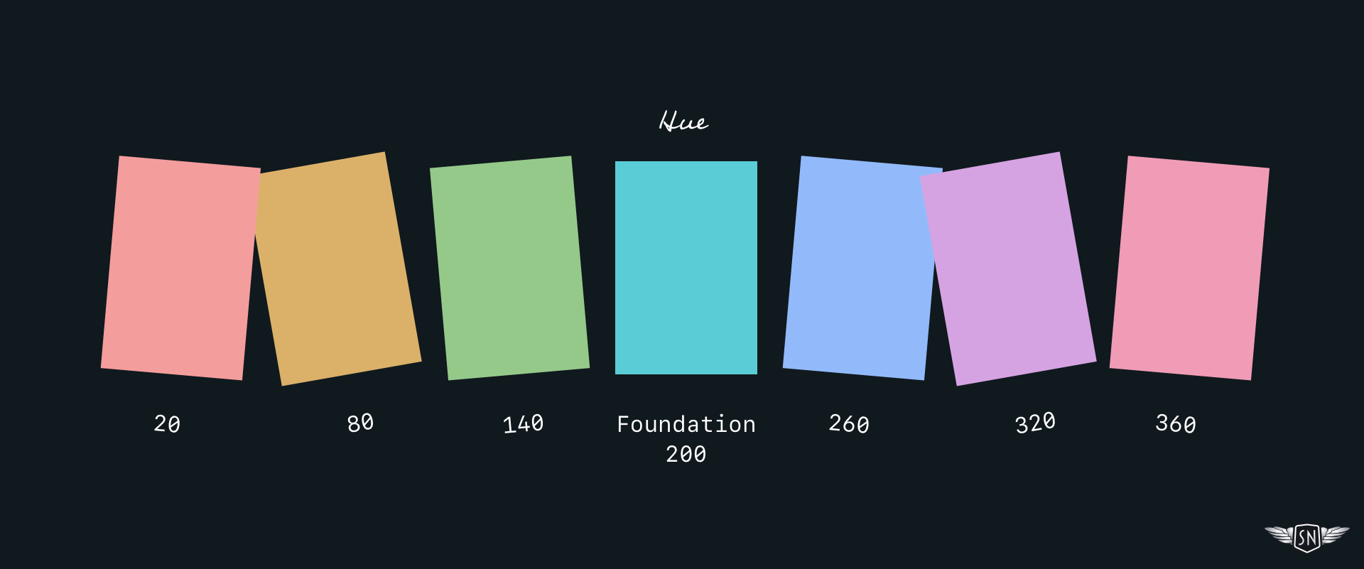
I can also alter the hue to create a palette of colours that share the same lightness and chroma values. In both HSL and LCH, the hue spectrum starts at red, moves through green and blue, and returns to red.
Why OKLCH Changed How I Think About Colour
Browser support for the OKLCH colour space is now widespread, even if design tools — including Sketch — haven’t caught up. Fortunately, that shouldn’t stop you from using OKLCH. Browsers will happily convert Hex, HSL, LAB, and RGB values into OKLCH for you. You can define a CSS custom property with a foundation colour in any space, including Hex:
/* Foundation colour */
--foundation: #5accd6;
Any colours derived from it will be converted into OKLCH automatically:
--foundation-light: oklch(from var(--foundation) [...]; }
--foundation-mid: oklch(from var(--foundation) [...]; }
--foundation-dark: oklch(from var(--foundation) [...]; }
Relative Colour As A Design System
Think of relative colour as saying: “Take this colour, tweak it, then give me the result.” There are two ways to adjust a colour: absolute changes and proportional changes. They look similar in code, but behave very differently once you start swapping foundation colours. Understanding that difference is what can turn using relative colour into a system.
/* Foundation colour */
--foundation: #5accd6;
For example, the lightness value of my foundation colour is 0.7837, while a darker version has a value of 0.5837. To calculate the difference, I subtract the lower value from the higher one and apply the result using a calc() function:
--foundation-dark:
  oklch(from var(--foundation)
  calc(l - 0.20) c h);
To achieve a lighter colour, I add the difference instead:
--foundation-light:
  oklch(from var(--foundation)
  calc(l + 0.10) c h);
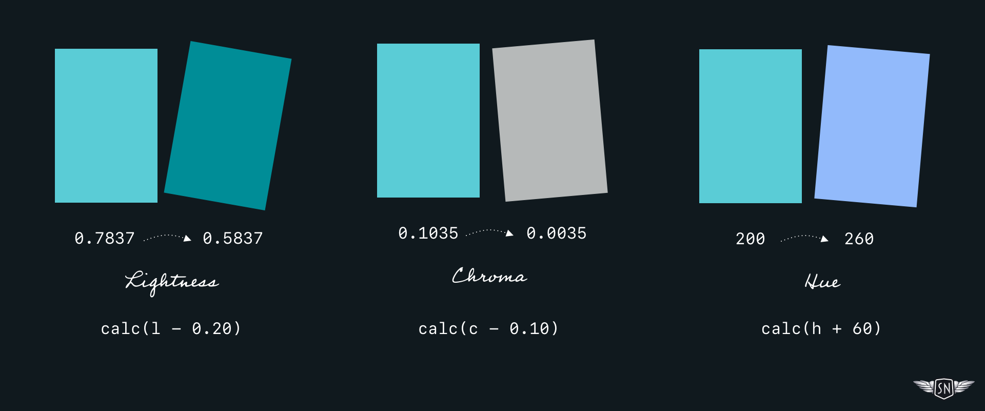
Chroma adjustments follow the same process. To reduce the intensity of my foundation colour from 0.1035 to 0.0035, I subtract one value from the other:
oklch(from var(--foundation)
l calc(c - 0.10) h);
To create a palette of hues, I calculate the difference between the hue value of my foundation colour (200) and my new hue (260):
oklch(from var(--foundation)
l c calc(h + 60));
Those calculations are absolute. When I subtract a fixed amount, I’m effectively saying, “Always subtract this much.” The same applies when adding fixed values:
calc(c - 0.10)
calc(c + 0.10)
I learned the limits of this approach the hard way. When I relied on subtracting fixed chroma values, colours collapsed towards grey as soon as I changed the foundation. A palette that worked for one colour fell apart for another.
Multiplication behaves differently. When I multiply chroma, I’m telling the browser: “Reduce this colour’s intensity by a proportion.” The relationship between colours remains intact, even when the foundation changes:
calc(c * 0.10)
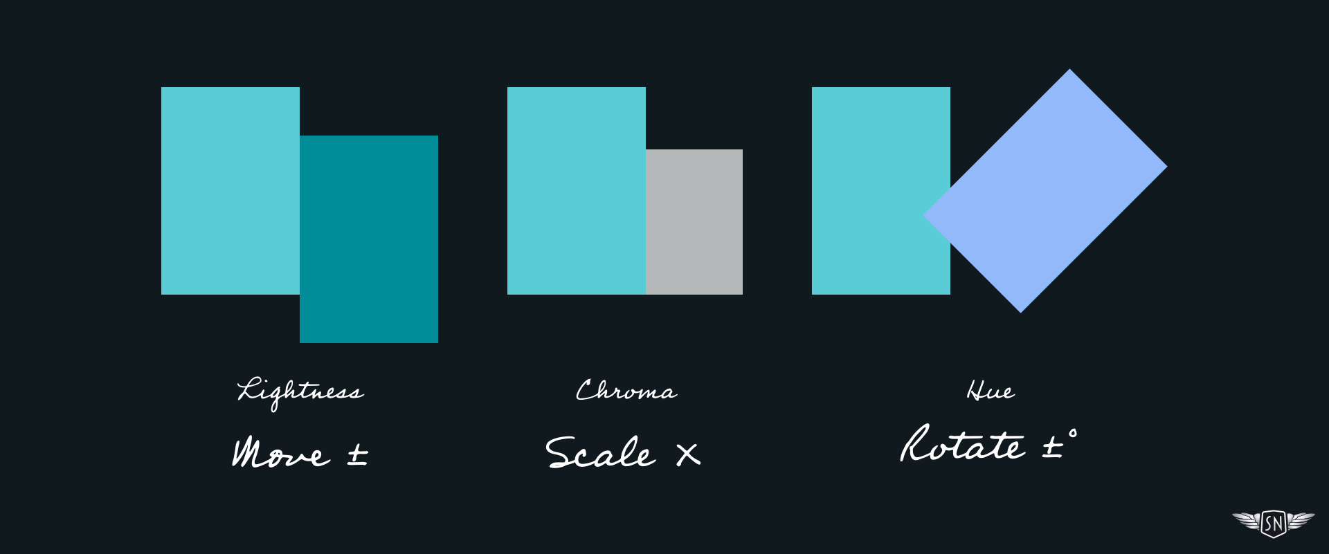
My Move It, Scale It, Rotate It Rules
- Move lightness (add or subtract),
- Scale chroma (multiply),
- Rotate hue (add or subtract degrees).
I scale chroma because I want intensity changes to stay proportional to the base colour. Hue relationships are rotational, so multiplying hue makes no sense. Lightness is perceptual and absolute — multiplying it often produces odd results.
From One Colour To An Entire Theme
Relative colour allows me to define a foundation colour and generate every other colour I need — fills, strokes, gradient stops, shadows — from it. At that point, colour stops being a palette and starts being a system.
SVG illustrations tend to reuse the same few colours across fills, strokes, and gradients. Relative colour lets you define those relationships once and reuse them everywhere — much like animators reused backgrounds to create new scenes.
Change the foundation colour once, and every derived colour updates automatically, without recalculating anything by hand. Outside of animated graphics, I could use this same approach to define colours for the states of interactive elements such as buttons and links.
The foundation colour I used in my “Lullabye-Bye Bear” Toon Title is a cyan-looking blue. The background is a radial gradient between my foundation and a darker version.

To create alternative versions with entirely different moods, I only need to change the foundation colour:
--foundation: #5accd6;
--grad-end: var(--foundation);
--grad-start: oklch(from var(--foundation)
  calc(l - 0.2357) calc(c * 0.833) h);

To bind those custom properties to my SVG gradient without duplicating colour values, I replaced hard-coded stop-color values with inline styles:
<defs>
  <radialGradient id="bg-grad" […]>
    <stop offset="0%" style="stop-color: var(--grad-end);" />
    <stop offset="100%" style="stop-color: var(--grad-start);" />
  </radialGradient>
</defs>
<path fill="url(#bg-grad)" fill="#5DCDD8" d="[...]"/>
Next, I needed to ensure that my Toon Text always contrasts with whatever foundation colour I choose. A 180deg hue rotation produces a complementary colour that certainly pops — but can vibrate uncomfortably:
.text-light {
  fill: oklch(from var(--foundation)
    l c calc(h + 180));
}
A 90° shift produces a vivid secondary colour without being fully complementary:
.text-light {
  fill: oklch(from var(--foundation)
    l c calc(h - 90));
}
My recreation of Quick Draw McGraw’s 1959 Toon Title “El Kabong“ uses the same techniques but with a more varied palette. For example, there’s another radial gradient between the foundation colour and a darker shade.


The building and tree in the background are simply different shades of the same foundation colour. For those paths, I needed two additional fill colours:
.bg-mid {
  fill: oklch(from var(--foundation)
    calc(l - 0.04) calc(c * 0.91) h);
}

.bg-dark {
  fill: oklch(from var(--foundation)
    calc(l - 0.12) calc(c * 0.64) h);
}
When The Foundations Start To Move
So far, everything I’ve shown has been static. Even when someone uses a colour picker to change the foundation colour, that change happens instantly. But animated graphics rarely stand still — the clue is in the name. So, if colour is part of the system, there’s no reason it can’t animate, too.
To animate the foundation colour, I first need to split it into its OKLCH channels — lightness, chroma, and hue. But there’s an important extra step: I need to register those values as typed custom properties. But what does that mean?
By default, a browser doesn’t know whether a CSS custom property value represents a colour, length, number, or something else entirely. That often means they can’t be interpolated smoothly during animation, and jump from one value to the next.
Registering a custom property tells the browser the type of value it represents and how it should behave over time. In this case, I want the browser to treat my colour channels as numbers so they can be animated smoothly.
@property --f-l {
  syntax: "<number>";
  inherits: true;
  initial-value: 0.40;
}

@property --f-c {
  syntax: "<number>";
  inherits: true;
  initial-value: 0.11;
}

@property --f-h {
  syntax: "<number>";
  inherits: true;
  initial-value: 305;
}
Once registered, these custom properties behave like native CSS. The browser can interpolate them frame-by-frame. I then rebuild the foundation colour from those channels:
--foundation: oklch(var(--f-l) var(--f-c) var(--f-h));
This makes the foundation colour become animatable, just like any other numeric value. Here’s a simple “breathing” animation that gently shifts lightness over time:
@keyframes breathe {
  0%, 100% { --f-l: 0.36; }
  50% { --f-l: 0.46; }
}

.toon-title {
  animation: breathe 10s ease-in-out infinite;
}
Because every other colour in fills, gradients, and strokes is derived from --foundation, they all animate together, and nothing needs to be updated manually.
One Animated Colour, Many Effects
At the start of this process, I wondered whether CSS relative colour values could offer more possibilities while also making them simpler to implement. I recently added a new gold mine background to my website’s contact page, and the first iteration included oil lamps that glow and swing.

I wanted to explore how animating CSS relative colours could make the mine interior more realistic by tinting it with colours from the lamps. I wanted them to affect the world around them, the way real light does. So, rather than animating multiple colours, I built a tiny lighting system that animates just one colour.

My first task was to slot an overlay layer between the background and my lamps:
<path
  id="overlay"
  fill="var(--overlay-tint)"
  [...]
  style="mix-blend-mode: color"
/>
I used mix-blend-mode: color because that tints what’s beneath it while preserving the underlying luminance. As I only want the overlay to be visible when animations are turned on, I made the overlay opt-in:
.svg-mine #overlay {
  display: none;
}

@media (prefers-reduced-motion: no-preference) {
  .svg-mine[data-animations=on] #overlay {
    display: block;
    opacity: 0.5;
  }
}
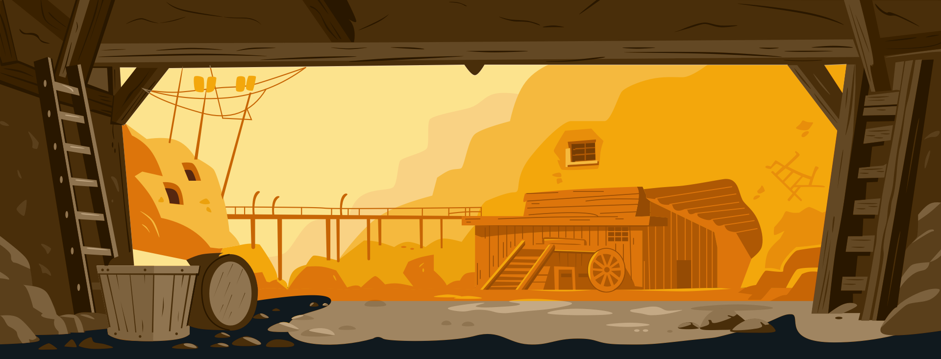
The overlay was in place, but not yet connected to the lamps. I needed a light source. My lamps are simple, and each one contains a circle element that I blurred with a filter. The filter produces a very soft blur over the entire circle.
<filter id="lamp-glow-1" x="-120%" y="-120%" width="340%" height="340%">
  <feGaussianBlur in="SourceGraphic" stdDeviation="56"/>
</filter>
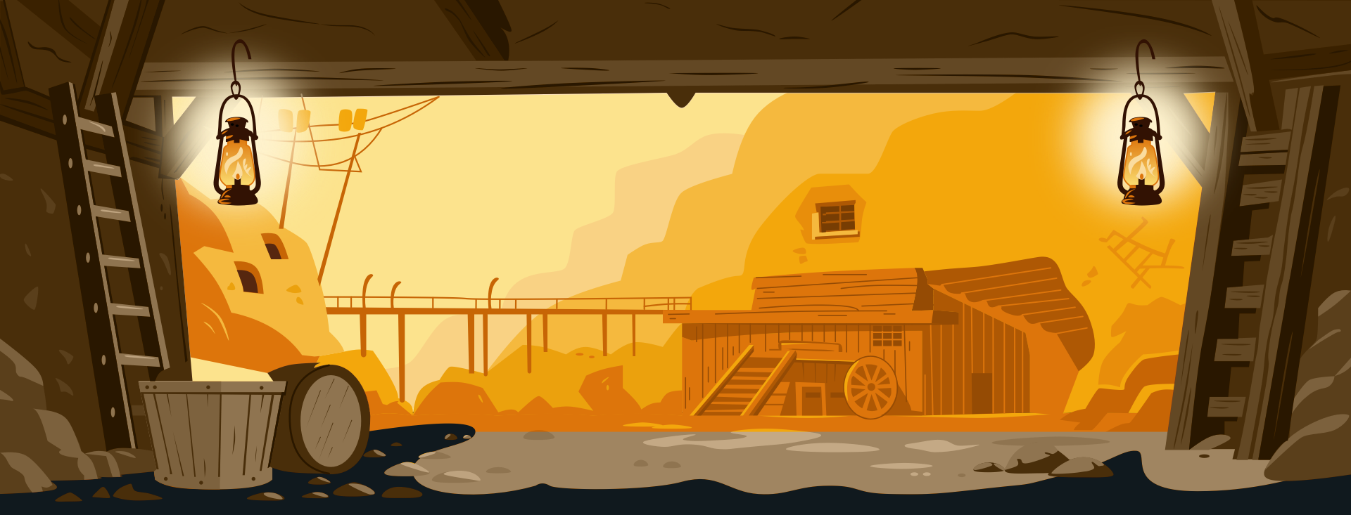
Instead of animating the overlay and lamps separately, I animate a single “flame” colour token and derive everything else from that. First, I register three typed custom properties for OKLCH channels:
@property --fl-l {
  syntax: "<number>";
  inherits: true;
  initial-value: 0.86;
}
@property --fl-c {
  syntax: "<number>";
  inherits: true;
  initial-value: 0.12;
}
@property --fl-h {
  syntax: "<number>";
  inherits: true;
  initial-value: 95;
}
I animated those channels, deliberately pushing a few frames towards orange so the flicker reads clearly as firelight:
@keyframes flame {
  0%, 100% { --fl-l: 0.86; --fl-c: 0.12; --fl-h: 95; }
  6% { --fl-l: 0.91; --fl-c: 0.10; --fl-h: 92; }
  12% { --fl-l: 0.83; --fl-c: 0.14; --fl-h: 100; }
  18% { --fl-l: 0.88; --fl-c: 0.11; --fl-h: 94; }
  24% { --fl-l: 0.82; --fl-c: 0.16; --fl-h: 82; }
  30% { --fl-l: 0.90; --fl-c: 0.12; --fl-h: 90; }
  36% { --fl-l: 0.79; --fl-c: 0.17; --fl-h: 76; }
  44% { --fl-l: 0.87; --fl-c: 0.12; --fl-h: 96; }
  52% { --fl-l: 0.81; --fl-c: 0.15; --fl-h: 102; }
  60% { --fl-l: 0.89; --fl-c: 0.11; --fl-h: 93; }
  68% { --fl-l: 0.83; --fl-c: 0.16; --fl-h: 85; }
  76% { --fl-l: 0.91; --fl-c: 0.10; --fl-h: 91; }
  84% { --fl-l: 0.85; --fl-c: 0.14; --fl-h: 98; }
  92% { --fl-l: 0.80; --fl-c: 0.17; --fl-h: 74; }
}
Then I scoped that animation to the SVG, so the shared variables are available to both the lamps and my overlay:
@media (prefers-reduced-motion: no-preference) {
  .svg-mine[data-animations=on] {
    animation: flame 3.6s infinite linear;
    isolation: isolate;

    /* Build a flame colour from animated channels */
    --flame: oklch(var(--fl-l) var(--fl-c) var(--fl-h));

    /* Lamp colour derived from flame */
    --lamp-core: oklch(from var(--flame) calc(l + 0.05) calc(c * 0.70) h);

    /* Overlay tint derived from the same flame */
    --overlay-tint: oklch(from var(--flame)
      calc(l + 0.06) calc(c * 0.65) calc(h - 10));
  }
}
Finally, I applied those derived colours to the glowing lamps and the overlay they affect:
@media (prefers-reduced-motion: no-preference) {
  .svg-mine[data-animations=on] #mine-lamp-1 > circle,
  .svg-mine[data-animations=on] #mine-lamp-2 > circle {
    fill: var(--lamp-core);
  }

  .svg-mine[data-animations=on] #overlay {
    display: block;
    fill: var(--overlay-tint);
    opacity: 0.5;
  }
}
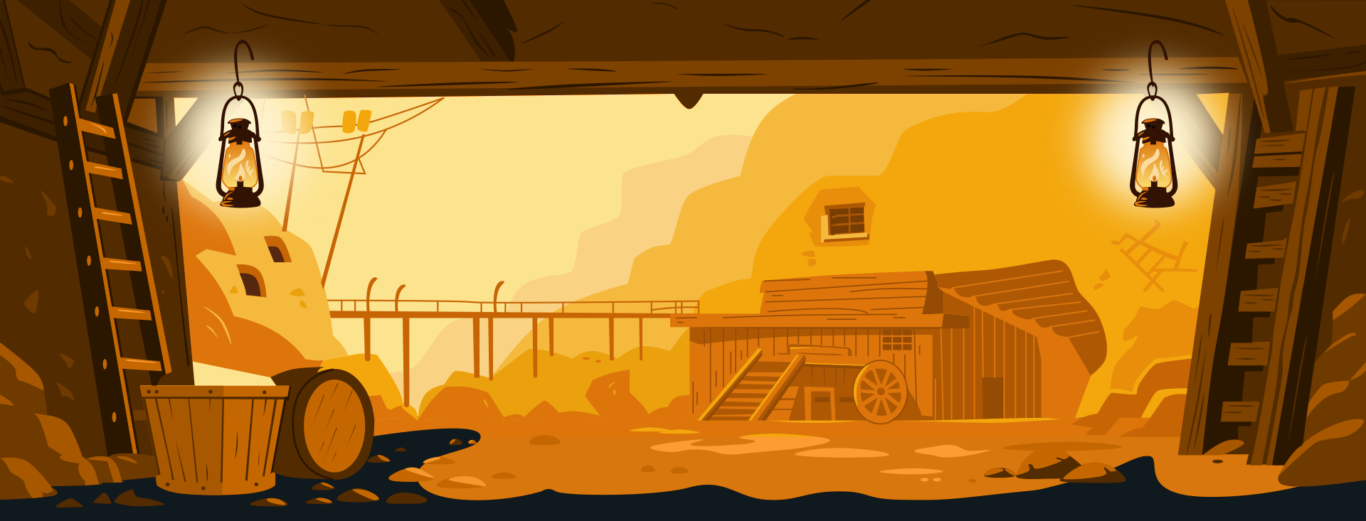
When the flame shifts toward orange, the lamps warm up, and the scene warms with them. When the flame cools, everything settles together. The best part is that nothing is written manually. If I change the foundation colour or tweak the flame animation ranges, the entire lighting system updates simultaneously.
You can see the final result on my website.
Reuse, Repurpose, Revisited
Those Hanna-Barbera animators were forced to repurpose elements out of necessity, but I reuse colours because it makes my work more consistent and easier to maintain. CSS relative colour values allow me to:
- Define a single foundation colour,
- Describe how other colours relate to it,
- Reuse those relationships everywhere, and
- Animate the system by changing one value.
 (gg, yk)