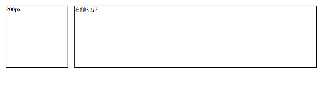
1、示例一
实现左右布局,左侧宽度200px,右侧自适配
代码如下:
<!DOCTYPE html>
<html lang="en">

<head>
    <meta charset="UTF-8">
    <meta name="viewport" content="width=device-width, initial-scale=1.0">
    <meta http-equiv="X-UA-Compatible" content="ie=edge">
    <title>Document</title>
    <style>
        .wrap {
            display: -webkit-box;
            display: -ms-flexbox;
            -webkit-box-orient: horizontal;
        }

        .child {
            border: 2px solid black;
            -webkit-box-align: center;
            margin: 10px;
            min-height: 200px;
            word-break: break-all;

        }

        .w200 {
            width: 200px;
        }

        .flex1 {
            -webkit-box-flex: 1;
            -ms-flex: 1;
        }
    </style>
</head>

<body>
    <div class="wrap">
        <div class="child w200">200px</div>
        <div class="child flex1">右侧内容2</div>
    </div>
</body>

</html>
说明:
display: -webkit-box; 适用于谷歌浏览器,火狐浏览器,IE Edge
display: -ms-flexbox; 适用于IE10、IE11,我试了IE8,IE9,都支持不了
效果如下:
2、示例二
实现左中右布局,左中右比例为:200px:1:2
代码如下:
<!DOCTYPE html>
<html lang="en">

<head>
    <meta charset="UTF-8">
    <meta name="viewport" content="width=device-width, initial-scale=1.0">
    <meta http-equiv="X-UA-Compatible" content="ie=edge">
    <title>Document</title>
    <style>
        .wrap {
            display: -webkit-box;
            display: -ms-flexbox;
            -webkit-box-orient: horizontal;
        }

        .child {
            border: 2px solid black;
            -webkit-box-align: center;
            margin: 10px;
            min-height: 200px;
            word-break: break-all;

        }

        .w200 {
            width: 200px;
        }

        .flex1 {
            -webkit-box-flex: 1;
            -ms-flex: 1;
        }

        .flex2 {
            -webkit-box-flex: 2;
            -ms-flex: 2;
        }
    </style>
</head>

<body>
    <div class="wrap">
        <div class="child w200">200px</div>
        <div class="child flex1">中间内容</div>
        <div class="child flex2">右侧内容</div>
    </div>
</body>

</html>
效果如下:

3、示例三
在示例二的基础上,使用-webkit-box-direction修改布局顺序
代码如下(黄色背景为添加的代码):
<!DOCTYPE html>
<html lang="en">

<head>
    <meta charset="UTF-8">
    <meta name="viewport" content="width=device-width, initial-scale=1.0">
    <meta http-equiv="X-UA-Compatible" content="ie=edge">
    <title>Document</title>
    <style>
        .wrap {
            display: -webkit-box;
            display: -ms-flexbox;
            -webkit-box-orient: horizontal;
            -webkit-box-direction: reverse;
        }

        .child {
            border: 2px solid black;
            -webkit-box-align: center;
            margin: 10px;
            min-height: 200px;
            word-break: break-all;

        }

        .w200 {
            width: 200px;
        }

        .flex1 {
            -webkit-box-flex: 1;
            -ms-flex: 1;
        }

        .flex2 {
            -webkit-box-flex: 2;
            -ms-flex: 2;
        }
    </style>
</head>

<body>
    <div class="wrap">
        <div class="child w200">200px</div>
        <div class="child flex1">中间内容</div>
        <div class="child flex2">右侧内容</div>
    </div>
</body>

</html>
通过指定-webkit-box-direction: reverse;显示顺序为从右到左显示。这个样式即使最新的IE11也是不支持的,在IE Edge浏览器上可以支持。
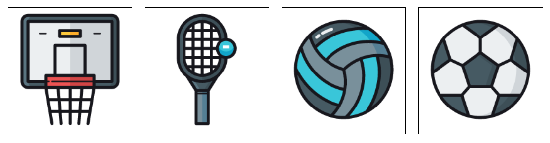
4、示例四
使用box-ordinal-group定义盒子布局的位置
代码如下:
<!DOCTYPE html>
<html lang="en">

<head>
    <meta charset="UTF-8">
    <meta name="viewport" content="width=device-width, initial-scale=1.0">
    <meta http-equiv="X-UA-Compatible" content="ie=edge">
    <title>Document</title>
    <style>
        .wrap {
            display: -webkit-box;
            display: -ms-flexbox; /* IE10+ */
            -webkit-box-orient:vertical;
        }

        .child {
            border: 1px solid black;
            margin: 10px;
            min-height: 200px;
            width: 200px;

        }

        .flex1 {
            -webkit-box-ordinal-group: 4;
            -ms-flex-order:4; /* IE10+ */
        }

        .flex2 {
            -webkit-box-ordinal-group: 3;
            -ms-flex-order:3; /* IE10+ */
        }

        .flex3 {
            -webkit-box-ordinal-group: 2;
            -ms-flex-order:2; /* IE10+ */
        }

        .flex4 {
            -webkit-box-ordinal-group: 1;
            -ms-flex-order:1; /* IE10+ */
        }
    </style>
</head>

<body>
    <div class="wrap">
        <div class="child flex1"><img src="images/img1.png"></div>
        <div class="child flex2"><img src="images/img2.png"></div>
        <div class="child flex3"><img src="images/img3.png"></div>
        <div class="child flex4"><img src="images/img4.png"></div>
    </div>
</body>

</html>
效果如下:
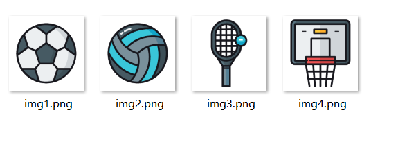
我本地的图片:
示例五
本示例使用box-orient来指定盒子是横向排列还是竖向排列
使用box-pack来指定子容器在水平轴上的空间分配方式,是居左,居右,还是居中
使用box-align来指定子容器在竖轴上的空间分配方式,是居上,居下,还是居中
代码如下:
<!DOCTYPE html>
<html lang="en">
<head>
    <meta charset="UTF-8">
    <meta name="viewport" content="width=device-width, initial-scale=1.0">
    <meta http-equiv="X-UA-Compatible" content="ie=edge">
    <title>Document</title>
</head>
<style>
        .wrap {
            min-height: 600px;
            display: -webkit-box;
            display: -ms-flexbox;
            -webkit-box-orient:vertical; /* 子容器竖向排列 */
            -ms-flex-direction: column; /* 子容器竖向排列,IE10+ */
            flex-direction: column; /* 子容器竖向排列,IE10+ */
            -webkit-box-pack: center; /* 子容器在水平轴上的空间分配方式,可以是start、end或者center */
            -webkit-box-align: center; /* 子容器在竖轴上的空间分配方式,可以是start、end或者center */
            -ms-flex-align: center; /* 子容器在竖轴上的空间分配方式,可以是start、end或者center */
            -ms-flex-pack:center /* 子容器在水平轴上的空间分配方式,IE10+,可以是start、end或者center */
        }

        .flex {
            border: 1px solid black;
            margin: 10px;
            width: 200px;
        }
</style>
<body>
    <div class="wrap">
        <div class="flex"><img src="images/img1.png" ></div>
        <div class="flex"><img src="images/img2.png" ></div>
    </div>
</body>
</html>
效果如下:

此内容由惯性聚合(RSS阅读器)自动聚合整理,仅供阅读参考。 原文来自 — 版权归原作者所有。