


Better prompts = better results, faster
Working with v0 is like working with a highly skilled teammate who can build anything you need. v0 is more than just a tool, it’s your building partner. And like with any great collaborator, the quality of what you get depends on how clearly you communicate.
The more specific you are, the better v0's output becomes. From our testing, good prompts consistently deliver:
Faster generation time (30-40% faster with less unnecessary code, fewer credits spent)
Smarter UX decisions (v0 understands intent and optimizes accordingly)
Cleaner, more maintainable code
This guide shows you a framework that consistently produces these results.
Link to headingThe framework: Three inputs that drive great prompts
After building hundreds of applications ourselves and learning from v0's power users, we’ve noticed that the best prompts always include three core inputs:
Product surface
Context of use
Constraints & taste
Here's the template:
Build [product surface: components, data, actions].
Used by [who],
in [what moment],
to [what decision or outcome].
Constraints:
- platform / device
- visual tone
- layout assumptions
Let's break down each input.
Link to headingProduct surface
What specifically are you building?
List the actual components, features, and data. Not “a dashboard”, but what data it shows, what actions users can take, and what the key sections are.
Example:
Dashboard displaying: top 5 performers with
names and revenue, team revenue vs quota
progress bar, deal pipeline with stages
(Leads → Qualified → Demo → Closed),
6-month revenue trend chart.
When you’re specific about the product surface, v0 doesn’t waste time inventing features you don’t need or missing ones you do.
Link to headingContext of use
Who’s using this, and in what moment?
Be specific about your users and how they interact with the product in real life. Their role, technical comfort level, time constraints, and environment shape how v0 designs the UX.
Ask yourself:
Who uses this?
When do they use it?
What decision are they trying to make?
How much time do they have?
Example:
Sales managers (non-technical) who check
this during morning standups on desktop
monitors to quickly spot underperformers and
celebrate wins with the team.
v0 optimizes for assumed usage. If you don’t define the context of use, it will guess.
Link to headingConstraints & taste
How should it work and look
Constraints tell v0 what not to invent.
Include:
Style preferences
Platform or device assumptions
Layout expectations
Color systems
Responsiveness or accessibility needs
Example:
Professional but approachable. Use card-based
layout with clear hierarchy. Color code: green for
on-track, yellow for at-risk, red for below target.
Desktop-first since they use large monitors. Make
it feel like a real SaaS product.
v0’s defaults are good. Specific constraints make them great while keeping code cleaner.
Link to headingShow the difference: Real test results
I tested this framework by building the same applications with different levels of context. Each test isolates one element to show its impact:
Link to headingTest 1: The impact of context of use
Without context of use:
Build an e-commerce site with product grid, filters, and shopping features.
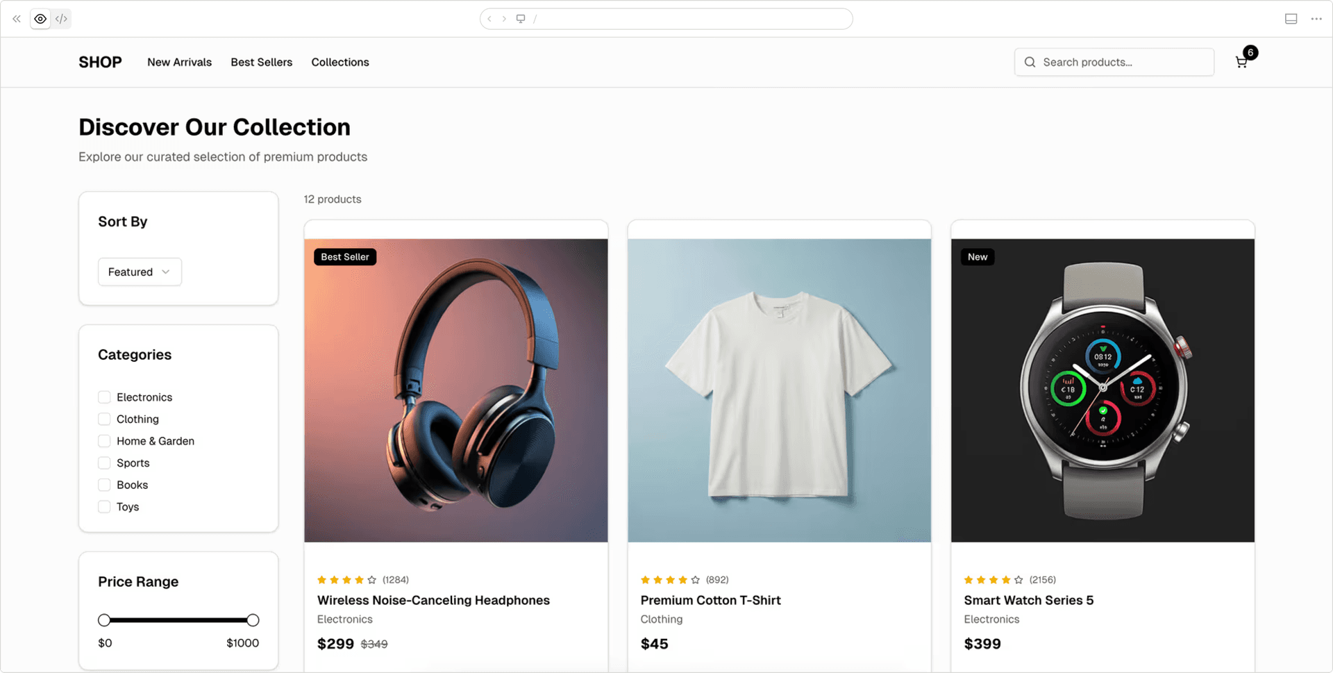
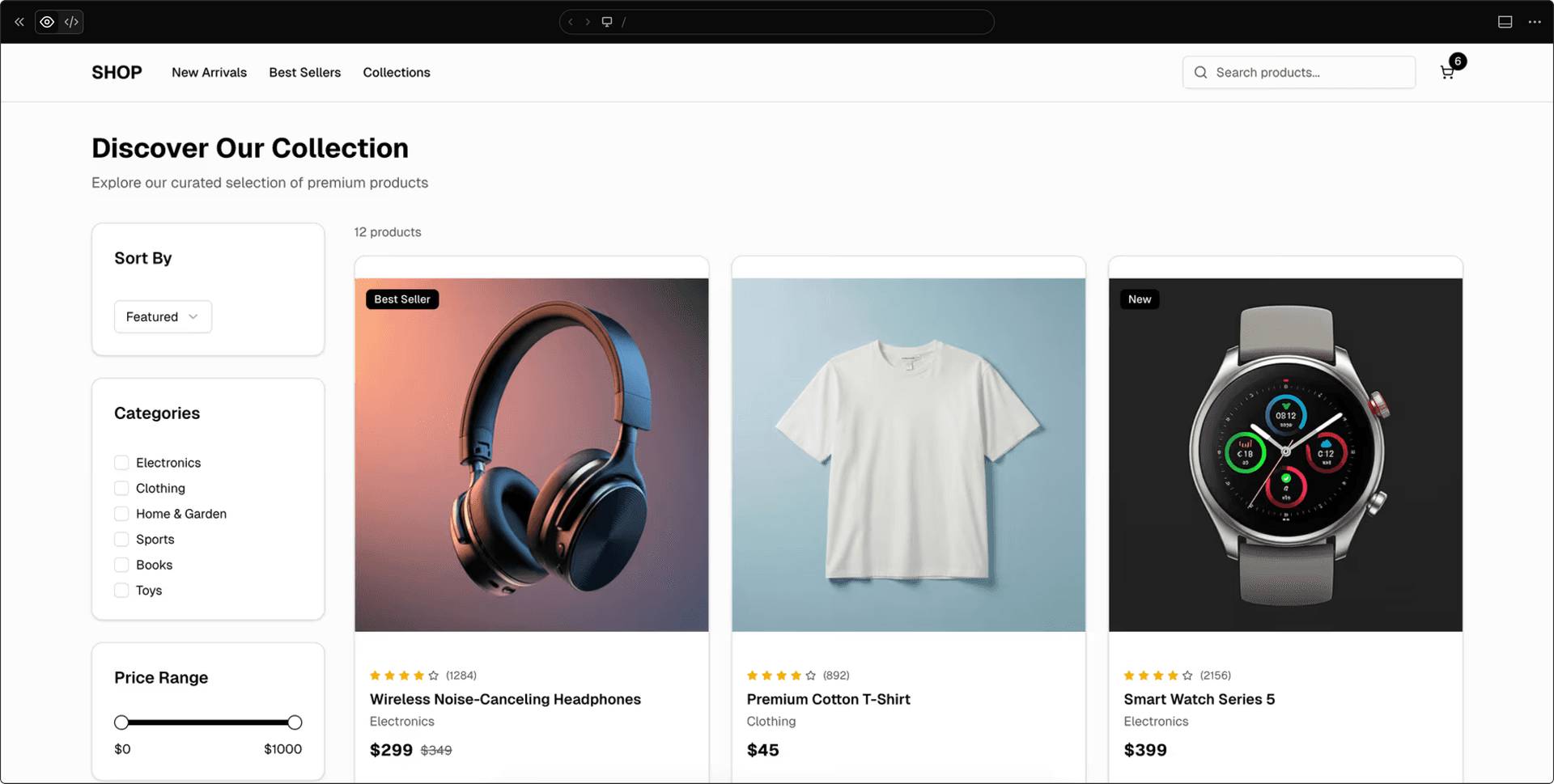
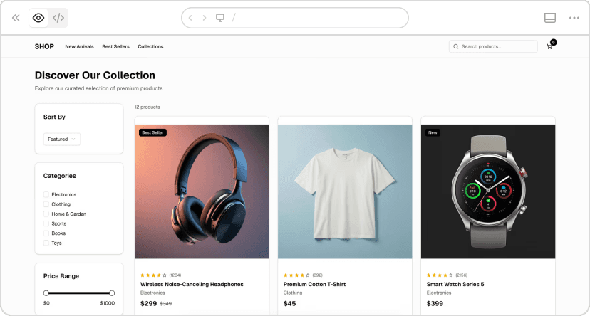
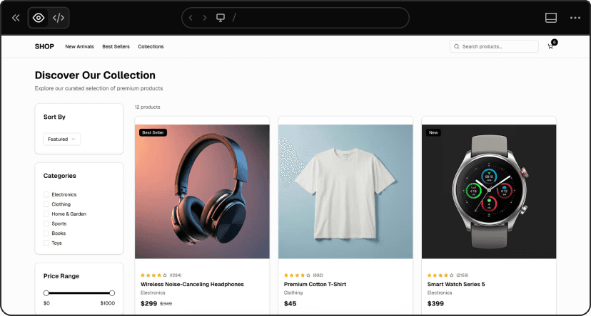
v0 chat: https://v0.link/6vSzuSI
With context of use:
Fashion e-commerce site targeting millennials (25-35)
who browse on mobile during commutes. They compare
multiple items quickly before buying. Build a product page
with: swipeable image gallery, product title, price, description,
size/color selectors, add to cart button. Include minimal header
with back button and cart icon. Clean, premium aesthetic.
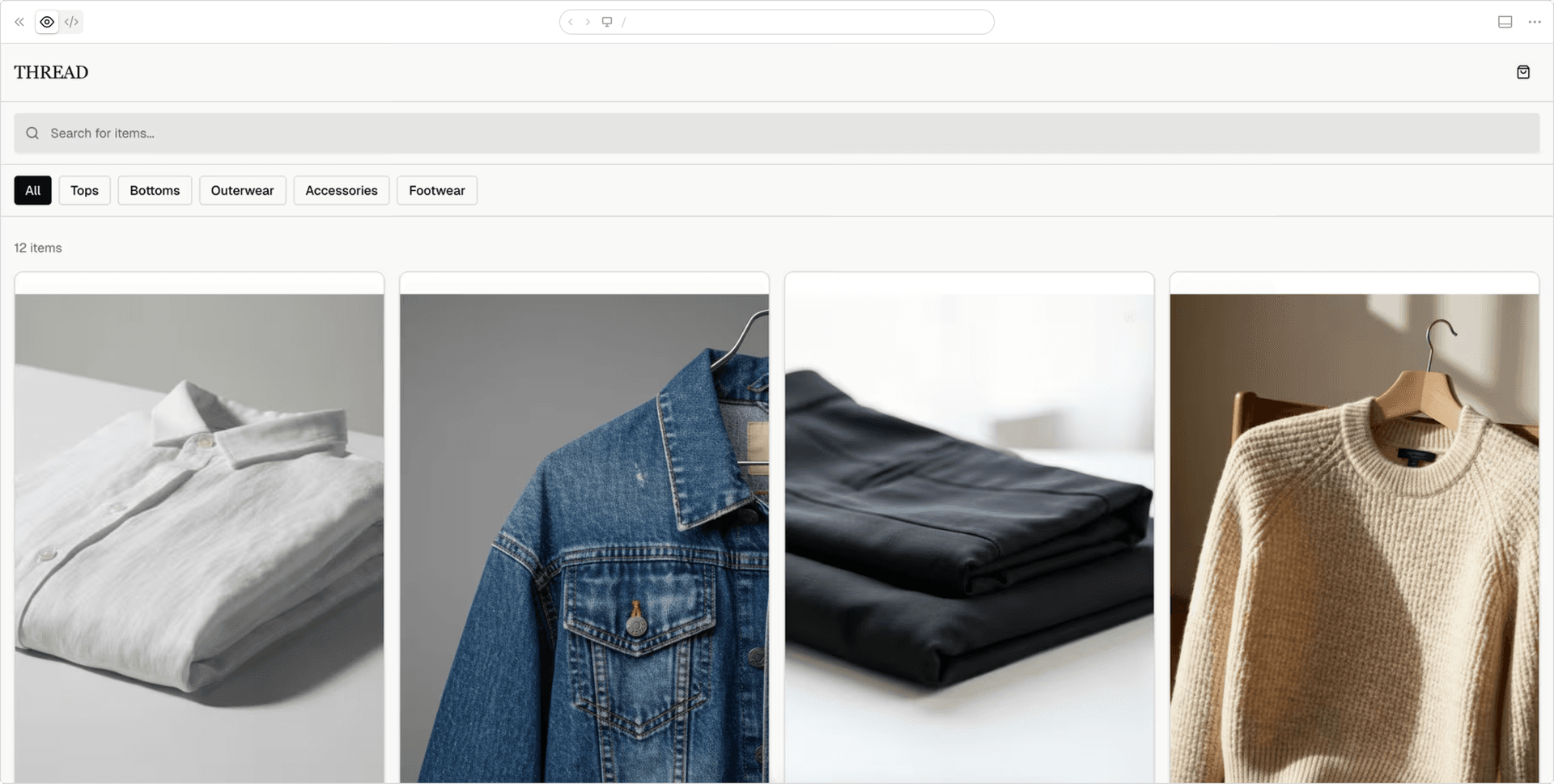
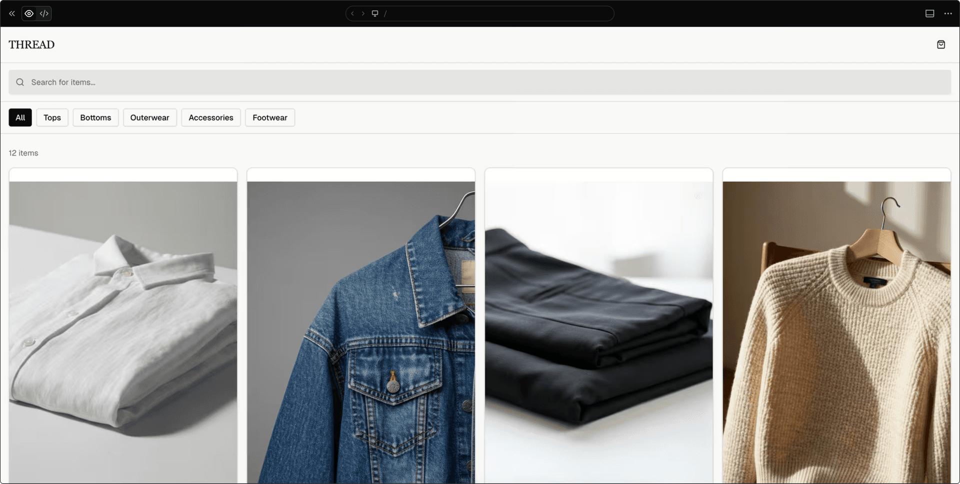
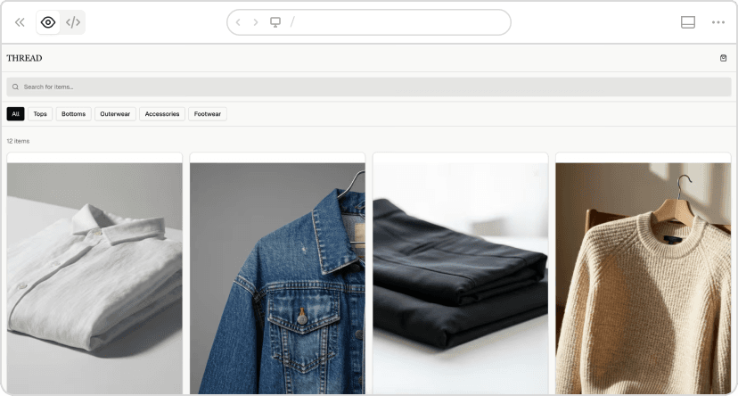
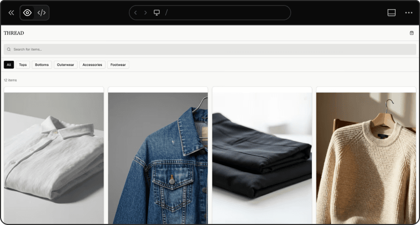
v0 chat: https://v0.link/CcOTmsI
What changed:
The version with context took 26 seconds longer but delivered a completely functional product. The version without context had:
Non-functional search (placeholder only)
Non-functional cart
NOT responsive
The version with context had:
Fully functional search and cart with quantity controls
100% mobile responsive
Sophisticated mobile-first design
Quick view modals and category filters
The real cost:
Without context would have required 1-2 more prompts to add the missing functionality, totaling ~5 minutes and ~1.5 credits. Better context saved multiple iterations.
Link to headingTest 2: The impact of product surface
Vague product surface:
Build a user profile page.
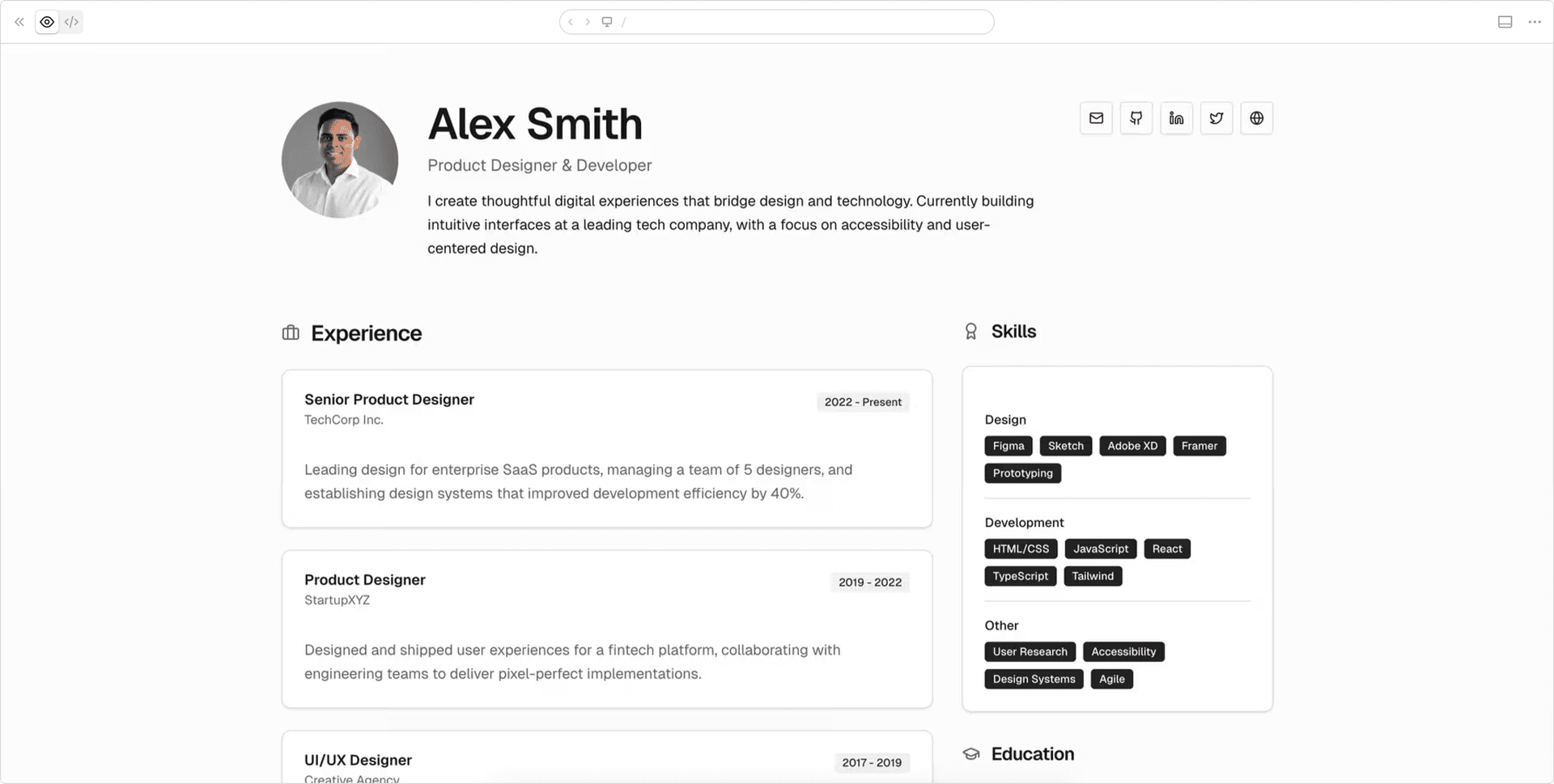
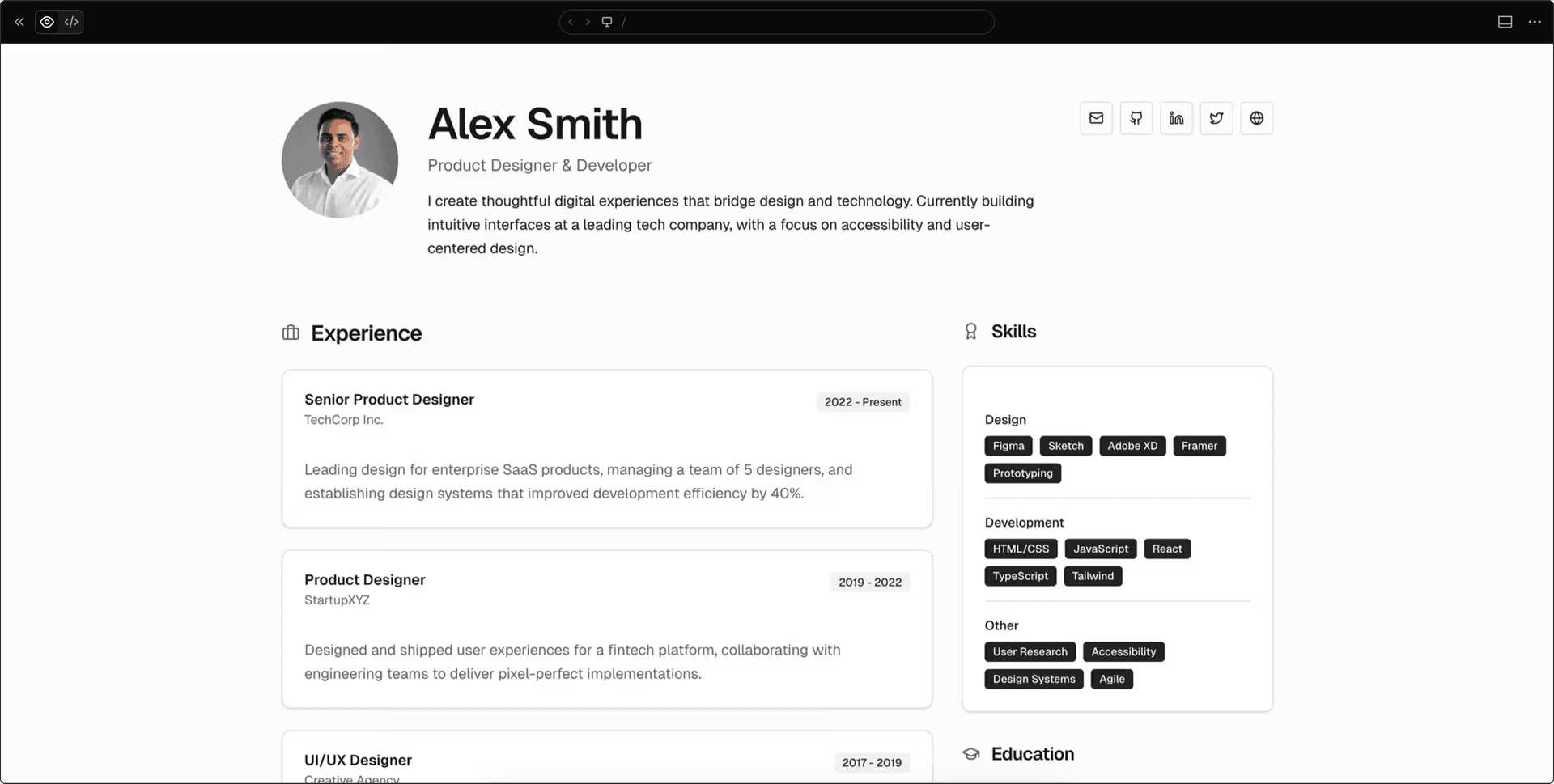
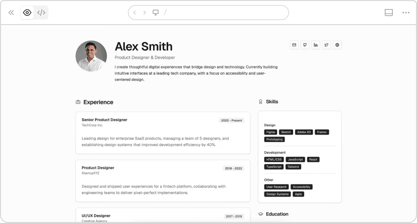
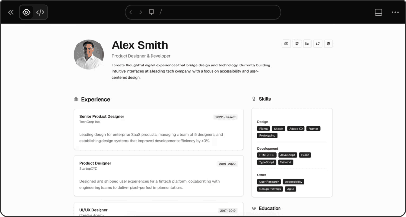
v0 chat: https://v0.link/1Gev1Gi
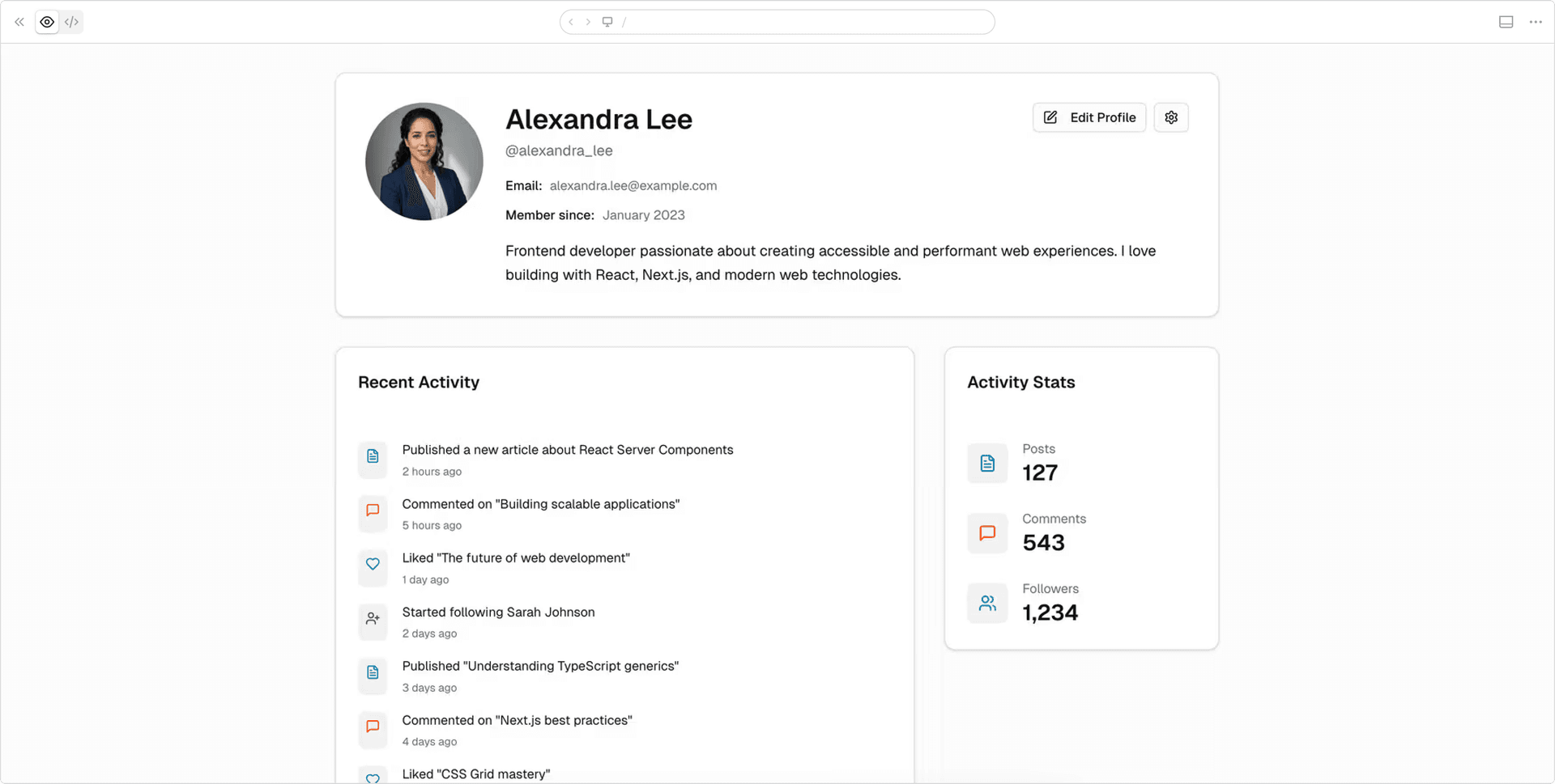
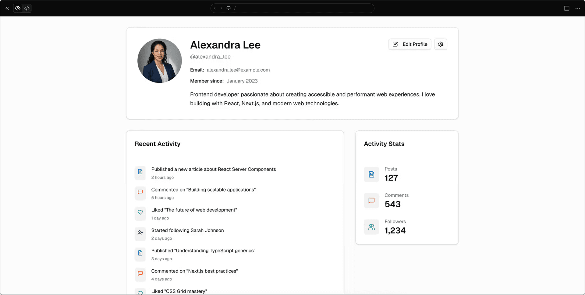
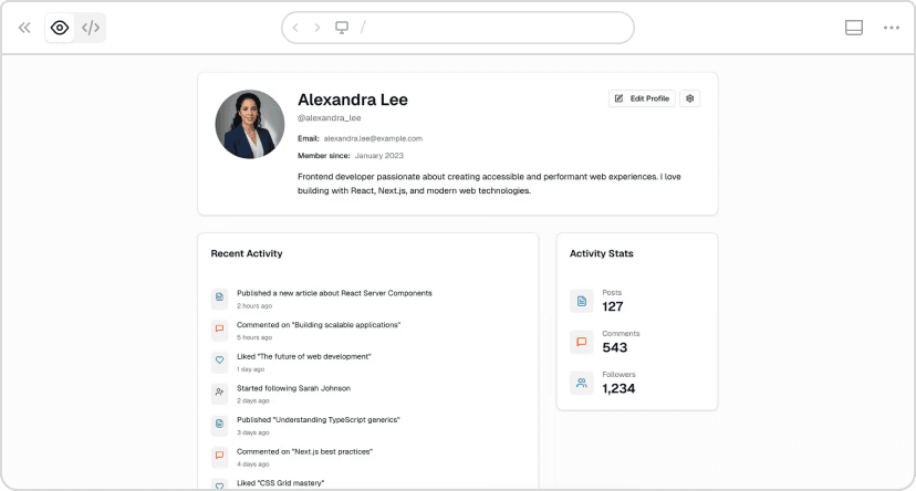
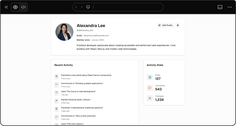
Specific product surface:
Build a user profile page showing: profile photo,
display name, username, email, bio, member since
date, activity stats (posts, comments, followers),
recent activity feed with timestamps, edit profile
and settings buttons.
v0 chat: https://v0.link/690wE6f
Results:
Vague: 1m 38s, 595 lines, 0.173 credits
Specific: 1m 19s, 443 lines, 0.160 credits
19 seconds faster, 152 fewer lines, lower cost.
The vague prompt forced v0 to guess. The specific prompt generated exactly what we needed: all requested fields properly structured, activity stats prominent, correct information architecture.
When the product surface is explicit, v0 doesn’t waste time inventing features you don’t need or missing ones you do.
Link to headingTest 3: The impact of constraints & taste
Basic constraints:
Build a support ticket dashboard. Shows: open
tickets, response time, agent performance,
recent activity.
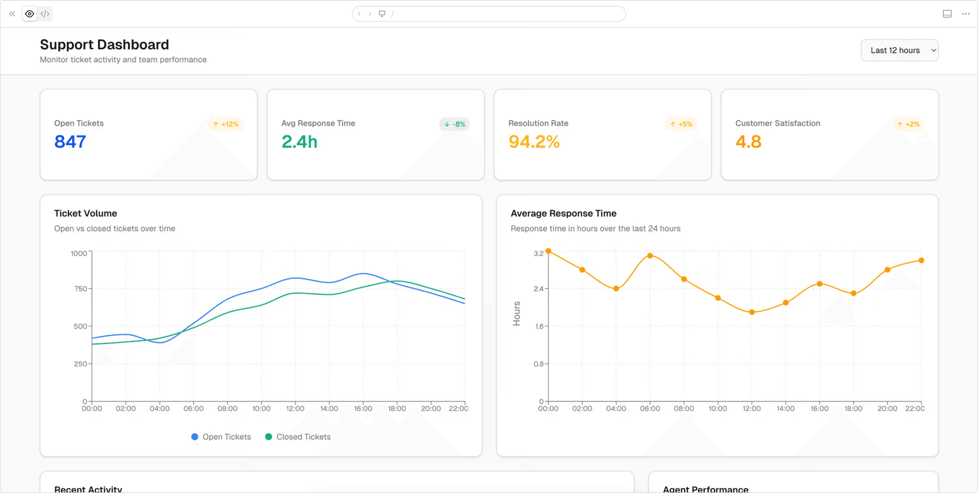
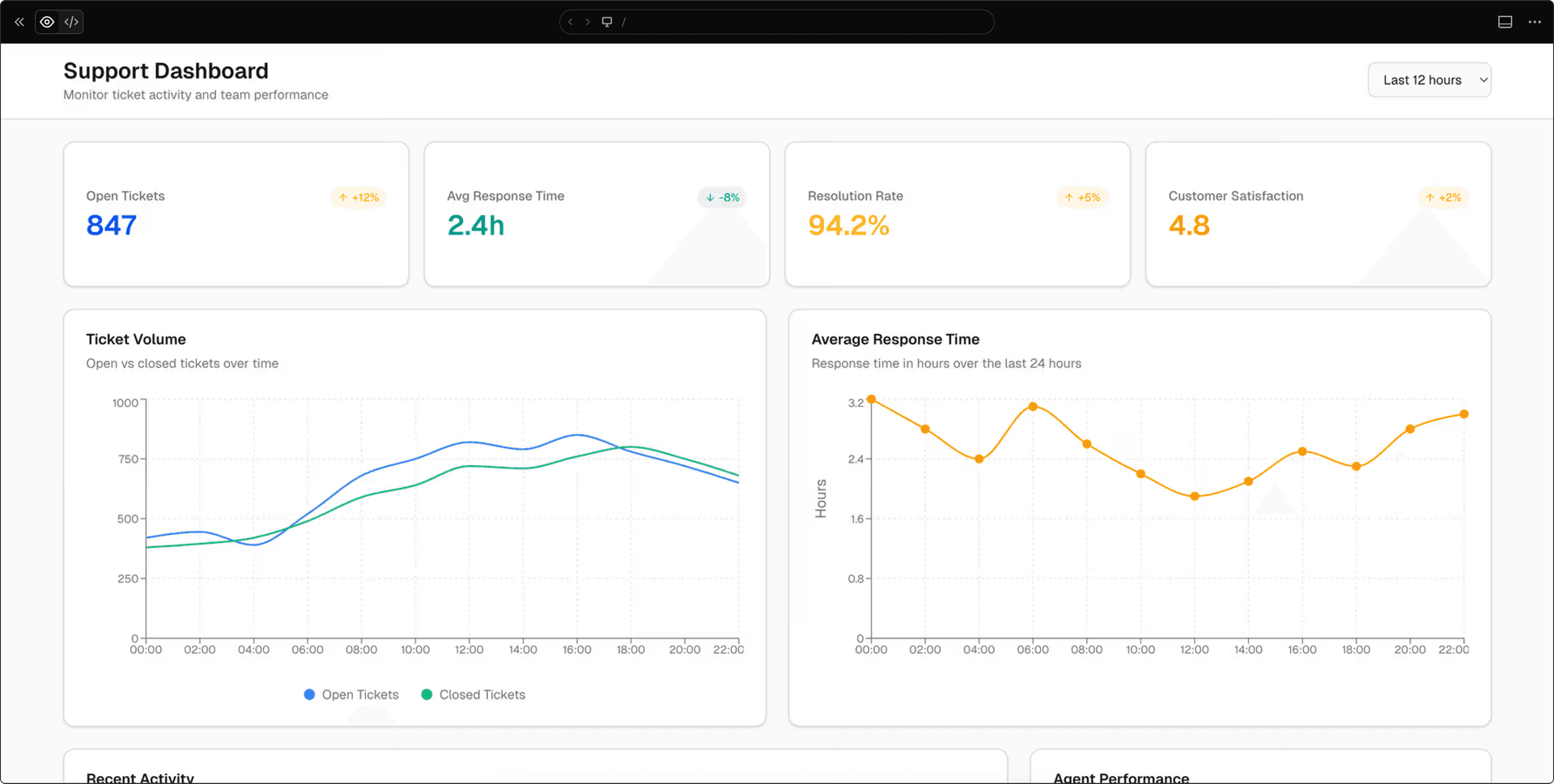
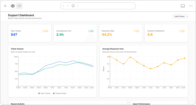
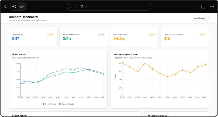
v0 chat: https://v0.link/jrNW2FX
Detailed constraints:
Build a support ticket dashboard. Shows: open tickets,
response time, agent performance, recent activity.
Mobile-first design (team leads check this on phones
while on the floor).
Light theme, high contrast. Color code: red for urgent
(>24h), yellow for medium, green for on-time. Maximum
3-column layout. Include loading states for real-time data.
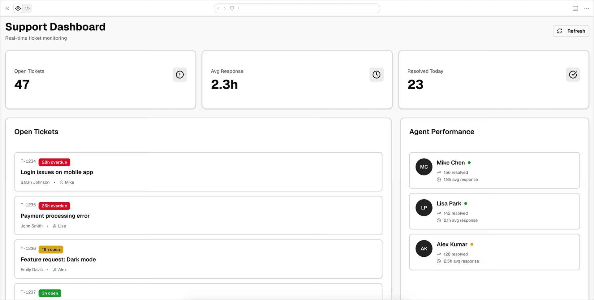
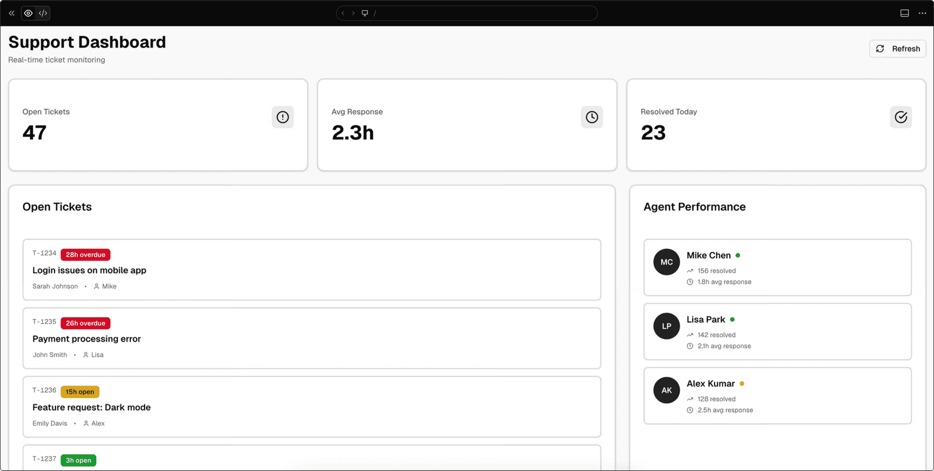
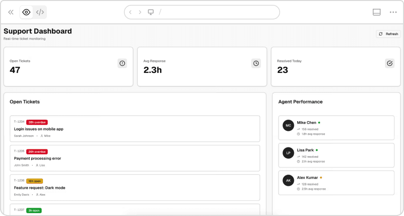
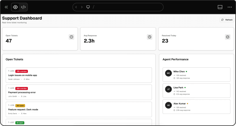
v0 chat: https://v0.link/ZtsFTeb
Results:
Basic: 1m 42s, 679 lines, 0.133 credits
Detailed: 1m 52s, 569 lines, 0.130 credits
Took 10 seconds longer but generated 110 fewer lines and cost less.
The difference: basic version "works on mobile" (desktop layout that shrinks). Detailed version is "mobile-first" (designed from the ground up for mobile, single column expanding to 3 max, intentional color coding with red/yellow/green urgency levels, agent status badges, high contrast for outdoor visibility).
v0's defaults are good. Specific constraints make them great while keeping code cleaner.
Link to headingIterating on your generations
Once v0 generates your app, you have two main ways to iterate:
Prompt for changes: Describe what you want to change, add, or remove. Best for functional changes, adding features, or restructuring layouts.
Design Mode: Click Design Mode, select any element visually, and adjust properties directly. Faster for quick visual changes like colors, spacing, or typography.
Use prompts for logic and structure. Use Design Mode for visual tweaks.
Link to headingQuick reference: Prompt template
Here's the template again, this time with a fully expanded example:
Template:
Build [product surface: components, data, actions].
Used by [who],
in [what moment],
to [what decision or outcome].
Constraints:
- platform / device
- visual tone
- layout assumptions
Example:
Build a support dashboard showing: open tickets count,
average response time, tickets by priority (high/medium/low),
agent performance list with current workload, recent ticket activity feed.
Used by support team leads (managing 5–10 agents),
on their phones while walking the floor,
to prevent agent burnout and maintain response-time SLAs.
Checked every 30 minutes to identify overloaded agents
and redistribute work.
Constraints:
Mobile-first, light theme, high contrast.
Color code by priority: red for urgent, yellow for medium, green for low.
Show agent status badges (busy/available).
Maximum 2 columns on mobile.
Ready to build?
Try it yourself. Next time you use v0, try being more specific. Add context about who's using your creation. Explain why it needs to exist. Describe how it should work.
Start building
Link to headingWant to go deeper?
v0 Documentation - Complete guide to all features
Design Systems Guide - Learn how to create and use design systems
Project Instructions - Set up rules that apply to all generations
v0 Templates - Pre-built starting points for common use cases
Community Platform - Ask for help, share prompt ideas, and chat about AI projects with the community