







import proplot as pplt
import cartopy

fig, ax = pplt.subplots(proj=['cyl'],ncols=1,nrows=1)
ax.add_feature(cartopy.feature.COASTLINE)
ax.add_feature(cartopy.feature.BORDERS, linestyle=':', linewidth=0.5)
ax.add_feature(cartopy.feature.LAND)
ax.add_feature(cartopy.feature.OCEAN)
ax.add_feature(cartopy.feature.LAKES, alpha=0.3)
ax.add_feature(cartopy.feature.RIVERS,alpha=0.3)
ax.format(
        reso='hi',
        lonlim=(-20,55),latlim=(-38,38),
        labels=True,
        gridlinewidth=0.5,
        grid=True,
        gridstyle='--',
        lonlocator=range(-10,55,15),
        latlocator=range(-30,40,15),
)
# ax.spines['top'].set_visible(False)
# ax.spines['bottom'].set_visible(False)
# ax.spines['right'].set_visible(False)
# ax.spines['left'].set_visible(False)
fig.save(f"maps/name.png", dpi=400)
import matplotlib.pyplot as plt
import cartopy

fig = plt.figure()
ax = fig.add_subplot(1, 1, 1, projection=cartopy.crs.PlateCarree())
ax.set_extent([-20, 60, -40, 45], crs=cartopy.crs.PlateCarree())
ax.add_feature(cartopy.feature.COASTLINE)
ax.add_feature(cartopy.feature.BORDERS, linestyle=':', linewidth=0.5)
ax.add_feature(cartopy.feature.LAND)
ax.add_feature(cartopy.feature.OCEAN)
ax.add_feature(cartopy.feature.LAKES, alpha=0.3)
ax.add_feature(cartopy.feature.RIVERS, alpha=0.3)
ax.set_xticks(range(-10, 55, 15), crs=cartopy.crs.PlateCarree())  #添加经纬度
ax.set_yticks(range(-30, 40, 15), crs=cartopy.crs.PlateCarree())
ax.xaxis.set_major_formatter(LongitudeFormatter())
ax.yaxis.set_major_formatter(LatitudeFormatter())
ax.gridlines(
	xlocs=range(-10, 55, 15),
	ylocs=range(-30, 40, 15),
	linestyle='--',
	linewidth=0.5
)
plt.tight_layout()
plt.savefig(f"maps/name.png", dpi=400)
import matplotlib
import matplotlib.pyplot as plt
matplotlib.font_manager.fontManager.addfont("/home/lixg/.fonts/msyh.ttf")
# 查看字体名以及对应的字体文件名
# for font in font_manager.fontManager.ttflist:
#     print(font.name, '-', font.fname)
plt.rcParams["font.family"] = "Microsoft Yahei"
通过网盘分享的文件:msyh.ttf
链接: https://pan.baidu.com/s/1B0WzpG-1IDAkVfCs9HxsEg?pwd=nw8s 提取码: nw8s
import os
import geopandas as gpd
import pandas as pd
import matplotlib.pyplot as plt
import matplotlib
import cartopy.io.img_tiles as cimgt
os.environ["http_proxy"] = "http://127.0.0.1:7890"
os.environ["https_proxy"] = "http://127.0.0.1:7890"
plt.style.use('classic')
matplotlib.font_manager.fontManager.addfont("/home/lixg/.fonts/msyh.ttf")
plt.rcParams["font.family"] = "Microsoft Yahei"
basemap = cimgt.GoogleTiles(
    url='https://server.arcgisonline.com/ArcGIS/rest/services/World_Terrain_Base/MapServer/tile/{z}/{y}/{x}.jpg')
ax.add_image(basemap,5)
代码中的url可以替换成其他底图,更多底图可参考这个网站 https://server.arcgisonline.com/ArcGIS/rest/services/
比如:https://server.arcgisonline.com/ArcGIS/rest/services/World_Topo_Map/MapServer/tile/{z}/{y}/{x}.jpg
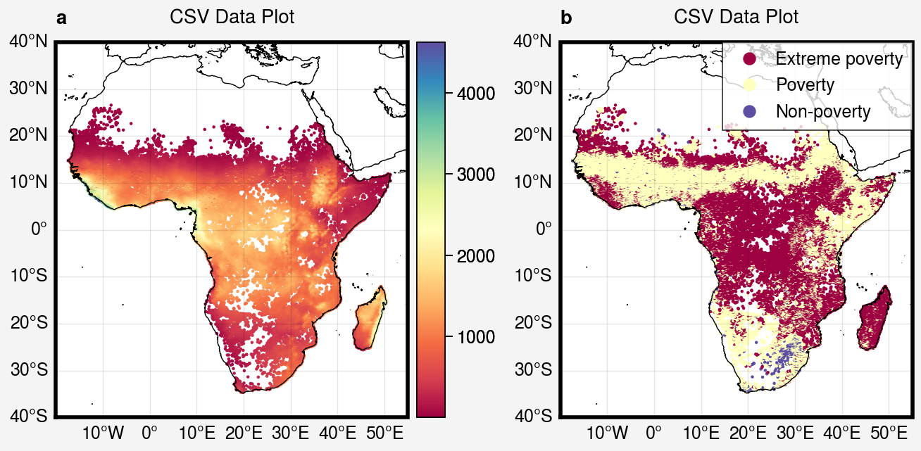
m = axs[1].scatter(
    x=data_id['lon'], y=data_id['lat'],
    c=data_id['y_pred_cls'],
    cmap='spectral', marker='o', markersize=1,)
# 创建图例并为每个标记设置自定义标签
handles, labels = m.legend_elements()
legend_labels = ['Extreme poverty', 'Poverty', 'Non-poverty']
axs[1].legend(handles, legend_labels,loc='ur',ncols=1)
sns.set_theme(context='notebook', style='darkgrid', palette='deep')
Context
sns.set_context('paper'):最小的尺寸
sns.set_context('notebook'):稍大的尺寸
sns.set_context('talk'):更大的尺寸
sns.set_context('poster'):最大的尺寸
Styles
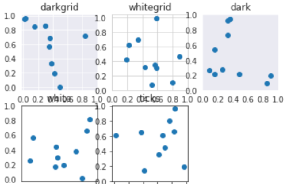
There are five preset seaborn themes:
darkgrid, whitegrid, dark, white, and ticks
They are each suited to different applications and personal preferences. The default theme is darkgrid. As mentioned above, the grid helps the plot serve as a lookup table for quantitative information, and the white-on grey helps to keep the grid from competing with lines that represent data. The whitegrid theme is similar, but it is better suited to plots with heavy data elements:
sns.reset_defaults():将所有RC参数恢复为默认设置。
此内容由惯性聚合(RSS阅读器)自动聚合整理,仅供阅读参考。 原文来自 — 版权归原作者所有。