


1
Hello, I’m new to Discourse and hope this is a helpful observation- the hamburger menu never changes to a ‘close’ ui so I’ve found myself clicking it thinking I’m about to reveal more stuff, but it closes unexpected. It was already open. I’ve got a few lines of css that I plan on adding as a topic in the ‘theme component’ category when I have more access. Luckily the codebase has proper classes so we can hook onto those based on the sidebar showing or not showing.
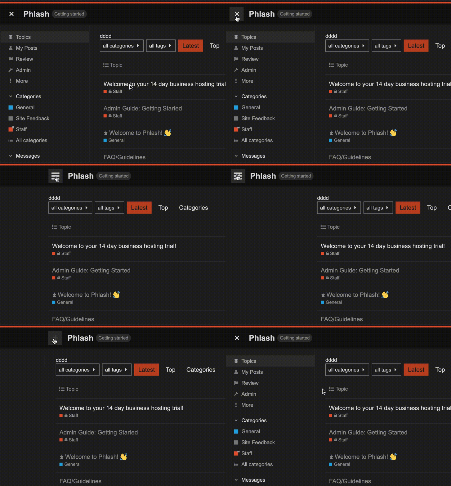
.btn-sidebar-toggle::before {
    transition:.2s ease-out all;
    opacity:0;
    content: "+";
    font-size: 32px;
    transform: rotate(0deg);
    position:absolute; left:12px;
}

.btn-sidebar-toggle  svg {
    transition:.2s ease-out all
}

body.has-sidebar-page .btn-sidebar-toggle::before {
    opacity:1;
    transform: rotate(45deg);
}

body.has-sidebar-page .btn-sidebar-toggle svg {
    opacity:0
}
4 Likes
Thank you for this! I would also suggest that the X Close button be moved to inside the Menu itself, at the very top. (In that position I would also add “Close Menu” text to the button, and perhaps use a left-pointing arrow instead of the X.)
← Close Menu or << Close Menu
4 Likes
Canapin (Coin-coin le Canapin) 3
I think most people use Discourse with the sidebar always enabled (I’d be curious to see stats on various forums). Having a large X that encourages, sort of speaking, of closing a part of the layout that is basically permanent for many users would look a bit weird to me. 
3 Likes
pfaffman (Jay Pfaffman)
4
I agree that having the little-used hamburger-to-close icon taking up the most valuable upper left easy target space on the window is non-optimal.
Here’s what cloudflare has at the bottom of their sidebar:
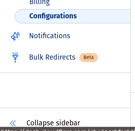
Seems like someone who knew a bit more than I about CSS (or maybe the DOM?) could make a theme component pretty quickly, but probably the thing is a PR that fixes the template.
It could even be the top item in the sidebar. . .
3 Likes
How do you open it again if the button is in the collapsed sidebar?
2 Likes
pfaffman (Jay Pfaffman)
6
doh!
You make a really good point!
I never said I was a UX guy.
. . . hmm . . . OK
What they do is have the sidebar get collapsed like this:

and the thing at the bottom expands it.
So maybe collapsing the sidebar rather than removing it is a solution. Then if you know what the icons/colors are, you can use it without having it expanded.
Pretty much every site makes the home/icon at the upper left, and having the hamburger there seems wrong.
3 Likes
Lilly 7
I know this is a different thing but I suspect the side-burger icon is still top right in mobile because on a small touchscreen, I can see tapping the logo by mistake would be a common thing if it were top left beside like on desktop view. Although same could be said about it being near avatar and search icons. 
2 Likes
Ah yes, that makes sense. I think Googlemail have similar, though they keep the hamburger button in the top left:


2 Likes
pfaffman (Jay Pfaffman)
9
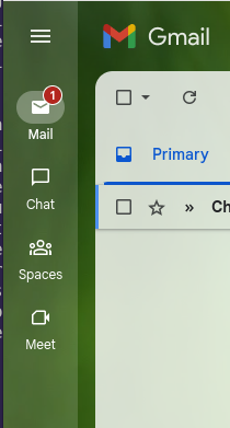
With this theme you can see that the hamburger is on a sidebar, though, so it’s sort-of not the upper left corner:
2 Likes
Lilly 10
FWIW I prefer top left for UX designs balance and appearance and have no issue with its open-collapse functionality.
1 Like
I’ve not really played with it before, but it also has an ‘expand on hover’ thing going on too which is quite nice.
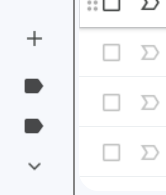
I think they have a more distinctive set of icons, which makes deciphering it when collapsed easier than a first glance at Meta’s one leads me to think. Though if you start adding in things like multiple labels then it does suffer the same ambiguity our tags might have:
1 Like
Lilly 12
no to hover tags and category names. hovering is not ideal for touchscreen interfaces either. using desktop mode with hover stufff on an iPad doesn’t really work well.
1 Like
I like the hover, as long as the screen tap behaves the same as with a mouse.
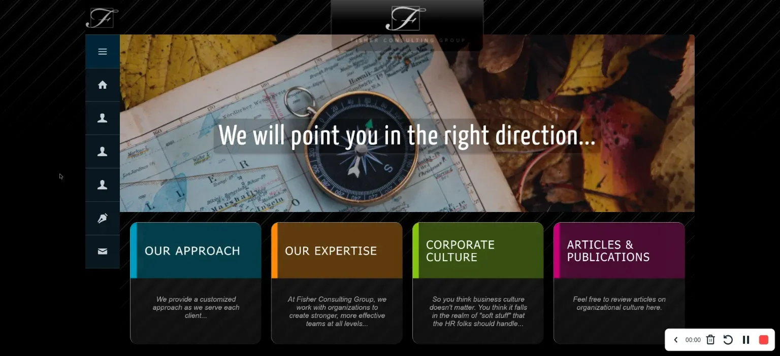
Here’s one of my favorite style, on a highly customized Ghost CMS site I built for a client, where hovering anywhere over the sidebar slides open the vertical stack of click/tap links to reveal cascading submenus… it feels very smooth and easy to navigate. You can try it out here:
PhilFoss (Phil Foss) 14
Have you checked this on mobile? Very buggy
15
Hello  Thanks for sharing.
I use the indent, outdent icons combo to the sidebar toggle on my site.
2 Likes
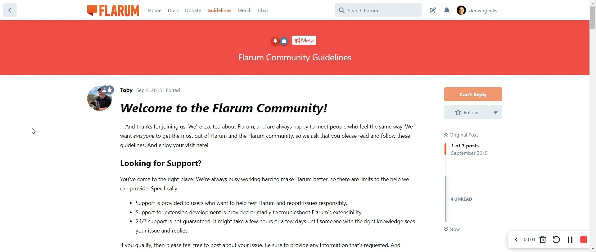
Another possibility (for desktop) is demonstrated on Flarum…
I wonder if someone else thinks this needs to be taken up by the Core team.
There are a lot of top communities using the previous UI (with no sidebar) on Discourse because of that.
I found the sidebar super useful to organize large communities like ours, but the current behavior on Discourse is the opposite.
It feels like non-technical folks just don’t know how to use our forums because of small but significant details like this one.
There is always room to improve 
Meanwhile I’m testing this Theme Component:
2 Likes
David_Chao (David Chao) 18
i have the same question too
Lilly 19
oh i made a theme component for this
此内容由惯性聚合(RSS阅读器)自动聚合整理,仅供阅读参考。 原文来自 — 版权归原作者所有。

