





Over the last few posts I wrote about things I did to improve font quality, such as antialiasing and combining distance fields to merge outlines and halos. But I want to “pop up the stack” a bit and talk about one of the bigger goals for this project. I want to render text in styles that I’ve seen in maps, both online and offline, both fantasy and real. In particular, I want to apply spacing, rotation, and curvature to the labels.

These are common in cartography, not only in fantasy maps like Tolkein’s but also in real-world maps. Eduard Imhof’s classic 1975 paper, Positioning Names on Maps[1] has a ton of great advice on how to position labels, and not only recommends curving text, but also sketches out examples:


Clear areal association often requires bending and spreading a name so that it is stretched as much as possible across the horizontal axis of an area.
I’ve had this paper sitting on my computer desktop since 2011. And I’m sure I was interested in this topic long before then. I will be re-reading it again before writing a label placement algorithm. Both Apple Maps and Google Maps use curved text, as shown in these examples:


Fantasy maps used curved text too. Tolkein’s Lord of the Rings maps used curved text for areas and rivers. Scott Turner’s inspirational blog includes a post Labeling the Coast part two[2] in which he shows how he analyzed the coastline to find a suitable curved arc, and also that he liked curved arcs better than more complex paths. There are also posts on Cartographers Guild[3] about when and how to use curved labels.
So I want to implement curved labels.
To figure out how to make text flow along a curve, I first sketched it out on paper, then made a standalone interactive widget. There are three cases to handle:
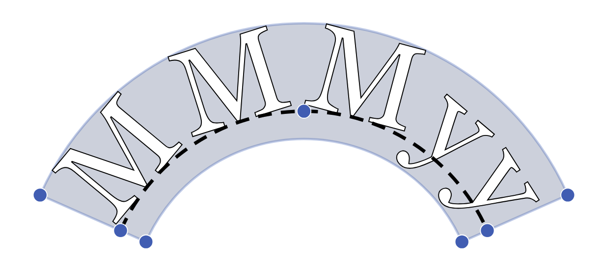
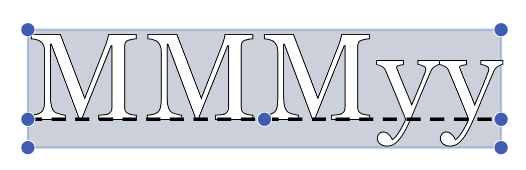
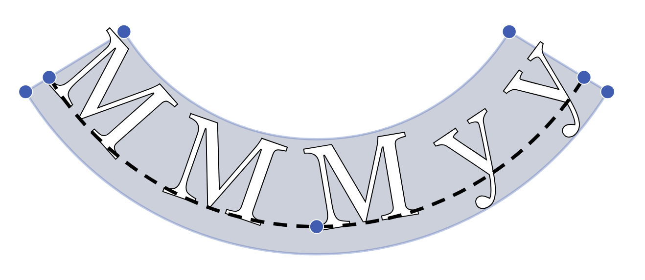
If I always curve at the baseline, the tops of the characters are too close together. That’s why I have to curve at the ascender line instead of the baseline when the curvature is negative:
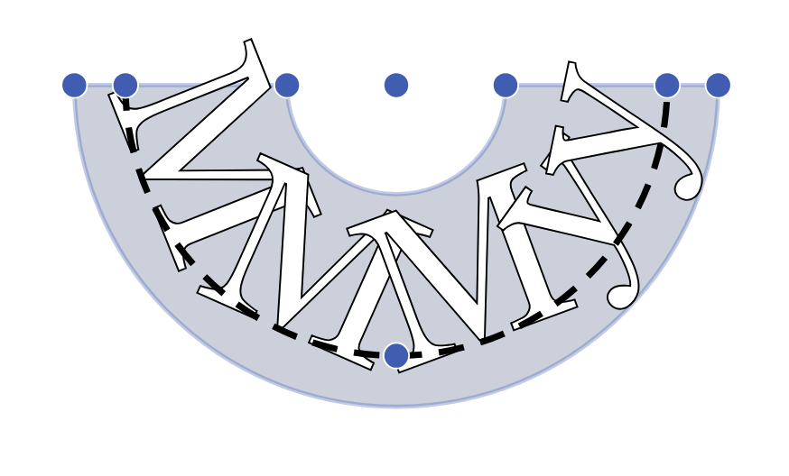
After calculating the geometry, there are two ways I know of to render the curved text.
One advantage of warping over wrapping is that it allows for many more effects, such as these:
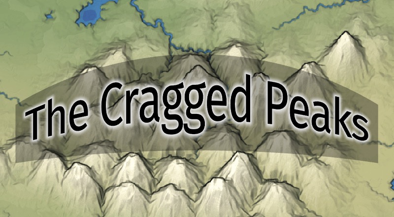
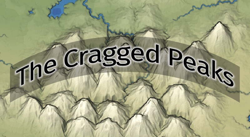
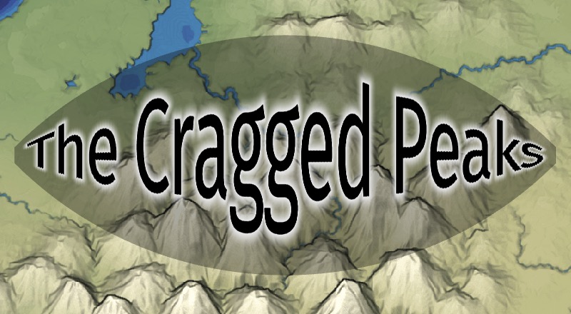
However, whenever stretching the label non-uniformly, the distance field gets distorted. In this example the white halo on the left side (The) is much larger vertically than horizontally. I can find a way to fix this but I decided not to pursue it, since I was primarily interested in curved text and not arbitary warpings:
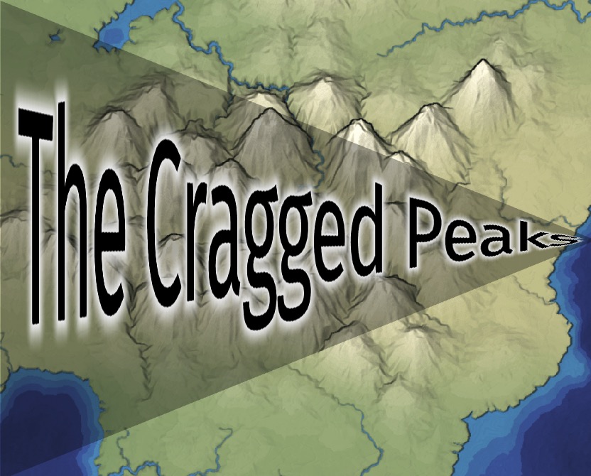
Google’s guide[4] says wrapping generally works better than warping, but I ended up trying warping first, and decided I liked it well enough. However, in the last post I had said next time I might choose to not use an intermediate combined distance field. I think without that step, it would be easier to use wrapping than warping.
Using distance fields, I can apply the outline, halo, and antialiasing after the curving step. I’m very happy with the way the curved labels turned out.

此内容由惯性聚合(RSS阅读器)自动聚合整理,仅供阅读参考。 原文来自 — 版权归原作者所有。