









In the last post I described how I fell into the font rendering rabbit hole. I try to put some time limits on each topic — otherwise I would explore forever! I try to pick a theme each week:
The key idea I wanted to explore this week is that a distance field font can be thought of as contour lines:
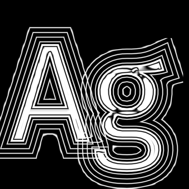
When rendering a font normally like I did last week, I considered distance < 0 ? "white" : "transparent". But there are so many more things to do with this distance!
The first thing I wanted to do is outlines. This is roughly distance < 0 ? "white" : distance < 0.1 ? "black" : "transparent":
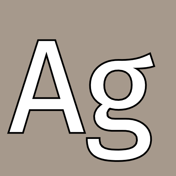
I think this looks beautiful!
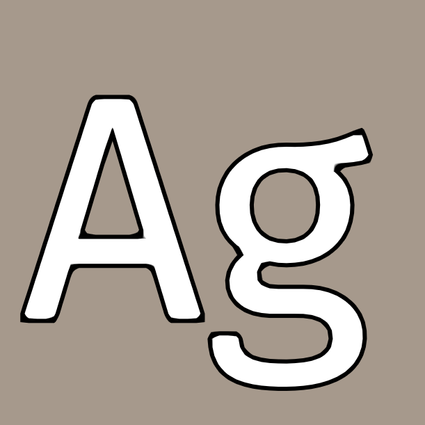
A variant is to apply blur to make this into a shadow, or apply blur and a bright color to make it into a glow effect. But I noticed that MSDF vs SDF makes a difference. SDF produces rounded corners, and I think the outlines don’t look nearly as good as with MSDF:
I wanted to see the difference, so I made this to highlight the pixels where they were different:
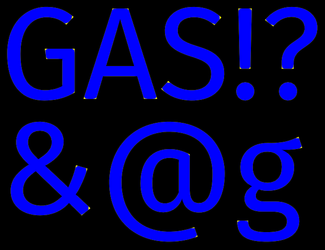
For some effects like shadow and blur I wanted the rounded corners, and for others like outlines I wanted the sharp corners. So I experimented with using both.
I played with lots of other things too, including taking the gradient of the distance field to get angles:
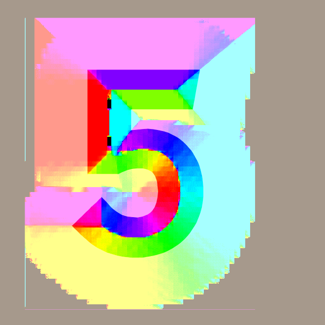
This gave me a way to apply lighting and make a bevel effect.
I learned a lot in Week 4. I had lots of bugs and I generally found it hard to debug shaders compared to cpu code. Sometimes I didn’t have the right frame of mind to fix a bug, so I continued with other experiments until I had a new idea, then came back to the bug and fixed it. I wrote up my notes originally for myself, and then cleaned them up for sharing. I had more I wanted to do, but the week was over, so I wrapped up and moved on to the next topic in Week 5.
此内容由惯性聚合(RSS阅读器)自动聚合整理,仅供阅读参考。 原文来自 — 版权归原作者所有。