





I have a lot of updates to share with you today:
use client directive.icon button size, updated sheet component and more.I've been working on a new CLI for the past few weeks. It's a complete rewrite. It comes with a lot of new features and improvements.
initWhen you run the init command, you will be asked a few questions to configure components.json:
Which style would you like to use? › Default
Which color would you like to use as base color? › Slate
Where is your global CSS file? › › app/globals.css
Do you want to use CSS variables for colors? › no / yes
Where is your tailwind.config.js located? › tailwind.config.js
Configure the import alias for components: › @/components
Configure the import alias for utils: › @/lib/utils
Are you using React Server Components? › no / yes
This file contains all the information about your components: where to install them, the import paths, how they are styled...etc.
You can use this file to change the import path of a component, set a baseColor or change the styling method.
{
  "style": "default",
  "tailwind": {
    "config": "tailwind.config.ts",
    "css": "src/app/globals.css",
    "baseColor": "zinc",
    "cssVariables": true
  },
  "rsc": false,
  "aliases": {
    "utils": "~/lib/utils",
    "components": "~/components"
  }
}
This means you can now use the CLI with any directory structure including src and app directories.
addThe add command is now much more capable. You can now add UI components but also import more complex components (coming soon).
The CLI will automatically resolve all components and dependencies, format them based on your custom config and add them to your project.
diff (experimental)We're also introducing a new diff command to help you keep track of upstream updates.
You can use this command to see what has changed in the upstream repository and update your project accordingly.
Run the diff command to get a list of components that have updates available:
The following components have updates available:
- button
  - /path/to/my-app/components/ui/button.tsx
- toast
  - /path/to/my-app/components/ui/use-toast.ts
  - /path/to/my-app/components/ui/toaster.tsx
Then run diff [component] to see the changes:
const alertVariants = cva(
- "relative w-full rounded-lg border",
+ "relative w-full pl-12 rounded-lg border"
)You can choose between using CSS variables or Tailwind CSS utility classes for theming.
When you add new components, the CLI will automatically use the correct theming methods based on your components.json configuration.
<div className="bg-zinc-950 dark:bg-white" />To use utility classes for theming set tailwind.cssVariables to false in your components.json file.
{
  "tailwind": {
    "config": "tailwind.config.js",
    "css": "app/globals.css",
    "baseColor": "slate",
    "cssVariables": false
  }
}<div className="bg-background text-foreground" />To use CSS variables classes for theming set tailwind.cssVariables to true in your components.json file.
{
  "tailwind": {
    "config": "tailwind.config.js",
    "css": "app/globals.css",
    "baseColor": "slate",
    "cssVariables": true
  }
}You can now configure the base color for your project. This will be used to generate the default color palette for your components.
{
  "tailwind": {
    "config": "tailwind.config.js",
    "css": "app/globals.css",
    "baseColor": "zinc",
    "cssVariables": false
  }
}
Choose between gray, neutral, slate, stone or zinc.
If you have cssVariables set to true, we will set the base colors as CSS variables in your globals.css file. If you have cssVariables set to false, we will inline the Tailwind CSS utility classes in your components.
If you're using a framework that does not support React Server Components, you can now opt out by setting rsc to false. We will automatically append or remove the use client directive when adding components.
{
  "rsc": false
}We are introducing a new concept called Style.
You can think of style as the visual foundation: shapes, icons, animations & typography. A style comes with its own set of components, animations, icons and more.
We are shipping two styles: default and new-york (with more coming soon).
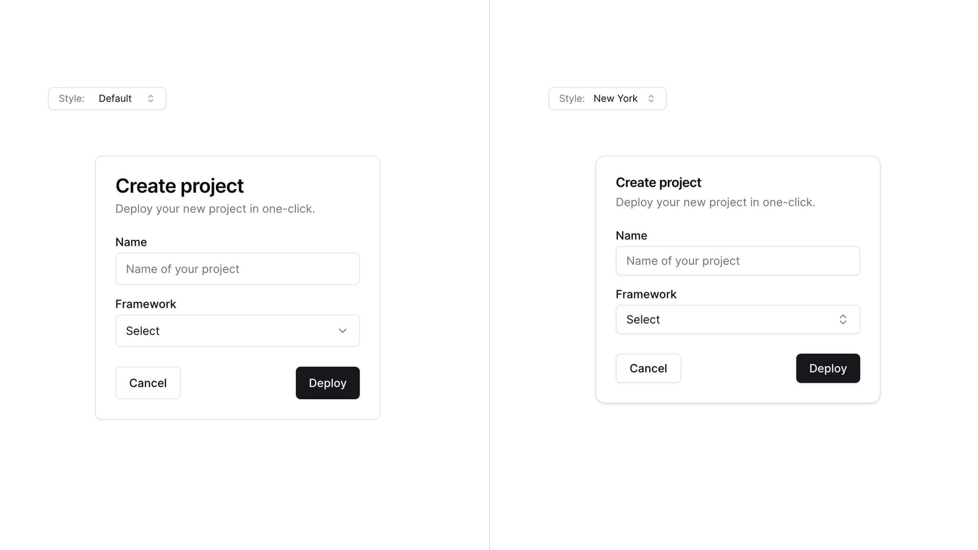
The default style is the one you are used to. It's the one we've been using since the beginning of this project. It uses lucide-react for icons and tailwindcss-animate for animations.
The new-york style is a new style. It ships with smaller buttons, cards with shadows and a new set of icons from Radix Icons.
When you run the init command, you will be asked which style you would like to use. This is saved in your components.json file.
{
  "style": "new-york"
}Start with a style as the base then theme using CSS variables or Tailwind CSS utility classes to completely change the look of your components.

I added exit animations to all components. Click on the combobox below to see the subtle exit animation.
The animations can be customized using utility classes.
icon:position to side to match the other elements.size props. Use className="w-[200px] md:w-[450px]" for responsive sizing.Since we follow a copy and paste approach, you will need to manually update your project to get the latest changes.
Note: we are working on a diff command to help you
keep track of upstream updates.
components.jsonCreating a components.json file at the root:
{
  "style": "default",
  "rsc": true,
  "tailwind": {
    "config": "tailwind.config.js",
    "css": "app/globals.css",
    "baseColor": "slate",
    "cssVariables": true
  },
  "aliases": {
    "components": "@/components",
    "utils": "@/lib/utils"
  }
}
Update the values for tailwind.css and aliases to match your project structure.
Add the icon size to the buttonVariants:
const buttonVariants = cva({
  variants: {
    size: {
      default: "h-10 px-4 py-2",
      sm: "h-9 rounded-md px-3",
      lg: "h-11 rounded-md px-8",
      icon: "h-10 w-10",
    },
  },
})sheet.tsx with the following:"use client"
import * as React from "react"
import * as SheetPrimitive from "@radix-ui/react-dialog"
import { cva, type VariantProps } from "class-variance-authority"
import { X } from "lucide-react"
import { cn } from "@/lib/utils"
const Sheet = SheetPrimitive.Root
const SheetTrigger = SheetPrimitive.Trigger
const SheetClose = SheetPrimitive.Close
const SheetPortal = ({
className,
...props
}: SheetPrimitive.DialogPortalProps) => (
<SheetPrimitive.Portal className={cn(className)} {...props} />
)
SheetPortal.displayName = SheetPrimitive.Portal.displayName
const SheetOverlay = React.forwardRef<
React.ElementRef<typeof SheetPrimitive.Overlay>,
React.ComponentPropsWithoutRef<typeof SheetPrimitive.Overlay>
>(({ className, ...props }, ref) => (
<SheetPrimitive.Overlay
className={cn(
"fixed inset-0 z-50 bg-background/80 backdrop-blur-sm data-[state=closed]:animate-out data-[state=closed]:fade-out-0 data-[state=open]:animate-in data-[state=open]:fade-in-0",
className
)}
{...props}
ref={ref}
/>
))
SheetOverlay.displayName = SheetPrimitive.Overlay.displayName
const sheetVariants = cva(
"fixed z-50 gap-4 bg-background p-6 shadow-lg transition ease-in-out data-[state=closed]:animate-out data-[state=closed]:duration-300 data-[state=open]:animate-in data-[state=open]:duration-500",
{
variants: {
side: {
top: "inset-x-0 top-0 border-b data-[state=closed]:slide-out-to-top data-[state=open]:slide-in-from-top",
bottom:
"inset-x-0 bottom-0 border-t data-[state=closed]:slide-out-to-bottom data-[state=open]:slide-in-from-bottom",
left: "inset-y-0 left-0 h-full w-3/4 border-r data-[state=closed]:slide-out-to-left data-[state=open]:slide-in-from-left sm:max-w-sm",
right:
"inset-y-0 right-0 h-full w-3/4 border-l data-[state=closed]:slide-out-to-right data-[state=open]:slide-in-from-right sm:max-w-sm",
},
},
defaultVariants: {
side: "right",
},
}
)
interface SheetContentProps
extends React.ComponentPropsWithoutRef<typeof SheetPrimitive.Content>,
VariantProps<typeof sheetVariants> {}
const SheetContent = React.forwardRef<
React.ElementRef<typeof SheetPrimitive.Content>,
SheetContentProps
>(({ side = "right", className, children, ...props }, ref) => (
<SheetPortal>
<SheetOverlay />
<SheetPrimitive.Content
ref={ref}
className={cn(sheetVariants({ side }), className)}
{...props}
>
{children}
<SheetPrimitive.Close className="absolute top-4 right-4 rounded-sm opacity-70 ring-offset-background transition-opacity hover:opacity-100 focus:ring-2 focus:ring-ring focus:ring-offset-2 focus:outline-none disabled:pointer-events-none data-[state=open]:bg-secondary">
<X className="h-4 w-4" />
<span className="sr-only">Close</span>
</SheetPrimitive.Close>
</SheetPrimitive.Content>
</SheetPortal>
))
SheetContent.displayName = SheetPrimitive.Content.displayName
const SheetHeader = ({
className,
...props
}: React.HTMLAttributes<HTMLDivElement>) => (
<div
className={cn(
"flex flex-col space-y-2 text-center sm:text-left",
className
)}
{...props}
/>
)
SheetHeader.displayName = "SheetHeader"
const SheetFooter = ({
className,
...props
}: React.HTMLAttributes<HTMLDivElement>) => (
<div
className={cn(
"flex flex-col-reverse sm:flex-row sm:justify-end sm:space-x-2",
className
)}
{...props}
/>
)
SheetFooter.displayName = "SheetFooter"
const SheetTitle = React.forwardRef<
React.ElementRef<typeof SheetPrimitive.Title>,
React.ComponentPropsWithoutRef<typeof SheetPrimitive.Title>
>(({ className, ...props }, ref) => (
<SheetPrimitive.Title
ref={ref}
className={cn("text-lg font-semibold text-foreground", className)}
{...props}
/>
))
SheetTitle.displayName = SheetPrimitive.Title.displayName
const SheetDescription = React.forwardRef<
React.ElementRef<typeof SheetPrimitive.Description>,
React.ComponentPropsWithoutRef<typeof SheetPrimitive.Description>
>(({ className, ...props }, ref) => (
<SheetPrimitive.Description
ref={ref}
className={cn("text-sm text-muted-foreground", className)}
{...props}
/>
))
SheetDescription.displayName = SheetPrimitive.Description.displayName
export {
Sheet,
SheetTrigger,
SheetClose,
SheetContent,
SheetHeader,
SheetFooter,
SheetTitle,
SheetDescription,
}position to side- <Sheet position="right" />
+ <Sheet side="right" />I'd like to thank everyone who has been using this project, providing feedback and contributing to it. I really appreciate it. Thank you.
此内容由惯性聚合(RSS阅读器)自动聚合整理,仅供阅读参考。 原文来自 — 版权归原作者所有。