


You walk into your neighborhood grocery store in search of some ingredients for a new recipe you plan to tackle this evening: rice, chicken, potatoes – your staples. But you’re also in search of saffron, a less familiar ingredient in your household. But knowing it’s a spice, you’re able to quickly navigate to the aisle, locate it on the shelf ordered alphabetically, and complete your checkout without a hitch.
While online shopping, brands should aim to facilitate the most straightforward discovery experience possible. In many regards, the eCommerce experience mimics that of brick-and-mortar shops. Users can browse through available inventory, typically accessing items they’ve purchased before with ease and comparing similar products before finalizing a decision. However, digital shops have a challenging task at hand. Unable to fully replicate the in-store shopping experience where consumers often take their time to interact with dozens of products, online shopping tends to be very transactional. To remedy this reality, brands must personalize the shopping experience to maintain user engagement. From the imagery, button colors, and homepage banners to email subject lines and the cart page design, every decision can dramatically affect how long a shopper remains on-site and whether or not they will complete a purchase.
And it’s not just what you offer and how you present products on your site that’s important; how you organize your site can make-or-break your business. Not only will a well-designed site ease the overall shopping experience, but when done right, it will also increase your primary metrics. Below, learn more about navigation optimization, the elements of all eCommerce sites should take into consideration and test, and examples of brands that have designed exceptional navigation experiences.
Navigation optimization refers to the process of improving how visitors and search engines find and access information within a given website. This includes the site’s taxonomy, how pages are structured, and how menus are labeled on both desktop and mobile. The design of all of these components can have a tremendous impact on the overall end-user experience, increasing or decreasing metrics like search ranking, bounce rate, pageviews, time on site, return visitors, conversions, and more. So to give you a leg up, let’s take a closer look at the details marketers should pay attention to.
How you present your header is the backbone of your eCommerce navigation strategy. The two most common formats are menus fixed either horizontally or vertically, exposing a handful of key product categories. Web designers have long debated which presentation is most optimal, but the truth is, it varies from site to site. What works well in one context doesn’t always work equally as well in another. And this is true when looking at design by the channel as well – mobile and web navigation experiences typically vary. Let’s assess the variables at play that will likely impact which approach you take:
Navigation structure and labeling should be clear and concise across all pages, and part of this includes deciding how to display product categories. If your product inventory is vast, a navigation menu bar consolidated by category type is integral. 34% of mobile eCommerce sites do not offer “thematic” product browsing, making it difficult for users to find what they are looking for. Therefore, brands should aim to display a few, top-level categories rather than overwhelm shoppers.
There are exceptions to this advice, of course. For example, if you only sell hats, it’s probably best to categorize your menu bar by hat type rather than merely listing one option. If you know users tend to primarily shop within a specific product category during a season (i.e., boots in the winter), restructure your menu to prioritize this section above other categories.
And it doesn’t stop with how you present your parent categories. Identifying how to showcase sub-categories within your navigation menu is also an essential part of the navigation experience. There are two primary ways brands typically go about this design:

eCommerce navigation menu example of a tiered approach where sub-categories are only exposed upon click

Menu design inspiration for a mega menu
Tiered navigation allows a user to make one, simple choice within a given moment by limiting the list of categories and options to choose from. A mega-menu releases an overwhelming sea of possibilities, which risks a user experiencing choice paralysis. While there may seem to be an obvious choice here, we encourage every organization to test both experiences and iterations of each, running experiments to determine which variation works best both for the average visitor, as well as for different audiences. Doing so will instill a sense of confidence in the ultimate decision you make.
The order in which you present menu items is also a way to optimize your site navigation. While you may have a default order you present to the average visitor or new user, using affinity data, you can tailor the order of menu items to personalize the experience on a more individual basis based on a user’s preferences. Not only will it expedite the discovery process, but it can also drive conversions more efficiently.

Re-sorted navigation menu example based on each visitor’s affinities
Aside from nailing down your main navigation layout, eCommerce teams have plenty of other decisions to make. These include:
These are fixed menus that help users navigate through pages on a site page. To simplify and facilitate a positive online shopping experience, navigation menus, product filters, and sorting menus should always be visible to users and appear while they browse and scroll through a webpage.

Sticky eCommerce menu example
The design of your menu options can also play a significant role in the navigation experience. From the button colors and look of the primary navigation menu to the fonts used and size of the sorting menu, design decisions can impact how easily users can navigate a site. Testing different looks, colors, sizes, and styles will inform which variations work best for your brand.
Two main types of menu styles currently exist: hover pop-down and click pop-down. The hover menu expands when the user’s mouse hovers over the navigation menu, and the latter option only pops down upon click. Similar to design decisions, test both options to identify which one to employ on your site. Additionally, with both tiered and mega menus, brands can showcase personalized product recommendations once fully expanded, further maximizing site real estate.
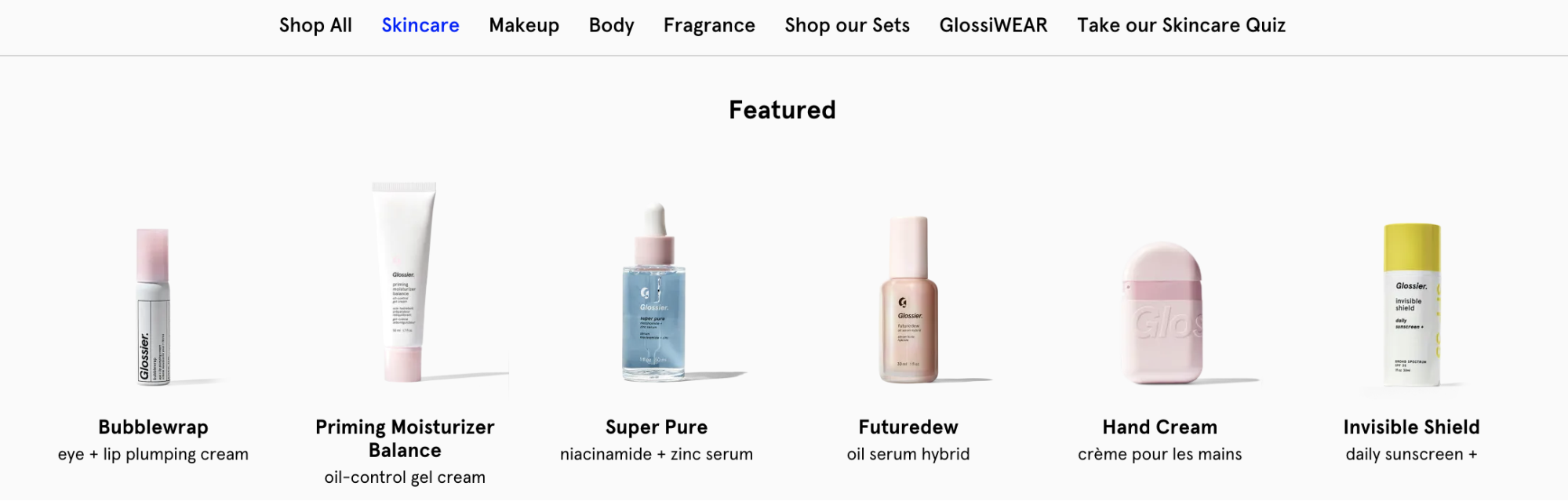
Featured product recommendations in an eCommerce navigation menu example
The footer of your site also presents an opportunity to serve as a medium to navigate users to pages they are interested in, encourage email sign-ups, establish your credibility through privacy-related information, and more. Consider displaying links to popular category pages in the fixed footer of your site so users can easily access additional site areas if they’ve reached the bottom of a page.

An example of a detailed footer experience
In addition to facilitating the product discovery experience, building a more comprehensive footer can positively affect your site’s SEO. Including the right amount of hyperlinks in your footer, even if you don’t opt for a more robust footer experience, will positively impact your search ranking. Evey link listed is analyzed for SEO rankings, so while you shouldn’t pack too many keywords into the footer, we suggest you add the phrases that add value to your brand or encourage user action.
Besides your primary menu navigation design and stickiness, eCommerce vendors have access to several additional strategies to optimize site navigation. When it comes to search functionality, organizations have two primary options: faceted search and semantic search.
Faceted search, or guided navigation, helps users analyze, organize, and filter large sets of product inventory based on filters such as size, color, price, and brand. Faceted search options are the result of a search query; therefore, options displayed are solely related to filtering options relevant to the query.

Example of faceted search on an eCommerce site
On the other hand, search filters allow users to sort through product attributes based on a particular category, e.g., by size, color, price, or brand. Filters differ from faceted searches because they aim to help browsers narrow down their queries without having to type in a manual search at all. Often seen on the left-hand side of the category or product listing pages, this functionality is especially useful to users browsing through a site with massive amounts of inventory available.

Example of search filters on an eCommerce site
Semantic search uses geolocation, a user’s (and global) search history, and spelling variations to improve search queries. This includes programming smart, autocomplete options when a user types items into a search menu. By understanding regional and behavioral trends at the individual and audience level, brands can prioritize the suggested queries that appear when a user begins typing in a search query.

Search results when typing while in incognito mode

Search results when typing while logged in
Additionally, brands may want to conduct additional experiments centered around search functionality. Suppose you notice users are abandoning your site after browsing a few categories or PDPs. In that case, you may want to encourage them to conduct a search on-site as an additional effort to surface a product they are interested in. Especially useful for companies with massive product catalogs, consider testing different variations of the search menu design so it appears more prominently on the page and captures users’ attention.

Two variations of the search box to encourage goal-oriented shoppers to find what they are looking for
A best practice for designing product listing pages (PLPs) and product detail pages (PDPs) is optimizing eCommerce navigation between pages. Once a user arrives on a PDP, they may want to easily return to their initial search results page if they haven’t found what they are looking for. Be sure users don’t lose their place on your site when navigating back and forth between pages by integrating breadcrumbs to help ease site navigation.
Breadcrumbs are a linear navigation display, typically visible at the top of a webpage, that display a user’s path through pages to arrive on the current one (i.e., Women > Shoes > Boots > Ankle Boots > Block Heels). Each item in the breadcrumb trail should be clickable and take a user back to that specific page.

Website navigation example: Breadcrumbs seen on the Target website
It’s integral that your mobile site and app experiences are as seamless as the desktop experience. With more shoppers making purchases on mobile devices than ever, be sure all navigation optimizations render correctly across your mobile inventory and incorporate mobile-first optimizations.
Some simple things to consider are menu design, whether menus should be fixed or hidden, vertical or horizontal, whether the menu should render on the right or left side, and more. Another consideration is assessing if your brand should use a hamburger menu to quickly expose and hide menus, maximizing real estate on your mobile site or app.

A vertical menu on the Nike app (left) and Amazon’s lefthand hamburger menu (center: before click; right: after click)
And as you experiment with maximizing the site real estate, there are some additional strategies teams can rely on specifically for mobile design. If breadcrumbs don’t fit well on a mobile screen, consider using category banners to drive users back to the main category page when browsing a PDP, for example. This will encourage them to continue discovering products rather than abandon the mobile site or app if the product in view doesn’t suit their interests.

Example of a category banner on a mobile PDP page to navigate users back to the primary category
Take best practices into account when designing how to properly utilize the little inventory you have on your mobile site. Always ensure users have easy access to their carts and avoid intrusive popups that will distract them as they flip between pages. Take advantage of more visual ways to navigate between different product category pages (i.e., using homepage cards to direct users toward popular product categories).
Small tweaks, such as incorporating icons instead of text, testing different CTA button messages and colors, encouraging app downloads for richer shopping experiences, and supporting mobile payment options (i.e., Apple Pay) are just a handful of the additional ways to ensure your eCommerce navigation experience is as stellar as your site experience is.
A leading sports and outdoor brand was looking to personalize its eCommerce navigation experience, focusing specifically on highlighting relevant menu items. Looking to maximize returns, they struggled with a tradeoff between promoting full-priced products and items that were on sale. They knew that users that navigated to New Arrivals using the site menu were more likely to purchase full-priced items but were also less likely to convert overall compared to users that navigate to the Sale page. In order to find a solution that would account for both of these behaviors, they used affinity-based targeting to highlight “New Arrivals” in the menu for customers with an affinity toward full-priced items and highlighted the “Sale” menu item for budget-forward shoppers.

Another customer in our customer base that has relied on navigation optimization best practices is a leading beauty brand. Unsure how to effectively organize their primary navigation experience, they especially grappled with whether to showcase brand names or product categories. To make a confident decision, the brand began testing both options and uncovered some important learnings. The first was that new users prefer navigating using familiar categories: lips, eyes, foundation, etc. The second was that returning users preferred exploring the site by navigating to familiar brand name product listing pages. As a result, the beauty retailer tailored the navigation experience according to each type of user that arrived on the site.
There’s no universal blueprint for building a site navigation experience. Especially in the eCommerce industry, where brands deal with users from various audiences with varying tastes and preferences, it’s essential to test different navigation design elements. Always experiment, and don’t hold back on what elements you test. Play with different menu placements and designs, test which product categories to display in tiered or fixed menus, personalize the order of items in filter menus according to a user’s browsing history, try out different messaging variations, and, of course, always QA your site experiences to ensure they are working in the ways you intend.
此内容由惯性聚合(RSS阅读器)自动聚合整理,仅供阅读参考。 原文来自 — 版权归原作者所有。