Bootstrap is a powerful, feature-packed frontend toolkit that is designed to help developers build anything from prototype to production in less time. Developed with a mobile-first approach, Bootstrap optimizes code for mobile devices first and then scales up components as necessary using CSS media queries. It includes HTML and CSS-based design templates for typography, forms, buttons, tables, navigation, modals, image carousels, and many other components, as well as optional JavaScript plugins.
In this article, we'll dive into how you can resize images in Bootstrap using various methods and parameters. We'll also explore how ImageKit can optimize and deliver responsive images with minimal coding. This guide is perfect for web developers, designers, and enthusiasts looking to master image resizing in Bootstrap
Traditional CSS Method vs. Bootstrap
When it comes to creating responsive websites, Bootstrap has long been a go-to framework in web development. One key aspect of creating a responsive design is handling images appropriately. However, when compared with traditional methods (Setting width and height attributes or CSS properties) how well does it perform?
Traditional CSS Method:
This traditional approach involves developers manually setting the width and height attributes or utilizing CSS properties to resize images. While this method provides precise control over image dimensions, it lacks the innate responsiveness needed for various screen sizes.
Let's consider an example:
<img src="your-image-source.jpg" width="500" height="400" alt="Specific size image">
And the same can be achieved with CSS properties:
<img src="your-image-source.jpg" style="width: 500px; height: 400px;" alt="Specific size image">
In these examples, the image will always be displayed with a width of 500 pixels and a height of 400 pixels, regardless of the parent element's size. This means that the image's dimensions will not change when the viewport changes, which can be beneficial when you need an image to fit a specific area of your layout precisely.
However, if you want to make an image responsive using the traditional CSS method, you can use the width: 100%; property in addition to setting the height:
<img src="your-image-source.jpg" style="width: 100%; height: 300px;" alt="Responsive image">
In this example, the width of the image will change when the viewport changes, but the height will be static. You can use the height: auto; CSS style to adapt the height automatically when the screen size changes.
From the demo above, the first image was given a fixed width and height while the others were made responsive using Bootstrap, you will notice that as the screen size reduced, the first image expanded more than its parent container.
Pros and Cons of Width and Height Attributes or CSS Properties
Using the width and height property gives you more control over the size of the image, but it can lead to less optimal display on different screen sizes.
Pros of Width and Height Attributes or CSS Properties:
- It gives you precise control over the image dimensions. With fixed dimensions, you can predict how images will appear across different devices or screen sizes, maintaining design consistency.
- It can be useful when you need an image to fit a specific area of your layout precisely. Specific dimensions help browsers allocate space for images during page load, preventing cumulative layout shifts.
Cons of Width and Height Attributes or CSS Properties:
- Images with fixed dimensions may not resize as the viewport changes, potentially causing them to overflow their container, or become too small/too large for certain screens.
- It doesn't optimize the image for different screen resolutions. If a user is viewing your site on a high-resolution screen, they might have to download a larger image than necessary, which can slow down your site and use more data.
How does Bootstrap fare at the same task? Let’s have a look.
Bootstrap .img-fluid class:
Bootstrap provides the .img-fluid class, a far more convenient way to make images responsive. When applied to an image, it scales the image with its parent element. This is achieved by applying the CSS properties max-width: 100%; and height: auto; to the image – automatically applied by the Bootstrap class itself.
Here's an example of an image tag with the .img-fluid class:
<img src="your-image-source.jpg" class="img-fluid" alt="Responsive image">
With the .img-fluid class, the image will resize according to the size of its parent element. This means that if the parent element's width changes (like when a user resizes their browser or on different screen sizes), the image will adjust its width proportionally, maintaining the aspect ratio and preventing any distortion.
For example, if you have a parent container with a width of 500px and you apply the .img-fluid class to an image with an original width of 1000px, the image will resize to a width of 500px. That means the image will always maintain its aspect ratio, and it won't become distorted.
Here’s a real-world example:
<section class="gallery min-vh-100">
     <div class="container-lg">
        <div class="row gy-4 row-cols-1 row-cols-sm-2 row-cols-md-3">
           <div class="col">
              <img src="your-image-source.jpg" class="img-fluid">
           </div>
           <div class="col">
              <img src="your-image-source.jpg" class="img-fluid">
           </div>
           <div class="col">
              <img src="your-image-source.jpg">
           </div>
           <div class="col">
              <img src="your-image-source.jpg" class="img-fluid">
           </div>
           <div class="col">
              <img src="your-image-source.jpg" class="img-fluid">
           </div>
           <div class="col">
              <img src=your-image-source.jpg" class="img-fluid">
           </div>
        </div>
     </div>
  </section>
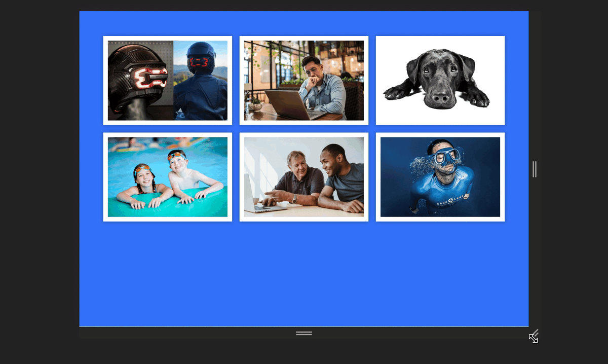
The provided code is an HTML snippet that creates a responsive image gallery using Bootstrap.
This is how it displays:

From the demo shown above, you can see that the images do not expand beyond their containers, even as the screen is being resized.
Let's break down its structure:
<section class="gallery min-vh-100">: This establishes a section with the class "gallery" and sets a minimum height of 100% of the viewport height (min-vh-100), ensuring that the gallery occupies at least the full height of the screen.<div class="container-lg">: Within the section, there's a large container (container-lg), a Bootstrap class that helps control the layout and responsiveness of the content inside.<div class="row gy-4 row-cols-1 row-cols-sm-2 row-cols-md-3">: This creates a row for the gallery, specifying that on small screens (row-cols-1), there should be one column, on medium screens (row-cols-sm-2), there should be two columns, and on large screens (row-cols-md-3), there should be three columns. The gy-4 class adds a margin-bottom of 1.5rem (4 units in Bootstrap's spacing system) between the rows.<div class="col">: Inside each column, there's a div with the class "col," indicating the column structure.<img src="your-image-source.jpg" class="img-fluid">: The class "img-fluid" ensures that the image scales appropriately with its parent container, maintaining responsiveness across different screen sizes.
You can find the complete code for this image gallery demo here.
Pros and Cons of .img-fluid Class
The .img-fluid class in Bootstrap is a powerful tool for creating responsive images. When applied to an image, it makes the image scale with its parent element, ensuring that the image never becomes larger than its container and maintains the aspect ratio.
Pros of the img-fluid class:
- It's a simple and straightforward way to make images responsive. Just adding the .img-fluid class to an image element automatically makes it responsive without needing additional CSS.
- It maintains the aspect ratio of the image, preventing distortion as the viewport changes.
- Bootstrap’s .img-fluid class is designed to work well across different browsers, minimizing cross-browser compatibility issues.
Cons of the img-fluid class:
- It doesn't provide control over the exact size of the image. If you need specific sizing behavior that doesn’t agree with Bootstrap’s predefined responsiveness rules, using the .img-fluid class might not be the best choice.
- Bootstrap is simply a styling framework. Just like the previous method, it can’t optimize an image for different screen resolutions, and this can reduce the quality of the image on larger screens.
The choice between using the .img-fluid class and the CSS width and height attributes or properties depend on the specific needs of your project. If you want to create a responsive design that adjusts to different screen sizes, the .img-fluid class is a good choice. However, if you need more control over the exact size of the image and don’t want to rely on a third-party library, using the width and height attributes or CSS properties might be more suitable.
But if you want the best of both worlds – complete control over the dimensions of your image, as well as responsiveness – in addition to optimization before they are served, and control over the format in which you deliver them so that your users get the best possible viewing experience, you’ll need something more than just styling solutions.
Image Resizing with ImageKit
While Bootstrap provides the .img-fluid class for responsive image resizing and traditional CSS styles provide you the ability to set the width and height attributes, these methods can fall short in certain scenarios.
For instance, specifying the same dimensions can lead to less optimal display on different screen sizes, and your images are also not optimized based on the network speed and device of the end user. These limitations are the reasons why tools like ImageKit come in, as they offer more advanced features for image optimization, transformation, and delivery.
ImageKit is a powerful image and video optimization, transformation, and delivery service along with a feature-packed digital asset management tool and a media library for storing, managing, and collaborating on assets in a central repository.
ImageKit offers a developer-friendly URL-based API, and client and server-side SDKs that enable image resizing via parameters. Once an image is uploaded to ImageKit’s media library, all you have to do is provide the dimensions as query or path params – and ImageKit will generate your requested variant and save it, without affecting the source image.
For example, you can use ImageKit's URL parameters to specify a static width and height of an image, and ImageKit will resize the image to these dimensions.
<img src="https://ik.imagekit.io/hhmnlrce0/demo.jpeg?tr=w-900,h-600" alt="ImageKit example">
In this example, the src attribute of the img tag is set to an ImageKit URL. The URL points to the image demo.jpeg stored in the ImageKit account with the ID hhmnlrce0.
The tr=w-900,h-600 part of the URL is a transformation parameter. It tells ImageKit to resize the image to a width of 900 pixels and a height of 600 pixels. The tr stands for transformation, and w-900, and h-600 specify the width and height of the image.
This transformation is applied in real-time, meaning that the image is resized when it is requested, and the resized image is then cached and served for subsequent requests.

In fact, in most cases, you won’t even need to specify image dimensions explicitly. ImageKit supports Client Hints out of the box, which allows it to use the client's viewport width to auto-adjust the image size accordingly and serve optimally sized images, without the headache of explicitly specifying them via CSS styles or Bootstrap classes.
This can be done by adding a meta tag to your website to enable client hints and then using the sizes attribute in the <img> tag.
<!-- Allow Viewport-Width header to be sent -->
<meta http-equiv="Accept-CH" content="Sec-CH-Viewport-Width">
...

<img src="https://ik.imagekit.io/hhmnlrce0/demo.jpeg" sizes="300px">
In this example, the sizes attribute is used to specify that the image should be 300 pixels wide. The browser takes this 300 pixels and multiplies it with the device pixel ratio. Assuming the device pixel ratio (DPR) is 2, the browser sets the Sec-CH-Width hint to 600, i.e. 300x2. This is the actual size of the image required for the current layout. ImageKit will then use the client's viewport width to adjust the image size accordingly.
ImageKit also ensures that the best format is delivered to your users using the Accept hints without changing the image source URL. From the screenshot below, the browser here accepts the following image formats image/avif,image/webp,image/apng,image/svg+xml,image/*,*/*;q=0.8. Google Chrome is used in this case.

Based on these values, ImageKit will automatically convert the image format ensuring that each user gets the best image format.
You can learn more about client hints here.
Conclusion
Compared to the native ways of resizing images using Bootstrap, ImageKit provides a more advanced and flexible solution. While Bootstrap's .img-fluid class and width and height attributes or CSS properties offer some basic image resizing capabilities, they have limitations when it comes to optimizing images for different screen resolutions or varying internet speeds.
ImageKit, on the other hand, not only provides precise control over image dimensions but also optimizes images for different screen resolutions and internet speeds, ensuring a smooth and optimized user experience.
Furthermore, ImageKit's support for Client Hints and automatic image resizing based on client hints makes it a better choice for delivering responsive images that adapt to different screen sizes and resolutions. This can help improve the user experience on your website, especially for users on different devices and network conditions.
If you're looking for a more advanced and flexible solution for image resizing other than Bootstrap, traditional CSS, or any other library, ImageKit stands as a powerful alternative that can provide a better user experience on your website.
Sign up for free today and explore ImageKit for yourself.