





When building an image-heavy website, like an e-commerce portal or a travel website, images serve a crucial role in narrating the story. Rich graphics help users in exploring content with ease. One of the tools designers use to create engaging visuals is adding effects like changing the image to grayscale, rounding the corners, etc.
But manual graphic editing tools don't work when we have to do this for hundreds of thousands of images. In that case, web developers use CSS to serve cool image effects without any significant dependency on graphic designers.
This article will lay out some of the commonly used CSS image effects that will help you create a unique visual experience for your users. With several examples, you'll learn how to apply effects and animation to photos using CSS techniques; they are as follows:
- Image filter effects like grayscale and blur
- Image shadow effect
- Image rounded corners
- Image rotation with CSS transform
- Image thumbnails
We will use the following image to demonstrate various image effects and animations in this article. The image is stored in imagekit.io and can be accessed through this URL.
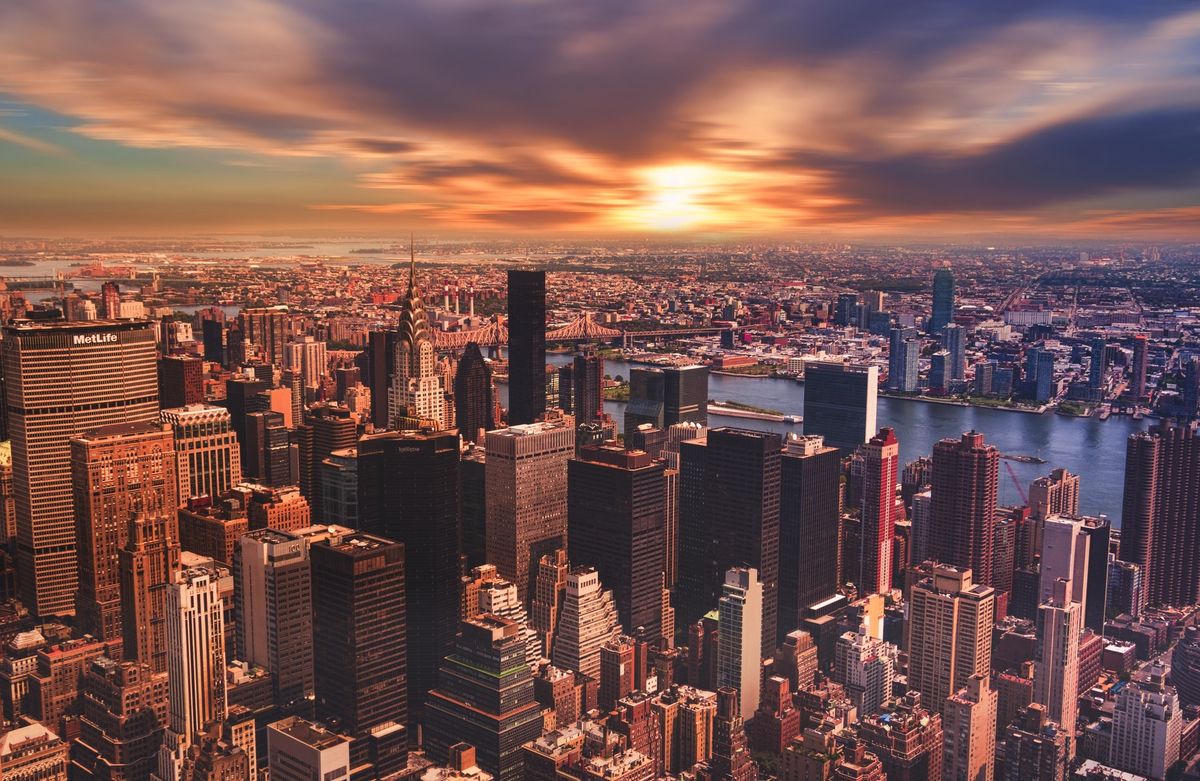
You can use the above URL or create your ImageKit account and upload an image to the Media Library by signing up here.
Now that we have an image to work with let's use it in an HTML document, as shown below. And don't forget to replace the image src with your unique ImageKit URL or any other image source.
<img src="https://ik.imagekit.io/ikmedia/css-image-effects/new-york_lbAbZZKZG.jpg" alt="new york">With the image set and ready, let's get started.
Image Filter Effect
The first image effect is the filter effect. The CSS filter property is one of the most popular ways of adding effects to images or any HTML elements. It allows us to use several functions to apply graphical effects like blur, saturation, or color shift to an element.
This section will teach you how to implement the grayscale() function effect and the filter blur() function effect using CSS.
1. Image Grayscale Effect
The grayscale() function is used to convert an image to grayscale, taking a number (percentage) as input which determines the intensity of the conversion.
A value of 100% will result in a completely grayscale image (black and white), while a value of 0% has no impact on the image colors.
The CSS sample below shows how the grayscale() filter can be applied to an image.
img {
  -webkit-filter: grayscale(100%); /* Safari 6.0 - 9.0 */
  filter: grayscale(100%);
}
The resulting image is shown below.

Go ahead and adjust the percentage value of the grayscale() function above to get your desired black and white image effect.
2. Image Blur Effect
The blur() function uses the Gaussian function in mathematics to blur an image.
Blurring an image is useful for adding text over an image overlay, as it increases the visibility of the text on the image. It can also be used to render low-quality images while lazy load the original image. This is a technique used by websites like Medium to load high-resolution graphics.
The unit of the blur() function can be any of px (pixels), rem (relative to the root font size of HTML document), em (relative to the font size of the parent element), or percentage (%), depending on your choice.
Here is the CSS for the blurred image effect.
img {
  -webkit-filter: blur(5px); /* Safari 6.0 - 9.0 */
  filter: blur(5px);
}
The resulting image is shown below.

We have also created an example with a button overlaid on top of a blurred image using HTML and CSS. You can check it out on CodePen here.
There are a lot of other CSS filter effects that allow you to modify the color tone, brightness, saturation, contrast, etc. You can find a comprehensive list of CSS filters and how to use them on MDN.
Image Shadow Effect
As the name suggests, the image shadow effect allows us to draw a shadow around an HTML element using the box-shadow property. A box-shadow is described by X and Y offsets relative to the element, blur and spread radius, and color.
In the example below, we have created a card from our sample image and added a shadow to it using the box-shadow property. In the CSS snippet below, see the box-shadow property added for the class card for the values of x and y offsets, blur, spread, and shadow color.
HTML to create a card:
<div class="card">
  <img src="https://ik.imagekit.io/ikmedia/css-image-effects/new-york_lbAbZZKZG.jpg" alt="new york" />
  <div class="card-info">
    New York is a city in the United States of America.
  </div>
</div>
CSS to add shadow to the card:
.card {
  width: 550px;
  box-shadow: 0 4px 8px 0 rgba(0, 0, 0, 0.2);
  text-align: center;
}
.card img {
  width: 100%;
}
.card-info {
  padding: 10px;
  font-weight: 500;
}
The final result of the above is a beautiful card with shadows that make it look slightly raised compared to the rest of the page.
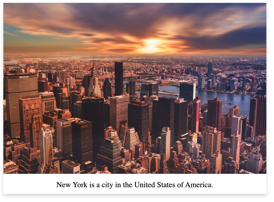
Image Rounded Corners
Rounding the corners of images and, in general, HTML elements is another popular effect used on the web. Some use cases of rounded corner effects are profile images, content cards, and buttons.
Rounded corners can be achieved using the CSS border-radius property, which allows you to specify four different values for the radius on the top-left, top-right, bottom-right, and bottom-left corners, respectively.
border-radius: 15px 15px 15px 15px;Since in the above example, the four corners have the same values, the border-radius property can be rewritten using the CSS shorthand method, as shown below.
border-radius: 15px;This shorthand method applies a radius of 15px to all four corners of the image.
The values of each individual corner radius can be specified using their dedicated CSS properties as well.
border-top-left-radius: 10px;
border-top-right-radius: 20px;
border-bottom-right-radius: 30px;
border-bottom-left-radius: 40px;

/* shorthand */
border-radius: 10px 20px 30px 40px;
You can use any CSS units such as the px, rem, em, or percentage (%) to specify the radius.
To create a rounded corner image, let's apply a radius of 50px to our image using the shorthand method as shown below.
img{
  border-radius: 50px;
}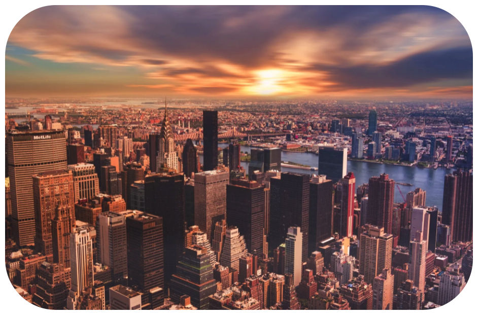
Image Rotation with CSS Transform
In this section, we will see how to rotate an image using the CSS transform property and then extend it to turn it into an animation.
The CSS transform property is very versatile and can be used to apply transformations such as rotate, scale, skew, etc. to an HTML element.
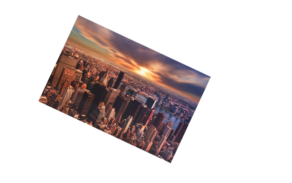
Using the CSS given below, we can rotate the image clockwise by 25 degrees.
img {
  width: 300px;
  transform: rotate(25deg); /* rotate the image in 25 degrees */
}
The transform rotate property can also take a negative value to rotate the image in an anti-clockwise direction, as shown below:
img {
  transform: rotate(-25deg); /* rotate the image in -25 degress */
}
Creating a vibration animation with CSS transform effect
We will now use these clockwise and anti-clockwise rotations using the CSS transform property to create a vibration effect when we hover on the image.
To create an animation, we need to use CSS Keyframes. Keyframes allow us to define the state of an element during an animation. In the example below, we have used small rotations at fixed intervals of 10% of the animation duration. vibrate is the name we have assigned to the keyframe here.
@keyframes vibrate {
  0% { transform: rotate(0deg); }
  10% { transform: rotate(-1deg); }
  20% { transform: rotate(1deg); }
  30% { transform: rotate(0deg); }
  40% { transform: rotate(1deg); }
  50% { transform: rotate(-1deg); }
  60% { transform: rotate(0deg); }
  70% { transform: rotate(-1deg); }
  80% { transform: rotate(1deg); }
  90% { transform: rotate(0deg); }
  100% { transform: rotate(-1deg); }
}
We can now apply the vibrate keyframe to our image on hover as shown below. The infinite value of animation-iteration-count results in the animation going on forever.
img:hover {
  /* Start the vibrate animation with duration 0.5 seconds */
  animation: vibrate 0.5s;

  /* When the animation is finished, start again */
  animation-iteration-count: infinite;
}
Hover on the image below to see it vibrate!
See the Pen Vibration effect using CSS transforms by ImageKit.io (@imagekit_io) on CodePen.
You can create your own animations by combining keyframes and the transform property in CSS to create really cool effects.
Image Thumbnails
An image thumbnail is a low-resolution version of a larger, higher resolution image. You would often see e-commerce companies using image thumbnails on their search or listing pages, which redirect to the product detail page with high-resolution images.
While ideally, an image thumbnail should load a pre-resized, low-resolution image, something that we cover in the next section, we can also use CSS to scale down a high-resolution image in the browser.
To achieve this, we use the width or height property in CSS as shown below.
img {
  width: 300px; /* set a small width */
}
The above CSS results in 300px wide image thumbnail.
Note that we are still loading a large image, and only downscaling it in the browser, which is not ideal for quick page load time or lower page size. Let's look at how ImageKit can be used to solve this problem and also recreate the CSS image effects with it.
Creating Cool CSS Image Effects with ImageKit
ImageKit.io is a complete media management and delivery service that offers real-time intelligent image optimization, image resizing, cropping, and other transformations.
ImageKit's real-time transformations and optimizations help us deliver stylized image thumbnails across all platforms. You can also use these images in emails where extensive CSS is not supported.
This section will demonstrate how to use the ImageKit to achieve some of the effects implemented with regular CSS above.
Image Grayscale Effect with ImageKit
The image grayscale effect can be achieved easily with ImageKit by adding the e-grayscale transformation parameter directly in the image URL as shown below.
https://ik.imagekit.io/ikmedia/css-image-effects/new-york_lbAbZZKZG.jpg?tr=e-grayscaleUnlike an image converted to grayscale in the browser using CSS, the image delivered from the image URL above is grayscale by default.
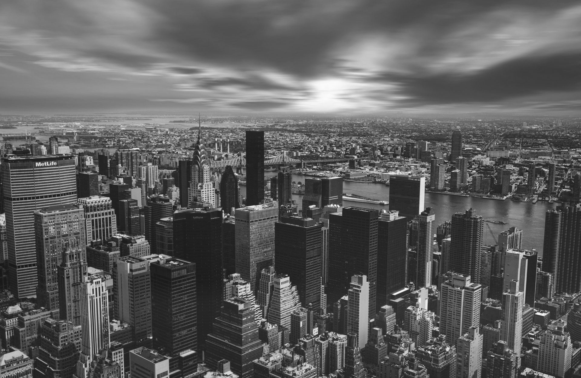
Easy, right? Another advantage is that when you save or open a grayscale image created with ImageKit URL in a new tab, it will retain the black and white effect, unlike the grayscale image made with regular CSS.
Image Blur Effect with ImageKit
The blurred image effect can be achieved with ImageKit by passing the bl-value transformation parameter in the image URL. The value here represents how blurry you want the image to be on a scale of 1 to 100.
For example, the URL below gives us a blurred image with the blur set to 7.
https://ik.imagekit.io/ikmedia/css-image-effects/new-york_lbAbZZKZG.jpg?tr=bl-7
Again, the original image itself here is blurred and we do not need any HTML or CSS to create this effect.
Image Rounded Corners with ImageKit
A rounded image can be achieved using the r-<value> transformation parameter in the image URL. It takes in any positive integers as its value. You can also use r-max to generate a perfectly circular image.
The URL below uses r-max to generate a circular image (downscaled for representation)
https://ik.imagekit.io/ikmedia/css-image-effects/new-york_lbAbZZKZG.jpg?tr=r-max
You can replace the max value in the radius transformation in the URL with any positive integer value to generate an image with the corresponding rounded corner effect.
Image Rotation with ImageKit
ImageKit allows you to rotate an image directly from the URL at specific angles. You simply need to pass the rt-value transformation parameter in the URL. The rotation values allowed are 0, 90, 180, 270, 360, and auto, representing the degrees the image should rotate.
The value auto automatically orients your image correctly using the EXIF Orientation in your image metadata.
The URL below rotates the image by 180 degrees.
https://ik.imagekit.io/ikmedia/css-image-effects/new-york_lbAbZZKZG.jpg?tr=rt-180This results in the following image that is rotated without using any CSS.

Image Thumbnails with ImageKit
When we looked at creating image thumbnails using CSS, we scaled down a high-resolution image in the browser. This is not ideal as the browser still needs to load a heavy image which slows down the load time and wastes the user's bandwidth.
ImageKit's real-time transformations allow us to deliver resized images to the users. Instead of using CSS to scale down the image, we get the ability to load a smaller image. This makes our web page lighter and faster.
For example, we can load a 200px wide image by adding the w-200 transformation parameter to the URL.
https://ik.imagekit.io/ikmedia/css-image-effects/new-york_lbAbZZKZG.jpg?tr=w-200
Or we can load a 400x300 px image by specifying both width and height parameters in our URL.
https://ik.imagekit.io/ikmedia/css-image-effects/new-york_lbAbZZKZG.jpg?tr=w-400,h-300
There are several other resize and cropping options available in ImageKit. You can read more about these options in this detailed dynamic image resizing guide.
Conclusion
CSS effects are great for developers. They can save a lot of time and reduce dependency on graphic design tools for creating cool image effects.
A real-time image transformation tool like ImageKit helps us deliver pre-stylized or resized images to the users without even writing CSS. Since all ImageKit transformations are URL-based, they can be done at scale and on platforms like emails or apps that don't support CSS.
If you want to try ImageKit to create image thumbnails or stylized images, sign up for the free plan now. It comes with a generous quota of free bandwidth and storage to use on your website.