


With the latest updates in Chrome versions 67 and above on, desktops no longer send Client Hints to third-party domain names because of privacy concerns. So if you have a website at www.example.com, Client Hints will not be sent to images.example.com or ik.imagekit.io.Client hints continue to work on mobile devices.
ImageKit now supports automatic image transformations based on Client Hints - DPR, Width, and Save-Data. The support for these Client Hints is available via new transformations dpr-auto for automatic image DPR, w-auto for automatic image width, and a dashboard setting to enable the Save-Data mode for your images. Combine these with ImageKit’s existing image optimization, transformation, and delivery capabilities, and it becomes even simpler to deliver responsive images. Images, optimized and resized perfectly for each device and layout, with absolute minimal effort.
Currently, these features are available to all users using the default “ik.imagekit.io” domain name for image delivery. Users using a custom domain will gradually get access to these features in the coming months.
Responsive images without Client Hints
With the growing number of devices and screen sizes, it is absolutely essential that we design our websites and apps in a way that ensure a great user experience across all devices. Your website should work well and look just as great on an Android Phone as on the latest iPhone, or a tablet, or laptop.

While it has become easier to implement fluid and responsive layouts for our HTML by using CSS libraries like Bootstrap, the same is not true for images.
We often stick to using just one large image across devices which is a major reason for slow loading websites. And even the new srcset and sizes attributes for images, which solve the problem of adapting images in a responsive layout, haven’t become too popular within the developer community.
There are two main reasons for that.
RESOURCE-GENERATION COMPLEXITY
Using srcset for responsive images requires you to generate different sizes of the same image, usually more than 3, to cater to different requirements on various devices.
For example, for an image that stretches across the entire page, you would need images with a width of 1440px for laptops, 960px for tablets, 480px and High-density images for bigger phones, and 320px for smaller phones.
It is complex to generate so many variations of the same images, especially if you are dealing with millions of images. Thankfully, ImageKit already solved this bit for you by enabling real-time resizing and cropping using URL parameters.
MARKUP COMPLEXITY
The other reason, and the more complex one to deal with, is the markup required for responsive images. In our blog, we have covered the use and function of srcset and sizes attribute for responsive images across devices. Using a similar logic, a small example implementing the responsive image with the breakpoints that we mentioned earlier:
<img src="https://ik.imagekit.io/demo/img/default-image.jpg" sizes="(max-width: 960px) 100vw, 50vw" srcset="https://ik.imagekit.io/demo/img/tr:w-360/default-image.jpg 360w, https://ik.imagekit.io/demo/img/tr:w-480/default-image.jpg 480w, https://ik.imagekit.io/demo/img/tr:w-960/default-image.jpg 960w, https://ik.imagekit.io/demo/img/tr:w-1440/default-image.jpg 1440w" />Now imagine having to generate this markup for all the images for your website - banners, product images, profile pictures, etc. The markup is already very complex, and it gets even more complex if you try solving for other factors like DPR. It is often because of the development effort involved in switching to this markup, that companies with access to real-time image resizing capabilities do not switch to completely responsive images.
Additionally, the above markup has its limitations. For example, a user’s preferences, like the Data-Saver mode, cannot be passed to the image server with this markup.
The use of Client Hints
The basic idea of Client Hints is very simple - the device (“client”) sends some “hints” to the server about its requirement, and the server is responsible for serving the right resource based on those hints. Instead of writing the complex markup on the frontend, you let the server do the heavy lifting for you.
For example, with client hints enabled, the browser can tell the server that it needs a 400px wide image for the current layout and the device DPR is 2. The server can decide what image to serve on the basis of these hints.
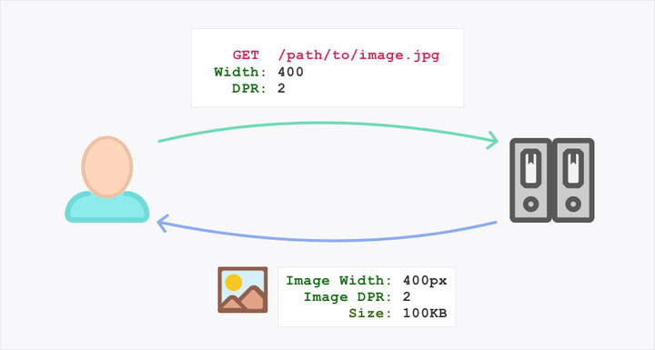
Or, the client can tell the server that the user has enabled the Data-Saver mode on his device, and the server can send a lighter version of the same image back to the user instead of the normal high-resolution version.
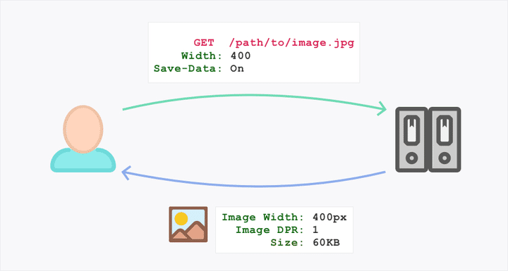
Since it is the browser and the server interacting with each other via Client Hints, your job gets much simpler - shorter, readable markup that can achieve the same functionality as the one shared above.
Following are some examples of how we can start using client hints for our images.
Using Client Hints with ImageKit
You can now leverage the power of client hints — DPR, Width, and Save-Data — for your images being delivered via ImageKit. We will first cover the DPR and Width client hints and later talk about using the Save-Data client hint.
Using automatic DPR for images with ImageKit
The first step towards using client hints is enabling the browser to advertise these hints to the server. By default, client hints are disabled.
You need a simple meta tag in the beginning of your HTML to enable them.
<meta http-equiv="Accept-CH" content="DPR">The code example above enables the browser to send DPR client hint to the browser.

ImageKit already supported numeric DPR transformation using the dpr transformation parameter like dpr-1 to get a 1x image, and dpr-2 to get a 2x image. To support automatic DPR, you can now use dpr-auto in your transformation string and ImageKit will automatically delivery different images to various devices based on their pixel density.
<img src="https://ik.imagekit.io/demo/img/tr:dpr-auto/default-image.jpg"/>The above URL gives a 1x image if the DPR client hint is 1, a 2x image if the DPR client hint is 2, and so on.
One URL to deliver different images customized for each device.
Using automatic width for images with ImageKit
Similar to dpr-auto for automatic DPR in images, you can now use w-auto to resize your images automatically for different layouts using the Width Client Hint.
You can send both, DPR and Width client hints to ImageKit using the following meta tag in the HTML
<meta http-equiv="Accept-CH" content="DPR, Viewport-Width, Width">Additionally, for automatic width to work, you need to tell the server the size of the image in the layout using the sizes attribute.
Automatic resizing works only if the browser sends the Width header to ImageKit, and the browser would send the Width header only if you specify the sizes attribute with the image tag. Therefore, sizes is essential for automatic resizing to work. You can read more about sizes attribute here.
The image tag for an image that occupies 100% of the viewport width (vw) with automatic resizing would look like:
<img src="https://ik.imagekit.io/demo/img/tr:w-auto/default-image.jpg" sizes="100vw" />
With both the tag and the sizes attribute taken care of, the browser starts sending the Width header along with the DPR header.

Similarly, let’s say, for our images we want a 2-column layout on desktops and 1-column layout on mobile devices. The automatic resizing image tag would look like:
<img src="https://ik.imagekit.io/demo/img/tr:w-auto/default-image.jpg" sizes="(max-width: 480px) 50vw, 100vw" />
How does ImageKit use the Width client?
Once ImageKit gets the Width header for an image request, it uses that header value to resize the image. The Width header value is rounded to the next 100 to ensure better caching and performance. For example, if Width header is 476 or 484, ImageKit delivers a 500px wide image in both the cases. If the Width header is 512, then ImageKit delivers a 600px wide image.
Also, the Width header sent by the browser automatically takes into account the DPR value. Thus, if your device DPR is 2 and you specify the size as 200px, the browser would send 400 in the header. So, we do not need to specify the dpr-auto transformation in the URL.
Fallback for automatic width
Not all browsers support client hints. In such cases, we need to have a fallback width. This width can be used for resizing in case the Width header is not available.
We can accomplish that using the following transformation in our image:
<img src="https://ik.imagekit.io/demo/img/tr:w-auto-400/default-image.jpg" sizes="100vw" />The transformation w-auto-400 tells ImageKit to use the Width client hint header if available, else use width equal to 400px to resize the image. This ensures that you are not loading an unnecessarily large image on devices that do not support Client Hints.
Combining automatic width with aspect ratio for accurate resizing
The w-auto transformation allows automatic resizing based on the image width. As the width gets adjusted automatically, the height of the output image also changes. This happens to preserve the complete image and original aspect ratio.
Thus, we can control the image width. But, we are not able to control the output height or the aspect ratio of the final image.
You could specify a fixed height transformation in the URL, like h-200 but it may not give you the desired output for different widths. For example, with the Width header equal to 100, the output image would be 100x200, but with the Width header equal to 300, the output image will be 300x200.
The aspect ratio transformation allows you to control the final dimension of the image by specifying a relative ratio of the width and height. For example, if our layout needs an image to always be in an aspect ratio of 1:1 (i.e, a square; 1 part of width to 1 part of height), we can use the following image transformation:
<img src="https://ik.imagekit.io/demo/img/tr:w-auto-400,ar-1-1/default-image.jpg" sizes="100vw" />In this case, with the Width header equal to 100, the output image would be 100x100 (1:1 ratio), but with the Width header equal to 300, the output image will be 300x300 (1:1 ratio again).
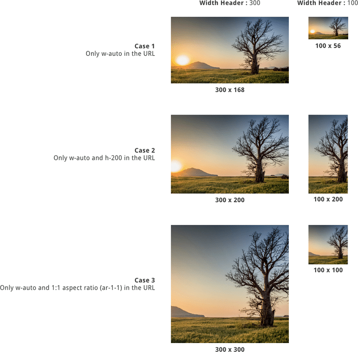
Thus, combining w-auto with a fallback width and the aspect ratio transform will give you easy access to responsive images with great control on the final image output.
Using Save-Data Client Hint
We have talked about automatic DPR and automatic width transform for images. Another client hint that is now supported in ImageKit is Save-Data.
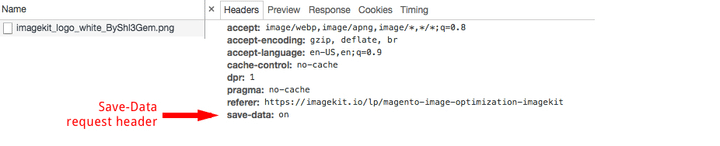
Mobile browsers such as Chrome Mobile and Opera Mobile allow the user to activate a data saver mode. With this mode enabled, the browsers send the Save-Data header with the request, with the value set as on. With this mode disabled, the Save-Data header is not sent at all.
As mentioned in Google’s post about the Save-Data header,
By identifying this header, a web page can customize and deliver an optimized user experience to cost- and performance-constrained users.
This is exactly what ImageKit allows you to do.
If a user is using the data saver mode in his browser, ImageKit compresses the image even further. This reduces the size of the image to ensure faster delivery and lighter resources for that user.
If a user doesn’t use the data saver mode, he continues to get the same image as always. Exactly the same URL that caters to different performance requirements of different users.
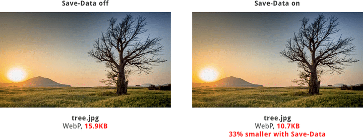
The images are almost 33% smaller when accessed by a client with Save-Data enabled. You can test this in your Chrome desktop by installing this.
Note that the Save-Data client, unlike DPR and Width client hints, will be passed to the server without any changes in your HTML. The Save-Data header will be passed as "on" when the data-saver mode is enabled.
Using Save-Data mode with ImageKit
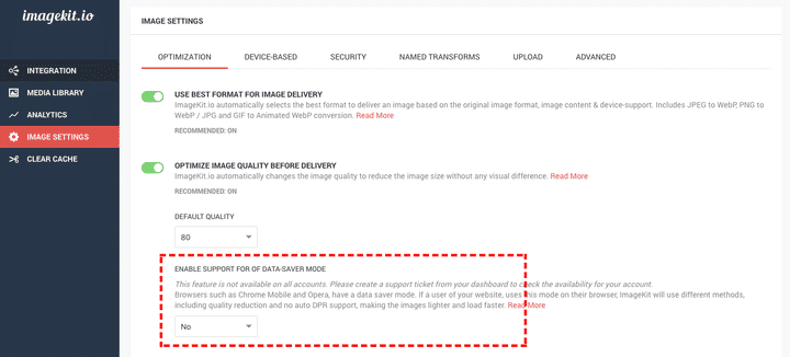
To start utilizing this Save-Data client hint with ImageKit, you need to enable it from your ImageKit dashboard.
Log in to your dashboard,
go to “Image Settings” tab, under “Optimization” set “ENABLE SUPPORT FOR OF DATA-SAVER MODE” to “Yes”.
Browser Support of Client hints
Client Hints is a relatively new specification and not all browsers implement it. At the time of writing this post, Chrome (desktop and mobile), UC Browser, and Samsung Browser do not support Client Hints Chrome alone makes up for almost 60% of the traffic on most websites, if not more.
The Save-Data header is supported by Chrome Mobile 49+, Opera Mobile 35+, and Yandex 16.2+ browsers. Again, a significant percentage of mobile browsing traffic comes from Chrome Mobile and Opera Mobile.
What’s the point of using client hints if not all browsers support it?
If you realize the importance of image optimization, you should definitely implement responsive images on your website.
The best way (the one that is supported by all browsers) to do so is to write the extensive markup involving srcset and sizes attributes of the img tag as discussed earlier.
However, if that's not possible, then using these client hint-based transforms is a simple step towards responsive images. It provides tremendous performance gains for at least 60% of your users, and gracefully falls back to the defaults for the other 40%.
Using the client hint-based transforms involves minimal code changes. Developers can get started with responsive images on their website immediately.
FOR THE GREATER GOOD
Also, for new specs being implemented in browsers, it is a lot like the chicken and egg problem. Browsers won’t implement a specification if users don’t start adopting it, and users won’t adopt the specification if a lot of browsers don’t implement it.
For example, Firefox still doesn’t support WebP and that is one of the reasons why WebP adoption is low. Services like ImageKit make it easier to utilise WebP images wherever possible, with minimum effort.
So, if you haven't implemented responsive images on your website yet, start using the above client hint-based transforms for your images. Your users would love the great experience with perfect images for each device, and the performance boost lighter images bring to your website.
Note: Currently, these features are available to all users using the default “ik.imagekit.io” domain name for image delivery. Users using a custom domain will gradually get access to these features in the coming months.
Are you optimizing your website images? No? Try ImageKit for free and start optimizing now!