











With the retention rate of visuals being much higher than textual content, businesses are leveraging images for all intents and purposes, leading to image-heavy websites. These images, though optimized for contextual consumption, pose a problem.
According to Adobe, 39% of people will stop engaging with a website if images won’t load or take too long to load.
Moreover, they are a threat to fast page loading.
Images carry weight and consume more bandwidth, slowing down page load speed. However, there are ways you can manage your image-heavy website to improve its load time.
So, where to get started? And how to manage an image-heavy website?
We can’t just do away with our images, they are an integral, and more importantly, a crucial part of our website. They ring in engagement and aid conversions by providing visual details of our products and services. But there are ways to use images on our websites without having them weighing it down.
One of the biggest mistakes we make when designing an image-heavy website is not optimizing the images. And even though we know we need to do it, we just don’t know the “how”.
Here we’ll explore the various ways we can optimize our images to reduce bandwidth load and improve page load speed.

To manage an image-heavy website -
Use Rightly-Sized Images
Image dimensions is one of the most common factors affecting image loading. When a maximum-sized image is delivered to the website with changes made in the CSS height and width for the browser, it makes for a heavier page. And loading these consumes more data.
Browser-side image resizing is a standard practice. But while you’re saving time and effort by delivering a large image, you’re wasting an even more precious asset — bandwidth.
Images need to be sized as per requirements. Loading a large image when a smaller one was needed would cost your website in valuable seconds. Even sizing the thumbnails right can bring down the page size considerably!
It is best to generate images in all required sizes, including optimally-sized website thumbnails, and deliver those to the users based on their device resolution and requirements.
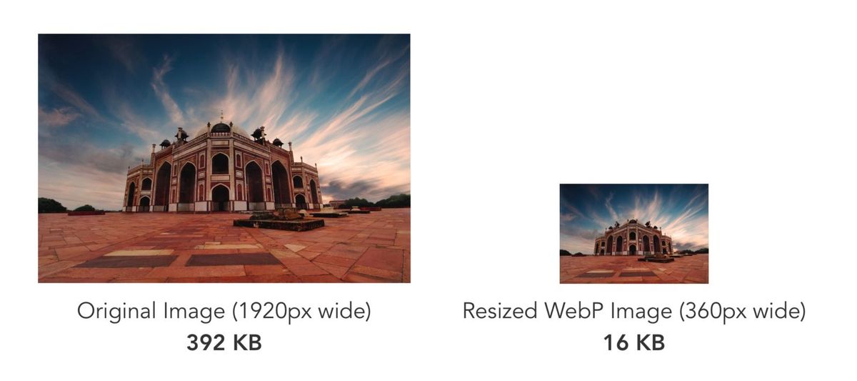
As demonstrated by the example here, a simple resizing can have a significant impact on the weight of the image to be loaded.
Use Responsive Images
While we’re talking about using the right sizes for the images on our websites, we need to talk about the appropriate image sizes for the various viewports.
Our websites are visited by a multitude of people using various devices. Each device has a different viewport, and each such viewport demands a different size of the images served to it.
Most of us make the mistake of serving images in the same size to all viewports while relying on client-side resizing, resulting in the rendering of needlessly large images costing users bandwidth, and slowing down your page load speed. And this practice costs us in unnecessary bandwidth usage as well.
We need to recognize the various devices being used to view our websites, and resize our images based on the various viewports they are being viewed from.
A responsive website is not efficient unless the images on the website are responsive as well.
Use Right Image Formats
The most common image formats are JPG, PNG, and GIF. And most people use any image format willy-nilly for their images without considering the use case and impact it would have on not just the image, but the website as well.
Each image format has its own nuances. PNG format is best suited for logos or for images with any transparency, whereas photographs should be served as JPGs. And then there’s WebP, an image format that encapsulates all the virtues of its predecessors and yet, provides better compression ratios, though hasn’t seen a 100% adoption in browser support yet.
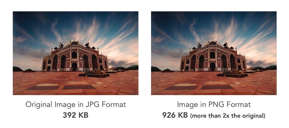
As we can see, the right image formats can influence your website’s bandwidth consumption considerably. And even though selecting them is a task, it is one that should be undertaken for optimum website performance.
With the correct image formats rendered on our websites, we can not just save our visitors some precious seconds, but also preserve our bandwidth usage and hence, costs.
Compress Images
Optimizing the image dimensions is not the only way to reduce image size, you can compress your images as well.
There are two kinds of compressions we can apply to our images - lossy and lossless.
Lossless compression is a set of techniques to compress the file without altering the image quality. On the other hand, with lossy compression, the image quality is tuned down to produce a smaller-sized image, without any perceivable difference in the image. It is pretty obvious that lossy compression results in a much smaller file size compared to lossless compression.
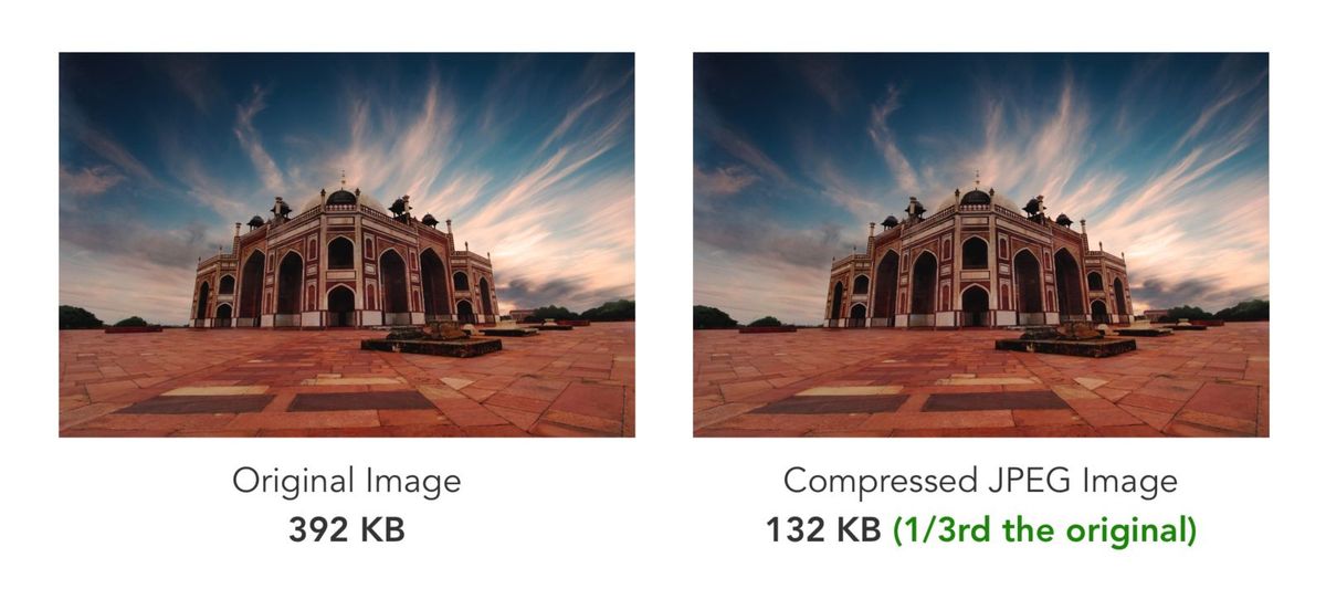
The human eye is incapable of perceiving certain kinds of differences, and image compression leverages just that. You can reduce the size of an image by bringing down the image quality to just the right point where the quality deterioration (if any) is inconceivable to the naked eye.
So assuming on a scale of 100, the image quality is reduced to somewhere between 80-90. Just that much can bring down the image size to 20-25% of the original!
Be Mobile-Friendly
More and more users are shifting to mobile devices for internet browsing. And even search engines recognize the importance of responsive design, making it a critical parameter for rankings in SERPs. Hence, the need for responsive websites.
But what good is responsive design on our website when the images are not responsive too?
Optimizing your images for mobile is not just an after-thought anymore, it needs to be a front-runner.
It is a common misconception that responsive web design is enough to make a website optimally responsive. The images on your website are just as crucial to the process.
With internet users moving to mobile devices for their browsing purposes, everything from bandwidth connections to multiple viewports now plays a significant role in the image optimization strategy of your website.
Why?
Because not optimizing them keeping these factors in mind would make your website crawl.
A common occurrence on most websites is serving the same image across all devices, using browser-side resizing for responsiveness. But that just adds more weight to the website.
Mobile devices don't require such large, heavy images to be served. These assets just consume more bandwidth and waste the user's time. And you end up paying for redundant bandwidth consumption.
A compressed version, optimized for the various viewports would do the job just as well. These lighter, responsive images will consume less bandwidth making them load faster, in turn, speeding up the load time of your website, while saving you those extra bucks.
Optimize Your Image Delivery
What’s the point of all your image optimizations and transformations if they are not delivered fast. The ultimate bottom line for it all is a faster page load, right?
Most people make the egregious error of serving all their assets from their origin servers. And when all website assets are delivered by the same origin, it multiplies the load on the server. And it gets worse if the server is not in proximity to the user. Add both these conditions, and you’ve got a slow website.
Image CDN — that’s what you need.
A Content Delivery Network, or CDN, is a network of servers spread throughout the world. And what it does for you is reduce the response time for requests, leading to faster load times.
For even better page speed, deliver your images through an image CDN with proper caching headers. This helps user’s devices cache the images, saving the user bandwidth and time by serving the cached versions of those images each time the website is loaded, unless the content has been modified.
Use HTTP/2
The size of web pages has evolved, and it’s all because of the uninhibited use of visual assets all over them. And that means network protocols also need an overhaul.
While HTTP/1.1 served us well, it isn’t equipped to handle the current trends. HTTP/2 is the need of the hour.
HTTP/1.1 had the limitation of 6 parallel requests to a domain, which required techniques like domain sharding for better performance. HTTP/2 allows using the same TCP connection for multiple parallel requests, and provides features like server push and header compression using HPACK. This helps cut down latency significantly.
Final Thoughts
Whether you like it or not, your images are weighing down your website. And they cost you in conversions.
Slow-loading websites cost retailers $2.6 billion in lost sales each year, and when 39% of people stop engaging with a website if its images won’t load or take too long to load, you know where to start optimizing.
ImageKit.io offers a seamless solution to manage your image-heavy websites with an easy-to-use tool bundled with one of the world’s best CDNs, and you can get started with it right now for free!