




Last week was a good one for a few different reasons; mainly, because I actioned all of my copyeditor’s feedback and managed to send off the almost-final version of my book, Universal Principles of Typography. Now it’s undergoing one final proofread to correct any typos that might’ve snuck in, and then that’ll be it. Done. Off to the printers with not a single look back.
I’m feeling a mix of emotions about this. Elated that the book is very nearly complete. Terrified that I’ve missed something that needs correcting. Proud that this thing will exist in the real world come March next year(!). But something that’s bothered me a little lately is that I’ve focused so much on getting it completed, I’m not quite sure I’ve managed to savour the process of, well, writing and designing a book. So, as this chapter draws to a close (see what I did there?), I’m very consciously trying to be present in the moment. I’m hoping I won’t look back in hindsight — as I have with so many other projects — and think, “oh yeah, I forgot to enjoy that.”
Anyway, lots of new subscribers recently. Hello! And thank you. OG subscribers might notice that I’ve really leaned into the sporadic side of the newsletter this time — it’s been a busy month (see above), and I figured you wouldn’t mind me holding back until I had big ol’ stack of type links for you. Well, today is that day: this is a pretty mammoth issue. So grab yourself a coffee, or a tea, or perhaps something stronger (hey, it’s five o’clock somewhere) and we’ll get going.
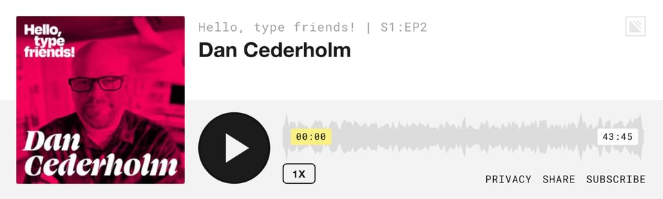
Firstly, huge thanks to those of you who’ve been saying such nice things about the podcast. I hope you’ll forgive me for featuring it as the first link, but I published a new episode. That’s right: Episode #2 of Hello, type friends! was a chat with Dan Cederholm — hugely influential web designer, co-founder of Dribbble, and now type designer. Those of you who like web design nostalgia will really enjoy this episode, but equally I think there’s lots for everyone to appreciate, especially for anyone who’s thinking of starting a new creative pursuit. Apple | Spotify | Google | hellotypefriends.com
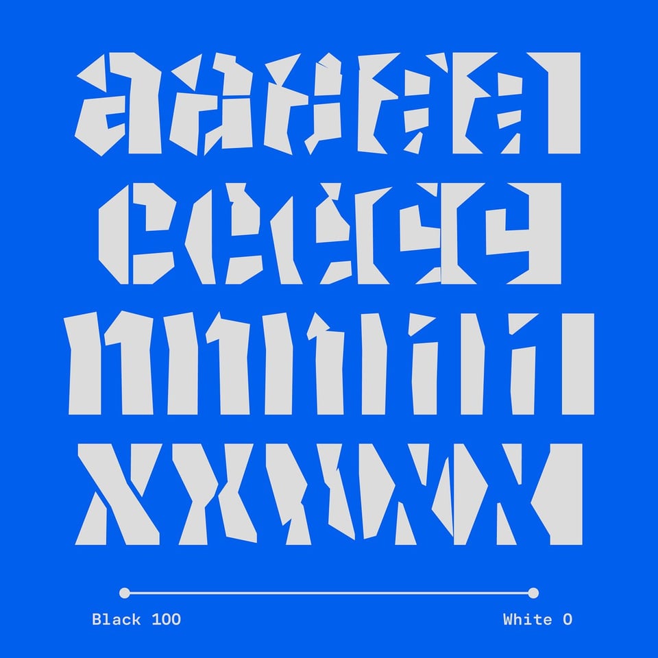
Stephen Nixon recently released v1.0 of Name Sans and updated his Arrow Type website in the process. I do love a process post, and Stephen’s The Story of Name Sans doesn’t disappoint.

Interesting to see more and more foundries starting to play with sub-brands that focus on publishing less complete typefaces that don’t come with all the baggage of the usual releases. Off Type, from Pangram Pangram, caught my eyes a few issues ago. Today, it’s Zetafonts Beats by, well, Zetafonts. Techincally, this is kind of like their own version of Future Fonts — Beats collects “fonts in development that you download and try before their official release.” Nice idea.

It’s not just them: OH no Type Co. have started experimenting with smaller fonts, too, with The Drawer. I love this from James: “We’ll release a new project every month, or whenever we feel like it. Because the Drawer isn’t a place for guilt and obligation. It’s for what brought us here in the first place. The idea that graphic design should be fun.” Amen to that, as they say.
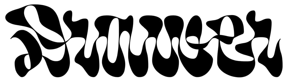
Speaking of Future Fonts… wow, just so many amazing in-progress fonts to be found over there. However, my interest was particularly piqued this week by the release of Invert by Anna Khorash — “an experimental variable typeface with interpolation between shapes and counter shapes.” Although only at v0.1, this is already seriously impressive.
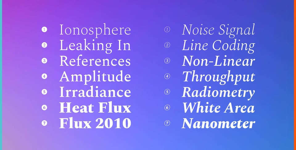
And speaking of variable fonts, my good friend Ty Finck has taken the open-source font Spectral and variable-ised it. I really love Spectral, despite its (IMHO) rather generous spacing, so I’m looking forward to playing with this.
Continuing on the theme of foundries experimenting with new models, I recently noticed that Miles Newlyn is taking a different approach to pricing, offering just one license that covers everything: unlimited domains, unlimited app embeds, etc. The only factor affecting price is the number of employees in the business. The resulting cost per font might initially seem higher than what a lot of other foundries and distributors might offer, but without the need to consider additional use cases, it could actually be a pretty good deal. Plus, Miles offers an annual subscription license option to keep the cost down. (Also interesting is that he doesn’t offer a per-weight option — controversial, perhaps, but I like the simplicity and boldness of that move.)
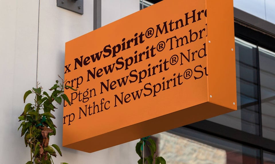
I don’t see myself as much of a calligrapher, but an Instagram ad caught my eye the other day: Start Gothic looks like a pretty interesting course, and they currently have a generous offer on. Maybe now’s the time.

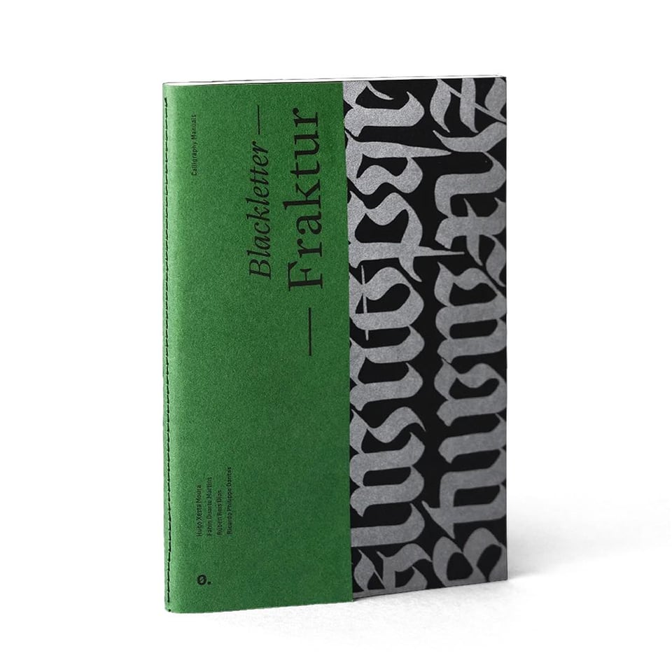
Related to that — because Instagram’s advertising algorithm totally has me sussed — the Blackletter — Fraktur book by Itemzero looks very nice indeed, and a great educational resource. I might not start learning Blackletter calligraphy, but it’s highly possible I might start collecting books about it. And wow, look at all the other beautiful books, prints, and typefaces these talented Itemzero folks are publishing!
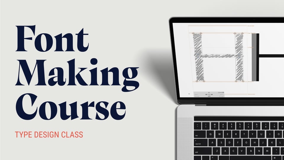
A few issues ago, I mentioned that Viktor Baltus, who runs Type Design Class — a course I’m taking and paid actual money for — gave me an affiliate link to share here. He’s got a Black Friday deal coming very soon, so feel free to wait until then, but if you’re thinking of dipping your toe into the warm waters of type design, please do sign up with my link and I’ll get a little kick-back.
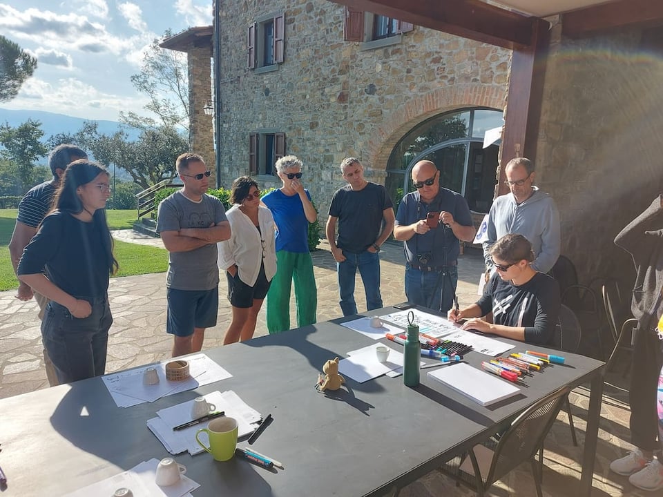
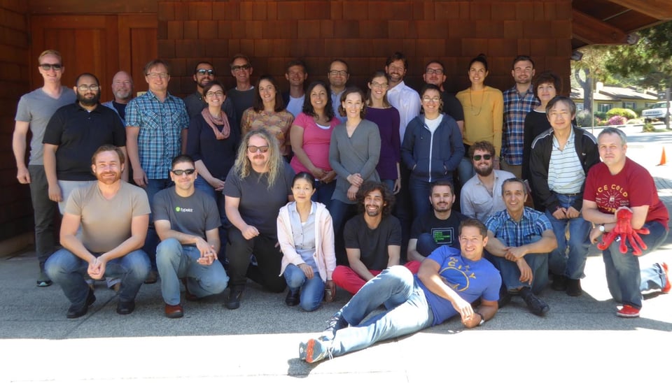
It’s so important to physically get together every now and then when you’re a remote team, and oh wow, I love the look of TypeTogether’s recent annual meeting in Arezzo, Italy. That is how you do a get-together!
When I was at Typekit — which will forever be Typekit to me, not Adobe Fonts — we all went away for a “Typekitpalooza” somewhere in California a couple of times a year, and I have such fond memories of those times. Here’s a photo from one of the final ones I was on, back in July 2015:
Folks who’ve been here for a while might remember that I mentioned TypeTogether’s extensive research into handwriting models taught in schools around the western world, and the typeface they was developed as a result of that research, Playpen Sans. Now it looks like Typotheque have been conducting Typotheque have been conducting their own research into handwriting education, which has resulted in Dash.

Some continued Typotheque news for you: they’ve recently started the Typotheque Club: “The club is free to join, and members will be able to access previews of work in progress and free font trials, as well as receive rewards for purchases and invitations to exclusive online presentations.” The first one is this week, on the 16th, with cognitive psychologist Héctor Mangas, design historian Sébastien Morlighem, and type designer Petra Dočekalová presenting their research into handwriting.

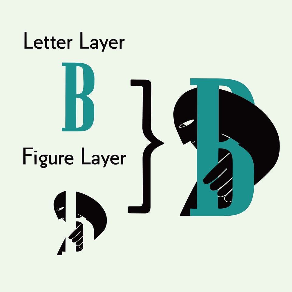
Lena Schmidt’s recently released typeface, Malutzki Initials, is a revival of a 1981 design by Peter Malutzki, found in a book that’s now a part of the Letterform Archive’s collection. Not my usual cup of tea, but I love the experimentation here, and I’m a sucker for layer fonts at the moment.
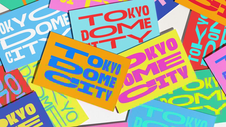
It’s nice to see folks experimenting with variable fonts in such a way that shows off the fluidity of the type, even in a static medium. That’s the case with the branding for Tokyo Dome City, recently profiled on Creative Boom.
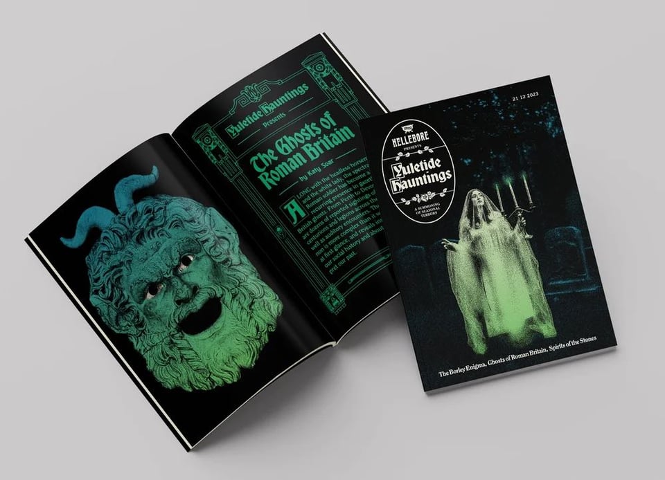
The last link for today is not explicitly typographic, but I hope you’ll enjoy it anyway: I recently discovered the wonderful Hellebore magazine, which is so beautifully designed and typeset that I don’t think an interest in the occult is a prerequisite for enjoyment. And oh, look, the magazine’s editor is based right here in Bristol! Nice. Their forthcoming special edition, Yuletide Hauntings, looks like a great stocking filler.
Phew. That was a lot of links. Was it too many, even? I’m still playing with the format here, and your feedback is always very welcome. Unless it’s really bad. Then please just scream it into a nearby pillow.
Next week, the newsletter worlds will combine when I meet Skylar Renslow of The Daily Grog for a beer or two while he’s visiting Bristol. He’s starting a pop-up newsletter, Craig-style, to “chronicle an upcoming pub and cask-ale-fueled trip through England and Wales” called The Morning Tipple.
Thanks for reading! As a reminder, this newsletter is made by me with zero AI, zero ads, and zero consideration for any sort of algorithm. To help me keep writing it, please consider buying my books or hiring me to speak at your event. And please do email me if you’d like to chat out about any of the above — I always respond.
You’ve just read the online version of my newsletter. Want to subscribe for free and get the next one straight into your inbox?
此内容由惯性聚合(RSS阅读器)自动聚合整理,仅供阅读参考。 原文来自 — 版权归原作者所有。