


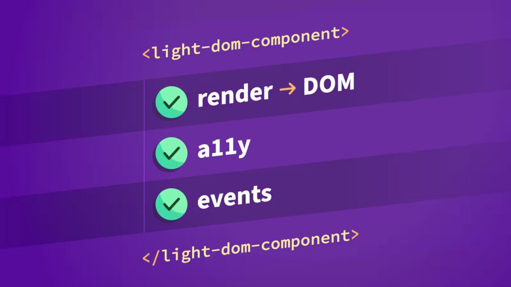
A recent project of ours involved modernizing a large, decades-old legacy web application. Our fantastic design team redesigned the interfaces and created in-browser prototypes that we referenced throughout development as we built HTML/CSS patterns and HTML web components. For the web components, we used the Light DOM and progressive enhancement where possible, keeping accessibility front and center.
Going in, we weren’t sure how challenging it’d be to write tests for HTML web components. Spoiler alert: It wasn’t too different than testing framework-specific components (e.g., Vue or React) and in some cases, even easier!
For a project of this scope, a strong test suite was crucial, as it enabled us to focus on new features instead of constantly fixing regression bugs and repeating manual browser testing again and again. These are the patterns that worked well for us.
Permalink to The web component testing stack we used
Our testing stack consisted of:
jsdom environmentrender() function and html templates to render to the DOM@testing-library/user-event – User interaction simulation@testing-library/jest-dom – DOM-specific matchers, for example toBeVisible(), toBeChecked(), and toHaveFocus()vitest-axe – Automated accessibility rule checking (to catch low-hanging fruit)eslint-plugin-testing-library and eslint-plugin-jest-dom ESLint plugins to help enforce testing best practicesMost of these tools are standard. The interesting choice here is using Lit’s html and render() in the tests. We built our first (and one of the most complex) web components with Lit, then switched to vanilla web components for the rest. Since lit was already a dependency, we continued to use its templating features, expressions, conditionals, and directives in our tests. A few of the benefits:
Overall, a better, more efficient developer experience.
Worth noting, there is also a standalone lit-html library that we could have used instead of the full lit package. lit-html provides html and render, as well as the directive modules. Today I learned. 🙂
Permalink to Light DOM web components simplified testing
One of the most impactful early architectural decisions we made was to build all web components using the Light DOM instead of Shadow DOM. While we didn’t realize it at the time, it dramatically simplified testing and component composition.
From a testing perspective, it meant we could query anything, anywhere, anytime:
render(
  html`
    <my-amazing-component>
      <my-tree-component
        data=${JSON.stringify(jsonData())}
      ></my-tree-component>
      <dialog></dialog>
    </my-amazing-component>
  `,
  document.body,
);Code language: JavaScript (javascript)
With Shadow DOM, we’d need something like:
// ❌ What you'd have to do with Shadow DOM
const component = document.querySelector('my-amazing-component');
const shadowRoot = component.shadowRoot; // May be null!
const button = shadowRoot?.querySelector('button'); // Doesn't cross boundaries
// Or use special testing utilities that pierce shadow boundaries
// And if there are nested shadow boundaries, *eek!* 😬Code language: JavaScript (javascript)
With Light DOM, it’s much simpler:
// ✅ What we actually do
const component = document.querySelector('my-amazing-component');
const button = component.querySelector('button'); // Just worksCode language: JavaScript (javascript)
And Testing Library queries also just work:
render(validationExample(), document.body);

// screen.getByRole() finds elements INSIDE your components
const emailInput = screen.getByRole('textbox', { name: /email/i });
const submitBtn = screen.getByRole('button', { name: 'Submit' });

// These work because there's no Shadow DOM boundary blocking queries
await user.click(submitBtn);
expect(emailInput).toHaveAttribute('aria-invalid', 'true');
expect(emailInput).toHaveFocus();Code language: JavaScript (javascript)
Testing Library’s philosophy is “query like a user would.” With Light DOM web components, the mental model matches perfectly.
Permalink to Testing web component events
Most, if not all, web components we built dispatched custom events with detail data. We used the following Vitest features to confirm the expected event data:
it('Emits change event when "Confirm" is clicked', async () => {
  const user = userEvent.setup();
  render(
    html`<my-tree-component
      data=${JSON.stringify(jsonData())}
    ></my-tree-component>`,
    document.body,
  );


  const changeHandler = vi.fn();
  document.addEventListener('my-tree-component-change', changeHandler);


  const confirmButton = screen.getByRole('button', { name: /^confirm$/i });
  await user.click(confirmButton);


  expect(changeHandler).toHaveBeenCalledWith(
    expect.objectContaining({
      type: 'my-tree-component-change',
      detail: {
        action: 'change',
        selectedEntityIds: ['test1'],
      },
      bubbles: true,
    }),
  );


  document.removeEventListener('my-tree-component-change', changeHandler);
});
Code language: TypeScript (typescript)
Permalink to Testing hidden inputs generated by web components
One of our goals was to minimize the need for legacy backend code refactors. The legacy application relied on good ol’ traditional form submission architecture. Some of the legacy UI relied on JavaScript-generated hidden inputs that satisfied the backend code. Our new web components needed to match this behavior.
When testing the hidden inputs feature of a web component, Light DOM web components made it much simpler because any hidden inputs created by the web component are included in the form submission automatically:
render(
  html`
    <form>
      <my-tree-component
        data=${JSON.stringify(jsonData())}
      ></my-tree-component>
      <button type="submit">Submit the form</button>
    </form>
  `,
  document.body,
);


const form = document.querySelector('form') as HTMLFormElement;


const hiddenInputs = form.querySelectorAll('input[type="hidden"][name="entity"]');
expect(hiddenInputs).toHaveLength(5);


const formData = new FormData(form);
const entities = formData.getAll('entities');
expect(entities).toHaveLength(5);
Code language: JavaScript (javascript)
In some cases, we needed to confirm the hidden inputs rendered in a specific order with specific prefixed values. To test this, Vitest’s toMatch() assertion with regular expressions came in handy:
expect(entities[0]).toMatch(/^OP(AND|OR|NOR|NAND)$/);
expect(entities[1]).toMatch(/^EL/);
expect(entities[2]).toMatch(/^OP(AND|OR|NOR|NAND)$/);
expect(entities[3]).toMatch(/^EL/);
expect(entities[4]).toMatch(/^EL/);Code language: JavaScript (javascript)
Permalink to Testing both attribute and property APIs
Most of the web components supported both declarative (HTML attributes) and imperative (JavaScript properties) APIs. We added basic “render” tests for each use case:
it('Renders via `content` attribute', () => {
  render(
    html`<my-data-table
      data=${JSON.stringify(jsonData())}
    ></my-data-table>`,
    document.body,
  );

  const tableEl = screen.getByRole('table');
  expect(tableEl).toBeVisible();
});

it('Renders via `content` property', () => {
  render(html`<my-data-table></my-data-table>`, document.body);


  const component = document.querySelector('my-data-table') as MyDataTable;
  component.data = jsonData();

  const tableEl = screen.getByRole('table');
  expect(tableEl).toBeVisible();
});
Code language: TypeScript (typescript)
Permalink to Typing web component references
We wrote all web components and tests in TypeScript. This helped catch API changes anytime we refactored or fixed bugs. In tests where we wanted to access component properties or methods, we needed to add a type assertion since querySelector() can possibly return null:
render(
  html`<my-tree-component
    data=${JSON.stringify(jsonData())}
  ></my-tree-component>`,
  document.body,
);


const myTreeComponent = document.querySelector(
  'my-tree-component',
) as MyTreeComponent;


expect(myTreeComponent.treeNodes).toHaveLength(21);
myTreeComponent.data = newData;
Code language: JavaScript (javascript)
Permalink to Tests and Storybook stories shared Lit html templates
html templates
As mentioned earlier, sharing Lit html templates helped reduce boilerplate and standardized how we set up all tests and Storybook stories. Below is an example Lit html template for an input validator component:
// input-validator-example.ts

import { html } from 'lit';
import { ifDefined } from 'lit/directives/if-defined.js';

export interface InputValidatorExampleArgs {
	type: HTMLInputElement['type'];
	validationError?: string;
	required?: boolean;
	pattern?: string;
	ariaDescribedby?: string;
}

/**
 * Used by tests and Storybook stories.
 */
export function inputValidatorExample({
	type,
	validationError,
	required = true,
	pattern,
	ariaDescribedby,
}: InputValidatorExampleArgs) {
	const inputId = `input-${type}`;
	let label = type.charAt(0).toUpperCase() + type.slice(1);

	if (type === 'select') {
		label = `${label} an option`;
	}

	if (type === 'text' && pattern) {
		label = `${label} with regex pattern`;
	}

	let field;
	if (type === 'select') {
		field = html`
			<select
				id=${inputId}
				?required=${required}
				?pattern=${pattern}
				aria-describedby=${ifDefined(ariaDescribedby)}
			>
				<option value=""></option>
				<option value="1">Option 1</option>
				<option value="2">Option 2</option>
				<option value="3">Option 3</option>
			</select>
		`;
	} else if (type === 'textarea') {
		field = html`
			<textarea
				id=${inputId}
				minlength="10"
				?required=${required}
				?pattern=${pattern}
				aria-describedby=${ifDefined(ariaDescribedby)}
			></textarea>
		`;
	} else {
		field = html` <input
			id=${inputId}
			.type=${type}
			minlength=${ifDefined(type === 'password' ? '5' : undefined)}
			?required=${required}
			.pattern=${ifDefined(pattern) as string}
			aria-describedby=${ifDefined(ariaDescribedby)}
		/>`;
	}

	return html`
		<div class="form-group">
			<label for=${inputId}>${label}</label>
			<input-validator validation-error=${ifDefined(validationError)}>
				${field}
			</input-validator>
		</div>
	`;
}Code language: TypeScript (typescript)
This allowed us to use the same HTML for both tests and Storybook stories:
// InputValidator.test.ts

render(inputValidatorExample({ type: 'tel' }), document.body);Code language: TypeScript (typescript)
// InputValidator.stories.ts
/**
* The component supports various `<input>` `type` values. Below are examples
* of different input types that can be used with the component.
*/
export const VariousInputTypesSupported: Story = {
render: () =>
html`${[
'email',
'url',
'password',
'tel',
'number',
'date',
'time',
'datetime-local',
'month',
'week',
'search',
'text',
'checkbox',
].map((type) => inputValidatorExample({ type }))}`,
};Code language: TypeScript (typescript)Permalink to Testing for accessibility
Building accessible user interfaces is something we believe in and strive for as a team. Our web component tests helped reinforce this core value.
Permalink to Every web component had an accessibility violation test assertion
As a baseline standard practice, we always included a vitest-axe toHaveNoViolations() test assertion (including checking multiple UI states as needed):
it('Has no accessibility violations', async () => {
  render(formValidatorExample(), document.body);

  const component = document.querySelector('form-validator') as HTMLElement;
  const submitBtn = screen.getByRole('button', { name: 'Submit' });

  // Initial form state
  expect(await axe(component)).toHaveNoViolations();

  // Invalid form state
  await user.click(submitBtn);
  expect(await axe(component)).toHaveNoViolations();
});
Code language: JavaScript (javascript)
Permalink to Testing Library ByRole queries as the default query
ByRole queries as the default query
With all our tests, we’d default to querying the DOM using Testing Library’s ByRole queries with accessible names. If a query fails, the control is not accessible (either an incorrect role or an incorrect/missing accessible name):
const submitBtn = screen.getByRole('button', { name: 'Submit' });Code language: JavaScript (javascript)Remember: The “first rule of ARIA” is to prefer native, semantic HTML elements and only introduce ARIA roles as needed. In both cases, ByRole queries help confirm the proper role.
Permalink to Assertions for ARIA attributes where applicable
In some cases, we’d assert certain ARIA attribute values where it made sense, for example:
expect(input).toHaveAttribute('aria-invalid', 'false');Code language: Bash (bash)Permalink to Testing focus management
Keyboard users rely on proper focus management. For example, forms should move focus to the first invalid field on validation:
it('Validates an empty form on submit', async () => {
  // … setup

  // Submit empty form
  await user.click(submitBtn);

  // Focus moves to first invalid field
  expect(emailInput).toHaveFocus();
});
Code language: JavaScript (javascript)
Other use cases where focus management assertions are important include testing that the focus returns to the appropriate elements after dialogs close or actions complete.
Tip: As part of our development process, we use our keyboards to navigate through the UI. Did the Tab jump to the control we expected? Did we expect the Escape key to close a dialog? After submitting an invalid form, is the focus on the first invalid input? Not using a mouse and manually testing these scenarios with a keyboard helps guide the assertions we include in the tests.
Permalink to Test file organization
As our test suite grew, we started organizing test files by feature or concern. This helped avoid monolithic Component.test.ts files with hundreds of tests. Here are the common test file categories we saw occur organically:
Permalink to Interaction tests: ComponentName.interactions.test.ts
ComponentName.interactions.test.ts
Tests included assertions for user interactions, click handlers, keyboard navigation, and UI state changes in response to user actions.
Permalink to Event tests: ComponentName.events.test.ts
ComponentName.events.test.ts
Tests included assertions for custom event emissions, event bubbling, and event payloads.
Permalink to Rendering tests: ComponentName.rendering.test.ts
ComponentName.rendering.test.ts
Tests included assertions for initial render, conditional rendering, and DOM structure.
Permalink to Feature-specific tests: ComponentName.feature.test.ts
ComponentName.feature.test.ts
For specific features, we named test files after the feature:
ComponentName.hidden-inputs.test.tsComponentName.sorting.test.tsComponentName.validation.test.tsPermalink to Directory structure patterns
We preferred to collocate the test files next to the component or feature. This kept the test suite maintainable, discoverable, and faster to run. We found it easier to find and run tests for specific features.
Permalink to Pattern 1: Tests alongside component
For simpler components:
ComponentName/
├── _component-name.css
├── ComponentName.ts
├── ComponentName.stories.ts
├── ComponentName.interactions.test.ts
├── ComponentName.rendering.test.ts
└── ComponentName.events.test.ts
Permalink to Pattern 2: Feature sub-directories with tests
For complex features that warrant their own folder:
ComponentName/
├── _component-name.css
├── ComponentName.ts
├── ComponentName.stories.ts
├── validation/
│   ├── use-validation.ts
│   ├── ComponentName.validation.test.ts
│   ├── ComponentName.validation.initial-render.test.ts
│   └── ComponentName.validation.attribute-changes.test.ts
├── single-select/
│   ├── component-name-single-select-example.ts // The `html` template for tests
│   └── ComponentName.single-select.test.ts
├── multi-select/
│   ├── component-name-multi-select-example.ts // The `html` template for tests
│   └── ComponentName.multi-select.test.ts
└── pre-select/
    ├── use-pre-select.ts
    ├── use-pre-select.test.ts
    └── use-pre-select.object-support.test.ts

Code language: JavaScript (javascript)
Permalink to Pattern 3: Helper/utility tests
Tests for pure functions and utilities:
MyTreeComponent/
├── _my-tree-component.css
├── MyTreeComponent.ts
├── MyTreeComponent.interactions.test.ts
├── MyTreeComponent.events.test.ts
└── helpers/
    ├── flatten-tree.ts
    ├── flatten-tree.test.ts
    ├── generate-node-id.ts
    ├── generate-node-id.test.ts
    ├── set-tree-ids.ts
    └── set-tree-ids.test.ts

Code language: Access log (accesslog)
Permalink to Using a for/of loop to run repetitive test assertions
for/of loop to run repetitive test assertions
This pattern isn’t groundbreaking, but there were times when we used an array of input names and a for/of loop to run the same assertions against multiple inputs.
For example, without a loop:
const dataTable = document.querySelector('data-table') as DataTable;

expect(within(dataTable).getAllByRole('checkbox')).toHaveLength(6);

const selectAllCheckbox = within(dataTable).getByRole(
	'checkbox',
	{ name: 'Select all' }
);
expect(selectAllCheckbox).toBeVisible();
expect(selectAllCheckbox).toBeChecked();

const entity01Checkbox = within(dataTable).getByRole(
	'checkbox',
	{ name: 'Select Entity_01' }
);
expect(entity01Checkbox).toBeVisible();
expect(entity01Checkbox).toBeChecked();

const entity02Checkbox = within(dataTable).getByRole(
	'checkbox',
	{ name: 'Select Entity_02' }
);
expect(entity02Checkbox).toBeVisible();
expect(entity02Checkbox).toBeChecked();

const entity03Checkbox = within(dataTable).getByRole(
	'checkbox',
	{ name: 'Select Entity_03' }
);
expect(entity03Checkbox).toBeVisible();
expect(entity03Checkbox).toBeChecked();

const entity04Checkbox = within(dataTable).getByRole(
	'checkbox',
	{ name: 'Select Entity_04' }
);
expect(entity04Checkbox).toBeVisible();
expect(entity04Checkbox).toBeChecked();

const entity05Checkbox = within(dataTable).getByRole(
	'checkbox',
	{ name: 'Select Entity_05' }
);
expect(entity05Checkbox).toBeVisible();
expect(entity05Checkbox).toBeChecked();

Code language: JavaScript (javascript)
Using a for/of loop:
const checkboxNames = [
	'Select all',
	'Select Entity_01',
	'Select Entity_02',
	'Select Entity_03',
	'Select Entity_04',
	'Select Entity_05',
];
const dataTable = document.querySelector('data-table') as DataTable;

expect(within(dataTable).getAllByRole('checkbox')).toHaveLength(
	checkboxNames.length,
);
for (const name of checkboxNames) {
	const checkbox = within(dataTable).getByRole('checkbox', { name });
	expect(checkbox).toBeVisible();
	expect(checkbox).toBeChecked();
}
Code language: JavaScript (javascript)
Using the for/of loop felt cleaner and was easier to maintain.
Permalink to Thinking critically about clicking various controls at once
This is less a pattern and more a reminder for our future selves to not just accept all ESLint rules without critical thinking.
Initially, we did the following:
// Expand each of the root nodes.
const tools = screen.getAllByRole('group', { name: /^tool\\\\./i });
for (const tool of tools) {
	await user.click(tool);
}

// Expand each of the second-level nodes.
const services = screen.getAllByRole('group', { name: /^service\\\\./i });
for (const service of services) {
	await user.click(service);
}
Code language: JavaScript (javascript)
However, the no-await-in-loop ESLint rule flagged the await within the for/of loop. Technically, the rule is correct:
Performing an operation on each element of an iterable is a common task. However, performing an
awaitas part of each operation may indicate that the program is not taking full advantage of the parallelization benefits ofasync/await.Often, the code can be refactored to create all the promises at once, then get access to the results using
Promise.all()(or one of the other promise concurrency methods). Otherwise, each successive operation will not start until the previous one has completed.
The ESLint rule suggested the following:
// Expand each of the root nodes.
const tools = screen.getAllByRole('group', { name: /^tool\\\\./i });
await Promise.all(tools.map((tool) => user.click(tool)));

// Expand each of the second-level nodes.
const services = screen.getAllByRole('group', { name: /^service\\\\./i });
await Promise.all(services.map((service) => user.click(service)));
Code language: TypeScript (typescript)
That makes sense. However, for our use case, we want each successive operation to wait until the previous one has completed. Imagine a user clicking various UI controls. The user will not be clicking all of them at once, it’d be impossible! Instead, the user would click the controls one by one. Our tests should match how a user will interact with our UI. Additionally, if the DOM updates after each click, a race condition may occur, potentially making the test flaky.
We ended up turning off the no-await-in-loop rule in each of those lines with a comment to help explain why we disabled the ESLint rule:
// Expand each of the root nodes.
const tools = screen.getAllByRole('group', { name: /^tool\\\\./i });
for (const tool of tools) {
	// We want to run the clicks sequentially to avoid UI race conditions.
	// Additionally, this closer aligns with how a real user would interact with the UI.
	// eslint-disable-next-line no-await-in-loop
	await user.click(tool);
}

// Expand each of the second-level nodes.
const services = screen.getAllByRole('group', { name: /^service\\\\./i });
for (const checkbox of individualCheckboxes) {
	// We want to run the clicks sequentially to avoid UI race conditions.
	// Additionally, this closer aligns with how a real user would interact with the UI.
	// eslint-disable-next-line no-await-in-loop
	await user.click(checkbox);
}
Code language: JavaScript (javascript)
Permalink to Avoid leaking state between tests
An important detail I want to highlight in particular: We need to reset the document body after each test run to avoid leaking state. In our case, we set this up globally in our vitest-setup.ts config file using the Vitest afterEach() teardown function. That way, we wouldn’t have to worry about manually adding this in each test or accidentally forgetting:
// vitest-setup.ts

/**
 * We are using Lit's `render` and `html` functions to render in the tests.
 * We need to reset the document body after each test to avoid leaking state.
 */
afterEach(() => {
  render(html``, document.body);
});Code language: TypeScript (typescript)
Permalink to Adding basic dialog functionality to jsdom
Our tests used jsdom. There is an open jsdom HTMLDialogElement issue that remains unresolved. We ended up mocking the HTMLDialogElement show(), showModal(), and close() methods in the vitest-setup.ts file as follows:
// vitest-setup.ts

// Add basic dialog functionality to jsdom
// @see https://github.com/jsdom/jsdom/issues/3294
HTMLDialogElement.prototype.show = vi.fn(function mock(
  this: HTMLDialogElement,
) {
  this.open = true;
});
HTMLDialogElement.prototype.showModal = vi.fn(function mock(
  this: HTMLDialogElement,
) {
  this.open = true;
});
HTMLDialogElement.prototype.close = vi.fn(function mock(
  this: HTMLDialogElement,
) {
  this.open = false;
});Code language: TypeScript (typescript)
This workaround allowed us to keep moving forward with any tests that included HTML dialog element assertions.
Permalink to Wrapping up
At the beginning of the project, I was feeling a bit nervous because I wasn’t sure how easy it would be to test HTML web components. Choosing to build Light DOM web components was absolutely the right choice, and once we got rolling, it made testing HTML web components no different from testing framework-specific components. I’m elated to have gone through this experience, and I must say, I love me some HTML web components. ❤️
Permalink to More resources
此内容由惯性聚合(RSS阅读器)自动聚合整理,仅供阅读参考。 原文来自 — 版权归原作者所有。