












Ok, let me get this out in the open: I love the new hex map in Calibre, maybe more than I should. Two weeks of wrestling with point-in-polygon calculations, tolerance settings, and the question of whether Tasmania is big enough to fill a 4-pixel hexagon (dear reader, it is not), and I’d do it all again. Let me show you how I built hex map.
Mapping real user sessions by performance#
"Hex map" is a dynamic map visualisation summarising user experience sessions from each country, displayed in the Real User Monitoring (RUM) Audience report.

The map is made up of interlocked hexagons, each representing a country. The colour of each country indicates Calibre’s UX Rating, based on overall performance.
As user sessions are observed, countries light up in the map. You can gain a lot of empathy and understanding when segmenting by UX Rating.
Design goals#
After viewing maps in products I knew, and surveying existing libraries and paid mapping services, it was clear I wanted something more simple, elegant, and maybe a bit more artistic. The requirements were:
- Load fast, and feel light-weight
- Visually display country-level UX Rating
- Intentionally low-fi, a visual element to enjoy and tell a story
- Work on all browsers
- Have light and dark colour mode themes to match the app
Research and inspiration#
With any creative data visualisation project, you want to look for examples in the wild. A few things kept pulling me in: the low-fi blockiness of voxels, numerous beautiful election voter maps, and more abstract geo visualisations.
I’ve always enjoyed the datavis used on election nights. Providing valuable illustrations for viewers who likely aren’t used to looking at visualisations is a bit of an art form. Hex cartograms do a great job of compacting data into beautiful visual elements that help tell a story without being too much.
Given a brief of visual simplicity, hexagonal maps were perfect and given my experience with SVG and D3, I knew I could quickly iterate to a high quality map.
Getting the detail right#
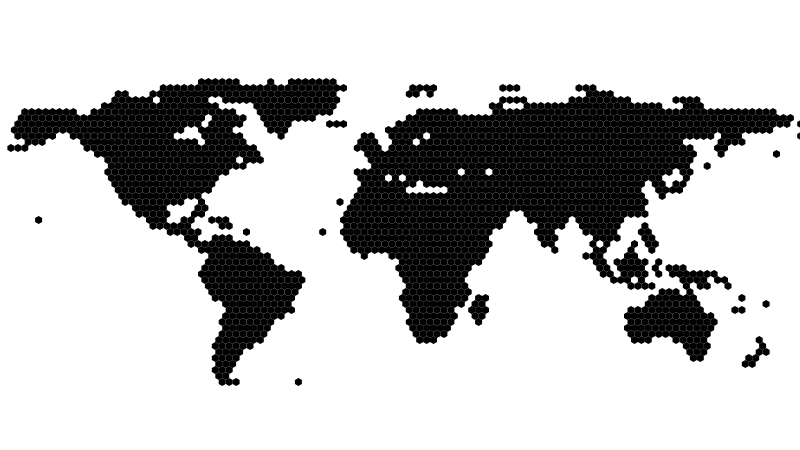
I wanted the map to feel blocky and not too detailed. Hexes at about 4 pixels wide felt right, low-fi enough to feel like an illustration rather than a satellite image.
Where the real work came in, was the map data itself. High-resolution geojson is hefty, but can be significantly reduced by simplifying paths (country borders). Oversimplify and countries merge, islands disappear. It’s a balance.
I started with 10 meter accuracy country boundaries and ran them through Turf’s excellent simplify function, iterating on the tolerance until countries were still recognisable at 4 pixels without overwhelming the visual with detail.
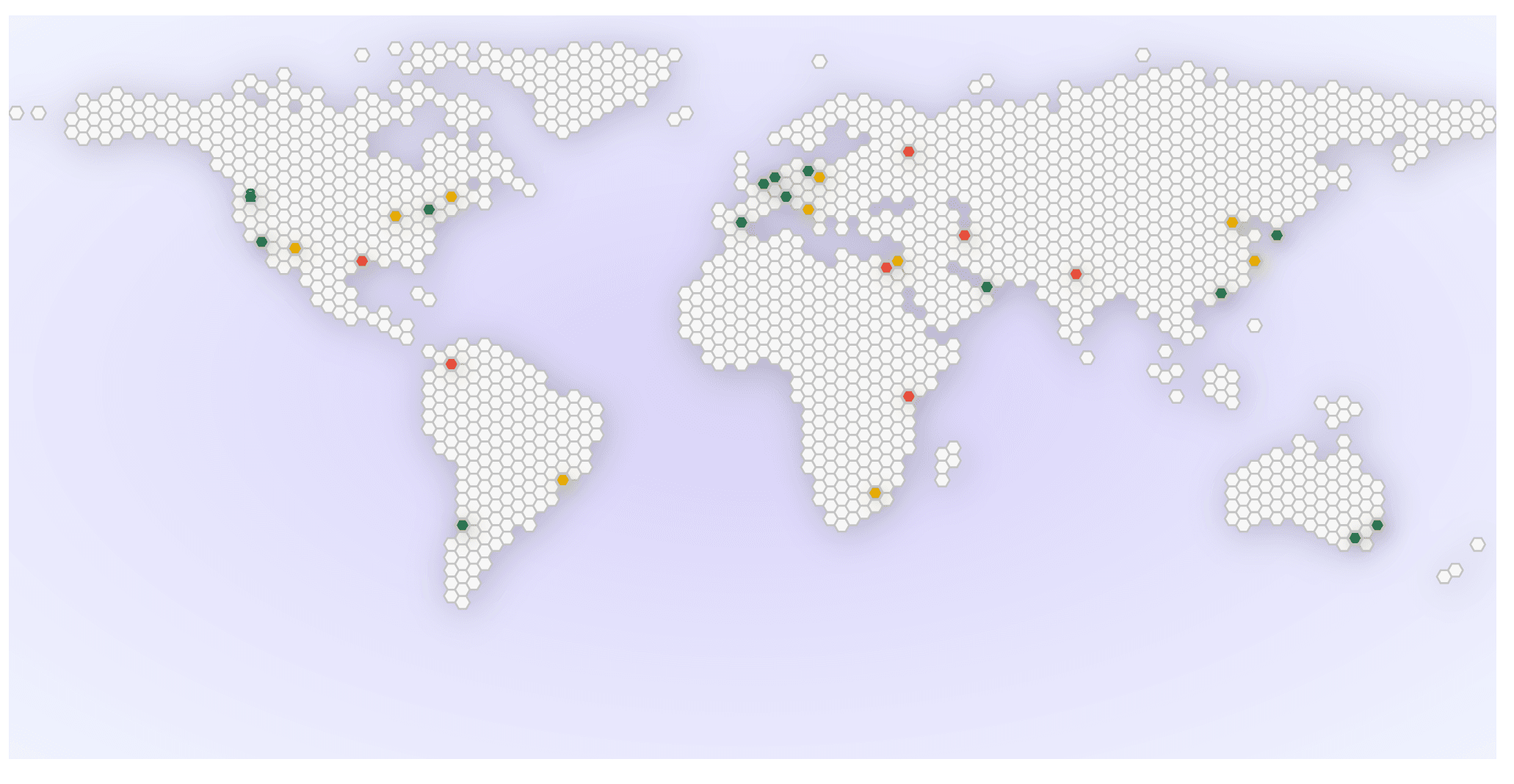
One shape, repeated 2,164 times#
Once the geometry was behaving, it was time to start narrowing into a final working implementation.
I wrote a pipeline in Node.js, it needed to:
- Source input map data
- Simplify / compress geojson data
- Include country names and 2 letter country codes
- Draw the map using equirectangular projection† (d3-geo)
- Centre the map with a slight north westward offset
- Remove Antarctica
- Render a hexagon grid, locating country boundaries using point-in-polygon and boundary detection for each hex
- Remove hexes for water
- Add ARIA roles and labels
- Render to SVG
† Map "projections" are the method used to draw a map. There’s many interesting interpretations of map projections, but most people are familar with equirectangular.
Rendering a static .svg file meant no client-side mapping data, no network calls after the initial load. A purely visual representation in one file.
Because the map is made of one shape repeated thousands of times, I leaned on SVG’s <symbol> and <use> to avoid redrawing it and creating a bloated SVG file. Define the hex once:
<symbol id="hex">...</symbol>Then reference hex wherever it needs to appear, grouped by country:
<g class="country-group" data-country="AU">
	<use href="#hex" x="..." y="..." />
	<use href="#hex" x="..." y="..." />
</g>
That’s the entire data model, structure and identifiers. The output is a single 144kb SVG. The map is generated each time we build and deploy, gets cached in the CDN, and is compressed down to just 10kb when served with GZip.
Comparing 10kb to full blown maps would be an unfair comparison, as they usually have drag to pan, zoom, tiling, internationalisation, and a lot more features. I won’t make that comparison directly.
Light, dark and glow#
Now that I had a .svg file, I added CSS to specify grading colours, and apply light and dark theming with light-dark:
svg {
	--hex-color: light-dark(var(--brand-grey-100), var(--brand-grey-500));
	--hex-stroke: light-dark(var(--brand-grey-200), var(--brand-grey-700));
	--hex-stroke-width: 1;
	--hex-transition: all 0.2s ease;

	/* also define --hex-good-color, --hex-good-stroke, --hex-needs-improvement-color,--hex-needs-improvement-stroke, --hex-poor-color, --hex-poor-stroke here. */

	& use {
		fill: var(--hex-color);
		stroke: var(--hex-stroke);
		stroke-width: var(--hex-stroke-width);
		transition: var(--hex-transition);
	}
}
Our in-app report page dynamically loads the SVG, and assigns grading colours to each country <g> with CSS variables, e.g.: hex-color: var(--hex-needs-improvement-color). Finalising with radial background to give the countries some glow against the background.
Sorry, Tasmania#
A few things didn’t make it. The United States wraps around the left and right edges of the map. Tasmania isn't large enough to register a 4 pixel dot (sorry mates!). There are many imperfections gained with this particular approach to simplification.
Getting a map that’s perfectly accurate, up-to-date with every disputed territory, aligned with our geolocation dataset, fast, and nice to look at would require a cartographer, a geopolitical advisor, and a lot more than two weeks. I am none of those things.
What the map does do: show users where their audience is and how they’re doing. And I love it.
If you want to see the map in action, sign up for a free trial and add real user monitoring to your website.