








Masonry layouts in pure CSS. No JavaScript. No hacks. Just four lines of code.
Brought to you by the team behind WebKit and Safari.
This is an interactive demo of CSS Grid Lanes. Try it in a browser with support.
Or simply scroll down to learn more about Grid Lanes.
(It is easy to use Grid Lanes today with simple fallbacks. This example skips them for clarity.)
1
2
3
4
5
6
7
8
9
10
11
12
13
14
15
16
17
18
19
20
21
22
23
24
25
26
27
Resize width:
Field Guide
Grid Lanes Basics
display: grid-lanes
Apply display: grid-lanes to a layout container. Then define columns or rows. The children pack into grid lanes automatically.
.container {
  display: grid-lanes;
  grid-template-columns: 1fr 1fr 1fr;
}
grid-template-columns
Waterfall
Defining columns creates a vertical waterfall. Tab order flows back and forth across the page. Each item is placed wherever puts it closest to the top. Additional items can be lazy-loaded at the bottom.
grid-template-rows
Brick
Defining rows creates a horizontal brick layout. Tab order flows up and down. Each item is placed wherever puts it closest to the inline start edge.
Options for Lane Definitions
fr unit
One fractional unit. Divides available space proportionally. 1fr 2fr 1fr gives the middle track twice the width.
grid-template-columns: 1fr 2fr 1fr;Fixed lengths
Use any CSS unit to define a fixed size. The classics: px, em, rem. Newer ones: ch (a character’s width), lh (a line’s height). Plus powerful viewport and container units. Pick the unit that fits the job.
grid-template-columns: 12ch 1fr 20rem;Percentage
The % unit resolves to percentage of the container’s size. It works — but fr units are usually a better fit, since they account for gap and % doesn’t. Plus you won’t have to worry about adding up to 100%.
grid-template-columns: 25% 75%;auto
Sized by content. Stretches to fill remaining space when there’s room.
grid-template-columns: auto 1fr;min-content & max-content
min-content
Most Narrow
max-content
Widest it can possibly be, no wrap
min-content makes a box the smallest it can be without overflow. max-content makes a box the biggest it can be, sized to its content.
grid-template-columns: max-content 1fr;grid-template-columns: min-content 1fr;fit-content()
Shrink-wrap with a ceiling. When there’s less content, fit-content behaves just like max-content. When there’s more content, it doesn’t grow beyond the declared size.
grid-template-columns: fit-content(300px) 1fr;minmax()
A flexible track sized between the declared minimum and maximum size. Using minmax(200px, 1fr) creates a track that’s never smaller than 200px, and grows to share any remaining space. When there’s more space, the browser automatically adds more tracks. Less space? Fewer tracks. No media or container queries needed!
grid-template-columns: minmax(200px, 1fr);repeat()
Shorthand to repeat track patterns. These two lines are identical:
grid-template-columns: repeat(3, 1fr);grid-template-columns: 1fr 1fr 1fr;auto-fill vs auto-fit
auto-fill
auto-fit
Both automatically choose the number of tracks. auto-fill creates all tracks that will fit, even if empty. auto-fit creates tracks, but not more than there are items, so there are no empty tracks.
The Go-To
Want flexible equal-width columns, where additional columns appear and disappear automatically as space allows? Use this, adjusting the 120px length to your needs:
grid-template-columns: repeat(auto-fit, minmax(120px, 1fr));Or use this to ensure that when the space available is extra narrow (less than 120px), the single column does not overflow:
grid-template-columns: repeat(auto-fit, minmax(min(120px, 100%), 1fr));Options for Placement & Spacing
flow-tolerance
flow-tolerance: 0
1
2
3
4
flow-tolerance: 4lh
1
2
3
4
Grid Lanes packs each item into whichever lane has the most empty space. When lanes are nearly equal and a one-pixel difference matters, the visual order gets scrambled for no good reason. Use flow-tolerance to declare “how close” matters. Anything less is considered a tie, and content flows in writing mode order. This better syncs visual order with tab order. The best value depends on your content’s sizes — experiment and see. Default is 1em.
flow-tolerance: 4lh;gap
One value for uniform spacing. Two values for different row-gap and column-gap. Works just like CSS Grid.
gap: 1rem 2rem;Spanning Lanes
Stretch an item across multiple tracks. Great for featured content.
.featured {
  grid-column: span 2;
}
.featured {
/* grid-column: span 2; */
}Explicit Placement
Pin an item to a specific track.
.item-1 {
  grid-column: 3;
}
.item-1 {
/* grid-column: 3; */
}Good to Know
Source Order Preserved
Grid Lanes reorders items visually for tighter packing, but the DOM order stays intact. Keyboard navigation, screen readers, and find-on-page all follow the original source order.
Spanning and explicit placement can pull items further from their source position. The visual reading order may diverge from the tab order — so author your HTML in the sequence you want users to encounter it.
Progressive Enhancement
Use @supports to layer Grid Lanes on top of a simpler fallback. Browsers that don't support it still get a reasonable layout.
@supports not (display: grid-lanes) {
  ul {
    columns: 3;
  }
}
@supports (display: grid-lanes) {
  ul {
    display: grid-lanes;
    grid-template-columns: repeat(3, 1fr);
  }
}
Switching between waterfall and brick
To switch between Waterfall and Brick layout direction, be sure to unset the original track definition. There are many ways to do so. Here’s one:
.container {
  display: grid-lanes;
  grid-template-columns: 1fr 1fr 1fr;
}
@media (width < 500px) {
  .container {
    grid-template-columns: unset;
    grid-template-rows: 1fr 1fr 1fr;
  }
}
Explore Demos
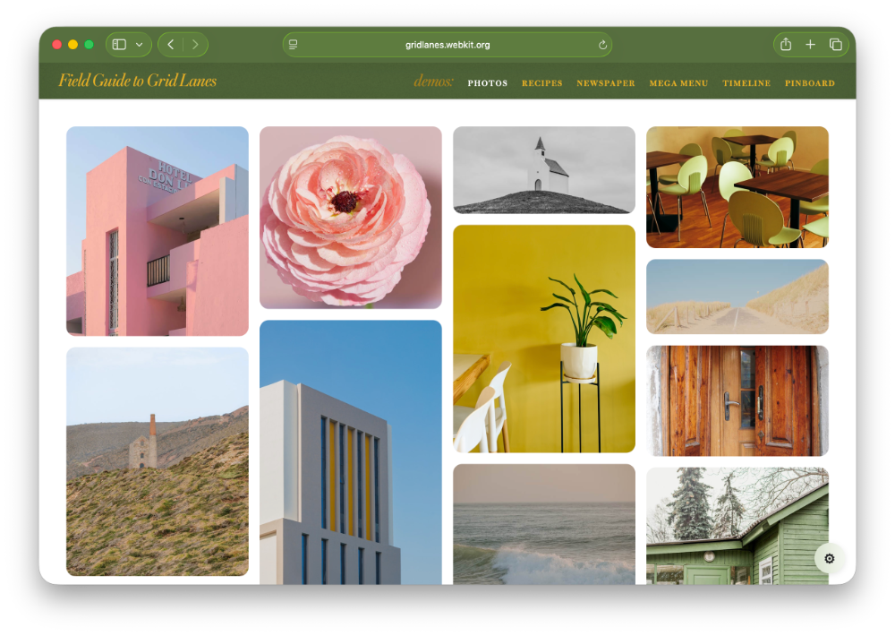

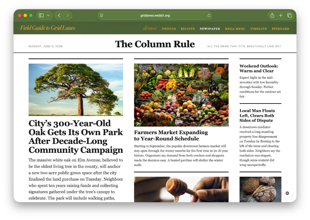

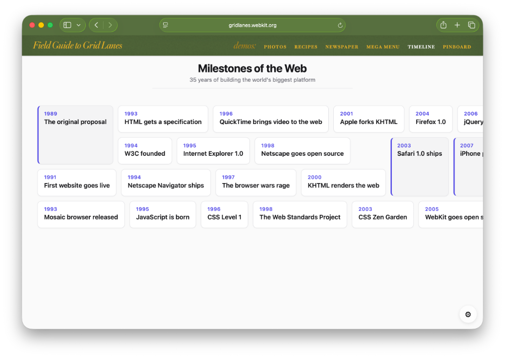
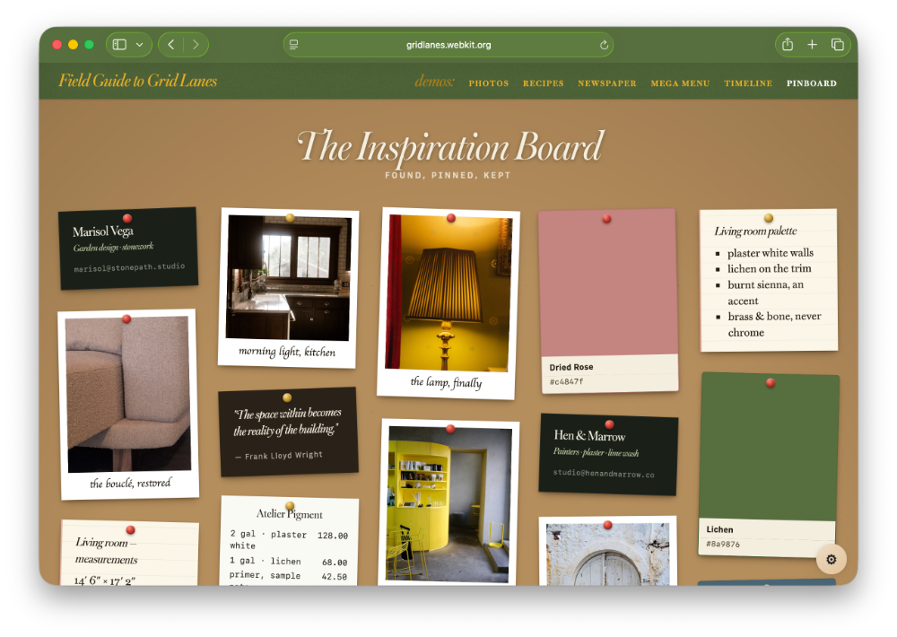
View these demos in Safari 26.4 or later, or another browser that supports Grid Lanes.
Watch the Talk
Dive Deeper
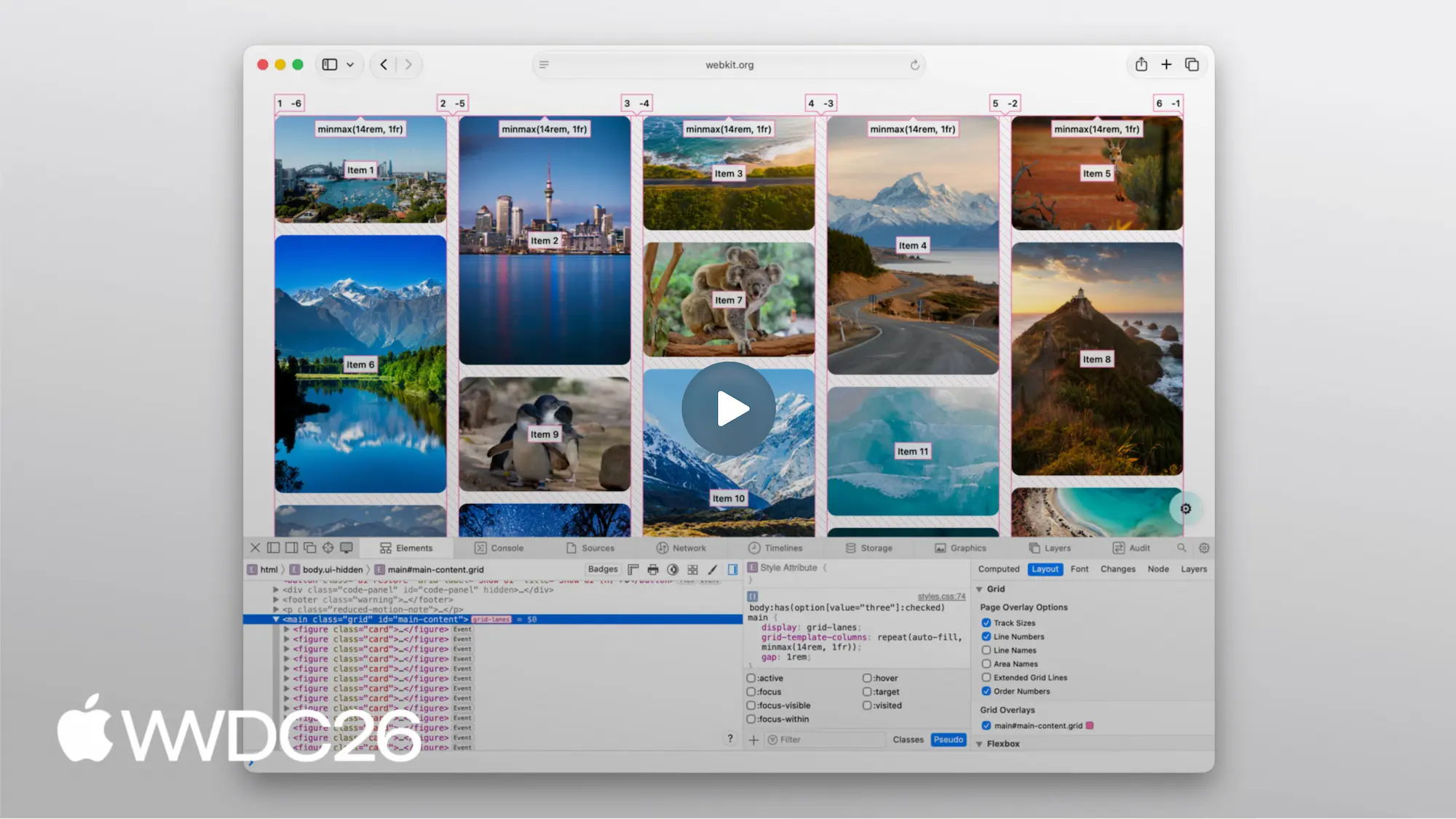
Safari’s Grid Inspector shows you exactly how items flow across lanes — open the demos and try it yourself.

From the Team
Ever since CSS Grid shipped in 2017, developers asked “How can I make a Masonry layout?” For years, the only option was to use JavaScript — often heavy, fragile, and not quite right. Now, CSS Grid Lanes solves this need, natively in the browser.
Grid Lanes went through years of design, prototyping, and debate within the CSS Working Group. The result is something we’re genuinely proud of. Four lines of CSS. No library. No framework. It’s fast and robust.
This website was made by the same people who’ve been involved from the beginning. Every demo, every diagram, every claim has been thoroughly reviewed for accuracy. This is exactly how Grid Lanes works, straight from the source.
We hope you create amazing things with Grid Lanes. It does far more than the classic masonry-style layout. We can’t wait to see what you make with it.