


CSS flexbox is one of the most useful CSS layout features nowadays. It’s tempting to add display: flex to a wrapper and have the child items ordered next to each other.
The thing is when there is not enough space, those child items won’t wrap into a new line by default. We need to change that behavior with flex-wrap: wrap.
Here is a typical example. We have a group of options that should be displayed next to each other.
.options-list {
  display: flex;
}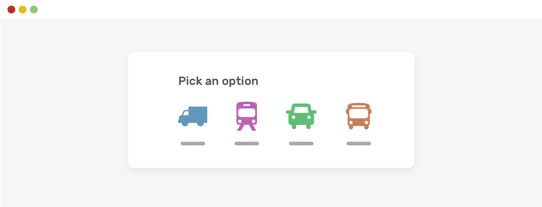
When there is less space, horizontal scrolling will occur. That’s should be expected and isn’t actually a “problem”.

Notice how the items are still next to each other. To fix that, we need to allow flex wrapping.
.options-list {
    display: flex;
    flex-wrap: wrap;
}
此内容由惯性聚合(RSS阅读器)自动聚合整理,仅供阅读参考。 原文来自 — 版权归原作者所有。