


In a flex container, you might use justify-content to space the child items from each other. With a certain number of child items, the layout will look okay. However, when they increase or decrease, the layout will look odd.
Consider the following example.
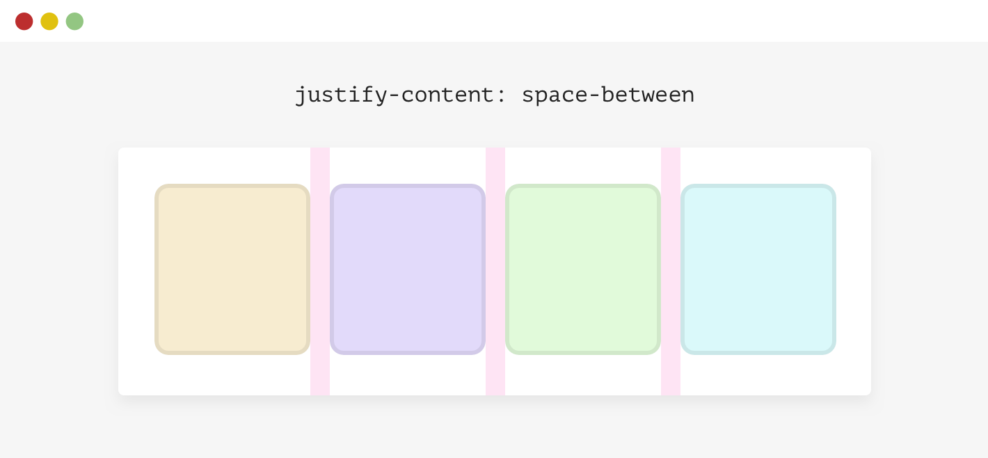
We have a flex container with four items. The spacing between each item isn’t a gap or margin, it’s there because the container has justify-content: space-between.
.wrapper {
    display: flex;
    flex-wrap: wrap;
    justify-content: space-between;
}
When the number of items is less than four, here is what will happen.
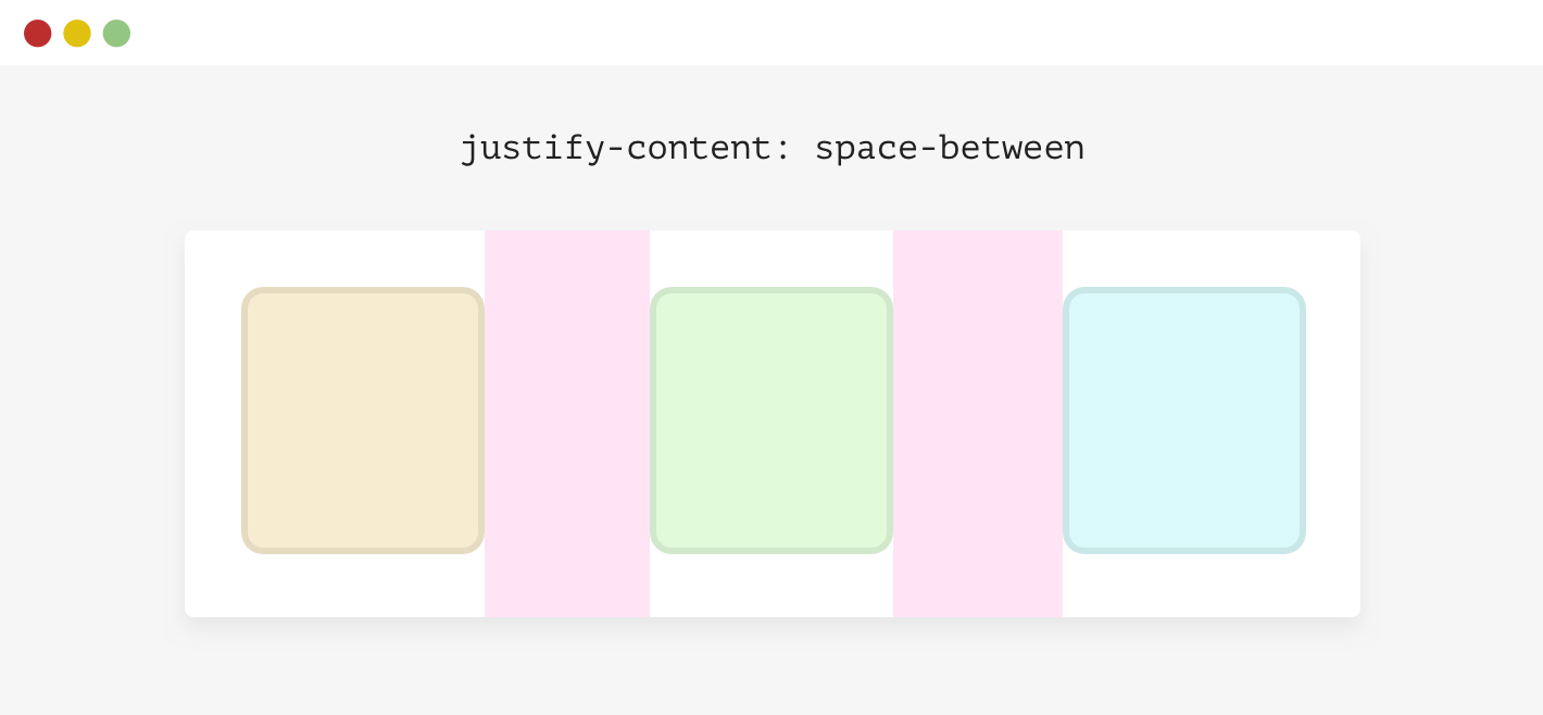
This isn’t good. There are different solutions to this:
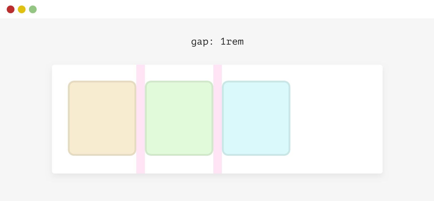
For simplicity, I will use gap.
.wrapper {
    display: flex;
    flex-wrap: wrap;
    gap: 1rem;
}
此内容由惯性聚合(RSS阅读器)自动聚合整理,仅供阅读参考。 原文来自 — 版权归原作者所有。