


We developers need to account for different content lengths. That means, spacing should be added to a component, even though it seems like not needed.
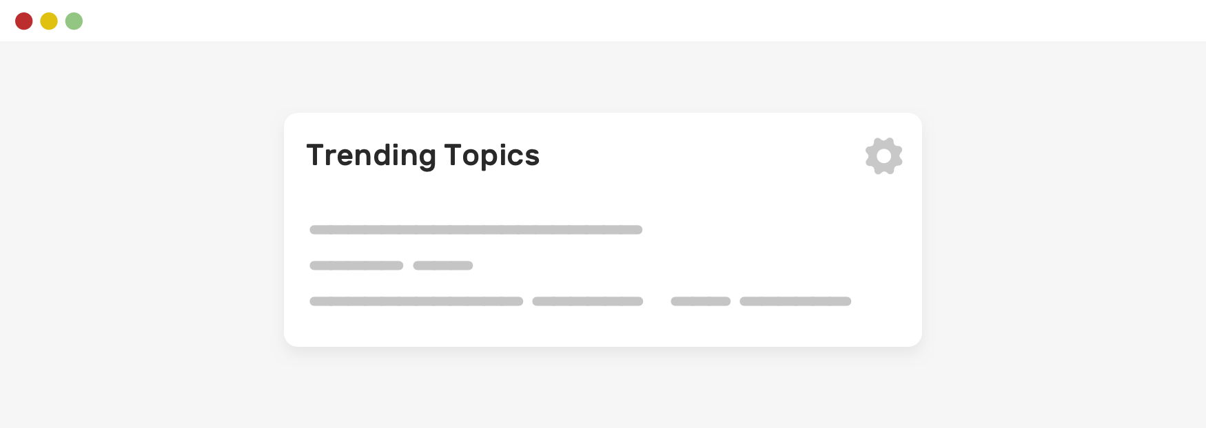
In this example, we have a section title and an action button on the right side. Currently, it looks okay. But let’s see what happens when the title is longer.
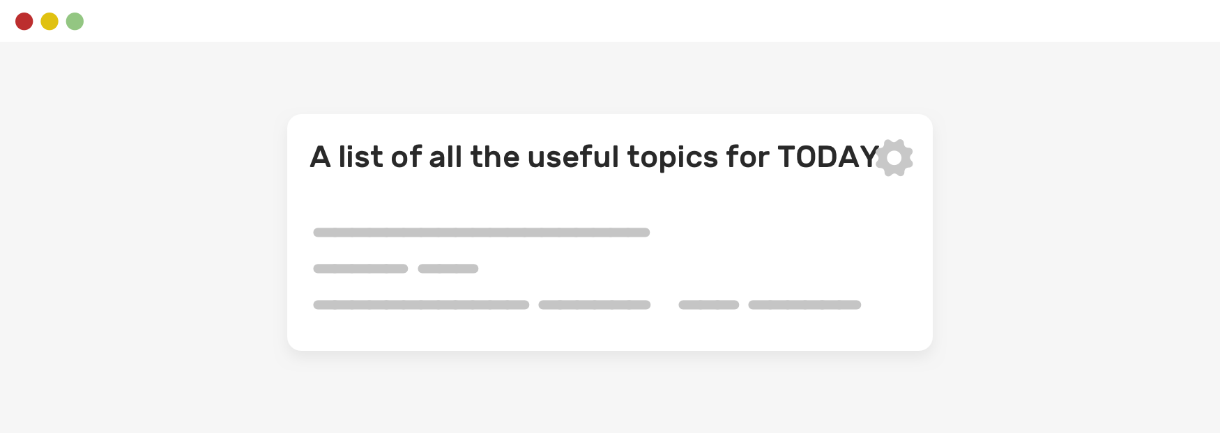
Notice how the text is too close to the action button? You might be thinking about multi-line wrapping, but I will come to that in another section. For now, let’s focus on the spacing.
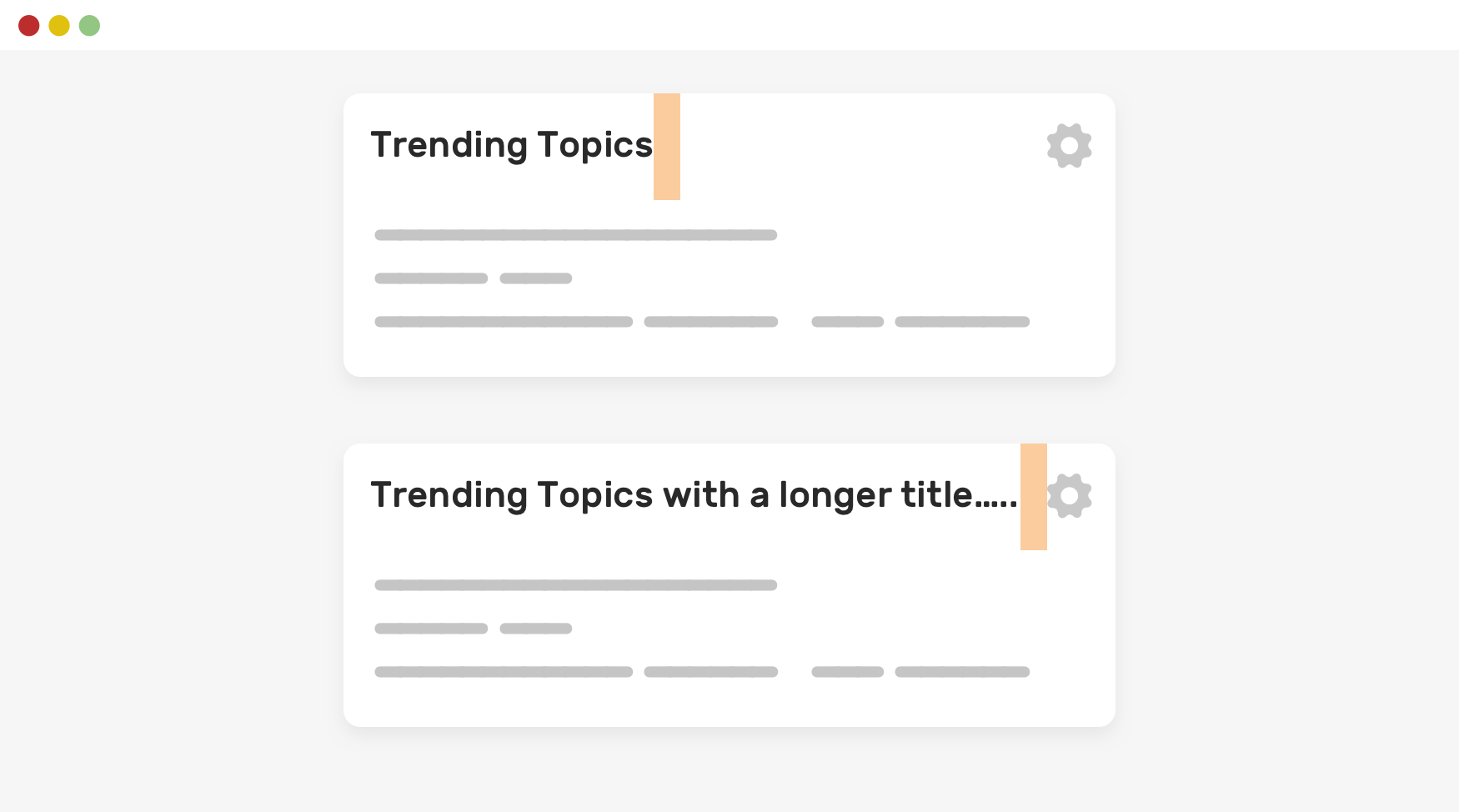
If the title has spacing and text truncation, we won’t see such an issue.
.section__title {
    margin-right: 1rem;
}
This is similar to the long content tip, but in that case we don't want to truncate the text since the user must read it all. One little thing here is to account for spacing even though the content we've currently isn't long.
Consider the following demo. We have a short title and everything works like a charm.
However, when the content is too long, the title should have 16px margin from the "more" button. Accounting for that ahead of time is important to avoid the text to collide with the button.
The pink outline represent the text element. When you click the "toggle defensive" checkbox, a 16px spacing will be added.
此内容由惯性聚合(RSS阅读器)自动聚合整理,仅供阅读参考。 原文来自 — 版权归原作者所有。