


Pie charts are common components that let you show portions of a whole, and you can use them for many different purposes.
You will find a lot of articles around building such a component, but they typically either rely on SVG or a lot of HTML elements.
In this post, I will show you how to create a pie chart using CSS and only one element.
Below is an overview of what we are building:
 20%
 40%
 60%
 80%
 90%
@property --p{
syntax:
As you can see in the CodePen above, we have a static pie chart, an animated one, and we can also have rounded edges. All this with a single <div> element.
In addition to that, we can easily adjust the different values using CSS variables so we don't have to bother ourselves with changing the CSS code.
I know the code may look a bit difficult at first glance, but after reading through the explanation below you will be able to confidently make your own pie charts.
The HTML Structure for the Pie Chart
As I mentioned above, we have a single <div> where we add the percentage value (the progress of the pie chart) as the main content:
<div class="pie" style="--p:60;--b:10px;--c:purple;">60%</div>
We also add the CSS variables as inline styles.
--p: This variable should contain the percentage value as a number (without the % sign). It be should the same as the content.
--b: This variable will define the thickness of the border.
--c: This variable will define the main color.
For the sake of this article and the demo, I am using a one-character variable to keep the code short. But it's better to consider more explicit variables when using the code in a production environment. Examples: --percentage, --border-thickness, and --main-color.
The CSS Setting for the Pie Chart
We first start by styling our content. This part is easy and the code is as follows:
.pie {
--w: 150px;
width: var(--w);
aspect-ratio: 1;
display: inline-grid;
place-content: center;
margin: 5px;
font-size: 25px;
font-weight: bold;
font-family: sans-serif;
}
I am defining the element as inline-grid to easily place the content at the middle using place-content: center. We use aspect-ratio: 1 to make sure the element remains square. We can also use height: var(--w) but it's always good to learn and use a new CSS property.
You may wonder why I am using a variable to define the width instead of simply setting width: 150px. I need to know the value of the width for future usage so I am defining it as a variable.
All the remaining CSS is pretty basic to style the text. Feel free to update it as you want.
Let's move on to the interesting part – the main shape of our component. For this, we will use a pseudo element with the following styles:
.pie:before{
content: "";
position: absolute;
border-radius: 50%;
inset: 0;
background: conic-gradient(var(--c) calc(var(--p)*1%),#0000 0);
}
A pseudo-element that has position: absolute covers all the area thanks to inset: 0. Yes, it's again a new CSS property which is the shorthand for top, right, bottom, and right (which you can read more about here).
Then we make it a circle ( border-radius: 50%) and we apply a conic-gradient(). Note the use of the CSS variables we defined as inline styles ( --c for the color and --p for the percentage).
Until now, this will give us the following result:
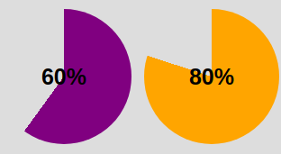
Conic-gradient applied to pseudo-element
We are getting closer! The conic-gradient() is giving us a two-color gradient. From 0% to p% the main color and the remaining part is a transparent color (defined with the hexadecimal value #0000 ).
To keep only the border part we will use a mask to hide the middle part. We will use a radial-gradient() this time:
radial-gradient(farthest-side,red calc(99% - var(--b)),blue calc(100% - var(--b)))
The above applied as a background will give us the following:
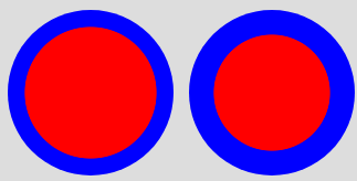
Illustration of the radial-gradient
Note the use of the variable --b that defines the thickness of the border (shown as blue in the above).
Now imagine the red part being the invisible part and the blue part the visible one. This is what we will get if we use the same gradient with the mask property:
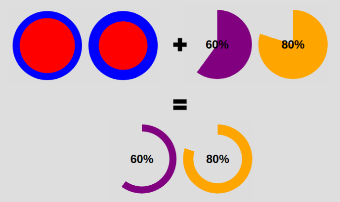
Applying mask to the pseudo element
We have our pie chart with one element and a few lines of CSS code.
.pie {
--w:150px;
width: var(--w);
aspect-ratio: 1;
position: relative;
display: inline-grid;
place-content: center;
margin: 5px;
font-size: 25px;
font-weight: bold;
font-family: sans-serif;
}
.pie:before {
content: "";
position: absolute;
border-radius: 50%;
inset: 0;
background: conic-gradient(var(--c) calc(var(--p)*1%),#0000 0);
-webkit-mask:radial-gradient(farthest-side,#0000 calc(99% - var(--b)),#000 calc(100% - var(--b)));
mask:radial-gradient(farthest-side,#0000 calc(99% - var(--b)),#000 calc(100% - var(--b)));
}
And the HTML:
<div class="pie" style="--p:60;--b:10px;--c:purple;">60%</div>
How to add the the rounded edges
For this I will add an extra gradient layer to round the top edge and a pseudo element to round the other edge. Here is an illustration to understand the trick:
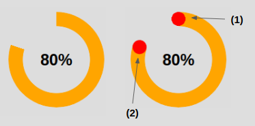
Illustration of the rounded edges
The code for (1) to round the top edge:
.pie:before {
background:
radial-gradient(farthest-side,var(--c) 98%,#0000) top/var(--b) var(--b) no-repeat,
conic-gradient(var(--c) calc(var(--p)*1%),#0000 0);
}
In addition to the conic-gradient() we add a radial-gradient() placed at the top that has a size equal to the border thickness defined by --b.
The code for (2) to round the other edge:
.pie:after {
content: "";
position: absolute;
border-radius: 50%;
inset: calc(50% - var(--b)/2);
background: var(--c);
transform: rotate(calc(var(--p)*3.6deg)) translateY(calc(50% - var(--w)/2));
}
The inset property is setting the size of the pseudo-element to be equal to --b. Remember that it's the shorthand for top, right, bottom and left. If we have
left = right = 50% - b/2
this means that from each side we are moving to the center minus an offset equal to b/2 – so we end up having a width equal to 2*b/2 = b. Same logic for the height.
Now we need to correctly place our element, which is why we use the transform property. Our element is initially placed at the center so we need to first rotate it. Having the percentage we use the "Rule of three" to get the angle:
angle = percentage*360deg/100
Then we do a translation, and here we will need the width because we have to perform a translation by half the width (w/2).
Ok, ok – you might be a bit lost within all these formulas. Find below an illustration to understand the logic behind the transform property
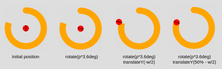
Applying the transform property to the pseudo-element
After that, we color the pseudo-element with the main color --c and we are done. We have our pie chart with rounded edges.
How to Animate the Pie Chart
A static pie chart is good but an animated one is better! To do this we will animate the percentage value --p from 0 to the defined value. By default, we cannot animate CSS variables, but thanks to the new @property feature it's now possible.
We register the variable:
@property --p{
syntax: '<number>';
inherits: true;
initial-value: 0;
}
We create a keyframes:
@keyframes p {
from {--p:0}
}
Note that we only need to specify the from. Doing this, the browser will make the to equal, by default, to the value we defined (<div class="pie" style="--p:60;">60%</div>).
And finally, we call the animation. You can define the duration/delay as you want.
animation: p 1s .5s both;
Unfortunately, this technique is not widely supported. You can test it on Chromium-based browsers (Chrome and Edge) but it will fail on Firefox and Safari. You can check out Can I Use to keep track of the support.
Before we end, here again is the full code and a demo of the final working product. You can see that I am using two classes to control the rounded edges and the animation so we can easily add/remove them as needed.
Click to see the full code
20%
40%
60%
80%
90%
@property --p{
syntax:
Learn to code for free. freeCodeCamp's open source curriculum has helped more than 40,000 people get jobs as developers. Get started
此内容由惯性聚合(RSS阅读器)自动聚合整理,仅供阅读参考。 原文来自 — 版权归原作者所有。