


Having a "back to top" button on a website is important. It allows users to easily scroll back to the top of the page.
Most websites rely on JavaScript to toggle the visibility of the button based on the amount of scroll. In this post, I will show you how to create such an effect using only CSS.
We will explore two kinds of effects – a "sliding" and a "fading" effect.
Here is an overview of what we are building in this part:
Click to see the full code
html
<body>
<div>
<!-- your content goes here -->
</div>
<a href="#" class="top">Back to Top ↑</a>
</body>
css
  body {
    display: grid;
    grid-template-columns: auto 0px;
  }

  .top {
    --offset: 50px;

    position: sticky;
    bottom: 20px;
    margin-right: 10px;
    place-self: end;
    margin-top: calc(100vh + var(--offset));

    /* visual styling */
    text-decoration: none;
    padding: 10px;
    font-family: sans-serif;
    color: #fff;
    background: #000;
    border-radius: 100px;
    white-space: nowrap;
  }

  p {
    font-size: 25px;
  }
If you scroll, the "back to top" button will appear and will stick at the bottom of the page. Click on it and you will get back to the top!
You will find no JavaScript in there. We'll only use CSS to make the button appear when you scroll the page.
It's cool, right? Let's dissect the code to understand the magic behind it.
The HTML Structure
<body>
  <div>
    <!-- your content goes here  -->
  </div>
  <a href="#" class="top">...</a>
</body>
Inside the body tag, we create a div where we put the content of the website. Right after that, we add our "back to top" button as a link.
For the sake of the article, I will keep the button as simple as possible but you can use whatever you want (an image, an icon, and so on). All you need is to keep the usage of a combined with href="#".
That's it! We are done with the HTML structure.
The CSS Code
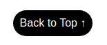
We first start by styling our button. For this part, it's up to you to be creative and build your own button. I will use a basic button (<a class="top" href="#">Back to Top ↑</a>) styled like this:
.top {
  text-decoration: none;
  padding: 10px;
  font-family: sans-serif;
  color: #fff;
  background: #000;
  border-radius: 100px;
}
Which will get us the following result:
Let's move to the main CSS. The effect we are aiming for uses two CSS techniques:
- CSS Grid to create the main structure
position: stickyto be able to keep the button at the bottom of the screen
Our structure will be a grid of two columns – one for the content and another one for the "back to top" button. For this, we add the following code:
body {
  display: grid;
  grid-template-columns: auto auto;
}
This gives us the following result:
Yes, it looks "ugly" but don't worry. This is due to the default stretch alignment of CSS Grid. We have to disable it and place our button at the bottom using place-self: end.
Now let's introduce position: sticky by adding this code:
.top {
  position: sticky;
  bottom: 20px;
}
Our button is fixed at the bottom right of our screen thanks to our "sticky" behavior. Now we need to control that behavior to make the button initially hidden. For this, we will use margin-top with a value equal to the screen height (100vh ).
See that? Our button appears only when we scroll the screen and then remains fixed. We are getting closer!
Let's do better by adding an offset. Our margin-top will become:
.top {
  --offset: 100px;

  margin-top: calc(100vh + var(--offset));
}
The above means: "After 100px of scrolling, show the button". To the screen height, we add an offset (that we define using a CSS variable) to control when the button should appear.
The final touch is to make the column width of the button equal to 0 by changing grid-template-columns: auto auto into grid-template-columns: auto 0px.
Oops, the button is messed up! Since we reduced the space of the button to 0, the latter will try to fit that space by adding line breaks. To fix this, we simply add white-space: nowrap to disable the line breaks.
We made our first CSS-only "back to top" button with a sliding effect.
- You can adjust the offset to control when the button should appear
- Using
bottomandmargin-rightyou can control the distance from the bottom right corner of the screen.
Let's not forget that you can easily style the button as you want. Here is another idea using the same code structure:
Click to see the full code
html
<body>
<div>
<!-- your content goes here -->
</div>
<a href="#" class="top">Back to Top ↑</a>
</body>
css
  body {
    display: grid;
    grid-template-columns: auto 0px;
  }

  .top {
    --offset: 50px;

    position: sticky;
    bottom: 20px;
    margin-right: 10px;
    place-self: end;
    margin-top: calc(100vh + var(--offset));

    /* visual styling */
    width: 45px;
    aspect-ratio: 1;
    background: #ff8b24;
    border-radius: 10px;
  }

  .top:before {
    content: "";
    position: absolute;
    inset: 30%;
    transform: translateY(20%) rotate(-45deg);
    border-top: 5px solid #fff;
    border-right: 5px solid #fff;
  }

  p {
    font-size: 25px;
  }
How to Make a Fading Back to Top Button
Let's tackle the second type of button where we will have a "fading" effect. Here's an overview of what we will create here:
Click to see the full code
html
  <body>
    <div>
      <!-- your content goes here  -->
    </div>
    <div class="container-top">
      <a href="#" class="top"></a>
    </div>
  </body>
css
  body {
    display: grid;
    grid-template-columns: auto 0px;
  }

  .container-top {
    --offset: 100px;
    --fade: 120px;

    display: flex;
    align-items: flex-end;
    width: 60px;
    justify-self: end;
    justify-content: flex-end;
    -webkit-mask: linear-gradient(#0000 calc(100vh + var(--offset)), #000 calc(100vh + var(--offset) + var(--fade)));
  }

  .top {
    position: sticky;
    bottom: 20px;
    margin-right: 10px;

    /* visual styling */
    width: 100%;
    aspect-ratio: 1;
    background: #ff8b24;
    border-radius: 10px;
  }

  .top:before {
    content: "";
    position: absolute;
    inset: 30%;
    transform: translateY(20%) rotate(-45deg);
    border-top: 5px solid #fff;
    border-right: 5px solid #fff;
  }

  p {
    font-size: 25px;
  }
Like the previous effect, you will find zero JavaScript code. That fading effect is handled with only CSS.
Let's dig into this one!
The HTML structure
<body>
  <div>
    <!-- your content goes here  -->
  </div>
  <div class="container-top">
    <a href="#" class="top"></a>
  </div>
</body>
It's very similar to the previous example. We've simply added an extra wrapper around our "back to top" button.
The CSS code
I will skip the part where we style the button since it's the same as the previous effect.
This effect also relies on CSS grid and position: sticky. We'll also use a third technique which is the mask property (the one that will simulate the fading effect).
Let's start with the main setting:
body {
  display: grid;
  grid-template-columns: auto auto;
}

.container-top {
  display: flex;
  align-items: flex-end;
  width: 60px;
}

.top {
  position: sticky;
  bottom: 20px;
  margin-right: 10px;
}
We define our two-column layout where the container-top is the second one. We make the latter a flex container and we place the button at the very bottom using align-items: flex-end. Finally, we use position: sticky to have the button fixed at the bottom right of the screen.
Now let's introduce the mask property to create the fading effect. To understand this trick, I will first use a background to illustrate how it works.
In the above, I applied the following gradient to container-top:
.container-top {
  background: linear-gradient(green 100vh, red 0);
}
If you scroll, you will notice that the button will move from the green area to the red one. The green area is equal to the screen height.
Imagine that the green area is the "invisible" part of the container-top and the red one is the "visible" part. This is what mask will be doing if we consider the same gradient.
In this last demo, we changed background with mask and we used a transparent/opaque combination of colors instead of the green/red one. The button now appears only on scroll!
To get the fading effect, we need to increase the distance between both colors. Let's introduce a CSS variable and update the mask like below:
.container-top {
  --fade: 120px;
  mask: linear-gradient(#0000 100vh, #000 calc(100vh + var(--fade)));
}
The transparent color ends at 100vh, and the opaque one start at 100vh + 120px. We have a fading of 120px between transparent and opaque which gives us the following result:
We are almost there! Our button is fading like expected. We are simply missing the offset variable to control when the fading effect should happen.
For this, we do the same as the previous effect by introducing the offset variable:
The final touch is to make the column width of container-top equal to 0 using grid-template-columns: auto 0px
.container-top {
  --offset: 100px;
  --fade: 120px;

  mask: linear-gradient(#0000 calc(100vh + var(--offset)), #000 calc(100vh + var(--offset) + var(--fade)));
}
Our second "back to top" button is done! Like the previous one, you can easily control the offset, the fading effect, and the position by adjusting the CSS variables, the bottom property, and the margin-right property.
Thank you for reading!
For more CSS tips, follow me on Twitter.
Learn to code for free. freeCodeCamp's open source curriculum has helped more than 40,000 people get jobs as developers. Get started